Upgrade to Pro
— share decks privately, control downloads, hide ads and more …
Speaker Deck
Sign up for free
Menu
Search
Features
All features
Private URLs
Password Protection
Custom URLS
Scheduled publishing
Remove Branding
Restrict embedding
Deck Collections
Notes
Features
All features
Private URLs
Password Protection
Custom URLS
Scheduled publishing
Remove Branding
Restrict embedding
Deck Collections
Notes
Explore
Featured decks
Featured speakers
Programming
Technology
Storyboards
Explore
Featured decks
Featured speakers
Programming
Technology
Storyboards
Pricing
Search
Sign in
Sign up for free
Responsive Web Design in a Nutshell
Search
Lean Machine
September 05, 2013
Programming
150
3
Share
Embed
Copy iframe code
Copy JS code
Copy link
Start on current slide
Responsive Web Design in a Nutshell
Lean Machine
September 05, 2013
More Decks by Lean Machine
See All by Lean Machine
Graceful Degradation with Modernizr
leanmachine
1
1k
Intro to HTML5
leanmachine
3
1k
Organizing Stylesheets with CSS Pre-processors
leanmachine
2
970
Seven UX Design Rules
leanmachine
9
1k
JavaScript Closures
leanmachine
1
1.1k
JavaScript Inheritance
leanmachine
2
1.1k
Asynchronous JavaScript
leanmachine
1
980
JavaScript Promises
leanmachine
2
1.1k
Other Decks in Programming
See All in Programming
SalesForceを内製化!? ~ HR事業を支える顧客管理基盤のインフラを大公開 ~
oku053
0
170
[ハンズオン]AIへの指示だけで「五目並べ」を作ってみよう
satoshi256kbyte
1
370
Ghostty + Neovimで作る 透明でカッコ良い開発環境
j341nono
0
170
AWSに止められる覚悟してますか?
morizo_1984
2
530
Androidだけじゃない、DroidKaigiで広がった私の技術スタック
akkeylab
0
120
When benchmarks go bad - what I learned from measuring performance wrong
hollycummins
0
200
[Rails World 2026] Durable orchestration on Rails: from continuation to workflow
palkan
1
710
Augmenting AI with the Power of Jakarta EE
ivargrimstad
0
620
Are APIs Still Relevant in the AI Era?
soyuka
0
450
GemmaをJevのように使ってみる / Use Gemma like Jev
kishida
5
760
半永久的に提供し続けられるプライベートクラウドを目指して ― 利用者の認知負荷を抑えるAPI抽象化とハードウェア世代交代の基盤設計
tomokon
0
480
Findy - エンジニア向け会社紹介/Findy Company Deck
findyinc
6
400k
Featured
See All Featured
Typedesign – Prime Four
hannesfritz
42
3.2k
Test your architecture with Archunit
thirion
2
2.4k
Making Projects Easy
brettharned
120
6.8k
DBのスキルで生き残る技術 - AI時代におけるテーブル設計の勘所
soudai
PRO
68
58k
Navigating Weather and Climate Data
rabernat
0
550
Rebuilding a faster, lazier Slack
samanthasiow
85
9.7k
CSS Pre-Processors: Stylus, Less & Sass
bermonpainter
360
31k
Optimizing for Happiness
mojombo
378
71k
4 Signs Your Business is Dying
shpigford
187
23k
How People are Using Generative and Agentic AI to Supercharge Their Products, Projects, Services and Value Streams Today
helenjbeal
2
360
Designing for humans not robots
tammielis
254
26k
Skip the Path - Find Your Career Trail
mkilby
1
250
Transcript
Responsive Web Design ... in a nutshell. leanmachine.se ▪
[email protected]
▪ 2013-09-06
What’s all the fuss about?
None
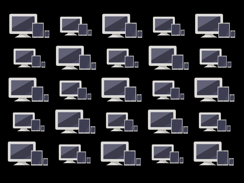
Our websites need to work on all devices
Responsive vs. Adaptive
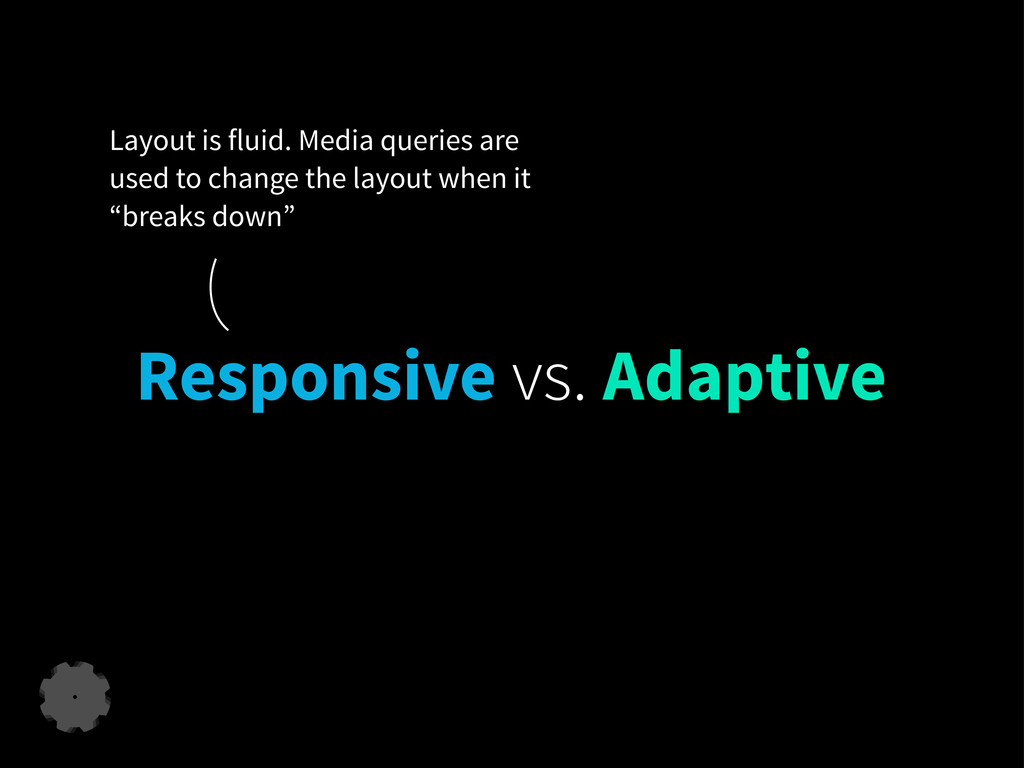
Responsive vs. Adaptive Layout is fluid. Media queries are used
to change the layout when it “breaks down”
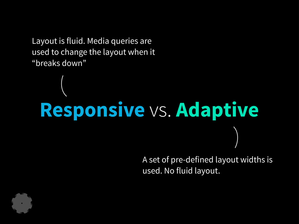
Responsive vs. Adaptive A set of pre-defined layout widths is
used. No fluid layout. Layout is fluid. Media queries are used to change the layout when it “breaks down”
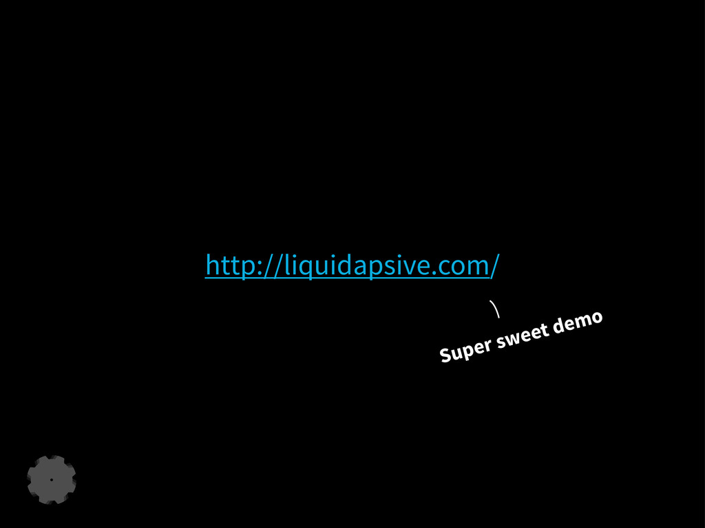
http://liquidapsive.com/ Super sweet demo
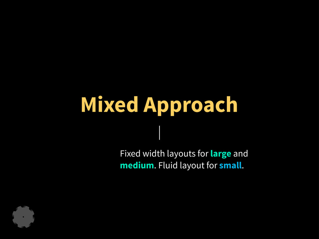
Mixed Approach Fixed width layouts for large and medium. Fluid
layout for small.
How do I make my site responsive?
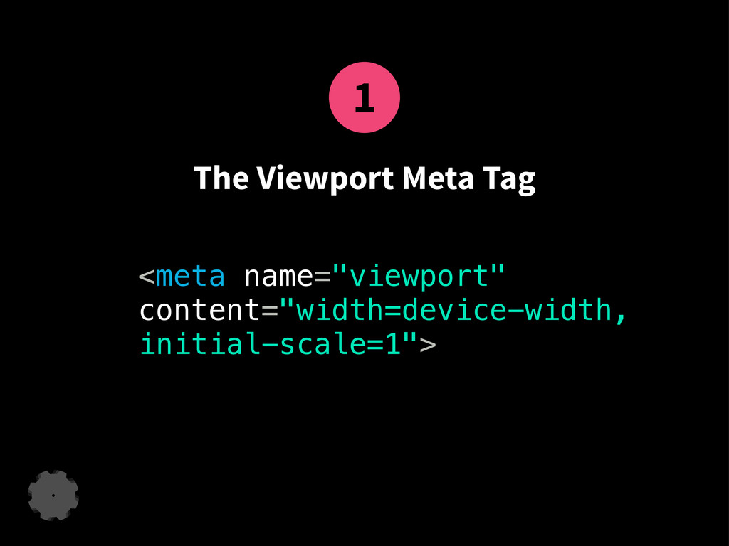
1 The Viewport Meta Tag <meta name="viewport" content="width=device-width, initial-scale=1">
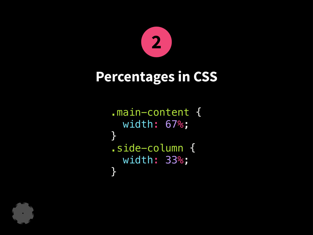
2 Percentages in CSS .main-content { width: 67%; } .side-column
{ width: 33%; }
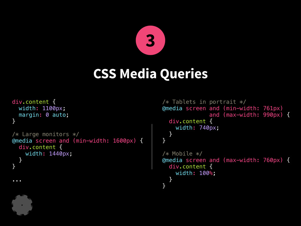
3 CSS Media Queries div.content { width: 1100px; margin: 0
auto; } /* Large monitors */ @media screen and (min-width: 1600px) { div.content { width: 1440px; } } ... /* Tablets in portrait */ @media screen and (min-width: 761px) and (max-width: 990px) { div.content { width: 740px; } } /* Mobile */ @media screen and (max-width: 760px) { div.content { width: 100%; } }
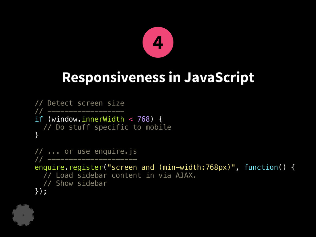
4 Responsiveness in JavaScript // Detect screen size // ------------------
if (window.innerWidth < 768) { // Do stuff specific to mobile } // ... or use enquire.js // --------------------- enquire.register("screen and (min-width:768px)", function() { // Load sidebar content in via AJAX. // Show sidebar });
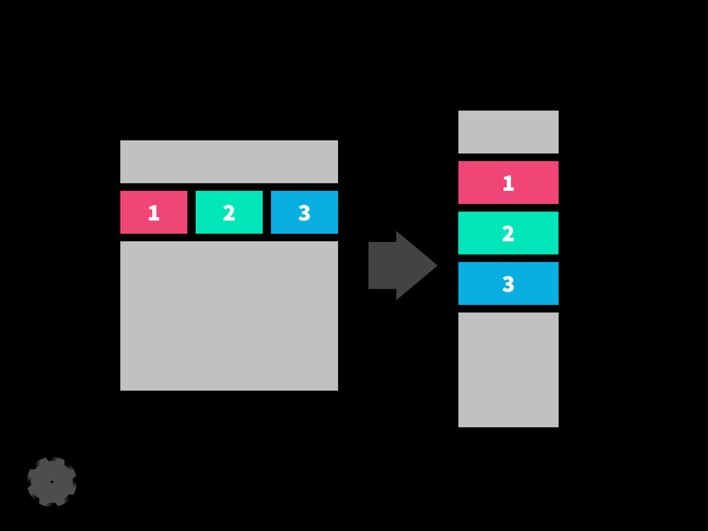
Responsive Design Patterns
1 2 3 1 2 3
http://bradfrost.github.io/this-is-responsive/patterns.html Tons of examples
Useful Tools
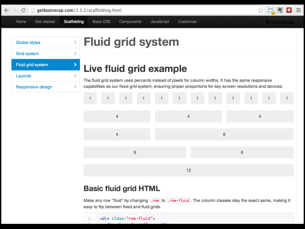
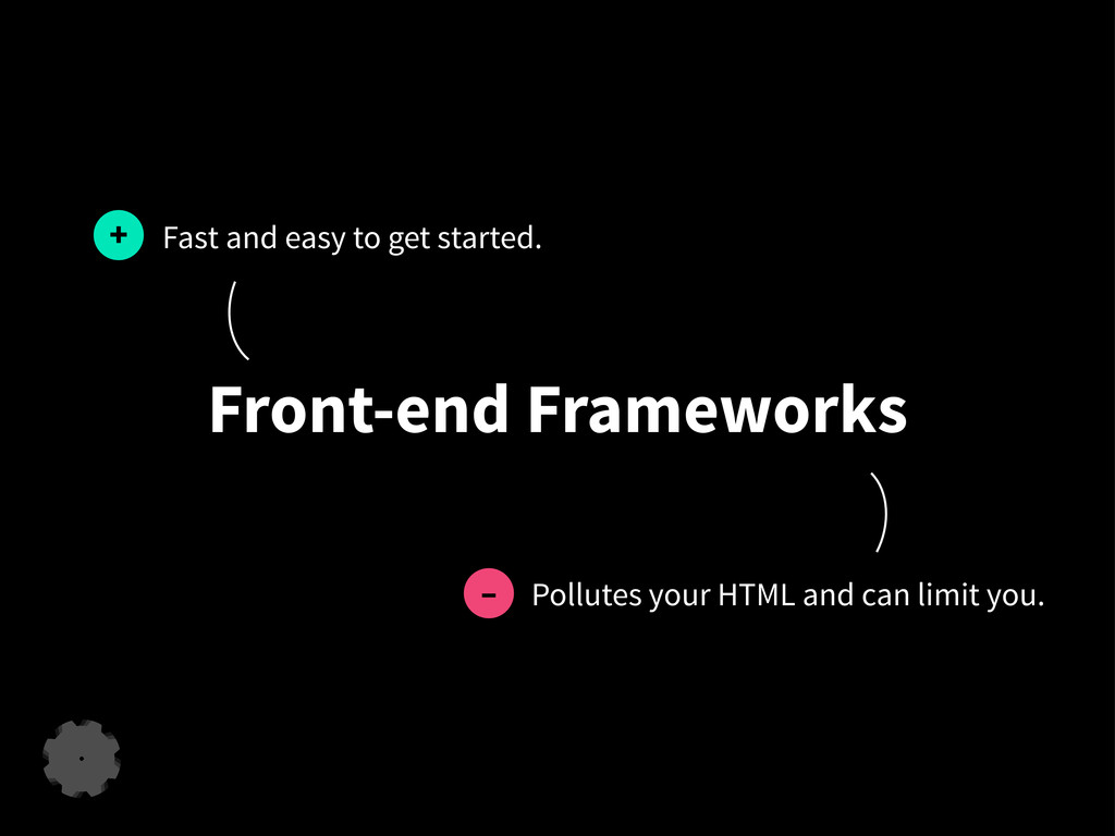
Front-end Frameworks
None
Front-end Frameworks Fast and easy to get started. +
Front-end Frameworks Fast and easy to get started. + Pollutes
your HTML and can limit you. –
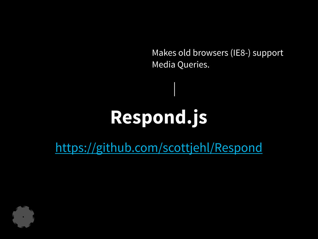
https://github.com/scottjehl/Respond Respond.js Makes old browsers (IE8-) support Media Queries.
Responsive Web Safari!
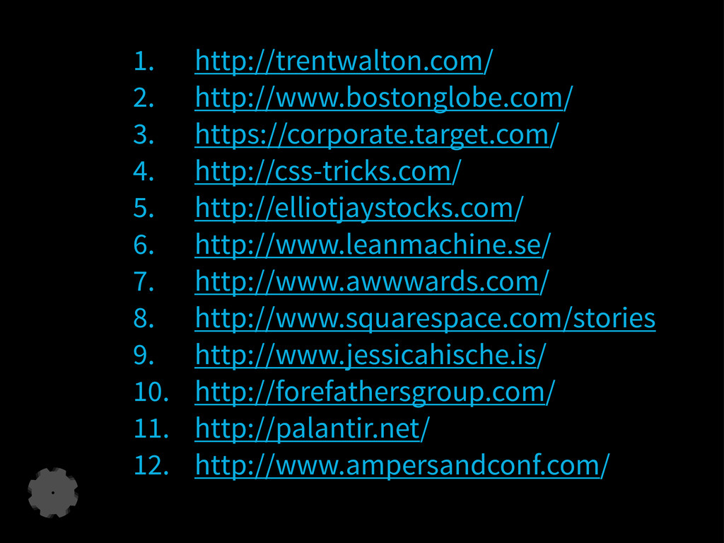
1. http://trentwalton.com/ 2. http://www.bostonglobe.com/ 3. https://corporate.target.com/ 4. http://css-tricks.com/ 5. http://elliotjaystocks.com/
6. http://www.leanmachine.se/ 7. http://www.awwwards.com/ 8. http://www.squarespace.com/stories 9. http://www.jessicahische.is/ 10. http://forefathersgroup.com/ 11. http://palantir.net/ 12. http://www.ampersandconf.com/
leanmachine.se ▪
[email protected]
▪ 2013-09-06


 leanmachine
 oku053
 satoshi256kbyte
 j341nono
 morizo_1984
 akkeylab
 hollycummins
 palkan
 ivargrimstad
 soyuka
 kishida
 tomokon
 findyinc
 hannesfritz
 thirion
 brettharned
 soudai
 rabernat
 samanthasiow
 bermonpainter
 mojombo
 shpigford
.png) helenjbeal
helenjbeal
 tammielis
 mkilby
![Responsive Web Design ... in a nutshell. leanmachine.se ▪ [email protected]](https://files.speakerdeck.com/presentations/4722b210f9320130cfb35e2e3956e717/slide_0.jpg)





![leanmachine.se ▪ [email protected] ▪ 2013-09-06](https://files.speakerdeck.com/presentations/4722b210f9320130cfb35e2e3956e717/slide_25.jpg)