Upgrade to Pro — share decks privately, control downloads, hide ads and more …

Introduction to Jupyter Notebooks & Data Analytics with Kaggle

Introduction to Jupyter Notebooks & Data Analytics with Kaggle

Workshop given on Pyladies Dublin

Leticia Portella

February 19, 2019
Tweet

More Decks by Leticia Portella

Other Decks in Technology

Transcript

  1. Kaggle is a place where you can find a lot

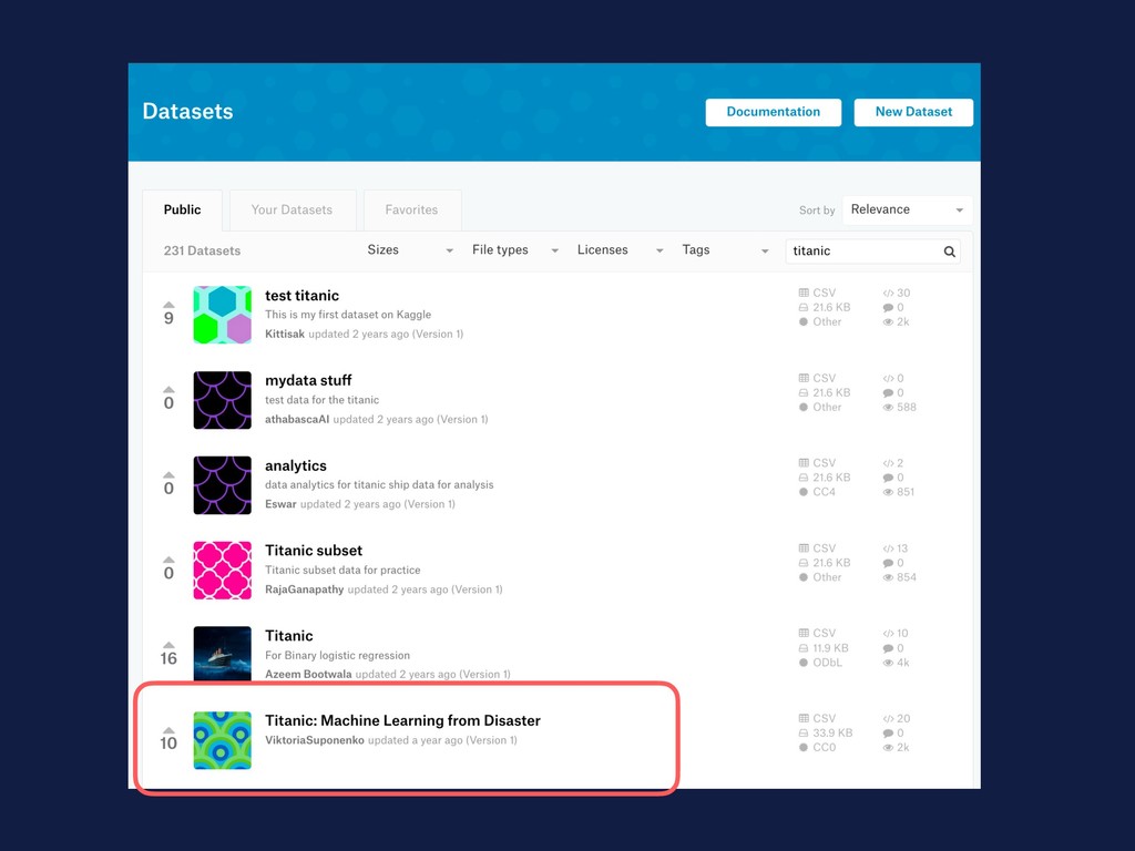
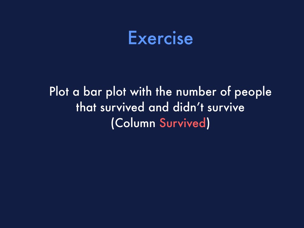
    of datasets, it already have installed most of tools you’ll need for a basic analysis, is a good place to see the people’s code and built a portfolio Why Kaggle?
  2. Notebooks are a place where you can create code, show

    graphs, document your methodologies and findings… all in a single place
  3. Jupyter Shortcuts Ctrl + Enter = Run cell ESC +

    B = New cell below ESC + dd = Delete cell
  4. Reading a document If you check the first cell, it

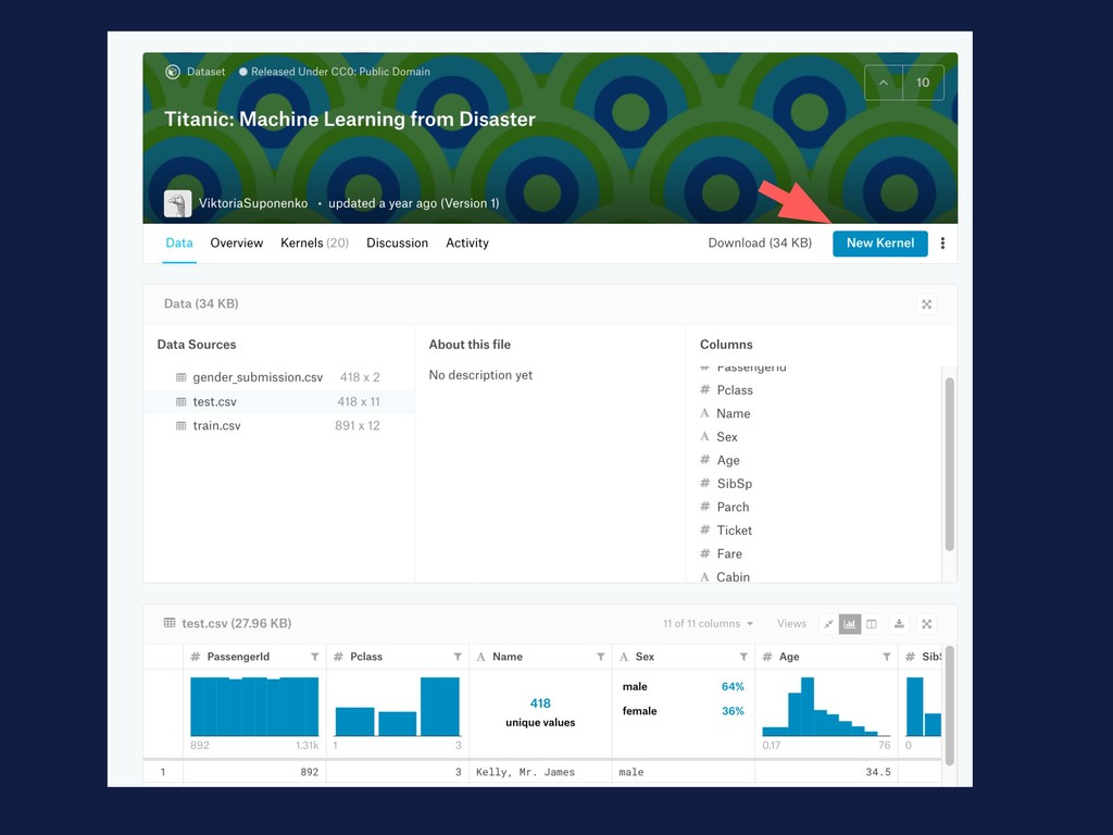
    will tell you that the documents are ready for you in ../input/. So, we can read the files by with a Pandas function and with the path of the file df = pd.read_csv(‘../input/train.csv')
  5. Dataframes Dataframes are similiar to what you find in Excel

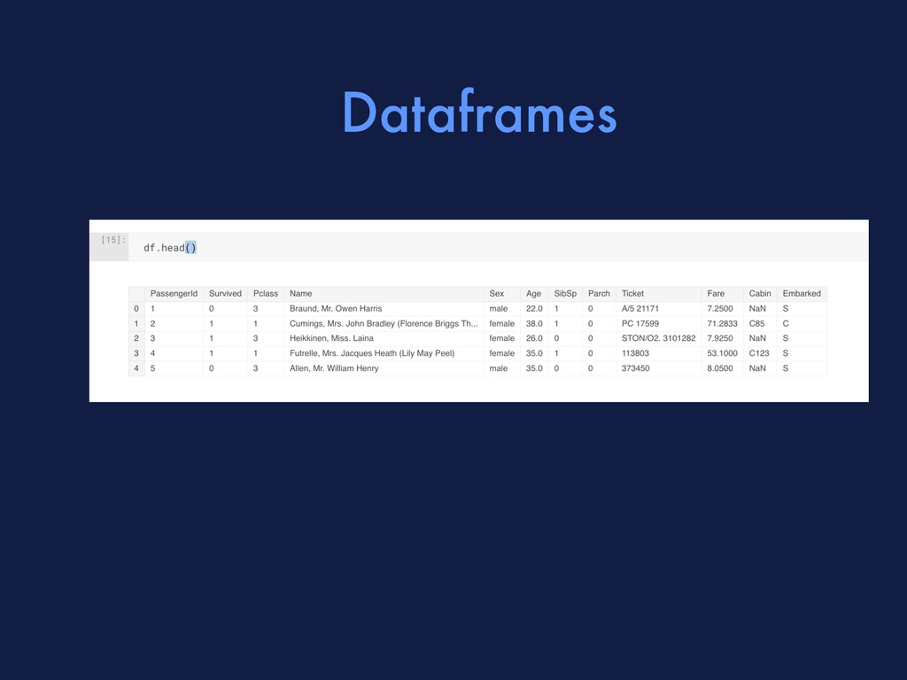
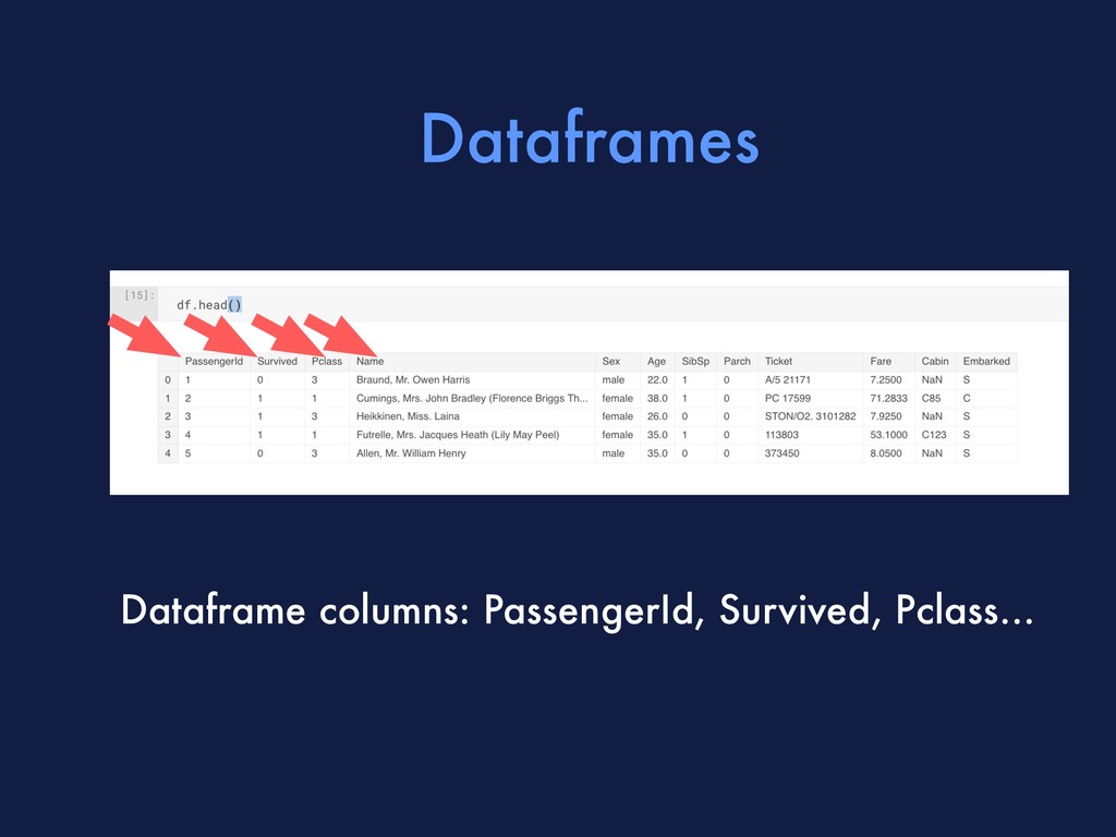
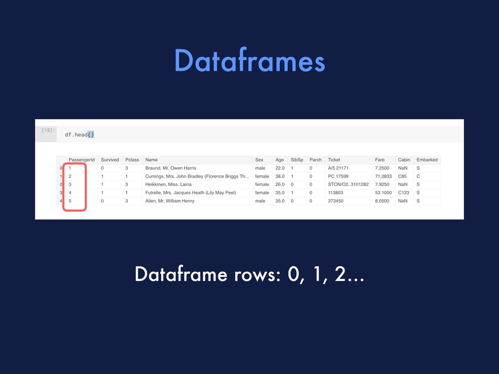
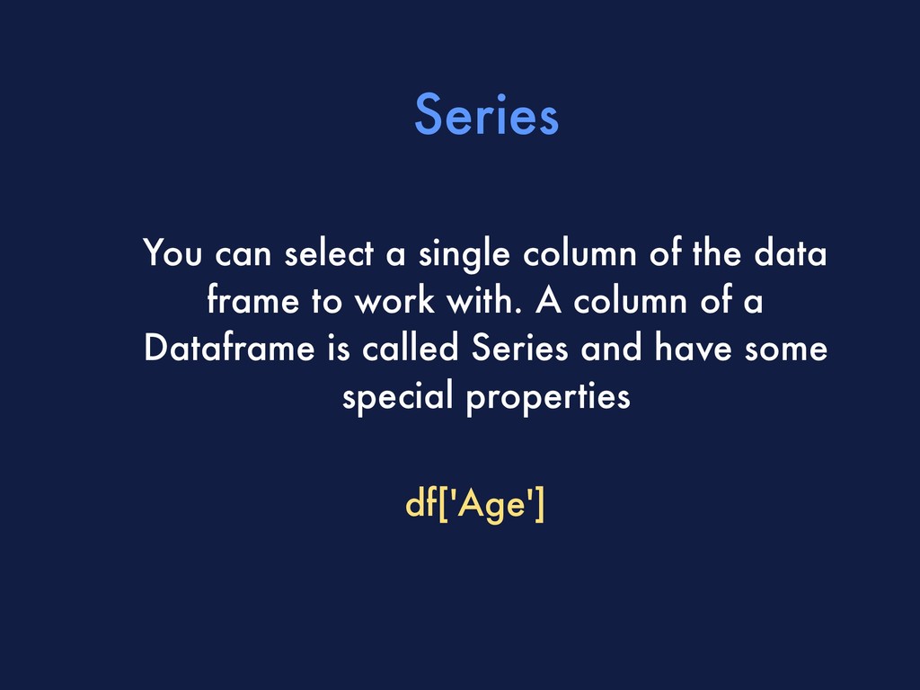
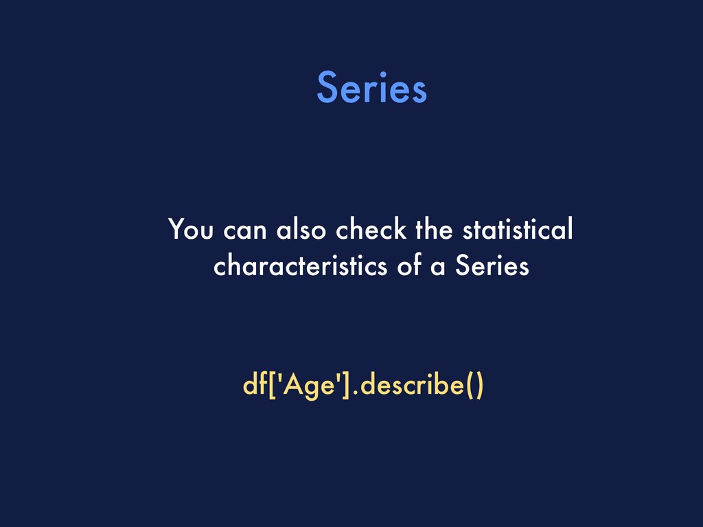
    structures. You have rows indicated by numbers and columns with names. You can check the first 5 rows of a data frame to see the basic structure: df.head()
  6. Dataframes You can check the structure of a dataframe, to

    get an idea of how many rows and columns it has: df.shape
  7. Dataframes You can check the main statistical characteristics of the

    numerical columns of a data frame df.describe()
  8. Series You can select a single column of the data

    frame to work with. A column of a Dataframe is called Series and have some special properties df['Age']
  9. Series You can filter a series to see which rows

    have adults. This will return a Series of True and False. df[‘Age'] > 10
  10. Series And Series have functions that help you quickly plot

    some of it. We can, for instance, check the histogram of Ages. df[‘Age’].plot.hist()
  11. Series And Series have functions that help you quickly plot

    some of it. We can, for instance, check the histogram of Ages. df[‘Age’].plot.hist()
  12. Series We can count how many passengers were on each

    class df[‘Pclass’].value_counts()
  13. Series Since the result of a value_counts is also a

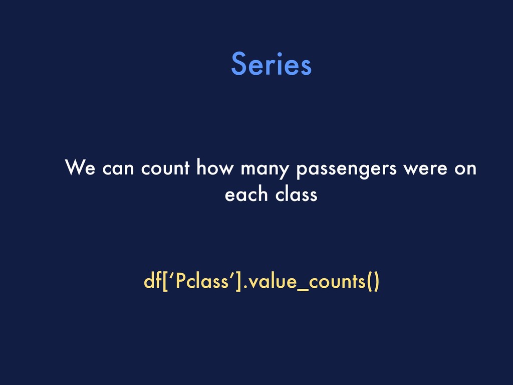
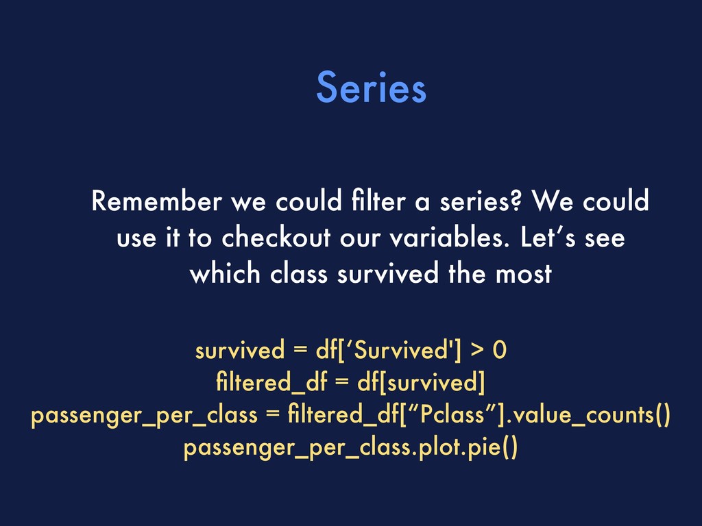
    Series, we can store this value in a variable and use it to plot a pie chart :) passengers_per_class = df[‘Pclass’].value_counts() passengers_per_class.plot.pie()
  14. Exercise Plot a bar plot with the number of people

    that survived and didn’t survive (Column Survived)
  15. Series Remember we could filter a series? We could use

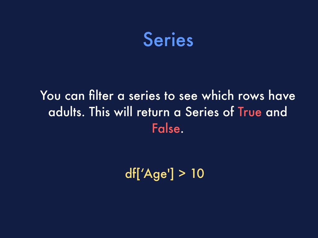
    it to checkout our variables. Let’s see which class survived the most survived = df[‘Survived'] > 0 filtered_df = df[survived] passenger_per_class = filtered_df[“Pclass”].value_counts() passenger_per_class.plot.pie()
  16. Series We can create a new column (Ageclass) using the

    Column Age and this function :) df[“Ageclass”] = df[“Age”].apply(age_to_ageclass)
  17. Exercise Now we have classes for age, we can check

    which sector survived the most, the same we did with Class :)