Upgrade to Pro — share decks privately, control downloads, hide ads and more …

Automating Responsive Images In HTML

Automating Responsive Images In HTML

The Web has gone from the era of just text to 60% images.
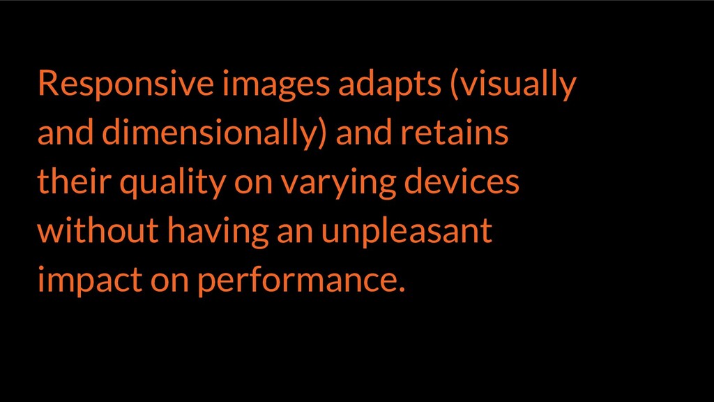
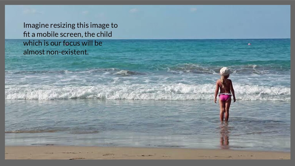
With more images comes a problem - How to make sure they remain responsive and performant in accordance with the user's device.
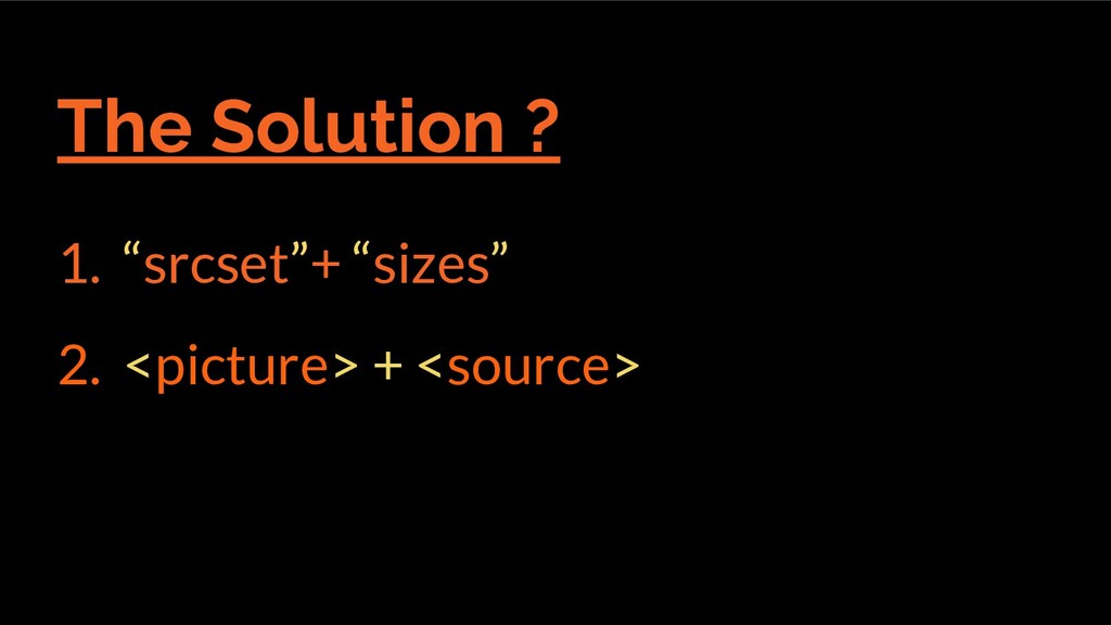
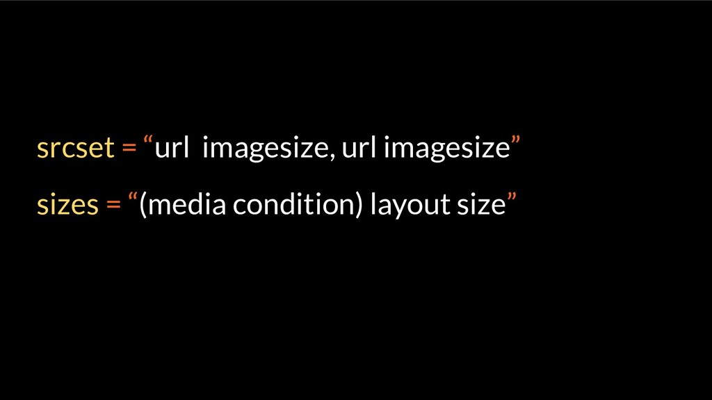
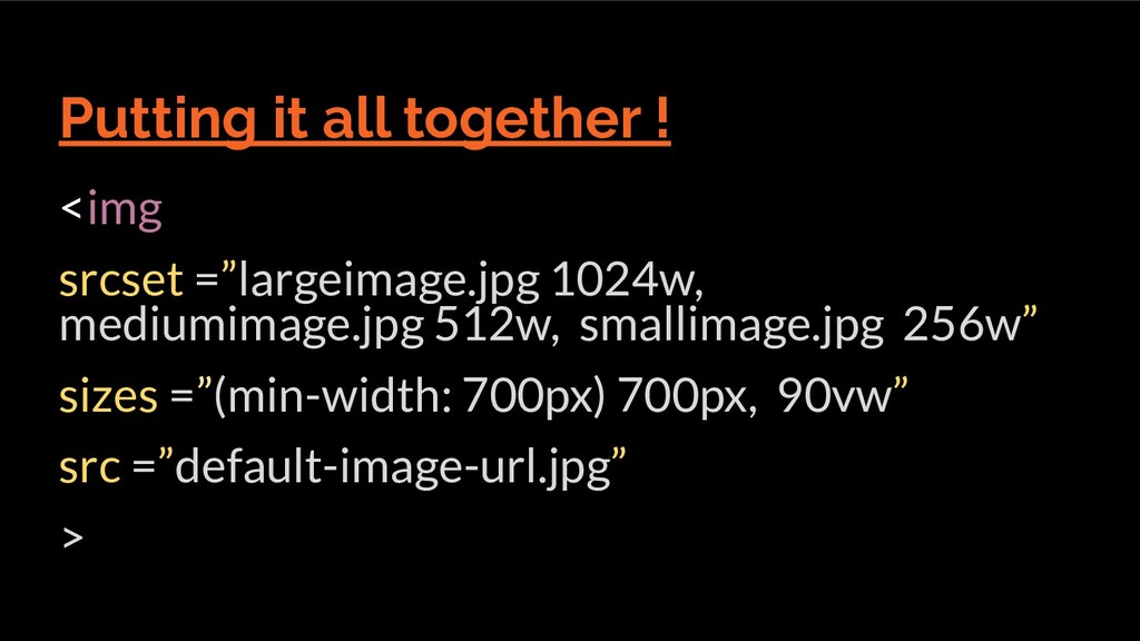
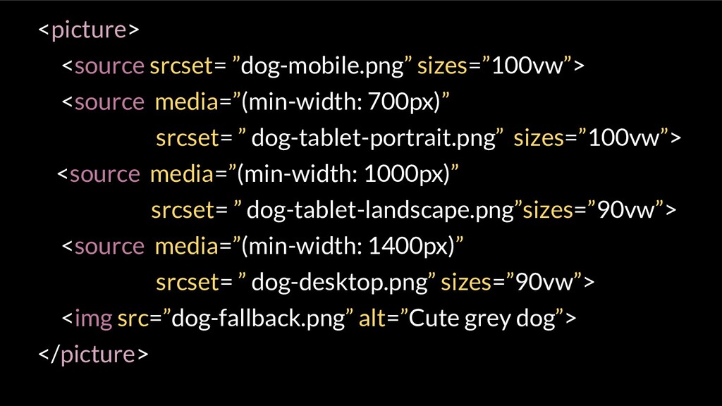
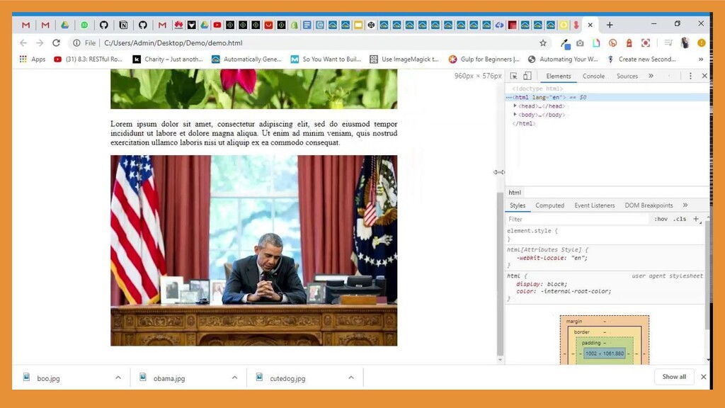
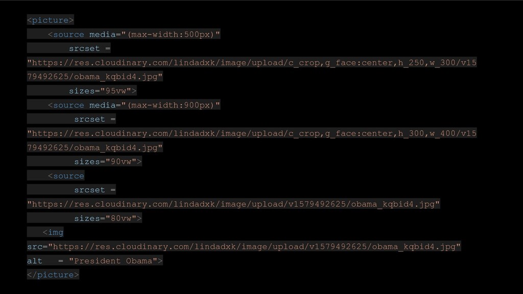
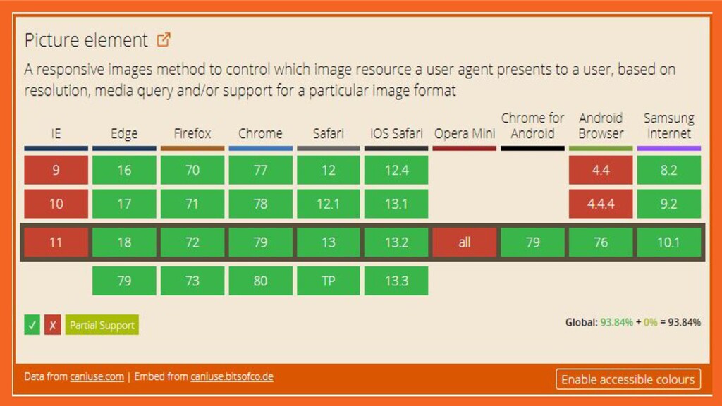
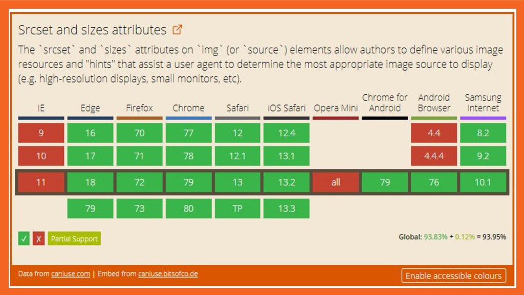
One way would be to manually resize and optimize these images with some tools then load them. For this, I'll introduce the picture and source Html elements.
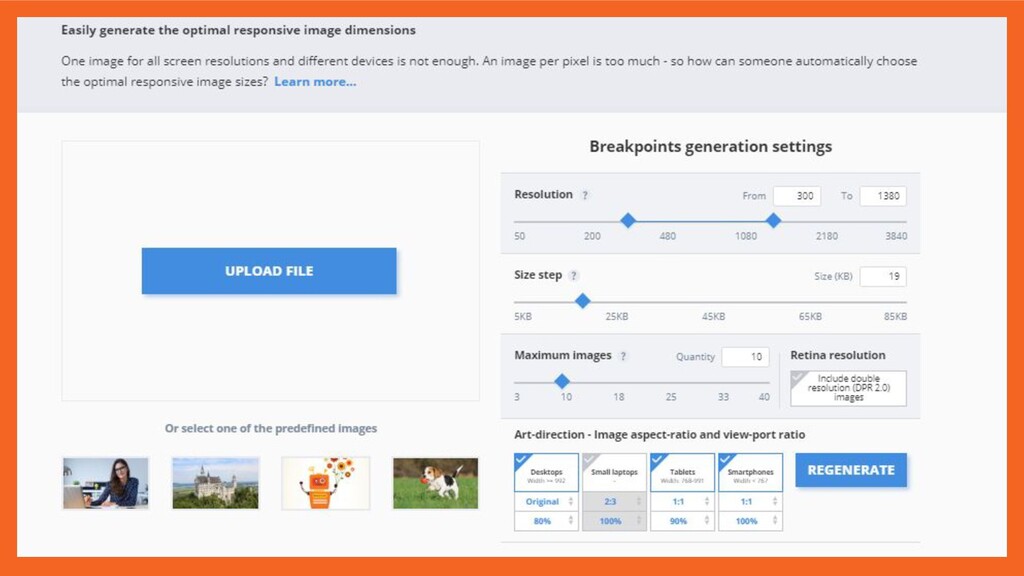
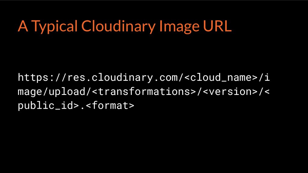
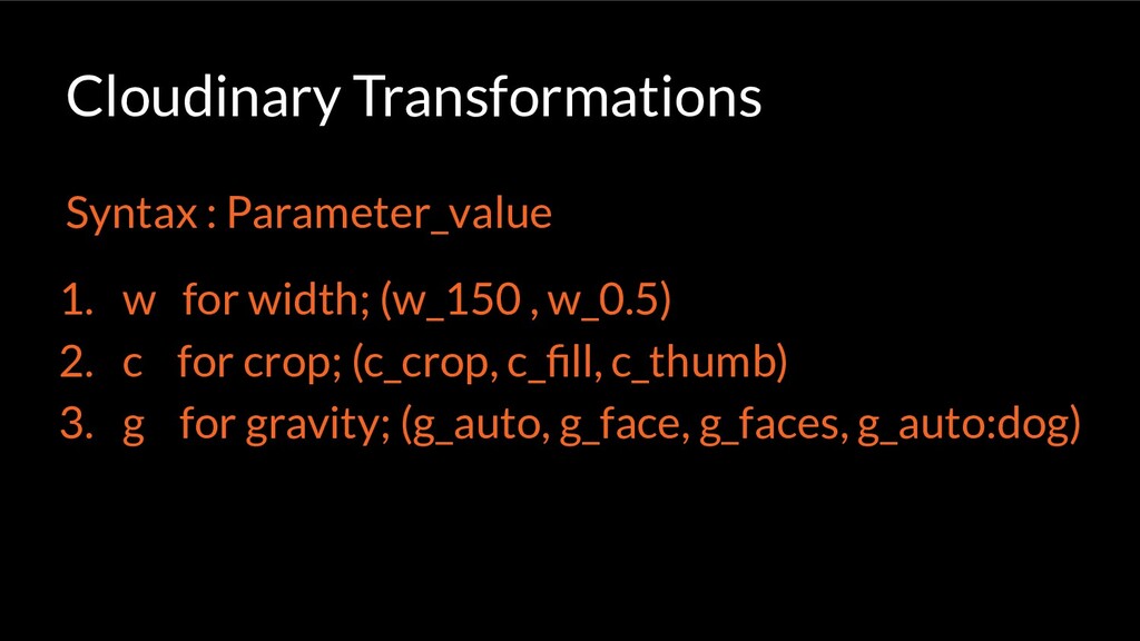
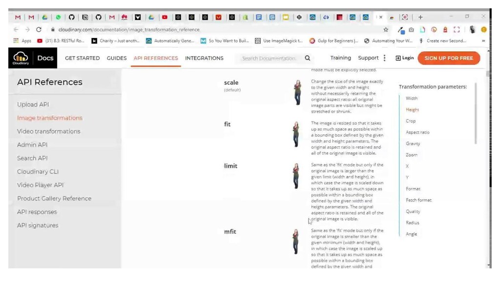
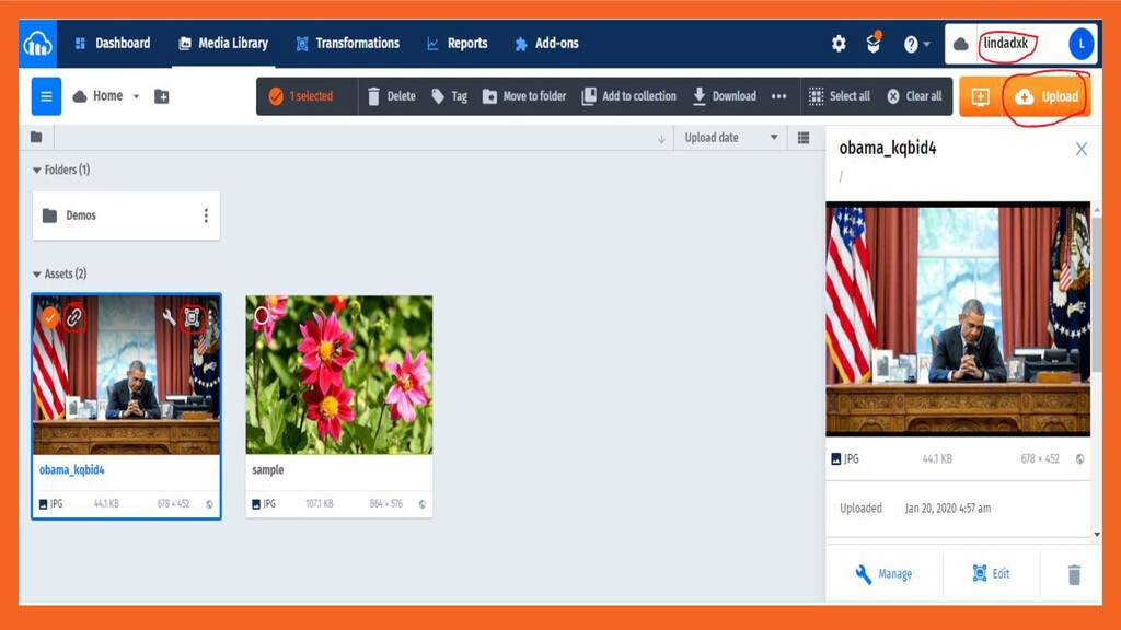
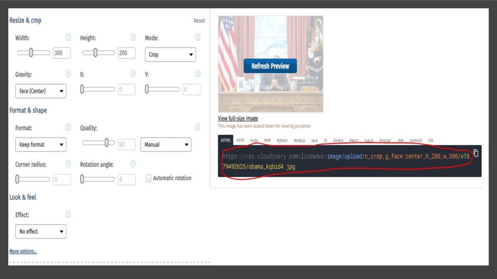
What then happens when we have so many images? Using the previous method would be tiring. I'll introduce how to use Cloudinary to automate responsive images.

Linda Ikechukwu

February 22, 2020
Tweet

More Decks by Linda Ikechukwu

Other Decks in Technology

Transcript

  1. Automating
    Responsive Images
    in HTML

    View Slide

  2. Linda Ikechukwu
    @_MsLinda

    View Slide

  3. Responsive images adapts (visually
    and dimensionally) and retains
    their quality on varying devices
    without having an unpleasant
    impact on performance.

    View Slide

  4. The Challenge ?
    Technology has evolved. People view
    and access the web with devices of
    different screen sizes, resolutions
    and capabilities.

    View Slide

  5. Responsive Images
    Dimension Switching Art Direction

    View Slide

  6. Imagine resizing this image to
    fit a mobile screen, the child
    which is our focus will be
    almost non-existent.

    View Slide

  7. The Solution ?
    1. “srcset”+ “sizes”
    2. +

    View Slide

  8. srcset = “url imagesize, url imagesize”
    sizes = “(media condition) layout size”

    View Slide

  9. Putting it all together !
    srcset =”largeimage.jpg 1024w,
    mediumimage.jpg 512w, smallimage.jpg 256w”
    sizes =”(min-width: 700px) 700px, 90vw”
    src =”default-image-url.jpg”
    >

    View Slide

  10. Dog looses its focus
    when just scaled
    down. Art direction
    to the rescue,

    View Slide


  11. srcset= ” dog-tablet-portrait.png” sizes=”100vw”>
    srcset= ” dog-tablet-landscape.png”sizes=”90vw”>
    srcset= ” dog-desktop.png” sizes=”90vw”>


    View Slide

  12. View Slide

  13. Another Challenge !
    Manually creating and editing
    the images

    View Slide

  14. The Solution ?
    Cloudinary’s Responsive Image
    Breakpoint Generator.
    https://www.responsivebreakpoints.com/

    View Slide

  15. 1. Go to responsivebreakpoints.com
    2. Upload your image
    3. Adjust settings
    4. Download images and copy code
    5. Include in your project and voila

    View Slide

  16. View Slide

  17. View Slide

  18. View Slide

  19. Yet Another Challenge !!
    Manually doing that for all the numerous
    images on our site and downloading ….

    View Slide

  20. Yet Another Solution!
    Cloudinary again

    View Slide

  21. 1. Sign up for a free account on
    cloudinary.com

    View Slide

  22. 2. Upload all images.

    View Slide

  23. Dynamic Image Transformation URL’S
    (Perfect for art direction)
    Case 1:

    View Slide

  24. https://res.cloudinary.com//i
    mage/upload///<
    public_id>.
    A Typical Cloudinary Image URL

    View Slide

  25. https://res.cloudinary.com/linda
    dxk/image/upload/c_scale,w_501/v
    1579492625/obama_kqbid4.jpg

    View Slide

  26. Syntax : Parameter_value
    1. w for width; (w_150 , w_0.5)
    2. c for crop; (c_crop, c_fill, c_thumb)
    3. g for gravity; (g_auto, g_face, g_faces, g_auto:dog)
    Cloudinary Transformations

    View Slide

  27. View Slide

  28. View Slide

  29. 3. Copy uploaded image url, apply
    desired transformation parameters or
    use the edit option.

    View Slide

  30. View Slide

  31. View Slide

  32. 4. Include resulting url’s into code

    View Slide


  33. srcset =
    "https://res.cloudinary.com/lindadxk/image/upload/c_crop,g_face:center,h_250,w_300/v15
    79492625/obama_kqbid4.jpg"
    sizes="95vw">
    srcset =
    "https://res.cloudinary.com/lindadxk/image/upload/c_crop,g_face:center,h_300,w_400/v15
    79492625/obama_kqbid4.jpg"
    sizes="90vw">
    srcset =
    "https://res.cloudinary.com/lindadxk/image/upload/v1579492625/obama_kqbid4.jpg"
    sizes="80vw">
    src="https://res.cloudinary.com/lindadxk/image/upload/v1579492625/obama_kqbid4.jpg"
    alt = "President Obama">

    View Slide

  34. View Slide

  35. Dynamic Image Resizing using
    Cloudinary’s JavaScript Library.
    (Perfect for dimension switching)
    Case 2:

    View Slide

  36. 3. Add cloudinary library to html
    src="https://cdnjs.cloudflare.com/ajax/libs/cloudinary-c
    ore/2.3.0/cloudinary-core-shrinkwrap.min.js">

    View Slide

  37. 4. Copy image url and set img parameters
    data-src="https://res.cloudinary.com/lindadxk/image/upload/w_
    auto,c_scale/v1501761946/petals-photo-457044_etqwsd.jpg"
    alt="Tower of paris" class="cld-responsive"
    >

    View Slide

  38. 5. Initialize the script in Js and call it
    // Initialize
    var cl = cloudinary.Cloudinary.new({ cloud_name:
    'lindadxk' });
    // Call
    cl.responsive();

    View Slide

  39. View Slide

  40. View Slide

  41. PictureFill
    https://scottjehl.github.io/picturefill/
    Is there a Polyfill?

    View Slide

  42. https://cloudinary.com/docu
    mentation/image_transform
    ation_reference
    Important Links
    https://cloudinary.com/docu
    mentation/image_transform
    ations

    View Slide

  43. THE END

    View Slide