Upgrade to Pro — share decks privately, control downloads, hide ads and more …

Design For Developers

Design For Developers

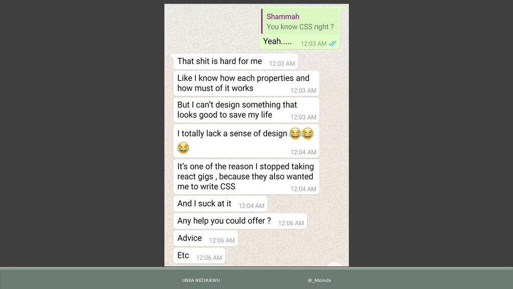
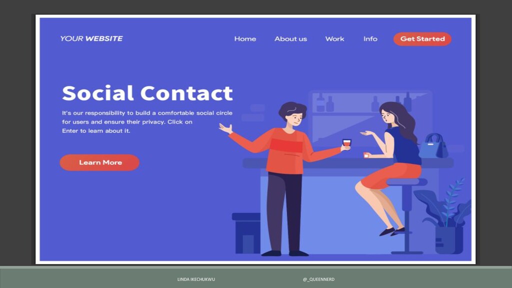
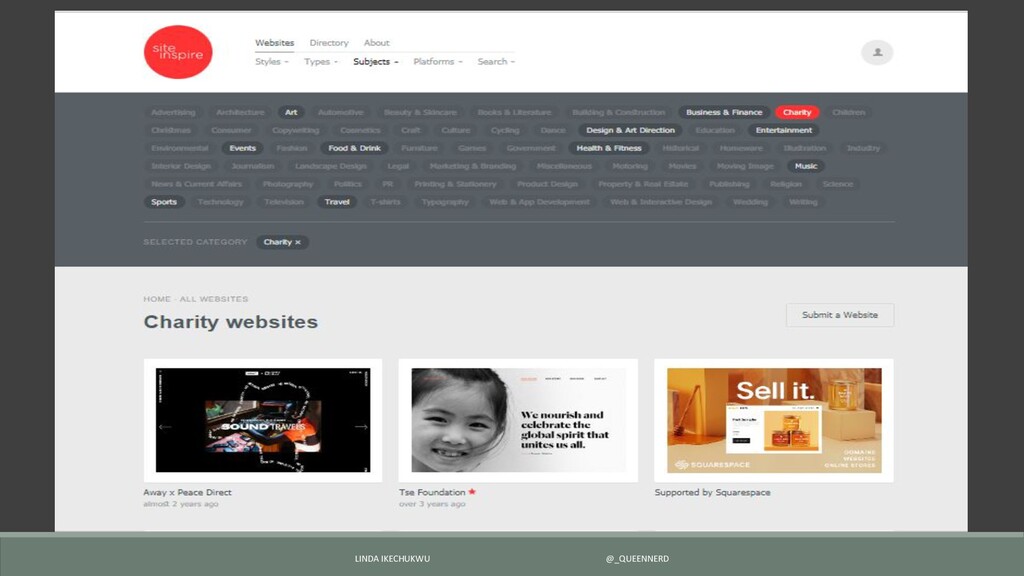
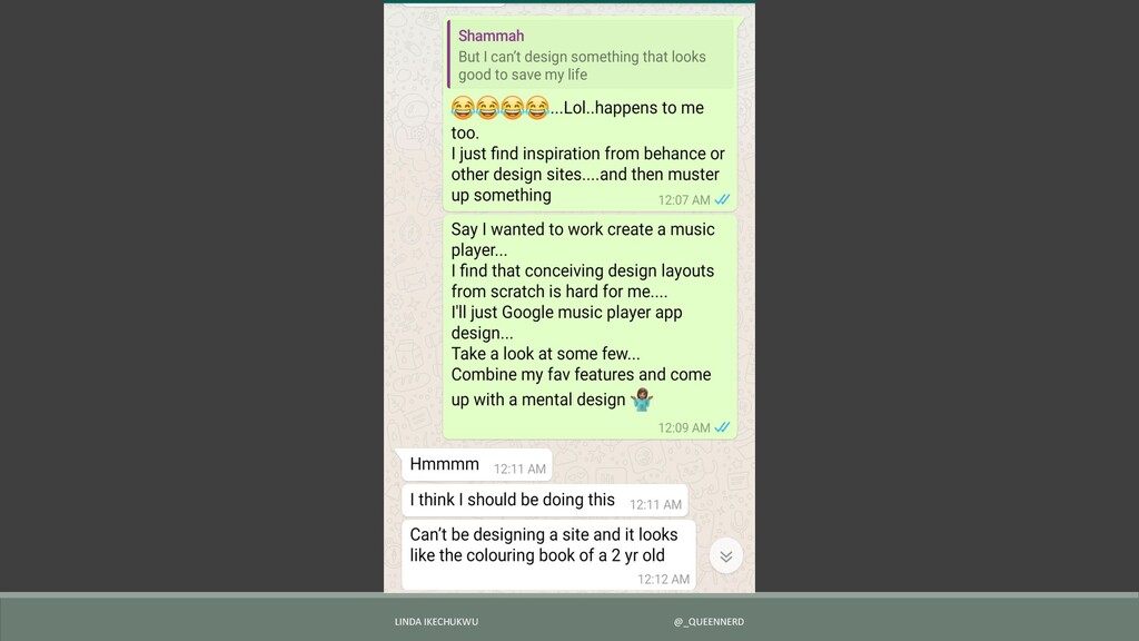
A lot of developers have a lot of trouble coming up with a simple design. When the time comes that they want to build a side project, the interface might end up looking like something out of a 2-year-old's coloring workbook.
This talk highlights simple steps that developers can follow to come up with simple yet elegant designs for their projects.

Linda Ikechukwu

July 13, 2019
Tweet

More Decks by Linda Ikechukwu

Other Decks in Design

Transcript

  1. Design : Simple guidelines that can help you (developers) build

    basic interfaces that are effective and visually appealing. LINDA IKECHUKWU @_QUEENNERD
  2. Cluster ▪Line components and items with grid based designs. ▪Let

    your pages breathe, be generous with whitespace. ▪Be consistent. LINDA IKECHUKWU @_QUEENNERD
  3. Colors Step 1 : Choose a starting color ▪Use what

    you have e.g. colors from existing logo. ▪Do not use your competitors colors and don’t default to stereotypes if you can help it. ▪Think about your target audience and what you want them to feel. Use www.color-meanings.com to find out which colors describe that feeling. LINDA IKECHUKWU @_QUEENNERD
  4. Colors Step 2 : Pick a shade. ▪Now that you

    have a starting color, you can use www.dribbble.com/colors to pick your preferred shade. Step 3 : Pick a complimentary color for contrast and highlighting e.g. headings, buttons and important tips. ▪ Use www.canva.com/colors/color-wheel/ to find a complimentary color to your base color LINDA IKECHUKWU @_QUEENNERD
  5. Color Step 4 : Your palette ▪ White + Black

    + Base Color + Complimentary Color Other Helpful sites : ▪www.color-blindness.com ▪www.coolors.com LINDA IKECHUKWU @_QUEENNERD
  6. Typography ▪Use lesser number of fonts. 2 from the same

    family is a safe bet. ▪Use fancy fonts sparingly , they increase clutter. ▪Vary weights to differentiate importance and bits. ▪Useful site : Typefont.com LINDA IKECHUKWU @_QUEENNERD
  7. Images Always use retina quality images Useful sites : ▪Unsplash.com

    ▪Photopin.com ▪Undraw.co LINDA IKECHUKWU @_QUEENNERD
  8. Actions ▪Make important actions/messages (e.g. buttons, widgets, headlines) easy to

    find and use by using brighter colors and bigger/bolder fonts. LINDA IKECHUKWU @_QUEENNERD
  9. Content : Less is More ▪ Use less number of

    words to pass your message across. ▪ Break up content into shorter paragraphs and bullet points where applicable. ▪ Remember the whitespace rule, be generous. ▪ Highlight / bolden important phrases in sentences. LINDA IKECHUKWU @_QUEENNERD