Upgrade to Pro — share decks privately, control downloads, hide ads and more …

Responsive Web Design workshop @ eZ Publish Summer Camp, Bol, Croatia

Marko Dugonjić
September 05, 2012

Responsive Web Design workshop @ eZ Publish Summer Camp, Bol, Croatia

Kick start into Responsive Web Design, from concept to code with content first, mobile first approach.

Marko Dugonjić

September 05, 2012
Tweet

More Decks by Marko Dugonjić

Other Decks in Design

Transcript

  1. Responsive
    Web Design
    Marko Dugonjić
    Creative Nights

    View Slide

  2. @markodugonjic

    View Slide

  3. Nice to meet you!

    View Slide

  4. begginer
    or
    The Old Grump?

    View Slide

  5. Definition of RWD

    View Slide

  6. Ethan Marcotte
    flexible layout
    flexible images
    media queries

    View Slide

  7. Brief books for people who make websites No.
    4
    !"#$%'("
    )"*+,"#'-&
    Ethan Marcotte
    Jeremy Keith

    View Slide

  8. Responsive Web Design
    is web design, done right.
    — Andy Clarke aka Malarkey

    View Slide

  9. Examples

    View Slide

  10. http://bostonglobe.com/

    View Slide

  11. http://smashingmagazine.com/

    View Slide

  12. http://foodsense.is/

    View Slide

  13. http://iso.org/

    View Slide

  14. http://maratz.com/

    View Slide

  15. The latest
    eZ Publish

    View Slide

  16. View Slide

  17. View Slide

  18. View Slide

  19. View Slide

  20. The switch

    View Slide

  21. a picture of a web site
    (way back then)

    View Slide

  22. the paradox of
    undeliverable promise

    View Slide

  23. interface elements
    instead of
    full layout

    View Slide

  24. View Slide

  25. design system
    instead of
    the final state

    View Slide

  26. View Slide

  27. View Slide

  28. View Slide

  29. designing in a browser
    is CSS3 enough?

    View Slide

  30. View Slide

  31. View Slide

  32. View Slide

  33. Mobile First

    View Slide

  34. View Slide

  35. (probably) last month

    View Slide

  36. Mobile First
    Content

    View Slide

  37. http://bit.ly/QWNTkA

    View Slide

  38. page diagrams
    HIGH PRIORITY ITEMS LOW PRIORITY ITEMS
    1 2 
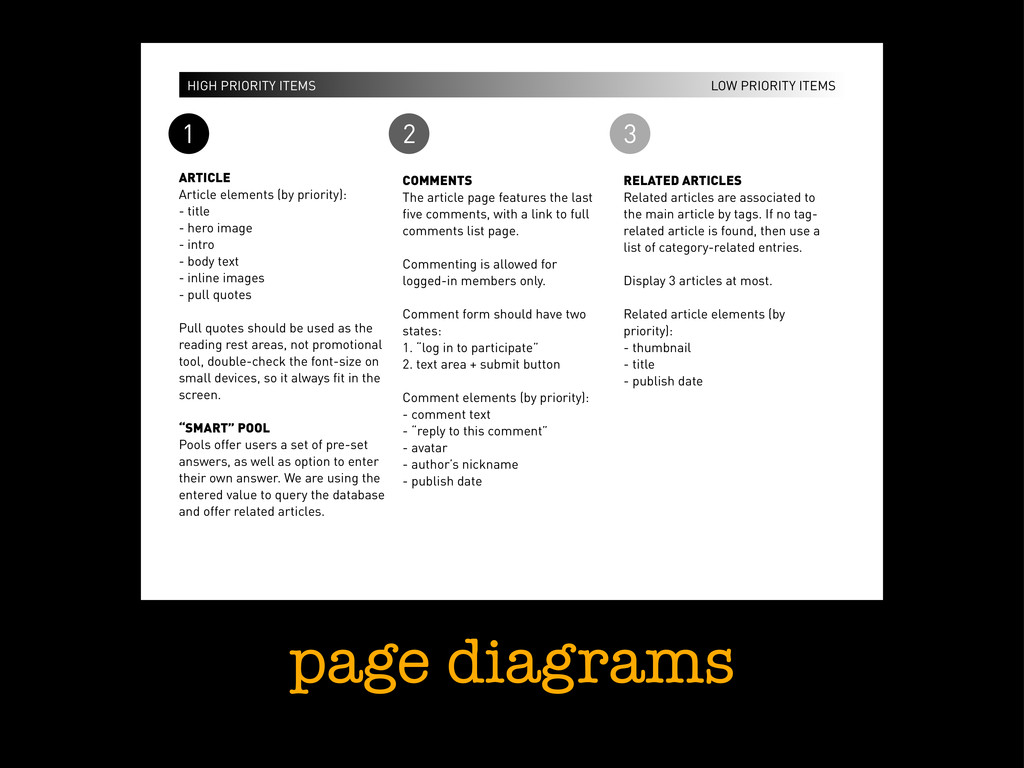
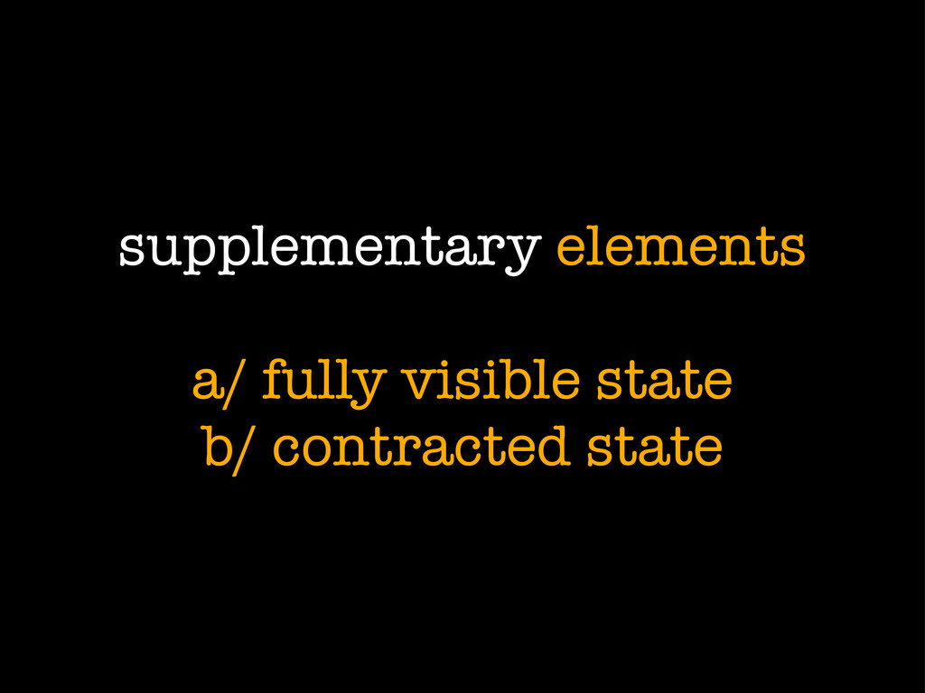
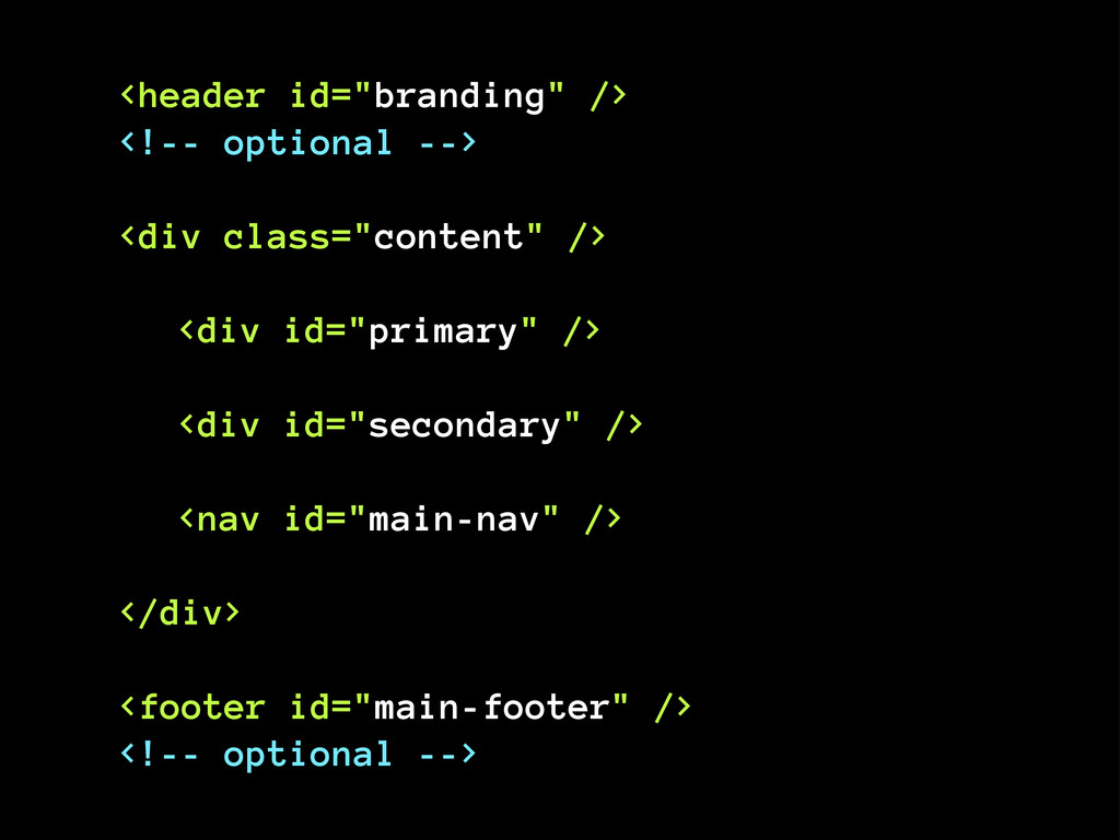
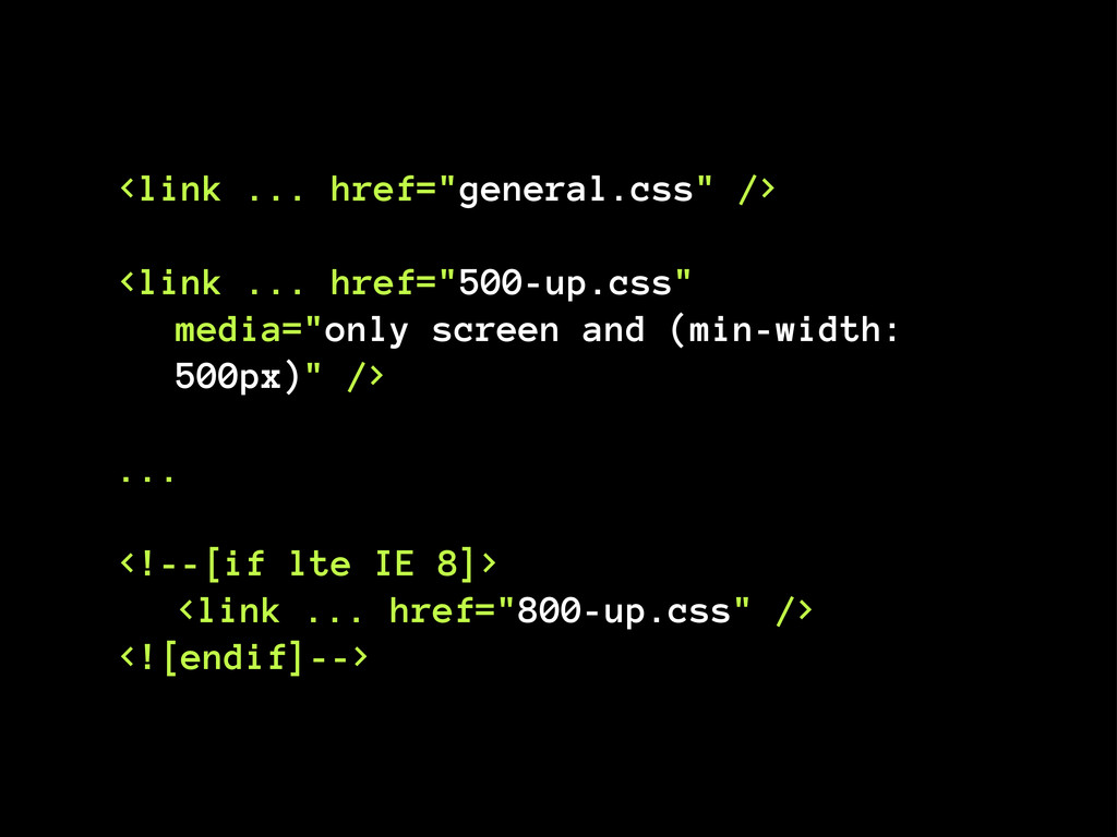
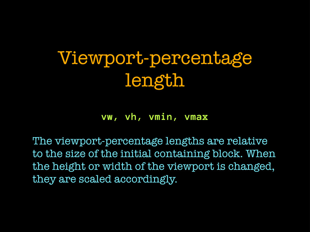
3
    ARTICLE
    Article elements (by priority):
    - title
    - hero image
    - intro
    - body text
    - inline images
    - pull quotes
    Pull quotes should be used as the
    reading rest areas, not promotional
    tool, double-check the font-size on
    small devices, so it always fit in the
    screen.
    “SMART” POOL
    Pools offer users a set of pre-set
    answers, as well as option to enter
    their own answer. We are using the
    entered value to query the database
    and offer related articles.
    COMMENTS
    The article page features the last
    five comments, with a link to full
    comments list page.
    Commenting is allowed for
    logged-in members only.
    Comment form should have two
    states:
    1. “log in to participate”
    2. text area + submit button
    Comment elements (by priority):
    - comment text
    - “reply to this comment”
    - avatar
    - author’s nickname
    - publish date
    RELATED ARTICLES
    Related articles are associated to
    the main article by tags. If no tag-
    related article is found, then use a
    list of category-related entries.
    Display 3 articles at most.
    Related article elements (by
    priority):
    - thumbnail
    - title
    - publish date

    View Slide

  39. View Slide

  40. Let’s build stuff!
    “the plan”

    View Slide

  41. analyze design
    sketch elements
    HTML structure
    modular CSS
    @media CSS
    breakpoints
    flexible layout

    View Slide

  42. #1
    Analyze design

    View Slide

  43. look and feel
    instead of
    layout

    View Slide

  44. typography
    color
    shape
    lines
    artwork

    View Slide

  45. http://clearairchallenge.com/

    View Slide

  46. http://www.dolectures.com/

    View Slide

  47. http://lifeingreenville.com/

    View Slide

  48. #2
    Sketch elements

    View Slide

  49. essential elements
    are always visible
    but flexible

    View Slide

  50. headlines
    body text
    images + multimedia
    data tables
    primary forms

    View Slide

  51. supplementary elements
    a/ fully visible state
    b/ contracted state

    View Slide

  52. branding (logo)
    (multi-level) navigation
    search
    pagination

    View Slide

  53. #3
    HTML structure

    View Slide

  54. header
    nav
    section
    article
    aside
    footer

    View Slide

  55. branding
    main navigation
    local navigation
    search
    primary content
    secondary content
    footer

    View Slide


  56. View Slide

  57. component markup
    enclose each component
    and give it a
    unique class name

    View Slide


  58. Article title

    Article content


    Comment
    Comment
    Comment


    View Slide


  59. name="viewport"
    content="initial-scale=1.0,
    width=device-width" />

    View Slide

  60. #4
    Scalable and
    Modular CSS

    View Slide

  61. typography hierarchy
    +
    vertical spacing

    View Slide

  62. * { margin: 0; padding: 0; }

    View Slide

  63. rem = root em

    View Slide

  64. html { font-size: 62.5%; }
    body { font-size: 1.4rem; } /* = 14px */
    h1 { font-size: 2.4rem; } /* = 24px */

    View Slide

  65. p, ul, ol {
    line-height: 1.5em;
    margin: 0 0 1.5em;
    }

    View Slide

  66. /* CSS */
    img,
    embed,
    object,
    video {
    max-width: 100%;
    height: auto;
    } /* IE7 and above */
    /* JavaScript concept! */
    if (parent.offsetWidth > 440) {
    img.src = 'bigger-image.jpg';
    }

    View Slide

  67. #5
    @media

    View Slide

  68. going up with min-width

    View Slide

  69. all browsers CSS
    @media only screen and (min-width: 500px)
    @media only screen and (min-width: 800px)

    View Slide


  70. media="only screen and (min-width:
    500px)" />
    ...

    View Slide

  71. #6
    Breakpoints

    View Slide

  72. reading distances
    and
    line-length
    instead of
    device resolutions

    View Slide

  73. Breakpoints should not be
    dictated by devices, but by
    content. Let the content
    decide when to expand and
    then adjust your designs.
    — Jeremy Keith
    http://www.lukew.com/ff/entry.asp?1393

    View Slide

  74. 0,26mm 1,3mm
    71cm 350cm

    View Slide

  75. View Slide

  76. create a set
    of
    typographic rules
    for each
    reading distance

    View Slide

  77. @media (breakpoint) {
    /* reading distance rules */
    /* layout rules (in a minute) */
    }

    View Slide

  78. vertical flipping

    View Slide

  79. NAVIGATION
    NAVIGATION

    View Slide

  80. .content {
    display: table;
    border-collapse: collapse;
    }
    #main-nav {
    display: table-header-group;
    }
    /* Hat tip to Andy Clarke */

    View Slide

  81. #7
    Flexible layout
    “columns management”

    View Slide

  82. maintain proportions
    with percentages

    View Slide

  83. column / wrapper
    = percentage

    View Slide

  84. column / wrapper
    = percentage
    COLUMN WRAPPER

    View Slide

  85. 300px / 1000px
    = 30%

    View Slide

  86. View Slide

  87. 483px 300px

    View Slide

  88. 483px 300px
    IAB

    View Slide

  89. 483px / 783px
    = 61,685823%
    300px / 783px
    = 38,314176%

    View Slide

  90. box-sizing: border-box
    (not supported in IE7)

    View Slide

  91. WIDTH
    PADDING
    BORDER
    WIDTH
    (box-sizing: border-box)

    View Slide

  92. emulate box-sizing with
    CSS expressions for IE7
    http://maratz.com/blog/?p=2046

    View Slide

  93. #primary,
    #secondary {
    float: left;
    -webkit-box-sizing: border-box;
    -moz-box-sizing: border-box;
    box-sizing: border-box;
    padding: 2rem;
    }
    #primary { width: 61.685823%; }
    #secondary { width: 38.314176%; }

    View Slide

  94. http://bit.ly/P4xZTF
    Faux Columns

    View Slide

  95. .content {
    background-image: url(columns.png);
    background-repeat: repeat-y;
    background-size: 100% auto;
    }

    View Slide

  96. Viewport-percentage
    length
    vw, vh, vmin, vmax
    The viewport-percentage lengths are relative
    to the size of the initial containing block. When
    the height or width of the viewport is changed,
    they are scaled accordingly.

    View Slide

  97. :root {
    font-size: calc(100vw / 40);
    }
    h1 {
    font-size: 2rem;
    }
    p {
    font-size: 1rem;
    }

    View Slide

  98. Viewport Sized Typography
    http://bit.ly/MABc8Q

    View Slide

  99. Close-up

    View Slide

  100. Tools and resources
    http://responsive.is/
    http://responsivepx.com/
    https://vimeo.com/34662135
    http://galleria.io/

    View Slide

  101. Q & A

    View Slide

  102. Thank you!
    creativenights.com
    @markodugonjic

    View Slide