$30 off During Our Annual Pro Sale. View Details »

How To Speak Unicorn (iThemes Webinar)

How To Speak Unicorn (iThemes Webinar)

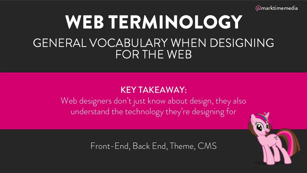
Gain insight into the “secret language” of Web Design Unicorns as we dive into the details of what makes up the design process, including vocabulary, problem-solving methods, and workflow.

In this webinar, Michelle Schulp will explain how to have a better conversation about design and apply that knowledge to your own site. She will also outline some simple methods to avoid “fail points” along the way.

Michelle Schulp Hunt

February 11, 2021
Tweet

More Decks by Michelle Schulp Hunt

Other Decks in Design

Transcript

  1. how to
    speak
    unicorn
    understanding
    the language
    of web design

    View Slide

  2. @marktimemedia
    I Design
    &
    Build DIGITAL
    INTERFACES
    Rockstar at saying stuff. Carefully
    curated spontaneity. Adorable badass.
    Master suitcase packer & marshmallow
    roaster. Accidental fitness buff.
    HI, I’M
    MICHELLE.

    View Slide

  3. @marktimemedia
    SOME PEOPLE
    CALL THAT A
    UNICORN

    View Slide

  4. @marktimemedia
    MYTHICAL
    CREATURE WITH
    EQUAL TALENT
    IN MULTIPLE
    DISCIPLINES

    View Slide

  5. @marktimemedia
    WHY ARE WE SO
    ENAMORED WITH
    UNICORNS?

    View Slide

  6. @marktimemedia
    SILOS HAVE
    LED TO
    CHAOS

    View Slide

  7. @marktimemedia
    OVERLAP
    BETWEEN
    DISCIPLINES

    View Slide

  8. @marktimemedia
    TIME
    BUDGET
    RESOURCE
    CONSTRAINTS

    View Slide

  9. @marktimemedia
    IF I’M NOT A
    DESIGNER
    WHY SHOULD I
    LEARN THIS?

    View Slide

  10. @marktimemedia
    BE A UNICORN
    SPEAK UNICORN

    View Slide

  11. @marktimemedia
    BETTER
    COMMUNICATION

    View Slide

  12. @marktimemedia
    YOUR
    TEAMMATES
    ARE NOT YOUR
    OPPONENTS

    View Slide

  13. @marktimemedia
    HOLISTIC PROCESS

    View Slide

  14. @marktimemedia
    ADAPTING
    ON THE FLY
    @marktimemedia

    View Slide

  15. @marktimemedia
    WRITE BETTER CODE
    @marktimemedia

    View Slide

  16. @marktimemedia
    BETTER
    FINAL
    PRODUCT

    View Slide

  17. @marktimemedia
    AVOID
    DEVELOPER UI

    View Slide

  18. @marktimemedia
    SO WHAT DO DESIGNERS DO?

    View Slide

  19. @marktimemedia
    SEE THE BIGGER
    PICTURE…

    View Slide

  20. @marktimemedia
    …AND THE
    DETAILS

    View Slide

  21. @marktimemedia
    CONSISTENCY OF
    EXPERIENCE

    View Slide

  22. @marktimemedia
    BE PREDICTABLE

    View Slide

  23. @marktimemedia
    YOUR UNICORN
    VOCABULARY LESSON

    View Slide

  24. @marktimemedia
    BRANDING
    COMMUNICATING THE ORGANIZATION’S
    MESSAGE, VALUES, AND EXPERIENCE
    Design System, Essence, Archetypes, Brand Strategy
    KEY TAKEAWAY:
    Create experiences that reinforce the company’s brand

    View Slide

  25. @marktimemedia
    VOCABULARY
    Identity: the entire visual representation of your brand,
    can include logo, color, typography, imagery, voice, etc.
    Lettermark/Wordmark/Logotype: logo made with stylized
    letters (IBM) or words (Coca-Cola)
    Brandmark: logo made with a graphical representation
    (Apple, Target)
    Icon: a simplified rendering of an object or concept

    View Slide

  26. @marktimemedia
    VOCABULARY
    Design System: a repository of reusable digital
    components that combine to form a website
    Brand Guide: a visual and philosophical reference for a
    brand’s color, personality, and voice

    View Slide

  27. @marktimemedia
    USER EXPERIENCE
    HOW PEOPLE INTERACT AND ENGAGE
    WITH THE SITE
    User Journey, Persona, User Testing, Research
    KEY TAKEAWAY:
    Make functionality decisions with the end user in mind,
    not your own preference or the tools you are using

    View Slide

  28. @marktimemedia
    VOCABULARY
    Persona: fictional character that represents a primary user
    of your site/product
    Wireframe: low-fidelity layout of a site, representation of
    general block-level content and interactive elements
    Mockup: high-fidelity layout of a site, representation of
    final color, typography, imagery, etc.
    Prototype: interactive version of a site, may not be built
    with final code

    View Slide

  29. @marktimemedia
    VOCABULARY
    CTA: call to action, usually paired with a button
    Conversion: when a user takes a specific desired action
    Landing Page: single page optimized for a specific
    audience or search engine result
    Usability: how real users actually interact with your site,
    usually tested by observing a series of guided tasks

    View Slide

  30. @marktimemedia
    USER INTERFACE
    THE ELEMENTS ON THE PAGE WITH WHICH
    THE USER INTERACTS
    Information Architecture, GUI, Interaction Design
    KEY TAKEAWAY:
    Don’t make your users think; Design an intuitive interface
    that takes advantage of modern patterns

    View Slide

  31. @marktimemedia
    VOCABULARY
    Breadcrumb: hierarchical content links
    Menu: primary navigation area, sometimes with a dropdown or
    flyout of sub-menu items
    Filter: pre-defined elements that allow narrowing down of
    visible content by various taxonomies (categories)
    Search: open ended input that queries content and returns a
    list of results
    Slider: a trendy, animated way of displaying information that
    you probably shouldn’t use J

    View Slide

  32. @marktimemedia
    COMPOSITION
    HOW THE CONTENT AND AESTHETICS
    OF THE SITE WORK TOGETHER
    Proximity, Harmony, Unity, Balance
    KEY TAKEAWAY:
    Each element should feel like it belongs within the
    site layout, not added as an afterthought

    View Slide

  33. @marktimemedia
    VOCABULARY
    Balance: using similar or complementary design elements
    to make the composition feel equal
    Repetition: using recurring elements to reinforce patterns
    or serve as familiar visual cues
    Whitespace: how much “breathing room” does each
    element have?
    Grid: underlying structure to a design that determines
    how everything lays out

    View Slide

  34. @marktimemedia
    VOCABULARY
    Grid: underlying structure to a design that determines
    how everything lays out
    Rule of Thirds: the most pleasing focal points are at the
    intersection of three rows and columns
    Padding:
    the space inside a block level element
    Margin:
    The space outside a
    block level element
    Rule of Thirds

    View Slide

  35. @marktimemedia
    HIERARCHY
    THE RELATIVE IMPORTANCE AND VISIBILITY OF
    PIECES OF INFORMATION
    Emphasis, Scale, Readability, Flow
    KEY TAKEAWAY:
    Decisions made about the styling and position of elements
    have a huge impact on the site experience

    View Slide

  36. @marktimemedia
    VOCABULARY
    Scale: how large or small are the elements on the page
    relative to each other?
    Proximity/Alignment: which elements on the page are
    associated with each other?
    Focal Point: the place on the page to which we are
    directing the user’s attention
    Semantic Markup: using HTML elements correctly to
    imply hierarchy and usage within the content

    View Slide

  37. @marktimemedia
    TYPOGRAPHY
    AESTHETIC DECISIONS ABOUT THE
    ARRANGEMENT OF TYPE
    Line Spacing, Letter Spacing, Kerning, Fonts
    KEY TAKEAWAY:
    Typographic choices should be deliberate,
    both reinforcing big-picture systems and being
    aesthetically appealing and easy to read/understand

    View Slide

  38. @marktimemedia
    VOCABULARY
    font (typeface) : collection of letters & glyphs/symbols
    font-family: which typeface are you using?
    font-size: how big/small is it?
    font-weight: how heavy/light is it?
    font-style, text-decoration: italic, underline, strike
    line-height (leading): how much space between lines?

    View Slide

  39. @marktimemedia
    VOCABULARY
    letter-spacing (tracking): adjusting the spacing between
    groups of letters/blocks of text
    kerning: adjusting the spacing between individual letters
    font-weight: how heavy/light is it?
    Serif Sans-Serif

    View Slide

  40. @marktimemedia
    COLOR
    AESTHETIC DECISIONS ABOUT THE USE OF
    COLOR IN A COMPOSITION
    Hue, Value, Shade, Tint, Saturation, Palette
    KEY TAKEAWAY:
    Color choices should be deliberate and
    used consistently across the entire site

    View Slide

  41. @marktimemedia
    VOCABULARY
    HEX: hexadecimal color, six digit number used to
    represent color in HTML/CSS
    RGB: additive color model used for screens,
    red/green/blue light values combining to form colors
    CMYK: subtractive color model used for ink,
    cyan/magenta/yellow/black ink combining to form colors
    Pantone/spot color: specific custom inks of a certain color

    View Slide

  42. @marktimemedia
    VOCABULARY
    Hue: where is it on the color spectrum?
    Saturation: how vivid or dull is the color?
    Contrast: how much does it stand out?
    Opacity: solid or transparent?

    View Slide

  43. @marktimemedia
    IMAGERY
    VISUAL AND GRAPHICAL ELEMENTS
    OF A SITE
    Stock photo, illustration, graphic, icon
    KEY TAKEAWAY:
    Use imagery to support your messaging;
    Use the right image format for the content

    View Slide

  44. @marktimemedia
    VOCABULARY
    Vector: images that are made out of math (SVG, EPS)
    Raster: images that are made out of pixels (JPG, TIFF,
    PNG, GIF)
    Resolution: how many pixels a raster images has (e.g.
    800x600 or 2400x1200). a higher resolution will
    typically be a larger size, but higher detail
    Compression: optimization (large/small file size)

    View Slide

  45. @marktimemedia
    VOCABULARY
    JPG/JPEG: best for photography and detailed images
    PNG: best for graphics, simple color, and images with
    transparency
    GIF: best for low detail graphics or animations
    TIFF: best for print quality, not suited for screen display
    SVG: a vector image format suitable for display on the
    web, best for graphics & logos

    View Slide

  46. @marktimemedia
    WEB TERMINOLOGY
    GENERAL VOCABULARY WHEN DESIGNING
    FOR THE WEB
    Front-End, Back End, Theme, CMS
    KEY TAKEAWAY:
    Web designers don’t just know about design, they also
    understand the technology they’re designing for

    View Slide

  47. @marktimemedia
    VOCABULARY
    Heading : titles and subtitles, written semantically with
    H1-H6 tags
    Body Copy/Body Text: the primary written content,
    usually paragraphs, lists, quotes, etc.
    Hero: the main image/graphic on a homepage or landing
    page, usually with a primary call to action
    Single-Scroll: a website where a majority of content is
    contained within a single page

    View Slide

  48. @marktimemedia
    VOCABULARY
    Responsive Design: a design that is not fixed, but adapts
    to the user’s screen size and/or device
    Breakpoint: a specific point (e.g. width) where a website’s
    content/layout will change to fit a different interface
    Accessible: ability of a website to be used by all audiences,
    including impaired vision, hearing, or motor function,
    through assistive technology or standard navigation

    View Slide

  49. @marktimemedia
    VOCABULARY
    Front-End: in general, dealing with code that runs in a
    browser and controls what is seen and interacted with
    Back-End: in general, dealing with code that runs on a
    server and controls the content and logic
    CMS: content management system (like WordPress)

    View Slide

  50. @marktimemedia
    TEAM UNICORN:
    JOB TITLES
    @marktimemedia

    View Slide

  51. @marktimemedia
    WORDPRESS DESIGNER
    • Usually: Aesthetics, interface, experience
    • Sometimes: Theme development, frontend markup/styling languages
    and/or Javascript, other design field experience
    • Related: UI/UX Designer, Theme Designer
    Choose this person if:
    Your project requires a very strong visual language

    View Slide

  52. @marktimemedia
    WORDPRESS DEVELOPER
    • Usually: Interactive/programming logic
    • Sometimes: Design/Styling experience, appliction/integration experience,
    other programming languages
    • Related: Frontend Developer, Backend Developer, Theme Developer,
    Plugin developer
    Choose this person if:
    Your project has complex functionality or
    integration requirements

    View Slide

  53. @marktimemedia
    WORDPRESS IMPLEMENTOR
    • Usually: Combines existing solutions to solve problems
    • Sometimes: development experience, design experience, content writing
    experience
    • Related: Integrator, Consultant
    Choose this person if:
    You want to build your project out of recommended
    existing solutions but aren’t sure where to look

    View Slide

  54. @marktimemedia
    SEO CONSULTANT
    • Usually: Recommending, optimizing, implementing and tracking SEO
    efforts
    • Sometimes: development experience, design experience, content writing
    experience, social media strategy, external campaigns
    • Related: SEO Strategist, Search Engine Marketer
    Choose this person if:
    You have an existing site or are in the process
    of redeveloping a site

    View Slide

  55. @marktimemedia
    Now What?

    View Slide

  56. @marktimemedia
    EVALUATE
    EXISTING
    EXAMPLES

    View Slide

  57. @marktimemedia
    TALK TO
    DESIGNERS!

    View Slide

  58. @marktimemedia
    RESOURCES
    Article: Web Design Basics Guide
    https://99designs.com/blog/tips/web-design-basics-guide/
    Article: Descriptive Design Words You Should Know
    https://99designs.com/blog/tips/15-descriptive-design-words-you-should-know/

    View Slide

  59. @marktimemedia
    QUESTIONS?
    Here’s how to
    get in touch:
    Michelle Schulp
    [email protected]
    @marktimemedia
    mynameismichelle.com
    ITHEMES WEBINAR SERIES:
    Web Design Bootcamp – February 24 & 25
    WHERE TO FIND ME NEXT:

    View Slide