Upgrade to Pro — share decks privately, control downloads, hide ads and more …

Building a Live Style Guide

Mark Meeker
December 04, 2014

Building a Live Style Guide

The Rich Web Experience - December, 2014

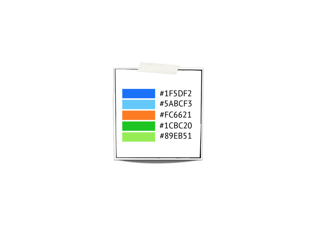
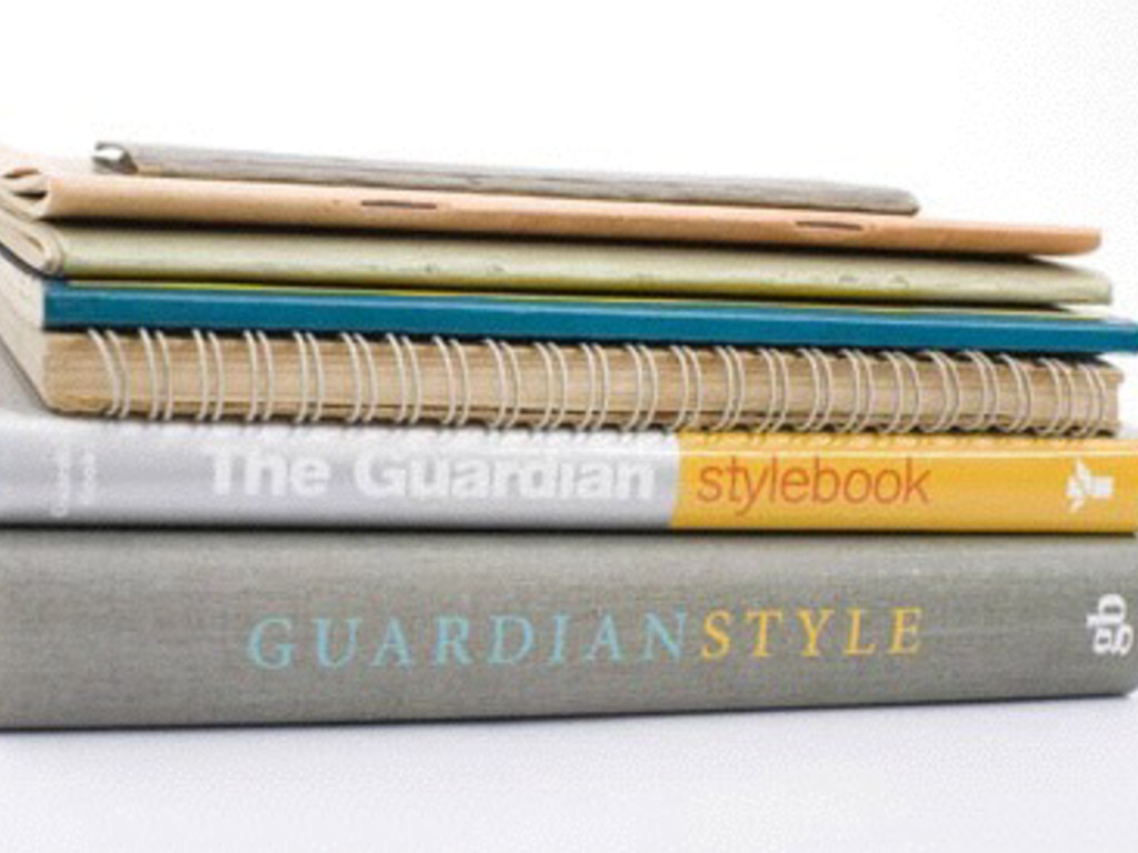
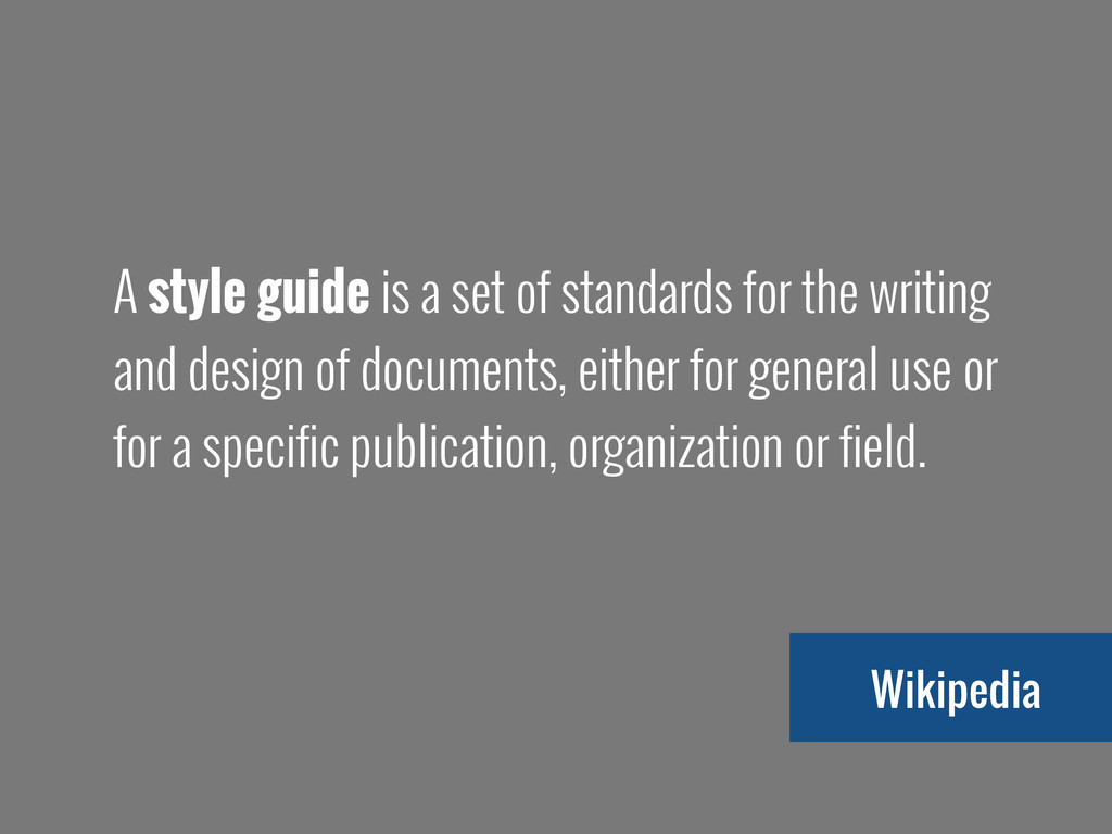
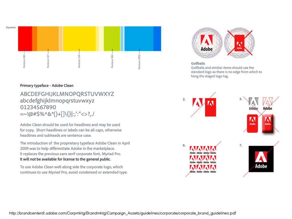
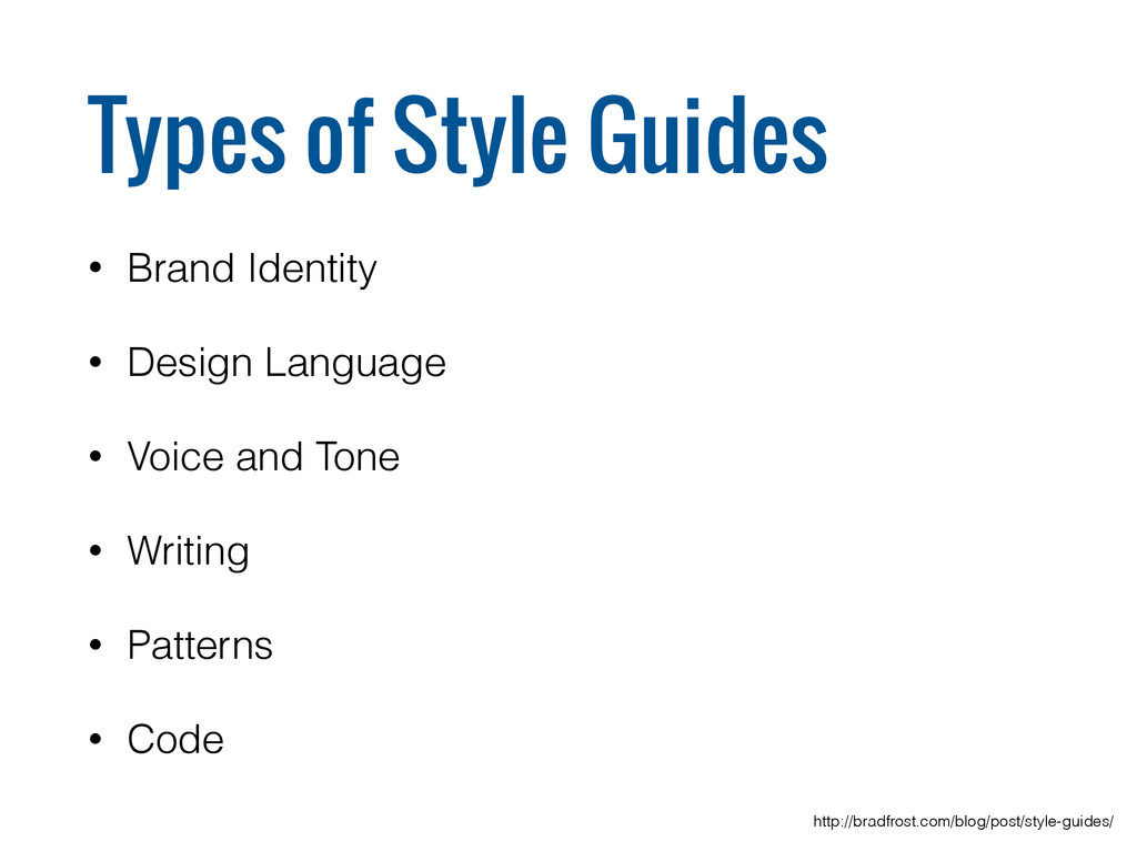
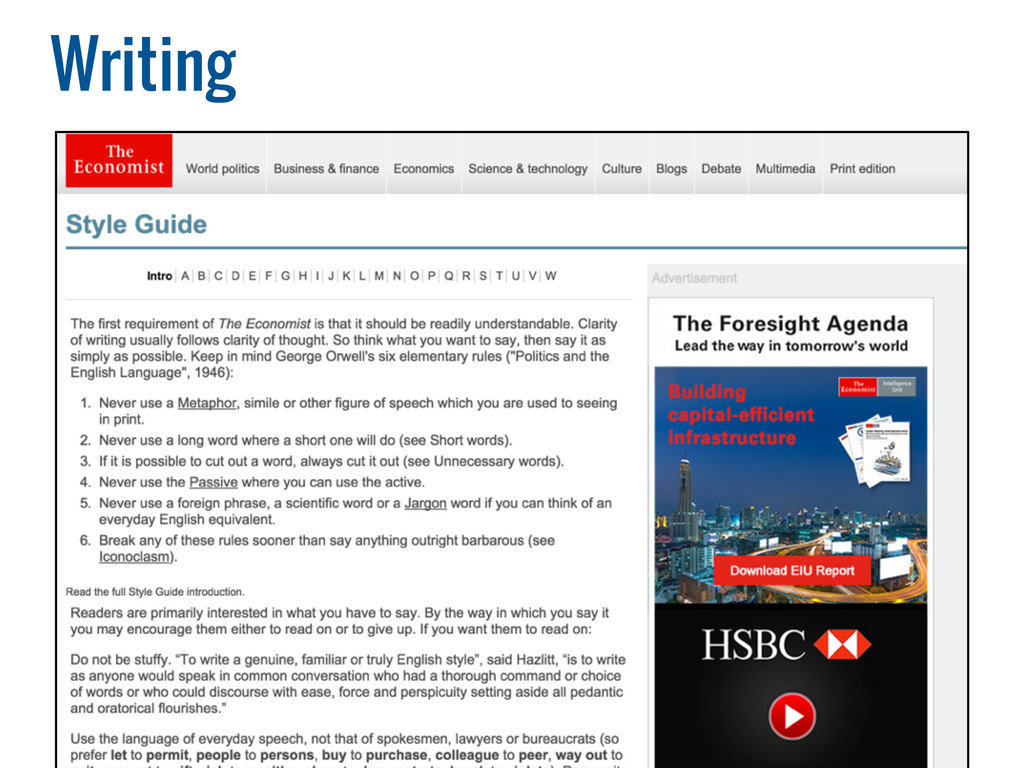
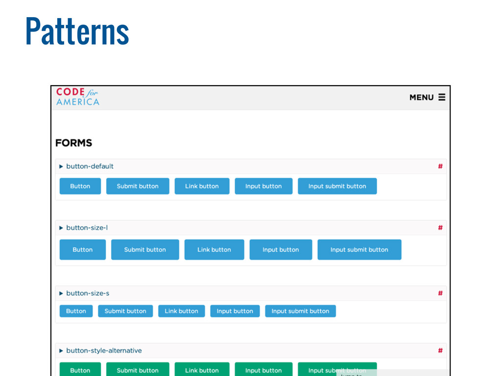
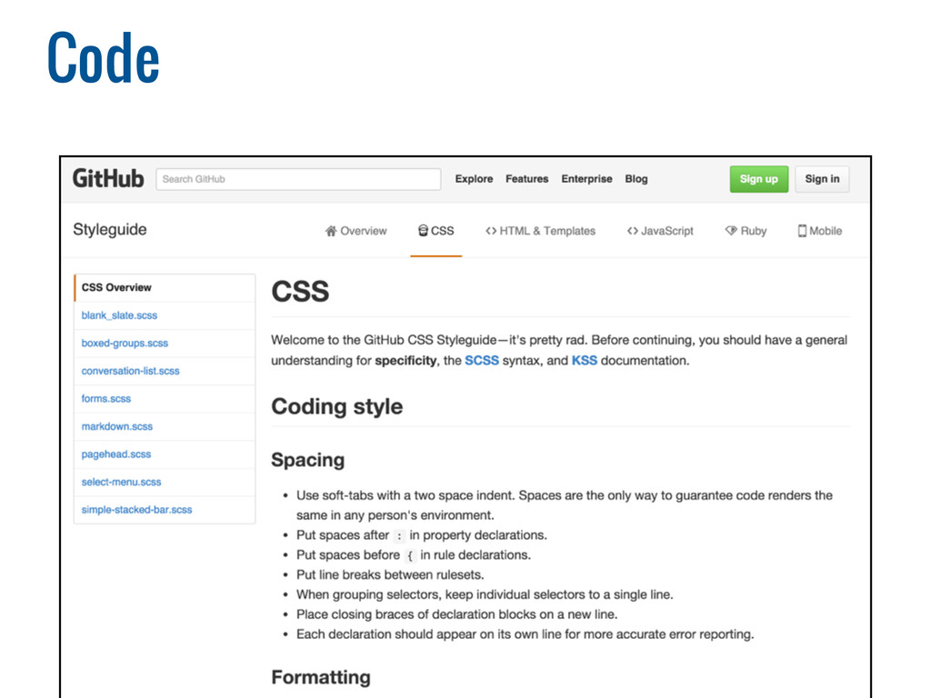
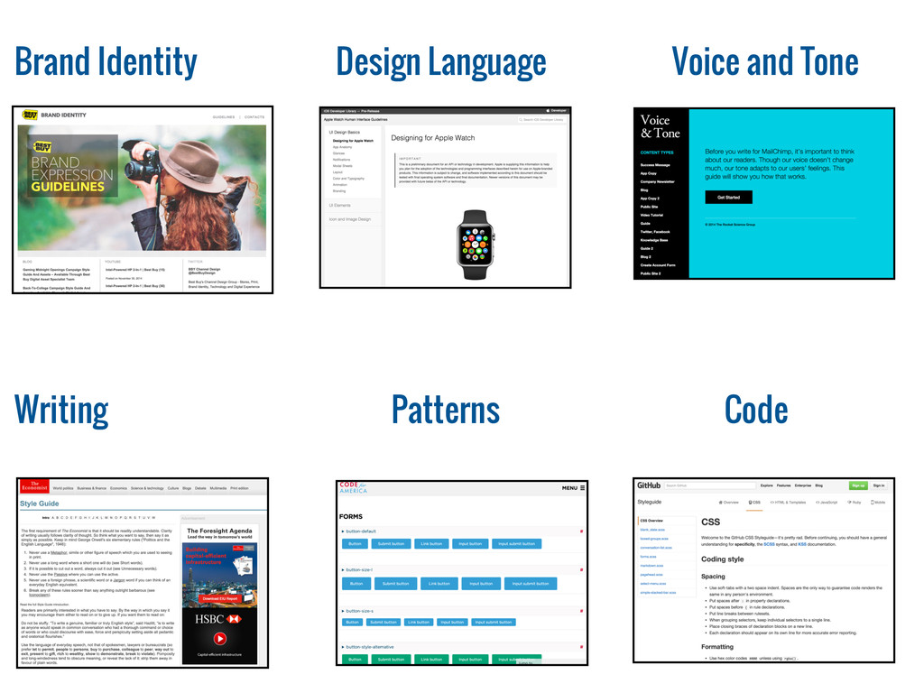
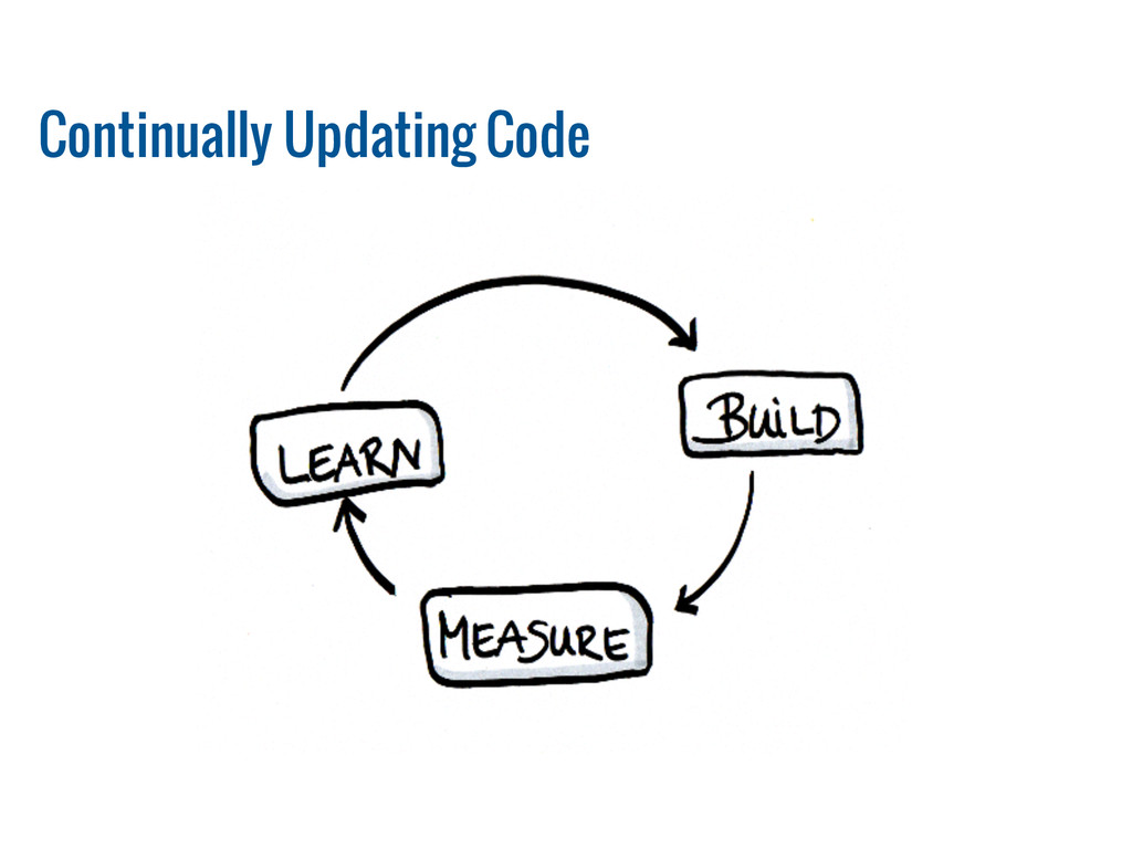
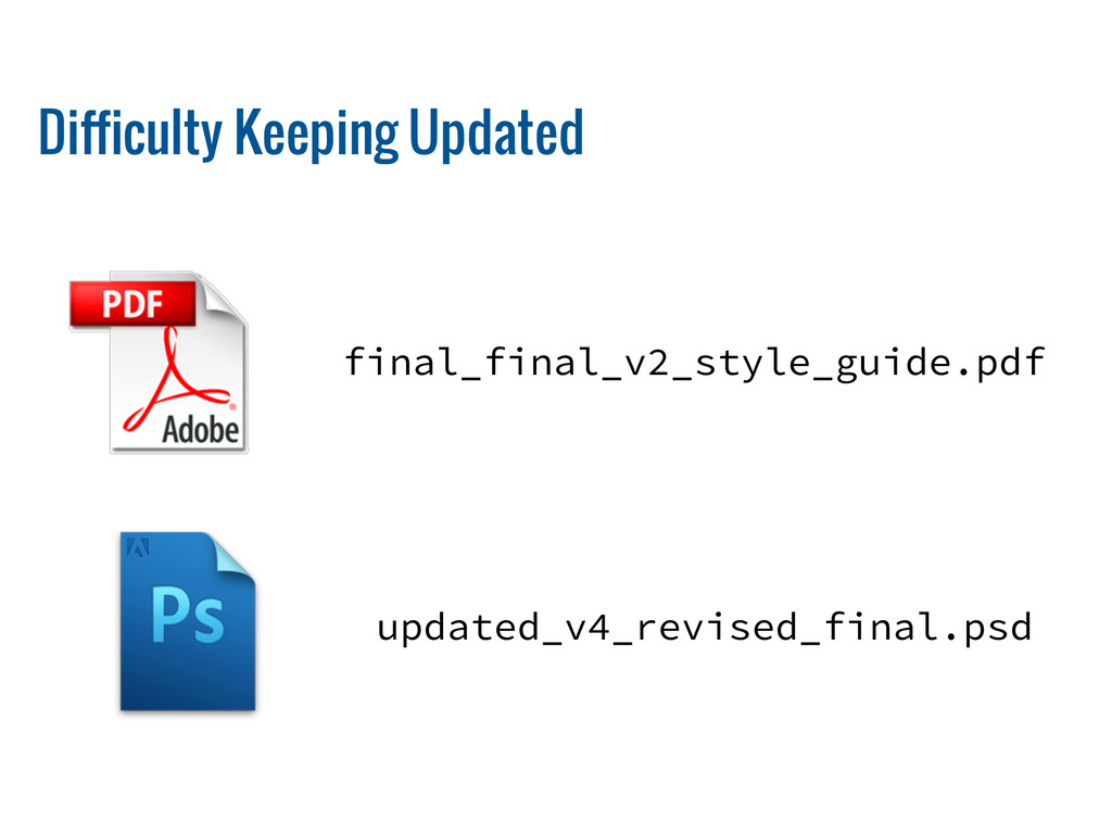
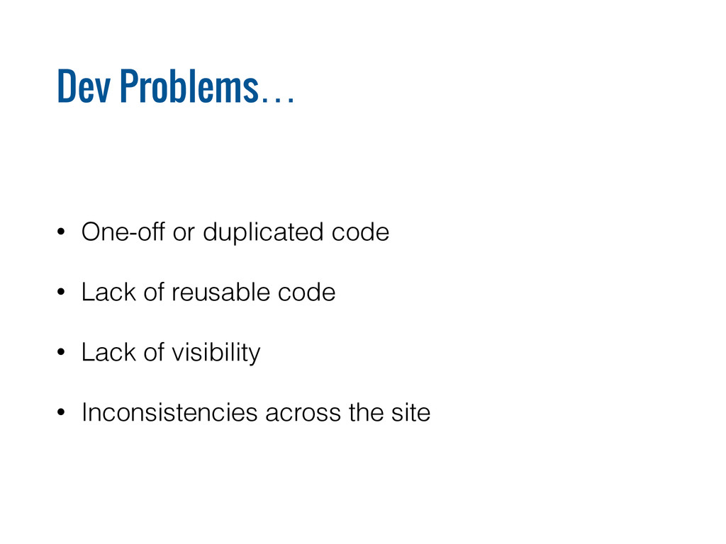
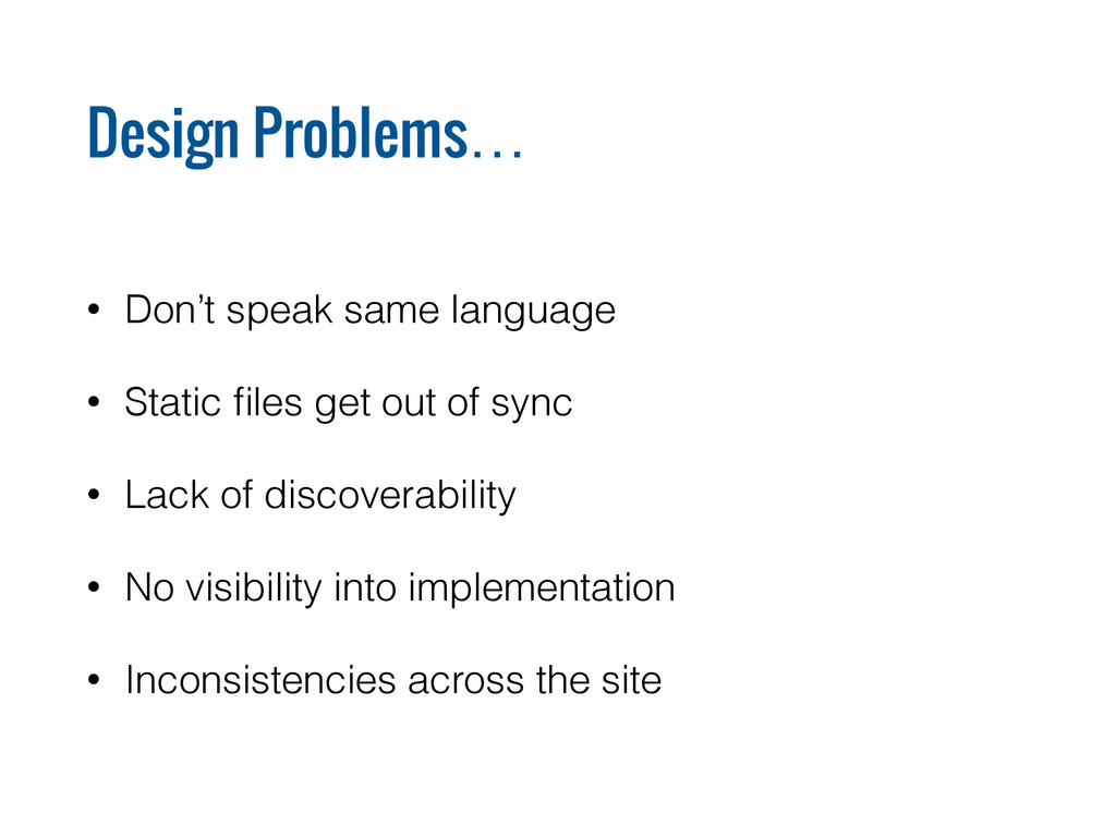
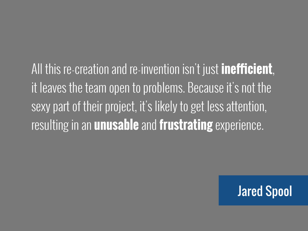
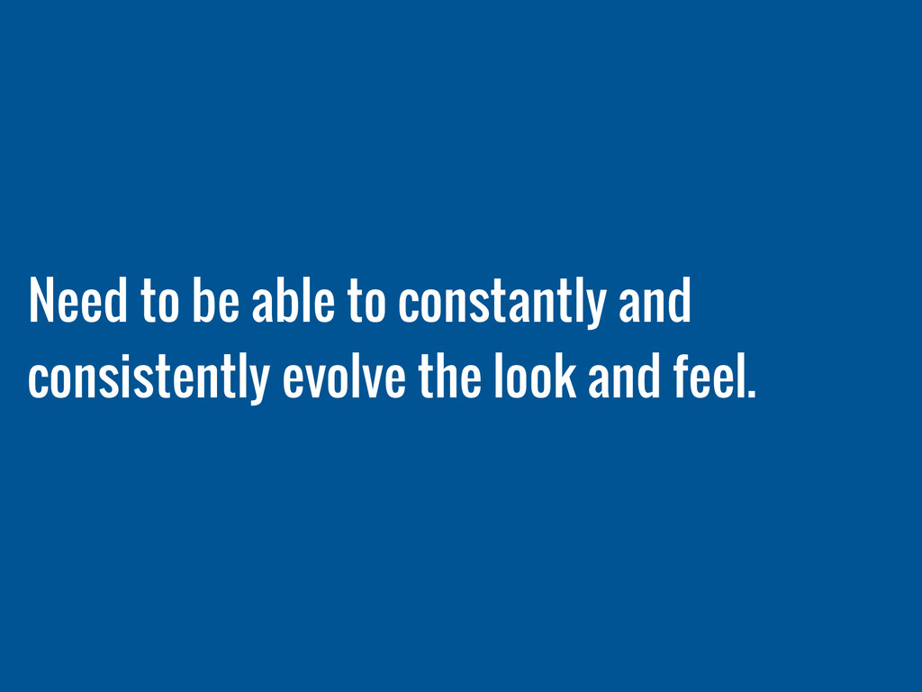
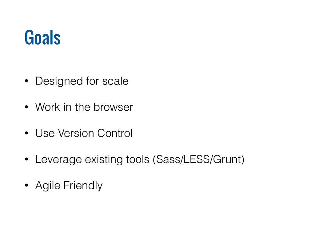
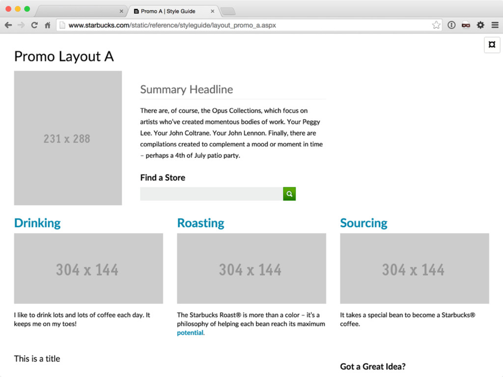
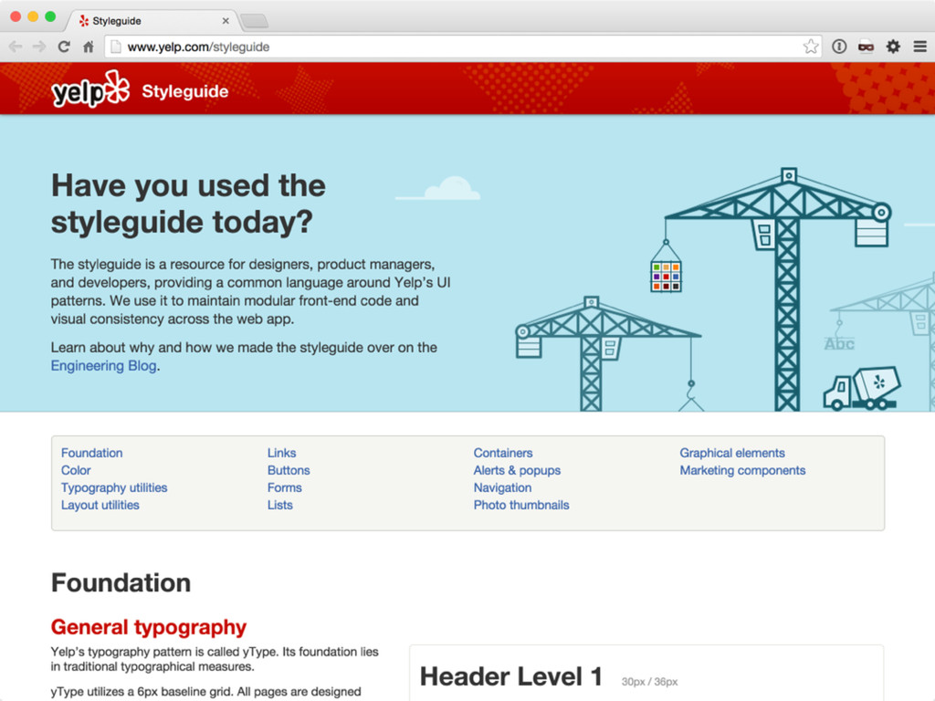
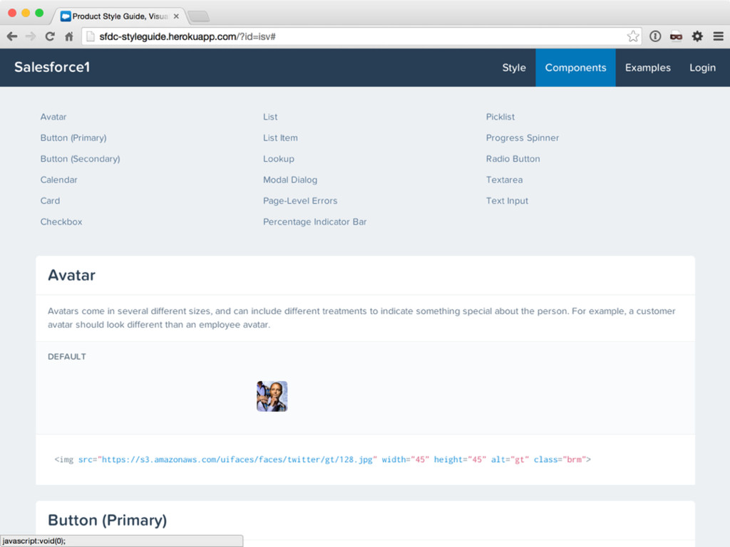
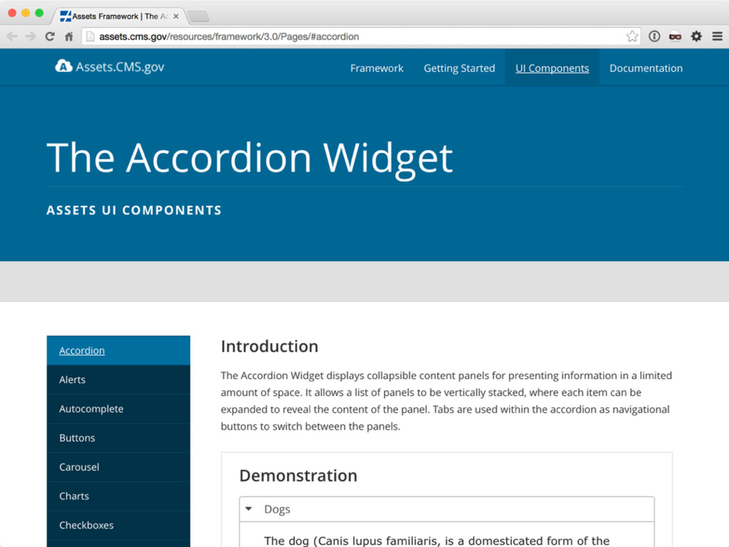
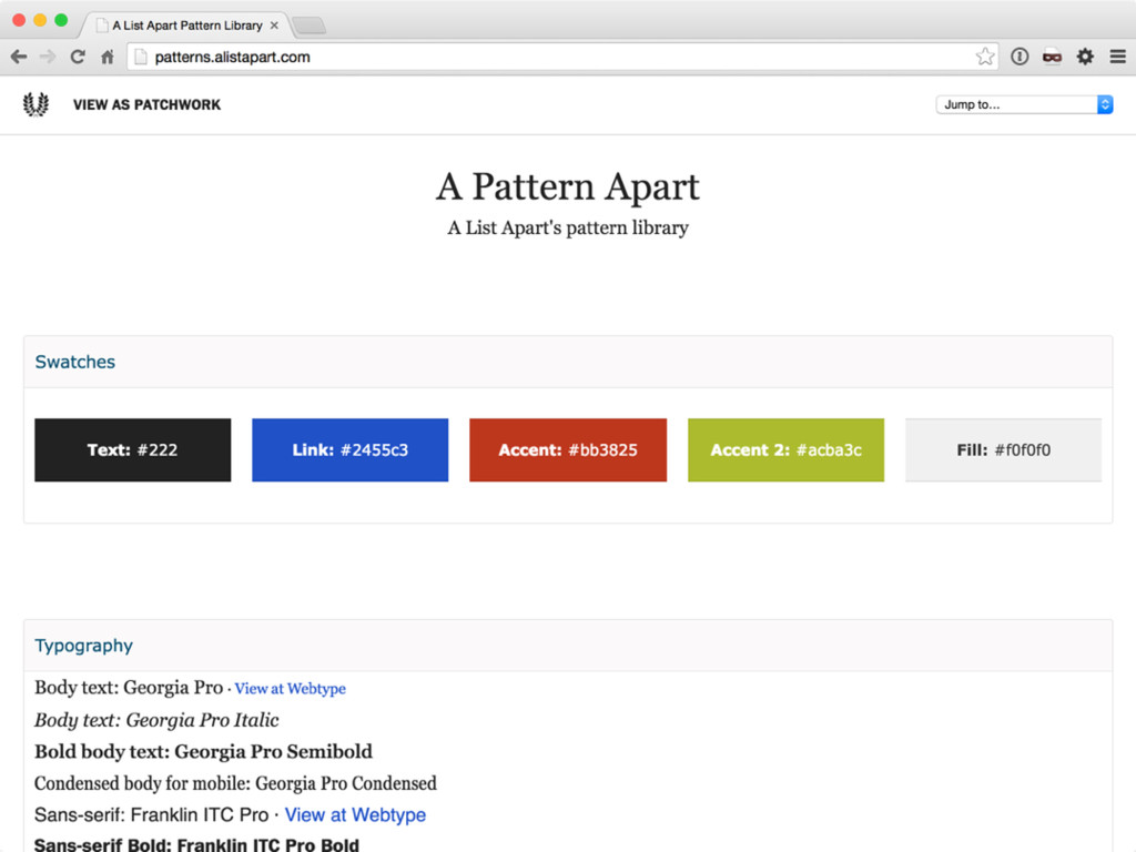
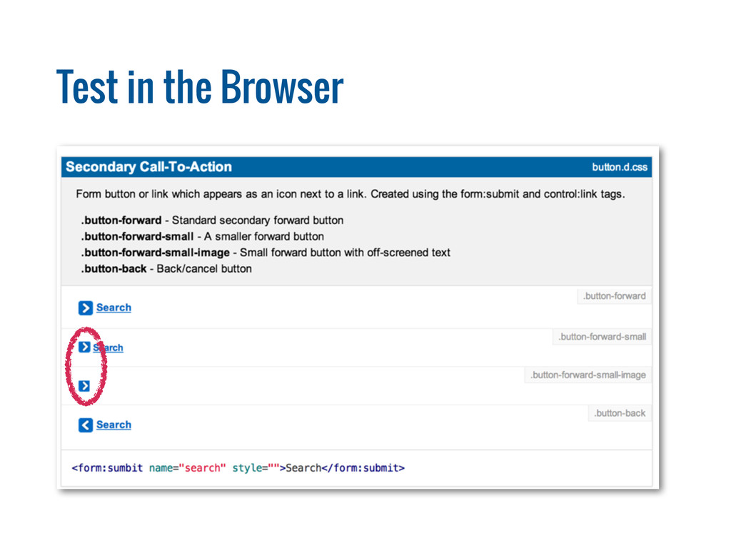
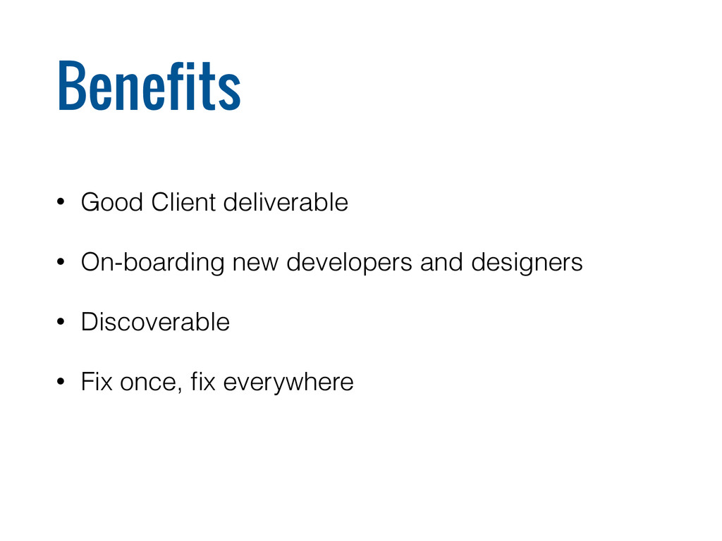
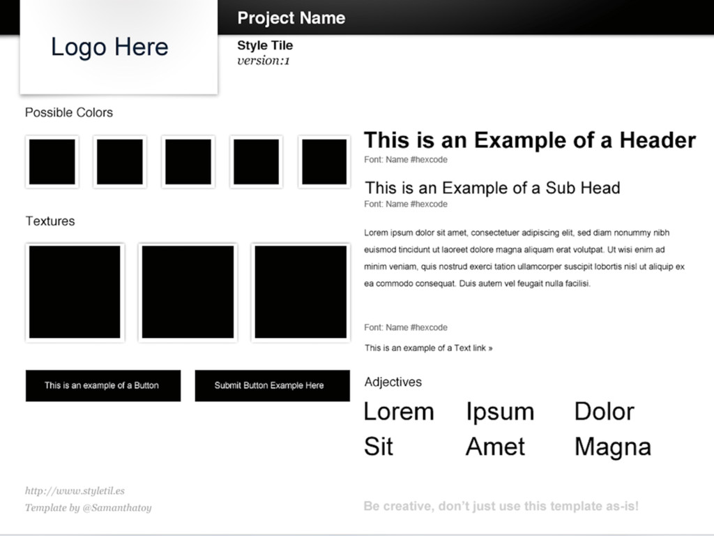
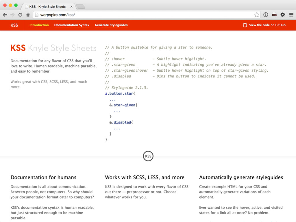
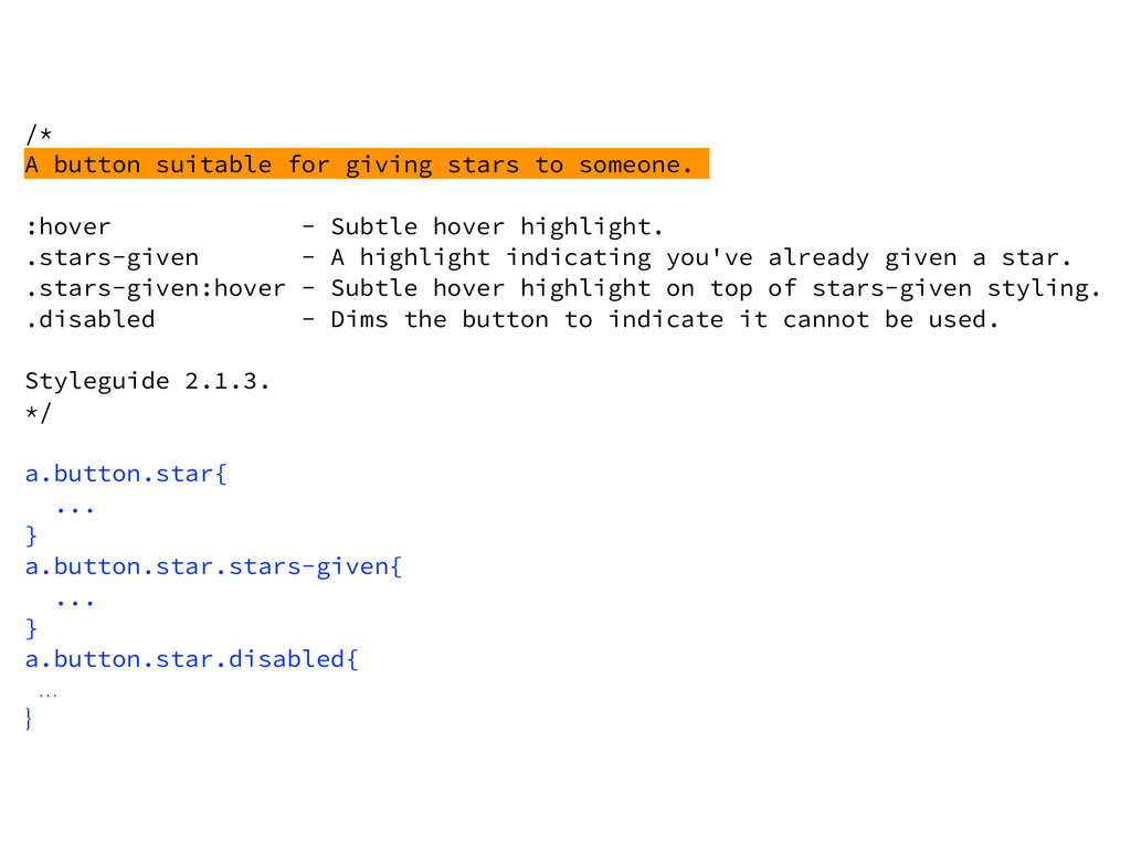
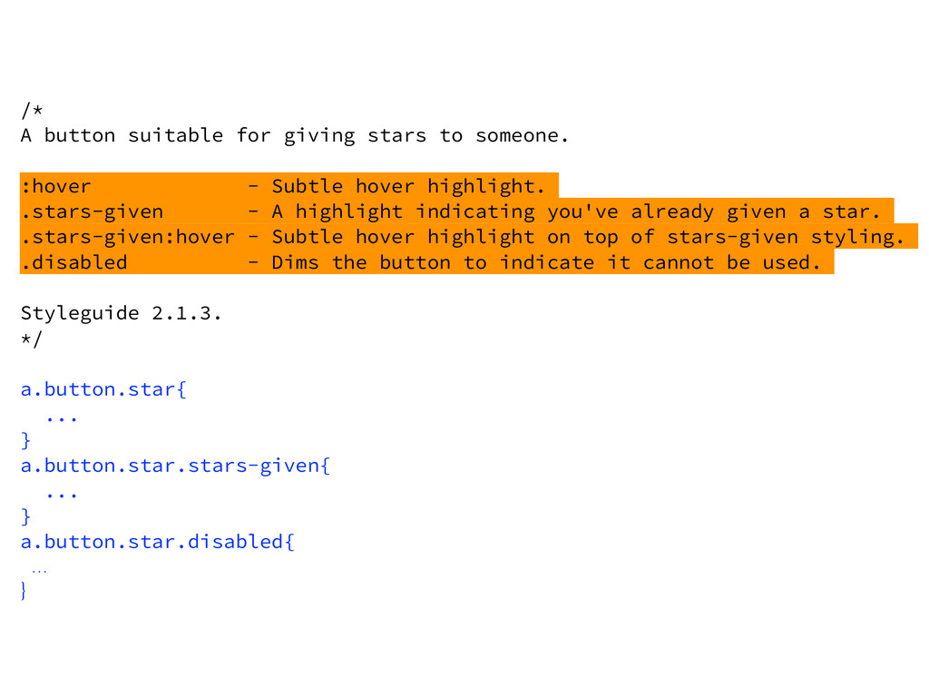
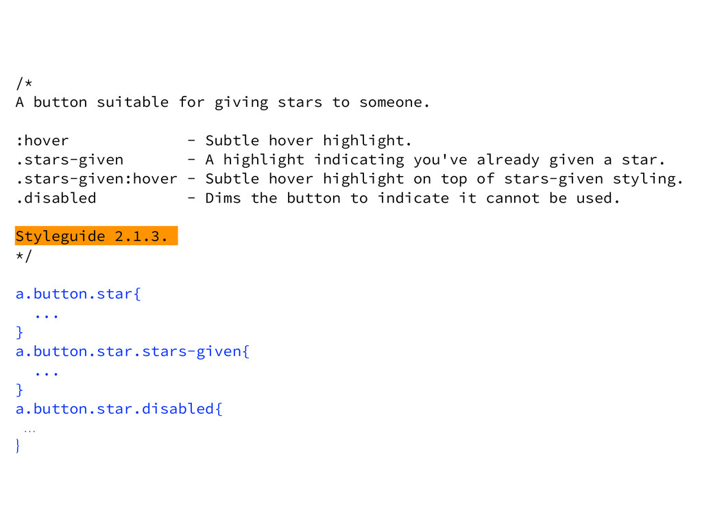
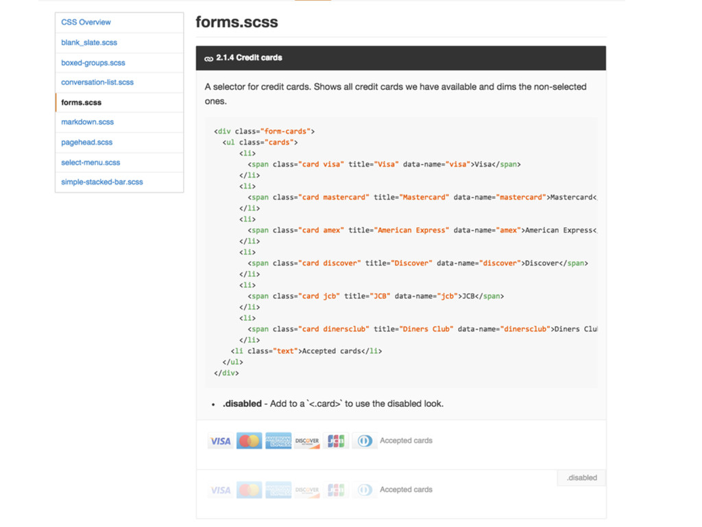
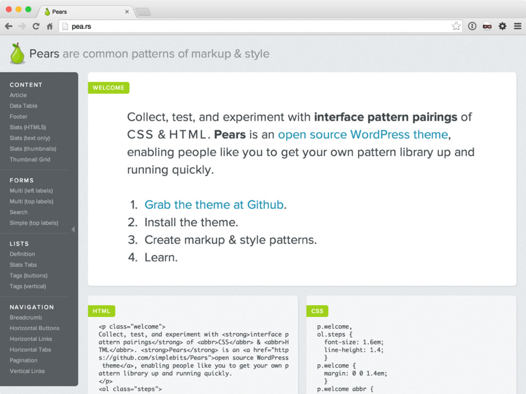
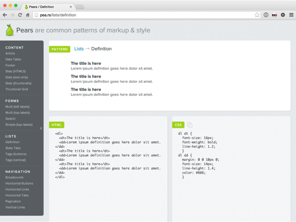
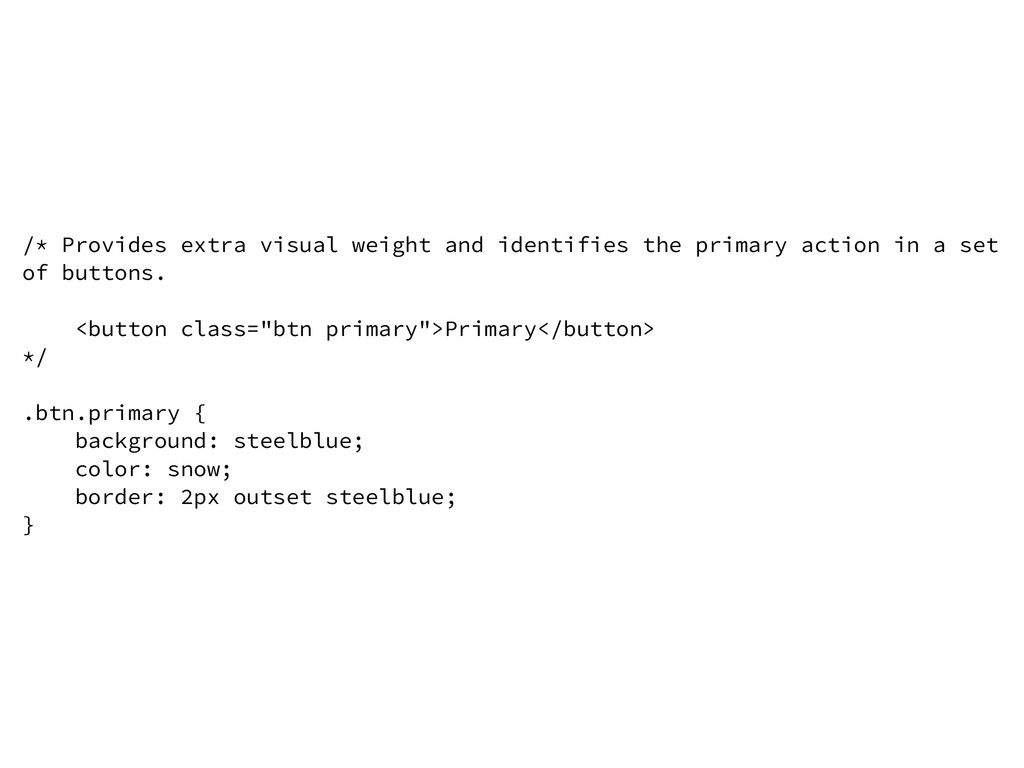
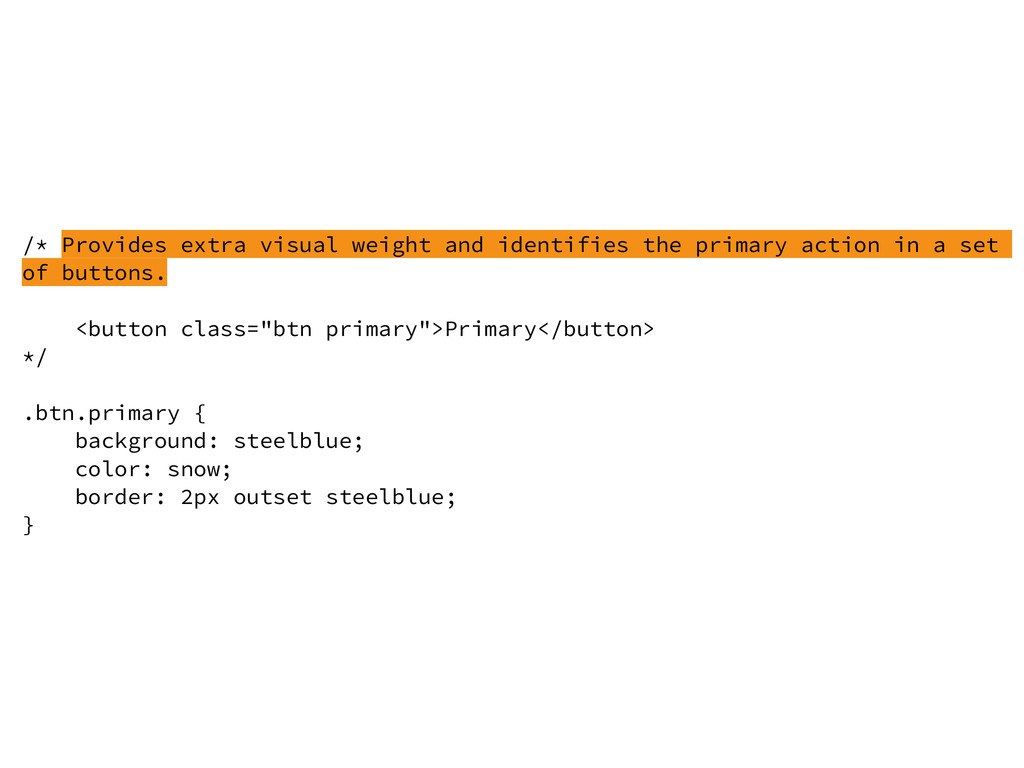
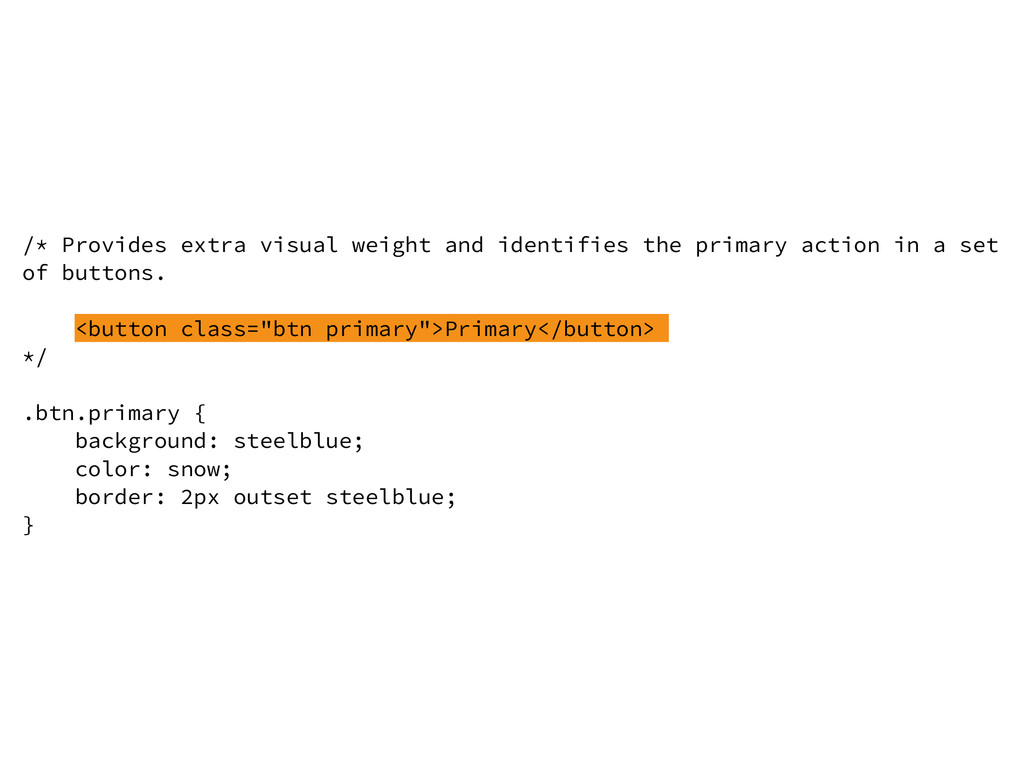
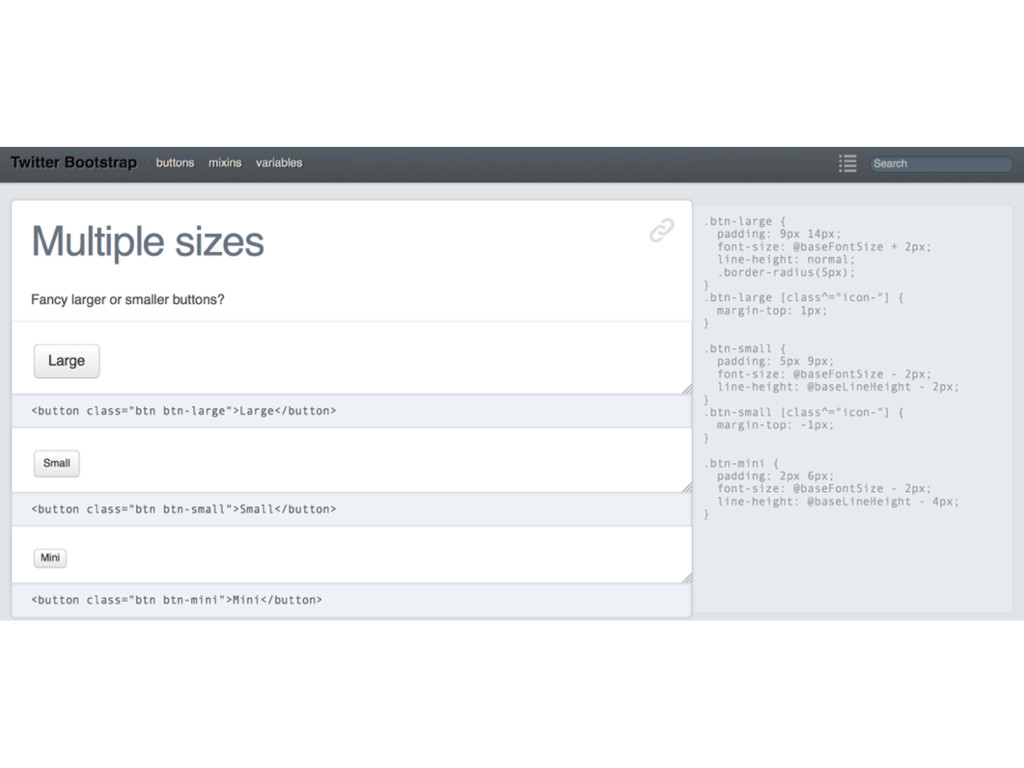
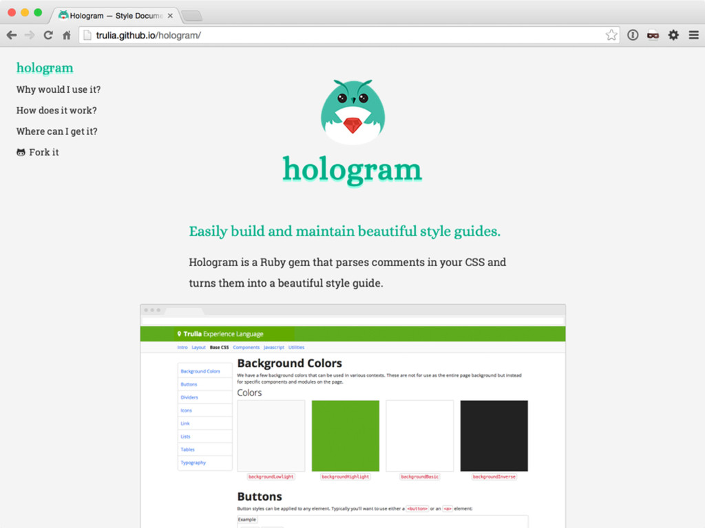
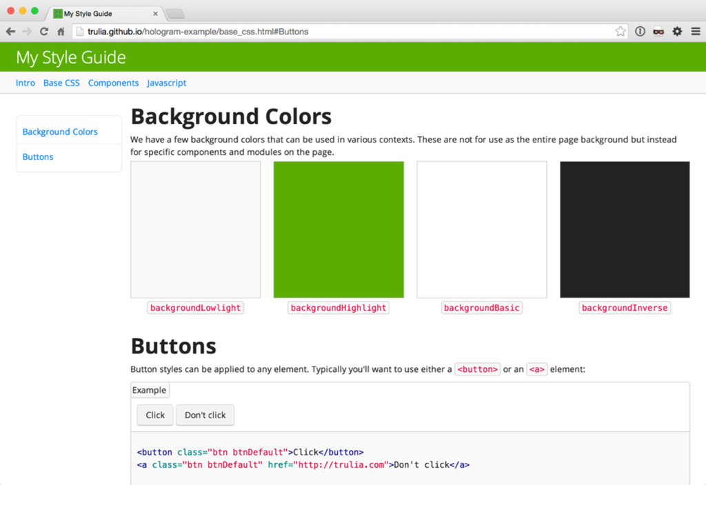
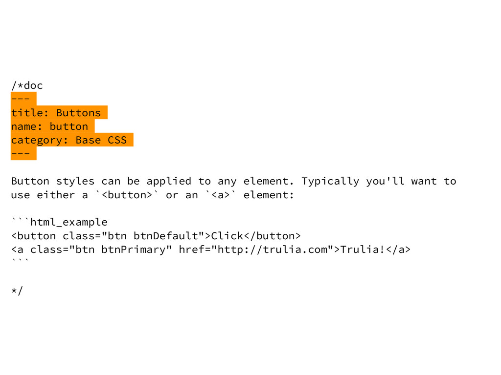
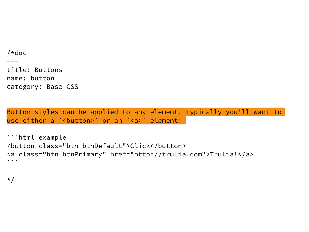
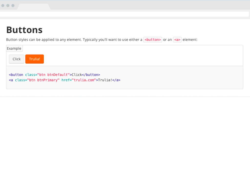
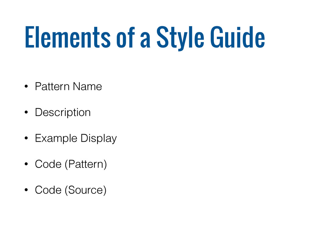
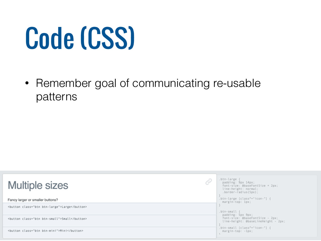
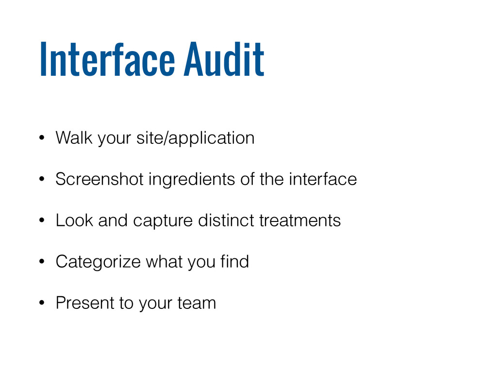
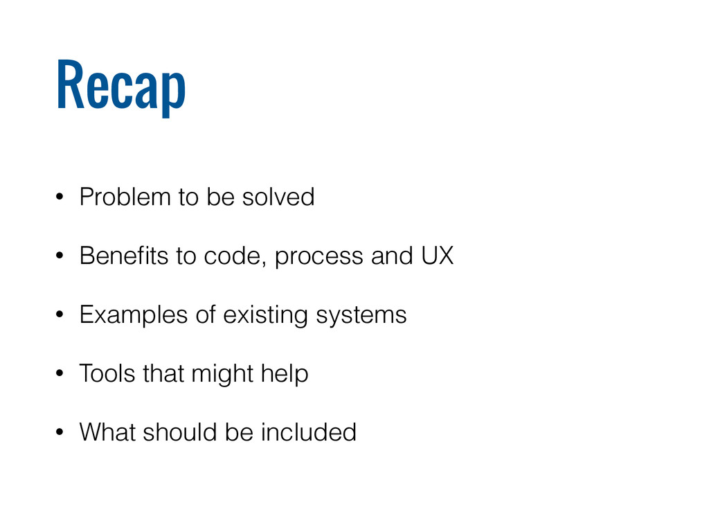
Style guides have traditionally been static documents maintained by designers. These get out of date with reality pretty fast and out of sync with code even faster. Instead of storing everything in a static document, the live (or living) style guide is generated dynamically from the production CSS and HTML code. The system itself evolves as the code evolves. Live style guides can lead to more maintainable code, help to bridge the gap between designer and developer, and result in a more consistent design across the site.

In this session, we'll review existing tools to aid in building a live style guide, look at the best way to organize everything, and figure out how to get started building one for your site or application.

Mark Meeker

December 04, 2014
Tweet

More Decks by Mark Meeker

Other Decks in Technology

Transcript

  1. Consistency is one of the most powerful usability principles: when

    things always behave the same, users don’t have to worry about what will happen. Jakob Nielson
  2. A style guide is a set of standards for the

    writing and design of documents, either for general use or for a specific publication, organization or field. Wikipedia
  3. Types of Style Guides • Brand Identity • Design Language

    • Voice and Tone • Writing • Patterns • Code http://bradfrost.com/blog/post/style-guides/
  4. While we’re doing this project, can we make a small

    change to the button? Sure, that’s easy! Everywhere? Umm...
  5. Dev Problems… • One-off or duplicated code • Lack of

    reusable code • Lack of visibility • Inconsistencies across the site
  6. Design Problems… • Don’t speak same language • Static files

    get out of sync • Lack of discoverability • No visibility into implementation • Inconsistencies across the site
  7. All this re-creation and re-invention isn't just inefficient, it leaves

    the team open to problems. Because it's not the sexy part of their project, it's likely to get less attention, resulting in an unusable and frustrating experience. Jared Spool
  8. We will encourage you to develop the three great virtues

    of a programmer: laziness, impatience and hubris. Larry Wall
  9. Goals • Designed for scale • Work in the browser

    • Use Version Control • Leverage existing tools (Sass/LESS/Grunt) • Agile Friendly
  10. Benefits • Good Client deliverable • On-boarding new developers and

    designers • Discoverable • Fix once, fix everywhere
  11. KSS

  12. /* A button suitable for giving stars to someone. :hover

    - Subtle hover highlight. .stars-given - A highlight indicating you've already given a star. .stars-given:hover - Subtle hover highlight on top of stars-given styling. .disabled - Dims the button to indicate it cannot be used. Styleguide 2.1.3. */ a.button.star{ ... } a.button.star.stars-given{ ... } a.button.star.disabled{ ... }
  13. /* A button suitable for giving stars to someone. :hover

    - Subtle hover highlight. .stars-given - A highlight indicating you've already given a star. .stars-given:hover - Subtle hover highlight on top of stars-given styling. .disabled - Dims the button to indicate it cannot be used. Styleguide 2.1.3. */ a.button.star{ ... } a.button.star.stars-given{ ... } a.button.star.disabled{ ... }
  14. /* A button suitable for giving stars to someone. :hover

    - Subtle hover highlight. .stars-given - A highlight indicating you've already given a star. .stars-given:hover - Subtle hover highlight on top of stars-given styling. .disabled - Dims the button to indicate it cannot be used. Styleguide 2.1.3. */ a.button.star{ ... } a.button.star.stars-given{ ... } a.button.star.disabled{ ... }
  15. /* A button suitable for giving stars to someone. :hover

    - Subtle hover highlight. .stars-given - A highlight indicating you've already given a star. .stars-given:hover - Subtle hover highlight on top of stars-given styling. .disabled - Dims the button to indicate it cannot be used. Styleguide 2.1.3. */ a.button.star{ ... } a.button.star.stars-given{ ... } a.button.star.disabled{ ... }
  16. /* Provides extra visual weight and identifies the primary action

    in a set of buttons. <button class="btn primary">Primary</button> */ .btn.primary { background: steelblue; color: snow; border: 2px outset steelblue; }
  17. /* Provides extra visual weight and identifies the primary action

    in a set of buttons. <button class="btn primary">Primary</button> */ .btn.primary { background: steelblue; color: snow; border: 2px outset steelblue; }
  18. /* Provides extra visual weight and identifies the primary action

    in a set of buttons. <button class="btn primary">Primary</button> */ .btn.primary { background: steelblue; color: snow; border: 2px outset steelblue; }
  19. /*doc --- title: Buttons name: button category: Base CSS ---

    Button styles can be applied to any element. Typically you'll want to use either a `<button>` or an `<a>` element: ```html_example <button class="btn btnDefault">Click</button> <a class="btn btnPrimary" href="http://trulia.com">Trulia!</a> ``` */
  20. /*doc --- title: Buttons name: button category: Base CSS ---

    Button styles can be applied to any element. Typically you'll want to use either a `<button>` or an `<a>` element: ```html_example <button class="btn btnDefault">Click</button> <a class="btn btnPrimary" href="http://trulia.com">Trulia!</a> ``` */
  21. /*doc --- title: Buttons name: button category: Base CSS ---

    Button styles can be applied to any element. Typically you'll want to use either a `<button>` or an `<a>` element: ```html_example <button class="btn btnDefault">Click</button> <a class="btn btnPrimary" href="http://trulia.com">Trulia!</a> ``` */
  22. Elements of a Style Guide • Pattern Name • Description

    • Example Display • Code (Pattern) • Code (Source)
  23. Pattern Name • Agree on a shared vocabulary • Use

    name in CSS classes and filenames
  24. Display Example • Use real content • Consider default state

    • Enable seeing RWD states • :hover and other interactions
  25. Impact on Code • Thoughtful defaults • Separates skin from

    structure • Single Responsibility Principle • BEM / SMACSS / OOCSS • SASS / LESS
  26. A pattern describes a problem that occurs over and over

    again in our environment, and then describes the core of the solution to that problem, in such a way that you can use this solution a million times over...
 Christopher Alexander
  27. Grid Typography Lists Links Buttons Forms Tables Labels Images Prices

    Products Maps Calendar Lightbox Notifications Navigation Icons
  28. Interface Audit • Walk your site/application • Screenshot ingredients of

    the interface • Look and capture distinct treatments • Categorize what you find • Present to your team
  29. Consider • Edge cases • Legacy vs. Aspirational • Be

    willing to say “no” or “not yet”
  30. Recap • Problem to be solved • Benefits to code,

    process and UX • Examples of existing systems • Tools that might help • What should be included
  31. Websites are systems rather than pages and as soon as

    we stop perceiving them as that, the better. Anna Debenham