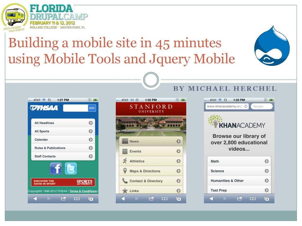
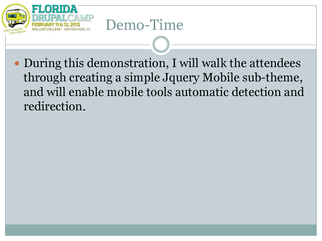
(JQM) mobile site with navigation using Drupal 7, Jquery Mobile. Set up redirection using Mobile Tools Convince the user (you!) that there‟s absolutely NO reason that you should not have a mobile site :)
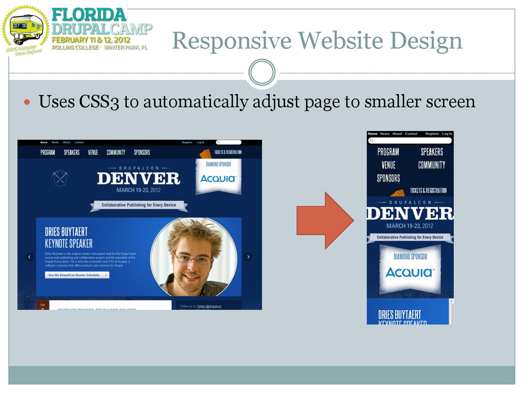
about one theme Do not have to worry about device detection and redirection Its the „hip‟ way of doing things :) Cons Can not change data between mobile and desktop versions Difficult to implement (especially with content rich layouts)
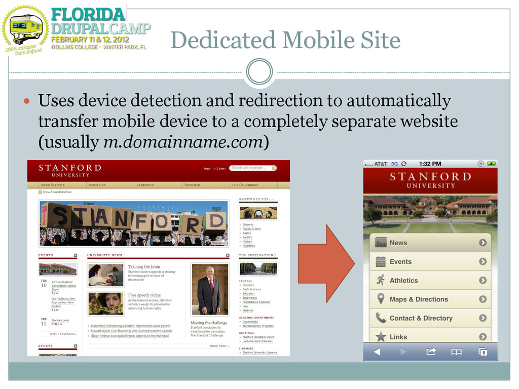
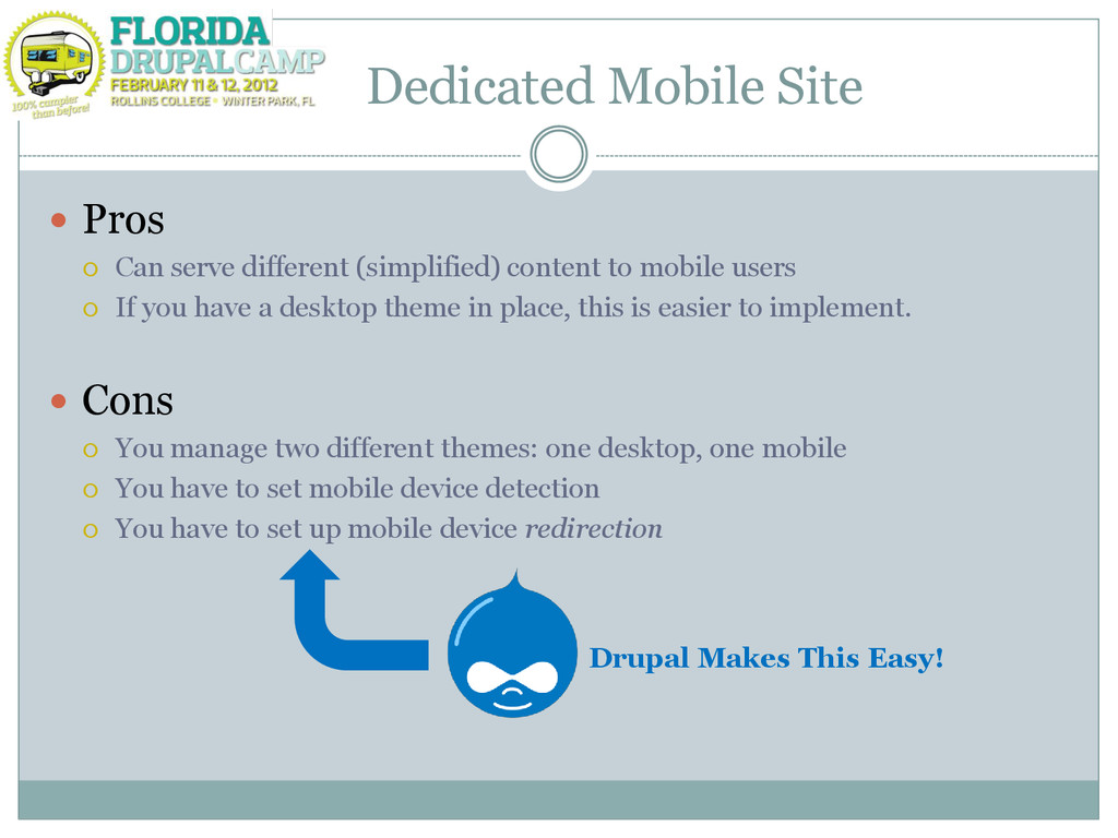
content to mobile users If you have a desktop theme in place, this is easier to implement. Cons You manage two different themes: one desktop, one mobile You have to set mobile device detection You have to set up mobile device redirection Drupal Makes This Easy!
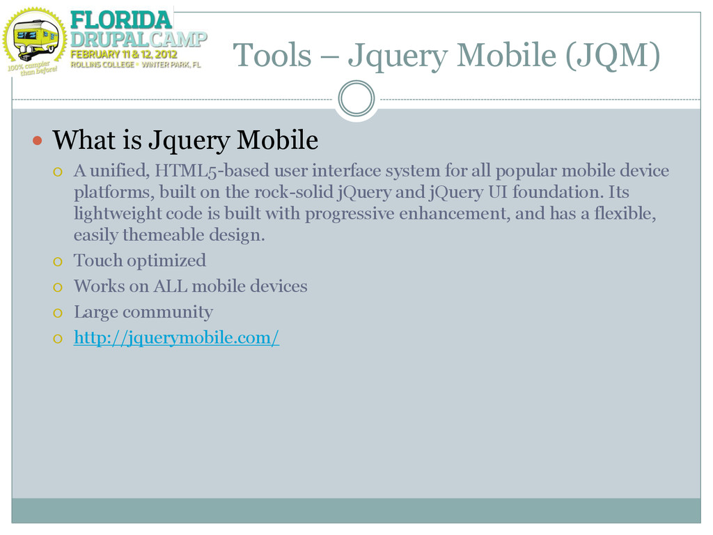
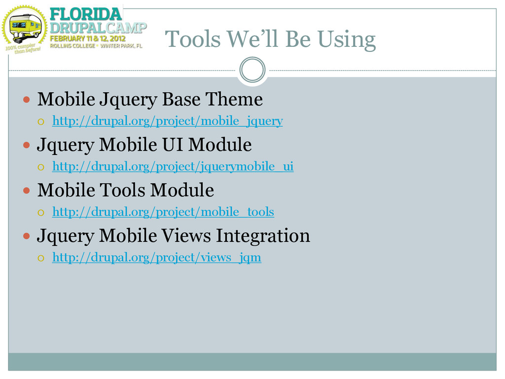
A unified, HTML5-based user interface system for all popular mobile device platforms, built on the rock-solid jQuery and jQuery UI foundation. Its lightweight code is built with progressive enhancement, and has a flexible, easily themeable design. Touch optimized Works on ALL mobile devices Large community http://jquerymobile.com/
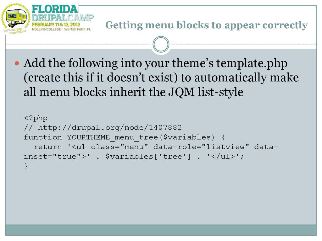
into your theme‟s template.php (create this if it doesn‟t exist) to automatically make all menu blocks inherit the JQM list-style <?php // http://drupal.org/node/1407882 function YOURTHEME_menu_tree($variables) { return '<ul class="menu" data-role="listview" data- inset="true">' . $variables['tree'] . '</ul>'; }
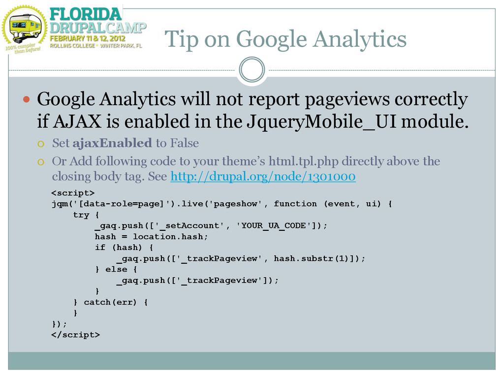
pageviews correctly if AJAX is enabled in the JqueryMobile_UI module. Set ajaxEnabled to False Or Add following code to your theme‟s html.tpl.php directly above the closing body tag. See http://drupal.org/node/1301000 <script> jqm('[data-role=page]').live('pageshow', function (event, ui) { try { _gaq.push(['_setAccount', 'YOUR_UA_CODE']); hash = location.hash; if (hash) { _gaq.push(['_trackPageview', hash.substr(1)]); } else { _gaq.push(['_trackPageview']); } } catch(err) { } }); </script>
 mherchel
 news_it_enj
 lycorptech_jp
 ysknsid25
 k8yasuma
 ykagano
 sue445
 miyukki
 kamoshika
 kawauso
 smt7174
 quiver
 nwiizo
 gr2m
gr2m
 mojombo
 popppiees
 tammyeverts
 szymonslowik
 techseoconnect
 konakalab
 brad_frost
 shlominoach
 lara
lara
 denniskardys