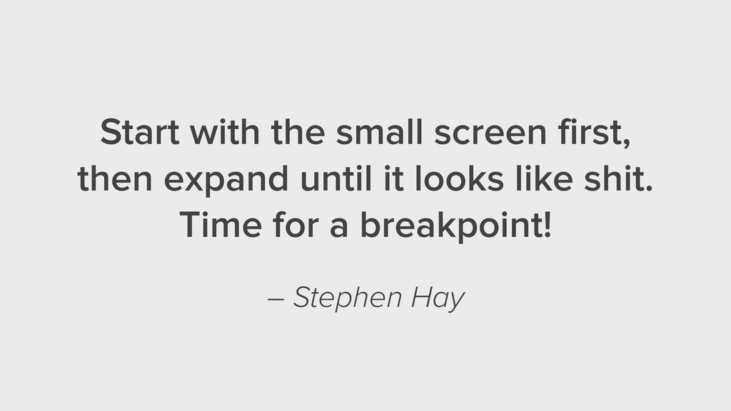
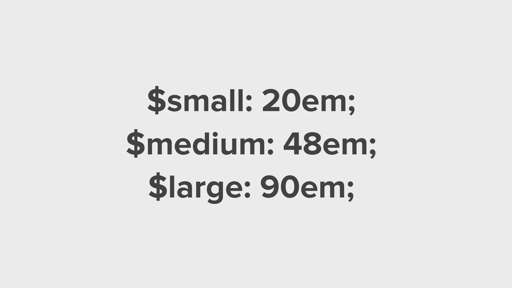
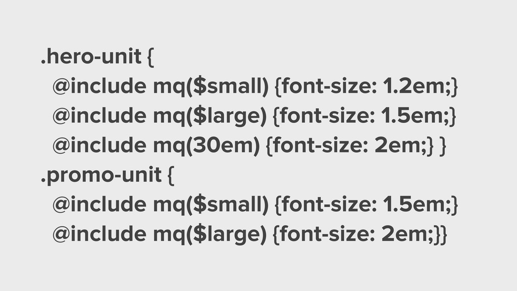
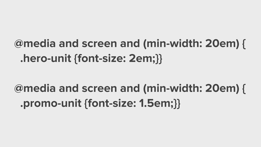
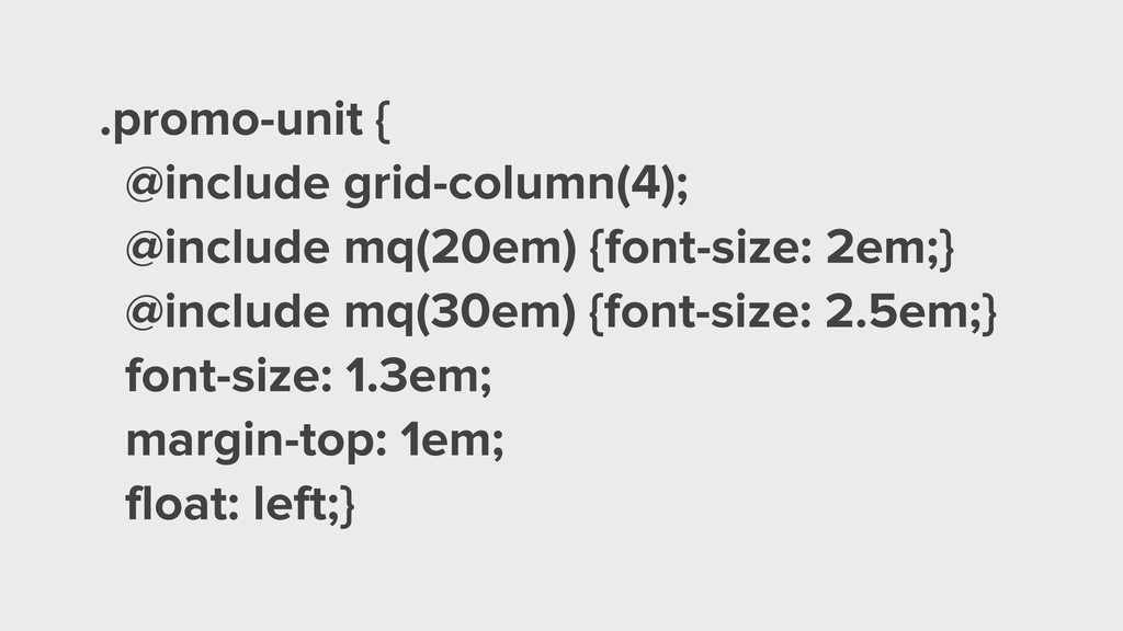
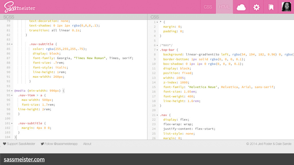
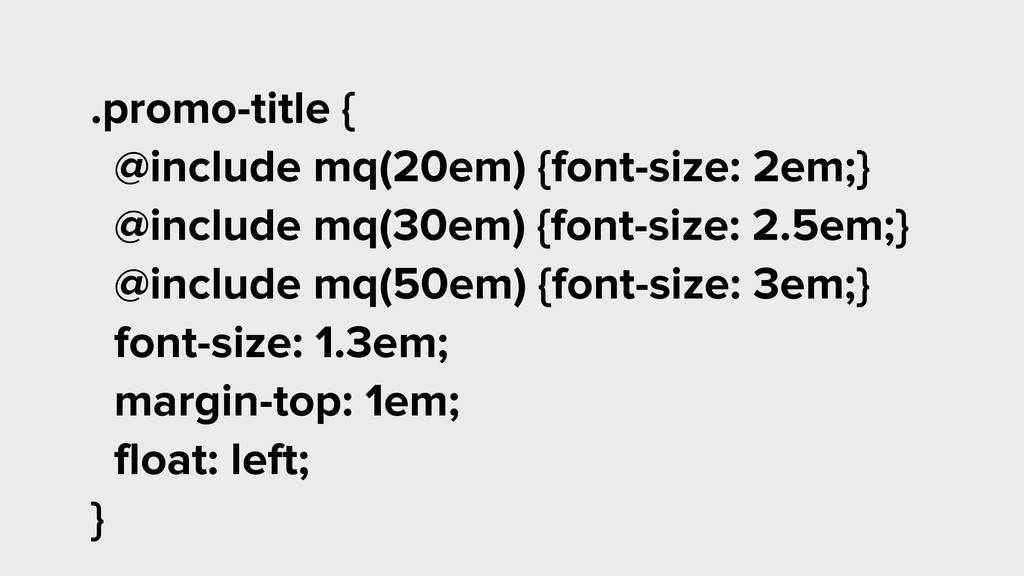
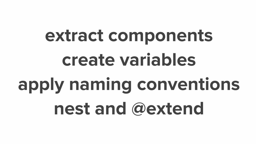
Most devs I know have a love/hate relationship with responsive design. We agree it's important. We agree it's hard. But it doesn't have to be. Using the power of Sass mixins, I'll show you how to declare base, media queries and browser specific styles in one place, making for less code and fewer worries.
 minamarkham
 news_it_enj
 kaym
kaym
 ks91
ks91
 taiga7543
 geekplus_tech
 kamoshika
 taka_aki
 moongift
 prgckwb
 srenext
 yukiogawa
 kaonavi
 brettharned
 asonas
 jnunemaker
 axbom
axbom
 honzajavorek
 bkeepers
 keavy
keavy
 inesmontani
 jacobtomlinson
 jeffersonlam
 sstephenson
![<img data-interchange="[small.jpg, (default)], [small.jpg, (small)], [medium.jpg, (medium)]">](https://files.speakerdeck.com/presentations/7b8e6f3007ea013251f2520610a05956/slide_26.jpg)