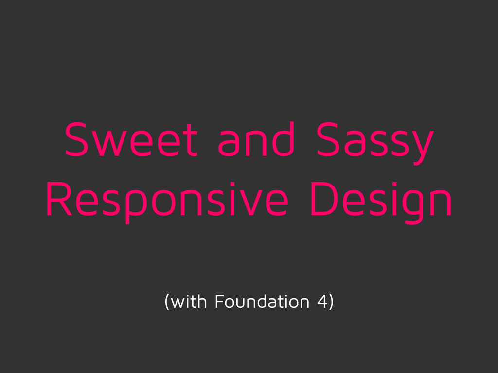
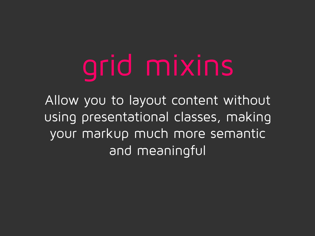
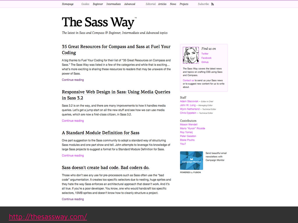
How to use Sass and grid frameworks to streamline the responsive design process, focusing on media queries and the power of mixins. I'll share some tips to best optimize your Sass for responsive design and some examples of sites utilizing these techniques.
 minamarkham
 karad
karad
 ukaoli
 xtone
xtone
 lynteo
 stmn
stmn
 littlebusters
 nbkouhou
 chiemitaki
 centou
 aonomasahiro
 mhand01
 godlingkogami
 caitiem20
 nwiizo
 jakevdp
 dougneiner
 gr2m
gr2m
 nmsamuel
 aleyda
 iamctodd
 jlugia
 quramy
 ryanjones
 marcelosomers
![$offset: [enter number] If you want to offset the element](https://files.speakerdeck.com/presentations/8b1389a012bd0131b1ec0667e5a019c9/slide_18.jpg)
![$push/$pull: [enter number] This value will change the ordering of](https://files.speakerdeck.com/presentations/8b1389a012bd0131b1ec0667e5a019c9/slide_19.jpg)
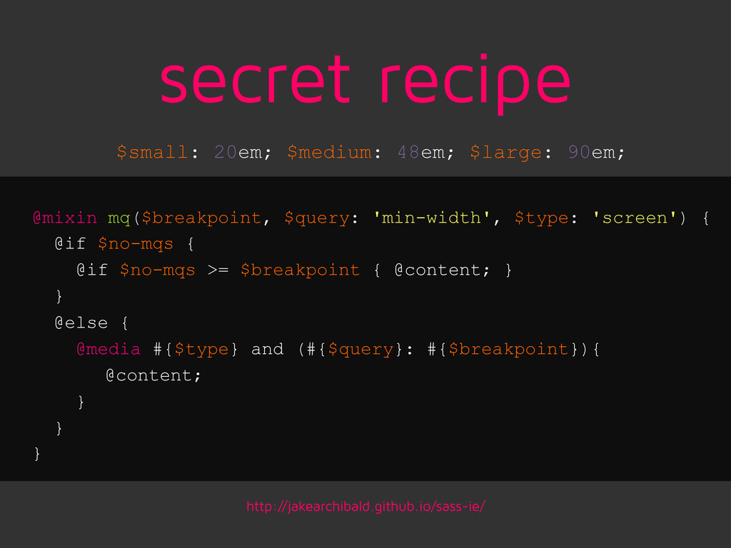
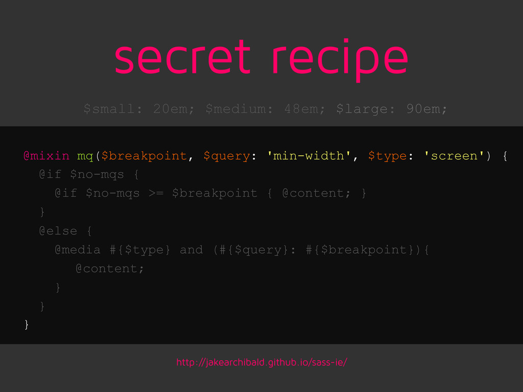
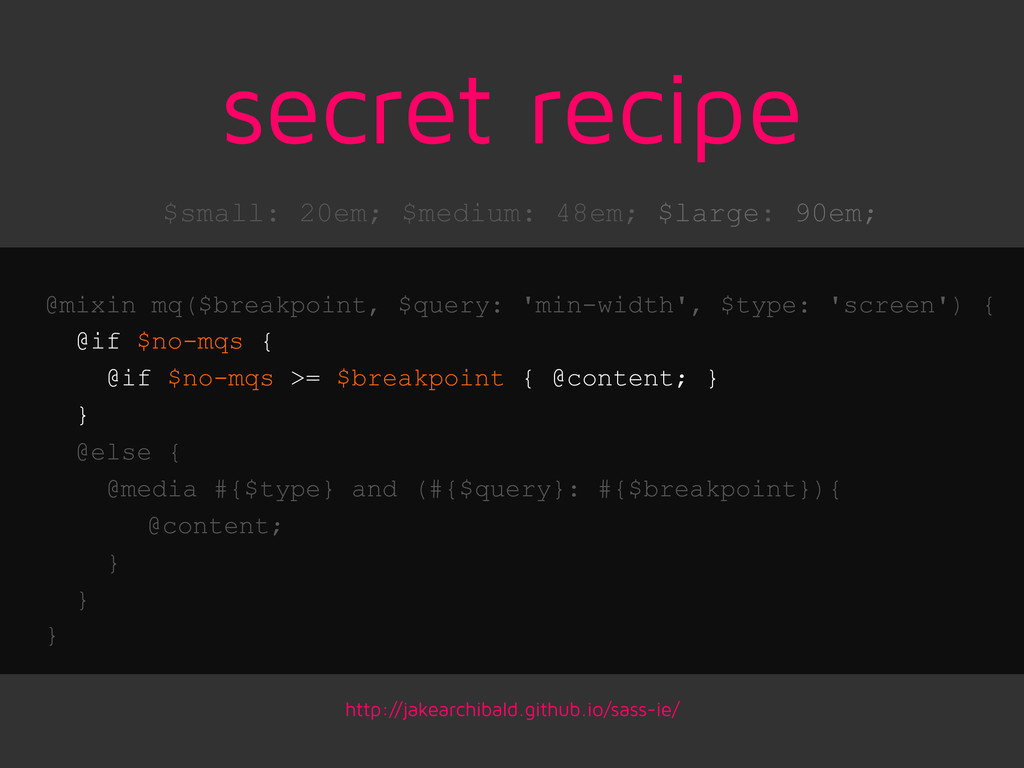
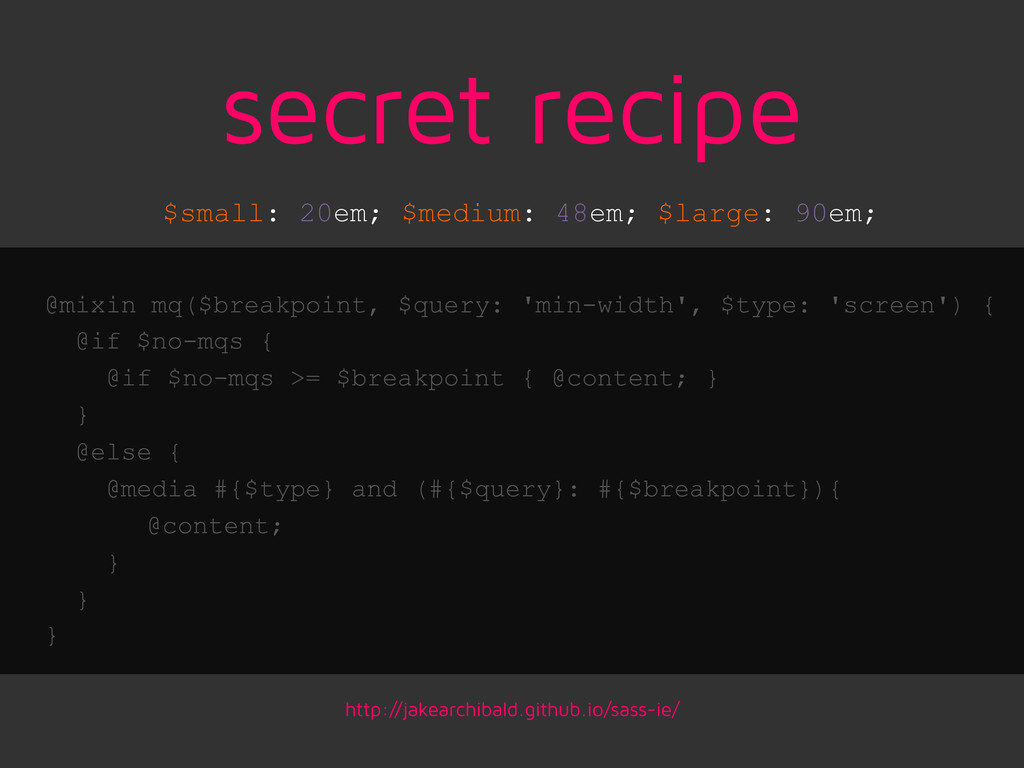
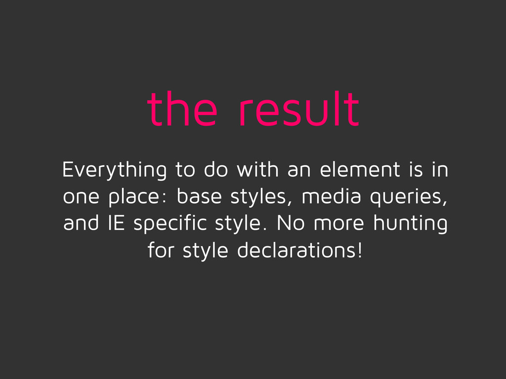
![ie.scss <!--[if lte IE 8]> <link rel="stylesheet" href="css/ie.css"> <![endif]--> $no-mqs:](https://files.speakerdeck.com/presentations/8b1389a012bd0131b1ec0667e5a019c9/slide_49.jpg)