Upgrade to Pro — share decks privately, control downloads, hide ads and more …

Capturing and the Responsive Web

Mobify
April 25, 2013

Capturing and the Responsive Web

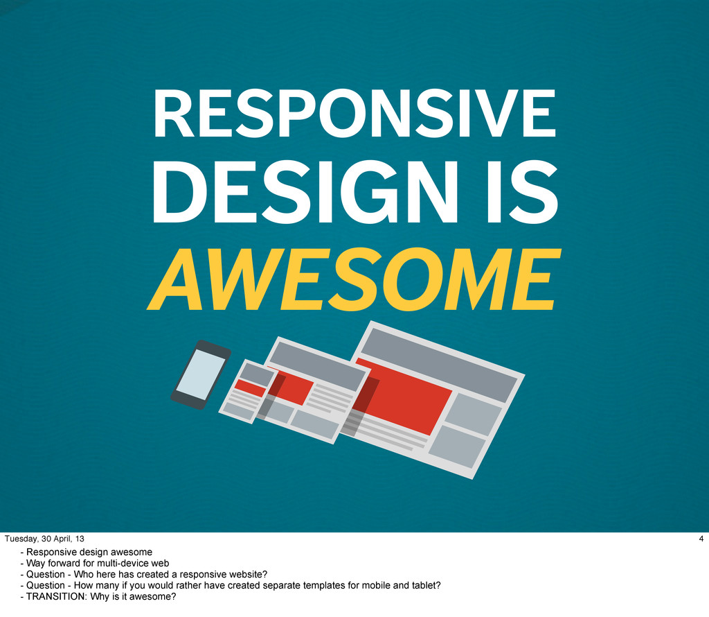
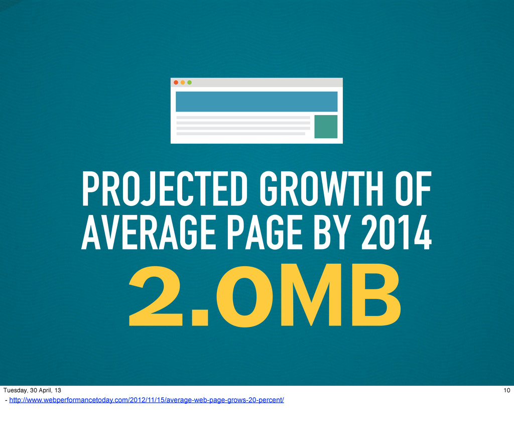
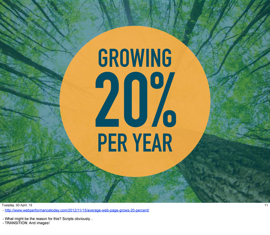
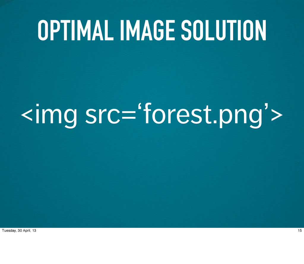
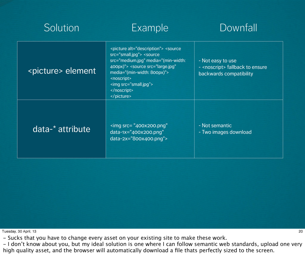
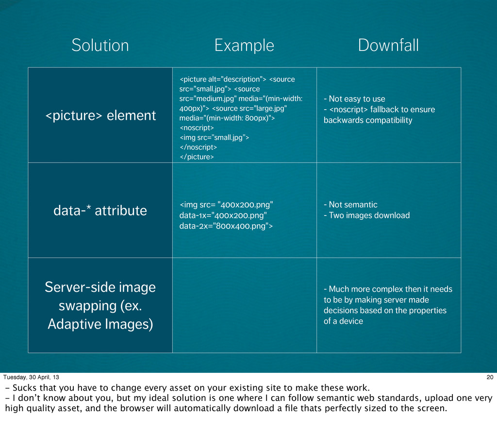
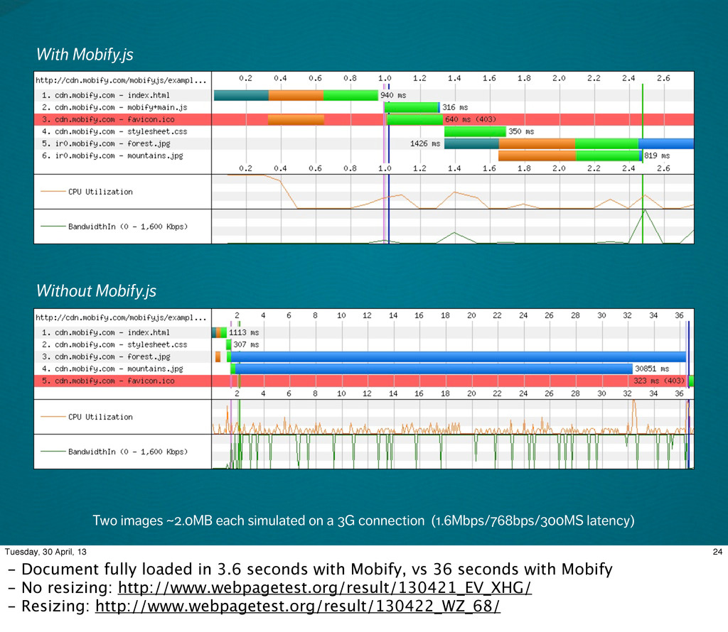
One of the most significant development challenges of responsive web design is controlling what resources you want to load based on the conditions of the device.

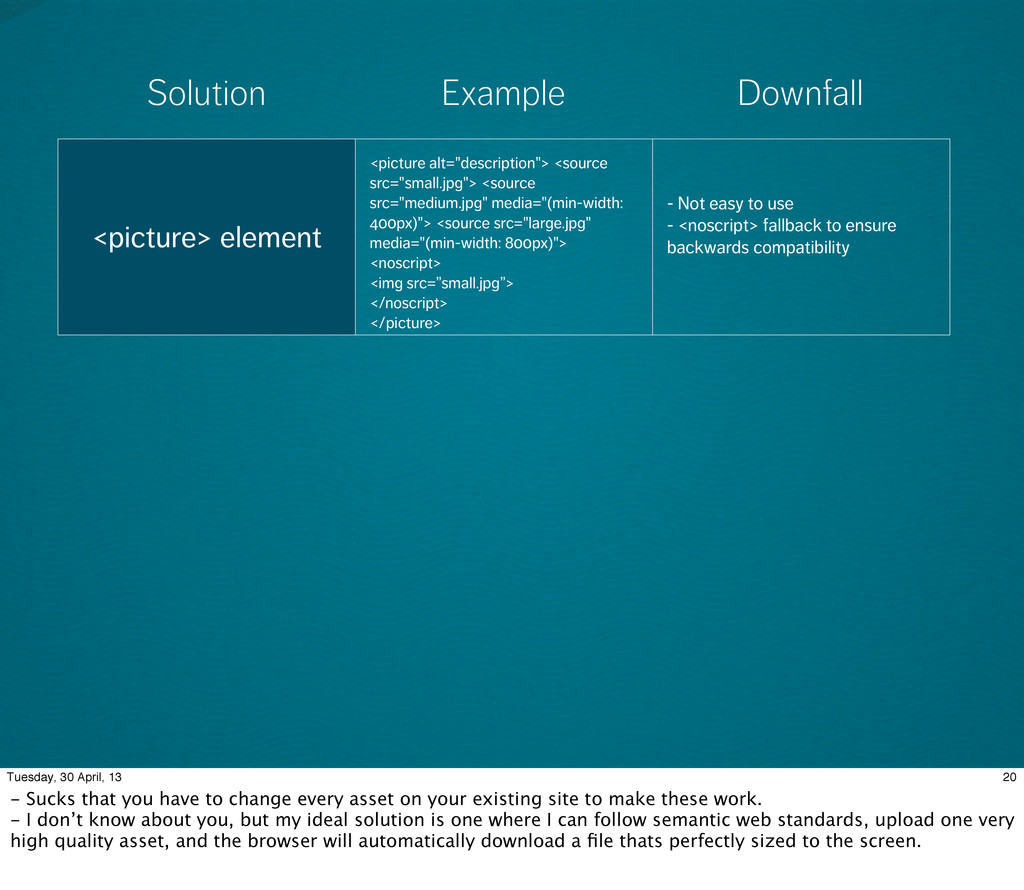
Unfortunately, all current solutions require you to make significant changes to your existing site by using either server-side user-agent detection or forcing you to break semantic web standards.

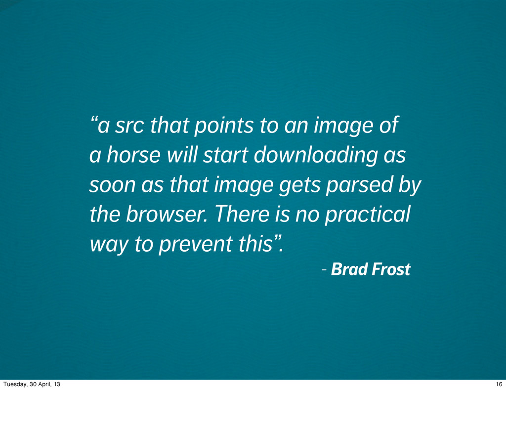
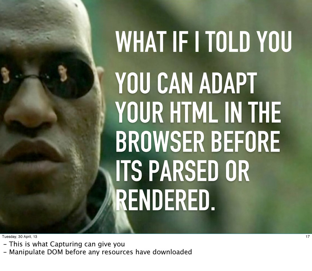
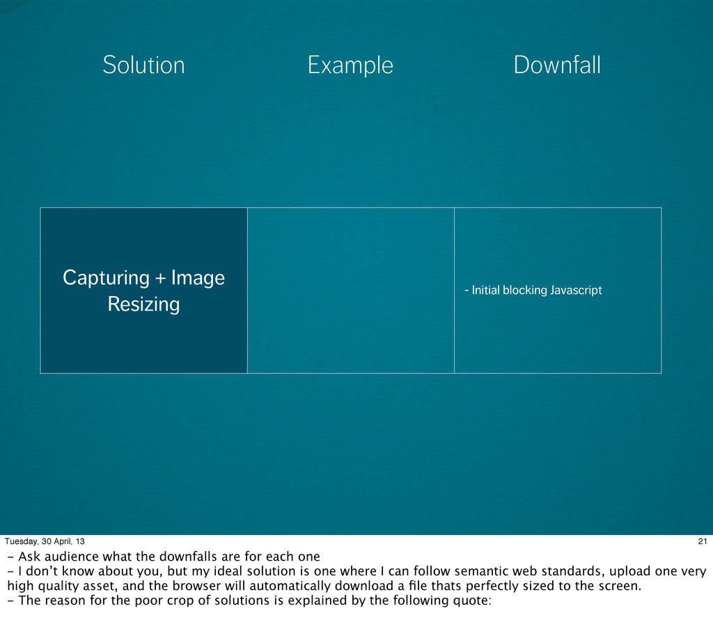
In this talk, Shawn Jansepar discusses capturing in Mobify.js – a library that allows you to mitigate the pre-parser, enabling you to manipulate the DOM before any resources have loaded.

Mobify

April 25, 2013
Tweet

Other Decks in Programming

Transcript

  1. Capturing in 3 Tuesday, 30 April, 13 - Today I'm

    here to tell you about Capturing, and how it can help you with the challenges introduce by responsive design - TRANSITION: Let’s talk about responsive design
  2. RESPONSIVE DESIGN IS AWESOME 4 Tuesday, 30 April, 13 -

    Responsive design awesome - Way forward for multi-device web - Question - Who here has created a responsive website? - Question - How many if you would rather have created separate templates for mobile and tablet? - TRANSITION: Why is it awesome?
  3. YOURSITE.COM YOURSITE.COM 5 Tuesday, 30 April, 13 - One set

    of markup for all devices - Let HTML worry about content generated - Let CSS worry about visually represented that content for all devices TRANSITION: But I'm not really here to convince you responsive design is good. Let's talk about some of the challenges of creating a responsive site!
  4. YOURSITE.COM YOURSITE.COM 5 Tuesday, 30 April, 13 - One set

    of markup for all devices - Let HTML worry about content generated - Let CSS worry about visually represented that content for all devices TRANSITION: But I'm not really here to convince you responsive design is good. Let's talk about some of the challenges of creating a responsive site!
  5. Credit: Brad Frost 6 Tuesday, 30 April, 13 - Responsive

    design just the top of the iceberg for the adaptive web - Companies we talk to typically tell us that they want a performant site, but it was usually low in priority - Performance should be considered a core aspect of the user experience - TRANSITION: Performance has always been a tough problem. But it’s a much harder problem to tackle with responsive. Why is it harder?
  6. 7 Tuesday, 30 April, 13 - It’s harder for the

    EXACT same reason that makes it awesome! Same markup for all devices - Retina Macbook Pro assets not download on old Android - Pre-parser is the source of the responsive performance problem. Assumes that all assets in the page have a high probability of being downloaded. - Progressive Enhancement the way to go, but that doesn’t solve the image problem - TRANSITION: A big problem is that it’s really easy to overlook performance. Why?
  7. 0 500 1000 1500 2000 2500 3000 3500 4000 iPhone

    4 iPhone 4S iOS Simulator PAGE LOAD TIME 8 Tuesday, 30 April, 13 http://www.guypo.com/mobile/javascript-pre-execution-for-mobile-taking-scripts-out-of-the-loop/ - It’s easy to overlook performance because we test on perfect conditions - Fast computer - Fast internet - Close proximity to our servers -TRANSITION: Just to give you an idea of how big this problem is
  8. PROJECTED GROWTH OF AVERAGE PAGE BY 2014 2.0MB 10 Tuesday,

    30 April, 13 - http://www.webperformancetoday.com/2012/11/15/average-web-page-grows-20-percent/
  9. GROWING 20% PER YEAR 11 Tuesday, 30 April, 13 -

    http://www.webperformancetoday.com/2012/11/15/average-web-page-grows-20-percent/ - What might be the reason for this? Scripts obviously... - TRANSITION: And images!
  10. IMAGES 12 Tuesday, 30 April, 13 Over half of page

    weight is attributed to image size http://httparchive.org/interesting.php#bytesperpage - Images are a hard problem to tackle - we need a responsive image solution!
  11. RESPONSIVE IMAGES 13 Tuesday, 30 April, 13 - TRANSITION: What

    would a optimal solution to responsive images look like?
  12. • Easy to use • Backwards Compatible • Semantic •

    Fast • Correct dimensions for device, layout and/ or bandwidth OPTIMAL IMAGE SOLUTION 14 Tuesday, 30 April, 13
  13. “a src that points to an image of a horse

    will start downloading as soon as that image gets parsed by the browser. There is no practical way to prevent this”. - Brad Frost 16 Tuesday, 30 April, 13
  14. 17 Tuesday, 30 April, 13 - This is what Capturing

    can give you - Manipulate DOM before any resources have downloaded
  15. YOU CAN ADAPT YOUR HTML IN THE BROWSER BEFORE ITS

    PARSED OR RENDERED. WHAT IF I TOLD YOU 17 Tuesday, 30 April, 13 - This is what Capturing can give you - Manipulate DOM before any resources have downloaded
  16. Solution Downfall Example 20 Tuesday, 30 April, 13 - Sucks

    that you have to change every asset on your existing site to make these work. - I don’t know about you, but my ideal solution is one where I can follow semantic web standards, upload one very high quality asset, and the browser will automatically download a file thats perfectly sized to the screen.
  17. <picture> element <picture alt="description"> <source src="small.jpg"> <source src="medium.jpg" media="(min-width: 400px)">

    <source src="large.jpg" media="(min-width: 800px)"> <noscript> <img src=”small.jpg”> </noscript> </picture> - Not easy to use - <noscript> fallback to ensure backwards compatibility data-* attribute <img src= "400x200.png" data-1x="400x200.png" data-2x="800x400.png"> - Not semantic - Two images download Server-side image swapping (ex. Adaptive Images) - Much more complex then it needs to be by making server made decisions based on the properties of a device Solution Downfall Example 20 Tuesday, 30 April, 13 - Sucks that you have to change every asset on your existing site to make these work. - I don’t know about you, but my ideal solution is one where I can follow semantic web standards, upload one very high quality asset, and the browser will automatically download a file thats perfectly sized to the screen.
  18. <picture> element <picture alt="description"> <source src="small.jpg"> <source src="medium.jpg" media="(min-width: 400px)">

    <source src="large.jpg" media="(min-width: 800px)"> <noscript> <img src=”small.jpg”> </noscript> </picture> - Not easy to use - <noscript> fallback to ensure backwards compatibility data-* attribute <img src= "400x200.png" data-1x="400x200.png" data-2x="800x400.png"> - Not semantic - Two images download Server-side image swapping (ex. Adaptive Images) - Much more complex then it needs to be by making server made decisions based on the properties of a device Solution Downfall Example 20 Tuesday, 30 April, 13 - Sucks that you have to change every asset on your existing site to make these work. - I don’t know about you, but my ideal solution is one where I can follow semantic web standards, upload one very high quality asset, and the browser will automatically download a file thats perfectly sized to the screen.
  19. <picture> element <picture alt="description"> <source src="small.jpg"> <source src="medium.jpg" media="(min-width: 400px)">

    <source src="large.jpg" media="(min-width: 800px)"> <noscript> <img src=”small.jpg”> </noscript> </picture> - Not easy to use - <noscript> fallback to ensure backwards compatibility data-* attribute <img src= "400x200.png" data-1x="400x200.png" data-2x="800x400.png"> - Not semantic - Two images download Server-side image swapping (ex. Adaptive Images) - Much more complex then it needs to be by making server made decisions based on the properties of a device Solution Downfall Example 20 Tuesday, 30 April, 13 - Sucks that you have to change every asset on your existing site to make these work. - I don’t know about you, but my ideal solution is one where I can follow semantic web standards, upload one very high quality asset, and the browser will automatically download a file thats perfectly sized to the screen.
  20. Solution Downfall Example 21 Tuesday, 30 April, 13 - Ask

    audience what the downfalls are for each one - I don’t know about you, but my ideal solution is one where I can follow semantic web standards, upload one very high quality asset, and the browser will automatically download a file thats perfectly sized to the screen. - The reason for the poor crop of solutions is explained by the following quote:
  21. Capturing + Image Resizing - Initial blocking Javascript Solution Downfall

    Example 21 Tuesday, 30 April, 13 - Ask audience what the downfalls are for each one - I don’t know about you, but my ideal solution is one where I can follow semantic web standards, upload one very high quality asset, and the browser will automatically download a file thats perfectly sized to the screen. - The reason for the poor crop of solutions is explained by the following quote:
  22. PERFORMANCE PENALTY OF CAPTURING 23 Tuesday, 30 April, 13 -

    Downside: Blocks images from starting to download
  23. • First request: DNS Lookup + Initial TCP Connection +

    Download + Capturing = ~1000ms 23 Tuesday, 30 April, 13 - Downside: Blocks images from starting to download
  24. • First request: DNS Lookup + Initial TCP Connection +

    Download + Capturing = ~1000ms • First request: DNS Lookup + Initial TCP Connection + Download + Capturing = ~350ms 23 Tuesday, 30 April, 13 - Downside: Blocks images from starting to download
  25. • First request: DNS Lookup + Initial TCP Connection +

    Download + Capturing = ~1000ms • First request: DNS Lookup + Initial TCP Connection + Download + Capturing = ~350ms • Subsequent requests: DNS Lookup + Initial TCP Connection + Download + Capturing = ~30ms 23 Tuesday, 30 April, 13 - Downside: Blocks images from starting to download
  26. Two images ~2.0MB each simulated on a 3G connection (1.6Mbps/768bps/300MS

    latency) With Mobify.js Without Mobify.js 24 Tuesday, 30 April, 13 - Document fully loaded in 3.6 seconds with Mobify, vs 36 seconds with Mobify - No resizing: http://www.webpagetest.org/result/130421_EV_XHG/ - Resizing: http://www.webpagetest.org/result/130422_WZ_68/