Upgrade to Pro — share decks privately, control downloads, hide ads and more …

Going Responsive for Developers

Going Responsive for Developers

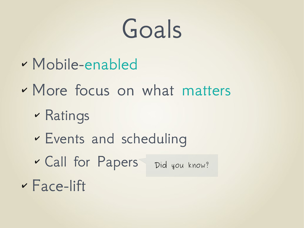
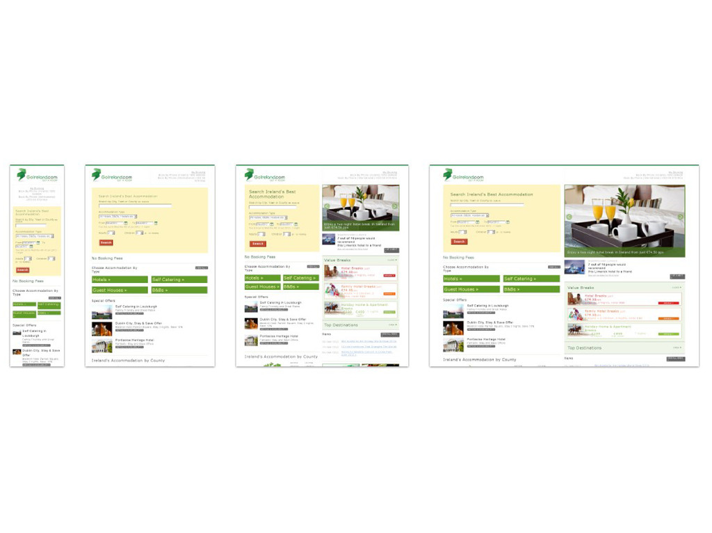
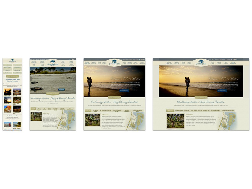
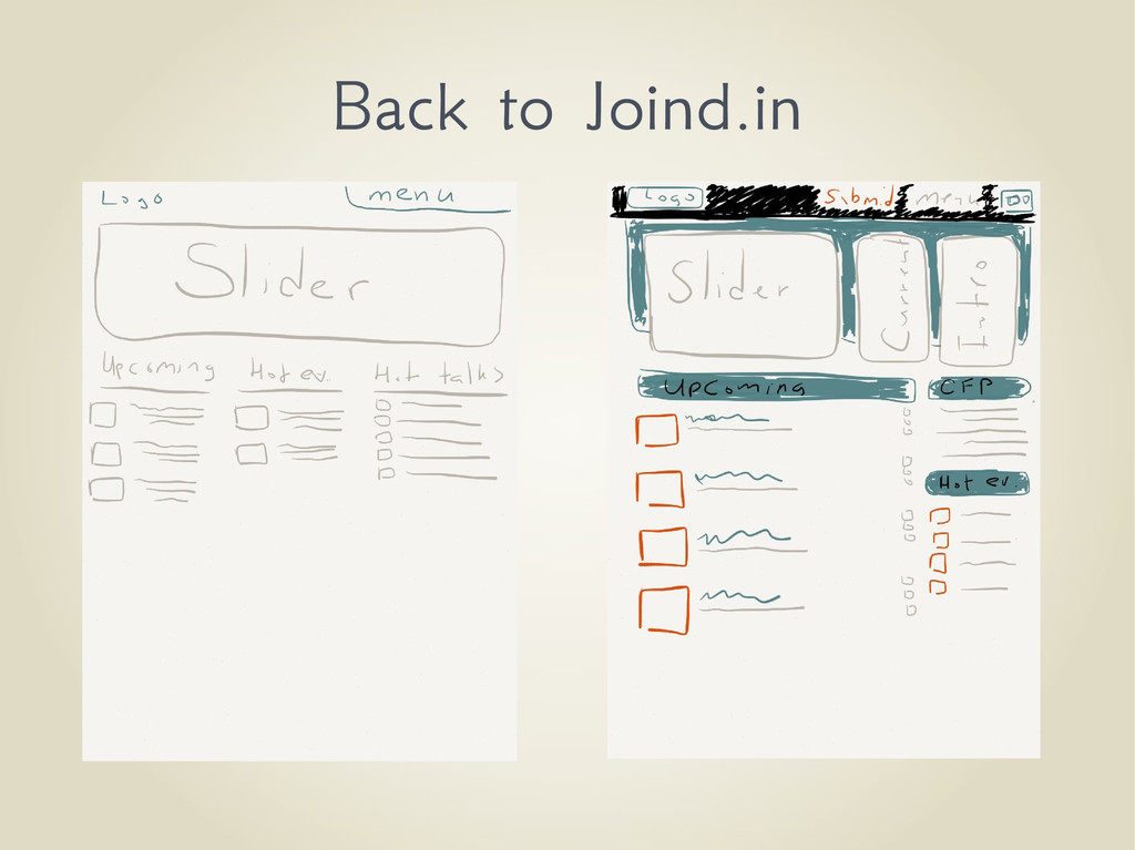
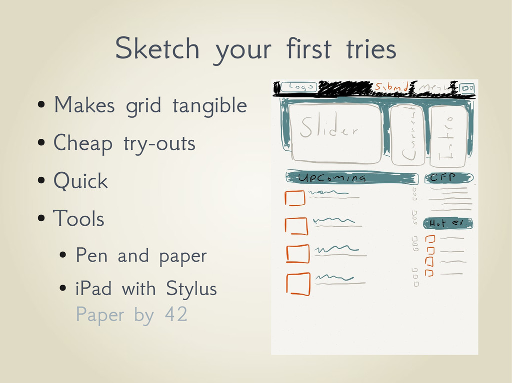
Designing and creating a website that is suitable for both the desktop and mobile is a unique kind of challenge. In the past years we have seen the rise of Responsive Design; a methodology and mindset on how to make a website suitable for both platforms. During this talk we'll design a new website using Responsive Design and show what considerations and design decisions are to be encountered along the way.

Mike van Riel

July 19, 2012
Tweet

More Decks by Mike van Riel

Other Decks in Technology

Transcript

  1. Going Responsive
    for Developers

    View Slide

  2. Mike van Riel
    @mvriel
    M
    e

    View Slide

  3. I'm not a
    Designer

    View Slide

  4. What is
    Responsive

    View Slide

  5. “Responsive design does not
    replace Mobile applications but
    empowers the user to experience
    your website from any device.”
    -- Me

    View Slide

  6. View Slide

  7. Most time is spent
    thinking
    and not coding

    View Slide

  8. Primary aids
    ✔ Media queries (CSS)
    ✔ Grid layouts
    ✔ Adapting images

    View Slide

  9. Let's learn by example

    View Slide

  10. Now

    View Slide

  11. Goals
    ✔ Mobile-enabled
    ✔ More focus on what matters
    ✔ Ratings
    ✔ Events and scheduling
    ✔ Call for Papers
    ✔ Face-lift
    Did you know?

    View Slide

  12. Find
    inspiration

    View Slide

  13. Inspiration
    ✔ Look at the competition
    ✔ What can you improve on that?
    ✔ Look at existing websites
    ✔ http://mediaqueri.es/
    ✔ http://templatemonster.com
    ✔ http://www.4templates.com/

    View Slide

  14. View Slide

  15. View Slide

  16. Think about your Grid
    1. Divide into contextual
    rows
    2. Identify content
    blocks per context
    3. Divide into columns
    4. Consider order of
    importance

    View Slide

  17. Example layouts

    View Slide

  18. “I did get Tom Hanks to say,
    Life is just a box of chocolates.”
    -- James Lipton

    View Slide

  19. Back to Joind.in

    View Slide

  20. Exercise

    View Slide

  21. Find the grid in the website
    http://joind.in

    View Slide

  22. Design

    View Slide

  23. Sketch your first tries
    ● Makes grid tangible
    ● Cheap try-outs
    ● Quick
    ● Tools
    ● Pen and paper
    ● iPad with Stylus
    Paper by 42

    View Slide

  24. “The best ideas come to
    you under the shower
    or on the toilet”
    -- Me

    View Slide

  25. Inkscape

    View Slide

  26. Demo
    This must go terribly terribly wrong

    View Slide

  27. Back to Joind.in II

    View Slide

  28. Use a CSS
    Framework

    View Slide

  29. Twitter Bootstrap 2
    960gs
    Blueprint
    YUI
    and many more

    View Slide

  30. Each of these combine
    the experience of
    several designers

    View Slide

  31. Example: Twitter Bootstrap
    ● Combines a CSS and JS Framework
    ● Responsive design is a first citizen
    ● Provides elements with strong symbiosis
    ● Less bootstrapping yourself

    View Slide

  32. Needs HTML 5


    ...


    ...

    View Slide

  33. Defining a row

    ...
    ...


    ...
    ...

    View Slide

  34. Defining columns

    ...
    ...


    ...
    ...

    12 Columns

    View Slide

  35. Nesting columns


    ...
    ...


    ...


    ...
    ...


    ...

    View Slide

  36. Two column example

    ...


    ...
    ...


    ...


    ...
    ...

    View Slide

  37. Three column example

    ...


    ...
    ...
    ...


    ...


    ...
    ...
    ...

    View Slide

  38. Modern example

    ...


    ...
    ...
    ...
    ...


    ...
    ...
    ...


    ...


    ...
    ...
    ...
    ...


    ...
    ...
    ...

    View Slide

  39. Sidebar example

    ...


    ...
    ...


    ...
    ...


    ...


    ...


    ...
    ...


    ...
    ...


    ...

    View Slide

  40. Responsiveness
    ● Grids help to collapse
    elements
    ● Think about which to
    throw away
    ● Consider which elements
    should be dominant
    ● Scrolling is good;
    clicking not so much

    View Slide

  41. More responsiveness
    ● Do not forget to link to bootstrap-responsive.css!
    ● Use media queries for conditional CSS
    @media (min­width: 980px)
    {

    }

    View Slide

  42. Back to Joind.in III

    View Slide

  43. Back to Joind.in IV

    View Slide

  44. Is there time
    for a Demo?

    View Slide

  45. Time's up.
    (What a shame)

    View Slide

  46. http://london2012.live.symfony.com/
    Symfony Live London 2012

    View Slide

  47. Questions?
    Y
    es,
    you!
    Please rate this talk
    http://joind.in/6711
    Please rate this talk
    http://joind.in/6711

    View Slide

  48. ➔Navigation http://bradfrostweb.com/blog/web/responsive-nav-patterns/
    ➔Layout types http://www.lukew.com/ff/entry.asp?1514
    ➔Screen sizes
    http://spirelightmedia.com/responsive-design-device-resolution-reference
    ➔CSS Frameworks
    ➔ http://twitter.github.com/bootstrap/
    ➔ http://960.gs/
    ➔ http://blueprintcss.org/
    ➔ http://yuilibrary.com/
    ➔Examples
    ➔ http://responsive.is/
    ➔ http://mediaqueri.es/
    Resources
    Please rate this talk
    http://joind.in/6711
    Please rate this talk
    http://joind.in/6711

    View Slide