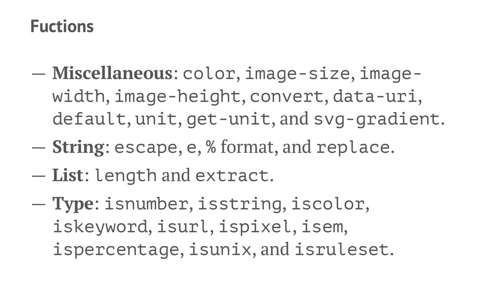
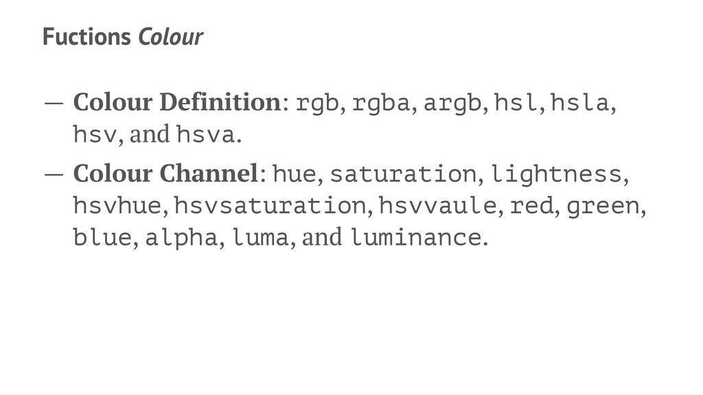
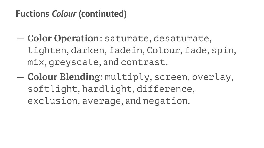
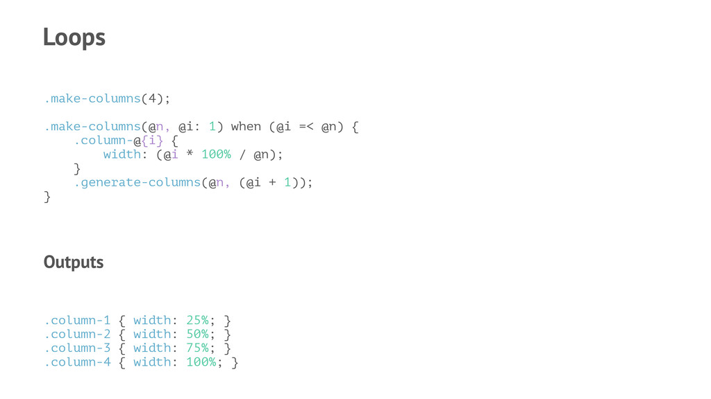
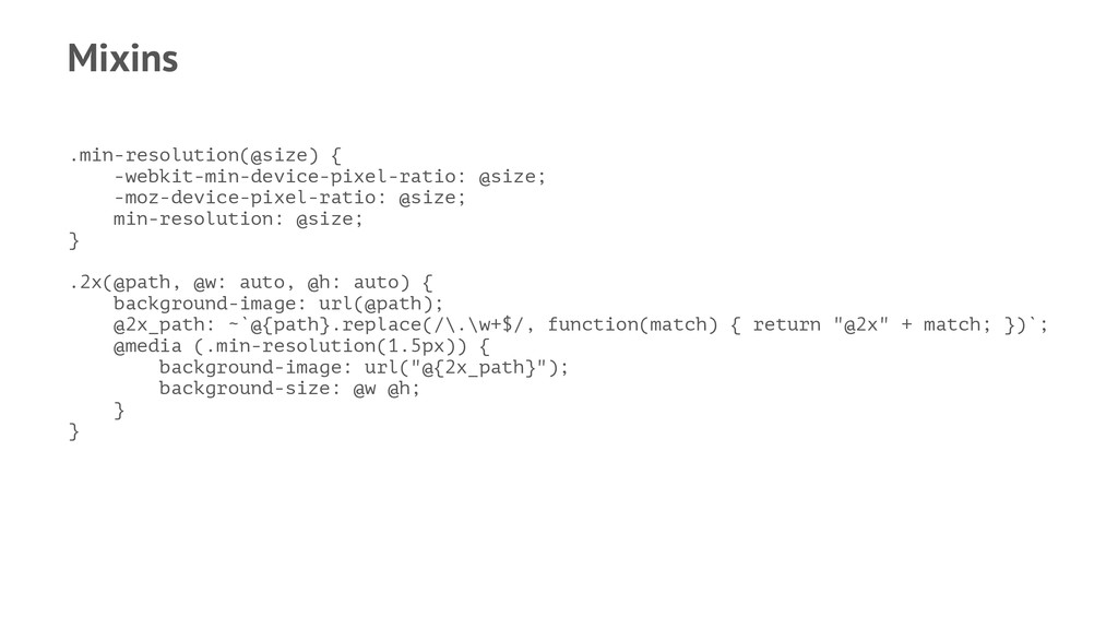
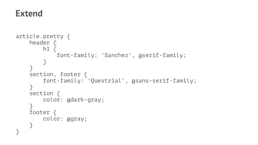
default, unit, get-unit, and svg-gradient. — String: escape, e, % format, and replace. — List: length and extract. — Type: isnumber, isstring, iscolor, iskeyword, isurl, ispixel, isem, ispercentage, isunix, and isruleset.
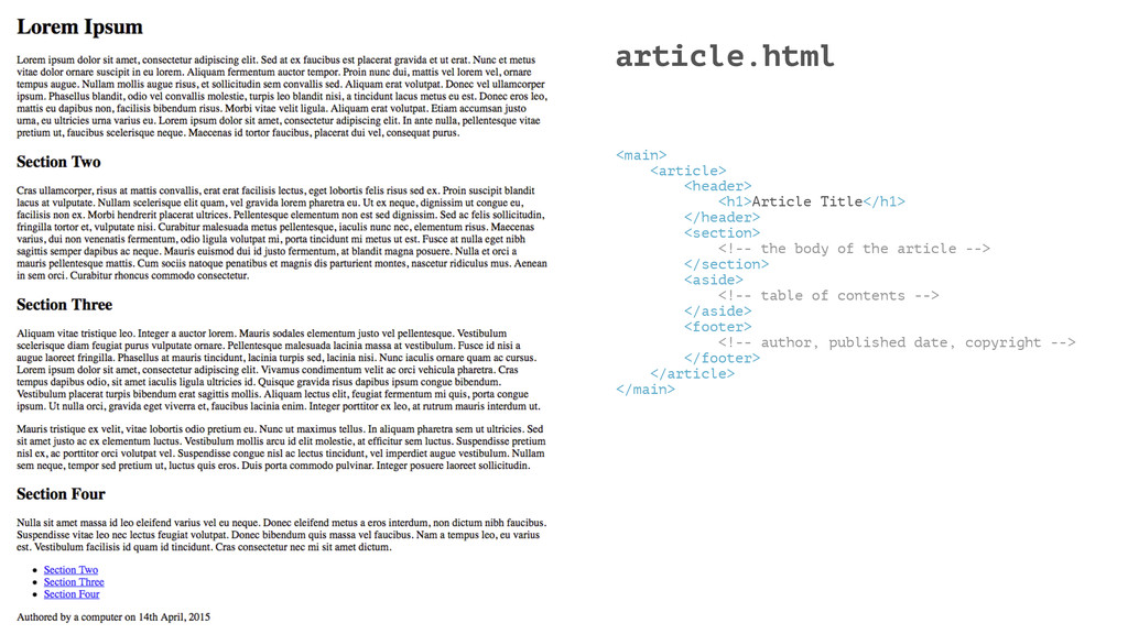
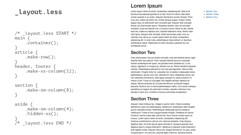
body of the article --> </section> <aside> <!-- table of contents --> </aside> <footer> <!-- author, published date, copyright --> </footer> </article> </main>
 myles
myles
 tatsuhiro
 guvalif
 daitasu
 yukukotani
 oku053
 makicamel
 panda728
 ioki
ioki
 nrslib
 suikabar
 rollbear
 blueswen
 holman
 tammyeverts
 ipullrank
 iamctodd
 bkeepers
 mlcsv
mlcsv
 irinanazarova
 csswizardry
 jcasabona
 ivargrimstad
 carmenintech
 cromwellryan
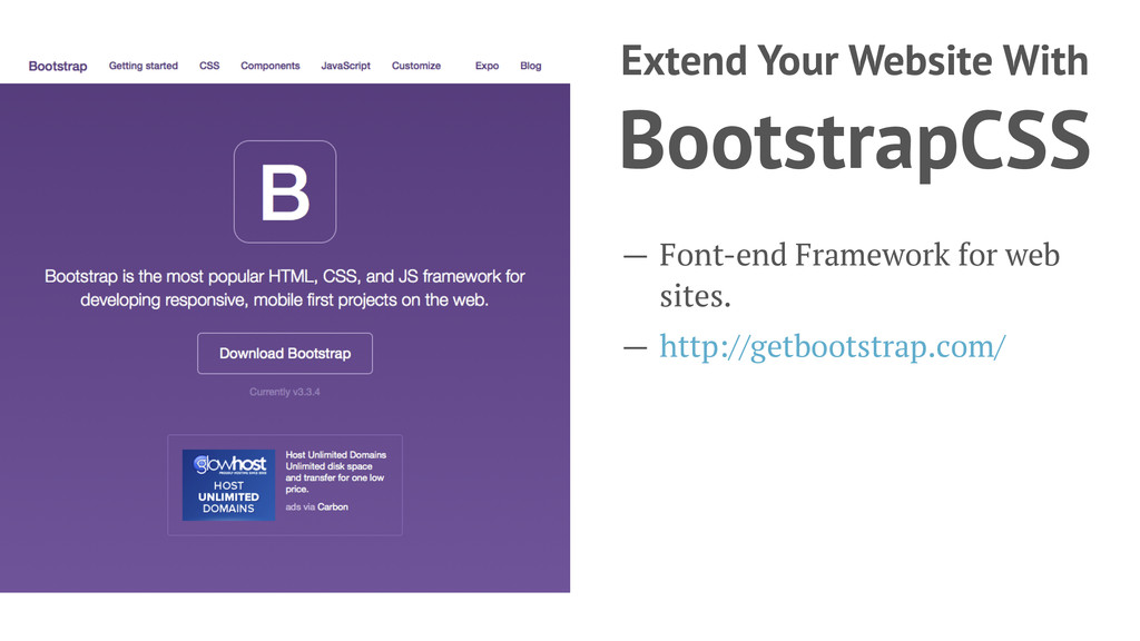
![LessCSS Myles Braithwaite http://myles.coffee | [email protected] | @MylesB](https://files.speakerdeck.com/presentations/03671844abba44039e21ebe508a43522/slide_0.jpg)
![Contact Me — Web: http://myles.coffee/ — Email: [email protected] — Twitter:](https://files.speakerdeck.com/presentations/03671844abba44039e21ebe508a43522/slide_44.jpg)