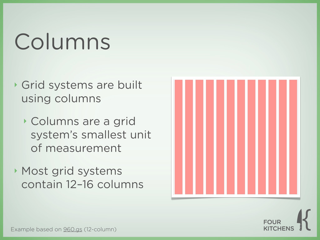
History of the grid ‣ The practice of using a grid to guide design and page layout is nearly a century old ‣ In the 1910s and 1920s, ornamental design gave way to Rationalism and New Objectivity ‣ This shift in design was part of a much larger movement towards function over form ‣ Helvetica typeface and Bauhaus architecture
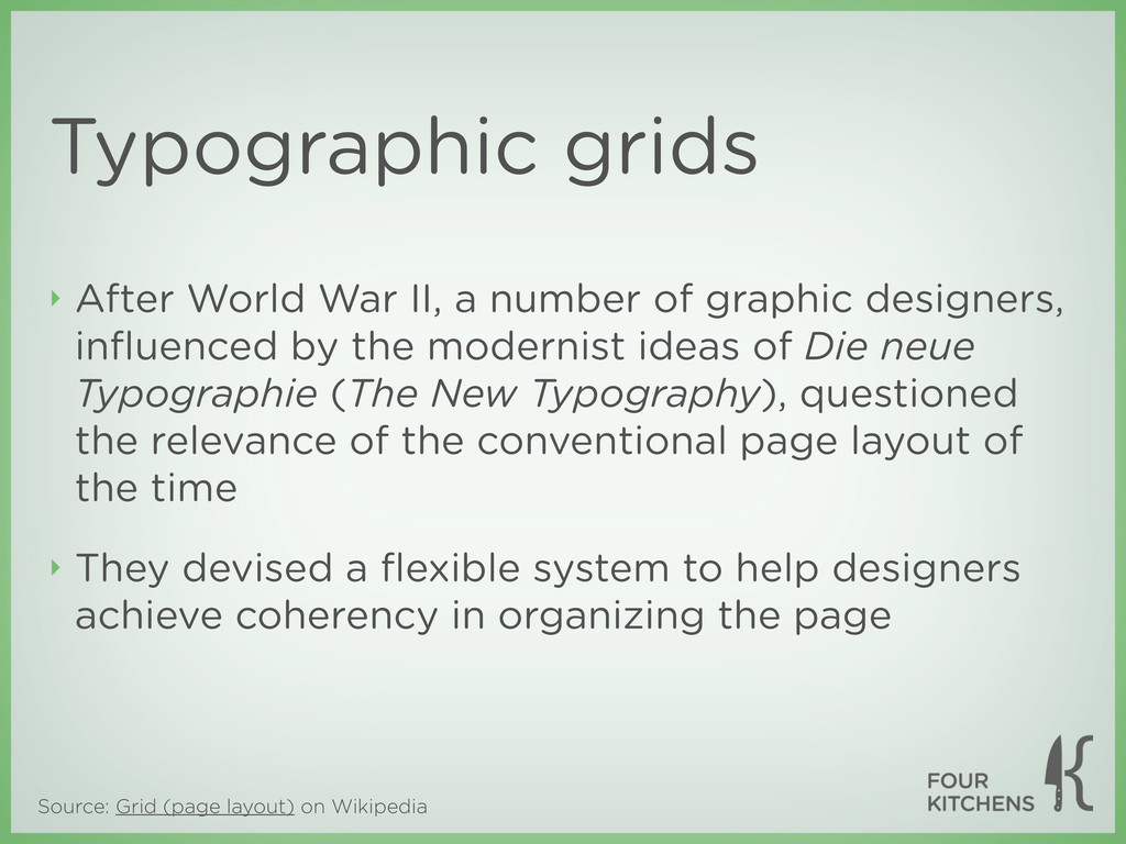
II, a number of graphic designers, influenced by the modernist ideas of Die neue Typographie (The New Typography), questioned the relevance of the conventional page layout of the time ‣ They devised a flexible system to help designers achieve coherency in organizing the page Typographic grids
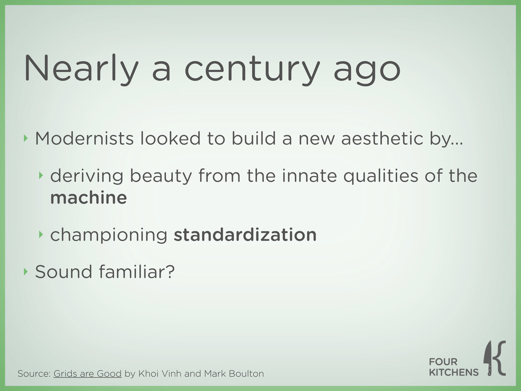
Nearly a century ago ‣ Modernists looked to build a new aesthetic by... ‣ deriving beauty from the innate qualities of the machine ‣ championing standardization ‣ Sound familiar?
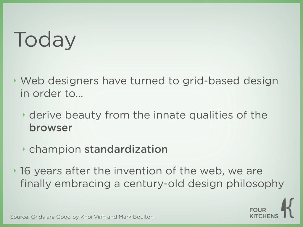
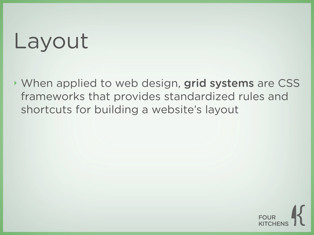
Today ‣ Web designers have turned to grid-based design in order to... ‣ derive beauty from the innate qualities of the browser ‣ champion standardization ‣ 16 years after the invention of the web, we are finally embracing a century-old design philosophy
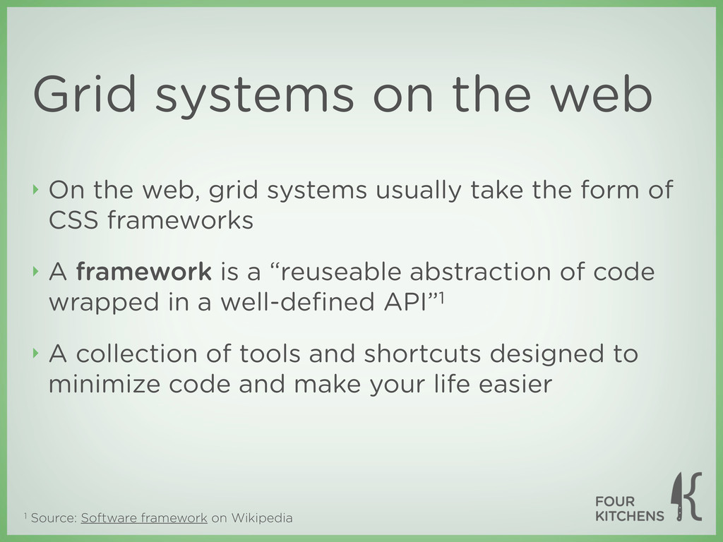
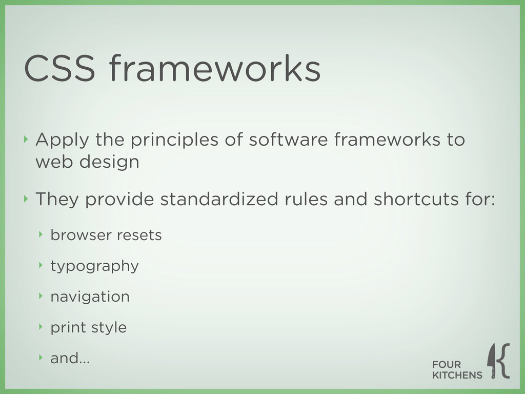
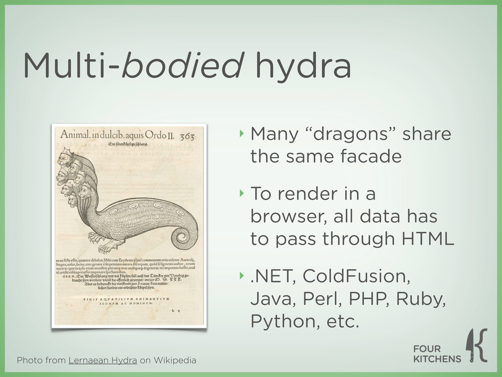
web ‣ On the web, grid systems usually take the form of CSS frameworks ‣ A framework is a “reuseable abstraction of code wrapped in a well-defined API”1 ‣ A collection of tools and shortcuts designed to minimize code and make your life easier
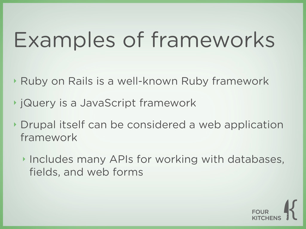
Ruby framework ‣ jQuery is a JavaScript framework ‣ Drupal itself can be considered a web application framework ‣ Includes many APIs for working with databases, fields, and web forms
providing built-in support for noncompliant browsers ‣ Minimize Internet Explorer hacks in your layout ‣ A well-tested grid system will rarely be the source of your problems
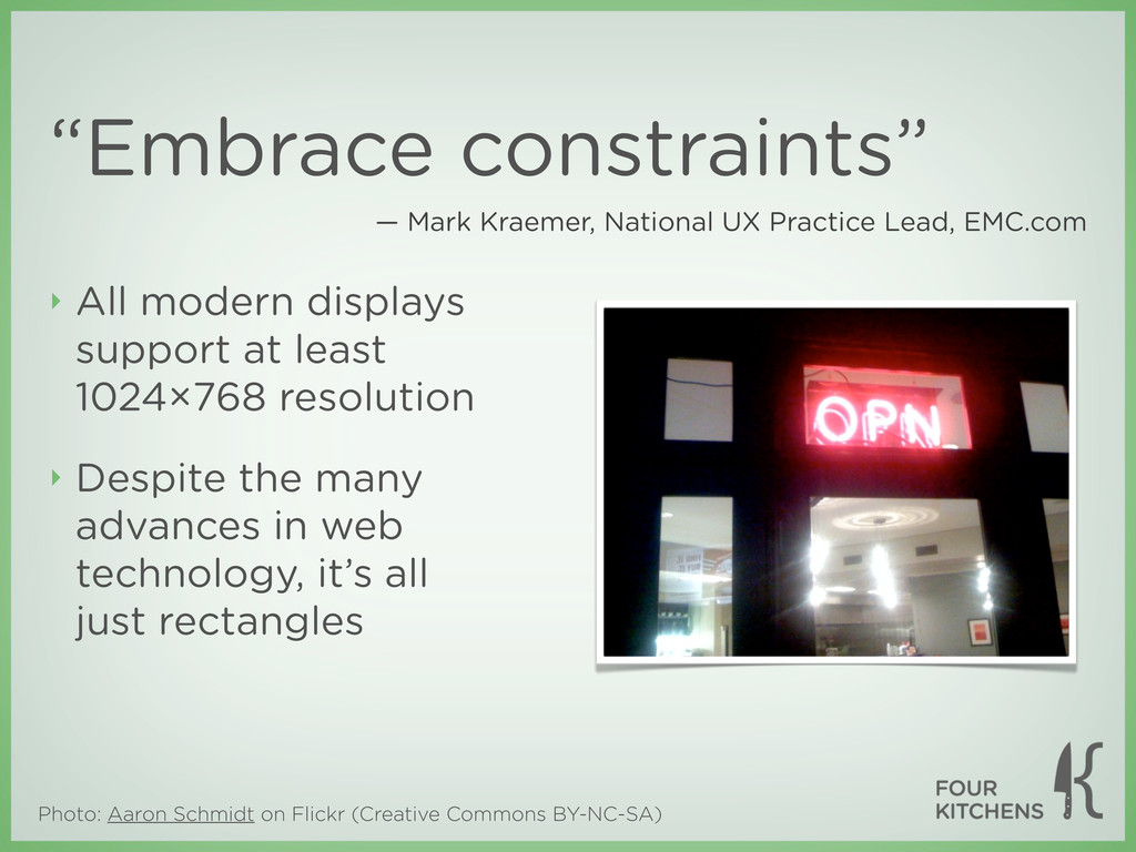
‣ All modern displays support at least 1024×768 resolution ‣ Despite the many advances in web technology, it’s all just rectangles — Mark Kraemer, National UX Practice Lead, EMC.com
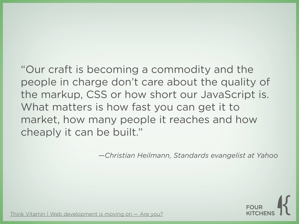
you? “Our craft is becoming a commodity and the people in charge don’t care about the quality of the markup, CSS or how short our JavaScript is. What matters is how fast you can get it to market, how many people it reaches and how cheaply it can be built.” —Christian Heilmann, Standards evangelist at Yahoo
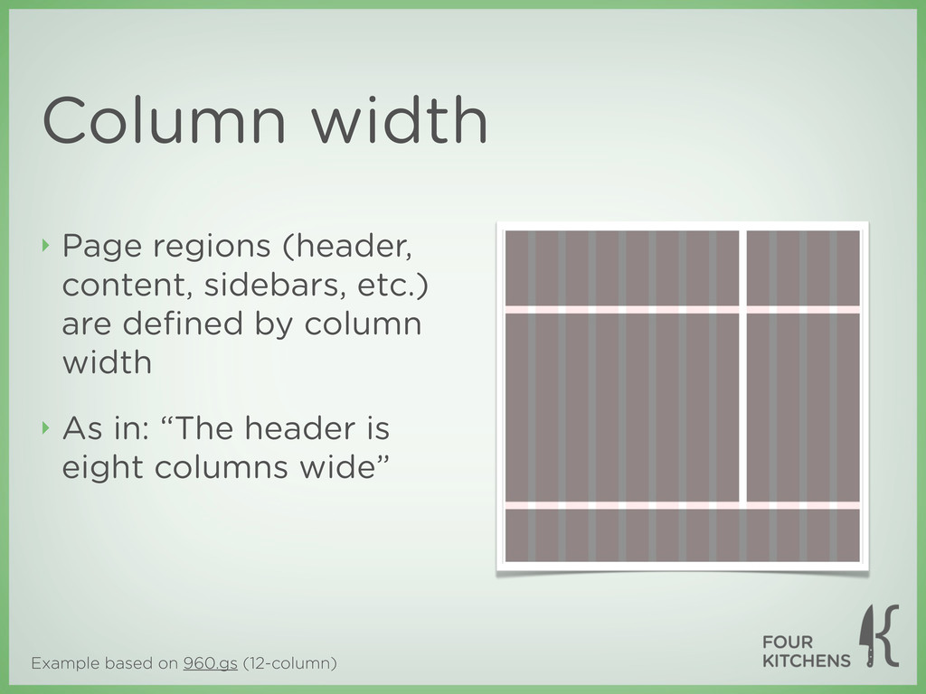
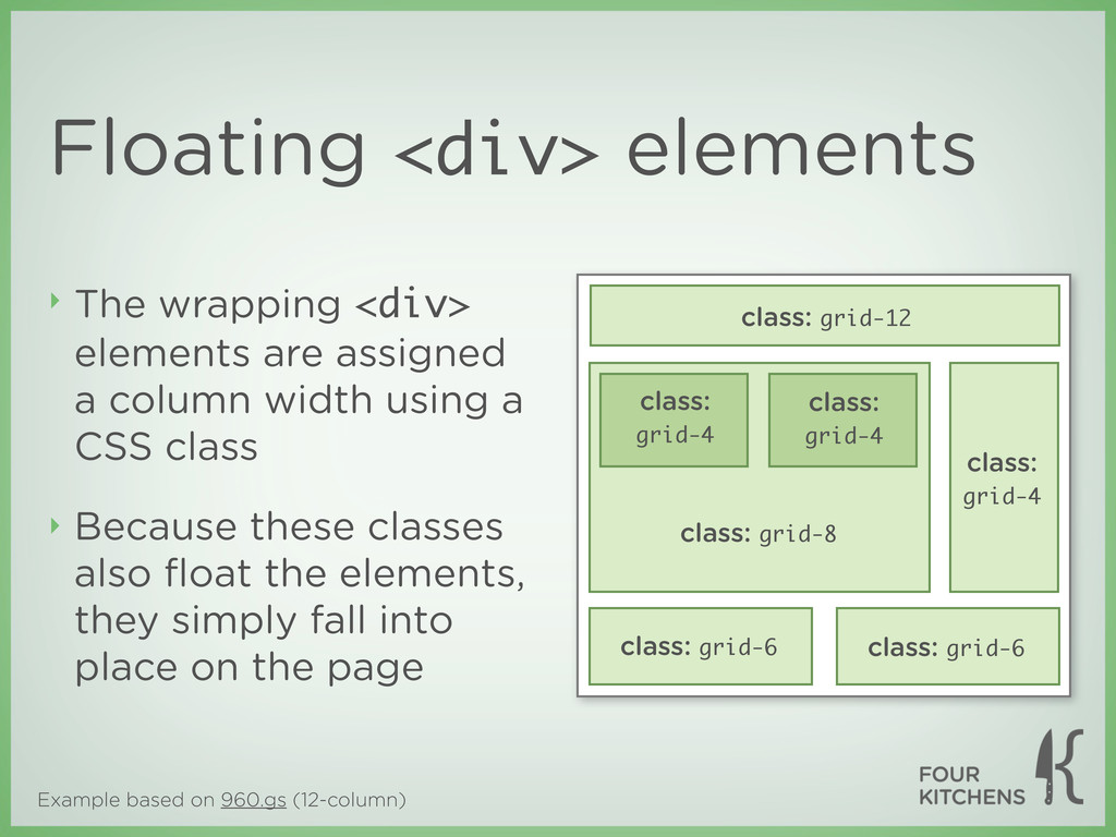
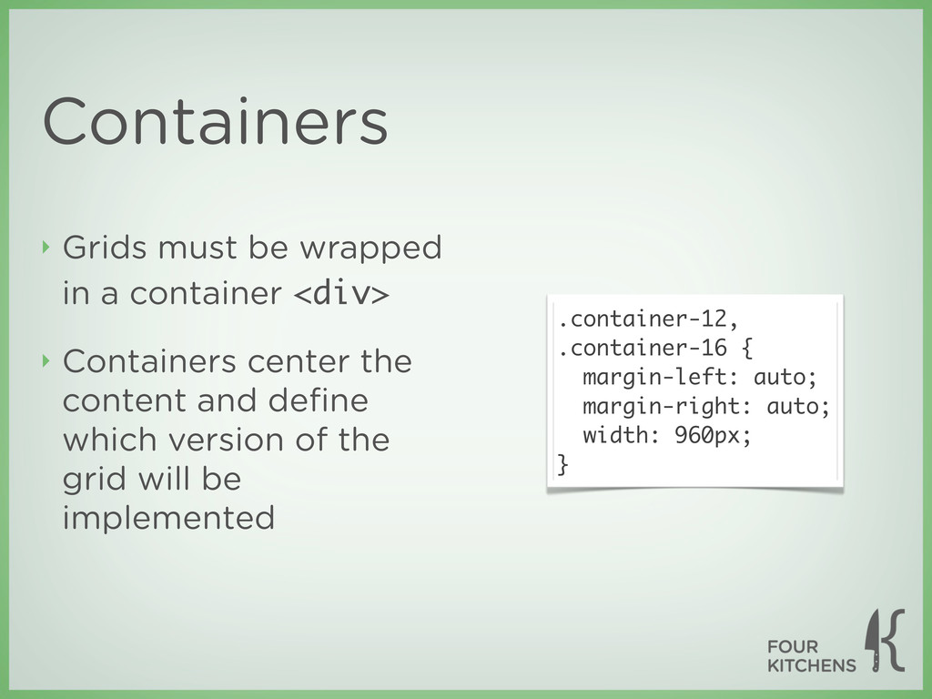
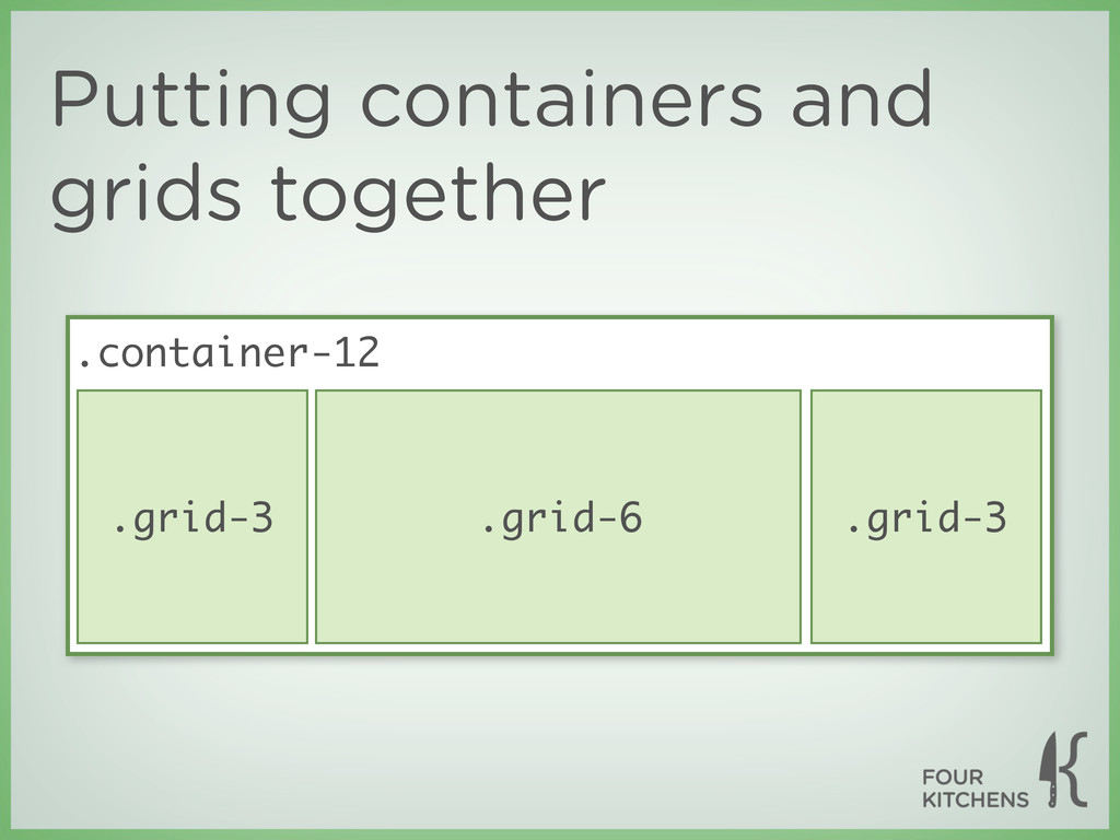
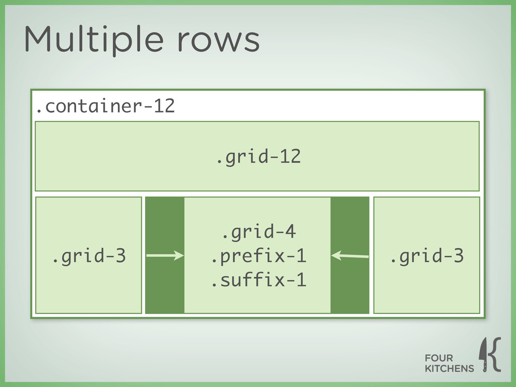
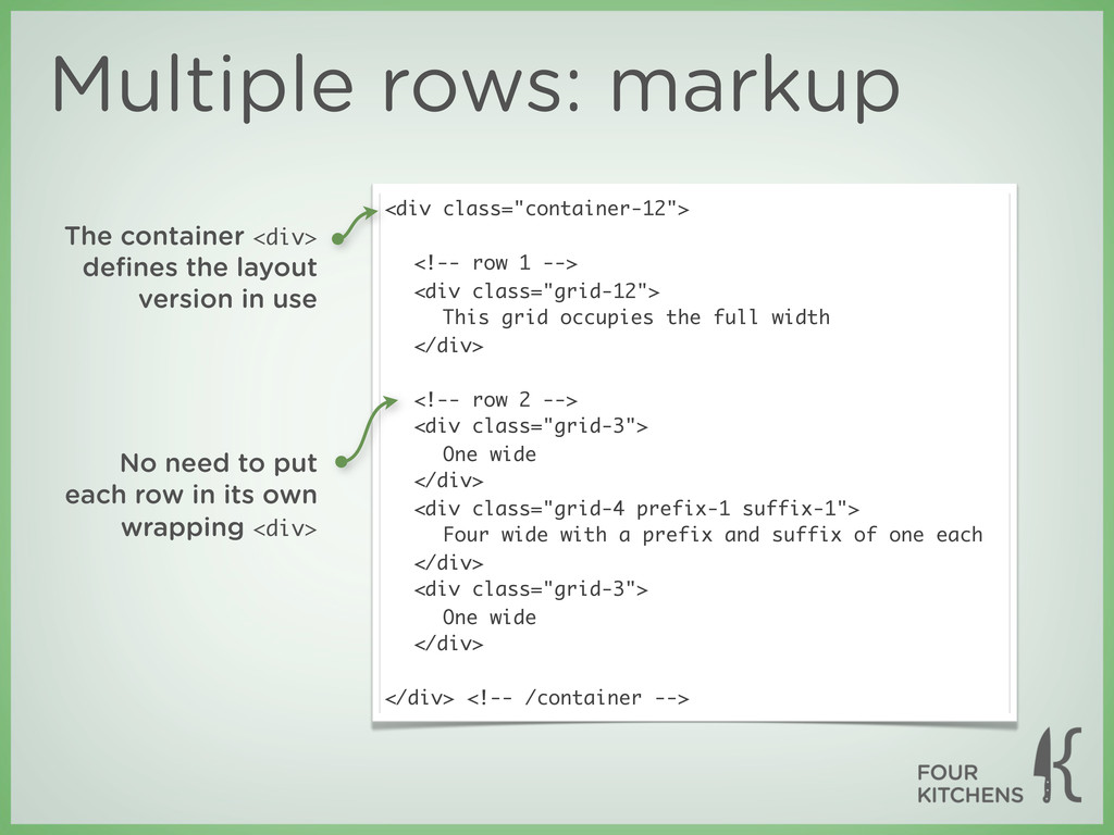
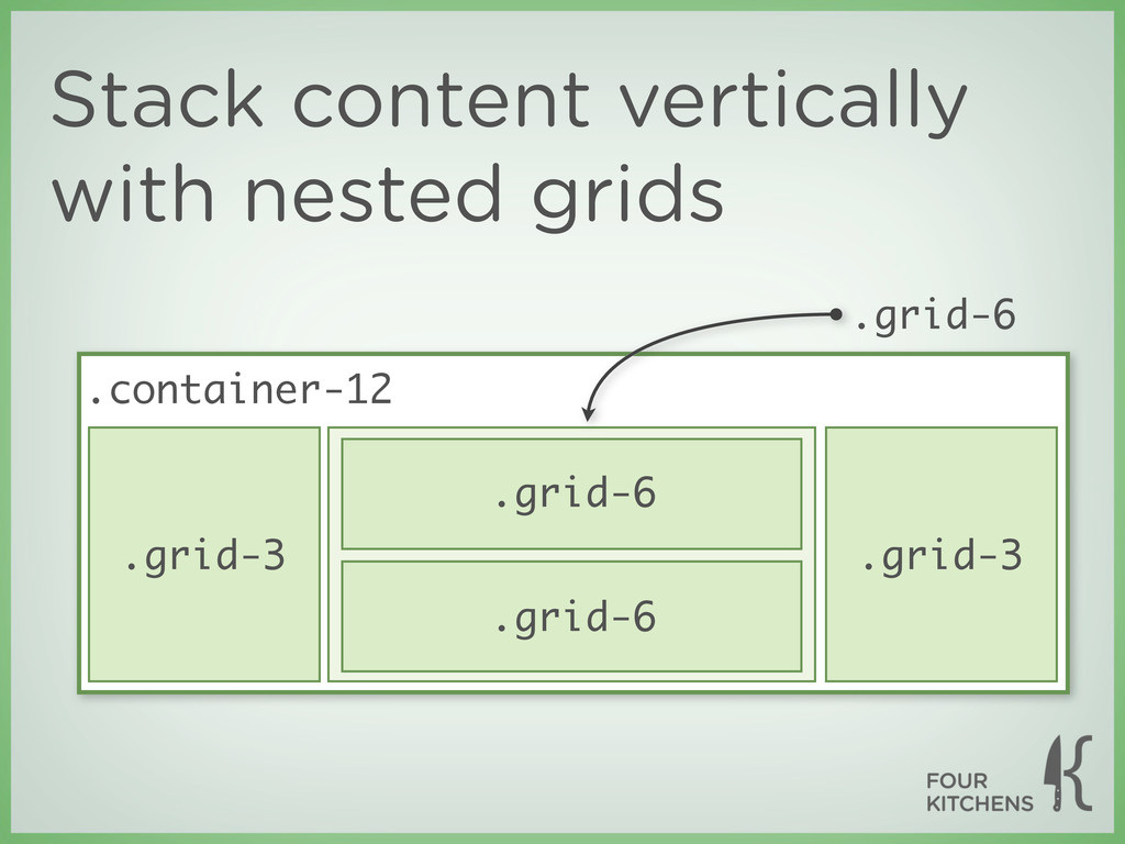
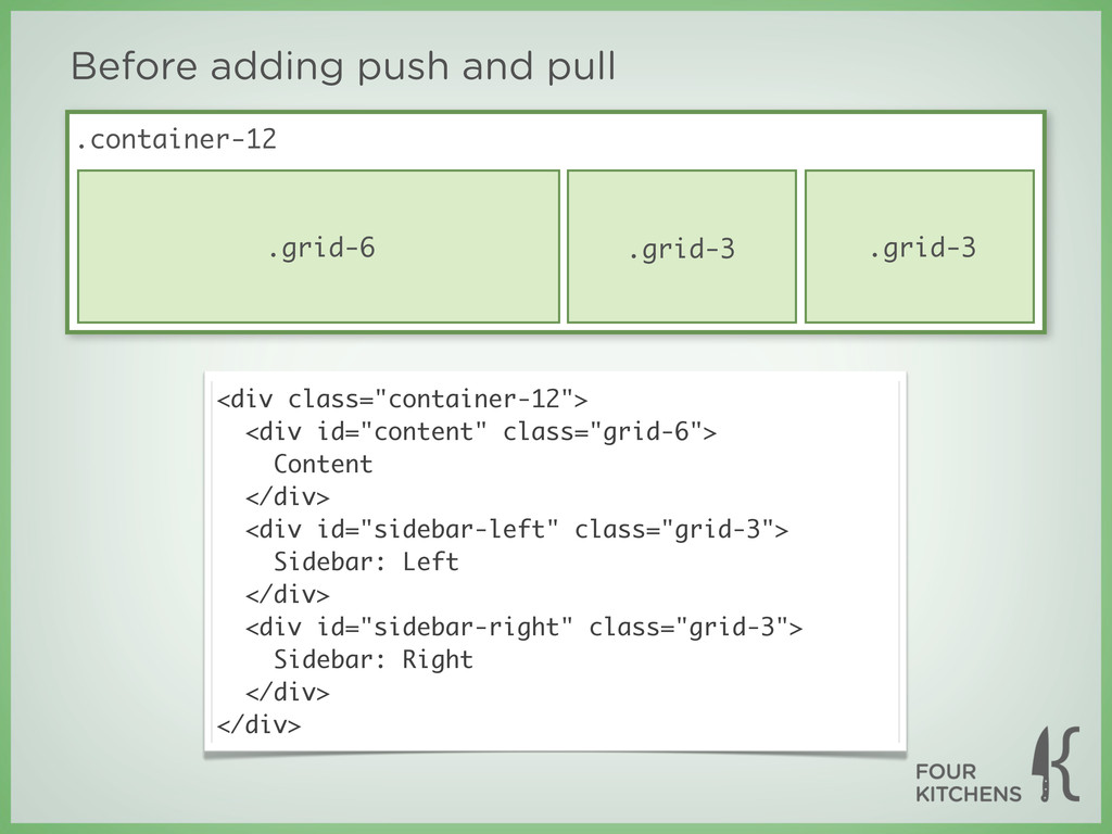
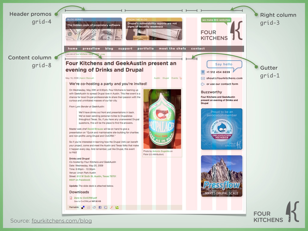
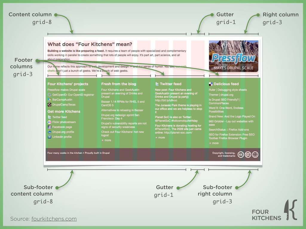
layout is wrapped inside a single <div> element ‣ <div> elements wrap the page regions and define their widths according to the number of columns they span ‣ These <div> elements may be nested to create regions within regions
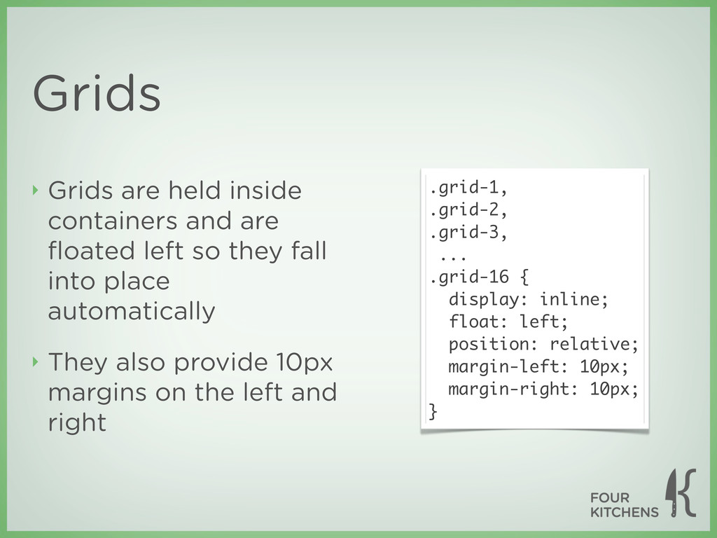
wrapping <div> elements are assigned a column width using a CSS class ‣ Because these classes also float the elements, they simply fall into place on the page class: grid-12 class: grid-8 class: grid-4 class: grid-4 class: grid-4 class: grid-6 class: grid-6
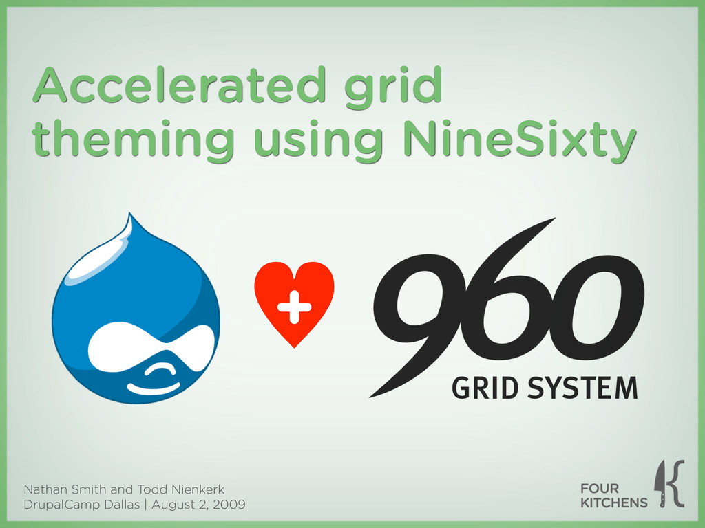
as the 960 Grid System — was created by Nathan Smith in order to “streamline web development workflow” ‣ It’s both a prototyping and development framework ‣ “The premise of the system is ideally suited to rapid prototyping, but it would work equally well when integrated into a production environment.”
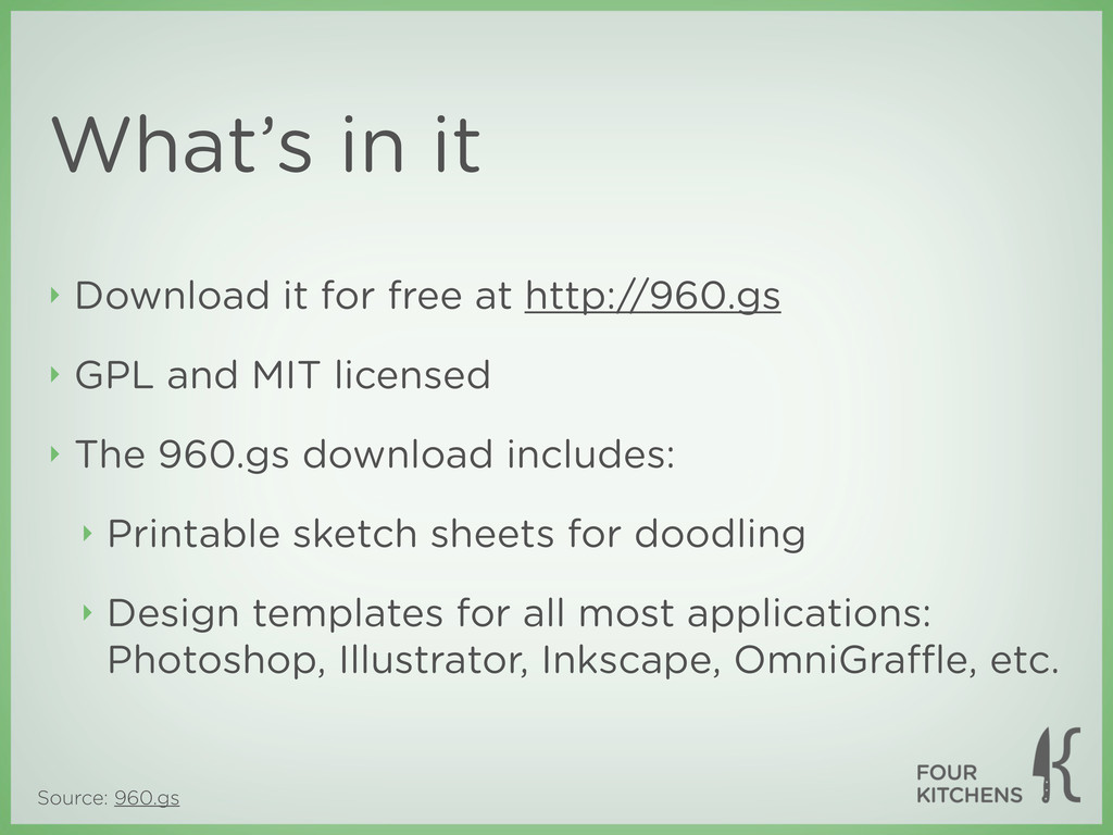
GPL and MIT licensed ‣ The 960.gs download includes: ‣ Printable sketch sheets for doodling ‣ Design templates for all most applications: Photoshop, Illustrator, Inkscape, OmniGraffle, etc. What’s in it
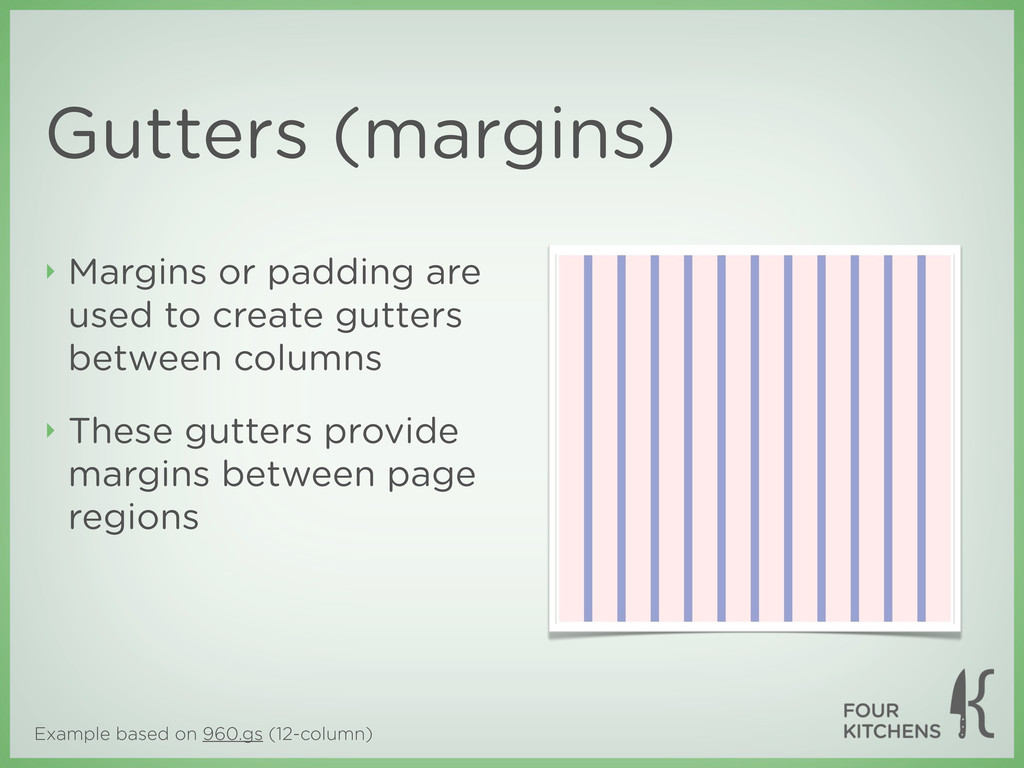
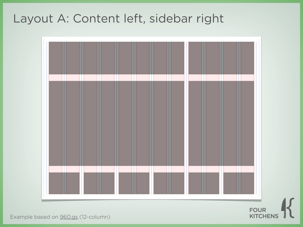
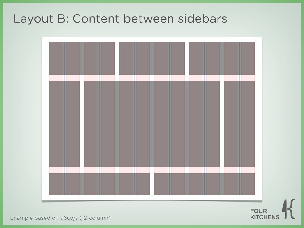
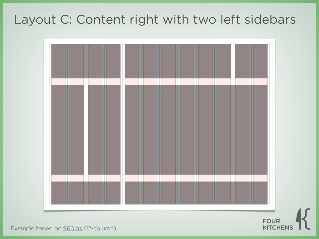
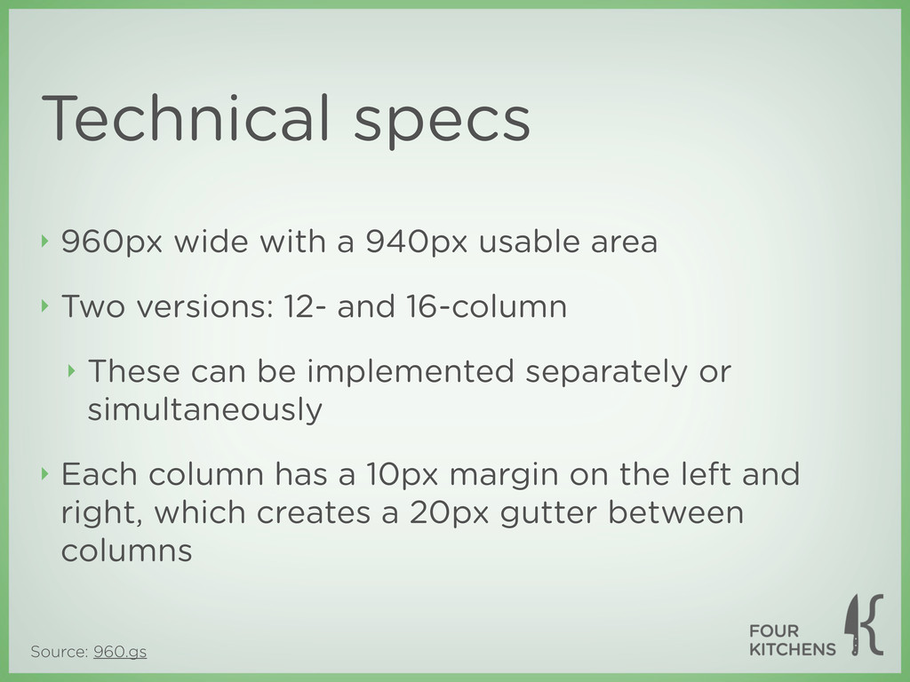
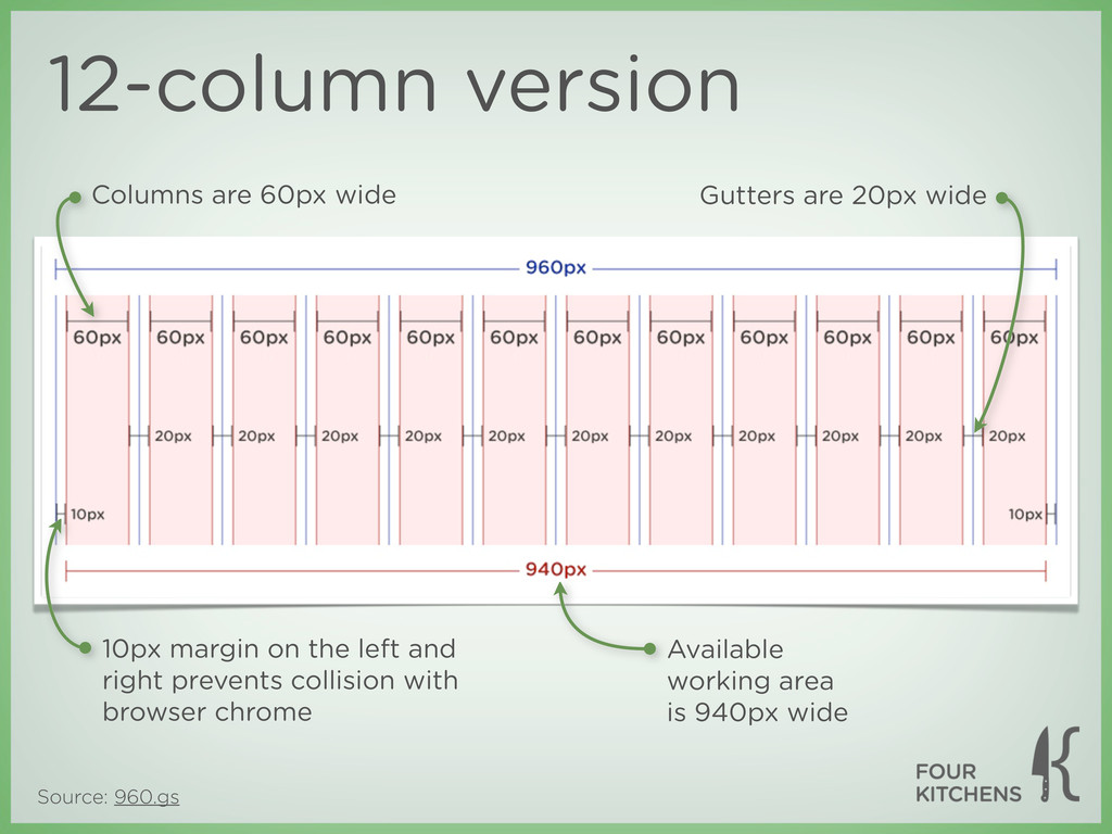
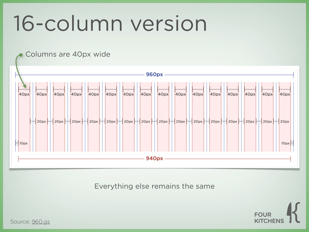
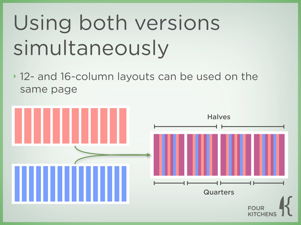
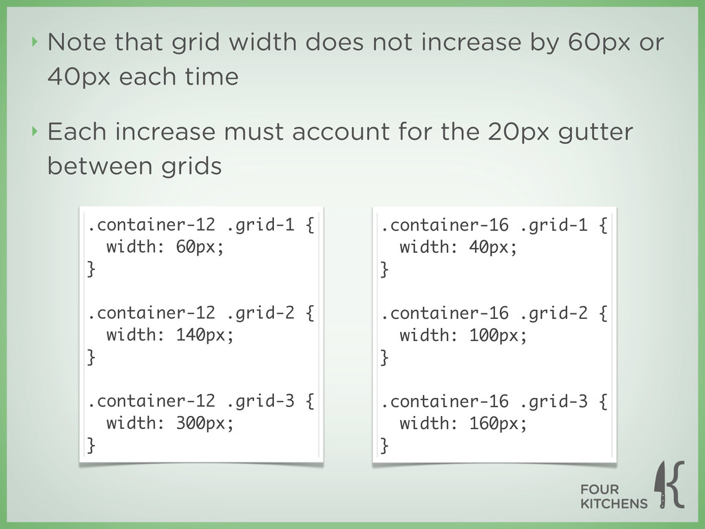
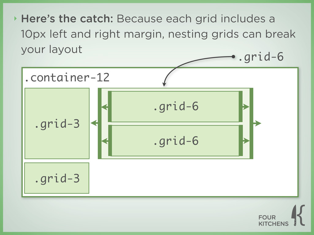
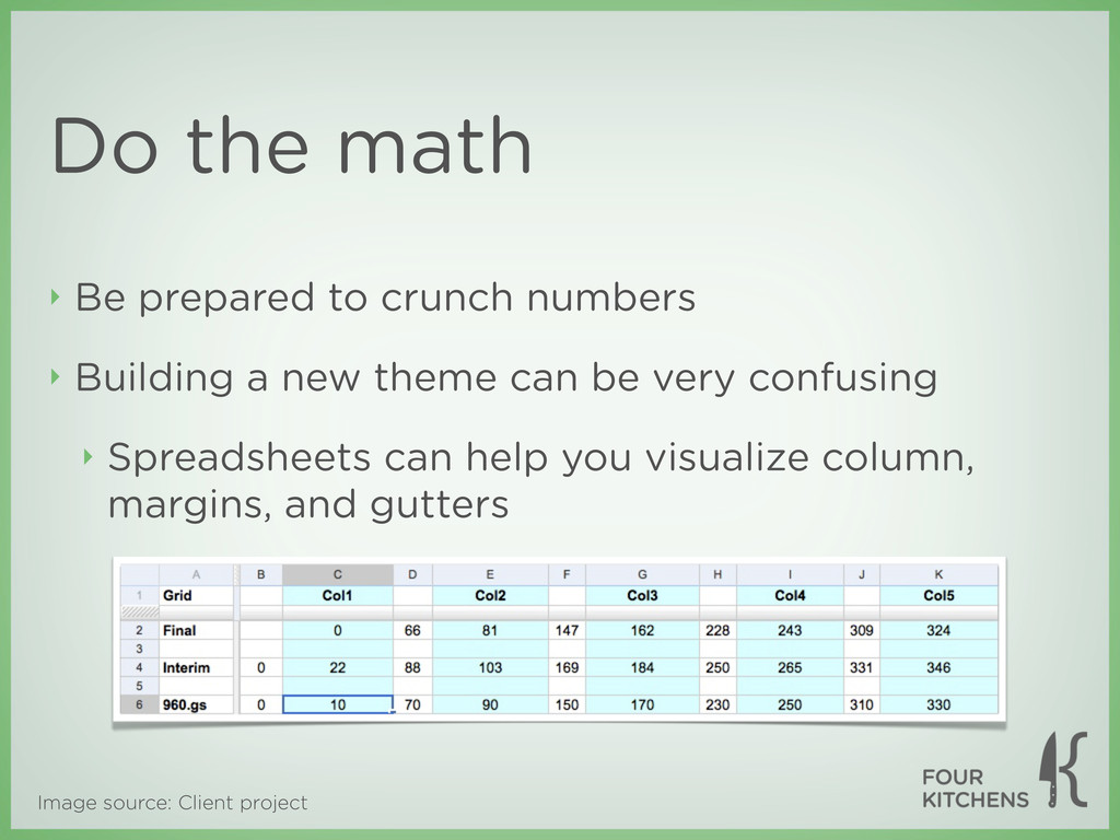
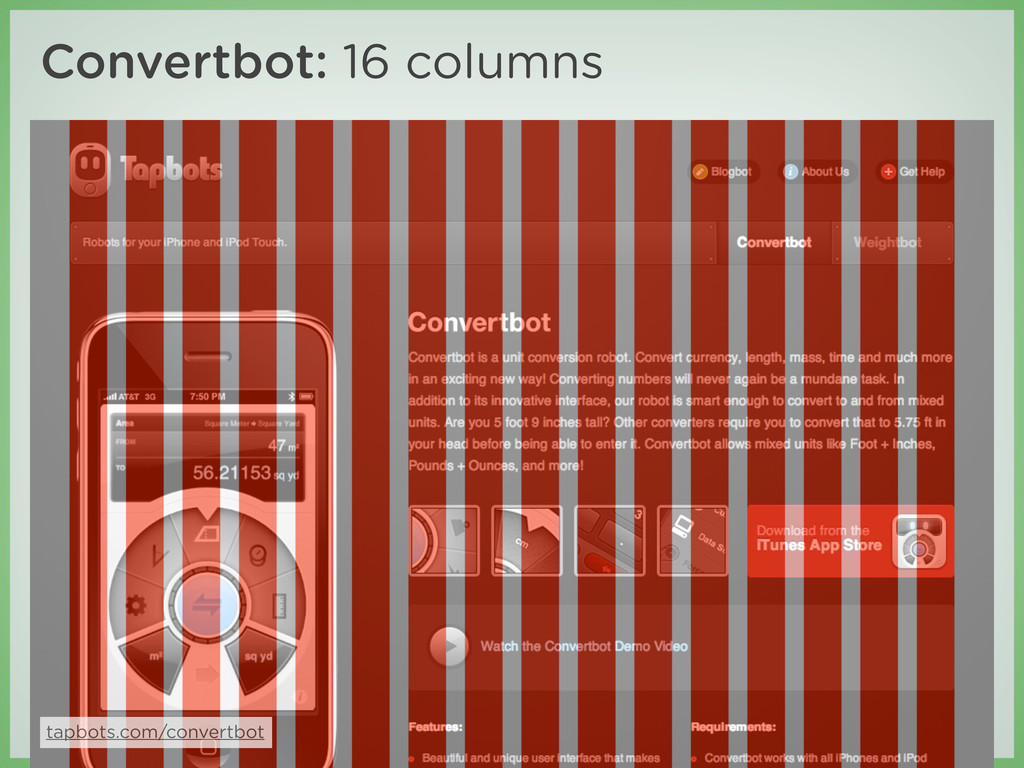
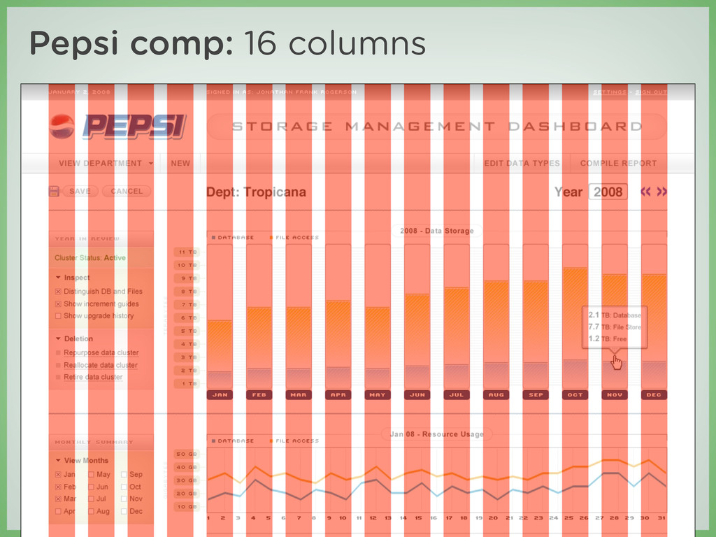
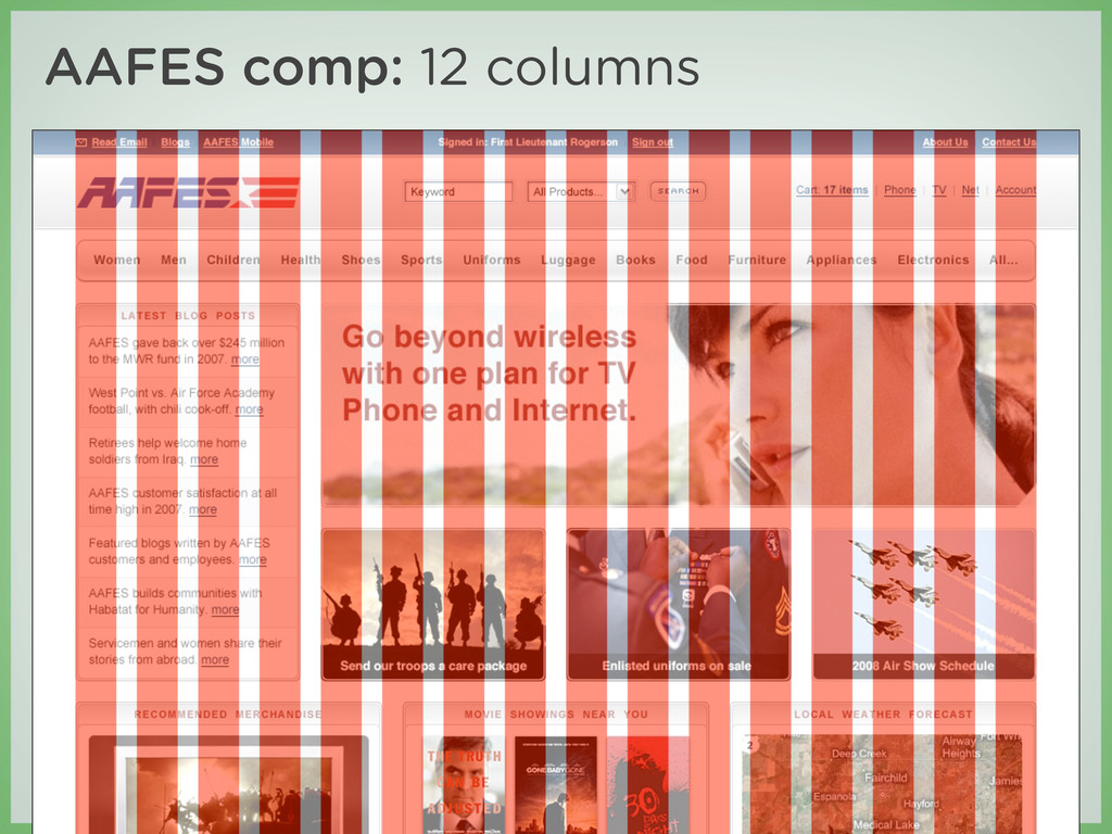
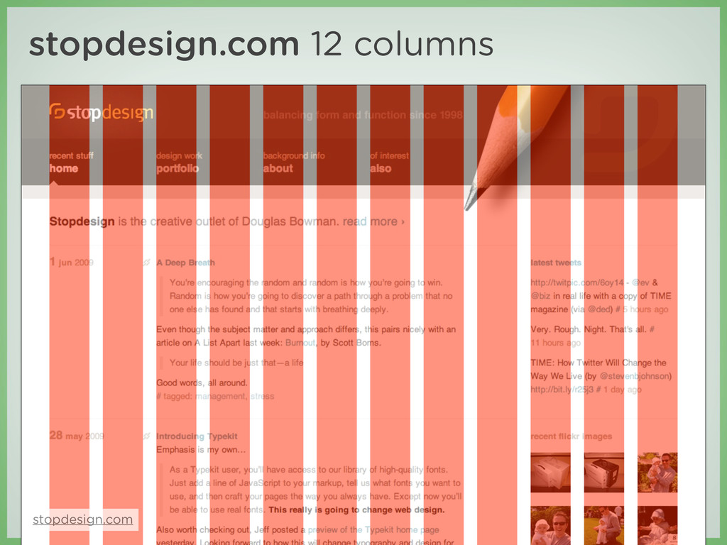
usable area ‣ Two versions: 12- and 16-column ‣ These can be implemented separately or simultaneously ‣ Each column has a 10px margin on the left and right, which creates a 20px gutter between columns
‣ Containers center the content and define which version of the grid will be implemented .container-12, .container-16 { margin-left: auto; margin-right: auto; width: 960px; }
left so they fall into place automatically ‣ They also provide 10px margins on the left and right .grid-1, .grid-2, .grid-3, ... .grid-16 { display: inline; float: left; position: relative; margin-left: 10px; margin-right: 10px; }
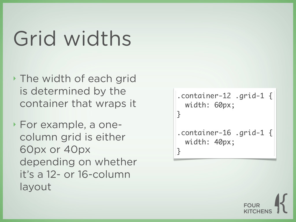
by the container that wraps it ‣ For example, a one- column grid is either 60px or 40px depending on whether it’s a 12- or 16-column layout .container-12 .grid-1 { width: 60px; } .container-16 .grid-1 { width: 40px; }
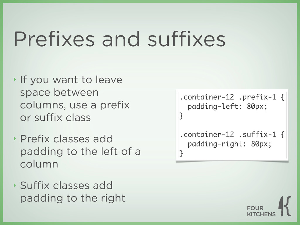
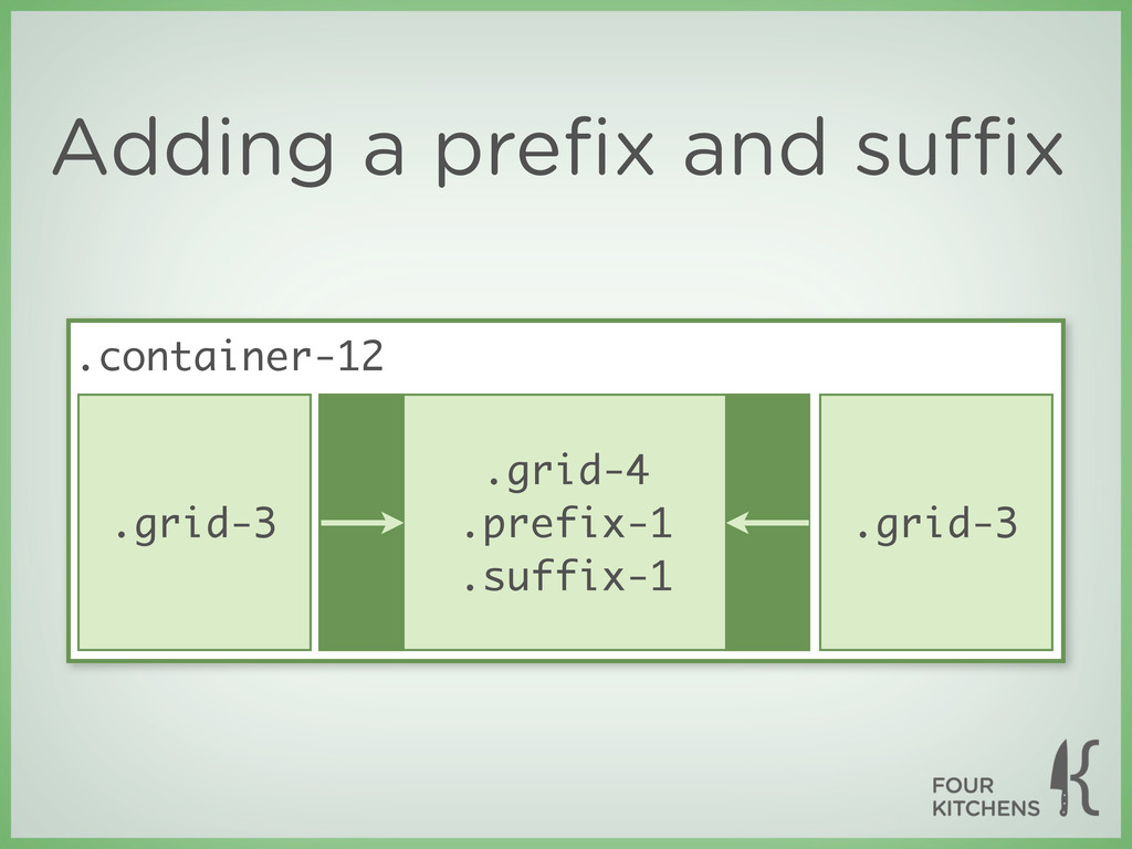
between columns, use a prefix or suffix class ‣ Prefix classes add padding to the left of a column ‣ Suffix classes add padding to the right .container-12 .prefix-1 { padding-left: 80px; } .container-12 .suffix-1 { padding-right: 80px; }
class="grid-12"> This grid occupies the full width </div> <!-- row 2 --> <div class="grid-3"> One wide </div> <div class="grid-4 prefix-1 suffix-1"> Four wide with a prefix and suffix of one each </div> <div class="grid-3"> One wide </div> </div> <!-- /container --> No need to put each row in its own wrapping <div> The container <div> defines the layout version in use
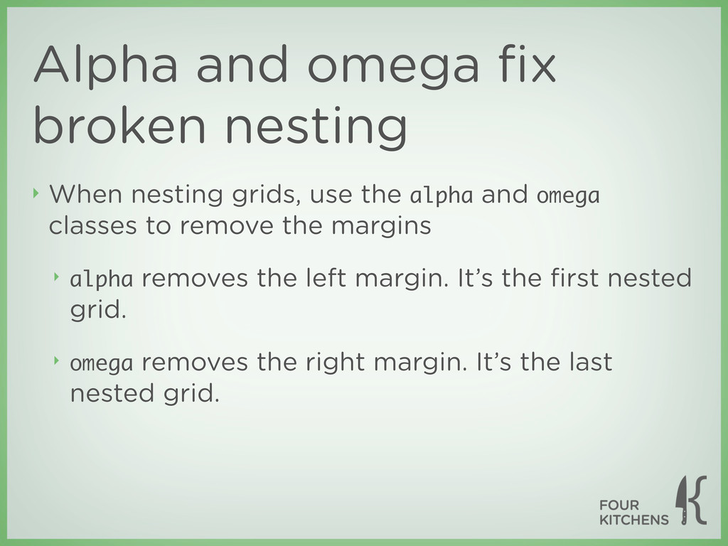
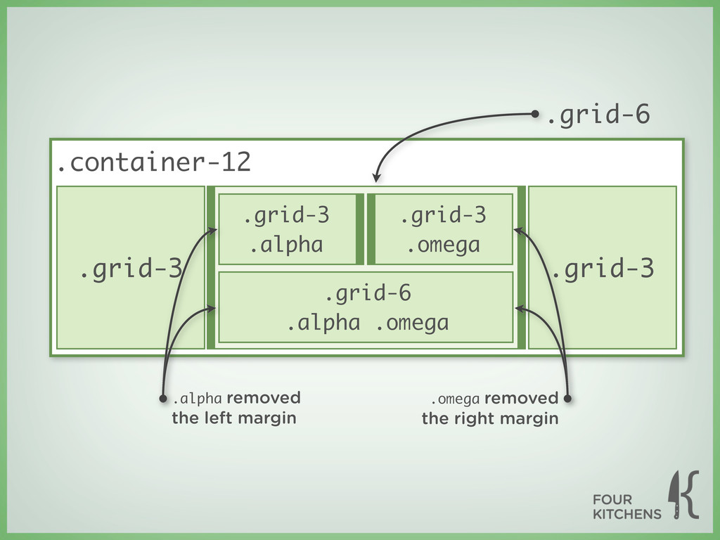
use the alpha and omega classes to remove the margins ‣ alpha removes the left margin. It’s the first nested grid. ‣ omega removes the right margin. It’s the last nested grid.
“In the time you could argue the relevance of naming conventions like these, I just built a 16 column layout.” —Matthew Anderson, designer at OneHub.com
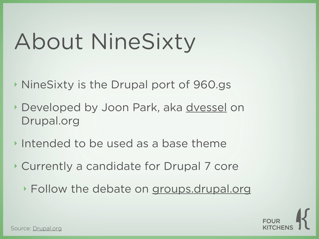
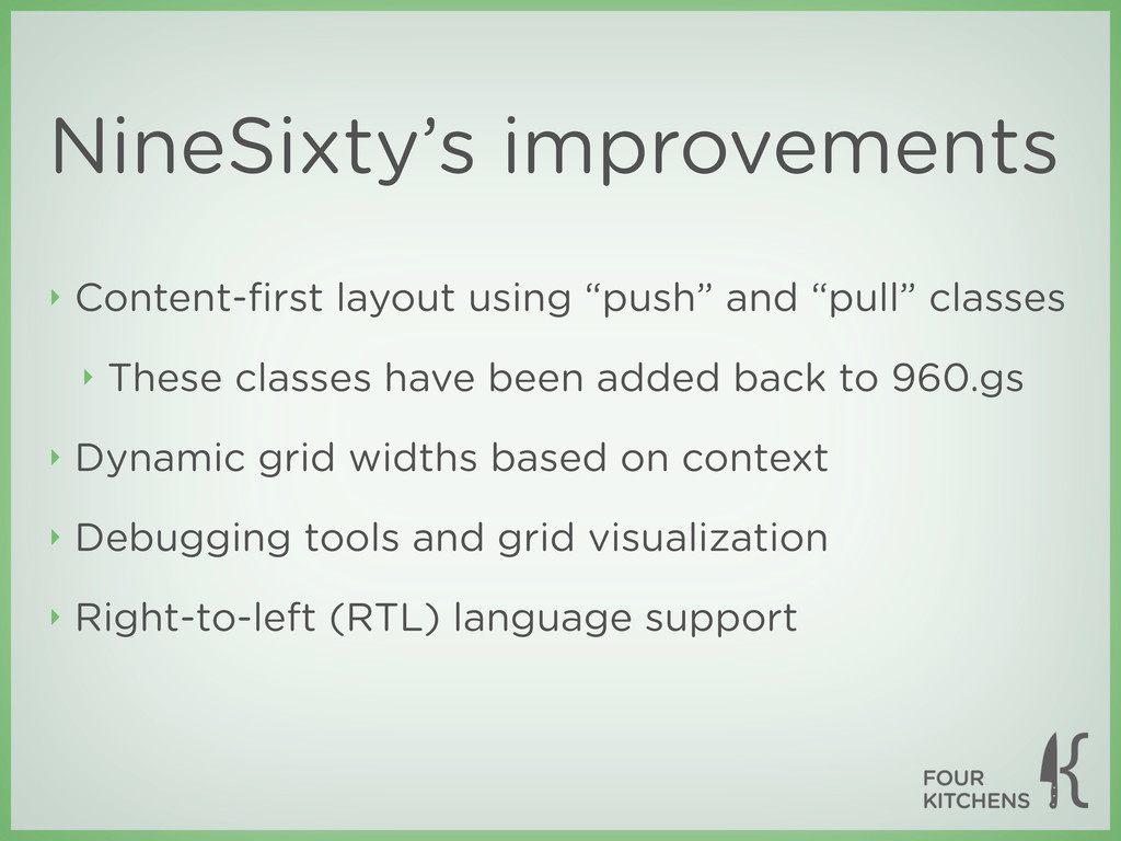
of 960.gs ‣ Developed by Joon Park, aka dvessel on Drupal.org ‣ Intended to be used as a base theme ‣ Currently a candidate for Drupal 7 core ‣ Follow the debate on groups.drupal.org
‣ These classes have been added back to 960.gs ‣ Dynamic grid widths based on context ‣ Debugging tools and grid visualization ‣ Right-to-left (RTL) language support
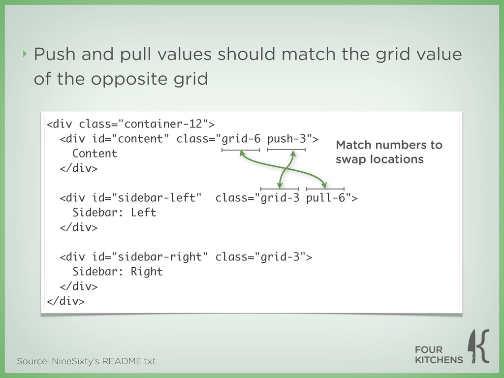
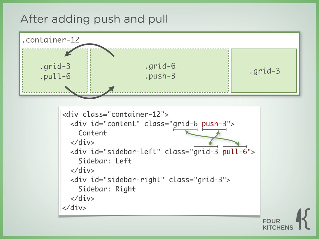
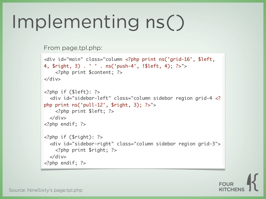
is output as close to the top of the markup as possible ‣ Content should be output before all sidebars ‣ Some designers believe it should be output before a site’s main navigation ‣ This can be very difficult to achieve on a site with one or more left columns
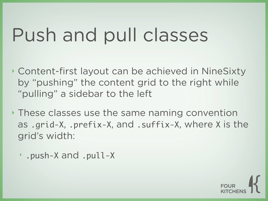
in NineSixty by “pushing” the content grid to the right while “pulling” a sidebar to the left ‣ These classes use the same naming convention as .grid-X, .prefix-X, and .suffix-X, where X is the grid’s width: ‣ .push-X and .pull-X
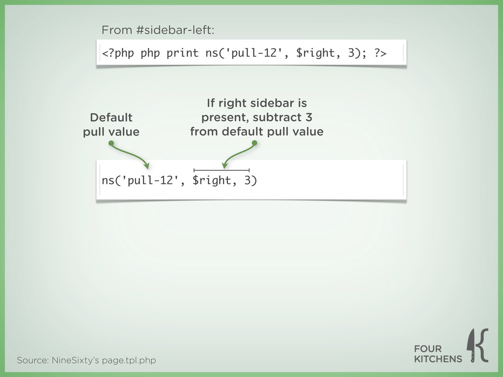
the grid value of the opposite grid <div class="container-12"> <div id="content" class="grid-6 push-3"> Content </div> <div id="sidebar-left" class="grid-3 pull-6"> Sidebar: Left </div> <div id="sidebar-right" class="grid-3"> Sidebar: Right </div> </div> Match numbers to swap locations
</div> <div id="sidebar-left" class="grid-3"> Sidebar: Left </div> <div id="sidebar-right" class="grid-3"> Sidebar: Right </div> </div> Before adding push and pull
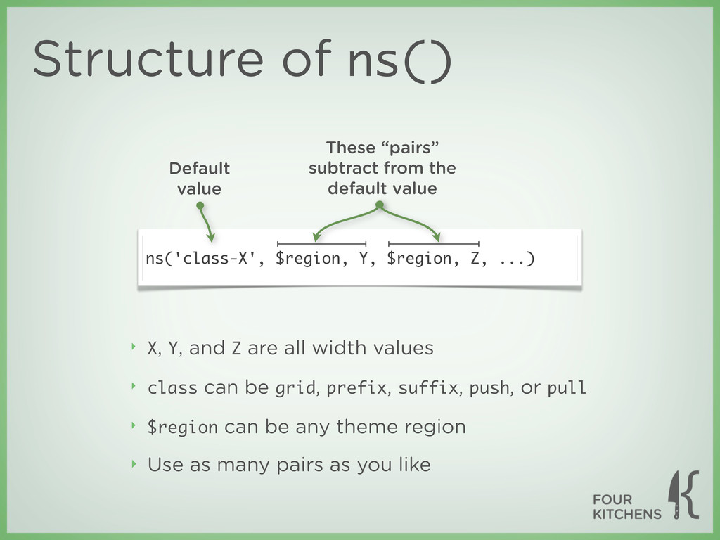
grids to resize themselves when a region isn’t populated ‣ For example, a 3-6-3 layout should become 3-9 if the right column is empty ‣ Dynamic width assignment is handled using the ns() function ‣ Defined in template.php
class can be grid, prefix, suffix, push, or pull ‣ $region can be any theme region ‣ Use as many pairs as you like Structure of ns() ns('class-X', $region, Y, $region, Z, ...) Default value These “pairs” subtract from the default value
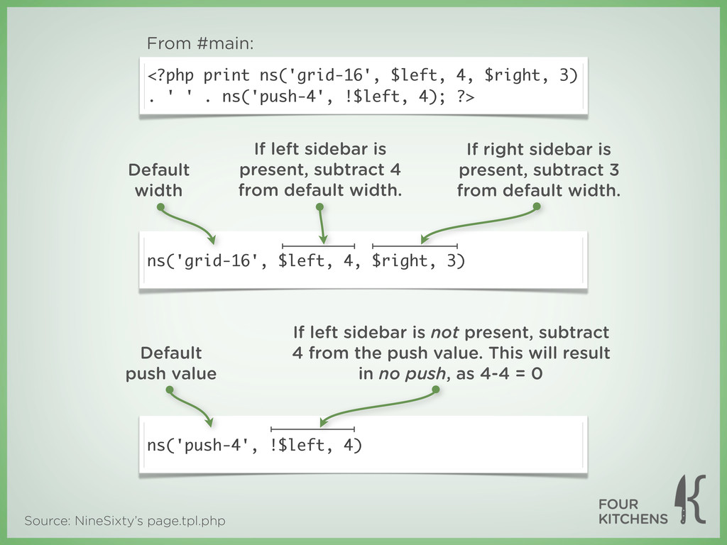
. ' ' . ns('push-4', !$left, 4); ?> From #main: ns('grid-16', $left, 4, $right, 3) ns('push-4', !$left, 4) Default width If left sidebar is present, subtract 4 from default width. If right sidebar is present, subtract 3 from default width. If left sidebar is not present, subtract 4 from the push value. This will result in no push, as 4-4 = 0 Default push value
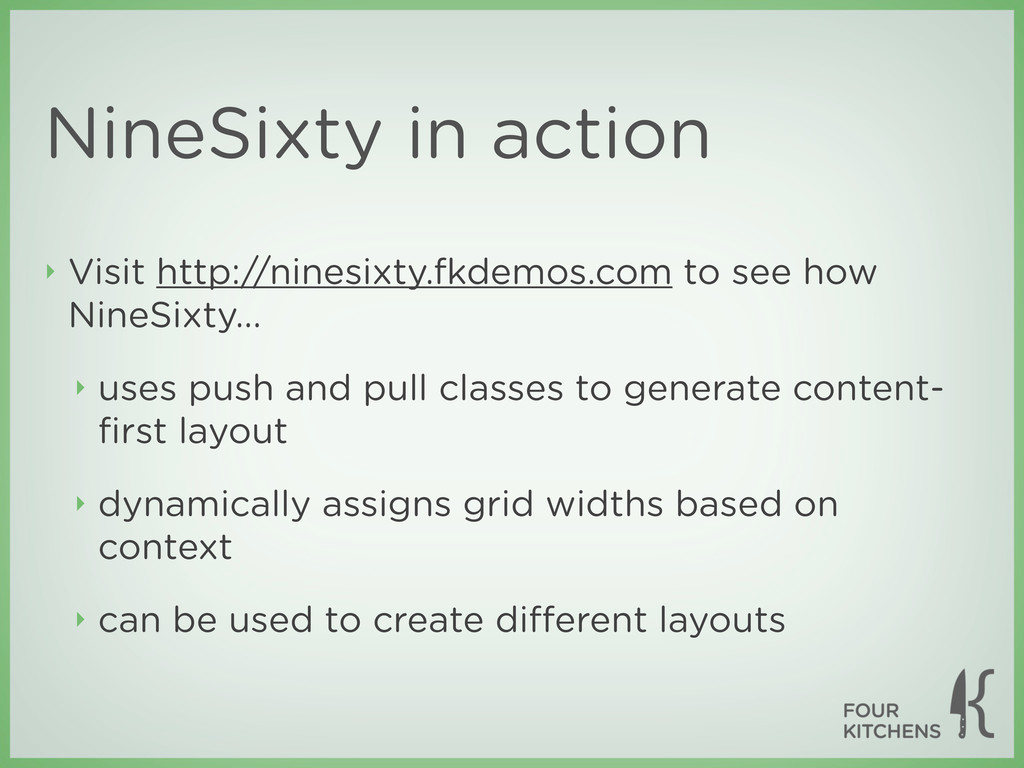
‣ uses push and pull classes to generate content- first layout ‣ dynamically assigns grid widths based on context ‣ can be used to create different layouts
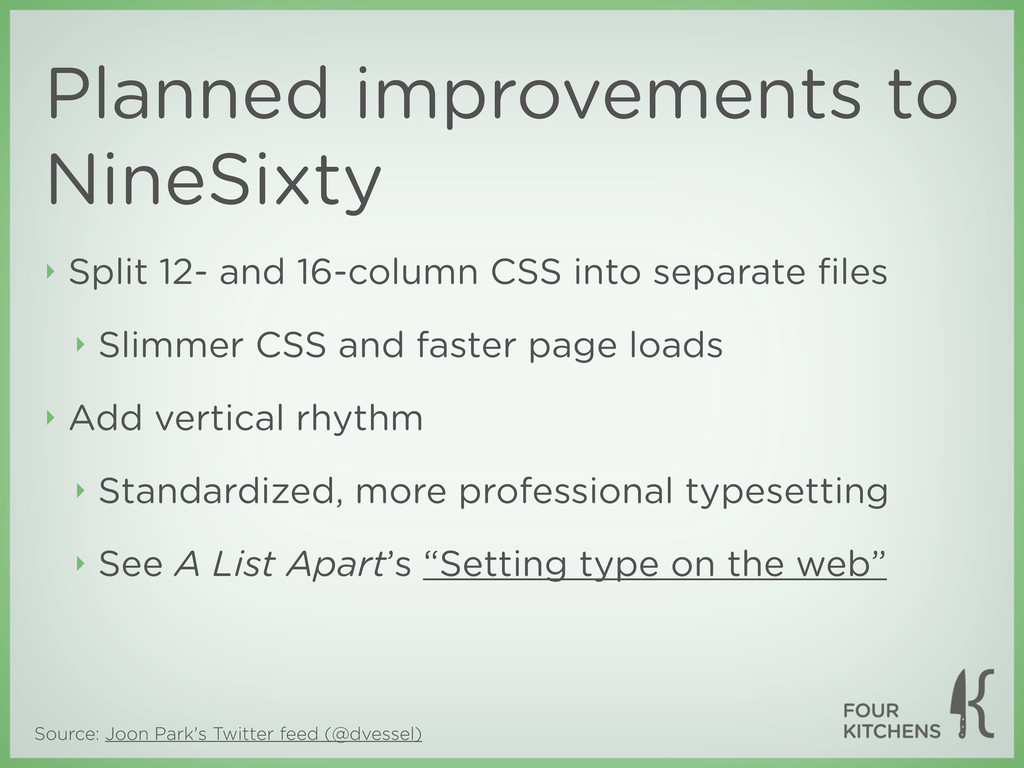
Slimmer CSS and faster page loads ‣ Add vertical rhythm ‣ Standardized, more professional typesetting ‣ See A List Apart’s “Setting type on the web” Planned improvements to NineSixty Source: Joon Park's Twitter feed (@dvessel)
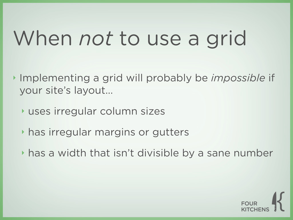
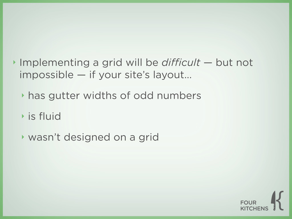
will probably be impossible if your site’s layout... ‣ uses irregular column sizes ‣ has irregular margins or gutters ‣ has a width that isn’t divisible by a sane number
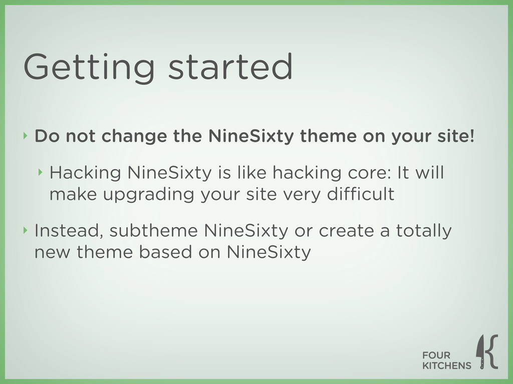
your site! ‣ Hacking NineSixty is like hacking core: It will make upgrading your site very difficult ‣ Instead, subtheme NineSixty or create a totally new theme based on NineSixty
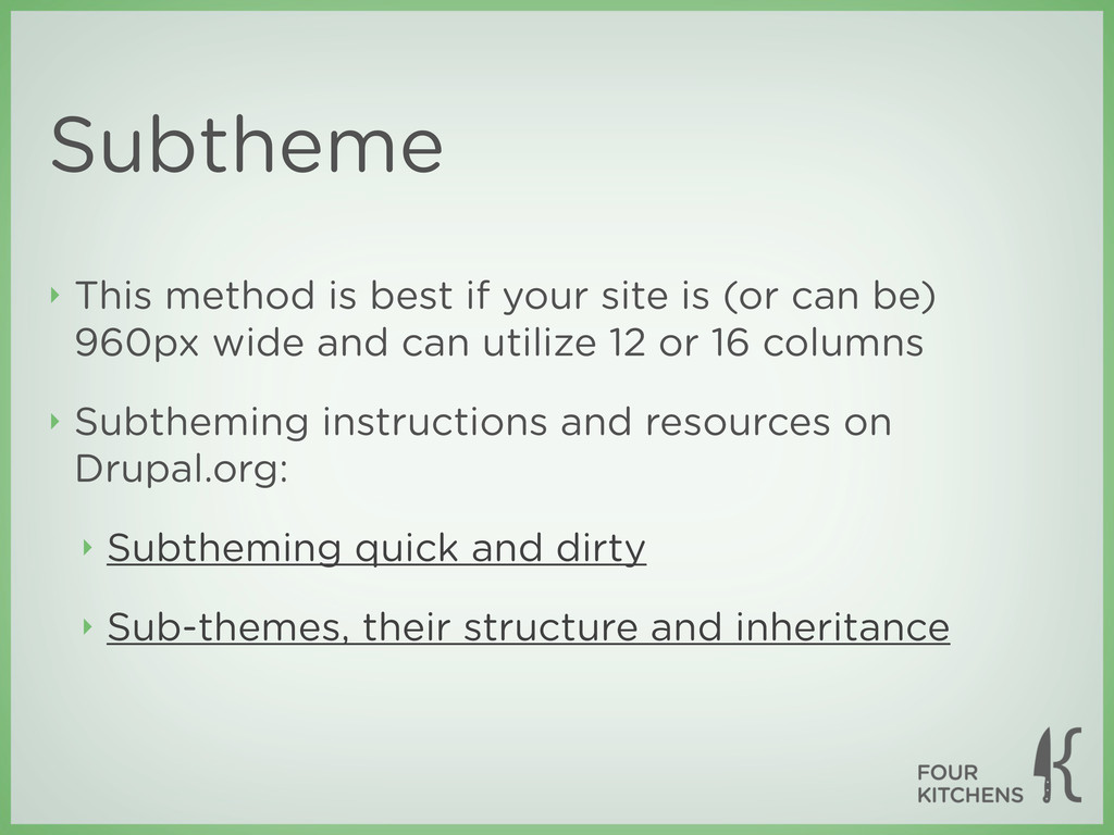
(or can be) 960px wide and can utilize 12 or 16 columns ‣ Subtheming instructions and resources on Drupal.org: ‣ Subtheming quick and dirty ‣ Sub-themes, their structure and inheritance
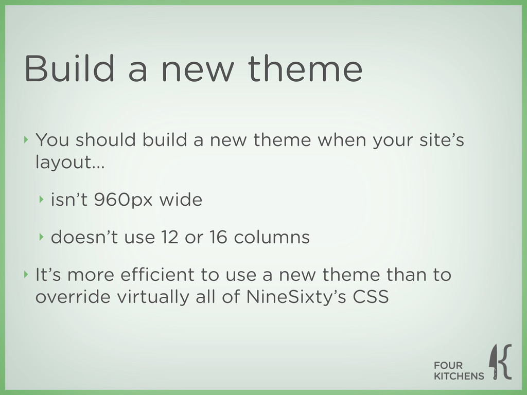
theme when your site’s layout... ‣ isn’t 960px wide ‣ doesn’t use 12 or 16 columns ‣ It’s more efficient to use a new theme than to override virtually all of NineSixty’s CSS
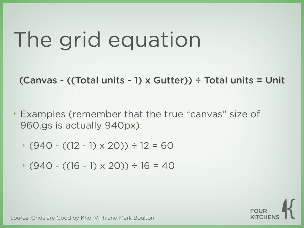
is actually 940px): ‣ (940 - ((12 - 1) x 20)) ÷ 12 = 60 ‣ (940 - ((16 - 1) x 20)) ÷ 16 = 40 Source: Grids are Good by Khoi Vinh and Mark Boulton The grid equation (Canvas - ((Total units - 1) x Gutter)) ÷ Total units = Unit
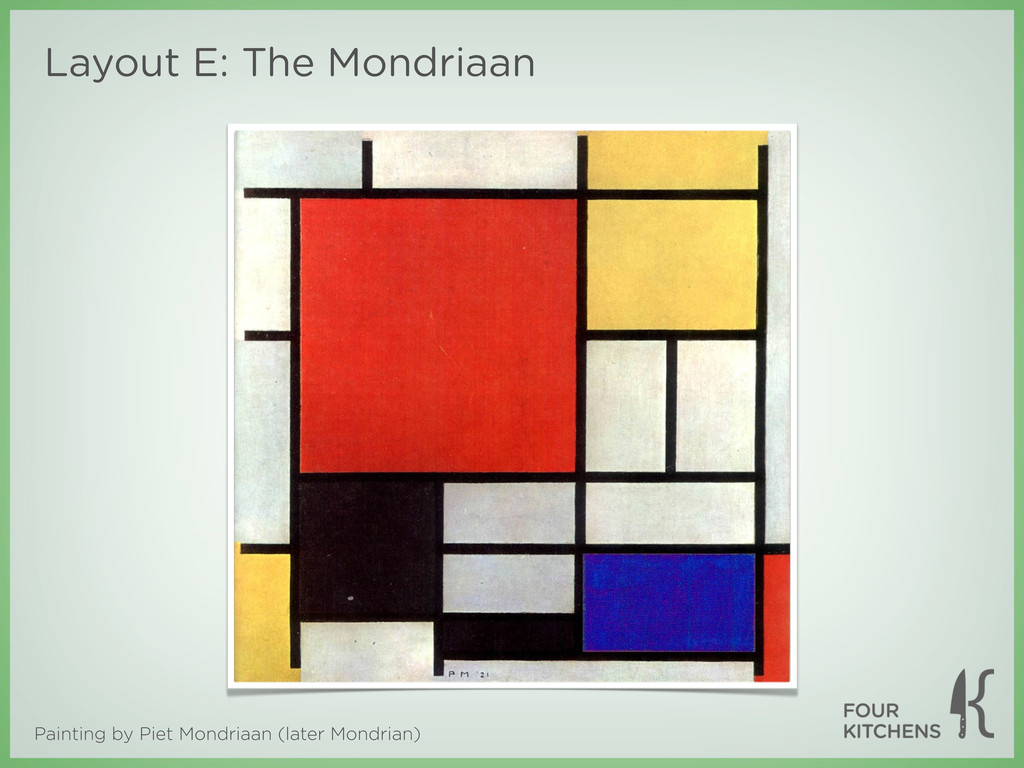
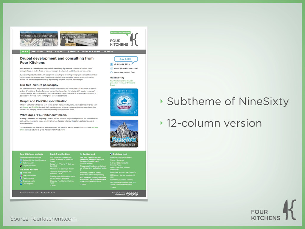
from Khoi Vinh and Mark Boulton’s presentation Grids are Good and from Wikipedia ‣ Piet Mondriaan painting was found somewhere online. Copyright holder is unknown ‣ The items listed above are exempt from this presentation’s Creative Commons license ‣ This presentation was created and delivered by Nathan Smith of Fellowship Tech and Todd Ross Nienkerk, co-founder of Four Kitchens
 nathansmith
 hypebeans
 kenichiota0711
 hjmkth
 sony
sony
 hiranotomoki
 hikarutakase
 ajstarks
 aonomasahiro
 abokadotyann
 hiromimaeo
 kimpetersen
 jmmastey
 tamaranovitovic
 maltzj
 jeffersonlam
 sarafernandez
 auna
auna
 addyosmani
 bkeepers
 destraynor
 gurzu
gurzu
 pwiseman
![Contact Nathan ‣ Email: [email protected] ‣ Twitter: twitter.com/nathansmith](https://files.speakerdeck.com/presentations/4f5149ee73c9220022005eee/slide_101.jpg)
![Contact Todd ‣ Email: [email protected] ‣ also works for Google](https://files.speakerdeck.com/presentations/4f5149ee73c9220022005eee/slide_102.jpg)