Upgrade to Pro — share decks privately, control downloads, hide ads and more …

Typesetting CSS

nitzan
September 26, 2011

Typesetting CSS

The connection between typesetting and CSSing of body type.

nitzan

September 26, 2011
Tweet

More Decks by nitzan

Other Decks in Design

Transcript

  1. Introduction The first decades following the introduction of movable type

    in Europe saw printers facing problems in translating (hand–written) manuscripts into textual layouts using metal blocks. The rapid growth of printed materials and the introduction of more complex textual compositions required the printers to develop new ways in which information could be more clearly represented. This led to the column-based layout, and an ongoing standardization process. The work of the typesetter, particularly in the years proceeding to the introduction of more affordable printing (the 19th Century) is well documented and offers a very useful set of skills that can be easily manifested online using CSS and correct mark-up. As Ruder1 observes, the typographer solves a very physical problem, lining up black and white shapes to form words — technique, function and formal design are an inseparable part of the typographerʼs work. The fascination with the form of the written word was nothing new however it was only with the widespread development of letterpress that the typographerʼs role was born (and has been growing in prominence since). The need to standardise the setting of type resulted in a set of rules and conventions — most of which are both accessible and useful when measured against the work of typesetting for screen. Well–designed works of print demonstrate perfect balance between word and typographical form. By following the same conventions from books extraced bellow typographers could create harmonious works that exceeded their primary role of transferring information. We will scan through typesetting resources in order to compile a list of guidelines and rules that can then be measured against its digital equivalent — by doing so a connection will emerge that will prove the relevance of the first to the latter. 2 11967, p.34
  2. Macro — Visual Order Text must be broken up to

    manageable chunks so that the reader can follow it comfortably. The most common way of separating body text is to break up ideas using paragraphs. To indicate a new paragraph the typesetter can use an indent, a space at the beginning of a sentence, or a line break. — It is not advisable to indent the first line of the page, especially if it follows a header. — It is important not to join both methods of paragraph indication, that is to say that when you use a line break, an indent is redundant. — The width of an indent can range from 1 to 3 ems and it depends greatly on the width of the columns it is used in. Swann2 compiled a concise guide to typesetting and layout design in the later part of the 60s when a shift from manual work to computer-assisted-technologies took place. — Line of body text should contain between 10-12 words — Words set in both capitals and small caps should be letter-spaced. — Small caps is generally a better option of emphasised text within a copy Punctuation The use of punctuation should be kept to a minimum and only be applied when it contributes to the understanding of the text: — Full points are not necessary after well-known abbreviations such as Mr, Mrs — In abbreviated qualifications the last full point will be omitted, i.e. M.S.I.A — Full points in abbreviations may be excluded entirely where qualifications are not likely to be confused e.g. Dr instead of Dr. — Single quotation marks are sufficient to indicate speech or cited text — Where cited text is italic or in smaller size quotation marks are not necessary at all — Instead of em dash3 (—) the en dash4(–) needs to be used followed by a word space Lead–ins Another way of indicating a new paragraph is setting the first word, or number of, in bold, italic, all caps or small caps — this technique is called Lead–ins. Other subhead include the hanging subhead, which is essentially a subhead indented to the left. The amount of the indent will still be a result of the width of the column. 3 21969, p.40 3Dash in the width of an m 4dash in the width of an n
  3. Citation When body text includes lengthy quotations and cited text

    (for example in some academic material) these should be set in smaller point size, with less leading and across a narrower column, separated with a line break before and after the text. These are often referred to as extracts. As the text is set to contrast the body text by size and visual rhythm there is no need to use quotations. Indent is not necessary in the extract nor in the beginning of the paragraph to follow as the text is already visually differentiated from the body text and the paragraphs surrounding it. Forms Strictly speaking a form is a document with blank spaces designated for the insertion and collection of data. The formʼs biggest goal as well as difficulty is to convey data clearly and collect data in a consistent and accessible manner. — A well-designed form will keep consistent relationship between the information and the blank spaces where information needs to be populated. — It is important to keep the boxed elements on an harmonic grid, and the visual noise to a minimum. — Typeface should be visually pleasant, anything between 11 to 14 points, with 12 being the ideal size (though this may vary). — Information hierarchy is of the highest importance in forms yet mustnʼt clutter it, simple bold would be sufficient to indicate areas requiring bigger attention. Orphans and Widows The typesetter has the freedom to advise changes to the copy that would enhance the visual consistency of the end result. — A paragraph mustnʼt end with one syllable of a word — this type of composition is known to be very unpleasant to read (and is referred to as an orphan). — A page should not contain only one line (that is referred to as a widow). 4
  4. Spacing According to Jahn5 , spacing and justification are the

    two most important factors when setting type. It is advisable to insist on close spacing even in the price of breaking a word in the end of the line. Much of the common mistakes of spacing are a direct result of too large of type, without the appropriate amendments to the spacing. Every size of type has recommended spacing, which will ensure both pleasant typography as well as maximum legibility. Figure 2.1.9 A - Upper-case word with additional letterspacing added (Swann,1969, p.35) Steer6 recommends word–space of one and a half to two times the linear (X) width of the lower-case alphabet of type selected. Too much spacing between words mars the looks of otherwise coherent piece of print. When word-spacing exceeds the correct measure, light is let in where it is not wanted, and the wide rivers of white space distract the reader and make reading difficult. Figure 2.1.9 B - Upper-case word with no additional letter-spacing (Swann,1969, p.34) Spacing Terms — The Em space is a square unit of vertical body point size — En is exact half of that, three thick units are equal to one En, four Mid units equal to one em and and five Thins equal to one Em. — The hair space is meant to be exactly twelve to the Em but realistically it come in various sizes and can be anything between 1 to 3 pt. 5 51931, p.136 61947, p.185
  5. Corrent spacing is a tool typographers can use to align

    text harmonically and to avoid orphans, widows, hyphenation and generally non-pleasant setting of type. As such this was considered to be a skill the typographer would need to master, a process that would often involve very meticulous work. — the proportion of spacing between letters and words is not linear as the size of the typeface increases and thus the typographer will need to consider the typeface against the needed spacing and maximising the legibility of the text. — commas and full point are equivalent to a word-space The spacing of letters is also a tool typographers can utilise to increase the contrast of a certain word. It can generate emphasise, distinguish as well as separate certain words. When letter spacing is used, spacing bigger than a hair space is often used as mechanically itʼs very thin and tends to break when placed between letters. Letter spacing was more commonly used when setting words in capitals and small caps. Letter spacing should be dealt with caution, as appearance of some typefaces can be ruined by excessive spacing. Even when separating display text it is important to be aware of the subtleties of the typeface and examine the ratio between the white and black space. Leading Line-spacing, also known as leading is an important element that determines the readability of body text and can be controlled by the typographer in order to balance long lines of text or typeface printed in less than legible colour. — The longer the line, the more leading it needs — The lighter a typeface is, the more leading it needs to be kept legible The leading required to keep composition pleasant is determined by both the outer space of the lines as well as the internal white space within letters. Addiontionally, leading is often used as a way to control the ʻcolourʼ of the text. The smaller the text, the less leading it needs and the actual colour of the composition is darker. When increasing the leading more light is reflected by the paper. Justification The alignment of the lines can have values of right, left or justified (which means that lines start and finish at the same place). In order to control the alignment of the words at the end the line word spacing is often manipulated. This creates gaps and irregular spacing, and thus a solution many typesetters prefer to avoid, relying on other tools e.g. alternating body size, page margins or hyphenation. 6
  6. Breaks Word break refers to a situation where a word

    is broken by hyphen (at the end of a line). Hochuli7 points out there should never be more than 3 successive word-breaks under each other. Extra — Dynamic Expression Of Order Steer8 examines the notion of order through symmetry and breaking of it. — the readerʼs eye mustnʼt come to a point of rest until the transfer of the message has been completed in full. — the vertical grid as the major generator of dynamic order and keeper of the symmetry — the horizontal line is a suggestive tool and a visual break whilst a vertical one performs the opposite role and encourages the reader to read through, pacing him though the text. — in vertical text we give prominence to the vertical dimension using visual queues and long and narrow proportions. Dynamic layout uses geometric principles to visually secure elements into a vertical order. — the typesetter ought to note the danger of creating a rigid and characterless layout and should examine each piece of layout against its desired function. — it is the work of the typographer to create visual queues that demonstrate both order as well as lack of it where appropriate. A design too harmonious might look monotonic and one with too much flair will look chaotic. Mechanism Of Reading As the experienced reader tracks though the letters and words, their eyes jump across the lines. These brief movements are known as saccades and their duration varies between 0.2 – 0.4 seconds. A line is perceived in a series of saccades followed by a long one, the end of the line. The readerʼs eye then reverts to the left, looking for a new line. Information is only absorbed within the fixed saccade period and any data to be after that is likely to be missed. With average body text size of 12 points such an interval would normally include 5-10 letters and 1-2 words. If the reader canʼt make sense of the text then the eye jumps back, in an action that is referred to as regression saccades. In a space of 10 letters only 3-4 letters are focused on by the readers and the rest is guessed according to the connotation of the sentence. When we learn to read the saccades are fairly short and the reading process is time-consuming. As we gain experience in the action of reading we train the eye to engage in longer saccades, over shorter duration of time. The size and frequency of saccades within a piece of type are dependent of the many different variables that micro-typography deals with and are in effect the absolute measurement of a set type readability. The more correct the setting of type is — the more pleasant the reading process will be, the measurable presence of that would be the length of the saccade. 7 72005, p.47 81947, p.25
  7. Digital — Current state of standards By now the separation

    of content from presentation has been widely established as an industry standard, table-based layouts are no longer acceptable and the introduction of techniques such as CSS3 and HTML5 signal more complex (and consistent) layouts and page grids. The tools available for styling text have made it possible for web designers to build frameworks in order to streamline the design (and implementation) process — whilst staying within design conventions such as grid and vertical rhythm. The working versions of CSS2, as well as all previous versions of it, revolutionised the way websites are built and styled. By their cascading nature, elements could be styled once and all subsequent uses of that element (as well as its HTML ʻsonsʼ) would inhirit the properties set. This is a feature that many designers may take for granted by now, however it led, together with other dynamic systems, to template-based design and development workflow. In the earlier stages of the internet, and prior to the widespread use of CSS, the design and development of any digital based work would be measured against the number of pages of the final product. This has now almost completely changed and work is measured by the number of templates required to get to the same end result. This would have not been possible if not for the cascading nature of CSS. Properties such as colour, font size, indent make the generic setting of body text possible. The tools set within CSS 1-2 as illustrated in table 2.2.1 laid the foundations for typographical order online. property description default value other values comments CSS version line-height distance between targeted lines normal absolute or relative number(%, px, em) meant to function as type leading 1 letter-spacing sets the spacing between letters normal absolute or relative number(%, px, em) 1 text-align set the nature of the justification of text left in latin languages right, center, justify in justified text word spacing is auto-adjusted 1 text-indent indentation of the first line of the element none absolute or relative number(%, px, em) Difficult to target the second paragraph 1 word-spacing control over the spacing between words normal absolute or relative number(%, px, em) 1 Vertical-align vertical alignment of an element baseline absolute or relative number(%, px, em) Align an element to its parent 1 8
  8. Table 2.2.1 - Styling of body text CSS 1-2.9 Note:

    on first look vertical-align seems to be the missing link to properly align typography on a carefully calculated baseline. However, the property doesnʼt serve its full semantical potential — it sets the element targeted with its parent element. The default value of vertical-align is in fact baseline and its more common uses might be sub-case or super-case a character, for example ʻvimʼ was set in sub case using the vertical align property. Figure 2.2.1 - Setting of text in sub case using the vertical align property Tools and Frameworks There is an abundance of web tools and frameworks that developers and web designers can use in order to enhance their work. The sets of tools available online today allow designers to push their designs forward in both the macro level, placing elements within a carefully calculated grid, and the micro, typographical level. property description default value other values text-wrap sets the mode for text wrapping normal unrestricted, none and suppress text-indent indentation of the first line of the targeted element normal length, percentage, hanging hanging- punctuation location of a punctuation mark, if present none start, end, end-edge Table 2.3.4 CSS Frameworks overview 9 9http://www.w3schools.com
  9. Eric Meyer Reset CSS Meyer has published an open source

    CSS framework (2007) as part of an attempt to regulate web design and eliminate cross browser rendering problems. The file has been massively used and cited in other frameworks. The purpose of the Reset CSS was quite literally reset any form of inhirit browser styling. Removing all browser-based behaviour has enabled the designer to start his designs on a clean sheet (and avoid browser based incosistencies later on). All browsers have a default CSS file that styles elements rendered such as lists or heading, unless otherwise instructed. Meyer has thoroughly traced all of those browser-inherited behaviours and compiled a compact reset file that ensures a better translation of a design across browsers. Meyerʼs work is important not only for simplifying the work of web designers and advocating correct workflow but as it was in effect the first widely-used and openly–distributed CSS framework. Despite being limited in scope, the free distribution model encouraged designers to not only use Meyerʼs work but also share their own code snippets and thus contributing to the ever–increasing open source nature of the web design community. On a more technical level Meyer has advocated the use of CSS to its fullest, pushing towards semantic and accessible websites. The reference to such obscure elements was suggestive to front-end developers to exploit a wider range of acronyms and attributes. blockquote:before, blockquote:after, q:before, q:after {content: ''; content: none;} Blueprint CSS Framework Blueprint was the first framework that offered a comprehensive set of CSS tools. It encompasses various elements of grids, typography and forms and included alternative style sheets for Internet Explorer as well as print. Today Blueprint might seem to be limited in scope, however its importance in promoting clearer, more ordered, web design in worth noting . The extent of work that was put into very elementary HTML elements such as forms and link buttons was the first step toward better design for the web and lead the way to more progressive solutions. 10
  10. 960 CSS Framework The issue of ideal screen resolution for

    the web has been a widely discussed, The argument was mainly split between 960 pixels and 1024 (and higher as time progressed). The source of the problem lays in the fact that users view sites on different machines, with subsequent variety in screen resolution. It is not only browser–inherit behaviour that alters the user experience but also the resolution on which it is viewed, particularly when absolute values are used. 960 CSS framework focuses on a grid with overall width of 960 pixels. Like all frameworks the main purpose of his work was to allow quick prototyping – as Smith (2008) mentions in his blog, he did not attempt to build a comprehensive (vertical and layout grid based) solution but simply a tool for quick mocking-up, a starting point for front-end developers. Additionally, the 960 CSS was not aimed at providing cross-browser consistency — it only supported browsers classed as A grade, a phrase that was coined by Yahoo10 and refers to all browsers with a certain level of rendering engine. Evidintly, the setting of body text and the baseline grid the 960 grid is the most basic, the margins are the same across all text sizes (table B.1) and the lack of vertical consistency is apparent (figure 2.4.3). unit: pixels h1 h2 h3 h4 h5 h6 Size 25 23 21 19 17 15 Margin-bottom 20 20 20 20 20 20 Line height - - - - - - Table 2.3.4.3 Comparison of heading properties in 960 CSS framework The 960 framework was written with the clear intention to give designers the tools for horizontal grid. Being able to lay out items perfectly on a grid that works visually, aesthetically and most importantly dynamically was (and still is) the holy grail. 11 10http://developer.yahoo.com/yui/articles/gbs
  11. Baseline CSS Out of all of the CSS frameworks the

    Baseline CSS is the most comprehensive one. Not only does the system offer tools for grids, forms and of course type, the developer also included alternative style sheets for iPhone in addition to the print and Internet Explorer. The Baseline system makes significant effort in order to accommodate a vertical rhythm using typographical understanding and mathematical work. unit: pixels h1 h2 h3 h4 h5 h6 Size 36 28 22 18 15 13 Top 5 8 1 2 4 5 Line height 1.2 1.2 1.2 1.2 1.2 1.2 2.3.4.4 CSS properties for heading in Baseline CSS framework Baseline CSS Interview — Stéphane Curzi You have mentioned on the site11 that you were missing a line-leading property. The obvious question would be why not to use line-height? There is a difference in the line-height and a leading, which I could simply use the line-height but as it's stand right now the type get centred in the line height with equal height at the top and bottom. A leading is a value that is applied to the bottom of the line. Working with a baseline grid, the most important part is a consistent type baseline, so by using a consistent line height you gain a consistent baseline, simple but I never thought about it before starting to work on Baseline. Were there any other CSS elements you were missing? Being able to align not on the bottom but on the type baseline would render my framework almost unnecessary, after that - thinking of type only - a true leading is the big one. One big thing missing is good support for hyphenation, it's probably one of the properties that would help the most the visual impact of type on the web. Even if people don't think about it, hyphenation plays a big role on the look of type column. Any other type property would be welcome also. Can you describe the mathematics you have used on setting the baseline grid? Pretty basic actually, I started by setting everything on the same line-height and "push" the type visually on the baseline with a top value, so right now it works perfectly with Helvetica on Safari and Google 12 11http://baselinecss.com — no date
  12. Chrome. The other browser are less predictable but the overall

    look is not bad either, just not pixel perfect like what I was aiming at. How do you see CSS3 pushing the envelope in terms of more visually consistent setting of type online? @font-face comes to mind as one of the big things coming. To finally have a choice of font would be welcome but I fear that it will bring a lot of ugly websites, the same thing happens when people started to use a computer to design, too many ugly fonts out there. Are you considering using CSS3 columns in the coming versions? pushing the aesthetic more towards print? The first version of Baseline was build with CSS3 columns and padding to push the typo on the baseline. I later found out that by using relative positioning I would gain in stability and simplicity, unfortunately that method does not work across CSS3 columns so I chose stability mainly because almost no browser support the CSS3 columns right now. I'll probably try and find a solution when more browser will support the column spec. 13
  13. Despite its prominence in our life, the internet is still

    young — the initial effect this had was an increasing numbers of businesses and individuals looking to get an online presence, mostly with little budget. This led to an abundance of sites where the design level is low, especially the attention to details. Issues such as typography, exact margins and word-spacing are being pushed aside. Interestingly, a similar process was taking place in the print industry when movable type machines were made more affordable — the market was flooded with books whose design level was questionable. It was not until later in the 20th Century that the industry has stabilised and the level of output has become more consistent. The ability, or rather the lack of it, of CSS to accommodate coherent designs has promoted other, less recommended solutions, essentially hacks, in order to achieve sufficient flare in their designs. It is only the recent introduction of new elements in CSS3 that has promoted the discipline to the forefront of the sector again. In many ways the gaps in previous versions of CSS have created the need for a more streamline work flow, which in return developed the demand for CSS frameworks. The fundamental difference between typesetting for print and typesetting for screen is still the control the user has over the copy. The end user neednʼt be a trained professional to publish new content and if not given the apropriate guidance the user is likely to make commmon punctuation, spacing and other styling mistakes — this is bound to change with the development of CSS3 and the raising attention to detail. 14
  14. References — Abel, P.(2009) Interviewed by Hermon, N. 19 September

    2009. — Curzi, S.(2010) Interviewed by Hermon, N. 11 April 2010 — Goodlatte, R. (2007) ʻSyncotype Your Baselinesʼ, Rob Goodlatte, 31 July 2007. Available at: http://robgoodlatte.com/syncotype-your-baselines (Accessed: 14 April 2010) — Hermon, N. (2009) ʻReading Monotype Casterʼ, Flickr, 12 November. Available at http:// www.flickr.com/photos/nitzan_fine_art/sets/72157623778151799 (Accessed: 21 April 2010). — Hochuli, J.(2005) - Detail in Typography - Hyphen Press — http://960.gs (no date) (Accessed: 9 April 2010) — http://developer.yahoo.com/yui/articles/gbs (no date) (Accessed: 28 April 2010) — http://handandeye.co.uk (no date) (Accessed: 28 April 2010) — http://tinymce.moxiecode.com (no date) (Accessed:28 April 2010) — http://webkit.org (no date) (Accessed 27 April 2010) — http://www.blueprintcss.org (no date) (Accessed: 9 April 2010) — Jahn, H. (1931) - Hand Composition. John Wiley & Sons, Inc. — Meyer, E.(2007) CSS Tools: Reset CSS. Available at: http://meyerweb.com/eric/tools/css/reset (Accessed: 9 April 2010) — Moye, S.(1995) - Fontographer - Type By Design. MIS Press. — Robert, L. and Thrift, J. (2005) The designer and the grid. Rotovision. — Ruder, E. (1967) Typographie. Niggli — Smith, N. (2008) ʻThe 960 Grid Systemʼ, Songspring, 26 March 2008. Available at: http:// sonspring.com/journal/960-grid-system (Accessed: 14 April 2010) — Steer, V. (1947) - Printing Design and Layout. Second Edition. Virtue & Company Limited. — Swann, C.(1969) - Techniques Of Typography - Lund Humphries — Tschichold, J.(1991) - The Form Of The Book - Lund Humphries Publishers — W3C (2009) CSS Multi-column Layout Module. Available at: http://www.w3.org/TR/css3-multicol (Accessed: 24 April 2010) — W3C (2010) HTML5 - a vocabulary and associated APIs for HTML and XHTML. Available at: http://dev.w3.org/html5/spec/Overview.html (Accessed: 27 April 2010) — White, A. (1987) - How To Spec Type. A Roundtable Press Book. 15
  15. Appendix A - CSS Multi-column Property Index Property Values Initial

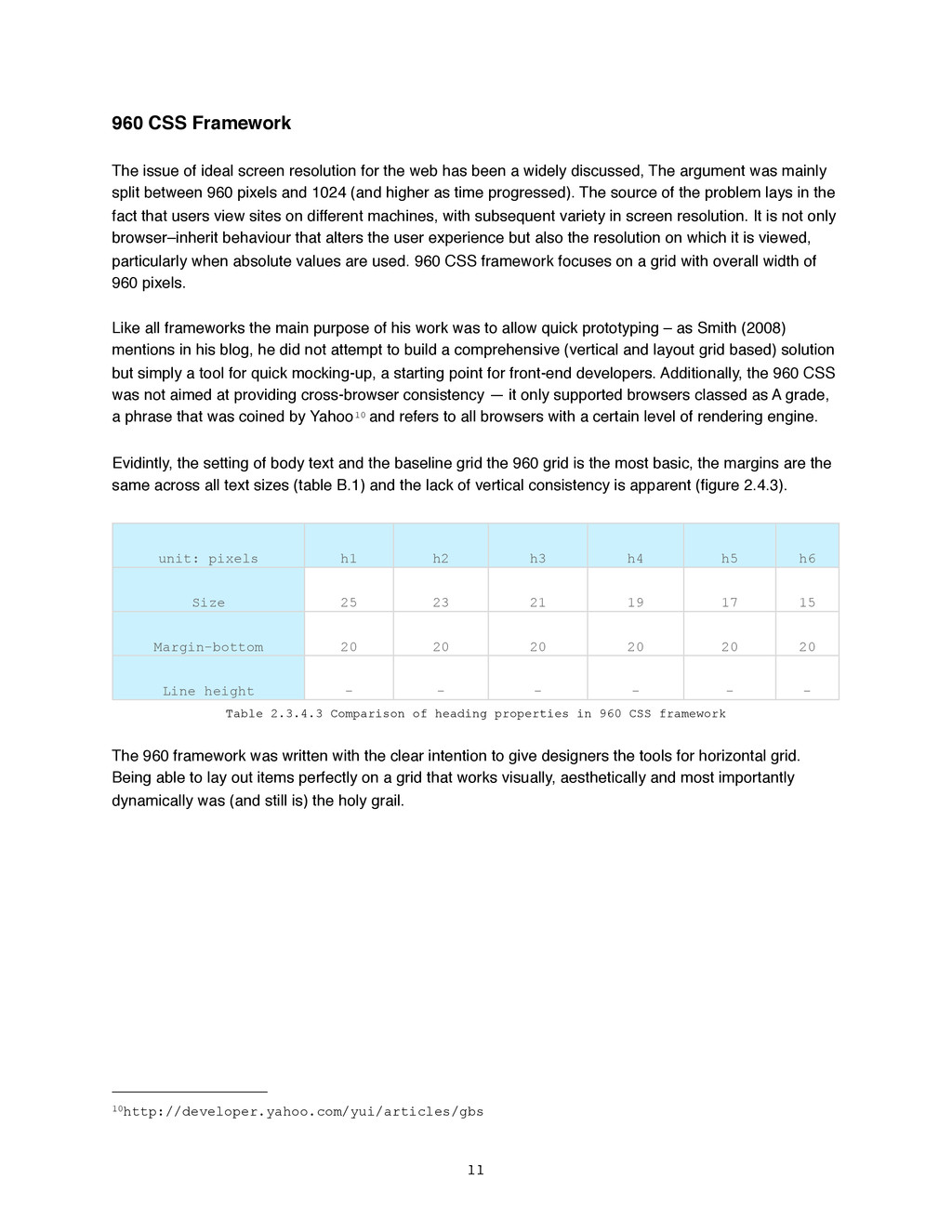
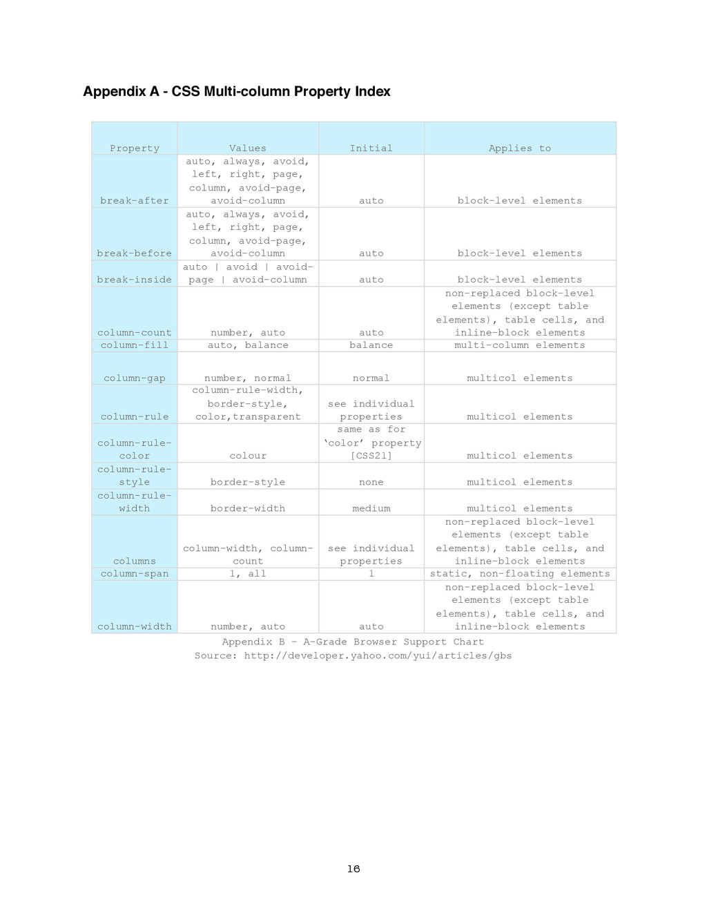
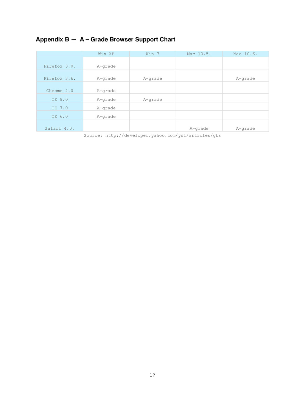
    Applies to break-after auto, always, avoid, left, right, page, column, avoid-page, avoid-column auto block-level elements break-before auto, always, avoid, left, right, page, column, avoid-page, avoid-column auto block-level elements break-inside auto | avoid | avoid- page | avoid-column auto block-level elements column-count number, auto auto non-replaced block-level elements (except table elements), table cells, and inline-block elements column-fill auto, balance balance multi-column elements column-gap number, normal normal multicol elements column-rule column-rule-width, border-style, color,transparent see individual properties multicol elements column-rule- color colour same as for ‘color’ property [CSS21] multicol elements column-rule- style border-style none multicol elements column-rule- width border-width medium multicol elements columns column-width, column- count see individual properties non-replaced block-level elements (except table elements), table cells, and inline-block elements column-span 1, all 1 static, non-floating elements column-width number, auto auto non-replaced block-level elements (except table elements), table cells, and inline-block elements Appendix B - A-Grade Browser Support Chart Source: http://developer.yahoo.com/yui/articles/gbs 16
  16. Appendix B — A – Grade Browser Support Chart Win

    XP Win 7 Mac 10.5. Mac 10.6. Firefox 3.0. A-grade Firefox 3.6. A-grade A-grade A-grade Chrome 4.0 A-grade IE 8.0 A-grade A-grade IE 7.0 A-grade IE 6.0 A-grade Safari 4.0. A-grade A-grade Source: http://developer.yahoo.com/yui/articles/gbs 17