Upgrade to Pro — share decks privately, control downloads, hide ads and more …

Mapping Data: Beyond the Choropleth

oobrien
May 24, 2016

Mapping Data: Beyond the Choropleth

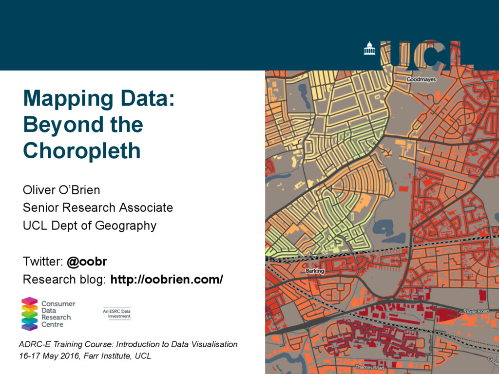
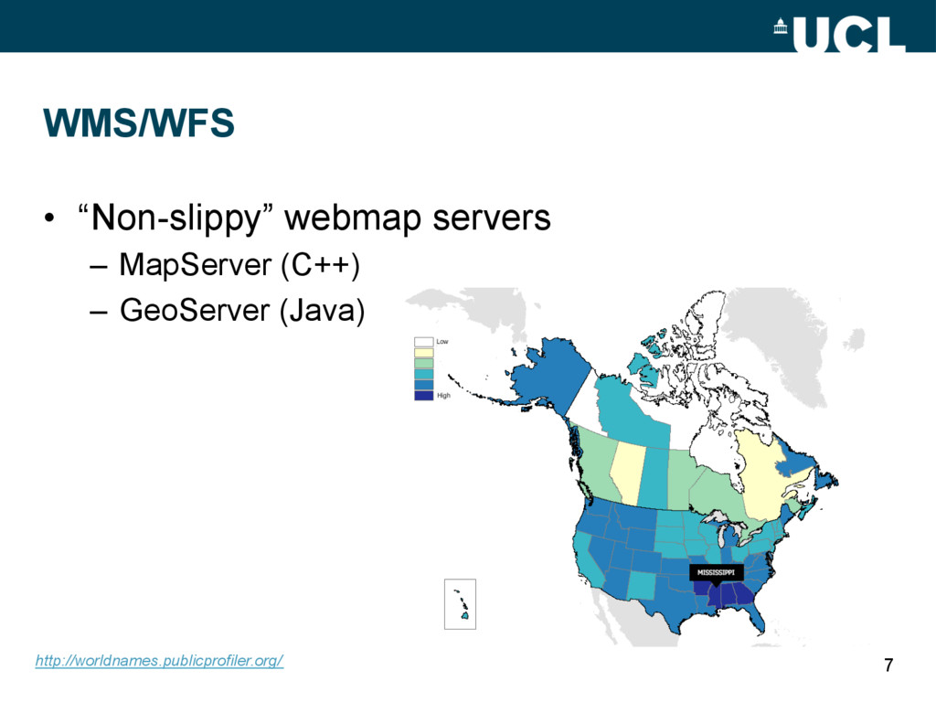
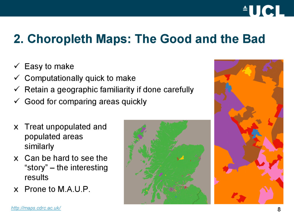
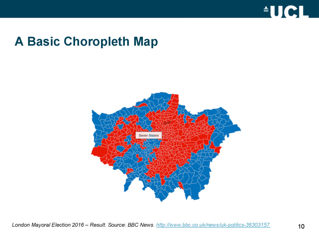
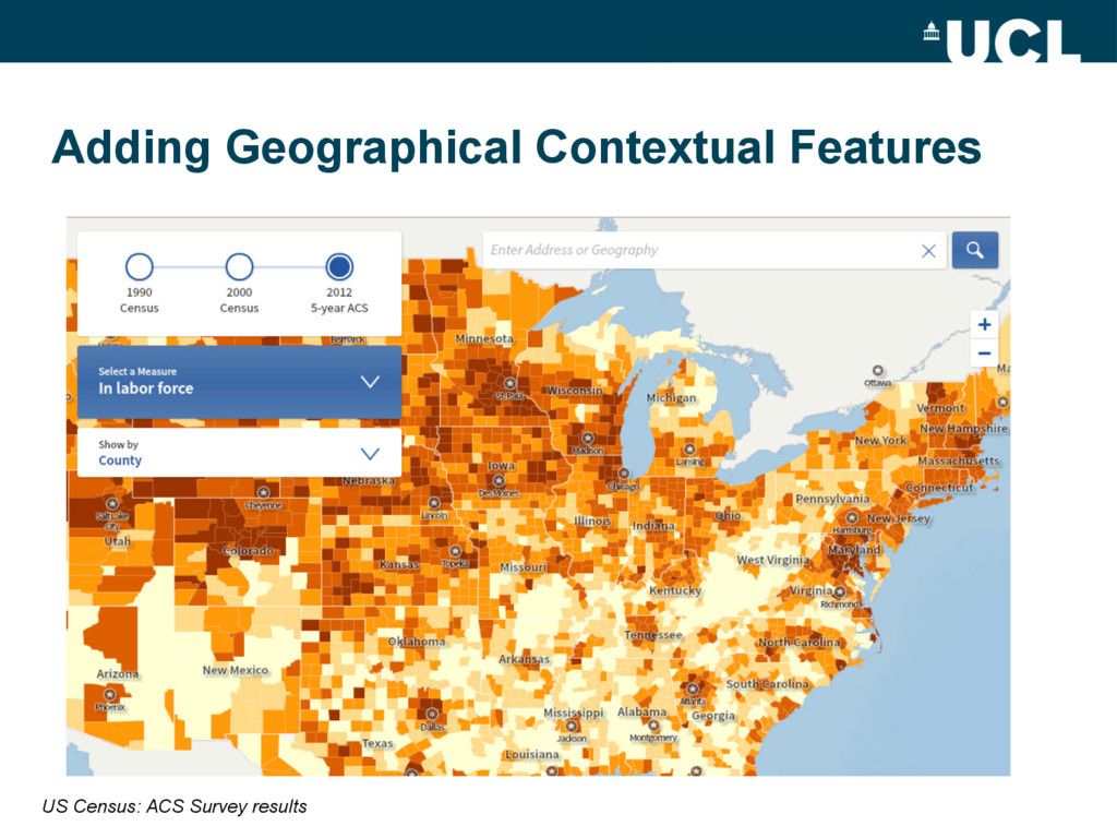
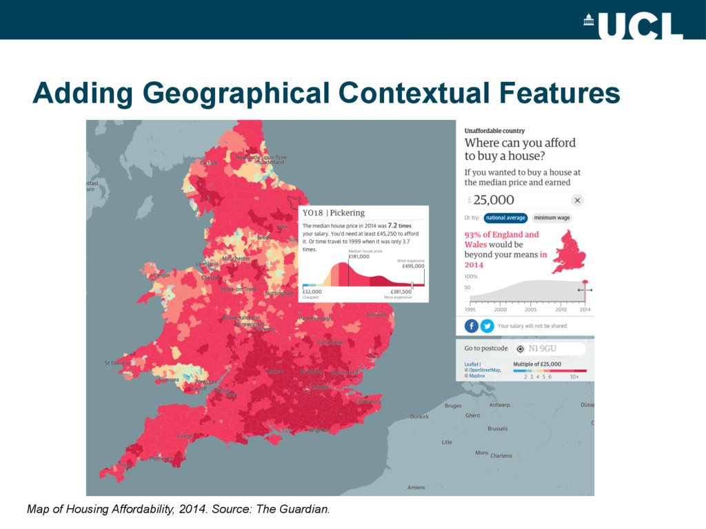
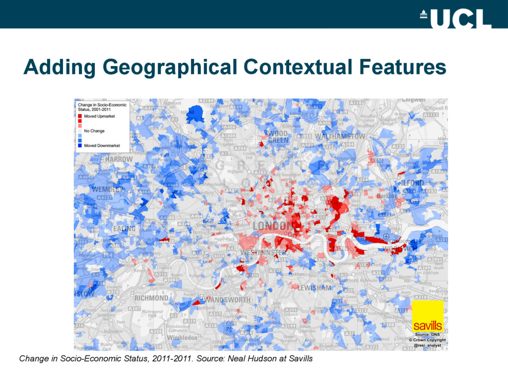
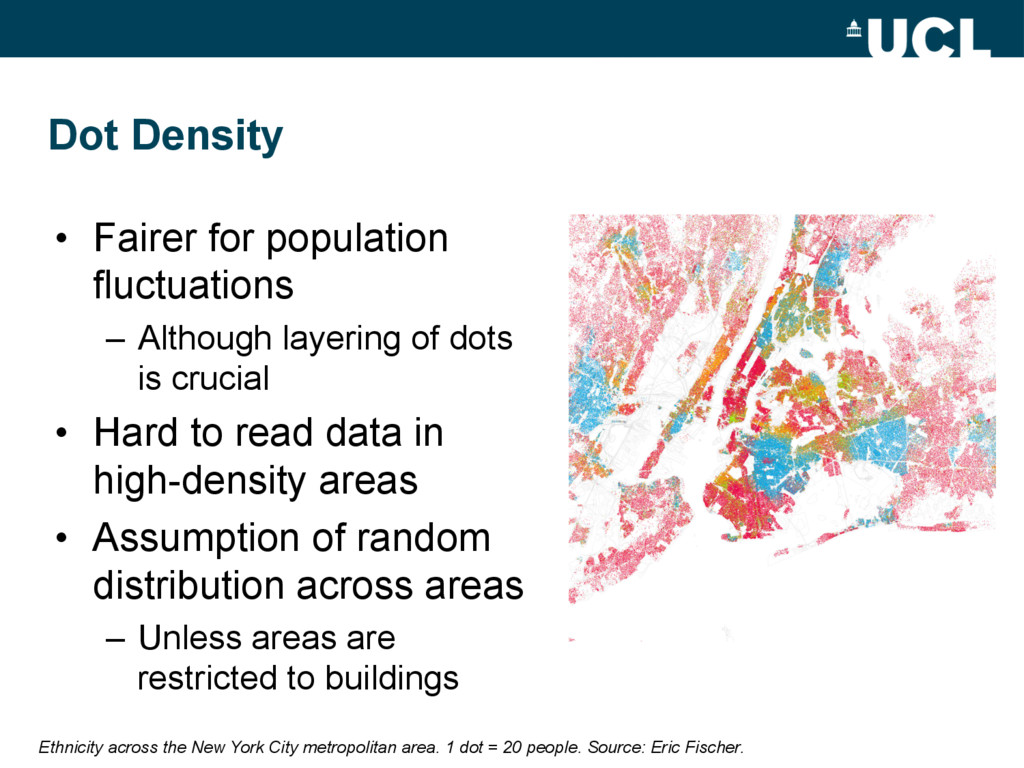
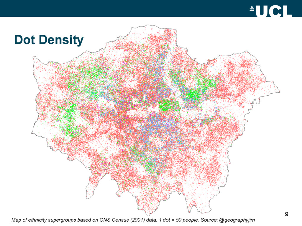
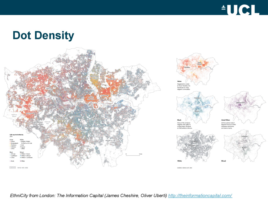
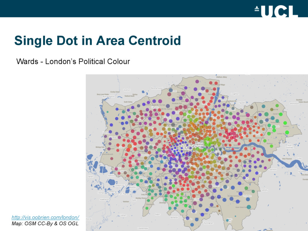
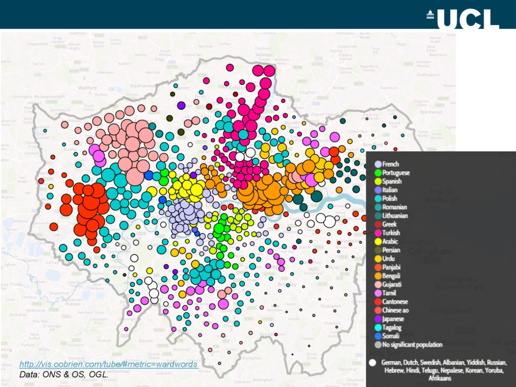
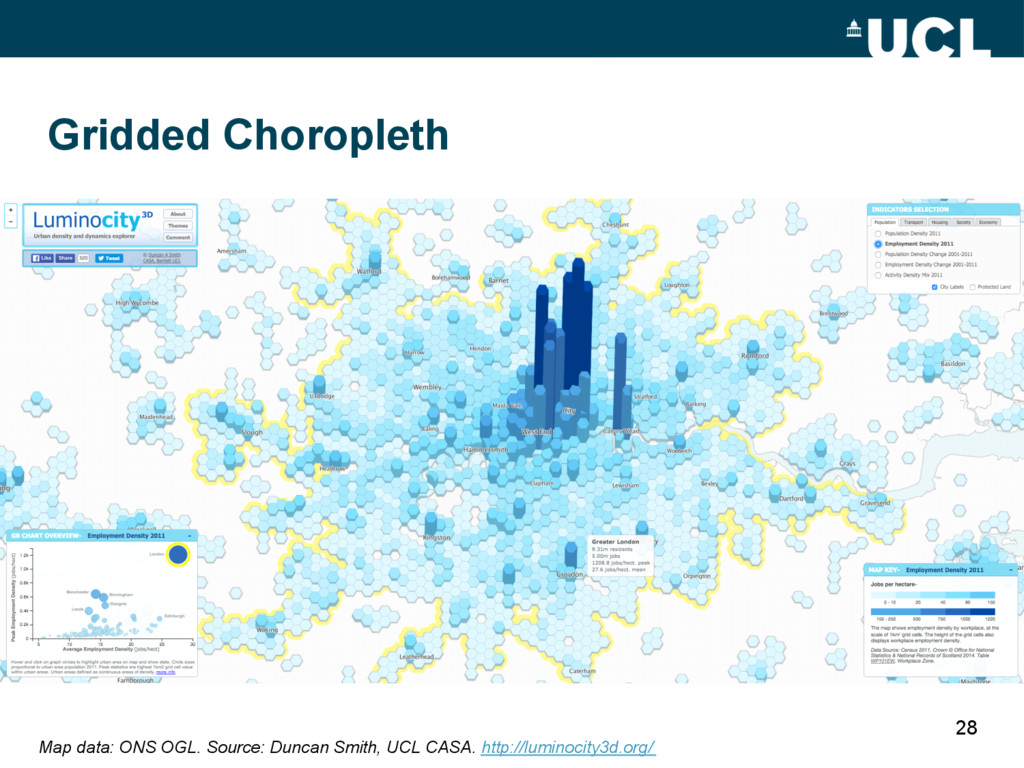
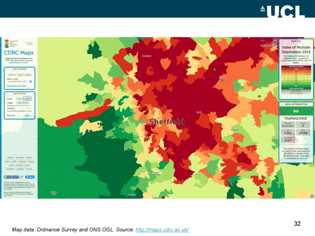
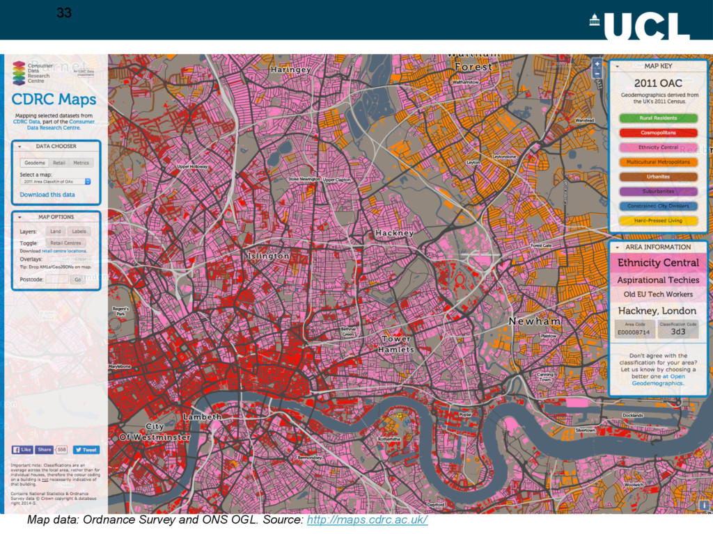
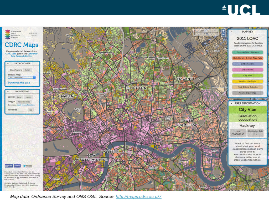
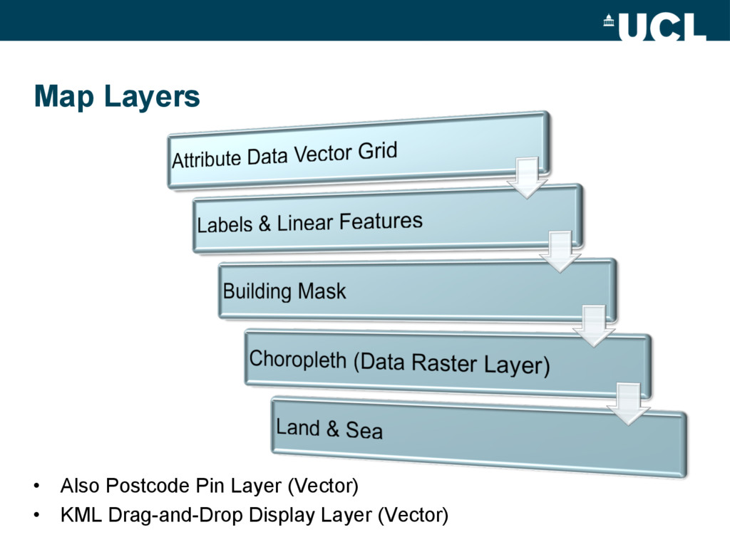
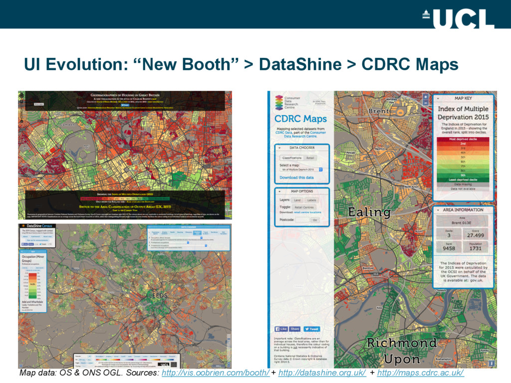
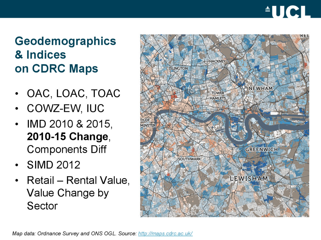
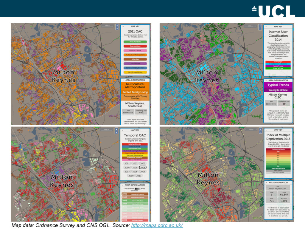
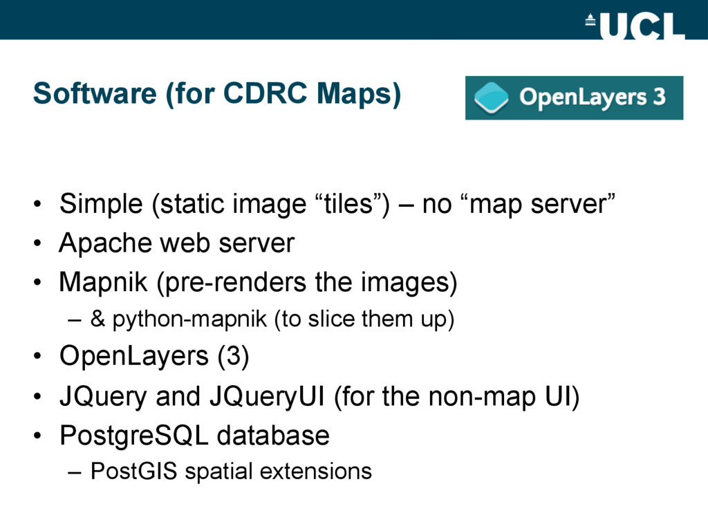
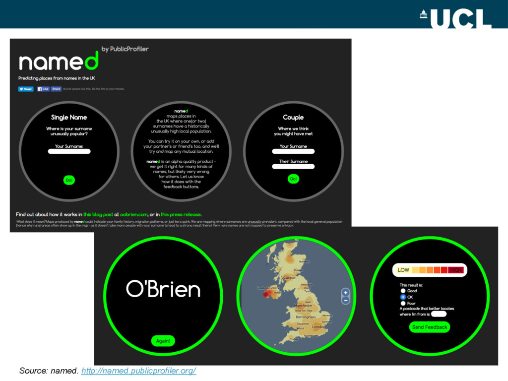
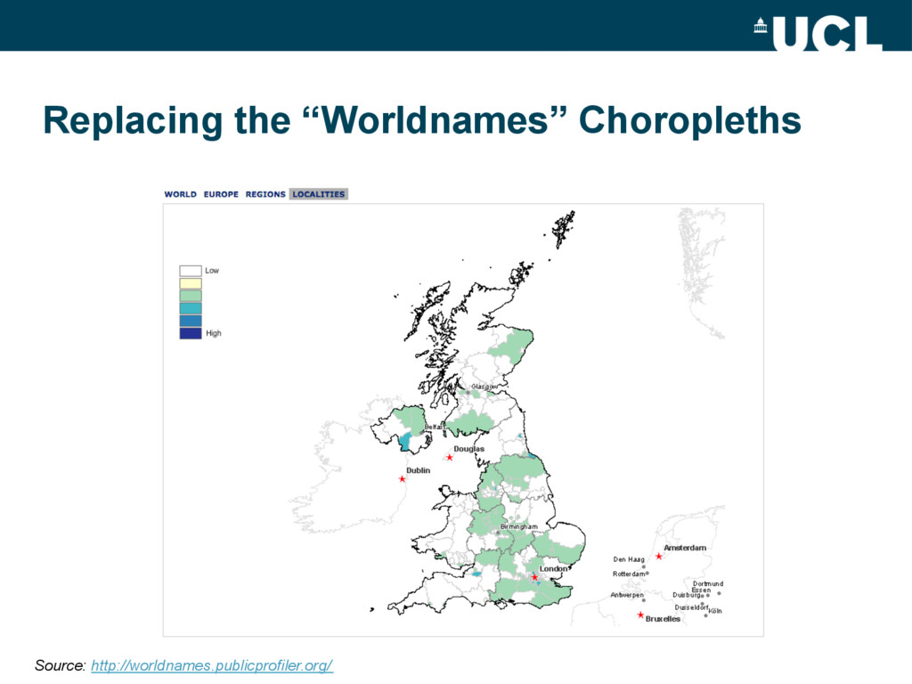
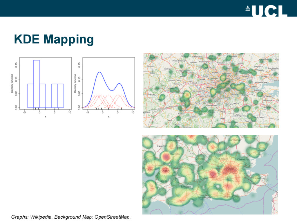
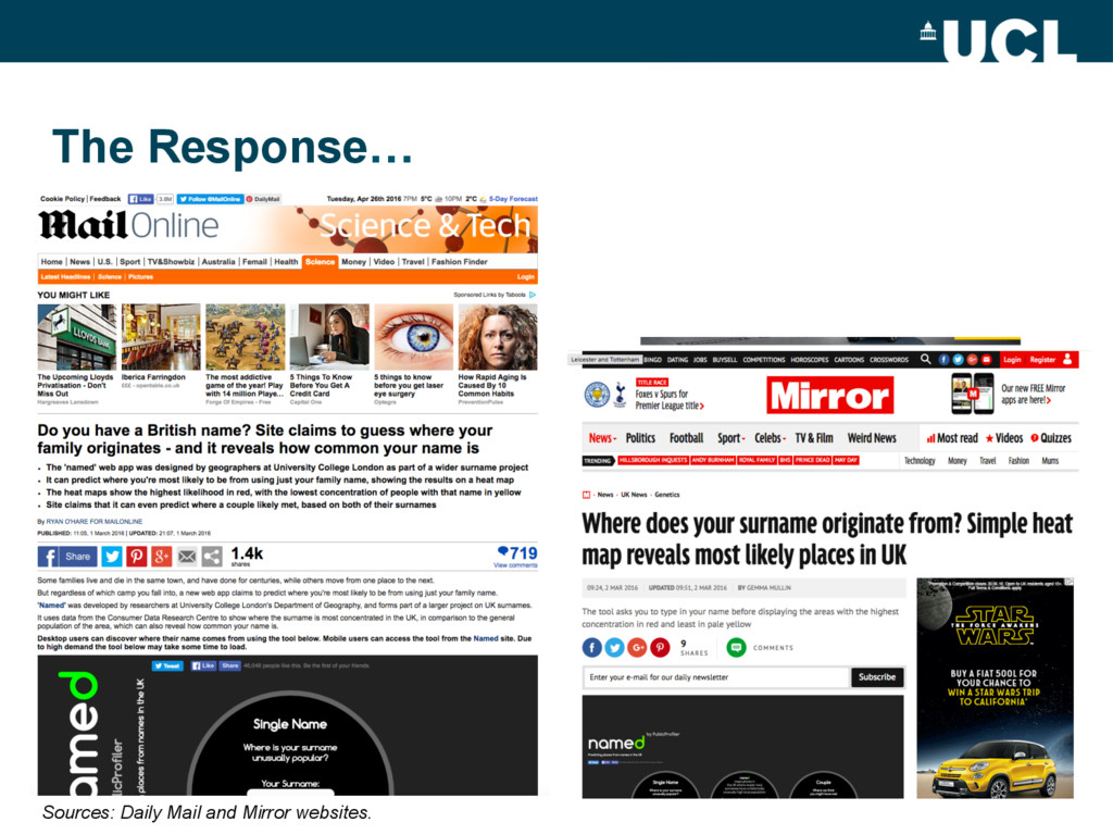
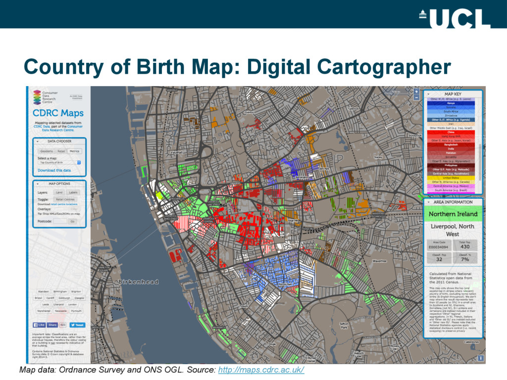
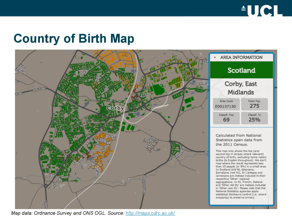
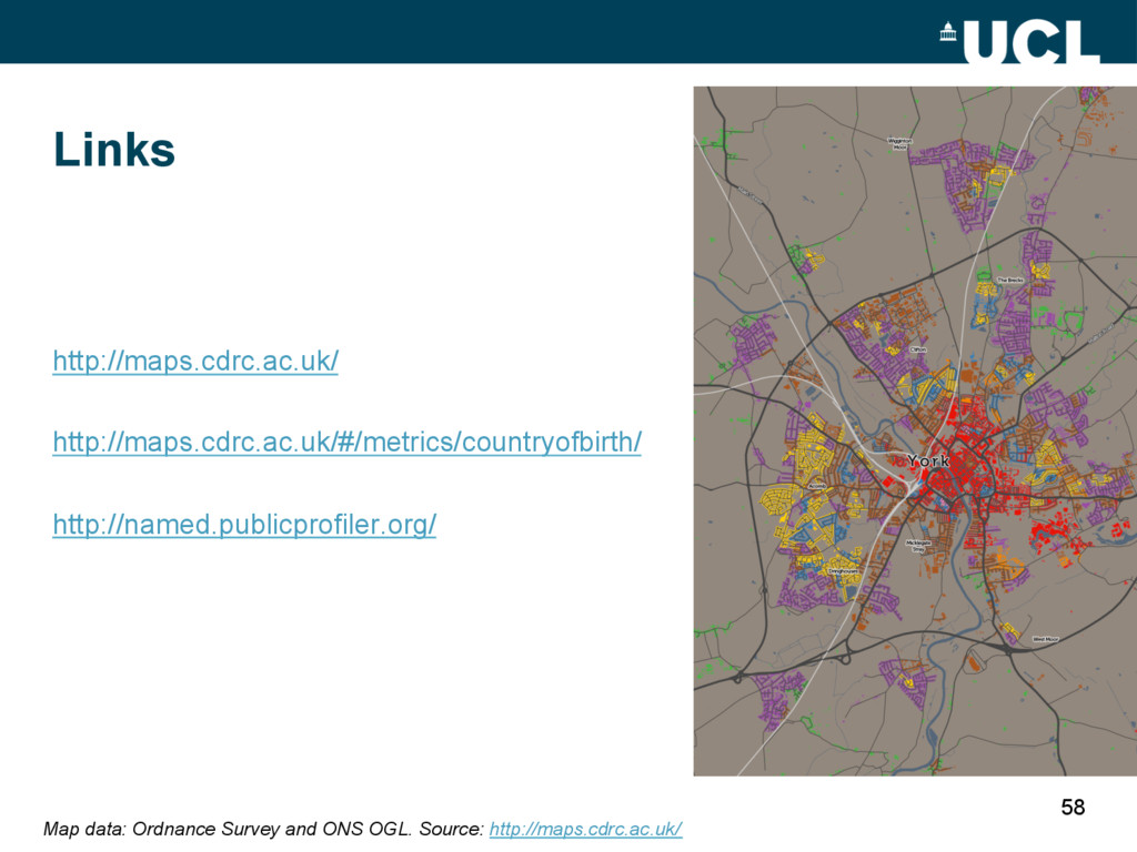
Contents: Technology Summary for Web Mapping, Choropleth Maps: The Good and the Bad, Moving Beyond the Choropleth, Example: CDRC Maps, Example: named – KDE “heatmap”, Case example: Country of Birth Map - concerns of the data scientist & digital cartographer.

oobrien

May 24, 2016
Tweet

Other Decks in Technology

Transcript

  1. Mapping Data: Beyond the Choropleth Oliver O’Brien Senior Research Associate

    UCL Dept of Geography Twitter: @oobr Research blog: http://oobrien.com/ ADRC-E Training Course: Introduction to Data Visualisation 16-17 May 2016, Farr Institute, UCL
  2. Contents •  Technology Summary for Web Mapping •  Choropleth Maps:

    The Good and the Bad •  Moving Beyond the Choropleth •  Example: CDRC Maps •  Example: named – KDE “heatmap” •  Case example: Country of Birth Map –  Concerns of the data scientist & digital cartographer 2
  3. Managed Wrappers •  MapBox Studio •  CartoDB •  ESRI ArcGIS

    Online •  Tableau •  Google Fusion Tables •  Google Maps Embed API •  Google Static Maps API 4 Example: MapBox Studio style editor
  4. JavaScript APIs •  OpenLayers •  Leaflet •  D3 •  Google

    Maps JS API 5 http://earth.nullschool.net/ http://osm.org/
  5. Programming/Scripting –  Typically to produce raster imagery which then can

    be combined with vector data in a Javascript API (or other) map –  R –  Java –  Mapnik 6 http://twitter.mappinglondon.co.uk/
  6. 2. Choropleth Maps: The Good and the Bad x  Treat

    unpopulated and populated areas similarly x  Can be hard to see the “story” – the interesting results x  Prone to M.A.U.P. 8 ü  Easy to make ü  Computationally quick to make ü  Retain a geographic familiarity if done carefully ü  Good for comparing areas quickly http://maps.cdrc.ac.uk/
  7. A Basic Choropleth Map Map of household income in the

    US by census tract. Source: Campus Activism blog.
  8. 10 London Mayoral Election 2016 – Result. Source: BBC News.

    http://www.bbc.co.uk/news/uk-politics-36303157 A Basic Choropleth Map
  9. Adding Geographical Contextual Features Map of Philadelphia housing prices per

    square foot using 2014 property assessment data. Source: Campus Activism blog.
  10. 3. Moving Beyond the Choropleth •  Adapting Choropleths –  Limiting

    Display to Populated Places •  Dot Maps •  Cartograms •  Grid Maps 15
  11. Adapted Choropleth •  Limiting Data Display to Populated Places • 

    Adding Contextual Information Source: Neal Hudson at Savills
  12. Dot Density •  Fairer for population fluctuations –  Although layering

    of dots is crucial •  Hard to read data in high-density areas •  Assumption of random distribution across areas –  Unless areas are restricted to buildings Ethnicity across the New York City metropolitan area. 1 dot = 20 people. Source: Eric Fischer.
  13. 19 Map of ethnicity supergroups based on ONS Census (2001)

    data. 1 dot = 50 people. Source: @geographyjim Dot Density
  14. Single Dot in Area Centroid 21 Wards - London’s Political

    Colour http://vis.oobrien.com/london/ Map: OSM CC-By & OS OGL
  15. Cartograms •  Fairer display of data •  Harder to relate

    geography unless carefully done Maps from Worldmapper: http://www.worldpopulationatlas.org - © SASI Research Group, University of Sheffield
  16. Half Way Between Choropleth & Cartogram •  Rentonomy (Postcode Prefixes)

    26 Source: Rentonomy. http://www.rentonomy.com/london-rental-map
  17. 4. Example: CDRC Maps •  CDRC needs maps of population/consumer

    data which are quick to interpret and effective •  The technology is simple –  We want to maintain the simplicity of creating choropleth mapping •  The key innovations are to: –  Put some contextual information above the choropleth –  Constrain the choropleth display to areas of population 30 http://maps.cdrc.ac.uk/
  18. UI Evolution: “New Booth” > DataShine > CDRC Maps 37

    Map data: OS & ONS OGL. Sources: http://vis.oobrien.com/booth/ + http://datashine.org.uk/ + http://maps.cdrc.ac.uk/
  19. Geodemographics & Indices on CDRC Maps •  OAC, LOAC, TOAC

    •  COWZ-EW, IUC •  IMD 2010 & 2015, 2010-15 Change, Components Diff •  SIMD 2012 •  Retail – Rental Value, Value Change by Sector Map data: Ordnance Survey and ONS OGL. Source: http://maps.cdrc.ac.uk/
  20. Software (for CDRC Maps) •  Simple (static image “tiles”) –

    no “map server” •  Apache web server •  Mapnik (pre-renders the images) –  & python-mapnik (to slice them up) •  OpenLayers (3) •  JQuery and JQueryUI (for the non-map UI) •  PostgreSQL database –  PostGIS spatial extensions
  21. •  “Where your name is unusually popular” •  “Where we

    think you might have met” The Website Source: named. http://named.publicprofiler.org/
  22. Software (for named) •  Java service which retrieves the data,

    grids it, creates a corresponding KDE grid and converts it to a PNG •  Apache web server •  PHP to glue the two together •  OpenLayers (3) •  JQuery and JQueryUI •  PostgreSQL database –  No need for a spatial database as just points
  23. 6. Case Example: Country of Birth Map •  “Top Metric”

    maps are pseudo-geodemographic maps –  showing a single value for an area that represents the most significant part of the population there 49
  24. 6. Case Example: Country of Birth Map •  Need three

    kinds of skills –  Data Scientist •  to manage the data and discover the story –  Demographic Geographer •  to make it a representative map –  Digital Cartographer •  to communicate the story effectively 50
  25. •  Top Metric Maps require care and curation to produce

    a map with: –  fair groupings – wary of aggregation bias –  a sensible threshold – maximise signal-to-noise ratio but don’t lose the story –  appropriate removal of spatially overwhelming majorities –  appropriate colours – use hues to show categorization and hierarchies (HSL) –  curated emphasis with colours - emphasise/fade certain data to tell the story of the data effectively - use brighter hues for more unusual results, and more modest ones for results that would otherwise dominate, while retaining balance Country of Birth Map
  26. •  An all-UK map of Census 2011 data, combining the

    equivalent (but subtly varying) tables from the 3 National Statistics bodies – ONS, NRS & NISRA. •  English excluded from all UK, & natives from their country –  Internal national land borders included to show these rule transitions •  8% threshold –  Balance between “exaggeration” and showing an interesting story Country of Birth Map: Demographic Geographer Map data: Ordnance Survey and ONS OGL. Source: http://maps.cdrc.ac.uk/
  27. Country of Birth Map: Digital Cartographer Map data: Ordnance Survey

    and ONS OGL. Source: http://maps.cdrc.ac.uk/
  28. Country of Birth Map: Digital Cartographer Map data: Ordnance Survey

    and ONS OGL. Source: http://maps.cdrc.ac.uk/
  29. Country of Birth Map Map data: Ordnance Survey and ONS

    OGL. Source: http://maps.cdrc.ac.uk/
  30. Paper on CDRC Maps Mapping •  O’Brien O, Cheshire J

    (2015) Interactive mapping for large, open demographic data sets using familiar geographical features –  Journal of Maps (T&F) –  Published online –  Online, PDF download –  Open access (CC-By) DOI: 10.1080/17445647.2015.1060183 57