Upgrade to Pro
— share decks privately, control downloads, hide ads and more …
Speaker Deck
Sign up for free
Menu
Search
Features
All features
Private URLs
Password Protection
Custom URLS
Scheduled publishing
Remove Branding
Restrict embedding
Deck Collections
Notes
Features
All features
Private URLs
Password Protection
Custom URLS
Scheduled publishing
Remove Branding
Restrict embedding
Deck Collections
Notes
Explore
Featured decks
Featured speakers
Programming
Technology
Storyboards
Explore
Featured decks
Featured speakers
Programming
Technology
Storyboards
Pricing
Search
Sign in
Sign up for free
Material designのWindow size classについて
Search
oyuk
June 20, 2023
Programming
1.6k
0
Share
Embed
Copy iframe code
Copy JS code
Copy link
Start on current slide
Material designのWindow size classについて
oyuk
June 20, 2023
More Decks by oyuk
See All by oyuk
Shorebird について
oyuk
0
520
Swiftでなんで[weak self]するのか?
oyuk
2
5.3k
LLVMについて調べた
oyuk
0
230
Swiftのmapからその次へ
oyuk
1
1.4k
Other Decks in Programming
See All in Programming
作って学ぶSpring BootのAuto Configuration / JJUG Night Seminar 2026-10-19
rshindo
0
200
Augmenting AI with the Power of Jakarta EE
ivargrimstad
0
340
SalesForceを内製化!? ~ HR事業を支える顧客管理基盤のインフラを大公開 ~
oku053
0
190
PyConTW 2026 - AI Coding 不只是工具升級, 區域醫院醫療資訊系統協作開發與資訊團隊轉型實踐
cclai999
0
140
AI時代のTerminal環境を UNIX哲学で設計・運用する
yasunori0418
1
200
GemmaをJevのように使ってみる / Use Gemma like Jev
kishida
5
820
残高管理から台帳サービスへの進化
artoy
1
210
JIS keyboard support in Omarchy
lef237
0
150
Railsのためのパスキー実践入門 〜マルチテナントSaaSでの意思決定〜
utakaha
3
1k
IBM Bob Dojo #1 仕様駆動開発入門
oniak3ibm
PRO
0
410
Agentic Software Factoryに、すごく賢いIF文を。 / super smart IF statement into the Agentic Software Factory.
rkaga
8
2.3k
ソニーのクラウド共通基盤の変遷と AI時代の開発スタイルに合わせた進化 / The Journey of Sony’s Common Cloud Platform and Its Evolution for AI-Native Development
kenjiyoneyama
0
300
Featured
See All Featured
Jamie Indigo - Trashchat’s Guide to Black Boxes: Technical SEO Tactics for LLMs
techseoconnect
PRO
0
710
The SEO identity crisis: Don't let AI make you average
varn
0
590
Understanding Cognitive Biases in Performance Measurement
bluesmoon
32
3.1k
職位にかかわらず全員がリーダーシップを発揮するチーム作り / Building a team where everyone can demonstrate leadership regardless of position
madoxten
69
67k
Ruling the World: When Life Gets Gamed
codingconduct
0
410
How to Think Like a Performance Engineer
csswizardry
28
2.9k
Writing Fast Ruby
sferik
630
63k
技術選定の審美眼(2025年版) / Understanding the Spiral of Technologies 2025 edition
twada
PRO
120
120k
From π to Pie charts
rasagy
1
400
Optimising Largest Contentful Paint
csswizardry
37
4k
VelocityConf: Rendering Performance Case Studies
addyosmani
331
25k
Fantastic passwords and where to find them - at NoRuKo
philnash
53
4k
Transcript
Material designのWindow size classについて potatotips #82 2023/6/20 oyuk
自己紹介 oyuk(@oydku) プログラマ 株式会社RelicでFlutterやってます。
Window size classとは? 画面サイズ毎に分割した区分の事 [1] https://m3.material.io/foundations/layout/applying-layout/window-size-classes#6e960b82-eff3-4f1b-92d3- 5edb5e338f49
Window size classとは? [2] https://m3.material.io/foundations/layout/applying-layout/window-size-classes
Window size classの用途 Window classに応じてコンポーネントの配置、表示状態を変更する事でより良いユーザー体 験を提供できる。 [3] https://m3.material.io/foundations/layout/applying-layout/window-size-classes#6e960b82-eff3-4f1b-92d3- 5edb5e338f49
Window size classの用途 Window class毎のデザイン作成方法 1. まず一つWindow classのデザインを作成する。 2. 次の5つの質問に回答していき、次のWindow
class sizeを作っていく。 i. 何が表示されるべきか? ii. 画面をどのように分割するか? iii. 何のサイズを変える必要があるか? iv. 何の位置を変える必要があるか? v. 何を交換する必要があるか?
Window size classの用途 1 何が表示されるべきか? 小さい画面では表示されていないコンポーネントが大きい画面では表示したほうが良い場合 がある。 画像ではpaneが表示状態がcompact、expandedで違っている。 [4] https://m3.material.io/foundations/layout/applying-layout/window-size-classes
Window size classの用途 2 画面をどのように分割するか? 一つのpaneはcompact,medium、二つのpaneはexpandedで使用すると良い。 [5] https://m3.material.io/foundations/layout/applying-layout/window-size-classes#64506ae2-f4c1-4810-8ee9- d2434ab8616c
Window size classの用途 3 何のサイズを変える必要があるか? compactでのコンポーネントのサイズはmedium,expandedでは大きくする事が可能である。 [6] https://m3.material.io/foundations/layout/applying-layout/window-size-classes#69b87bd8-6ed7-4df5-a91d- 04247c47ebe1
Window size classの用途 4 何の位置を変える必要があるか? Window classが大きくなればよりスペースが大きくなる。これに合わせてコンポーネントの 位置を変える事を検討する。 例 Cardの位置を変更する
コンテンツに二つ目のカラムを追加する
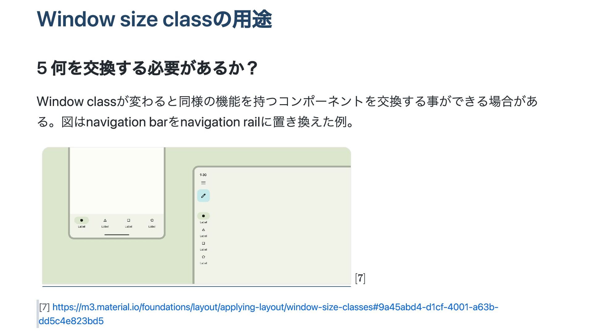
Window size classの用途 5 何を交換する必要があるか? Window classが変わると同様の機能を持つコンポーネントを交換する事ができる場合があ る。図はnavigation barをnavigation railに置き換えた例。
[7] https://m3.material.io/foundations/layout/applying-layout/window-size-classes#9a45abd4-d1cf-4001-a63b- dd5c4e823bd5
実装方法 AdaptiveScaffoldとAdaptiveLayoutというAPIが提供されている。 AdaptiveLayoutの方がカスタマイズ性が高い。 https://github.com/flutter/packages/tree/main/packages/flutter_adaptive_scaffold
実装方法 これらのコンポーネントが画面サイズに応じて何を表示するかを指定する。 [8] https://github.com/flutter/packages/tree/main/packages/flutter_adaptive_scaffold#adaptivelayout
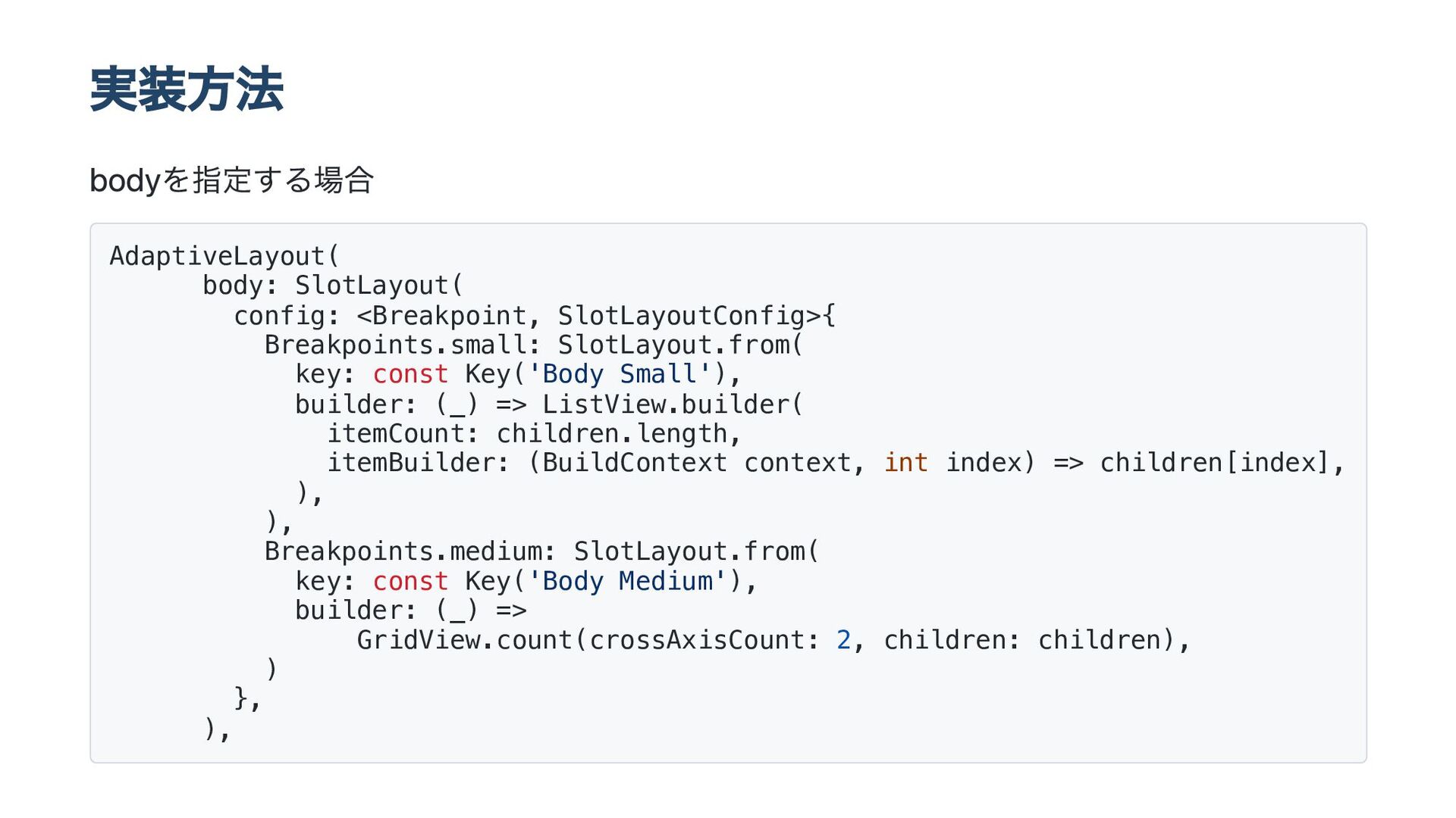
実装方法 bodyを指定する場合 AdaptiveLayout( body: SlotLayout( config: <Breakpoint, SlotLayoutConfig>{ Breakpoints.small: SlotLayout.from(
key: const Key('Body Small'), builder: (_) => ListView.builder( itemCount: children.length, itemBuilder: (BuildContext context, int index) => children[index], ), ), Breakpoints.medium: SlotLayout.from( key: const Key('Body Medium'), builder: (_) => GridView.count(crossAxisCount: 2, children: children), ) }, ),
実装方法 topNavigation等も設定可能。 const AdaptiveLayout({ super.key, this.topNavigation, this.primaryNavigation, this.secondaryNavigation, this.bottomNavigation, this.body,
this.secondaryBody, this.bodyRatio, this.internalAnimations = true, this.bodyOrientation = Axis.horizontal, });
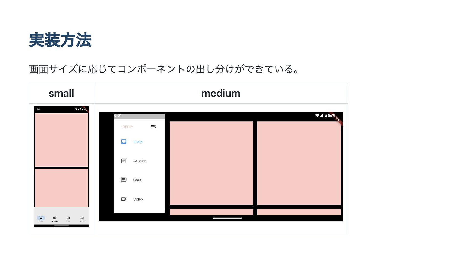
実装方法 画面サイズに応じてコンポーネントの出し分けができている。 small medium
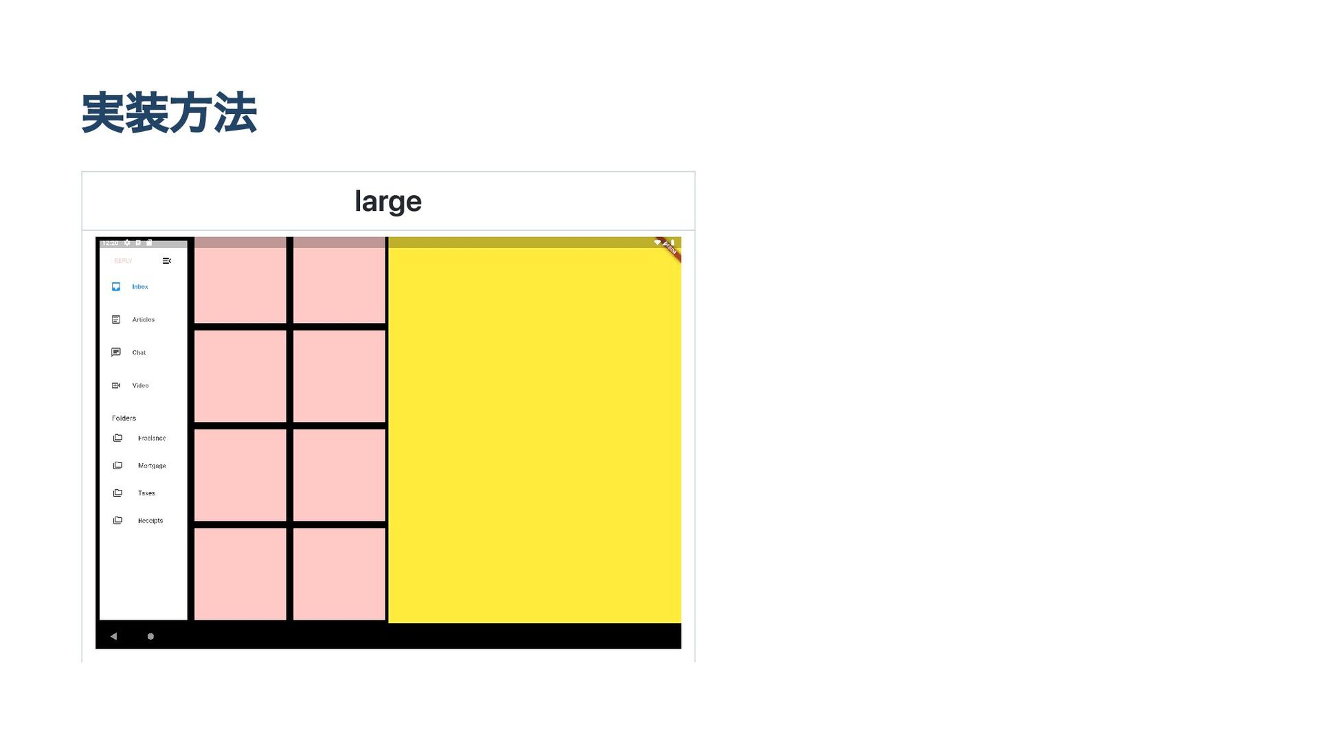
実装方法 large


 oyuk
oyuk
 rshindo
 ivargrimstad
 oku053
 cclai999
 yasunori0418
 kishida
 artoy
artoy
 lef237
 utakaha
 oniak3ibm
 rkaga
rkaga
 kenjiyoneyama
 techseoconnect
 varn
varn
 bluesmoon
 madoxten
 codingconduct
 csswizardry
 sferik
 twada
twada
 rasagy
 addyosmani
 philnash

![Window size classとは? 画面サイズ毎に分割した区分の事 [1] https://m3.material.io/foundations/layout/applying-layout/window-size-classes#6e960b82-eff3-4f1b-92d3- 5edb5e338f49](https://files.speakerdeck.com/presentations/68057ca4eebe425b9a5fdb385346a696/slide_2.jpg)
![Window size classとは? [2] https://m3.material.io/foundations/layout/applying-layout/window-size-classes](https://files.speakerdeck.com/presentations/68057ca4eebe425b9a5fdb385346a696/slide_3.jpg)
![Window size classの用途 Window classに応じてコンポーネントの配置、表示状態を変更する事でより良いユーザー体 験を提供できる。 [3] https://m3.material.io/foundations/layout/applying-layout/window-size-classes#6e960b82-eff3-4f1b-92d3- 5edb5e338f49](https://files.speakerdeck.com/presentations/68057ca4eebe425b9a5fdb385346a696/slide_4.jpg)
![Window size classの用途 1 何が表示されるべきか? 小さい画面では表示されていないコンポーネントが大きい画面では表示したほうが良い場合 がある。 画像ではpaneが表示状態がcompact、expandedで違っている。 [4] https://m3.material.io/foundations/layout/applying-layout/window-size-classes](https://files.speakerdeck.com/presentations/68057ca4eebe425b9a5fdb385346a696/slide_6.jpg)
![Window size classの用途 2 画面をどのように分割するか? 一つのpaneはcompact,medium、二つのpaneはexpandedで使用すると良い。 [5] https://m3.material.io/foundations/layout/applying-layout/window-size-classes#64506ae2-f4c1-4810-8ee9- d2434ab8616c](https://files.speakerdeck.com/presentations/68057ca4eebe425b9a5fdb385346a696/slide_7.jpg)
![Window size classの用途 3 何のサイズを変える必要があるか? compactでのコンポーネントのサイズはmedium,expandedでは大きくする事が可能である。 [6] https://m3.material.io/foundations/layout/applying-layout/window-size-classes#69b87bd8-6ed7-4df5-a91d- 04247c47ebe1](https://files.speakerdeck.com/presentations/68057ca4eebe425b9a5fdb385346a696/slide_8.jpg)


![実装方法 これらのコンポーネントが画面サイズに応じて何を表示するかを指定する。 [8] https://github.com/flutter/packages/tree/main/packages/flutter_adaptive_scaffold#adaptivelayout](https://files.speakerdeck.com/presentations/68057ca4eebe425b9a5fdb385346a696/slide_12.jpg)