 SiteGround - Reliable hosting with speed, security, and support you can count on.
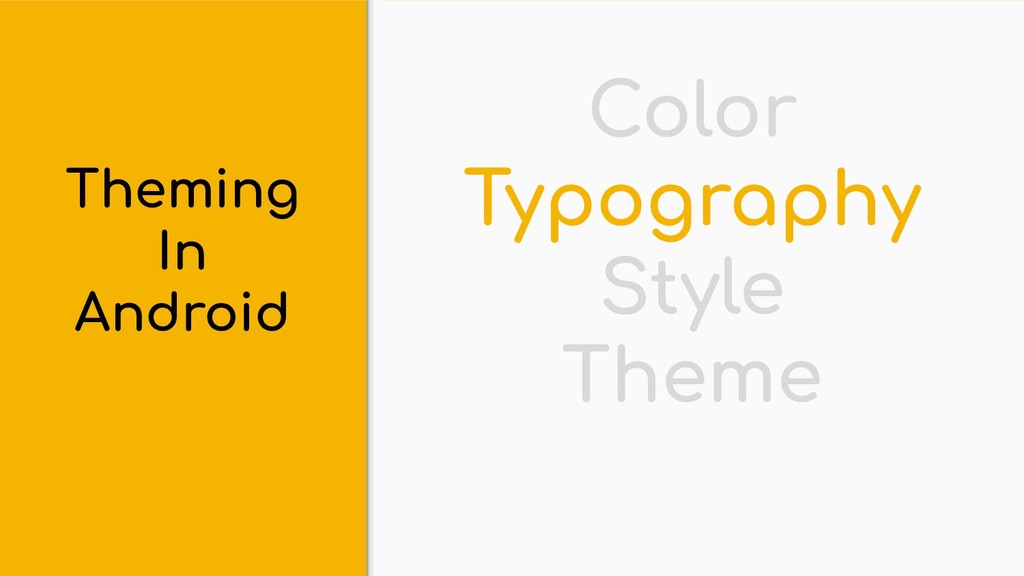
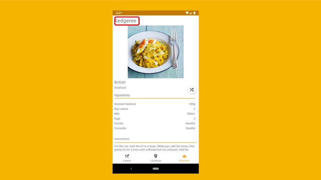
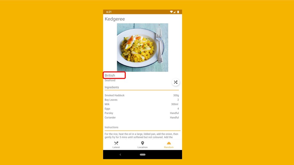
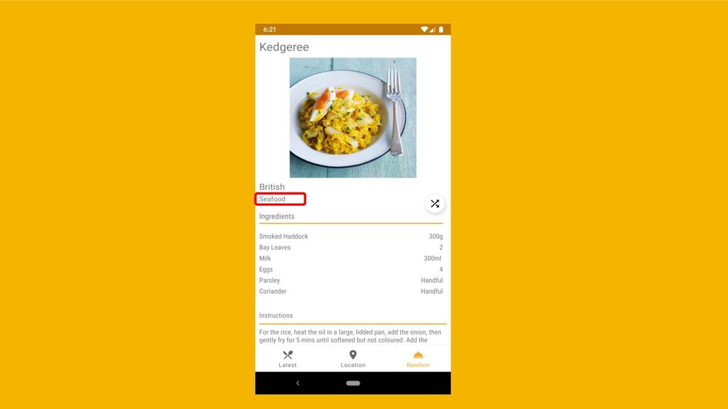
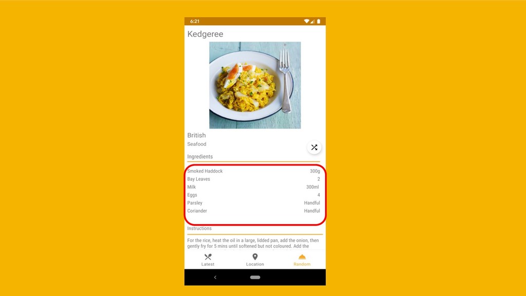
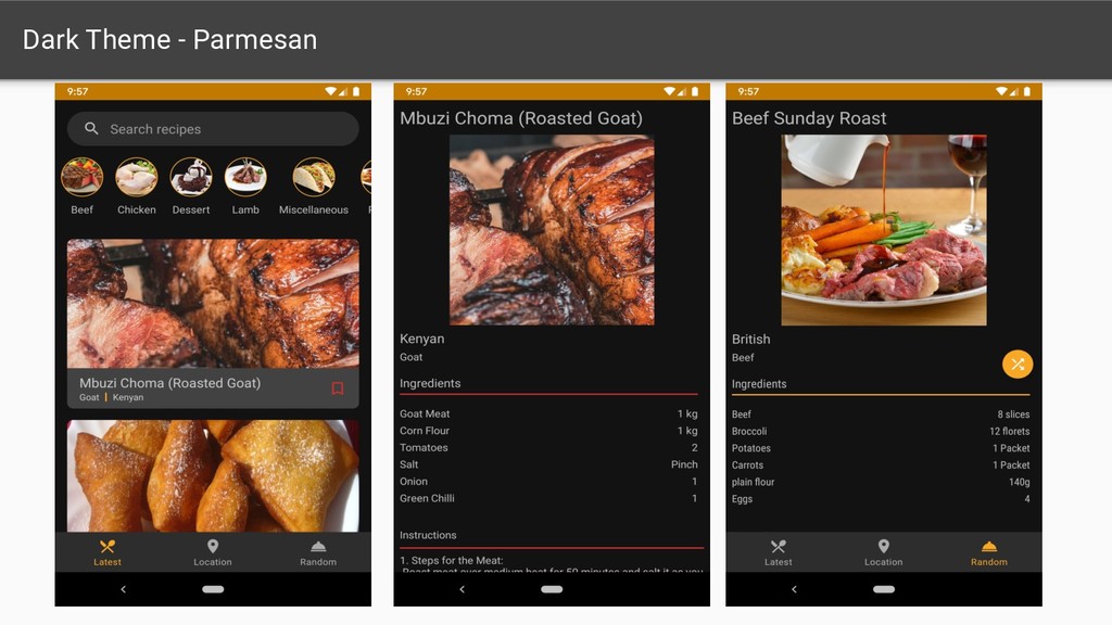
This deck was originally presented at JavaCloud 2019 and it is all about theming your Android app using Google's Material Design.
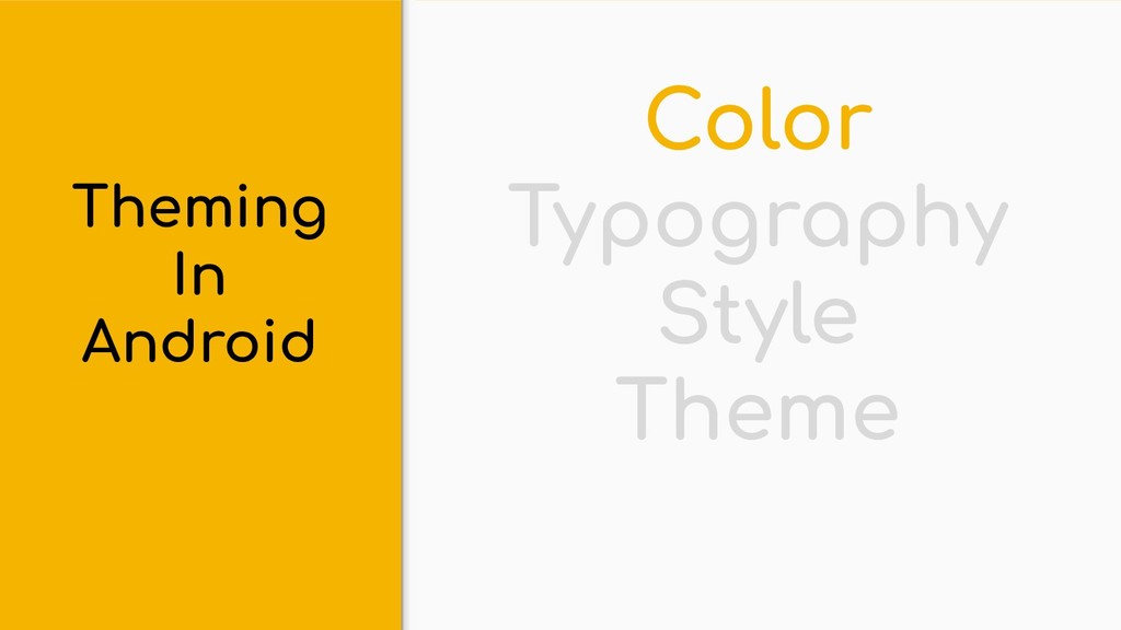
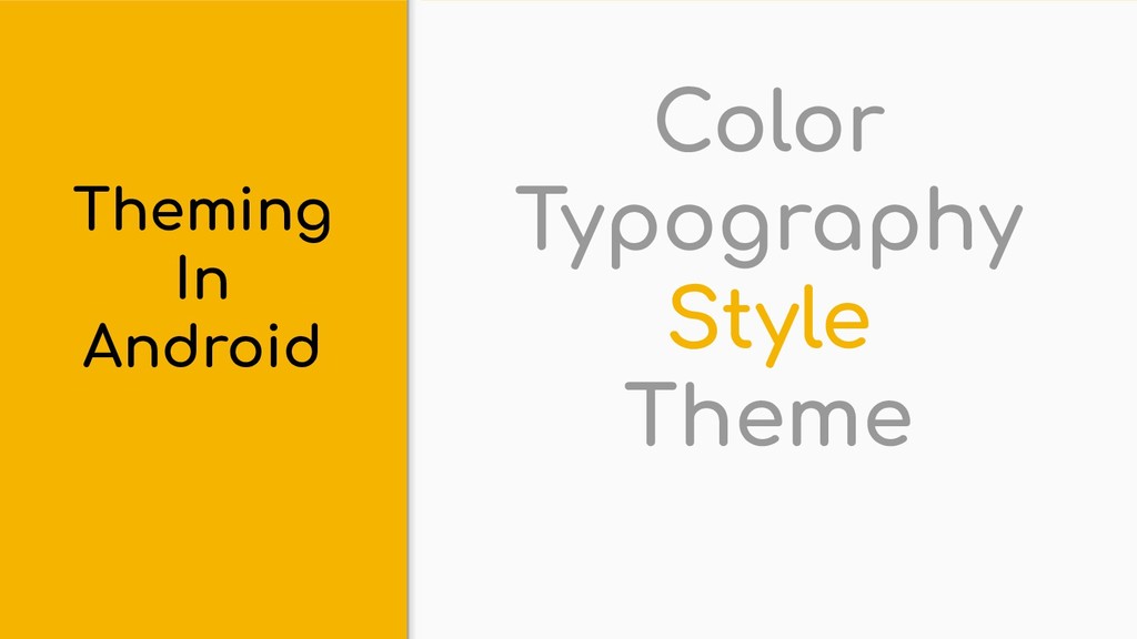
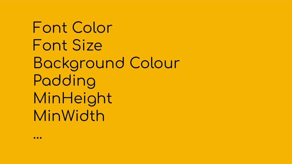
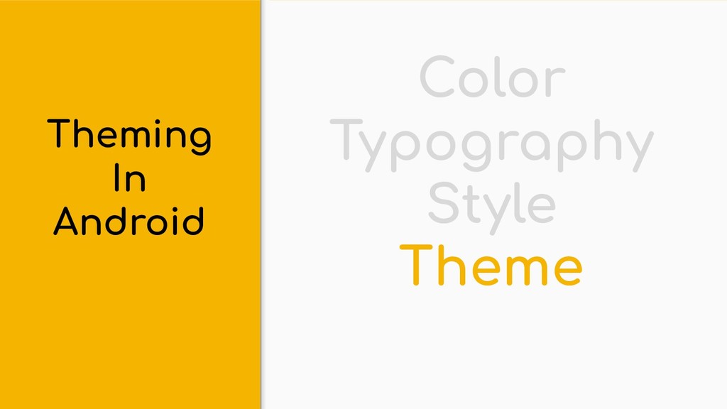
Topics Covered:
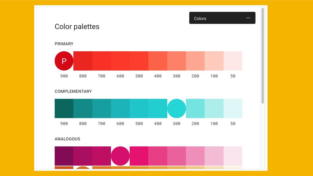
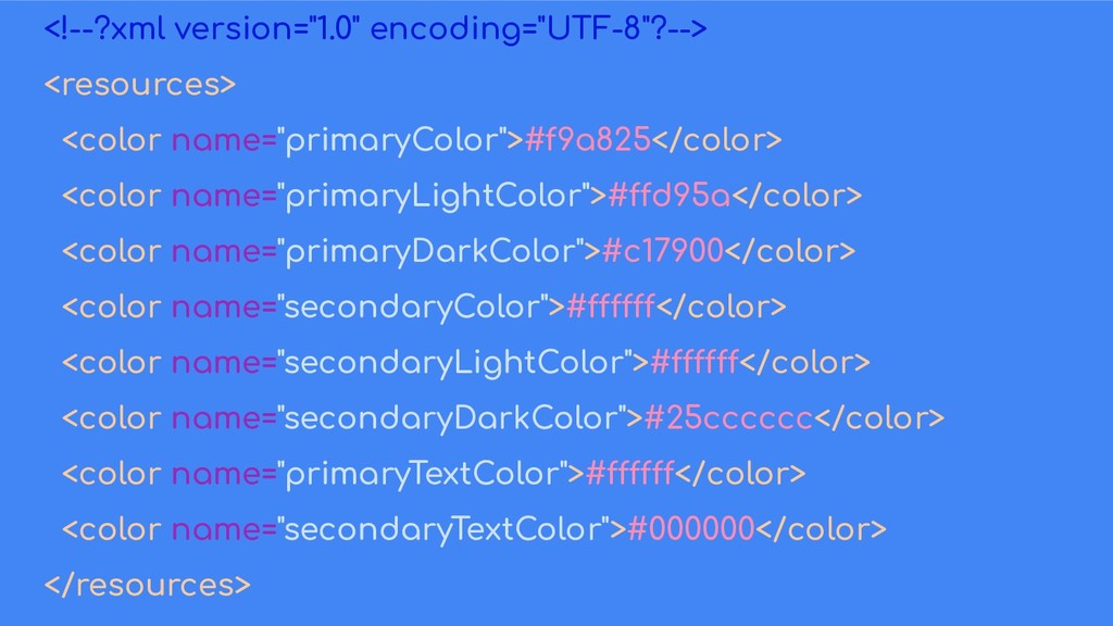
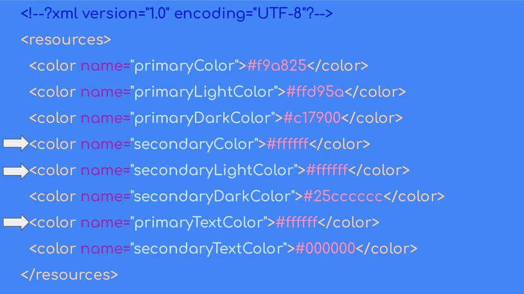
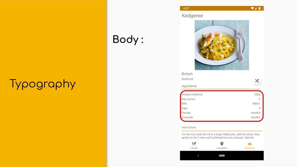
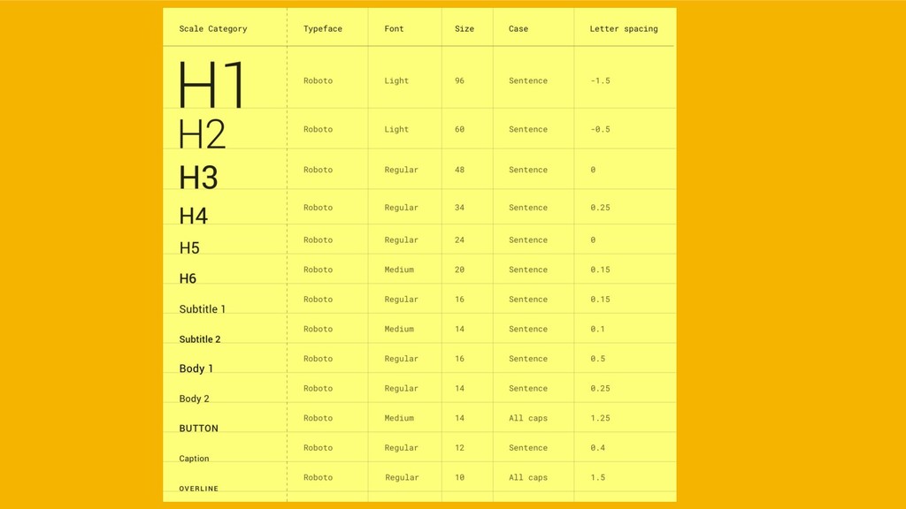
- Color
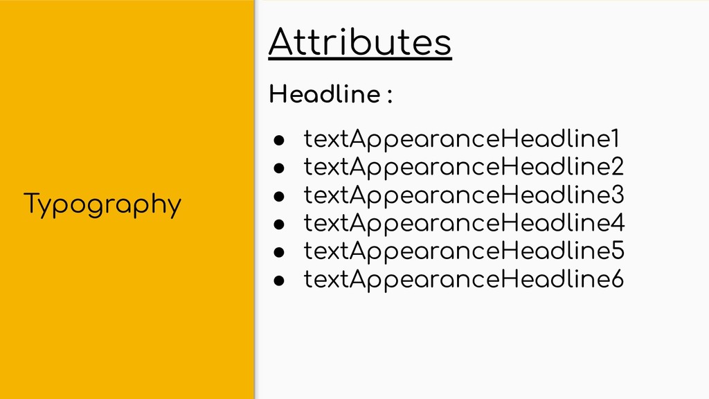
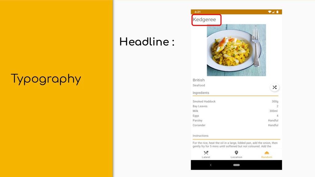
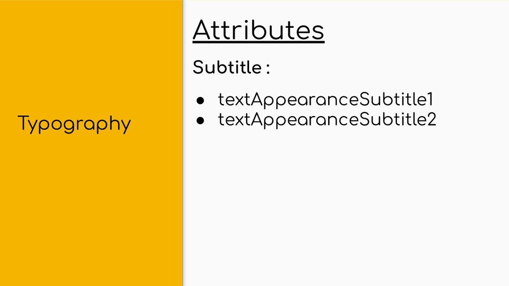
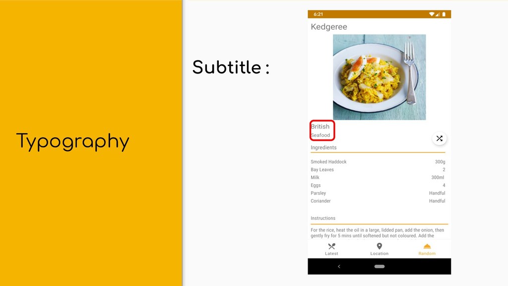
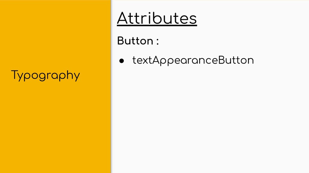
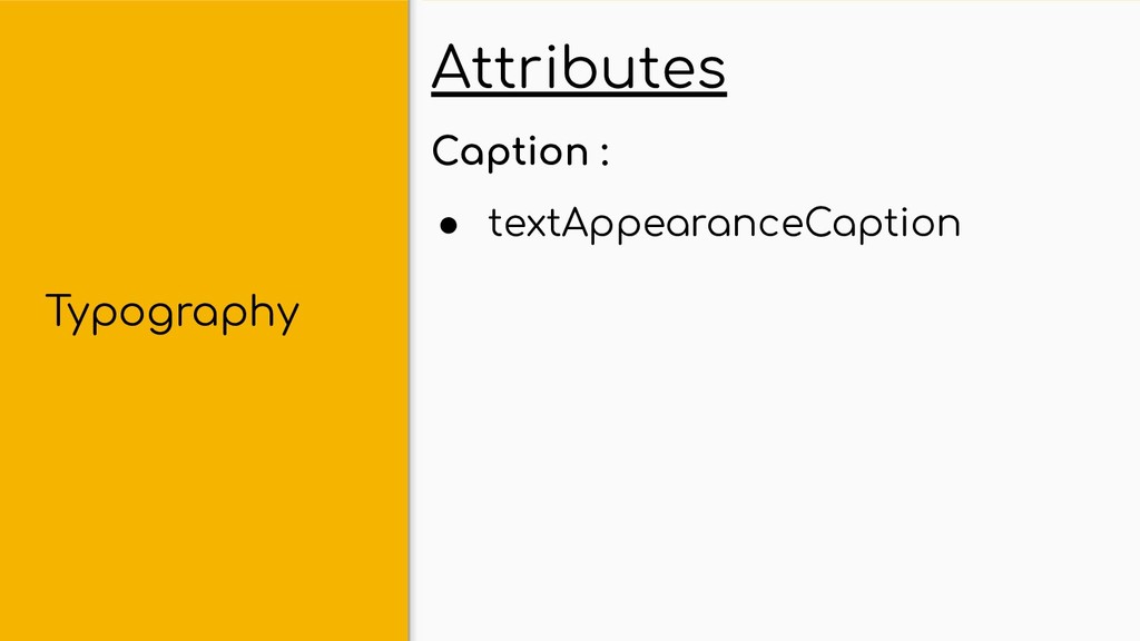
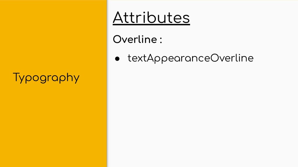
- Typography
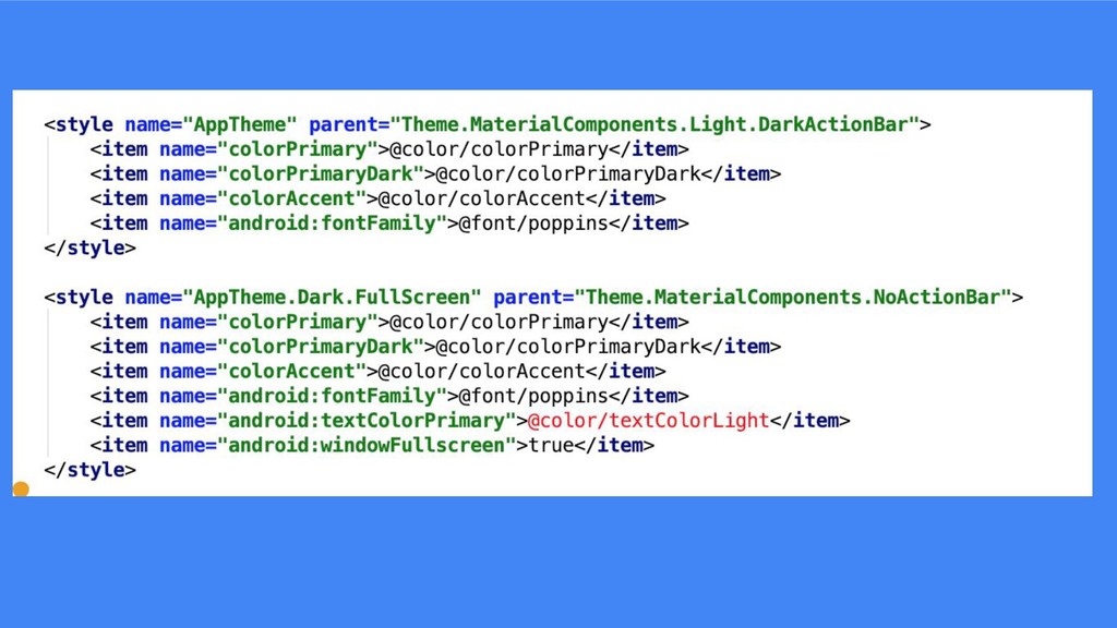
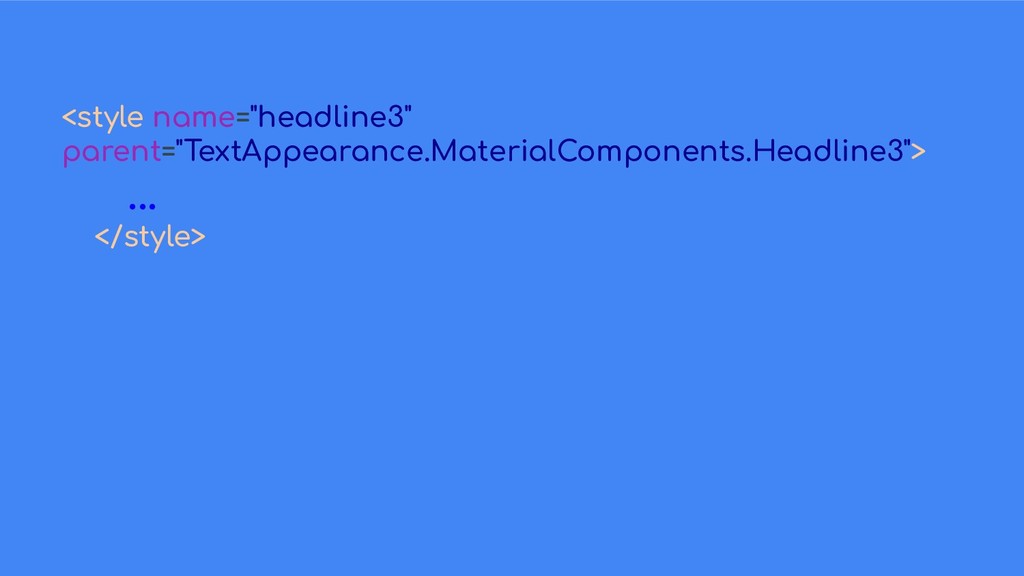
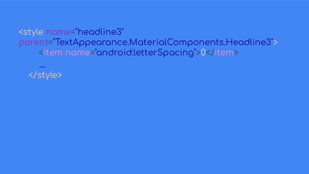
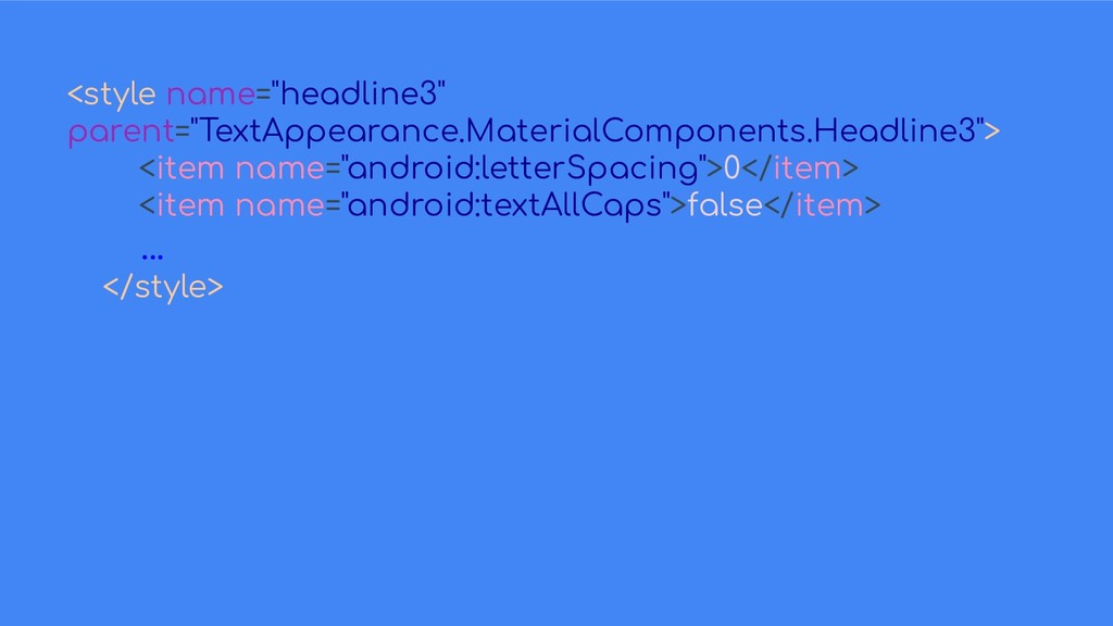
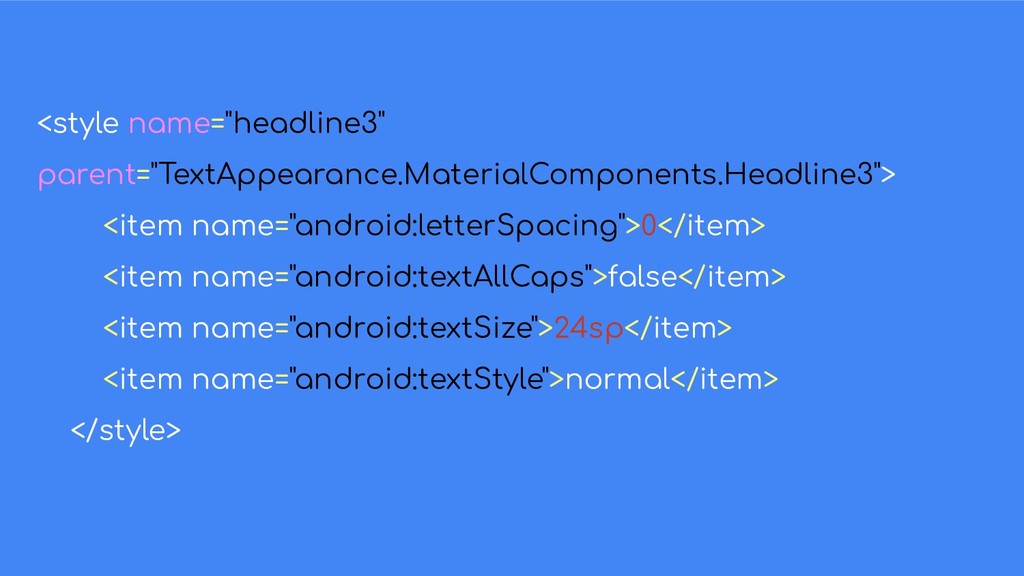
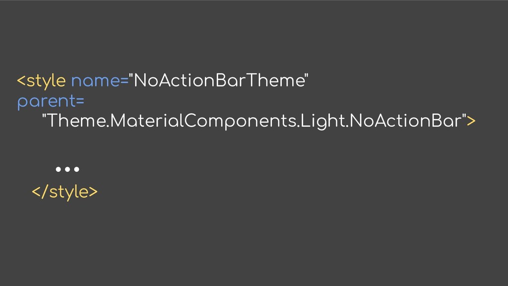
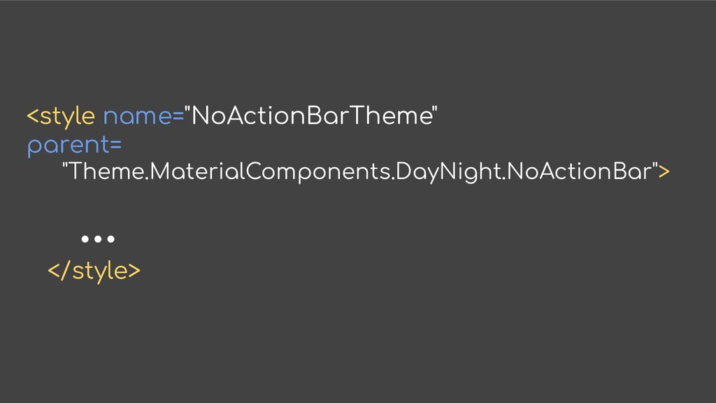
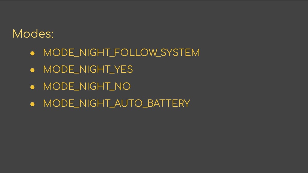
- Themes
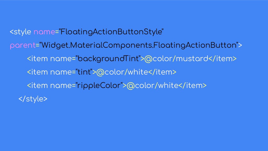
- Styles
 pabimoloi
 nwiizo
 nulabinc
 oracle4engineer
 overflowinc
 jacopen
 tsho
tsho
 prinlab
 hacomono
 akihiro_kokubo
 tonyrice
 marcelosomers
 zakiyama
 watany
 bethany
 deanohume
 garrettdimon
 helmedeiros
 addyosmani
 kimpetersen