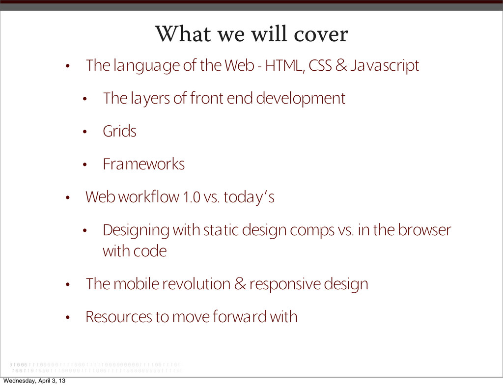
- HTML, CSS & Javascript • The layers of front end development • Grids • Frameworks • Web workflow 1.0 vs. today’s • Designing with static design comps vs. in the browser with code • The mobile revolution & responsive design • Resources to move forward with Wednesday, April 3, 13
Catholic Relief Services Lorem ipsum dolor sit amet, consectetur adipiscing elit. Integer fringilla imperdiet orci quis adipiscing. Fusce tristique mattis urna, non congue nulla mattis in. In tincidunt diam sed sem vehicula vestibulum. Viva- mus turpis diam, dignissim ut gravida non, varius sit amet neque. Lorem ipsum dolor sit amet EVENTS Lorem ipsum dolor sit amet, consectetur adipiscing elit. Vestibulum dapibus ipsum vitae felis tristique sed sollicitudin lectus vehicula. Pellentesque habitant morbi tristique senectus et netus et malesuada fames ac turpis egestas. See all Events >> NEWS Lorem ipsum dolor sit amet, consecte- tur adipiscing elit. Vestibulum dapibus ipsum vitae felis tristique sed sollicitudin lectus. Pellentesque habitant morbi tristique senectus et netus et malesuada. Read all University News on Lorem ipsum dolor sit amet, consectetur adipiscing elit. Act Now! Latest Action Alert: Vestibulum dapibus ipsum vitae felis tristique sed sollicitudin lectus vehicula. Take Action! Lorem ipsum dolor sit amet, consectetur adipiscing elit. Integer frin- gilla imperdiet orci quis adipiscing. Integer fringilla imperdiet orci quis adipiscing. Read more. ABOUT STUDENT AND STAFF RESOURCES FACULTY RESOURCES ADVOCACY MEDIA CAMPUS AMBASSADORS GLOBAL SOLIDARITY NETWORK SCHOLARS IN GLOBAL SOLIDARITY University Home | Sign up for E-mails | Donate | Contact • IA - Information Architecture Technically, Fair Trade is a program/activity. Is it important enough to be called out as a top level navigation item? These categories need to be eshed out because there are too many currently. Can this go under a category, rather than exist as a top navigational item? Proposed title for CCGP section. Proposed title for Take Action Now. Would link to a search of resources that are tagged as GSN. Can we link this login to the login of the main site or does it have to be separate since it is house by an outside vendor? 1 4 2 3 NOTES 5 6 7 You Tube Twitter Facebook CRS Website FOOTER NAVIGATION Pinterest Newswire Media Photos Videos Blog Stories This section contains all multimedia and news about CRS College that is not and educational resource. Social Media Sign up for E-mail Advocacy About Advocacy Current Alerts Campus Organizer Guide Manual Handouts The landing page would feature current Advocacy Alerts, Advocacy News and highlight Campus Advocacy. 3 Online Advocacy 4 5 Faculty Resources Food Security Human Tra cing International Development Economic Justice Migration Peace Building A resource database that can be searched based on audience, type of resource, and subject. Water Gender & Development Other Middle East Catholic Social Teaching 2 Student Resources Fair Trade Programs/Activities Prayer and Spirituality Connect to Our Partners Fundraising Countries The landing page would be a mini-resource database. It would also provide a link to the CRS resouce center. 1 Global Solidarity Network The landing page would have the About informa- tion and feature the current session. Current Session Past Sessions 6 Course Registration Member Login 7 Case Studies Current Scholars Scholars In Global Solidarity Resources Message Board Partners The landing page would have the about informa- tion and would provide navigation to other areas. Apply Campus Ambassadors The landing page would have the about informa- tion and would provide navigation to other areas. Training Message Board Current Ambassadors Resources Case Studies Apply SECONDARY NAVIGATION TOP-LEVEL NAVIGATION Sign Up for E-mail Faculty Log In Student Login University Home Donate Contact HEADER NAVIGATION University Website Information Architecture - First Draft Contact Us About The landing page for About will have the intro to CRS and overview of university.crs.org content. Wednesday, April 3, 13
design... • HTML • CSS • Javascript • and NO we don’t want no stinkin’ Flash... • Grids & Frameworks • SASS & LESS • Responsive design Wednesday, April 3, 13
browser encounters a DOCTYPE that indicates a well coded document the browser will render it in Standards Mode. This is GOOD! • An incomplete or outdated DOCTYPE causes the browser to render in Quirks mode. This is BAD! • HTML 4.01 strict: <!DOCTYPE html PUBLIC "-//W3C//DTD HTML 4.01//EN "http:// www.w3.org/TR/html4/strict.dtd"> • HTML 4.01 Transitional: <!DOCTYPE html PUBLIC "-//W3C//DTD HTML 4.01 Transitional//EN" "http://www.w3.org/TR/html4/loose.dtd"> • XHTML 1.0 Strict: <!DOCTYPE html PUBLIC "-//W3C//DTD XHTML 1.0 Strict//EN" "http:// www.w3.org/TR/xhtml1/DTD/xhtml1-strict.dtd"> • XHTML 1.0 Transitional: <!DOCTYPE html PUBLIC "-//W3C//DTD XHTML 1.0 Transitional//EN" "http://www.w3.org/TR/xhtml1/DTD/xhtml1-transitional.dtd"> • HTML5: <!DOCTYPE html> Wednesday, April 3, 13
encoding • language • keywords • description • author • more: http://www.w3schools.com/html/html_meta.asp • links to stylesheet files • links to any script files (ie: javascript) These now should be placed right before the closing body tag Wednesday, April 3, 13
titile=”Title of Page I am linking to” • Always close elements (tags) when they have been opened • there are a few that don’t have a close • <h1>This is a Heading for my Page</h1> • Always nest elements properly • <p><em>This text is emphasized <strong>strongly in parts</strong></em></p> • <p><em>This text is emphasized <strong>strongly in parts</em></strong></p> Wednesday, April 3, 13
more containers • Every semantic, structural html element is a container • The idea is to give some semantic meaning to the container based on what element you choose • Browsers are dumb, or at least very literal • A browser will display an html element the only way it knows how to • Semantic html has no awareness of layout or design • Generic elements such as <header> <footer> <section> <article> <div> can be used to define the layout of an html document Wednesday, April 3, 13
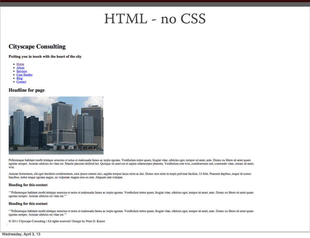
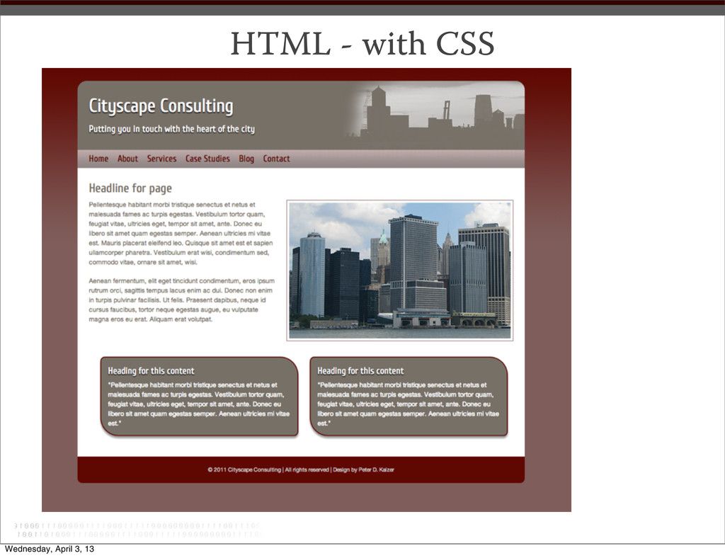
semantic html alone is not enough • we need a presentation language • an efficient way to give design and layout instructions to our semantic mark up • we need CSS Wednesday, April 3, 13
is • Comments are text in your page that is invisible • Comments can help you organize your code <!-- this is an html comment --> /* this a css comment */ Wednesday, April 3, 13
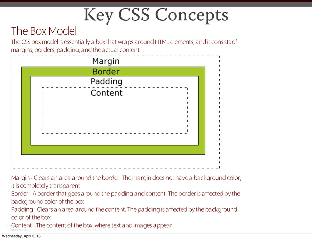
is essentially a box that wraps around HTML elements, and it consists of: margins, borders, padding, and the actual content. Margin - Clears an area around the border. The margin does not have a background color, it is completely transparent Border - A border that goes around the padding and content. The border is affected by the background color of the box Padding - Clears an area around the content. The padding is affected by the background color of the box Content - The content of the box, where text and images appear Wednesday, April 3, 13
inherited by child elements from their parent element (i.e. by an element contained inside another one). Others are not automatically inherited. Specificity A measure of how specific a rule’s selector is. Source Order If you define a style property, and later define an alternative style property for the same thing, the later definition over-rules the earlier one. More Key CSS Concepts Wednesday, April 3, 13
your site holistically • Keep as much of your CSS in the external stylesheet or style sheets • Group your styles in your stylesheet by what they control • Well comment your stylesheet (and your html files) Wednesday, April 3, 13
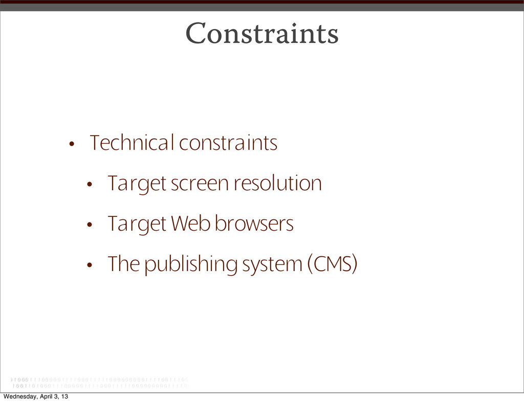
of all design; print, web, etc.. • Grids add order,continuity, and harmony to the presentation of information • Grids allow an audience to predict where to find information, thus enhancing the user experience • Grids make it easier to add new content to a website in a manner consistent with the overall vision of the website Wednesday, April 3, 13
problem solving first and aesthetics second • The grid is a component of the user experience • The simpler the grid, the more effective it is Wednesday, April 3, 13
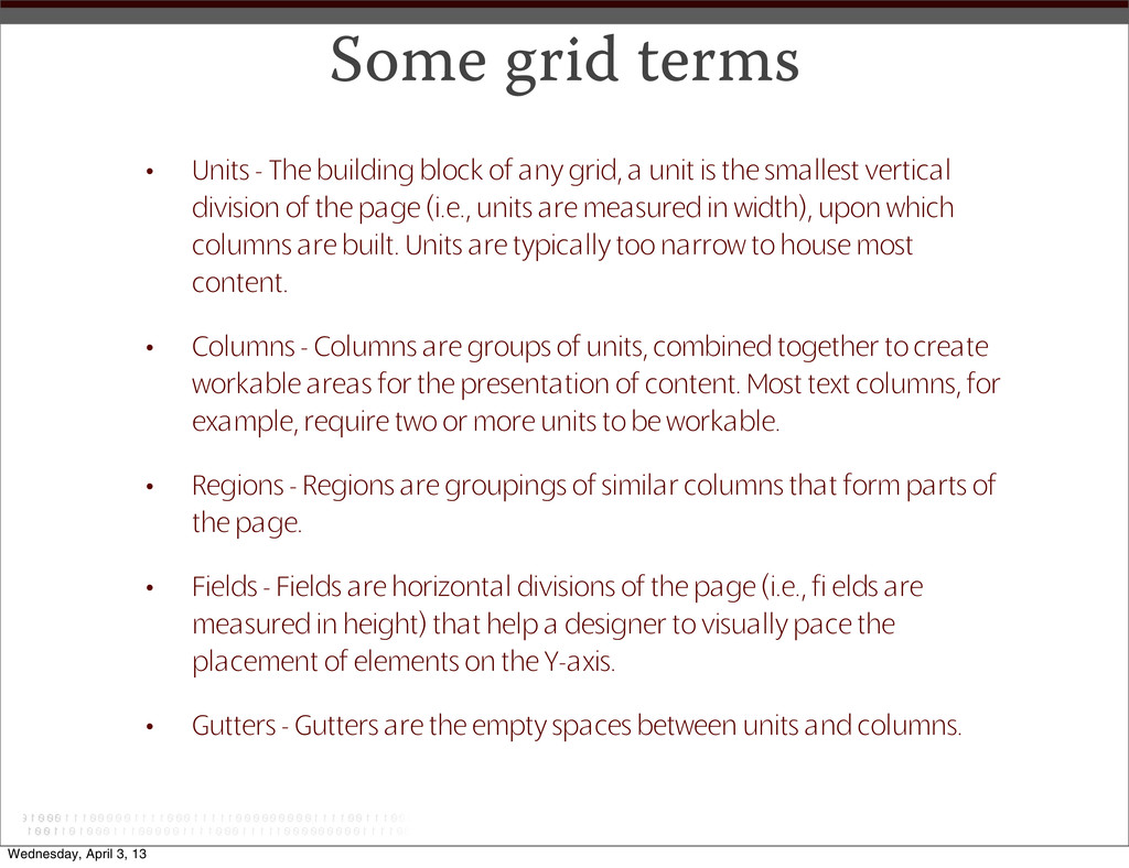
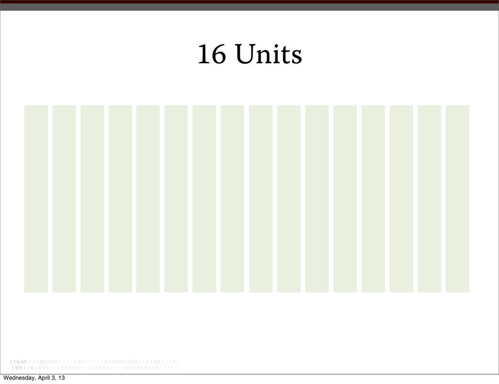
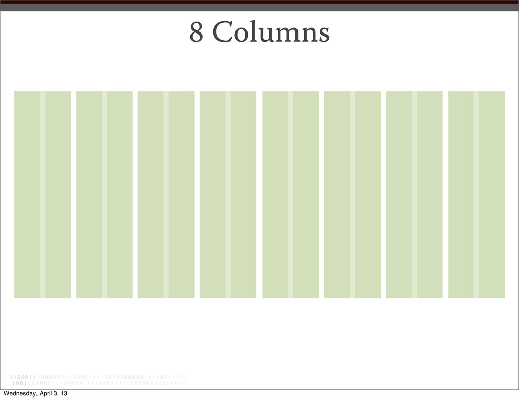
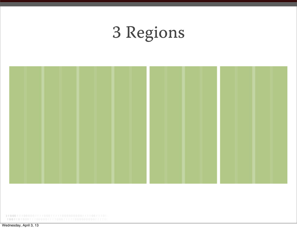
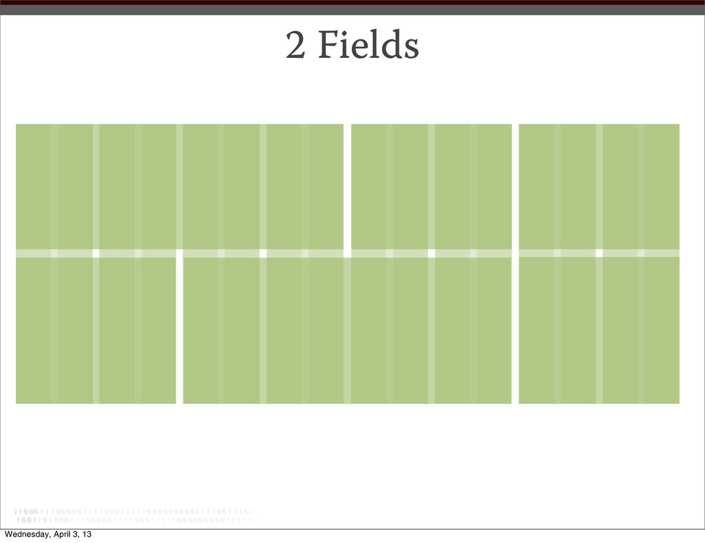
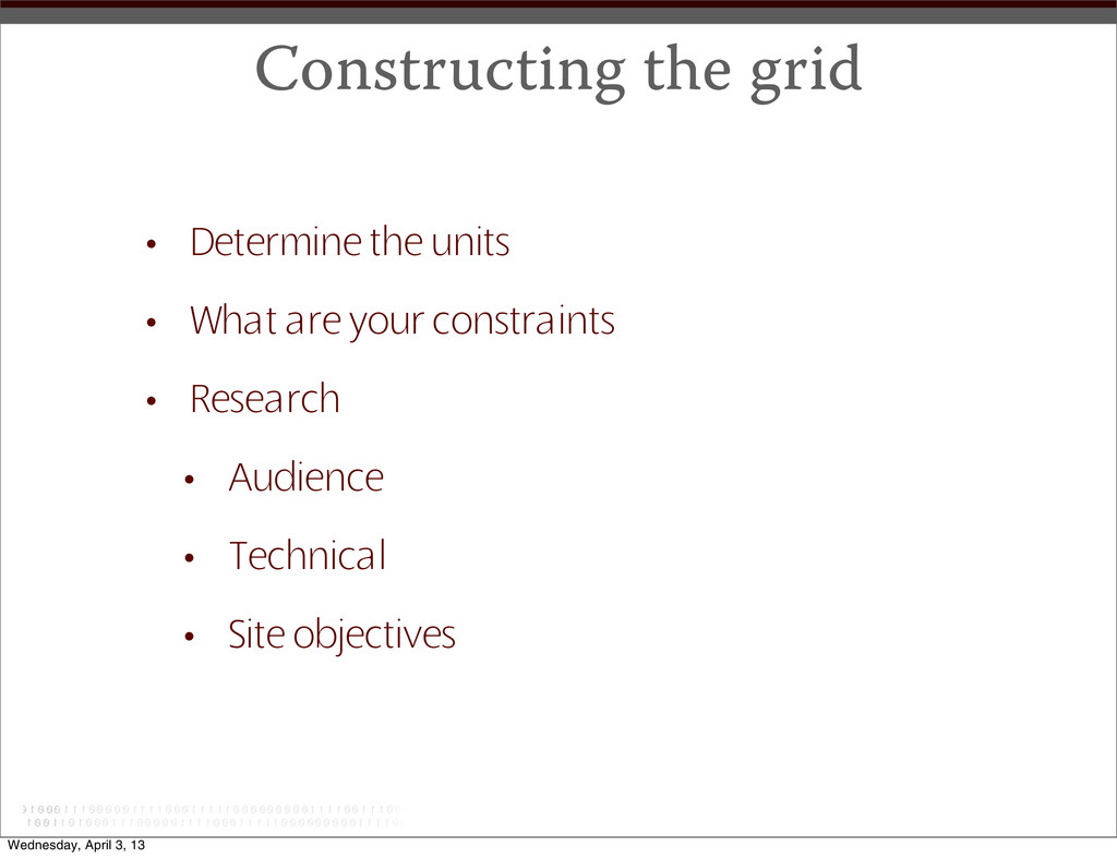
any grid, a unit is the smallest vertical division of the page (i.e., units are measured in width), upon which columns are built. Units are typically too narrow to house most content. • Columns - Columns are groups of units, combined together to create workable areas for the presentation of content. Most text columns, for example, require two or more units to be workable. • Regions - Regions are groupings of similar columns that form parts of the page. • Fields - Fields are horizontal divisions of the page (i.e., fi elds are measured in height) that help a designer to visually pace the placement of elements on the Y-axis. • Gutters - Gutters are the empty spaces between units and columns. Wednesday, April 3, 13
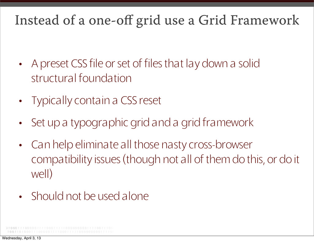
A preset CSS file or set of files that lay down a solid structural foundation • Typically contain a CSS reset • Set up a typographic grid and a grid framework • Can help eliminate all those nasty cross-browser compatibility issues (though not all of them do this, or do it well) • Should not be used alone Wednesday, April 3, 13
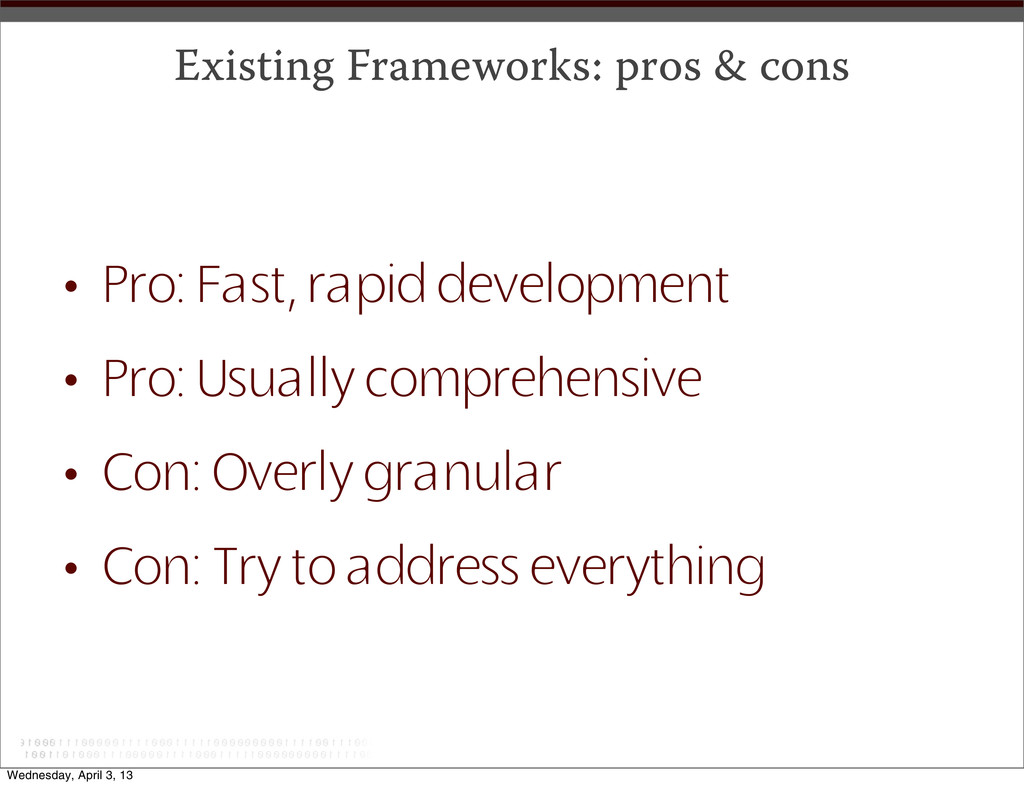
the problem you are trying to solve • Pro: only develop what you need • Pro: can always add more features • Con: Not as rapid a development time • Tip: “Borrow” bits of code from existing frameworks Wednesday, April 3, 13
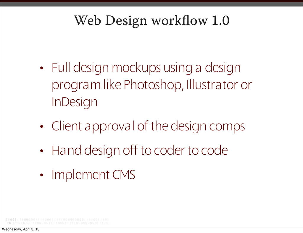
design program like Photoshop, Illustrator or InDesign • Client approval of the design comps • Hand design off to coder to code • Implement CMS Wednesday, April 3, 13
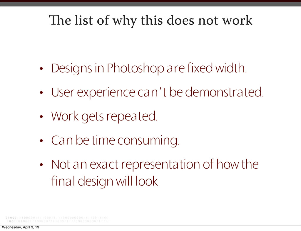
in Photoshop are fixed width. • User experience can’t be demonstrated. • Work gets repeated. • Can be time consuming. • Not an exact representation of how the final design will look Wednesday, April 3, 13
million in 2012, up 17.1% from 97.3 million in 2011. • Smartphone users will reach 106.7 million in 2012, up 18.4% from 2011. • In 2012, 94% of smartphones users will be mobile internet users. • All mobile phone users will reach 242.6 million in 2012, up 2.3% from 2011. • Mobile shoppers will reach 72.8 million in 2012. • Tablet users will reach 54.8 million in 2012, up 62.8% from 33.7 million in 2011. Wednesday, April 3, 13
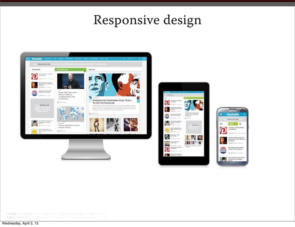
approach in web design that provides an optimal viewing experience across a wide range of screen resolutions and devices. • Accomplished using the same codebase and content, instead of separate sites for different devices. • Responsive design is made possible with the use of: • Adaptive layout - Uses media queries to modify the design in ways that suit different screen sizes. • Fluid grid - Uses relative units like percentages instead of fixed- width units like pixels. • Flexible media/images - Images and other media (like videos) must also be scaled using relative units so they don’t expand beyond their containing element. Wednesday, April 3, 13
 pdkaizer
 designer_no_pon
 hicard
 happy_ferret153
 kgsi
kgsi
 mhand01
 usagimaru
 lynteo
 0b1tk
0b1tk
 chorkaichan
 nagata03
 chiilog
 mlcsv
mlcsv
 marketingsoph
 katarinadahlin
 lara
lara
 danielanewman
 cassininazir
 samlambert
 jonrohan
 chriscoyier
 afnizarnur
 ks91
ks91
![ank you! peterkaizer.com [email protected] linkedin.com/in/pdkaizer/ facebook.com/pkaizer twitter.com/pdkaizer Wednesday, April 3,](https://files.speakerdeck.com/presentations/603089507e820130163e123138152827/slide_51.jpg)