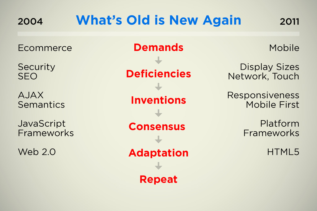
Presentation about mobile trends and technologies delivered to Greater Seattle NetSquared (Nov 15, 2011), a Meetup group of non-profits and tech volunteers.
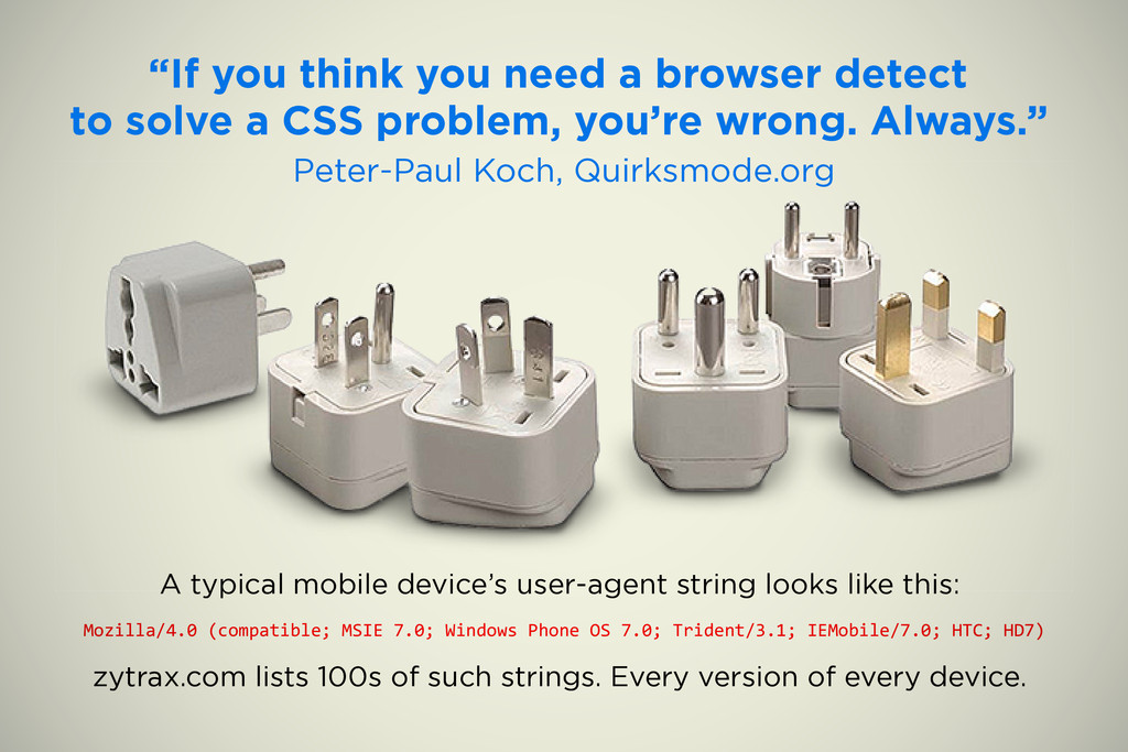
a CSS problem, you’re wrong. Always.” Peter-Paul Koch, Quirksmode.org A typical mobile device’s user-agent string looks like this: Mozilla/4.0 (compatible; MSIE 7.0; Windows Phone OS 7.0; Trident/3.1; IEMobile/7.0; HTC; HD7) zytrax.com lists 100s of such strings. Every version of every device.
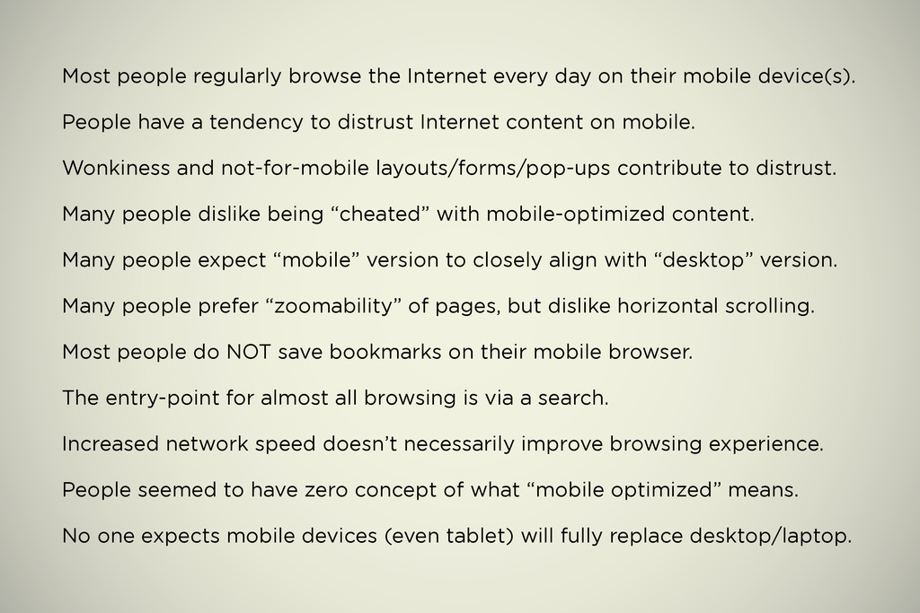
mobile device(s). People have a tendency to distrust Internet content on mobile. Wonkiness and not-for-mobile layouts/forms/pop-ups contribute to distrust. Many people dislike being “cheated” with mobile-optimized content. Many people expect “mobile” version to closely align with “desktop” version. Many people prefer “zoomability” of pages, but dislike horizontal scrolling. Most people do NOT save bookmarks on their mobile browser. The entry-point for almost all browsing is via a search. Increased network speed doesn’t necessarily improve browsing experience. People seemed to have zero concept of what “mobile optimized” means. No one expects mobile devices (even tablet) will fully replace desktop/laptop.
 ptrdo
ptrdo
 miyukichi_ospf
 nomizone
 kakehashi
 lycorptech_jp
 chmikata
 y150saya
 ysknsid25
 odan611
 muziyoshiz
 kawaguti
 shift_evolve
 mojombo
 emna__ayadi
 codingconduct
 aleyda
 nikkihalliwell
 rmw
rmw
 cromwellryan
 tammyeverts
 gr2m
gr2m
 sarafernandez
 jakevdp
 uxyall
![Peter Sylwester [email protected] delicious.com/ptrdo/mobile delicious/stacks/view/BHaNrB](https://files.speakerdeck.com/presentations/4ec2eecff5511900a9002da5/slide_20.jpg)