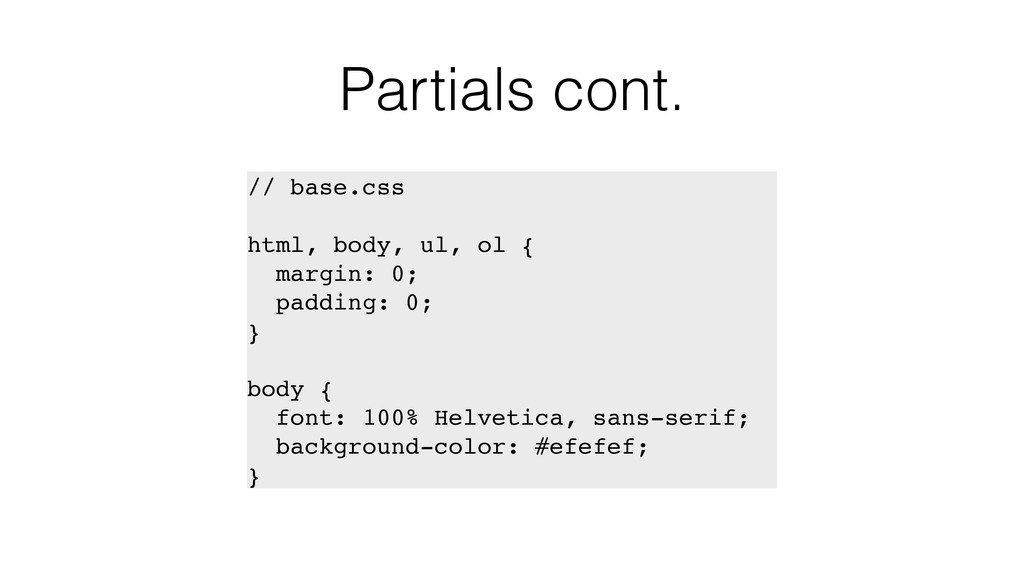
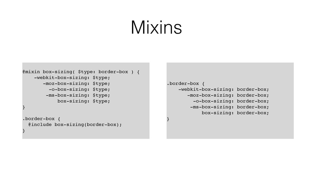
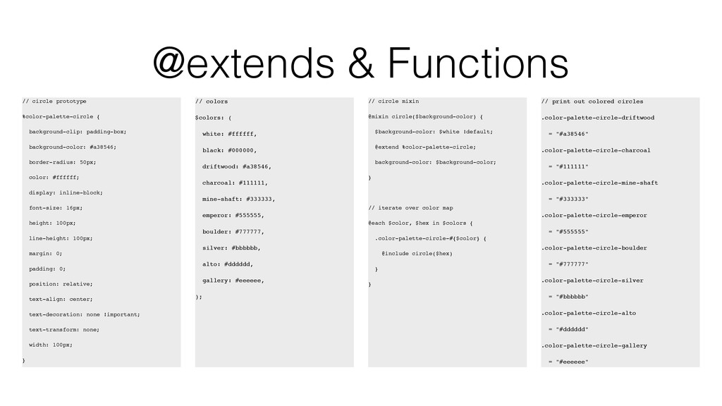
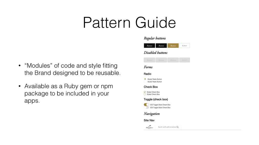
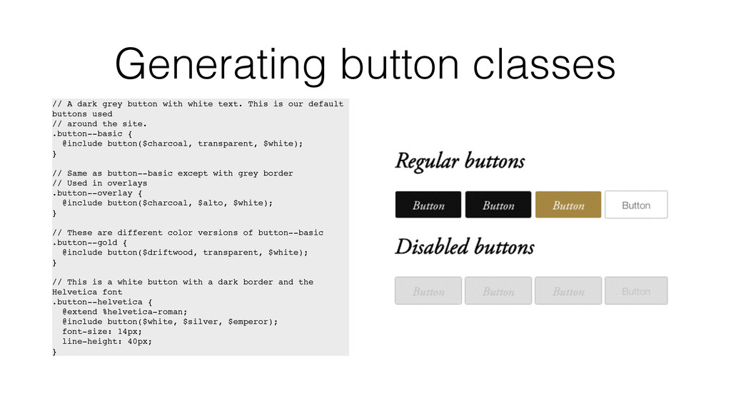
text. This is our default buttons used // around the site. .button--basic { @include button($charcoal, transparent, $white); } // Same as button--basic except with grey border // Used in overlays .button--overlay { @include button($charcoal, $alto, $white); } // These are different color versions of button--basic .button--gold { @include button($driftwood, transparent, $white); } // This is a white button with a dark border and the Helvetica font .button--helvetica { @extend %helvetica-roman; @include button($white, $silver, $emperor); font-size: 14px; line-height: 40px; }
 rachelober
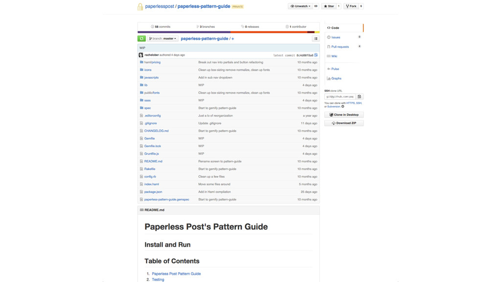
 kazumax55
 77web
77web
 manfredsteyer
 tomoyk
 o0h
o0h
 okumin
 panda728
 johnroyer
 yug1224
 tooppoo
 kajitack
 kentaroutakeda
 quramy
 aleyda
 jakevdp
 bluesmoon
 kneath
 addyosmani
 kimpetersen
 gurzu
gurzu
 tammyeverts
 eileencodes