Upgrade to Pro
— share decks privately, control downloads, hide ads and more …
Speaker Deck
Features
Speaker Deck
PRO
Sign in
Sign up for free
Search
Search
Unidades Mágicas do CSS3
Search
Ricardo Gouveia
February 27, 2016
Programming
59
0
Share
Embed
Copy iframe code
Copy JS code
Copy link
Start on current slide
Unidades Mágicas do CSS3
Apresentação de algumas unidades que, apesar de muito úteis, são pouco conhecidas.
Ricardo Gouveia
February 27, 2016
More Decks by Ricardo Gouveia
See All by Ricardo Gouveia
Performance Pré JS
ricardogouveia3
2
120
Hexo.js & Github Pages
ricardogouveia3
1
110
Diagrama de Portas (Doors Diagram)
ricardogouveia3
1
52
Other Decks in Programming
See All in Programming
jQueryをバージョンアップする前に使いたいjQuery Migrate
matsuo_atsushi
0
510
肥大化するレガシーコードに立ち向かうためのインターフェース分離と依存の逆転 / JJUG CCC 2026 Spring
hirokunimaeta
0
560
A2UI という光を覗いてみる
satohjohn
1
140
ふつうのFeature Flag実践入門
irof
7
4k
キャリア迷子上等 ─ "ない道"は自分で作ればいい
16bitidol
3
2.1k
Lemonade + Foundry Toolkit でお手軽アプリ開発
seosoft
1
340
JJUG CCC 2026 Spring: JSpecify で実現する Kotlin フレンドリーな Java API 設計
ternbusty
1
170
Lessons from Spec-Driven Development
simas
PRO
0
200
Make SRE Operations Easier with Azure SRE Agent
kkamegawa
0
6.2k
過去最大のMCPアップデート! 2026-07-28 RC版の謎に迫る
licux
6
340
Developing with AI Agents — Codex, Claude Code & Cowork Practical Guide
x5gtrn
PRO
0
1.3k
Skillsは効率化、Agentsは"自分の拡張"——Builder時代のエージェント編成(CC Night 2026)
wemra
1
130
Featured
See All Featured
CSS Pre-Processors: Stylus, Less & Sass
bermonpainter
360
30k
Paper Plane
katiecoart
PRO
1
51k
Side Projects
sachag
455
43k
The Curious Case for Waylosing
cassininazir
1
390
Information Architects: The Missing Link in Design Systems
soysaucechin
0
970
The Straight Up "How To Draw Better" Workshop
denniskardys
239
140k
Game over? The fight for quality and originality in the time of robots
wayneb77
1
200
YesSQL, Process and Tooling at Scale
rocio
174
15k
State of Search Keynote: SEO is Dead Long Live SEO
ryanjones
0
200
Learning to Love Humans: Emotional Interface Design
aarron
275
41k
Building a Modern Day E-commerce SEO Strategy
aleyda
45
9.1k
KATA
mclloyd
PRO
35
15k
Transcript
Unidades Mágicas do CSS3 rem, vh, vw, vmin, vmax, ex,
ch
Ricardo Gouveia Q @ricardogouveia3 a
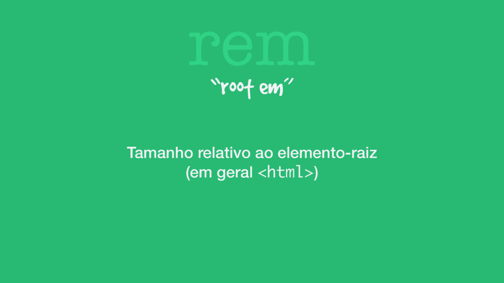
rem “root em” Tamanho relativo ao elemento-raiz (em geral <html>)
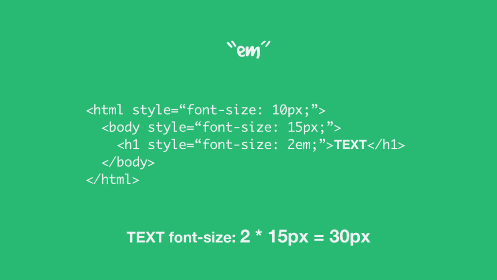
“em” <html style=“font-size: 10px;”> <body style=“font-size: 15px;”> <h1 style=“font-size: 2em;”>TEXT</h1>
</body> </html> TEXT font-size: 2 * 15px = 30px
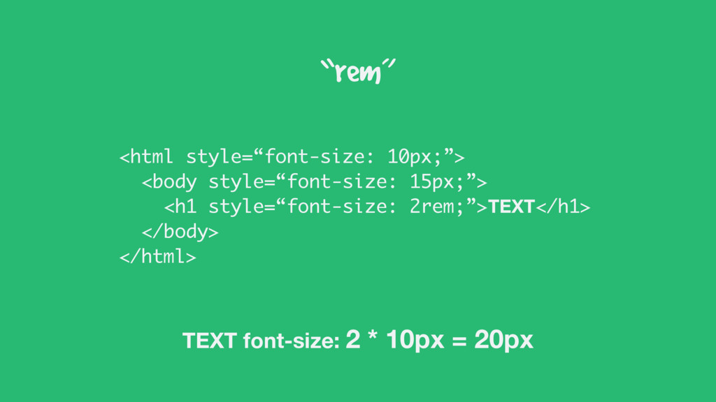
“rem” <html style=“font-size: 10px;”> <body style=“font-size: 15px;”> <h1 style=“font-size: 2rem;”>TEXT</h1>
</body> </html> TEXT font-size: 2 * 10px = 20px
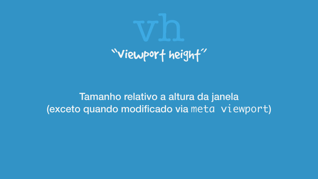
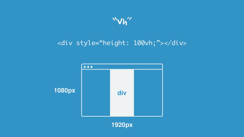
vh “viewport height” Tamanho relativo a altura da janela (exceto
quando modificado via meta viewport)
“vh” <div style=“height: 100vh;”></div> 1080px 1920px div
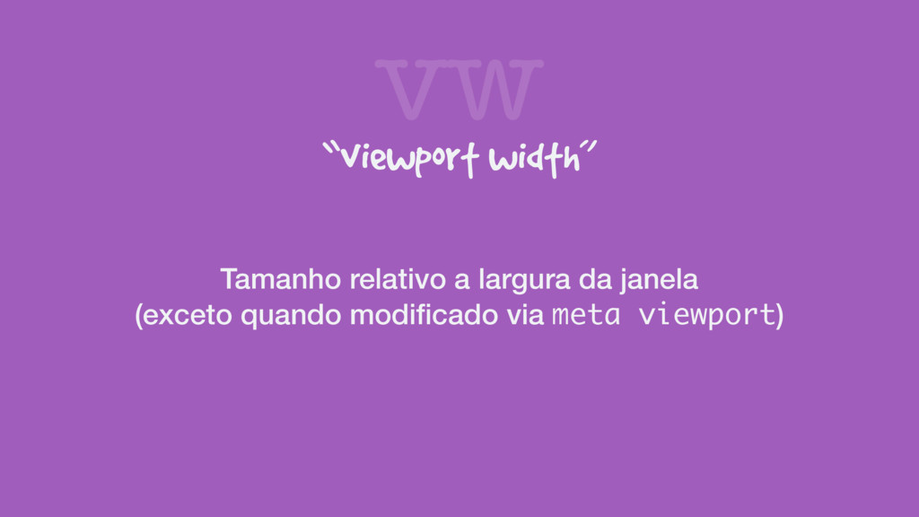
vw “viewport width” Tamanho relativo a largura da janela (exceto
quando modificado via meta viewport)
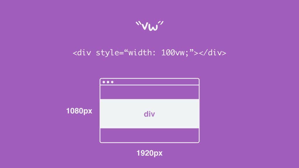
“vw” <div style=“width: 100vw;”></div> 1080px 1920px div
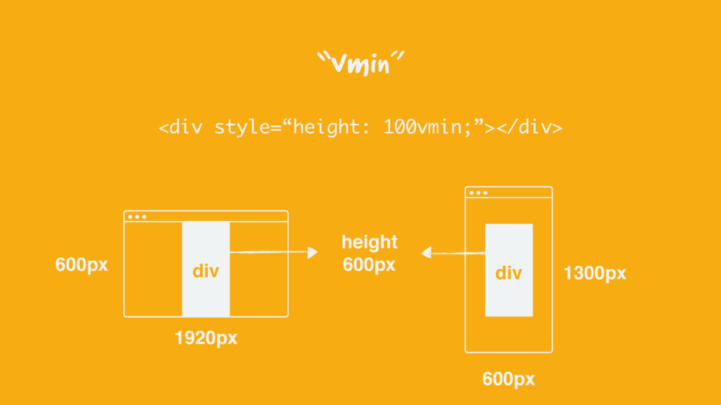
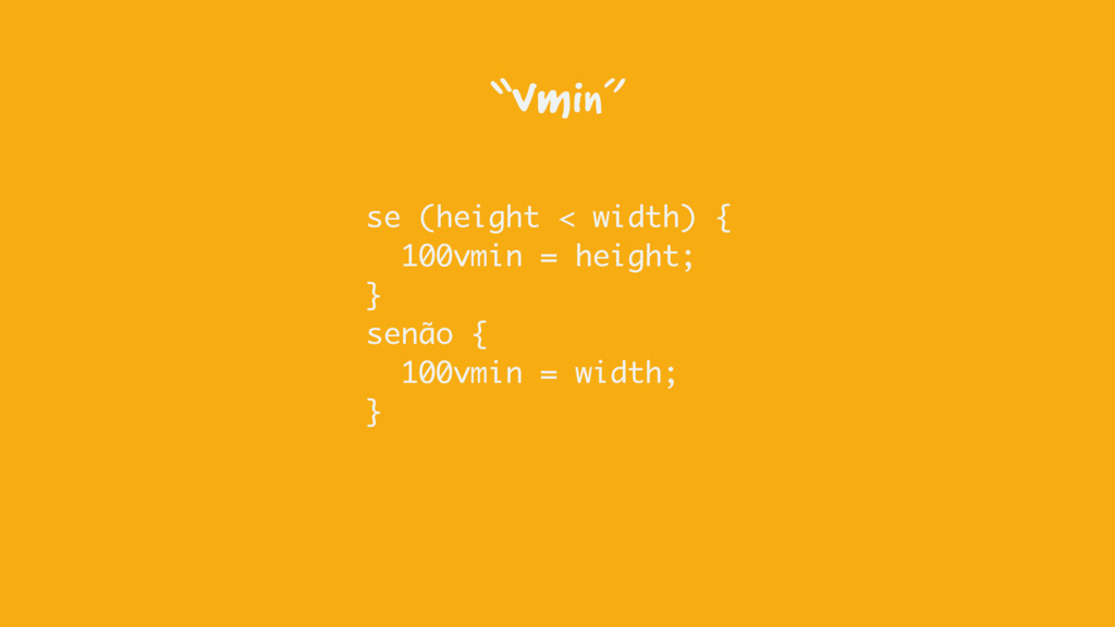
vmin “viewport min value” Relativo ao menor valor entre altura
e largura
<div style=“height: 100vmin;”></div> 600px 1920px “vmin” div 600px 1300px div
height 600px
se (height < width) { 100vmin = height; } senão
{ 100vmin = width; } “vmin”
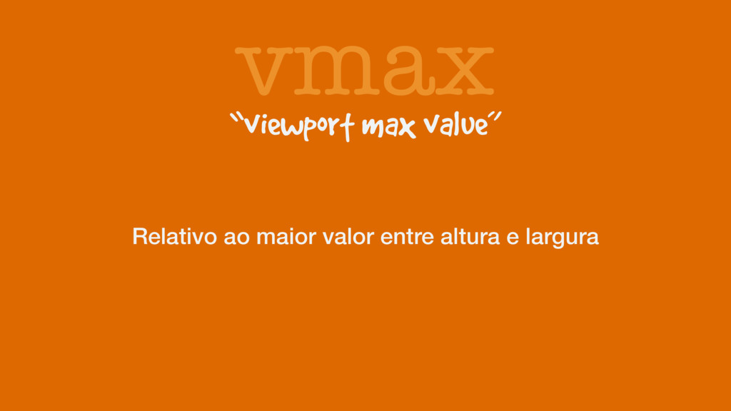
vmax “viewport max value” Relativo ao maior valor entre altura
e largura
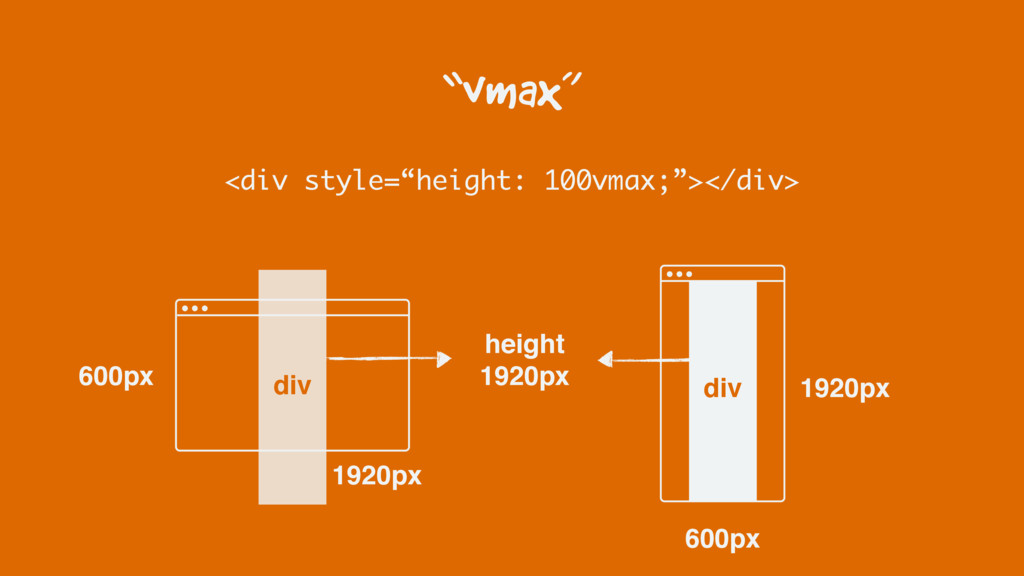
“vmax” <div style=“height: 100vmax;”></div> 600px 1920px div 600px 1920px div
height 1920px
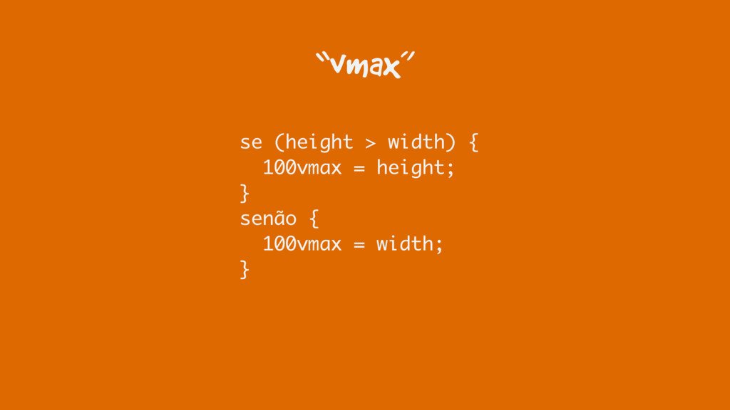
“vmax” se (height > width) { 100vmax = height; }
senão { 100vmax = width; }
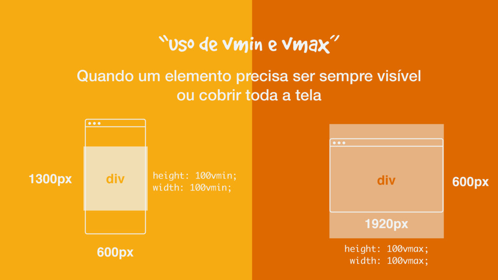
“uso de vmin e vmax” Quando um elemento precisa ser
sempre visível ou cobrir toda a tela 600px 1920px div 600px 1300px div height: 100vmin; width: 100vmin; height: 100vmax; width: 100vmax;
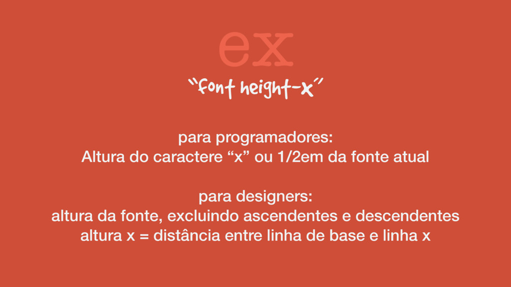
ex “font height-x” para programadores: Altura do caractere “x” ou
1/2em da fonte atual para designers: altura da fonte, excluindo ascendentes e descendentes altura x = distância entre linha de base e linha x
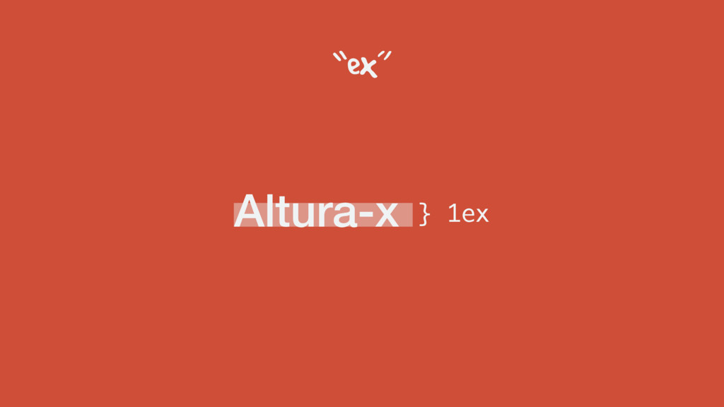
Altura-x “ex” } 1ex
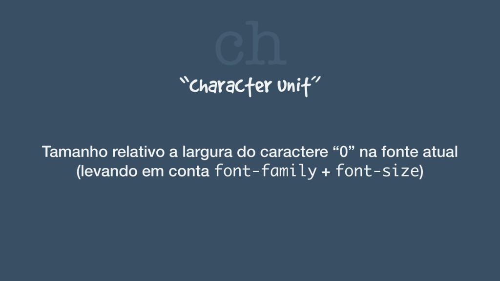
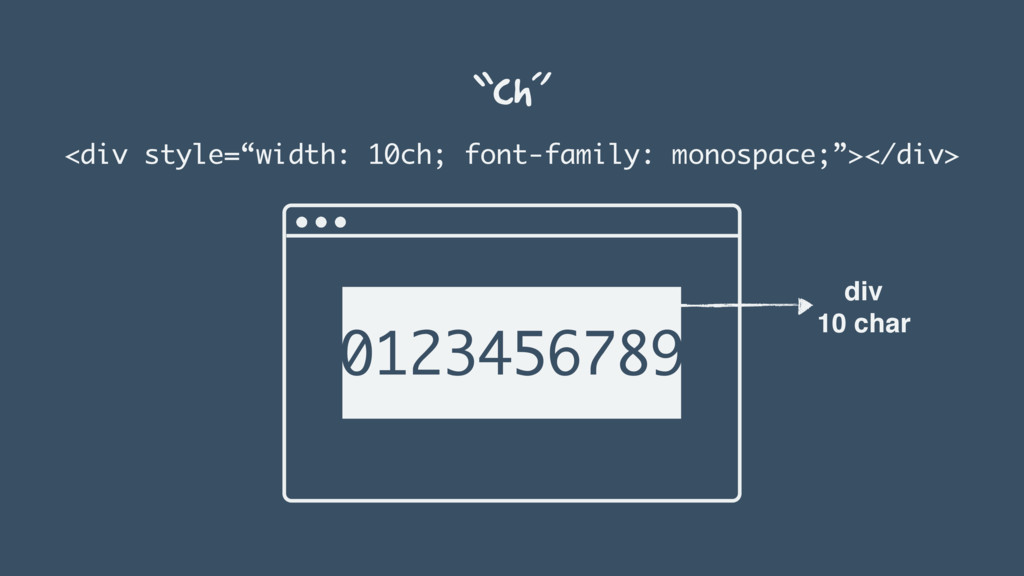
ch “character unit” Tamanho relativo a largura do caractere “0”
na fonte atual (levando em conta font-family + font-size)
“ch” <div style=“width: 10ch; font-family: monospace;”></div> 0123456789 div 10 char
None
 ricardogouveia3
 matsuo_atsushi
 hirokunimaeta
 satohjohn
 irof
irof
 16bitidol
 seosoft
 ternbusty
 simas
simas
 kkamegawa
 licux
licux
 x5gtrn
 wemra
wemra
 bermonpainter
 katiecoart
 sachag
 cassininazir
 soysaucechin
 denniskardys
 wayneb77
 rocio
rocio
 ryanjones
 aarron
 aleyda
 mclloyd