Upgrade to Pro — share decks privately, control downloads, hide ads and more …

VicRoads website case study: Bigger, better and responsive

VicRoads website case study: Bigger, better and responsive

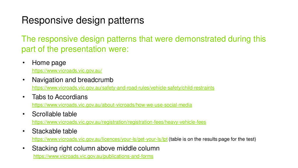
Interested in responsive design? This deck was presented at UX Australia 2014. Richard and Jolanda share their key insights in redesigning one of the most highly trafficked Victorian Government websites into a smart, engaging experience. Learn about the challenges of responsive design for large websites and how they resolved them. The VicRoads website went live one week before the conference.

Other Decks in Design

Transcript

  1. VicRoads case study Bigger, better and responsive Richard Perdriau UX

    Manager, Deloitte Digital Jolanda Zerbst Web Services Manager, VicRoads @zerbstj
  2. VicRoads manages over 22,000 kilometres of roads, 3133 bridges and

    processes more than 22 million transactions each year for 3.7 million licensed drivers and 4.9 million registered vehicles.
  3. The Project • Implementation of a new CMS • User-centred

    IA • The new website to be usable on any device Redesign and development of the VicRoads website
  4. The Project Jul Aug Sep Oct Nov Dec Jan Feb

    Mar Apr May Jun Jul Aug Research Design Build Test Content Migration Go live 2013 2014 Fourteen month timeline
  5. Percentage of users viewing the VicRoads website on mobile devices

    The trend towards mobile usage 2010 2012 2014 4% 15% 40%
  6. 2012 and 2013 marked a big shift towards mobile responsive

    The decision to go responsive • More succinct, user-centred content • Don't have to manage two sites • More consistent experience across devices Benefits Responsive vs mobile
  7. • User workshops • Card sorting • Stakeholder workshops &

    interviews Desktop research • Competitor analysis • Existing research • Website usage statistics Generative research Research
  8. Research A survey was used to understand the preferred channels

    for a range of tasks across different user groups Channel survey
  9. Research • Most users preferred the online channel • Most

    users expected to be able to complete most activities on different devices • Users became more task focussed on mobile Key take outs
  10. Conceptual design • Collaborative design sessions included the UX design

    team, visual designer, front end developer, technical architect and content writer • Mobile and Desktop always designed together • Rapid iterations on whiteboard Collaborative design
  11. Conceptual design • Whiteboard designs evolved into paper prototyping •

    Content written during design sessions. Refining the designs
  12. Conceptual design • Collaborate with the whole project team early,

    particularly the FEDs! • The importance of lean content. Key take outs
  13. The importance of lean content for mobile • VicRoads had

    not initially planned or budgeted for rewriting content • Initial resistance from content owners to condense information • Socialising an example of a page rewritten as “mobile first” got stakeholders on board to provide resources for rewriting content. • Content was rewritten to be task focused, action orientated, and in plain English for mobile delivery. Rewriting content
  14. Responsive design patterns Header Navigation Content Sidebar Footer Header Navigation

    Content Sidebar Footer Optimising the web page for the device it is being viewed on
  15. • Home page https://www.vicroads.vic.gov.au/ • Navigation and breadcrumb https://www.vicroads.vic.gov.au/safety-and-road-rules/vehicle-safety/child-restraints •

    Tabs to Accordians https://www.vicroads.vic.gov.au/about-vicroads/how-we-use-social-media • Scrollable table https://www.vicroads.vic.gov.au/registration/registration-fees/heavy-vehicle-fees • Stackable table https://www.vicroads.vic.gov.au/licences/your-ls/get-your-ls/lpt (table is on the results page for the test) • Stacking right column above middle column https://www.vicroads.vic.gov.au/publications-and-forms The responsive design patterns that were demonstrated during this part of the presentation were: Responsive design patterns
  16. • Wireframes of desktop and mobile but not tablet •

    Decisions on tablet breakpoints were made during the build The functional specification Detailed design
  17. Summary • Don’t under estimate content rewriting • Keep the

    client on the journey • Collaborate with your development team throughout the entire project Key take outs