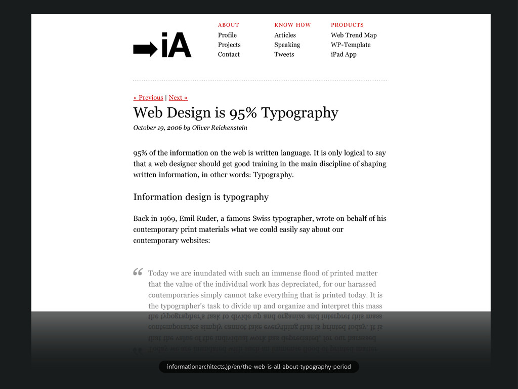
Web Trend Map WP-Template iPad App Web Design is 95% Typography October 19, 2006 by Oliver Reichenstein « Previous | Next » 95% of the information on the web is written language. It is only logical to say that a web designer should get good training in the main discipline of shaping written information, in other words: Typography. Information design is typography Back in 1969, Emil Ruder, a famous Swiss typographer, wrote on behalf of his contemporary print materials what we could easily say about our contemporary websites: Today we are inundated with such an immense flood of printed matter that the value of the individual work has depreciated, for our harassed contemporaries simply cannot take everything that is printed today. It is the typographer’s task to divide up and organize and interpret this mass of printed matter in such a way that the reader will have a good chance of finding what is of interest to him. With some imagination (replace print with online) this sounds like the job description of an information designer. It is the information designer’s task “to divide up and organize and interpret this mass of printed matter in such a way that the reader will have a good chance of finding what is of interest to him”. informationarchitects.jp/en/the-web-is-all-about-typography-period
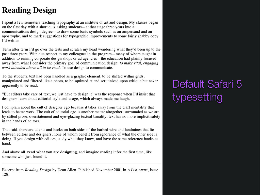
an institute of art and design. My classes began on the first day with a short quiz asking students—at that stage three years into a communications design degree—to draw some basic symbols such as an ampersand and an apostrophe, and to mark suggestions for typographic improvements to some fairly shabby copy I’d written. Term after term I’d go over the tests and scratch my head wondering what they’d been up to the past three years. With due respect to my colleagues in the program—many of whom taught in addition to running corporate design shops or ad agencies—the education had plainly focused away from what I consider the primary goal of communication design: to make vital, engaging work intended above all to be read. To use design to communicate. To the students, text had been handled as a graphic element, to be shifted within grids, manipulated and filtered like a photo, to be squinted at and scrutinized upon critique but never apparently to be read. “But editors take care of text, we just have to design it” was the response when I’d insist that designers learn about editorial style and usage, which always made me laugh. I complain about the cult of designer ego because it takes away from the craft mentality that leads to better work. The cult of editorial ego is another matter altogether: surrounded as we are by stilted prose, overstatement and eye–glazing textual banality, text has no more implicit safety in the hands of editors. That said, there are talents and hacks on both sides of the barbed wire and landmines that lie between editors and designers, none of whom benefit from ignorance of what the other side is doing. If you design with editors, study what they know, and have the same reference books at hand. And above all, read what you are designing, and imagine reading it for the first time, like someone who just found it. Excerpt from Reading Design by Dean Allen. Published November 2001 in A List Apart, Issue 128. Default Safari 5 typesetting
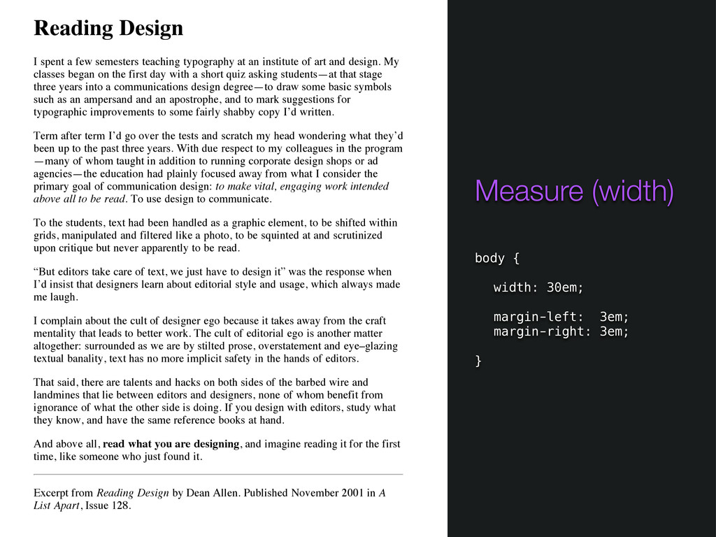
an institute of art and design. My classes began on the first day with a short quiz asking students—at that stage three years into a communications design degree—to draw some basic symbols such as an ampersand and an apostrophe, and to mark suggestions for typographic improvements to some fairly shabby copy I’d written. Term after term I’d go over the tests and scratch my head wondering what they’d been up to the past three years. With due respect to my colleagues in the program —many of whom taught in addition to running corporate design shops or ad agencies—the education had plainly focused away from what I consider the primary goal of communication design: to make vital, engaging work intended above all to be read. To use design to communicate. To the students, text had been handled as a graphic element, to be shifted within grids, manipulated and filtered like a photo, to be squinted at and scrutinized upon critique but never apparently to be read. “But editors take care of text, we just have to design it” was the response when I’d insist that designers learn about editorial style and usage, which always made me laugh. I complain about the cult of designer ego because it takes away from the craft mentality that leads to better work. The cult of editorial ego is another matter altogether: surrounded as we are by stilted prose, overstatement and eye–glazing textual banality, text has no more implicit safety in the hands of editors. That said, there are talents and hacks on both sides of the barbed wire and landmines that lie between editors and designers, none of whom benefit from ignorance of what the other side is doing. If you design with editors, study what they know, and have the same reference books at hand. And above all, read what you are designing, and imagine reading it for the first time, like someone who just found it. Excerpt from Reading Design by Dean Allen. Published November 2001 in A List Apart, Issue 128. Measure (width) body { width: 30em; margin-left: 3em; margin-right: 3em; }
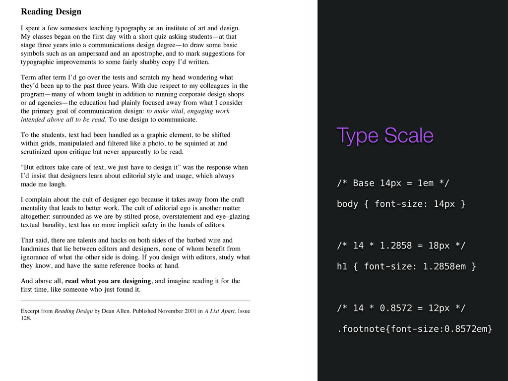
an institute of art and design. My classes began on the first day with a short quiz asking students—at that stage three years into a communications design degree—to draw some basic symbols such as an ampersand and an apostrophe, and to mark suggestions for typographic improvements to some fairly shabby copy I’d written. Term after term I’d go over the tests and scratch my head wondering what they’d been up to the past three years. With due respect to my colleagues in the program—many of whom taught in addition to running corporate design shops or ad agencies—the education had plainly focused away from what I consider the primary goal of communication design: to make vital, engaging work intended above all to be read. To use design to communicate. To the students, text had been handled as a graphic element, to be shifted within grids, manipulated and filtered like a photo, to be squinted at and scrutinized upon critique but never apparently to be read. “But editors take care of text, we just have to design it” was the response when I’d insist that designers learn about editorial style and usage, which always made me laugh. I complain about the cult of designer ego because it takes away from the craft mentality that leads to better work. The cult of editorial ego is another matter altogether: surrounded as we are by stilted prose, overstatement and eye–glazing textual banality, text has no more implicit safety in the hands of editors. That said, there are talents and hacks on both sides of the barbed wire and landmines that lie between editors and designers, none of whom benefit from ignorance of what the other side is doing. If you design with editors, study what they know, and have the same reference books at hand. And above all, read what you are designing, and imagine reading it for the first time, like someone who just found it. Excerpt from Reading Design by Dean Allen. Published November 2001 in A List Apart, Issue 128. Type Scale /* Base 14px = 1em */ body { font-size: 14px } /* 14 * 1.2858 = 18px */ h1 { font-size: 1.2858em } /* 14 * 0.8572 = 12px */ .footnote{font-size:0.8572em}
an institute of art and design. My classes began on the first day with a short quiz asking students—at that stage three years into a communications design degree—to draw some basic symbols such as an ampersand and an apostrophe, and to mark suggestions for typographic improvements to some fairly shabby copy I’d written. Term after term I’d go over the tests and scratch my head wondering what they’d been up to the past three years. With due respect to my colleagues in the program—many of whom taught in addition to running corporate design shops or ad agencies—the education had plainly focused away from what I consider the primary goal of communication design: to make vital, engaging work intended above all to be read. To use design to communicate. To the students, text had been handled as a graphic element, to be shifted within grids, manipulated and filtered like a photo, to be squinted at and scrutinized upon critique but never apparently to be read. “But editors take care of text, we just have to design it” was the response when I’d insist that designers learn about editorial style and usage, which always made me laugh. I complain about the cult of designer ego because it takes away from the craft mentality that leads to better work. The cult of editorial ego is another matter altogether: surrounded as we are by stilted prose, overstatement and eye–glazing textual banality, text has no more implicit safety in the hands of editors. That said, there are talents and hacks on both sides of the barbed wire and landmines that lie between editors and designers, none of whom benefit from ignorance of what the other side is doing. If you design with editors, study what they know, and have the same reference books at hand. And above all, read what you are designing, and imagine reading it for the first time, like someone who just found it. Excerpt from Reading Design by Dean Allen. Published November 2001 in A List Apart, Issue 128. Leading /* 14 * 1.5 = 21px */ body { line-height: 1.5em; }
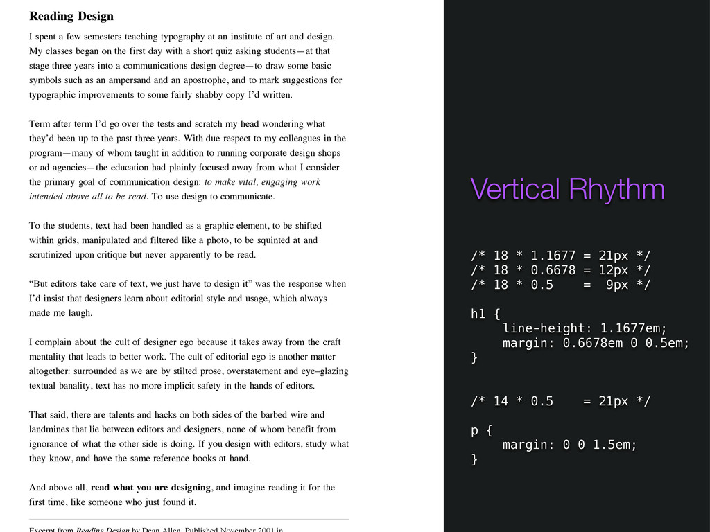
an institute of art and design. My classes began on the first day with a short quiz asking students—at that stage three years into a communications design degree—to draw some basic symbols such as an ampersand and an apostrophe, and to mark suggestions for typographic improvements to some fairly shabby copy I’d written. Term after term I’d go over the tests and scratch my head wondering what they’d been up to the past three years. With due respect to my colleagues in the program—many of whom taught in addition to running corporate design shops or ad agencies—the education had plainly focused away from what I consider the primary goal of communication design: to make vital, engaging work intended above all to be read. To use design to communicate. To the students, text had been handled as a graphic element, to be shifted within grids, manipulated and filtered like a photo, to be squinted at and scrutinized upon critique but never apparently to be read. “But editors take care of text, we just have to design it” was the response when I’d insist that designers learn about editorial style and usage, which always made me laugh. I complain about the cult of designer ego because it takes away from the craft mentality that leads to better work. The cult of editorial ego is another matter altogether: surrounded as we are by stilted prose, overstatement and eye–glazing textual banality, text has no more implicit safety in the hands of editors. That said, there are talents and hacks on both sides of the barbed wire and landmines that lie between editors and designers, none of whom benefit from ignorance of what the other side is doing. If you design with editors, study what they know, and have the same reference books at hand. And above all, read what you are designing, and imagine reading it for the first time, like someone who just found it. Excerpt from Reading Design by Dean Allen. Published November 2001 in A List Apart, Issue 128. Vertical Rhythm
an institute of art and design. My classes began on the first day with a short quiz asking students—at that stage three years into a communications design degree—to draw some basic symbols such as an ampersand and an apostrophe, and to mark suggestions for typographic improvements to some fairly shabby copy I’d written. Term after term I’d go over the tests and scratch my head wondering what they’d been up to the past three years. With due respect to my colleagues in the program—many of whom taught in addition to running corporate design shops or ad agencies—the education had plainly focused away from what I consider the primary goal of communication design: to make vital, engaging work intended above all to be read. To use design to communicate. To the students, text had been handled as a graphic element, to be shifted within grids, manipulated and filtered like a photo, to be squinted at and scrutinized upon critique but never apparently to be read. “But editors take care of text, we just have to design it” was the response when I’d insist that designers learn about editorial style and usage, which always made me laugh. I complain about the cult of designer ego because it takes away from the craft mentality that leads to better work. The cult of editorial ego is another matter altogether: surrounded as we are by stilted prose, overstatement and eye–glazing textual banality, text has no more implicit safety in the hands of editors. That said, there are talents and hacks on both sides of the barbed wire and landmines that lie between editors and designers, none of whom benefit from ignorance of what the other side is doing. If you design with editors, study what they know, and have the same reference books at hand. And above all, read what you are designing, and imagine reading it for the first time, like someone who just found it. Vertical Rhythm /* 18 * 1.1677 = 21px */ /* 18 * 0.6678 = 12px */ /* 18 * 0.5 = 9px */ h1 { line-height: 1.1677em; margin: 0.6678em 0 0.5em; } /* 14 * 0.5 = 21px */ p { margin: 0 0 1.5em; }
an institute of art and design. My classes began on the first day with a short quiz asking students—at that stage three years into a communications design degree—to draw some basic symbols such as an ampersand and an apostrophe, and to mark suggestions for typographic improvements to some fairly shabby copy I’d written. Term after term I’d go over the tests and scratch my head wondering what they’d been up to the past three years. With due respect to my colleagues in the program—many of whom taught in addition to running corporate design shops or ad agencies—the education had plainly focused away from what I consider the primary goal of communication design: to make vital, engaging work intended above all to be read. To use design to communicate. To the students, text had been handled as a graphic element, to be shifted within grids, manipulated and filtered like a photo, to be squinted at and scrutinized upon critique but never apparently to be read. “But editors take care of text, we just have to design it” was the response when I’d insist that designers learn about editorial style and usage, which always made me laugh. I complain about the cult of designer ego because it takes away from the craft mentality that leads to better work. The cult of editorial ego is another matter altogether: surrounded as we are by stilted prose, overstatement and eye–glazing textual banality, text has no more implicit safety in the hands of editors. That said, there are talents and hacks on both sides of the barbed wire and landmines that lie between editors and designers, none of whom benefit from ignorance of what the other side is doing. If you design with editors, study what they know, and have the same reference books at hand. And above all, read what you are designing, and imagine reading it for the first time, like someone who just found it. Vertical Rhythm /* 18 * 1.1677 = 21px */ /* 18 * 0.6678 = 12px */ /* 18 * 0.5 = 9px */ h1 { line-height: 1.1677em; margin: 0.6678em 0 0.5em; } /* 14 * 0.5 = 21px */ p { margin: 0 0 1.5em; }
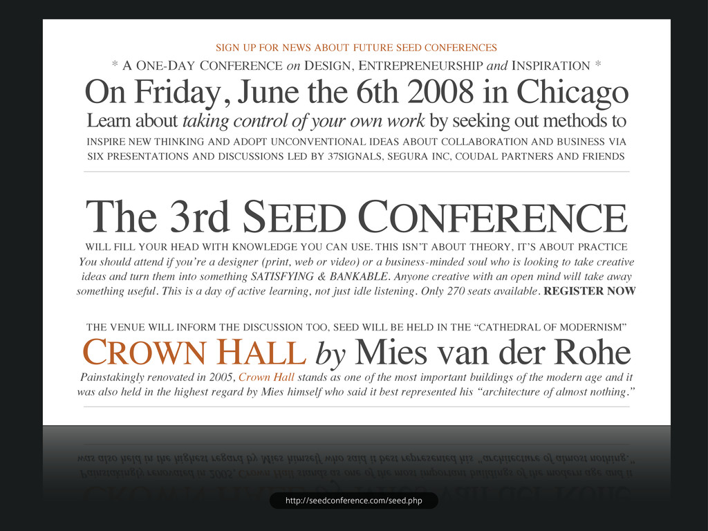
ONE-DAY CONFERENCE on DESIGN, ENTREPRENEURSHIP and INSPIRATION * On Friday, June the 6th 2008 in Chicago Learn about taking control of your own work by seeking out methods to INSPIRE NEW THINKING AND ADOPT UNCONVENTIONAL IDEAS ABOUT COLLABORATION AND BUSINESS VIA SIX PRESENTATIONS AND DISCUSSIONS LED BY 37SIGNALS, SEGURA INC, COUDAL PARTNERS AND FRIENDS The 3rd SEED CONFERENCE WILL FILL YOUR HEAD WITH KNOWLEDGE YOU CAN USE. THIS ISN’T ABOUT THEORY, IT’S ABOUT PRACTICE You should attend if you’re a designer (print, web or video) or a business-minded soul who is looking to take creative ideas and turn them into something SATISFYING & BANKABLE. Anyone creative with an open mind will take away something useful. This is a day of active learning, not just idle listening. Only 270 seats available. REGISTER NOW THE VENUE WILL INFORM THE DISCUSSION TOO, SEED WILL BE HELD IN THE “CATHEDRAL OF MODERNISM” CROWN HALL by Mies van der Rohe Painstakingly renovated in 2005, Crown Hall stands as one of the most important buildings of the modern age and it was also held in the highest regard by Mies himself who said it best represented his “architecture of almost nothing.” * THE DAY’S SCHEDULE and INVITED GUESTS * CARLOS SEGURA is the founder of Segura, Inc. an internationally recognized visual communications company and the creator of T.26 the web's original digital type foundry as well as the 5" retail brand and the JASON FRIED is the founder of 37signals, influential creators of web- based communication and collaboration tools Basecamp, Highrise, Backpack & Campfire and authors of the book Getting Real and the popular weblog JAKE NICKELL is the Founder and JEFFREY KALMIKOFF is the Creative Director of skinnyCorp, the force behind the unstoppable community- based tee shirt design concept Threadless and a steady stream of other http://seedconference.com/seed.php