Upgrade to Pro — share decks privately, control downloads, hide ads and more …

Engineering a Design System

Engineering a Design System

While plenty is said about design system theory, organizational adoption, and visual design, you won’t get very far without solid engineering practices, sound architecture, and the right technologies.

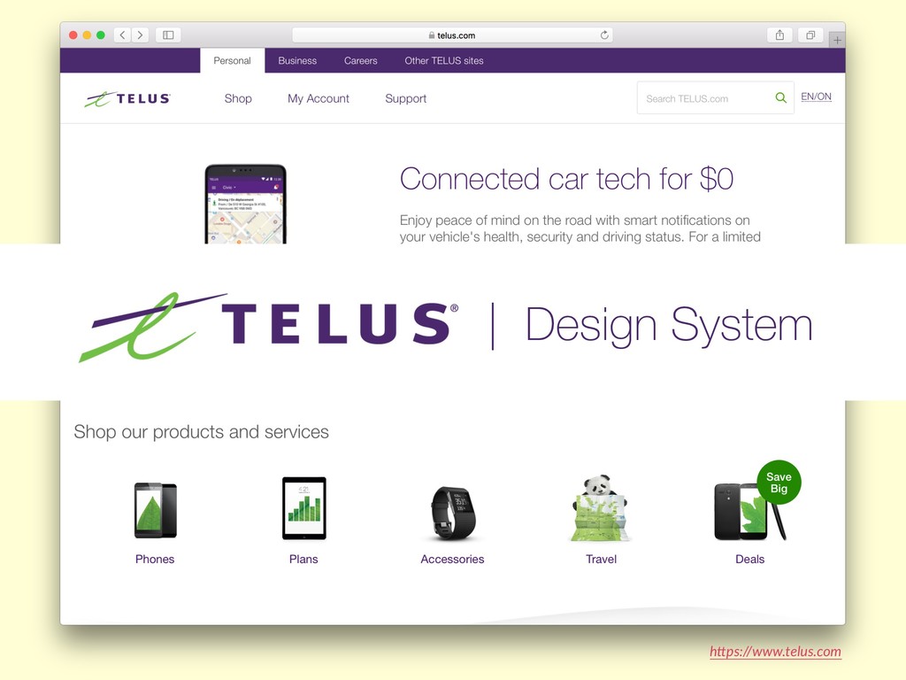
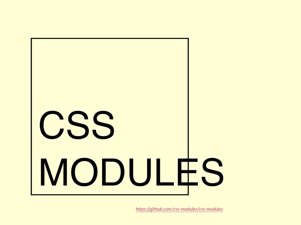
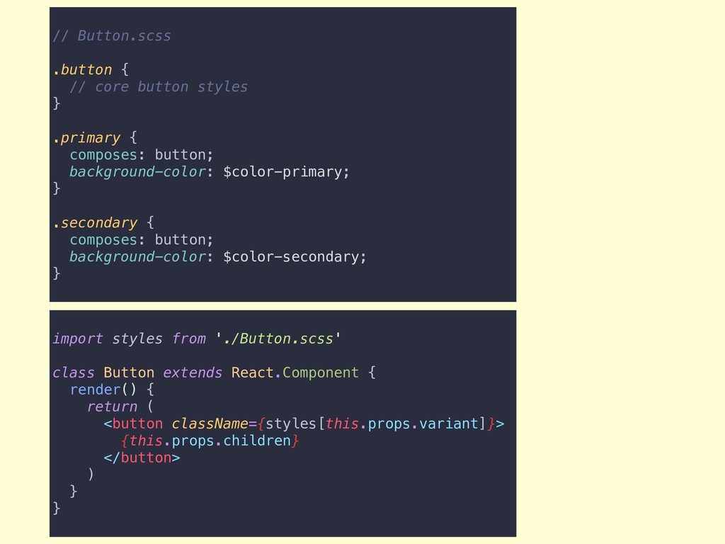
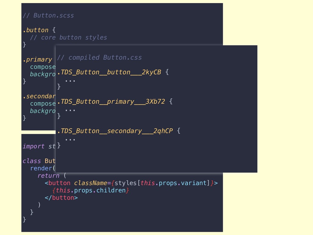
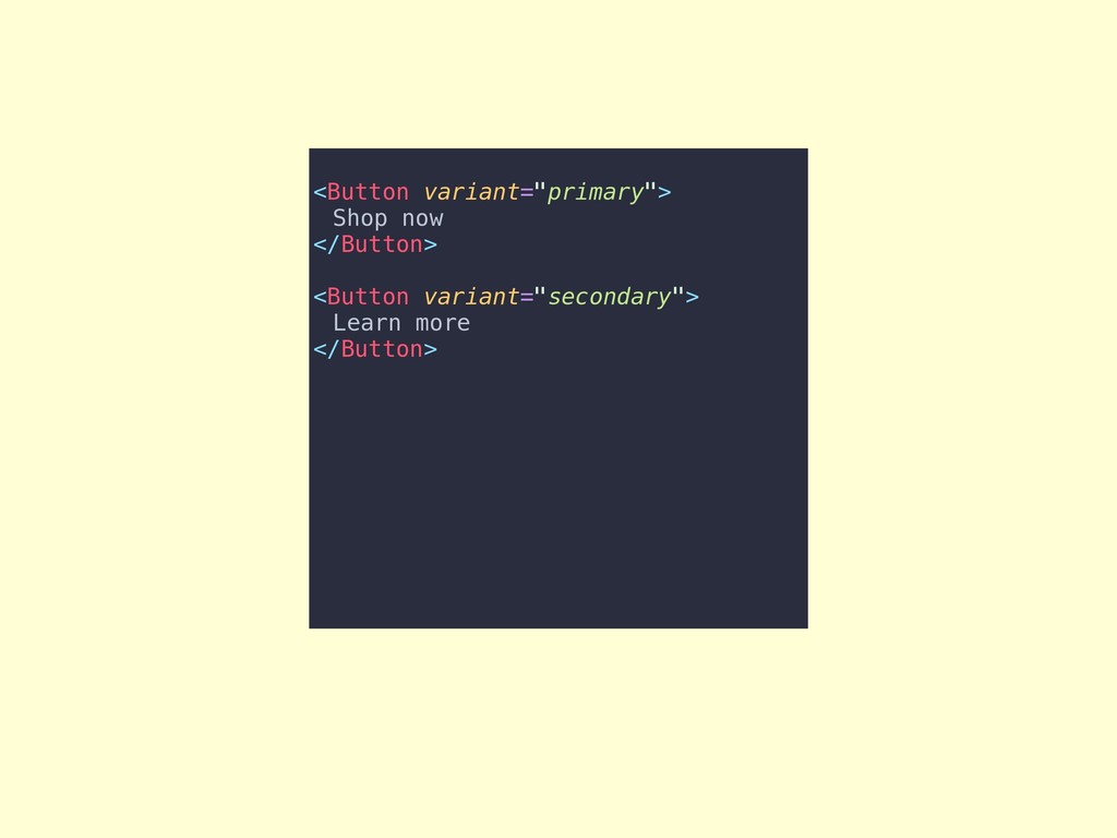
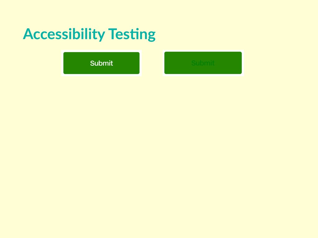
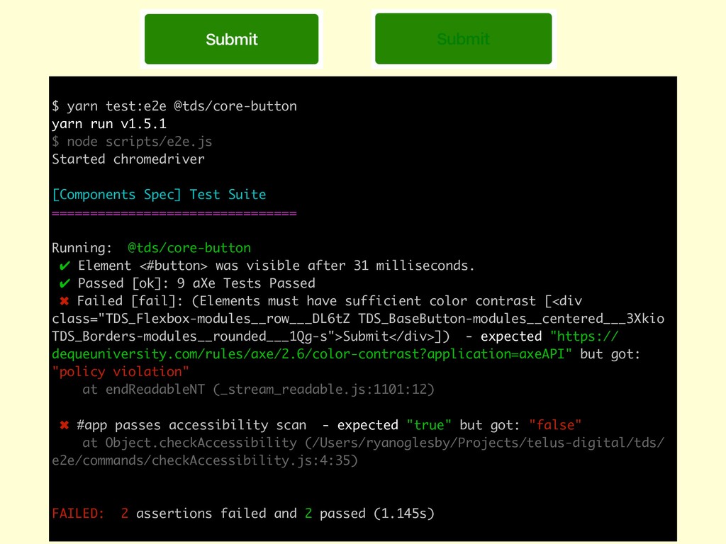
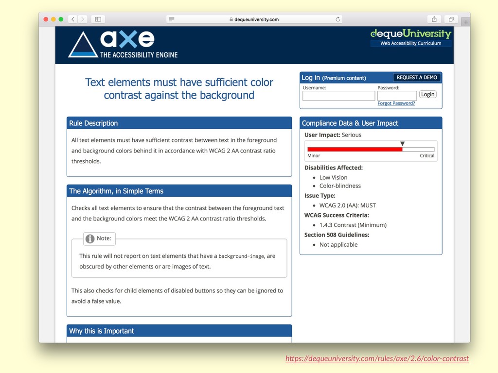
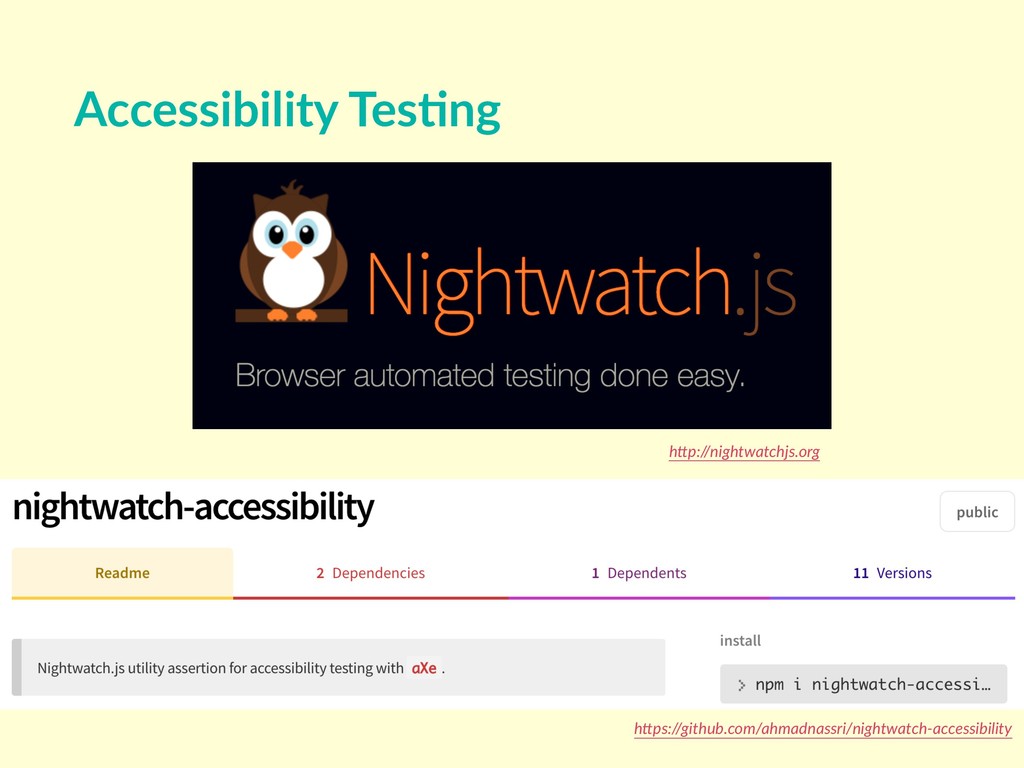
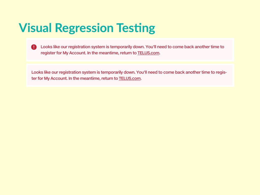
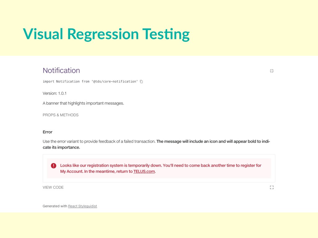
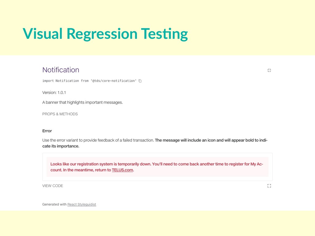
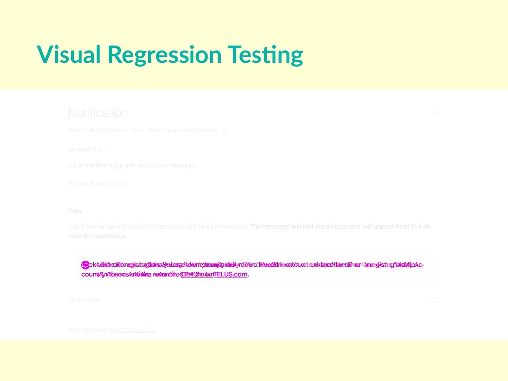
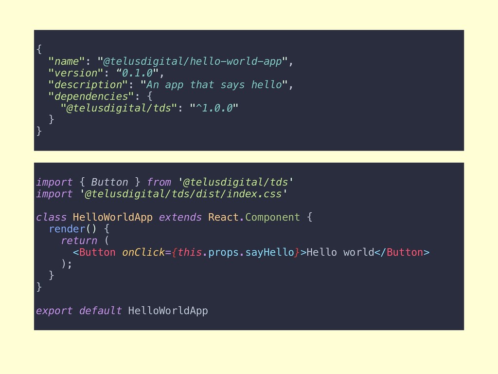
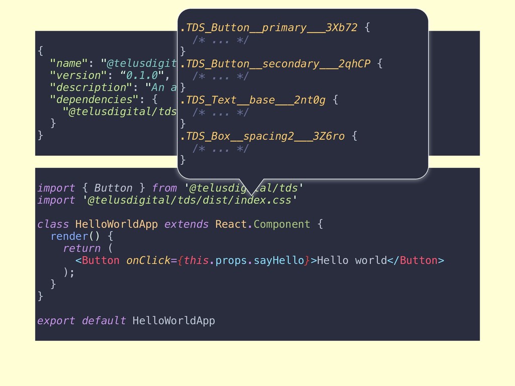
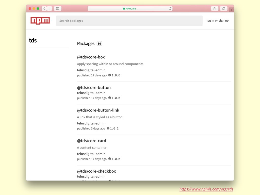
We’ll take a tour through the engineering of TELUS digital’s React-based design system developed over the past year, examining technologies such as CSS Modules; testing practices; architectural decision points; and strategies for scaling to dozens of teams and hundreds of users.

Whether you are at a small or large scale, just starting or far along with a design system, you can immediately apply the lessons and technologies from this talk to your own work.
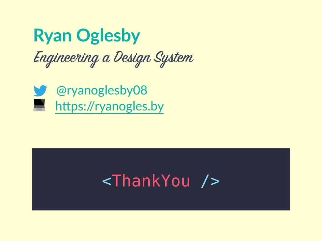
Ryan Oglesby

April 24, 2018
Tweet

More Decks by Ryan Oglesby

Other Decks in Technology

Transcript

  1. Engineering
    a
    Design System

    View Slide

  2. Design systems
    Style guide?

    Component library?

    UI toolkit?
    }close enough

    View Slide

  3. Make designers and developers more produc

    Consistent end user experience
    Why?

    View Slide

  4. h"ps://www.telus.com
    | Design System

    View Slide

  5. | Design System
    React Sketch

    View Slide

  6. Engineering for stability
    by crea(ng inten(onal APIs and

    tes(ng first and o5en.
    Engineering for scale ↔
    by automa(ng documenta(on and
    op(mizing package distribu(on.

    View Slide


  7. // Button.scss
    .button {
    padding: 1rem;
    border-radius: 4px;
    color: white;
    }
    .button--primary {
    background-color: $color-primary;
    }
    .button--secondary {
    background-color: $color-secondary;
    }


    Shop now


    Learn more

    class Button extends React.Component {
    render() {
    // a branded HTML button
    }
    }
    Design system Applica8on
    Output

    View Slide


  8. // Button.scss
    .button {
    padding: 1rem;
    border-radius: 4px;
    color: white;
    }
    .button--primary {
    background-color: $color-primary;
    }
    .button--secondary {
    background-color: $color-secondary;
    }

    // MySquareButton.scss

    .button {
    border-radius: 0;
    color: black;
    }
    .my-square-button {
    background-color: hotpink;
    }

    className=“my-square-button">
    Find a store

    class Button extends React.Component {
    render() {
    // a branded HTML button
    }
    }
    Design system Applica8on

    // Button.scss
    .button {
    padding: 1rem;
    border-radius: 4px;
    color: white;
    }
    .button--primary {
    background-color: $color-primary;
    }
    .button--secondary {
    background-color: $color-secondary;
    }
    Output

    View Slide

  9. h"ps://github.com/css-modules/css-modules

    View Slide

  10. // Button.scss
    .button {
    // core button styles
    }
    .primary {
    composes: button;
    background-color: $color-primary;
    }
    .secondary {
    composes: button;
    background-color: $color-secondary;
    }
    import styles from './Button.scss'
    class Button extends React.Component {
    render() {
    return (

    {this.props.children}

    )
    }
    }

    View Slide

  11. // Button.scss
    .button {
    // core button styles
    }
    .primary {
    composes: button;
    background-color: $color-primary;
    }
    .secondary {
    composes: button;
    background-color: $color-secondary;
    }
    import styles from './Button.scss'
    class Button extends React.Component {
    render() {
    return (

    {this.props.children}

    )
    }
    }
    // compiled Button.css
    .TDS_Button__button___2kyCB {
    ...
    }

    .TDS_Button__primary___3Xb72 {
    ...
    }
    .TDS_Button__secondary___2qhCP {
    ...
    }

    View Slide


  12. Shop now


    Learn more

    View Slide

  13. Accessibility Tes8ng

    View Slide


  14. $ yarn test:e2e @tds/core-button
    yarn run v1.5.1
    $ node scripts/e2e.js
    Started chromedriver
    [Components Spec] Test Suite
    ================================
    Running: @tds/core-button
    ✔ Element <#button> was visible after 31 milliseconds.
    ✔ Passed [ok]: 9 aXe Tests Passed
    ✖ Failed [fail]: (Elements must have sufficient color contrast [class="TDS_Flexbox-modules__row___DL6tZ TDS_BaseButton-modules__centered___3Xkio
    TDS_Borders-modules__rounded___1Qg-s">Submit]) - expected "https://
    dequeuniversity.com/rules/axe/2.6/color-contrast?application=axeAPI" but got:
    "policy violation"
    at endReadableNT (_stream_readable.js:1101:12)
    ✖ #app passes accessibility scan - expected "true" but got: "false"
    at Object.checkAccessibility (/Users/ryanoglesby/Projects/telus-digital/tds/
    e2e/commands/checkAccessibility.js:4:35)
    FAILED: 2 assertions failed and 2 passed (1.145s)


    View Slide

  15. h"ps://dequeuniversity.com/rules/axe/2.6/color-contrast

    View Slide

  16. Accessibility Tes8ng
    h"p://nightwatchjs.org
    h"ps://github.com/ahmadnassri/nightwatch-accessibility

    View Slide

  17. Visual Regression Tes8ng

    View Slide

  18. $ yarn test:e2e @tds/core-notification
    yarn run v1.5.1
    $ node scripts/e2e.js
    Started chromedriver
    [Components Spec] Test Suite
    ================================
    Running: @tds/core-notification
    ✖ Screenshots Match Failed for chrome_headless.png with a tolerance of 0%,
    actual was 1.07%. - expected "0" but got: "1.07"
    at Object.takeScreenshot (/Users/ryanoglesby/Projects/telus-digital/tds/e2e/
    commands/compareScreenshot.js:55:17)
    at Object.browser.saveScreenshot (/Users/ryanoglesby/Projects/telus-digital/
    tds/e2e/commands/compareScreenshot.js:38:16)
    at FSReqWrap.oncomplete (fs.js:153:20)
    FAILED: 1 assertions failed and 3 passed (3.314s)
    _________________________________________________
    TEST FAILURE: 1 assertions failed, 3 passed. (3.378s)

    View Slide

  19. Visual Regression Tes8ng

    View Slide

  20. Visual Regression Tes8ng

    View Slide

  21. Visual Regression Tes8ng

    View Slide

  22. Visual Regression Tes8ng
    h"ps://github.com/HuddleEng/Resemble.js

    View Slide

  23. Engineering for stability
    by crea(ng inten(onal APIs and

    tes(ng first and o5en.
    Engineering for scale ↔
    by automa(ng documenta(on and
    op(mizing package distribu(on.

    View Slide

  24. • Correct and trustworthy
    • Comprehensive
    • Component APIs (props, data types, allowed values)
    • Live examples
    Documenta8on must-haves
    React Styleguidist Storybook

    View Slide

  25. /**
    * A standard, branded clickable element for use in forms mainly.
    * @version 1.0.2
    */
    class Button extends React.Component {
    render() {
    // ...
    }
    }
    Button.propTypes = {
    /**
    * The HTML button type.
    * @see See [MDN](https://developer.mozilla.org/en-US/docs/Web/HTML/
    Element/button) for more info.
    */
    type: PropTypes.oneOf(['button', 'submit', 'reset']),
    /**
    * The style.
    */
    variant: PropTypes.oneOf(['primary', 'secondary', 'inverted']),
    /**
    * The label.
    */
    children: PropTypes.string.isRequired,
    }
    Button.defaultProps = {
    type: 'button',
    variant: 'primary',
    }

    View Slide

  26. Provide a function as the `onClick` prop to perform an action when
    clicked. **Avoid using a button if navigation
    is the primary action, as a [Link](#link) is more appropriate.**
    ### Best practices
    * Aim to use only one primary button per page
    * Keep the label short and able to fit on a single line
    * The label should clearly describe the action
    By default, Buttons will be displayed in the `primary` variant. Use
    primary buttons for the main action on a page or
    in a form.
    ```
    Submit
    ```
    Specify the `variant` to create a button for secondary actions.
    ```
    Find out more
    ```

    View Slide

  27. h"ps://tds.telus.com/components/index.html

    View Slide

  28. h"ps://www.npmjs.com/package/@telusdigital/tds

    View Slide

  29. import { Button } from '@telusdigital/tds'
    import '@telusdigital/tds/dist/index.css'
    class HelloWorldApp extends React.Component {
    render() {
    return (
    Hello world
    );
    }
    }
    export default HelloWorldApp

    {
    "name": "@telusdigital/hello-world-app",
    "version": “0.1.0",
    "description": "An app that says hello",
    "dependencies": {
    "@telusdigital/tds": "^1.0.0"
    }
    }

    View Slide

  30. import { Button } from '@telusdigital/tds'
    import '@telusdigital/tds/dist/index.css'
    class HelloWorldApp extends React.Component {
    render() {
    return (
    Hello world
    );
    }
    }
    export default HelloWorldApp

    {
    "name": "@telusdigital/hello-world-app",
    "version": “0.1.0",
    "description": "An app that says hello",
    "dependencies": {
    "@telusdigital/tds": "^1.0.0"
    }
    }
    “^2.0.0"
    .TDS_Button__primary___3Xb72 {
    /* ... */
    }
    .TDS_Button__secondary___2qhCP {
    /* ... */
    }
    .TDS_Text__base___2nt0g {
    /* ... */
    }
    .TDS_Box__spacing2___3Z6ro {
    /* ... */
    }

    View Slide

  31. @tds/box
    @tds/buDon
    @tds/buDon-link
    @tds/card
    @tds/checkbox
    @tds/chevron-link
    @tds/colours
    @tds/css-reset
    @tds/decora8ve-icon
    h"ps://lernajs.io

    View Slide

  32. h"ps://www.npmjs.com/org/tds

    View Slide

  33. • Consolidate the lint, build, test, and release process
    • Easier to coordinate changes across mul• Single place to report issues
    • Easier to generate documentaWhy a monorepo?

    View Slide

  34. import Box from '@tds/core-box'
    import Button from '@tds/core-button'
    class HelloWorldApp extends React.Component {
    render() {
    return (

    Hello world

    );
    }
    }
    export default HelloWorldApp

    {
    "name": "@telusdigital/hello-world-app",
    "version": “0.1.0",
    "description": "An app that says hello",
    "dependencies": {
    “@tds/core-box": “^1.0.2”,
    “@tds/core-button": "^1.1.0"
    }
    }

    View Slide

  35. h"ps://tds.telus.com
    h"ps://github.com/telus/tds-core
    It’s open source

    View Slide

  36. React
    CSS Modules
    ✅ jest + enzyme + enzyme-matchers
    nightwatch + nightwatch-accessibility (axe-core)
    resemble-js
    react-styleguidist
    lerna
    Key technology

    View Slide


  37. Ryan Oglesby
    @ryanoglesby08
    hOps:/
    /ryanogles.by
    Engineering a Design System

    View Slide