$30 off During Our Annual Pro Sale. View Details »

UI Components by Design: Bridging the Designer-Developer Gap

UI Components by Design: Bridging the Designer-Developer Gap

Presented at the Chicago Coder Conference 2017

------------------------------------

Abstract:
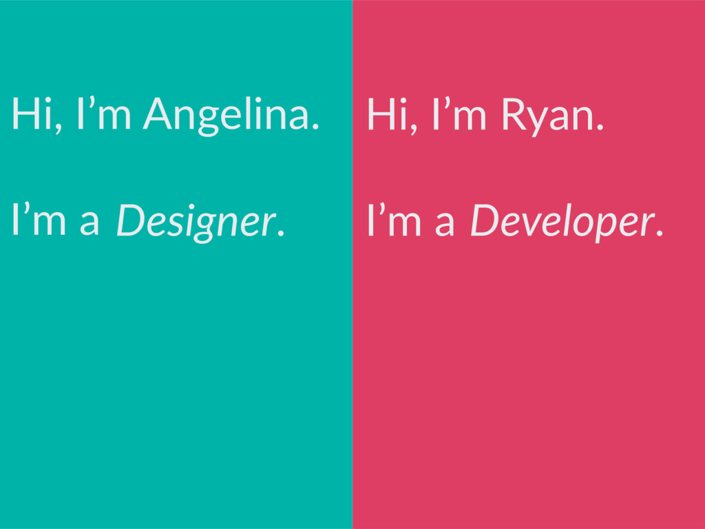
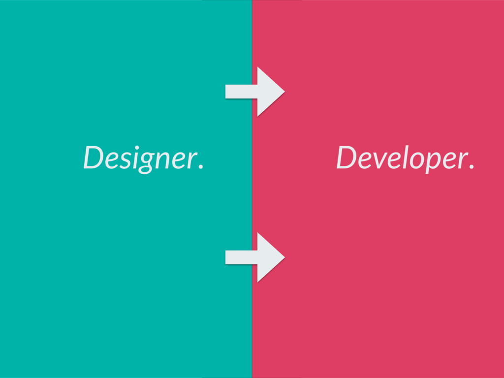
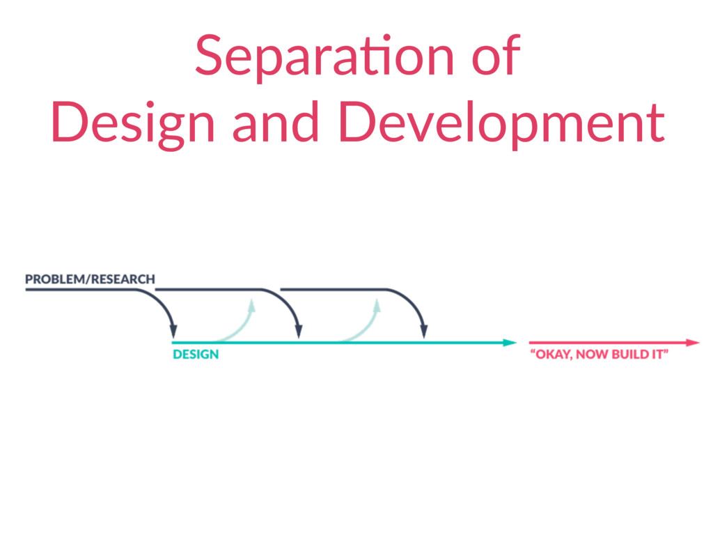
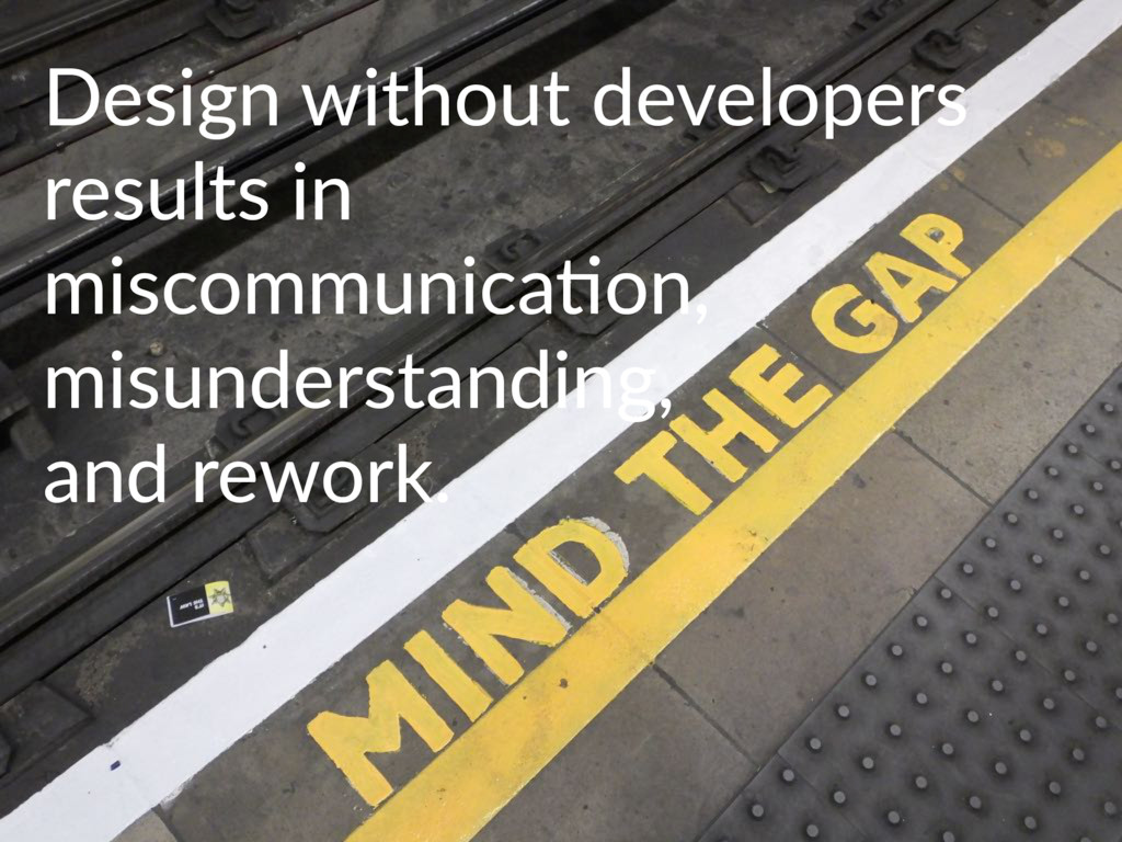
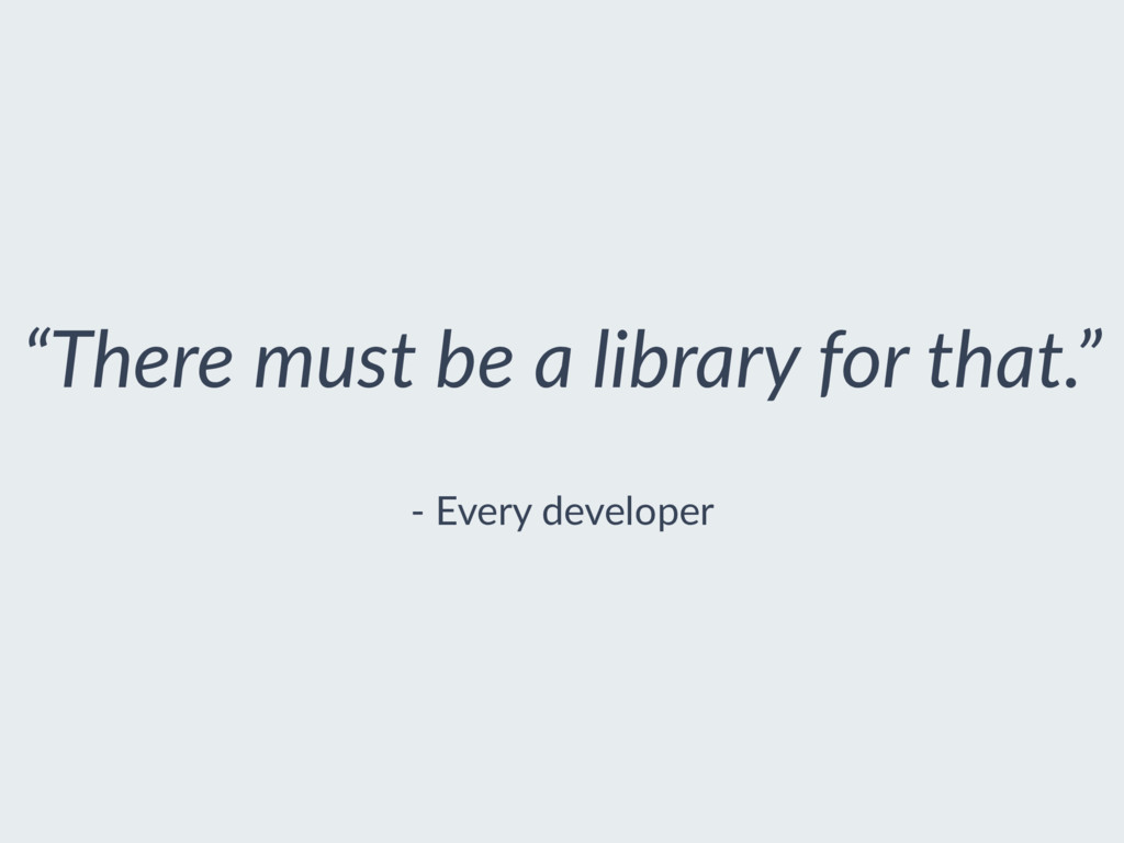
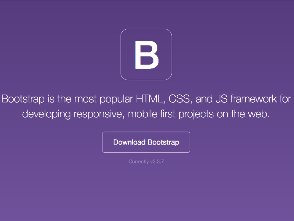
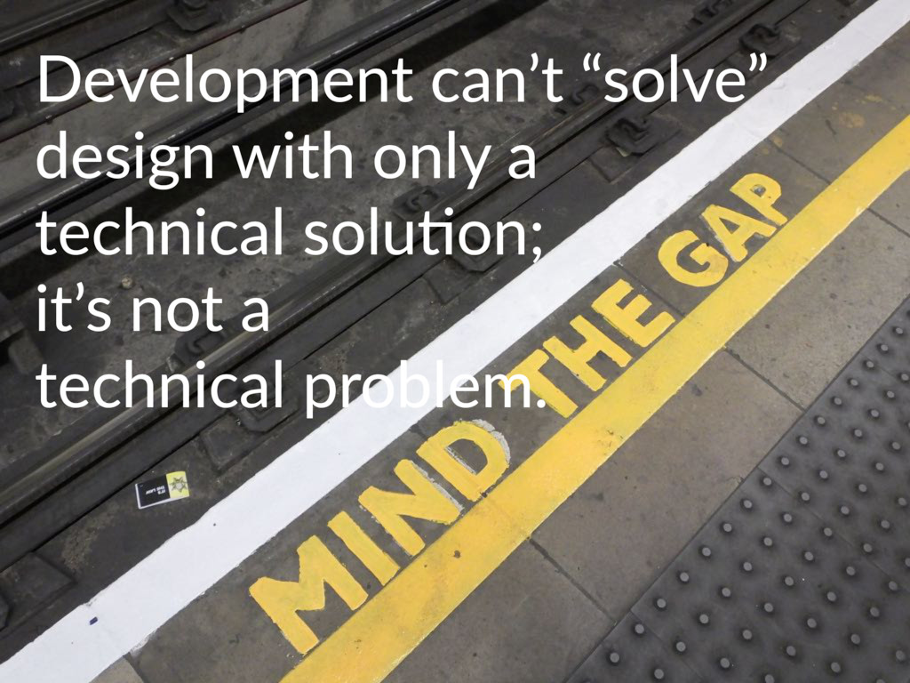
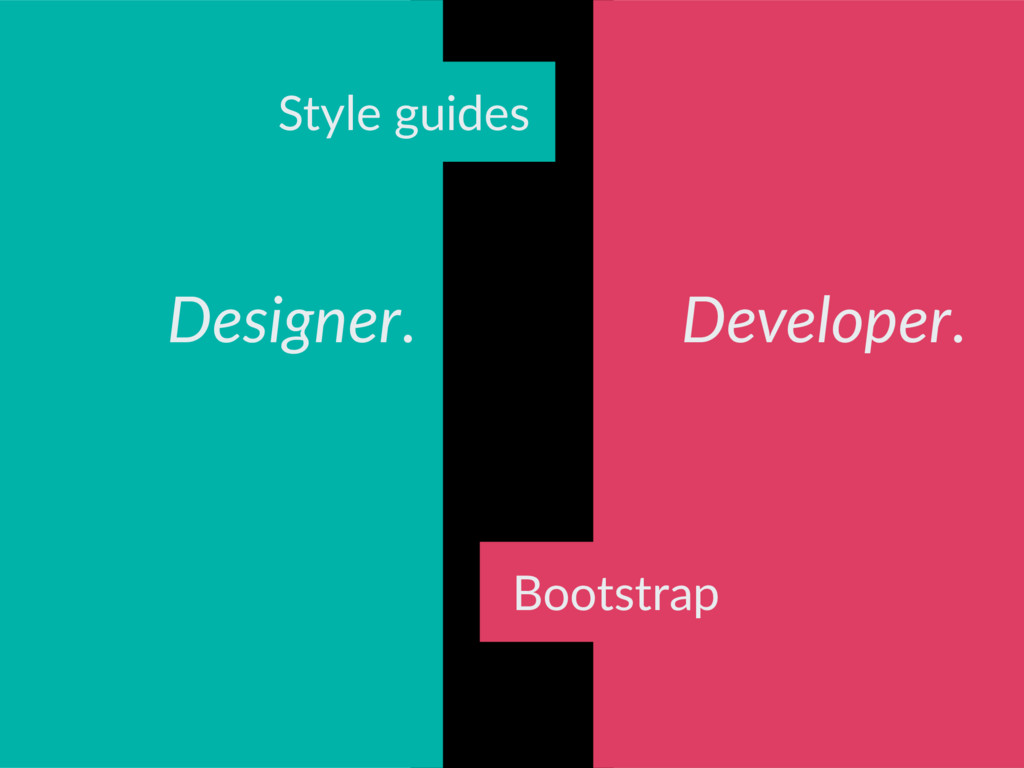
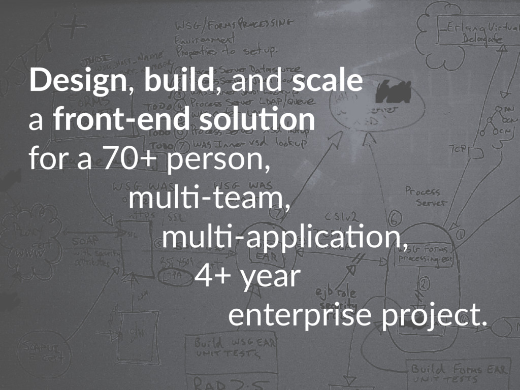
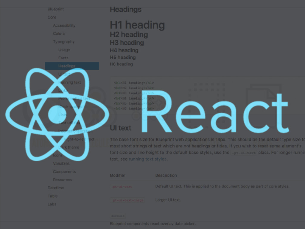
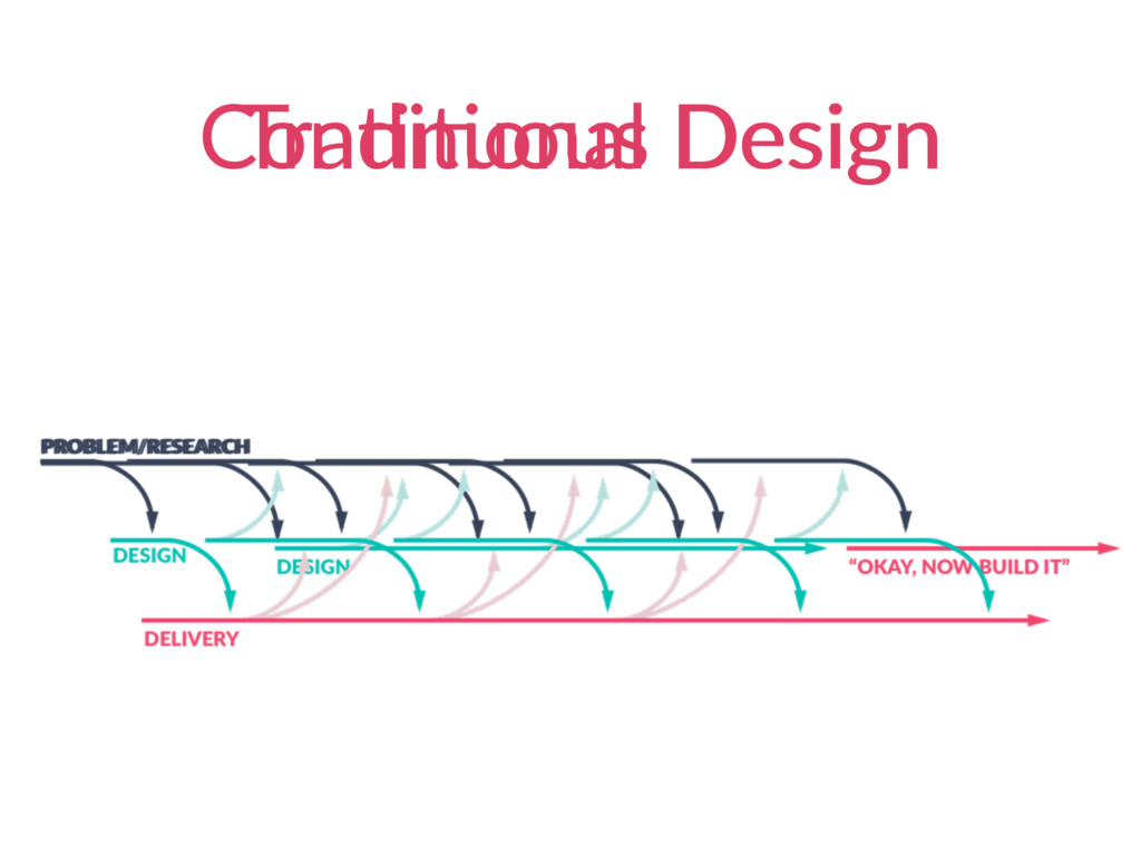
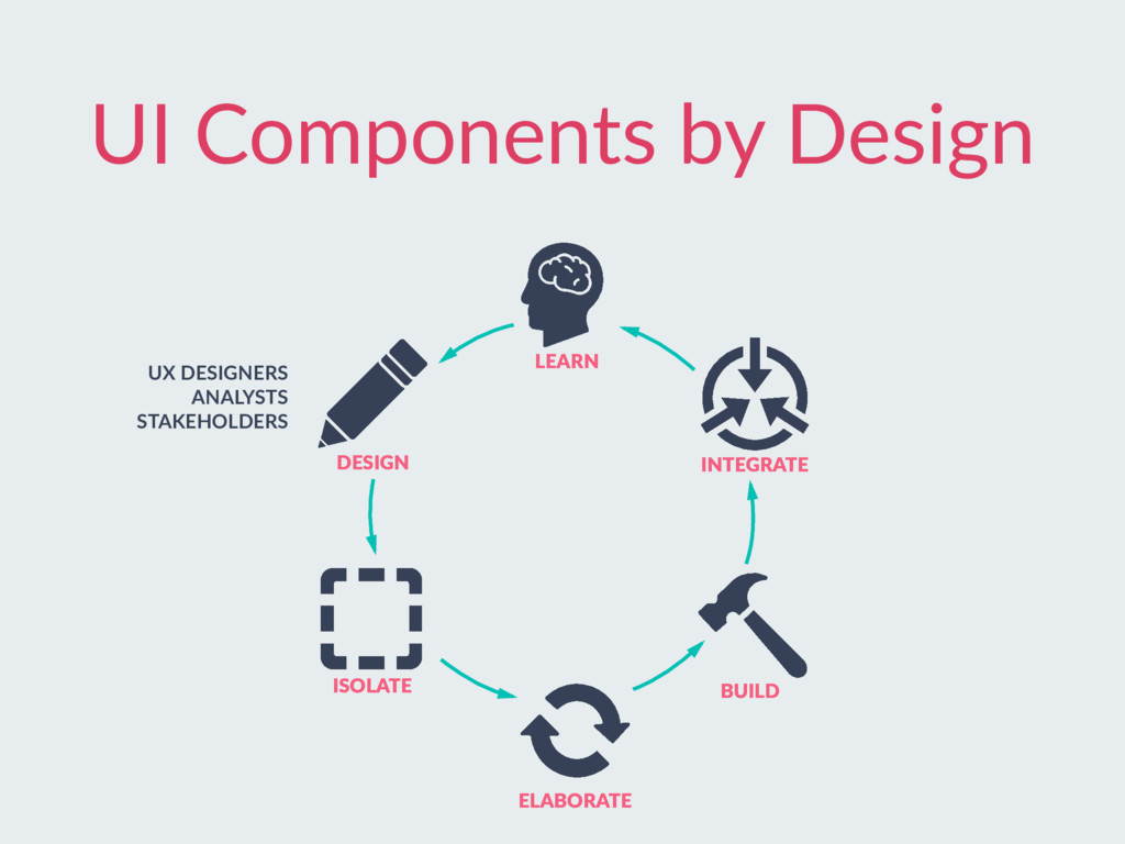
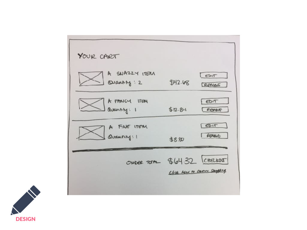
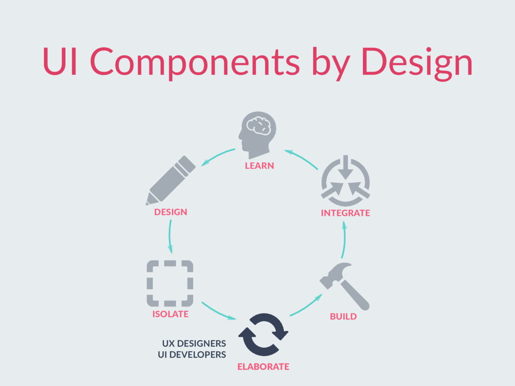
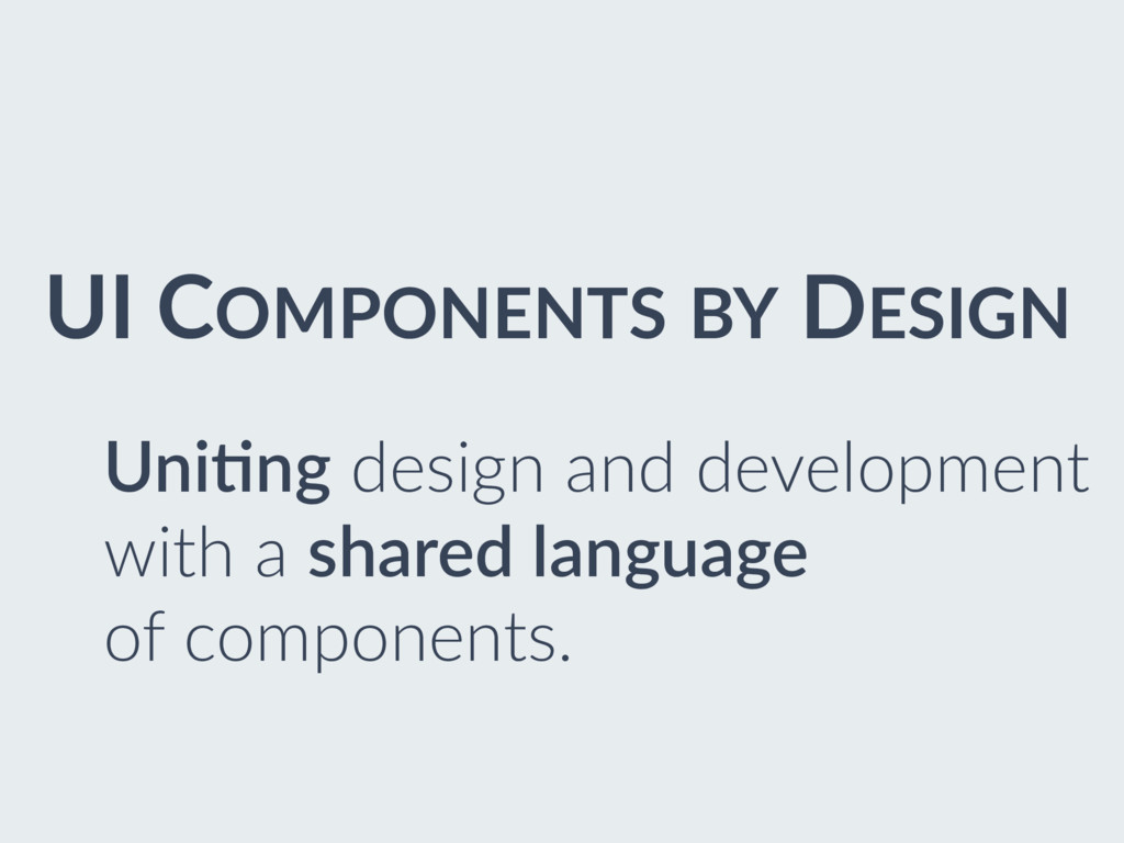
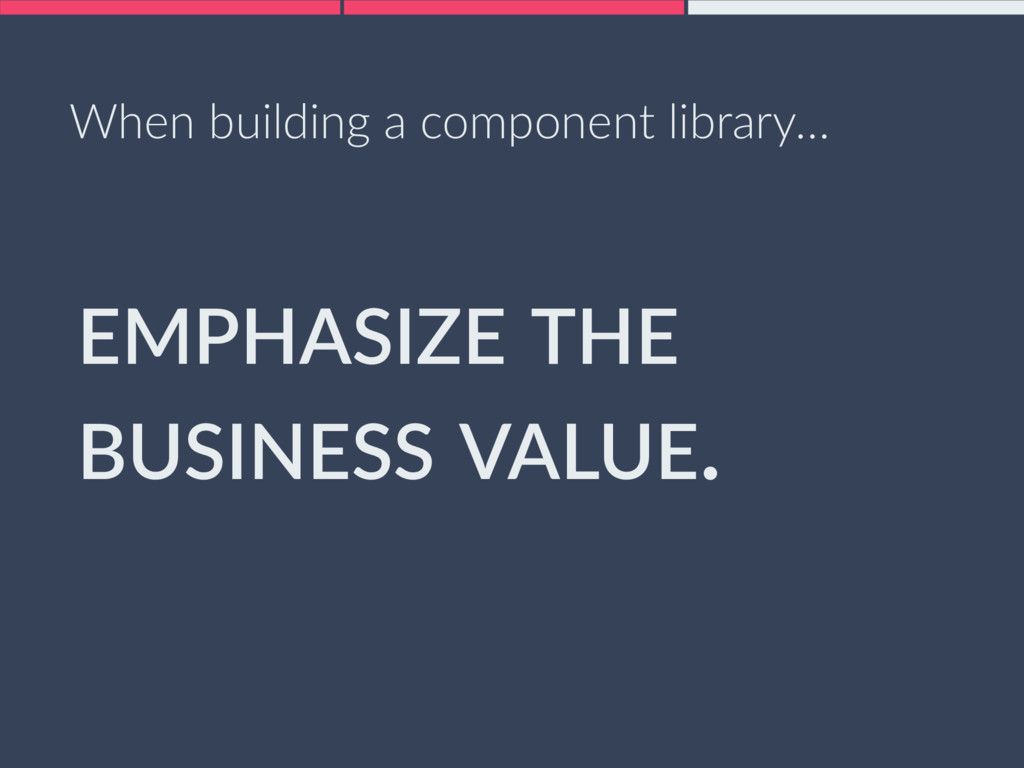
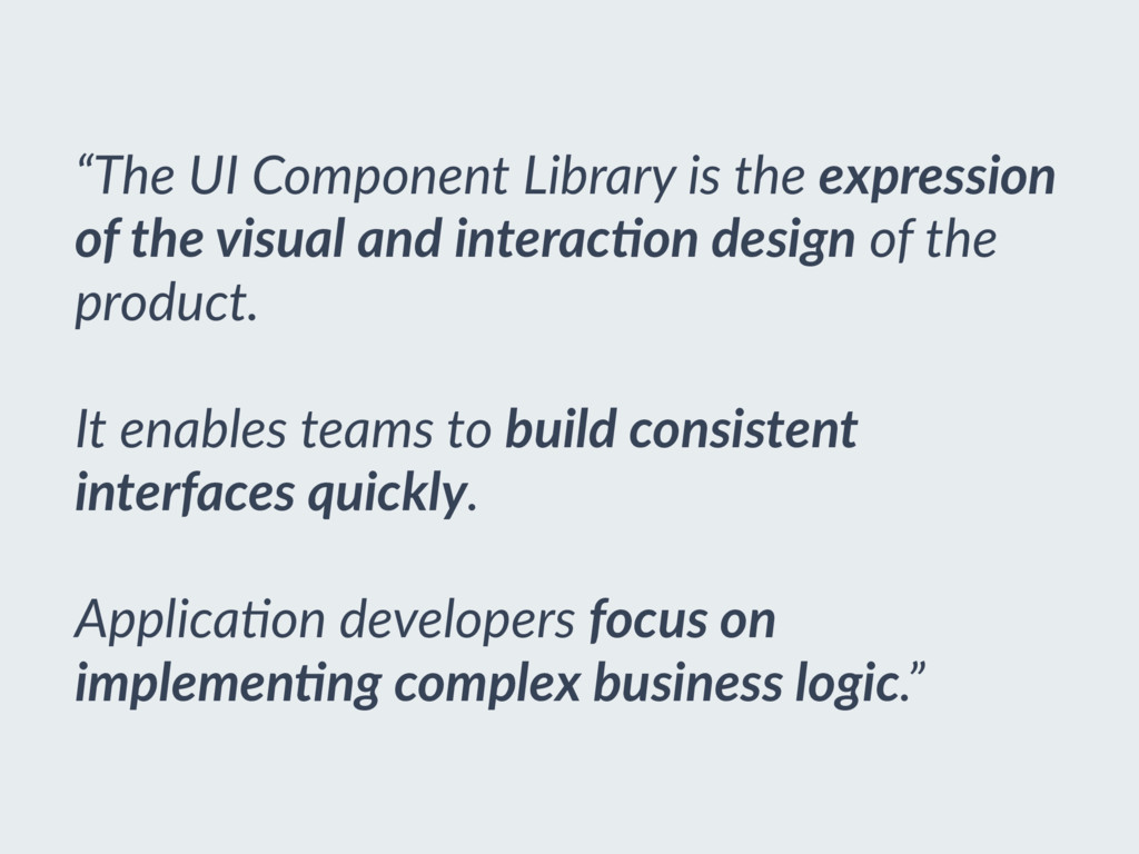
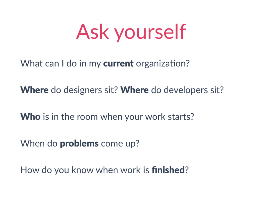
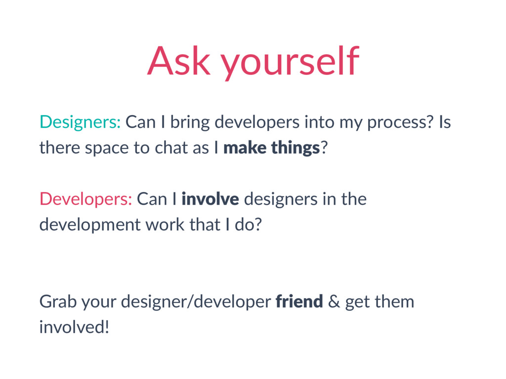
Even in an agile environment, the transition between design work and development work has been un-collaborative. Designers design a thing. Developers build a thing. And in the middle… a 1-way hand-off that lacks consideration for both crafts. We can do better. Ryan and Angelina share their challenges and insights in trying to break down that wall, learned from experiences on a large-scale, integrated UX design and UI development team. From strategies for building a purposeful team structure to technical considerations in implementing a library of UI components, you’ll hear relatable experiences and practical tips to create a more enjoyable, collaborative, and productive space for design and development.

Ryan Oglesby

June 26, 2017
Tweet

More Decks by Ryan Oglesby

Other Decks in Programming

Transcript

  1. UI Components
    by Design
    Bridging the Designer Developer Gap
    Angelina Cole & Ryan Oglesby
    ThoughtWorks

    View Slide

  2. Hi, I’m Ryan.
    I’m a
    Hi, I’m Angelina.
    I’m a Designer. Developer.

    View Slide

  3. Designer. Developer.

    View Slide

  4. Mental
    Technological
    OrganizaAonal
    misalignment

    View Slide

  5. 1. The gap is bad.

    2. How did we bridge it?

    View Slide

  6. 1. The gap is bad.

    2. How did we bridge it?

    View Slide

  7. Two designers One product owner
    No developers!

    View Slide

  8. One designer One product owner
    30+ developers!
    OFFSHORE

    View Slide

  9. “That’s not what designers do.”

    View Slide

  10. SeparaAon of
    Design and Development

    View Slide

  11. Design without developers
    results in
    miscommunicaAon,
    misunderstanding,
    and rework.

    View Slide

  12. “There must be a library for that.”
    - Every developer

    View Slide

  13. View Slide

  14. Development can’t “solve”
    design with only a
    technical soluAon;
    it’s not a
    technical problem.

    View Slide

  15. Designer. Developer.
    Style guides
    Bootstrap

    View Slide

  16. Designer. Developer.

    View Slide

  17. 1. The gap is bad.

    2. How did we bridge it?

    View Slide

  18. Design, build, and scale
    a front-end soluFon
    for a 70+ person,
    mulA-team,
    mulA-applicaAon,
    4+ year
    enterprise project.

    View Slide

  19. View Slide

  20. View Slide

  21. View Slide

  22. Designer. Developer.

    View Slide

  23. ConAnuous Design
    TradiAonal Design

    View Slide

  24. UI Components by Design
    DESIGN
    ISOLATE
    ELABORATE
    INTEGRATE
    LEARN
    BUILD
    UX DESIGNERS
    ANALYSTS
    STAKEHOLDERS
    DESIGN
    ISOLATE
    ELABORATE
    INTEGRATE
    LEARN
    BUILD

    View Slide

  25. DESIGN

    View Slide

  26. COMPONENT
    An independent, reusable
    unit of your applica/on.

    View Slide

  27. DESIGN

    View Slide

  28. FoundaAon
    Components
    ApplicaAon
    Components
    DESIGN

    View Slide

  29. UI Components by Design
    DESIGN
    ISOLATE
    ELABORATE
    INTEGRATE
    LEARN
    BUILD
    UX DESIGNERS
    UI DEVELOPERS

    View Slide

  30. already exists
    already exists
    already exists
    build it!
    build it!
    FoundaAon
    Components
    ISOLATE

    View Slide

  31. DESIGN
    ISOLATE
    ELABORATE
    INTEGRATE
    LEARN
    BUILD
    UI Components by Design
    UX DESIGNERS
    UI DEVELOPERS

    View Slide

  32. Does this appear on the top of the screen or the bo]om?
    Does it meet accessibility standards?
    What colors can it accept?
    Does it have any transiAons?
    What does this do on mobile?
    Does it have a loading spinner?
    When does it Ame out?
    Can it appear like a link?
    Does it have a hover?
    What do errors look like?
    What size is appropriate?
    Is the text sentence case or Atle case?
    Is the touch area large enough?
    What’s the tab order?
    What are the alignment rules?
    ELABORATE

    View Slide

  33. DESIGN
    ISOLATE
    ELABORATE
    INTEGRATE
    LEARN
    BUILD
    UI Components by Design
    UX DESIGNERS
    UI DEVELOPERS

    View Slide

  34. BUILD
    class Button extends React.Component {
    render() {
    const className = this.props.primary ? "primary-button" :
    "secondary-button";
    return (

    {this.props.children}

    );
    }
    }

    View Slide

  35. DESIGN
    ISOLATE
    ELABORATE
    INTEGRATE
    LEARN
    BUILD
    UI Components by Design
    UX DESIGNERS
    UI DEVELOPERS
    APPLICATION DEVELOPERS

    View Slide

  36. class Cart extends React.Component {
    render() {
    return (

    Your Cart


    Order Total
    {this.props.orderTotal}

    Checkout


    Continue shopping

    );
    }
    }
    INTEGRATE

    View Slide

  37. INTEGRATE
    ApplicaAon Focus
    Component Focus
    LEARN
    DESIGN
    ISOLATE
    ELABORATE
    BUILD

    View Slide

  38. UI COMPONENTS BY DESIGN
    Uni0ng design and development
    with a shared language
    of components.

    View Slide


  39. View Slide


  40. A Component Library

    View Slide

  41. When building a component library…

    View Slide

  42. STANDARDIZE THE
    TECH STACK.
    When building a component library…

    View Slide

  43. EMPHASIZE THE
    BUSINESS VALUE.
    When building a component library…

    View Slide

  44. “The UI Component Library is the expression
    of the visual and interac7on design of the
    product.

    It enables teams to build consistent
    interfaces quickly.
    ApplicaBon developers focus on
    implemen7ng complex business logic.”

    View Slide

  45. DELIGHT YOUR
    CUSTOMERS.
    When building a component library…

    View Slide

  46. CUSTOMERS.
    Write awesome docs
    h]ps:/
    /react-styleguidist.js.org
    DELIGHT YOUR CUSTOMERS

    View Slide

  47. $ npm publish
    $ npm install @myCompany/foundation-components
    Streamline distribuAon
    DELIGHT YOUR CUSTOMERS

    View Slide

  48. Over communicate
    DELIGHT YOUR CUSTOMERS

    View Slide

  49. Component all the things
    @mixin layout-horizontally { … }
    @mixin layout-vertically { … }
    h1 { … }
    h2 { … }
    .small-font { … }
    .bold-font { … }
    .button__primary { … }
    .button__primary--disabled { … }
    .button__seccondary { … }


    DELIGHT YOUR CUSTOMERS

    View Slide


  50. DESIGN
    ISOLATE
    ELABORATE
    INTEGRATE
    LEARN
    BUILD
    UI Components by Design

    View Slide

  51. Designer. Developer.
    Style guides
    Bootstrap

    View Slide

  52. Ask yourself
    What can I do in my current organizaAon?
    Where do designers sit? Where do developers sit?
    Who is in the room when your work starts?
    When do problems come up?
    How do you know when work is finished?

    View Slide

  53. Ask yourself
    Designers: Can I bring developers into my process? Is
    there space to chat as I make things?
    Developers: Can I involve designers in the
    development work that I do?
    Grab your designer/developer friend & get them
    involved!

    View Slide

  54. Designer. Developer.
    If you only do one thing…
    Work together.

    View Slide

  55. Thanks!

    View Slide

  56. Angelina Cole
    @uxangelina
    h]p:/
    /angelinamcole.com
    Ryan Oglesby
    @ryanoglesby08
    h]p:/
    /ryanogles.by
    ThoughtWorks
    h]ps:/
    /www.thoughtworks.com

    View Slide