Upgrade to Pro — share decks privately, control downloads, hide ads and more …

Responsive Design with @media Queries

Responsive Design with @media Queries

Shows an example of how to use @media queries to provide a responsive web app that behaves well on narrow screens (e.g., smartphones).

solipet

May 14, 2013
Tweet

More Decks by solipet

Other Decks in Programming

Transcript

  1. Using @media queries • Style content differently given different media/

    properties, e.g.: <link rel="stylesheet" type="text/css" media="print" href="print.css"> @media print { … } @media screen and (max-width: 500px) { … }
  2. Media query types (HTML4) • screen • print • aural

    • braille • handheld • projection • tty • tv Implicit defaults to ‘all’
  3. Media query properties • width • height • device-width •

    device-height • orientation <portrait|landscape> • aspect-ratio • device-aspect-ratio • color <bits-per-color> • color-index <number-of-entries> • monochrome <bits-per-pixel> • resolution • scan <progressive|interlaced> • grid
  4. My Problem: Show a list of objects • First column

    shows a list of items • Second column shows details/actions for the selected item • What happens when screen is too narrow? (e.g., phone) Item Info/ Actions Item 1 Item 2 Item 3 Item 4 Item 5 Item 6 Item 7 Item 8 Item 9 Item 10 Item 11 Item 12 Item 13
  5. Sliding two-column display • For narrow views, only show one

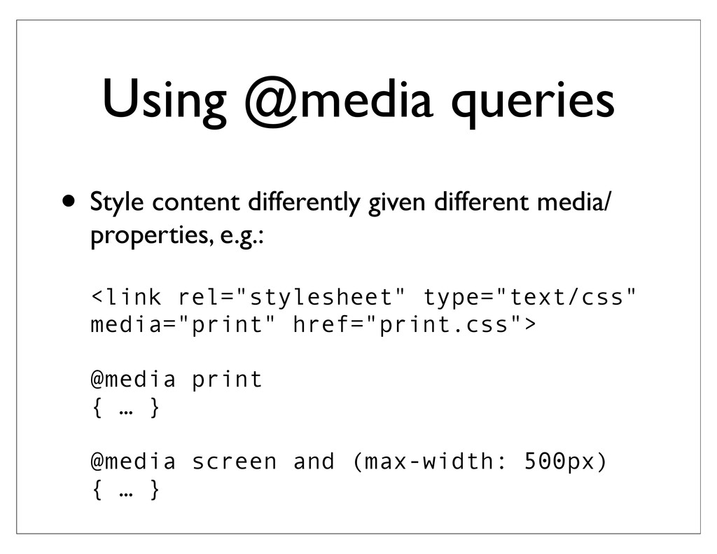
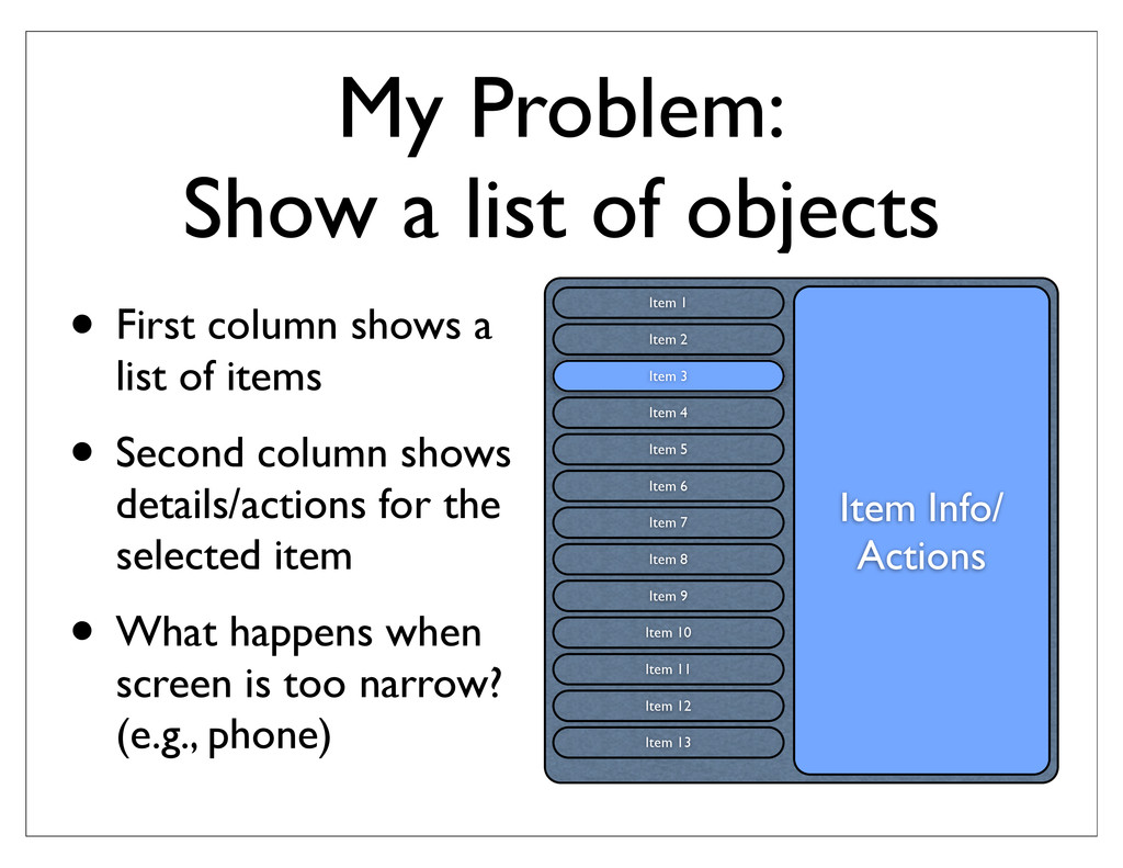
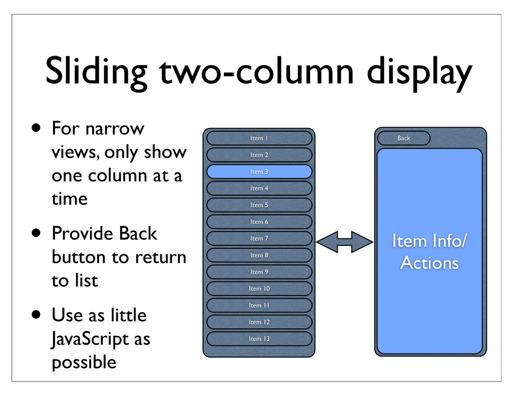
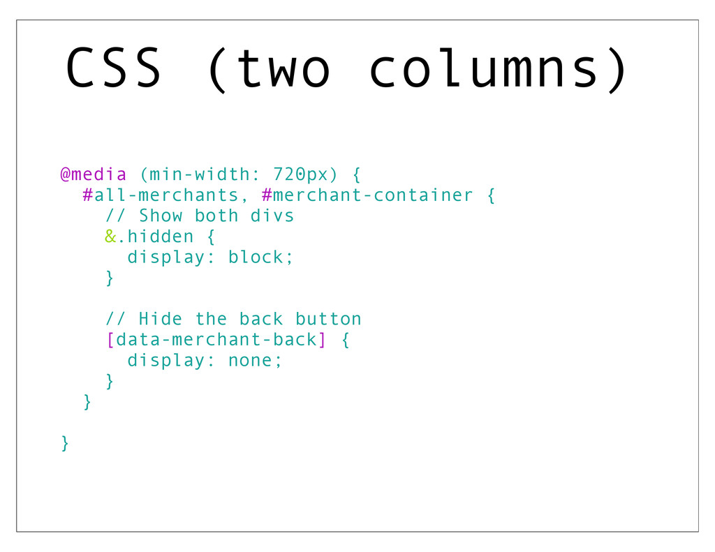
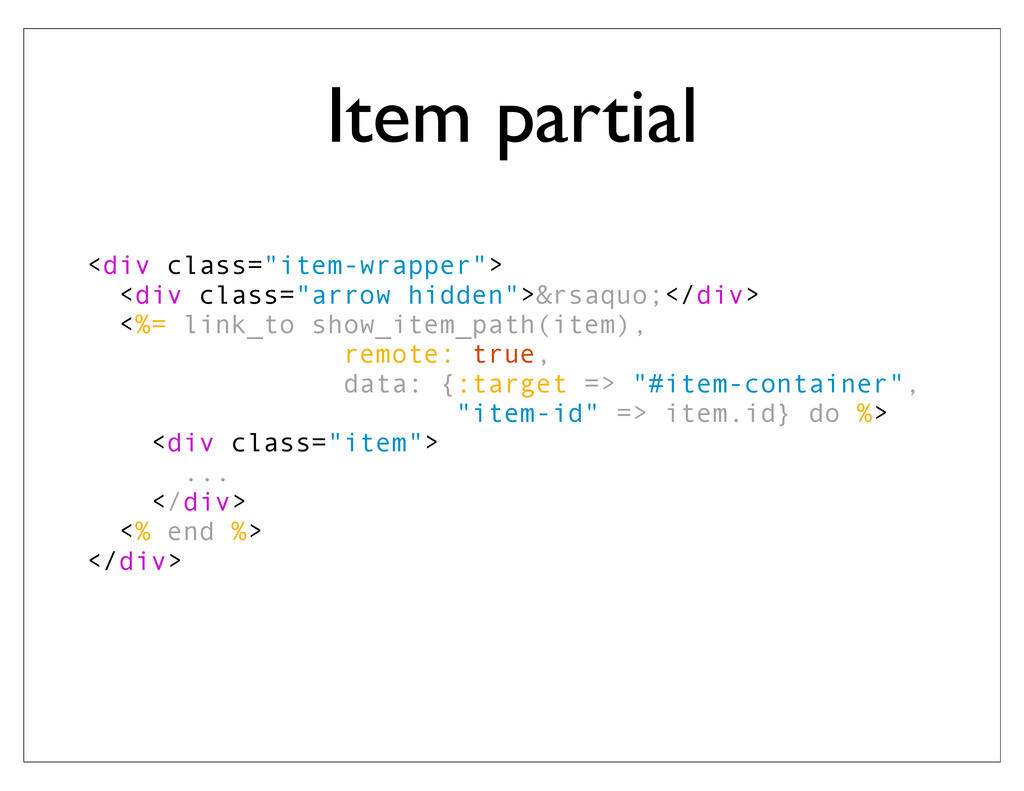
    column at a time • Provide Back button to return to list • Use as little JavaScript as possible Item 1 Item 2 Item 3 Item 4 Item 5 Item 6 Item 7 Item 8 Item 9 Item 10 Item 11 Item 12 Item 13 Item Info/ Actions Back
  6. show.html.erb <div class="slider-container"> <div id="all-items"> <%# render the list %>

    </div> <div id="item-container" class="hidden" > <%# render the selected item %> </div> </div> Default width: 40% Narrow width: 50% Default width: 60% Narrow width: 50% Default width: 100% Narrow width: 200%
  7. CSS (one column) @media (max-width: 720px) { .slider-container { width:

    200%; } #all-items, #item-container { width: 50%; float: left; transition: transform 300ms ease-in-out; } #all-items { &.hidden { transform: translate3d(-100%, 0, 0); } } #item-container { transform; translate3d(-100%, 0, 0); &.hidden { transform: translate3d(0%, 0, 0); } } }
  8. CSS (two columns) @media (min-width: 720px) { #all-merchants, #merchant-container {

    // Show both divs &.hidden { display: block; } // Hide the back button [data-merchant-back] { display: none; } } }
  9. Item partial <div class="item-wrapper"> <div class="arrow hidden">&rsaquo;</div> <%= link_to show_item_path(item),

    remote: true, data: {:target => "#item-container", "item-id" => item.id} do %> <div class="item"> ... </div> <% end %> </div>
  10. CoffeeScript $('body').on 'ajax:success', '.item-list a[data-remote]', (e, data, status, xhr) ->

    $target = $('#item-container') $target.html(data) $target.removeClass "hidden" $('.back').removeClass "hidden" $('#all-items').addClass "hidden" currenthash = hash() window.location.hash = $(this).attr "data-item-id" window.scrollTo(0,0)
  11. CoffeeScript $('body').on 'click', "[data-item-back]", (event) -> event.preventDefault() event.stopPropagation() $('.back').addClass "hidden"

    $('#all-items').removeClass "hidden" $('#item-container').addClass "hidden" window.scrollTo(0,0) window.location.hash = ""
  12. CoffeeScript (hash) currenthash = "" hash = -> window.location.hash.substr(1) checkUrl

    = -> return if currenthash == hash() if hash() $("a[data-item-id=\"#{hash()}\"]").click() else $('.back').addClass "hidden" $('[data-item-back]').click() currenthash = hash() if 'onhashchange' in window $(window).on('hashchange', checkUrl ) else setInterval(checkUrl, 100); checkUrl()
  13. Acknowledgements: Thanks to Nick Gauthier for all his assistance More

    info: Athayde, John and Williams, Bruce. The Rails View: Creating a Beautiful and Maintainable User Experience, The Pragmatic Programmers, 2012. http://www.w3.org/TR/css3-mediaqueries/ -- W3C specification http://mediaqueri.es/ -- great examples of responsive design http://alchemee.com/ -- launching soon!