VEROU DAVID STOREY CHRIS HEILMANN AARRON WALTER ARAL BALKAN BEN SCHWARZ DMITRY FADEYEV MARC EDWARDS AND LITTLE OL’ ME Absolutely shameless, yet tasteful book plug
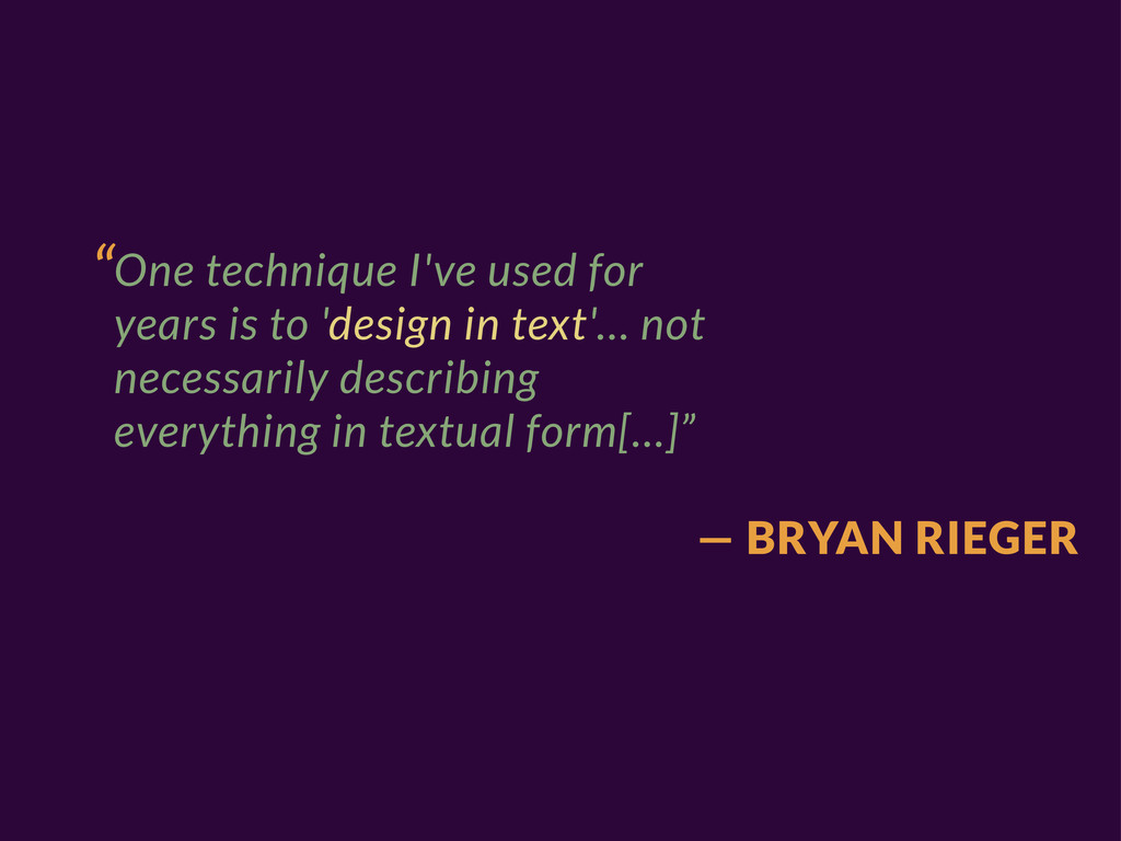
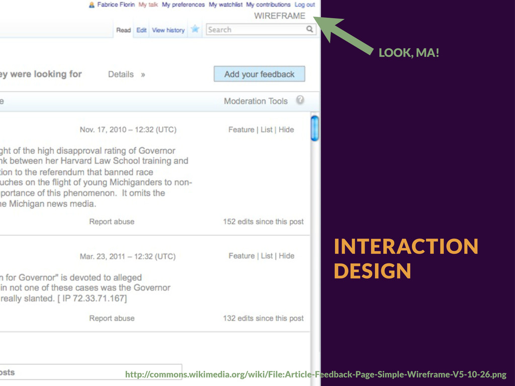
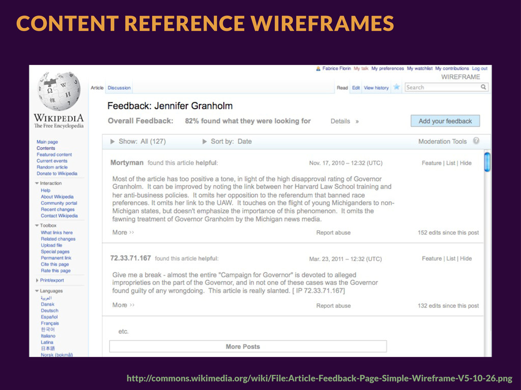
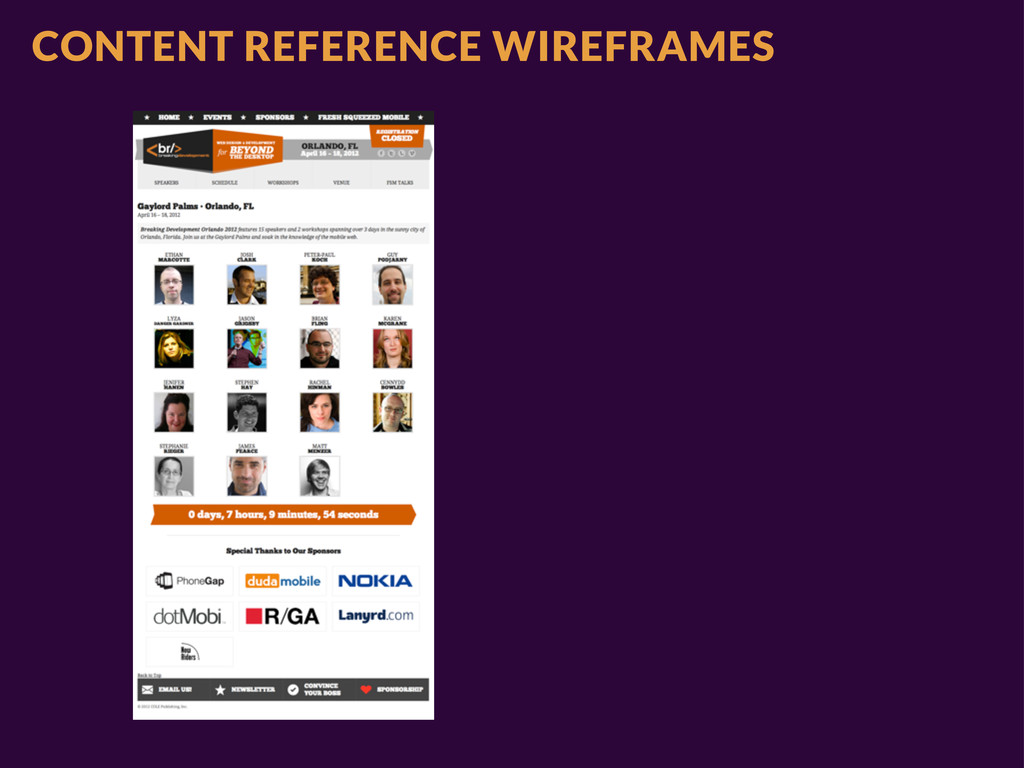
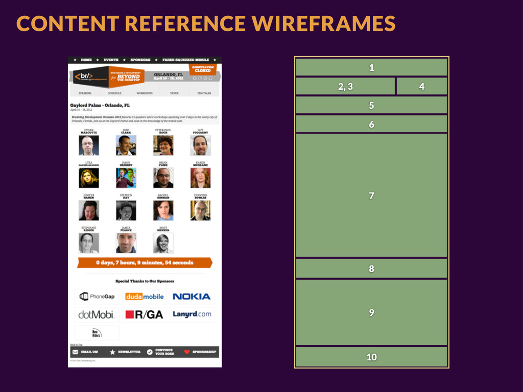
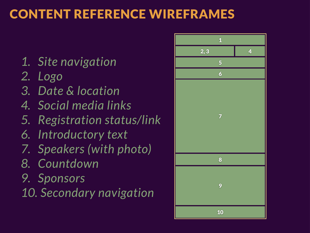
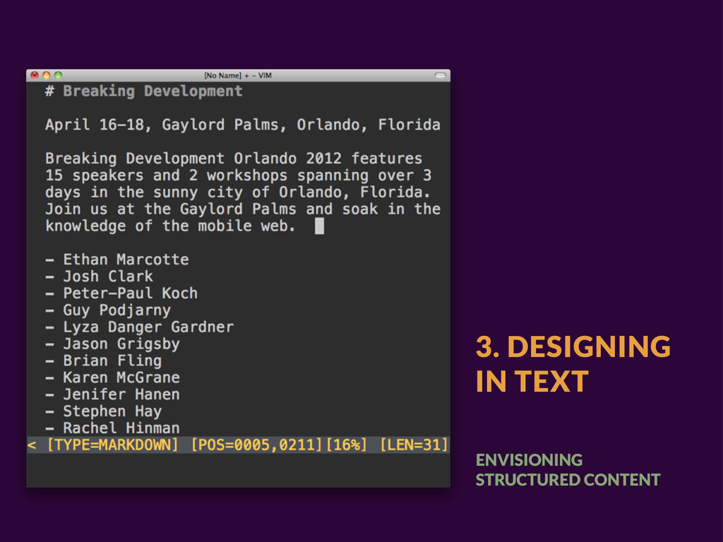
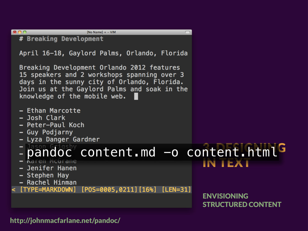
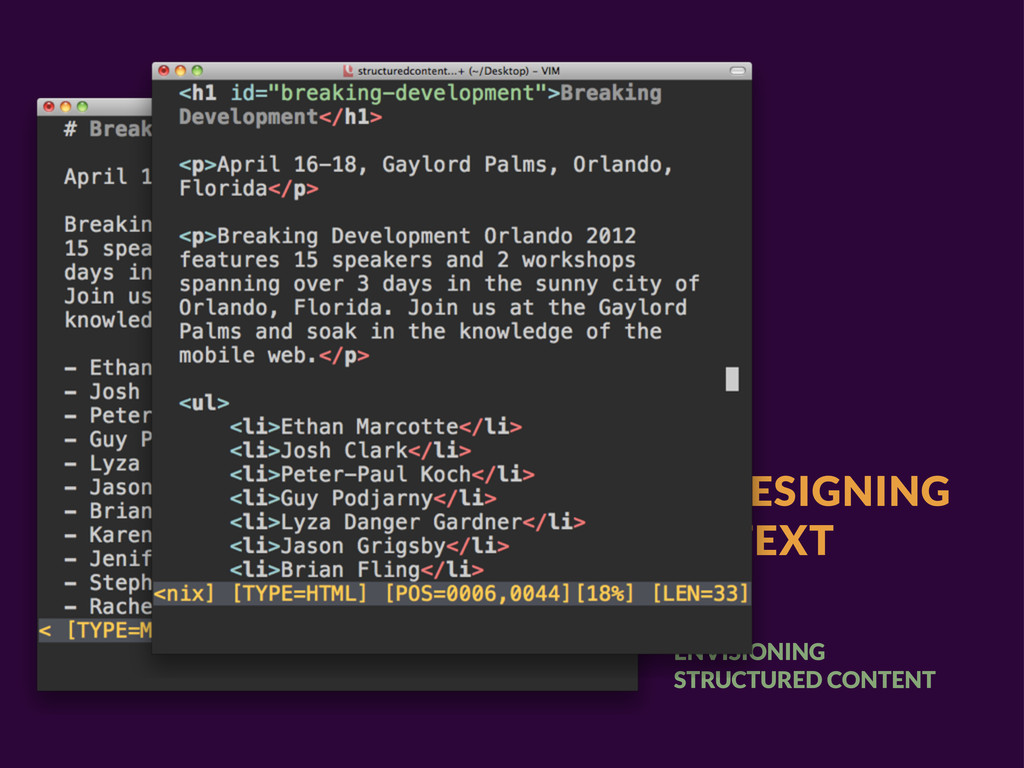
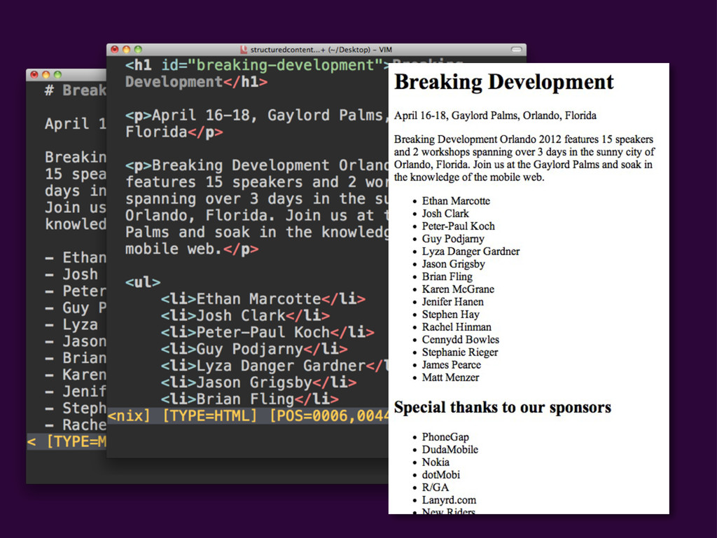
wireframes 3. Design in text (structured content) 4. Linear design 5. Breakpoint graph 6. Design for various breakpoints 7. HTML design prototype 8. Present prototype screenshots 9. Present prototype after revision 10. Document for production
wireframes 3. Design in text (structured content) 4. Linear design 5. Breakpoint graph 6. Design for various breakpoints 7. HTML design prototype 8. Present prototype screenshots 9. Present prototype after revision 10. Document for production
 stephenhay
 securecat
 godlingkogami
 nishame
 nagata03
 pkshadeck
 hicard
 mhand01
 garyuten
 hiro0218
 moco1013
 baasie
 littlebusters
 nikkihalliwell
 jeffersonlam
 trallard
 colly
colly
 letsgokoyo
 erikaheidi
 honnibal
 eileencodes
 retrage
 stephenakadiri
 bluesmoon
 axbom
axbom