Upgrade to Pro
— share decks privately, control downloads, hide ads and more …
Speaker Deck
Features
Speaker Deck
PRO
Sign in
Sign up for free
Search
Search
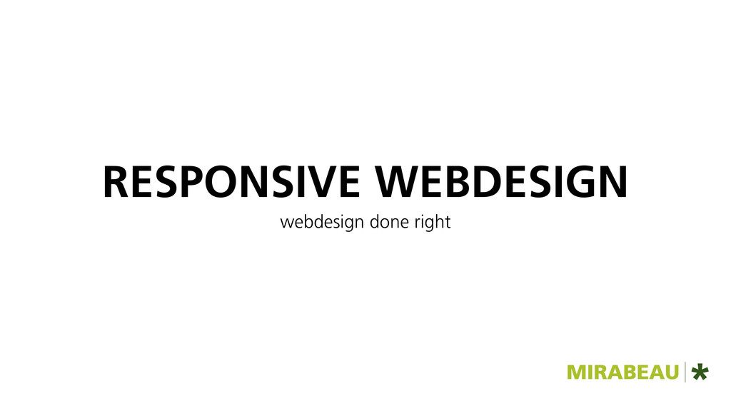
Responsive webdesign - webdesign done right
Search
Sybren Wartna
January 09, 2012
Technology
300
3
Share
Embed
Copy iframe code
Copy JS code
Copy link
Start on current slide
Responsive webdesign - webdesign done right
Sybren Wartna
January 09, 2012
More Decks by Sybren Wartna
See All by Sybren Wartna
Typography on the web
syb
0
83
Everything can break
syb
1
100
Werken in stijl
syb
0
100
Other Decks in Technology
See All in Technology
探して_入れて_作って_使う_Agent_Skills___LT.pdf
peintangos
2
160
BigQuery の Cross-cloud Lakehouse への歩み
phaya72
2
550
ルールやカスタム機能、どう使う?理想の出力を引き出すために今知りたいIBM Bob 5つの機能
muehara
1
340
もりもり新機能を一挙紹介! AgentCoreに入門して、AWS上にAIエージェントを構築しよう
minorun365
PRO
6
820
トークン数だけでは測れない — Claude Code 組織展開の効果検証から学んだこと
makikub
0
130
【5分でわかる】セーフィー エンジニア向け会社紹介
safie_recruit
0
50k
チームで実践する AI-DLC 思考の軌跡を残すチェックポイント設計
belongadmin
0
2.6k
「コーディング」しない人のための Claude Code 入門 ChatGPT の次の一歩 — 業務に組み込む 育成・共有・自動化
rfdnxbro
2
1.2k
ポケモンの型をTypeScriptの型システムで表現してみた
subroh0508
0
330
ITエンジニアを取り巻く環境とキャリアパス / A career path for Japanese IT engineers
takatama
4
1.8k
TypeScript Compiler APIとPHP-Parserを活用し、TypeScriptとPHPで型を共有する
shuta13
0
360
Oracle AI Database@AWS:サービス概要のご紹介
oracle4engineer
PRO
4
2.8k
Featured
See All Featured
The MySQL Ecosystem @ GitHub 2015
samlambert
251
13k
WCS-LA-2024
lcolladotor
0
620
JAMstack: Web Apps at Ludicrous Speed - All Things Open 2022
reverentgeek
1
460
Lightning talk: Run Django tests with GitHub Actions
sabderemane
0
190
Navigating the moral maze — ethical principles for Al-driven product design
skipperchong
2
380
Building the Perfect Custom Keyboard
takai
2
780
Responsive Adventures: Dirty Tricks From The Dark Corners of Front-End
smashingmag
254
22k
Introduction to Domain-Driven Design and Collaborative software design
baasie
1
820
Bootstrapping a Software Product
garrettdimon
PRO
307
120k
Money Talks: Using Revenue to Get Sh*t Done
nikkihalliwell
0
240
[RailsConf 2023] Rails as a piece of cake
palkan
59
6.7k
The Impact of AI in SEO - AI Overviews June 2024 Edition
aleyda
5
1.1k
Transcript
RESPONSIVE WEBDESIGN webdesign done right
Sybren Wartna
None
WAAROM RESPONSIVE?
devices, devices, devices
wie heeft geen smartphone?
mobile first ‣ markt groeit sterk ‣ meer mogelijkheden ‣
focus op broodnodige
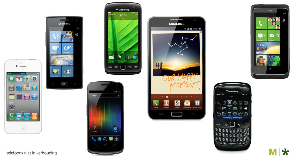
let’s make a mobile app
telefoons niet in verhouding
oh, en we willen ook iets met tablets
None
er is geen mobile web
er is één web
en dat is responsive
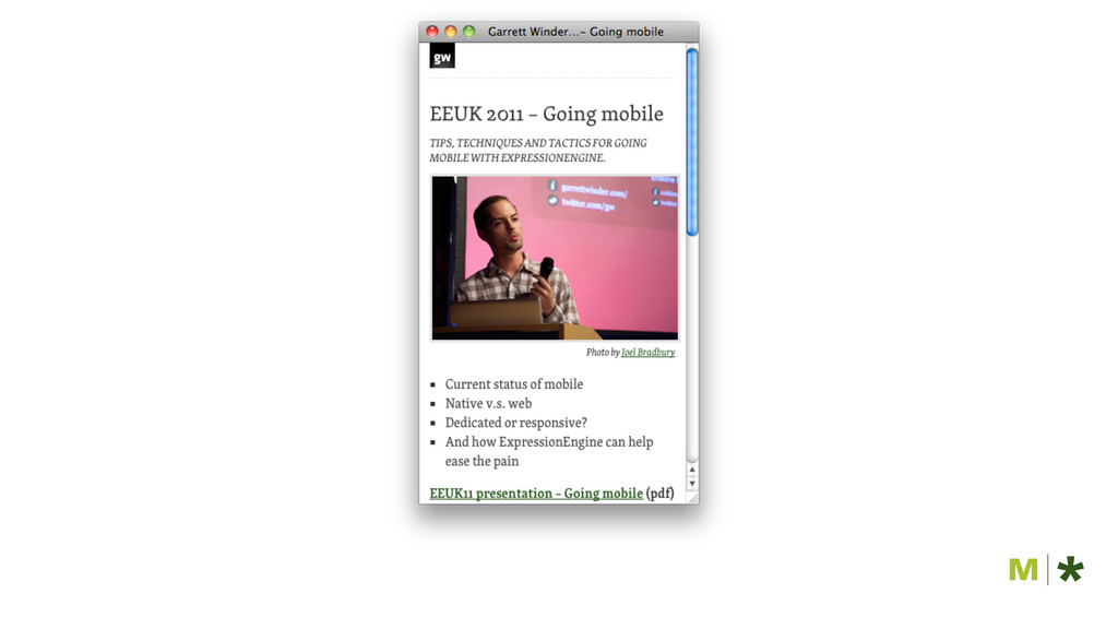
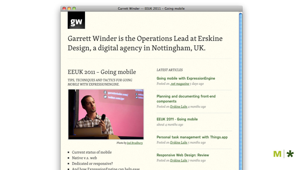
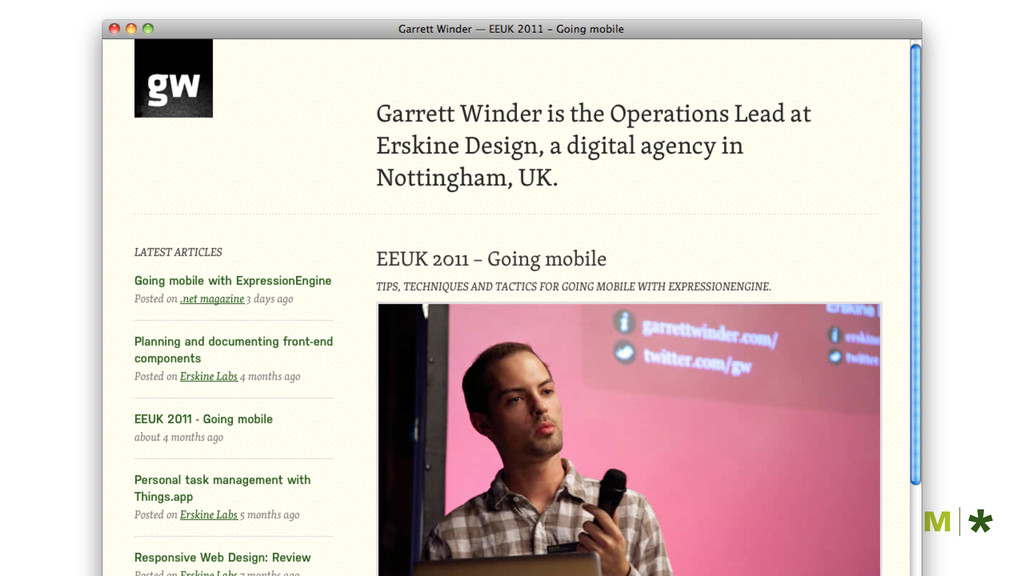
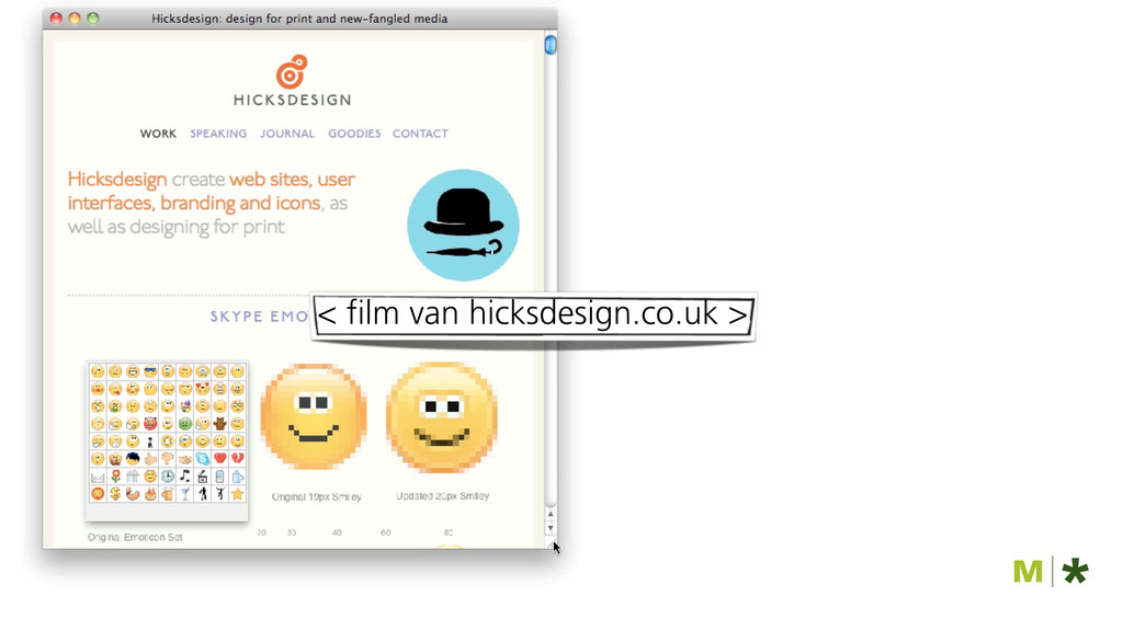
RESPONSIVE VOORBEELDEN
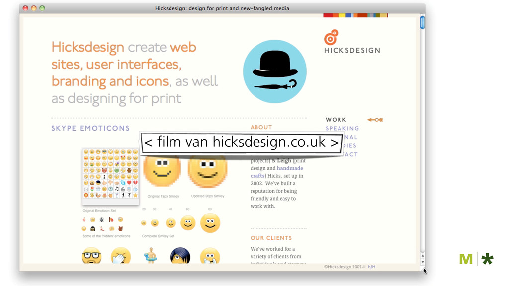
< film van hicksdesign.co.uk >
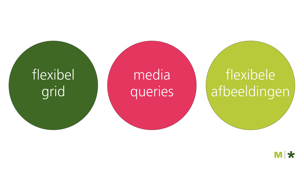
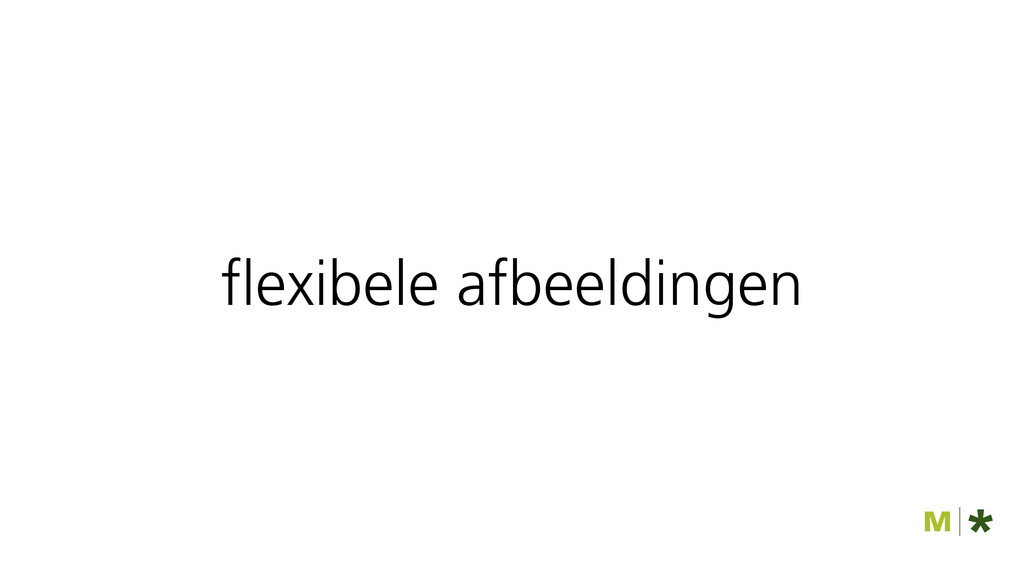
media queries flexibel grid flexibele afbeeldingen
garrettwinder.com
None
None
None
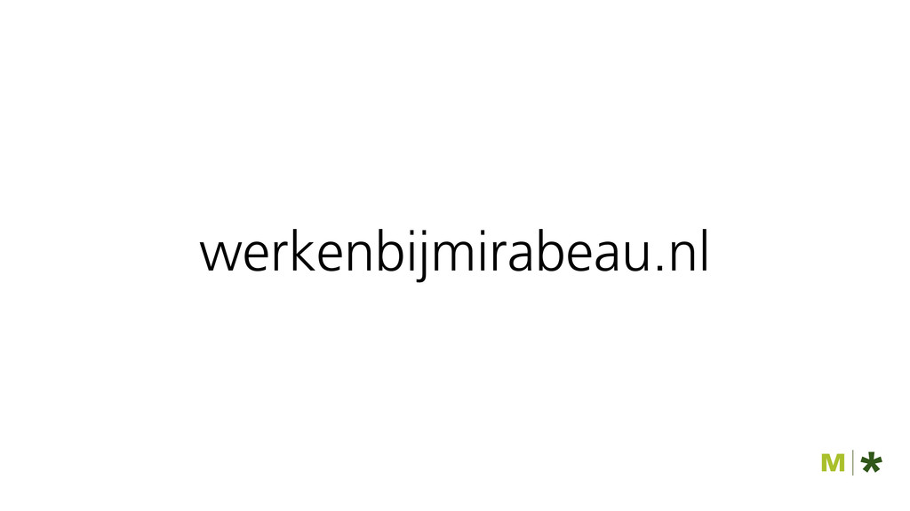
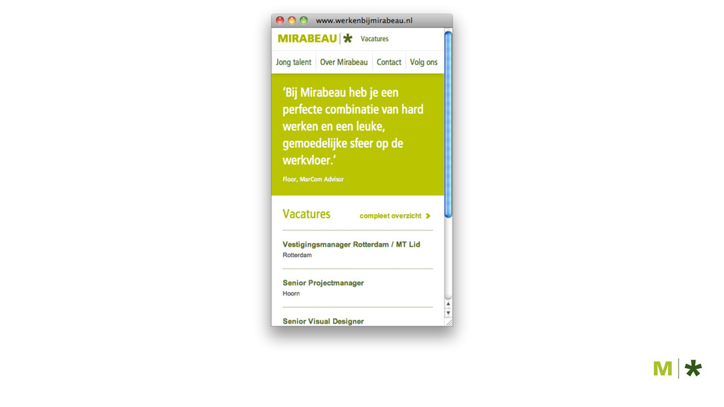
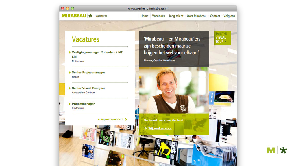
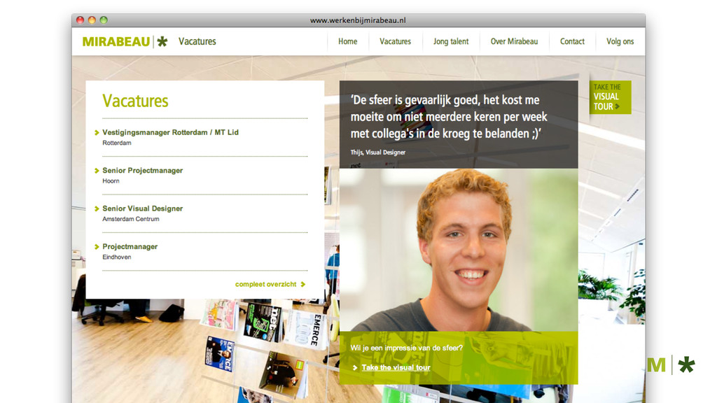
werkenbijmirabeau.nl
None
None
None
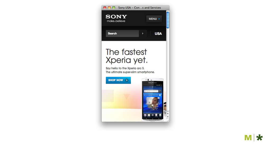
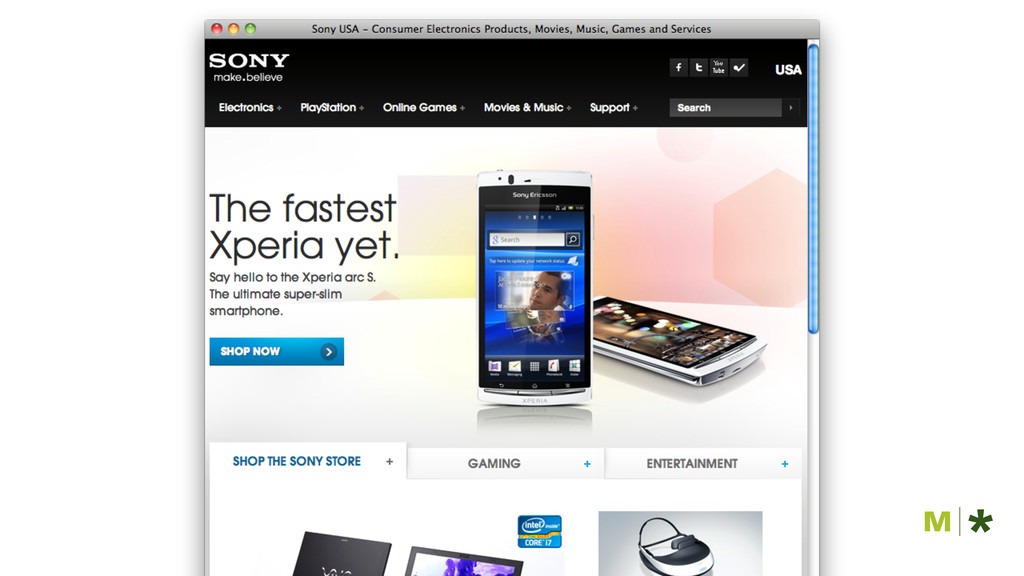
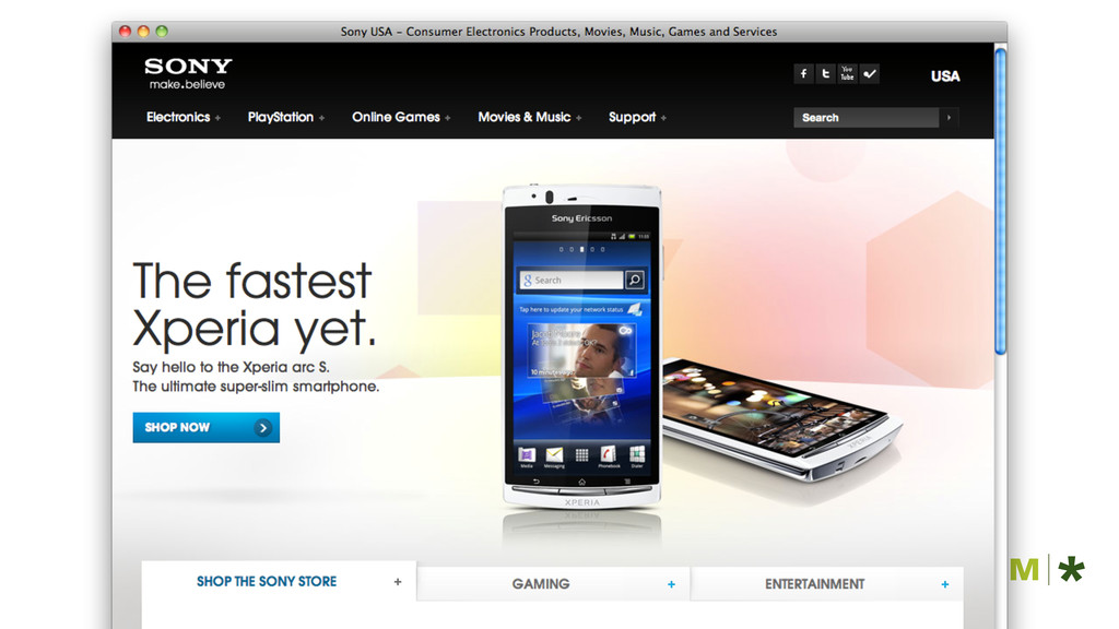
sony.com
None
None
None
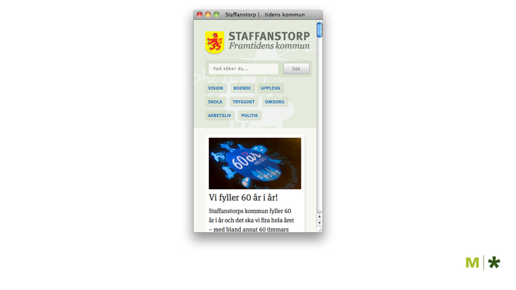
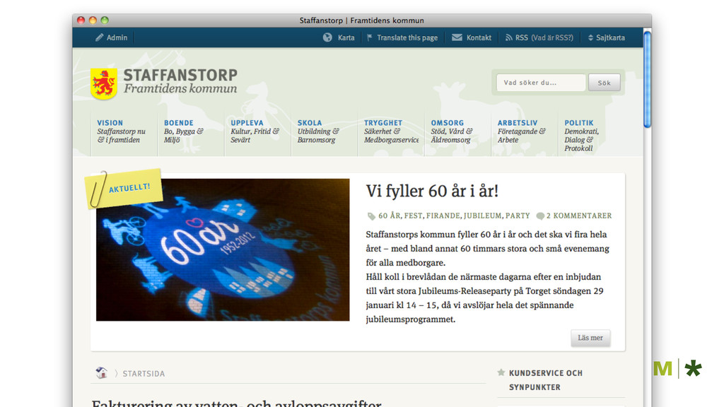
staffanstorp.se
None
None
None
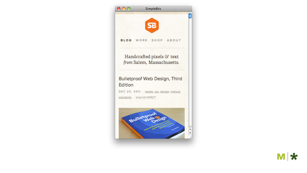
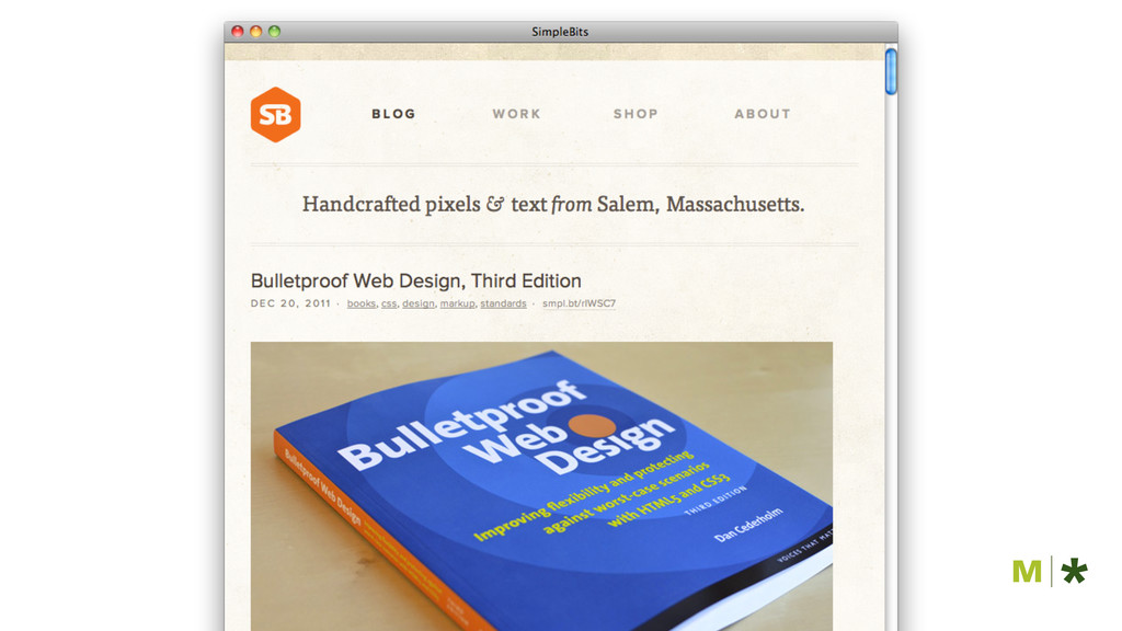
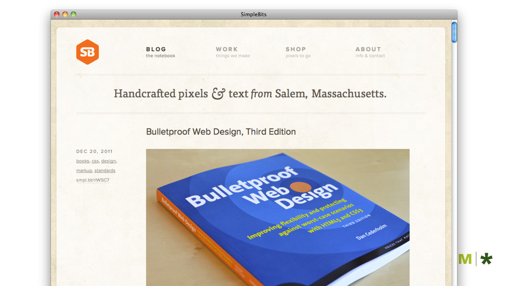
simplebits.com
None
None
None
HOE WORD JE RESPONSIVE?
media queries flexibel grid flexibele afbeeldingen
flexibel grid
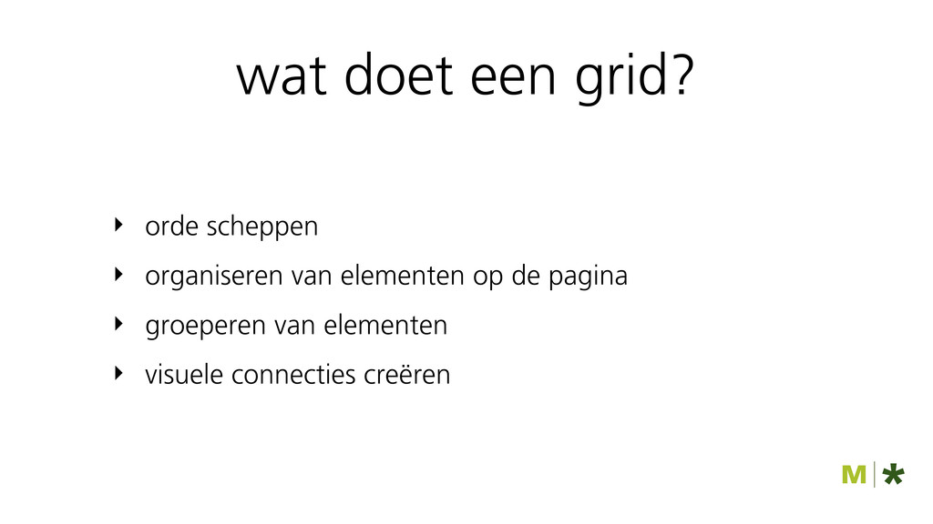
wat doet een grid?
‣ orde scheppen ‣ organiseren van elementen op de pagina
‣ groeperen van elementen ‣ visuele connecties creëren wat doet een grid?
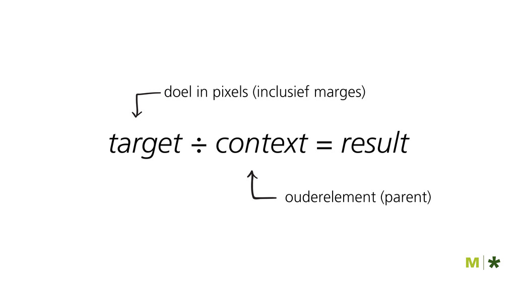
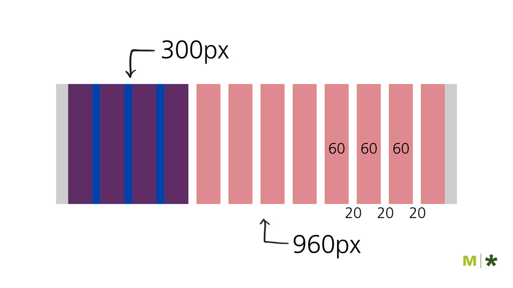
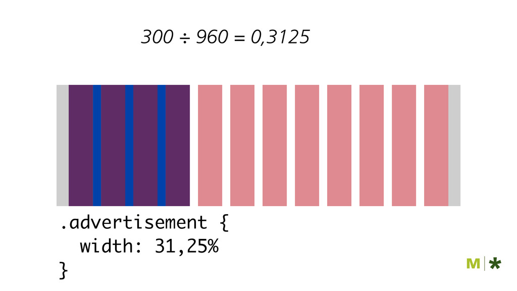
target ÷ context = result
target ÷ context = result doel in pixels (inclusief marges)
ouderelement (parent)
None
None
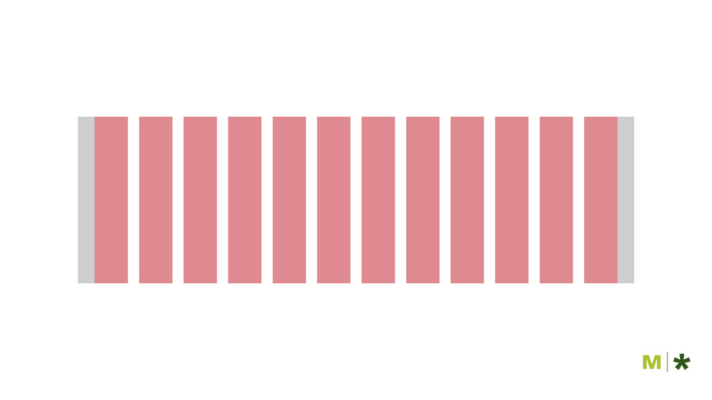
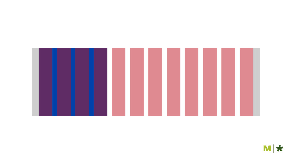
960px 60 20 60 20 60 20 300px
300 ÷ 960 = 0,3125 .advertisement { width: 31,25% }
media queries
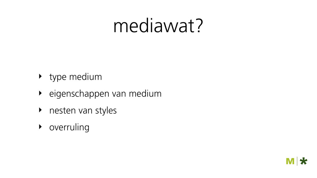
mediawat? ‣ type medium ‣ eigenschappen van medium ‣ nesten
van styles ‣ overruling
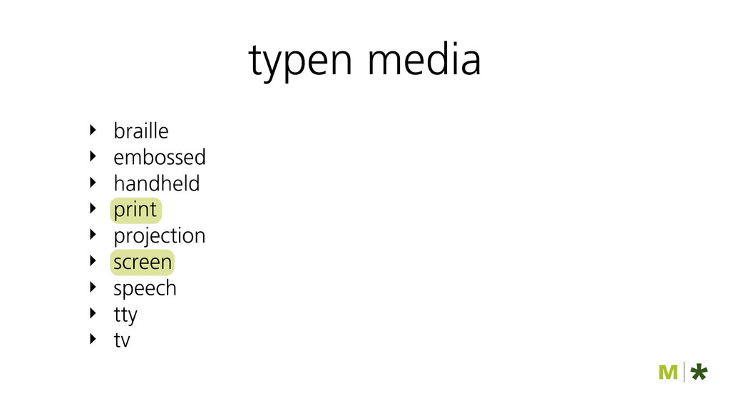
‣ braille ‣ embossed ‣ handheld ‣ print ‣ projection
‣ screen ‣ speech ‣ tty ‣ tv typen media
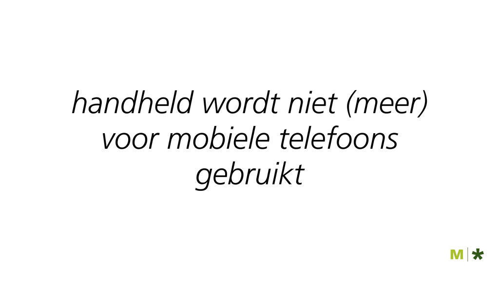
handheld wordt niet (meer) voor mobiele telefoons gebruikt
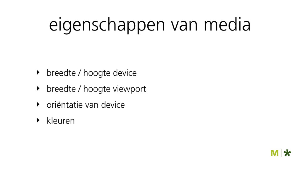
‣ breedte / hoogte device ‣ breedte / hoogte viewport
‣ oriëntatie van device ‣ kleuren eigenschappen van media
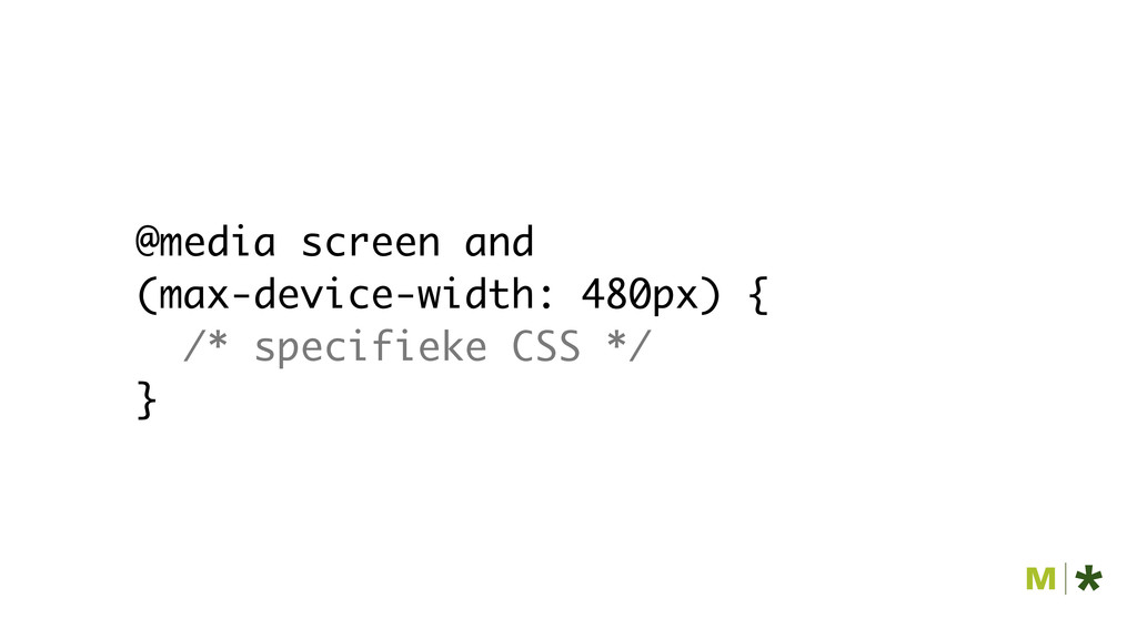
@media screen and (max-device-width: 480px) { /* specifieke CSS */
}
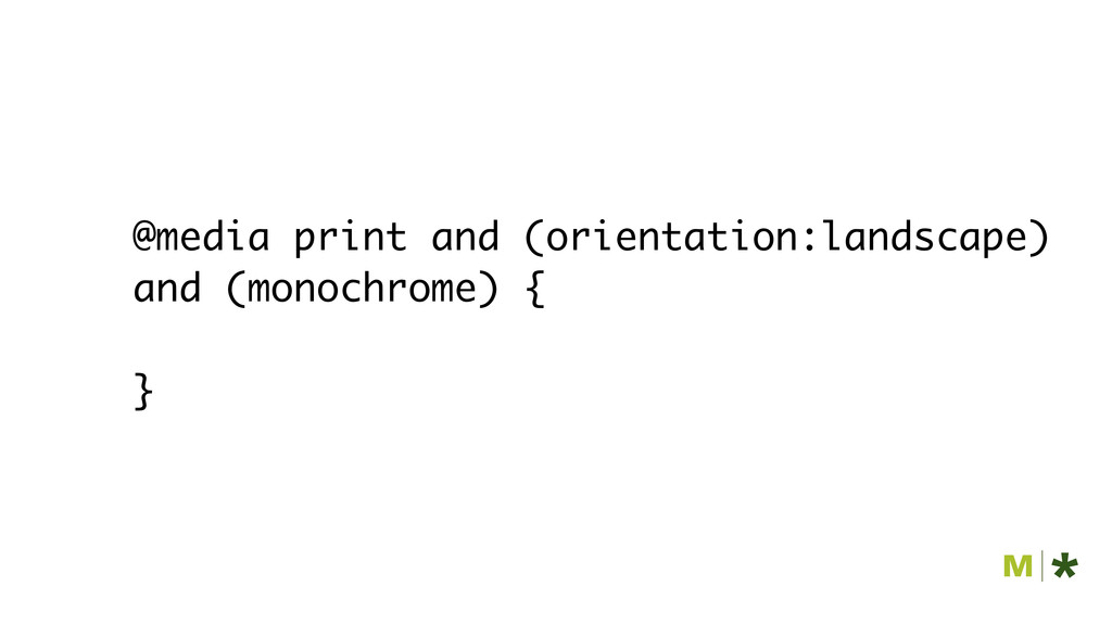
@media print and (orientation:landscape) and (monochrome) { }
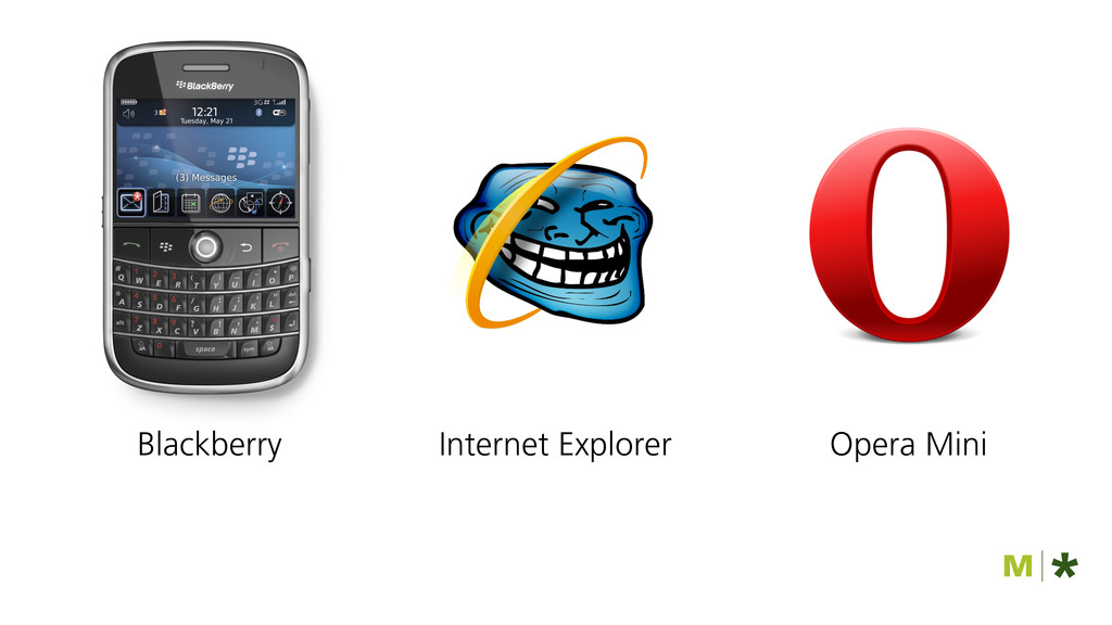
Opera Mini Internet Explorer Blackberry
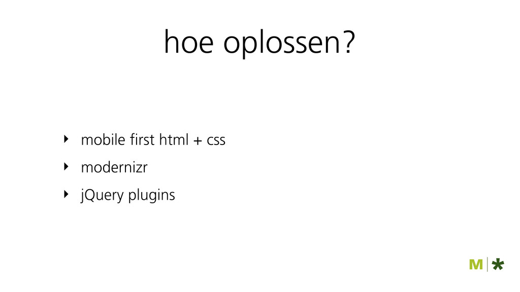
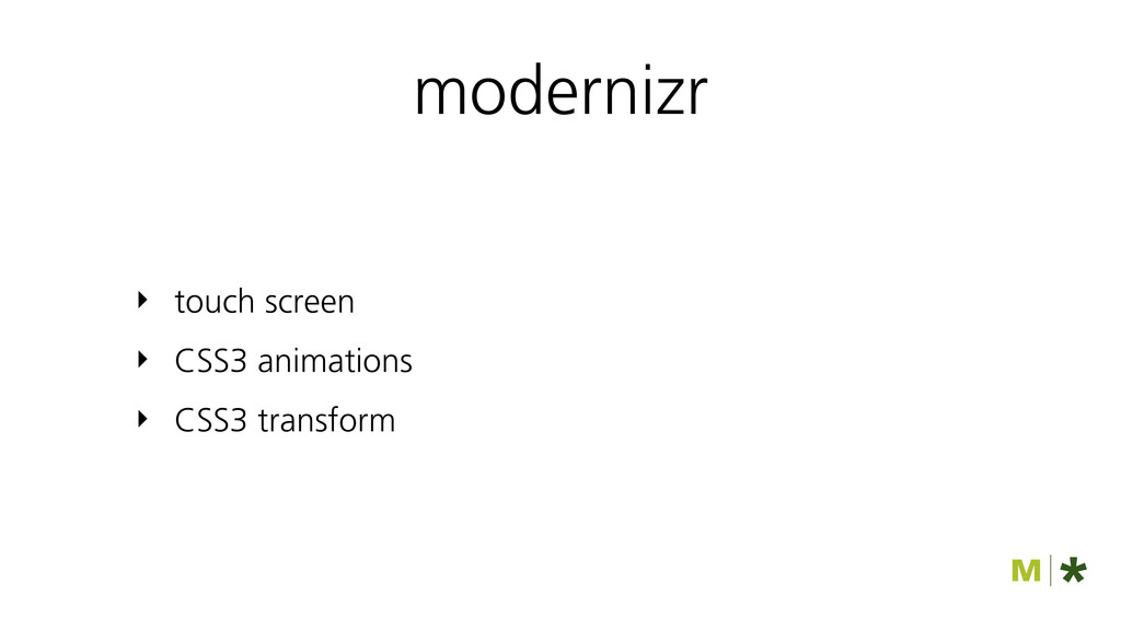
hoe oplossen? ‣ mobile first html + css ‣ modernizr
‣ jQuery plugins
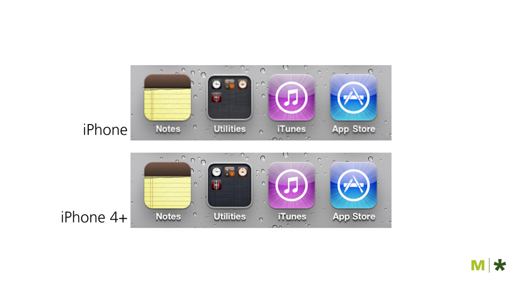
iPhone iPhone 4+
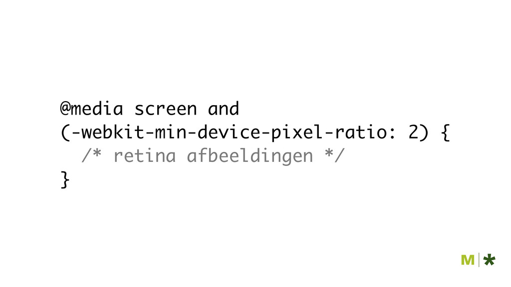
@media screen and (-webkit-min-device-pixel-ratio: 2) { /* retina afbeeldingen */
}
Modernizr.load([{ test : Modernizr.mq(‘(-webkit-min- device-pixel-ratio: 2)’), yep : [‘retina.css’], nope
: [‘images.css’] }]);
modernizr ‣ touch screen ‣ CSS3 animations ‣ CSS3 transform
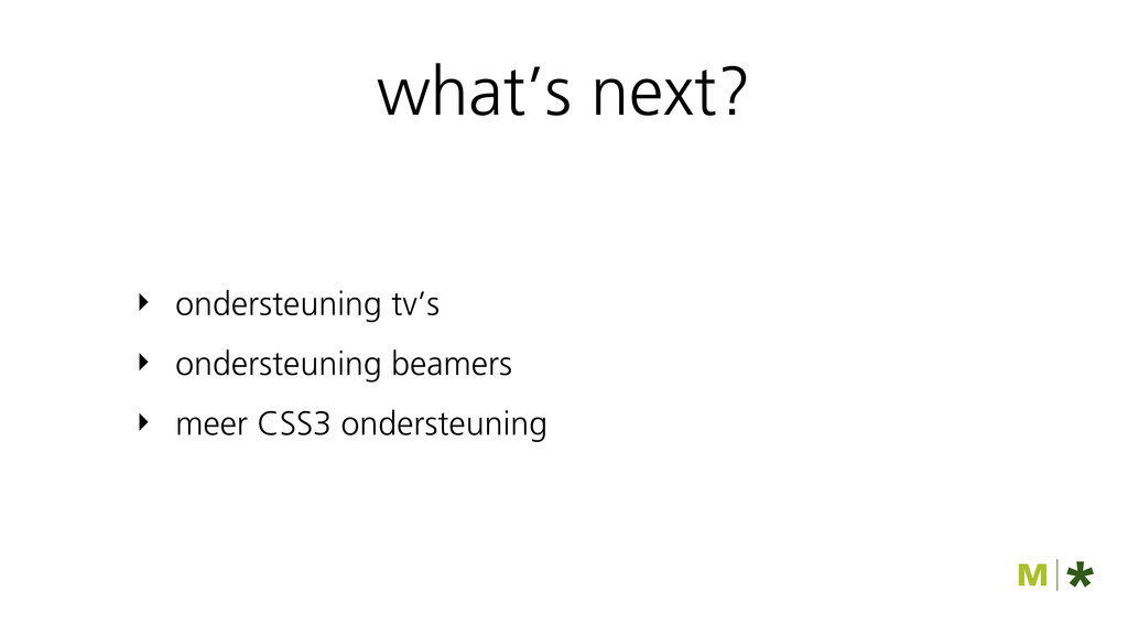
what’s next? ‣ ondersteuning tv’s ‣ ondersteuning beamers ‣ meer
CSS3 ondersteuning
flexibele afbeeldingen
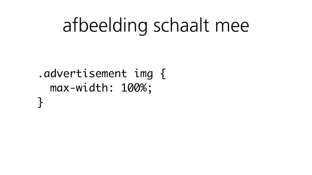
.advertisement img { max-width: 100%; } afbeelding schaalt mee
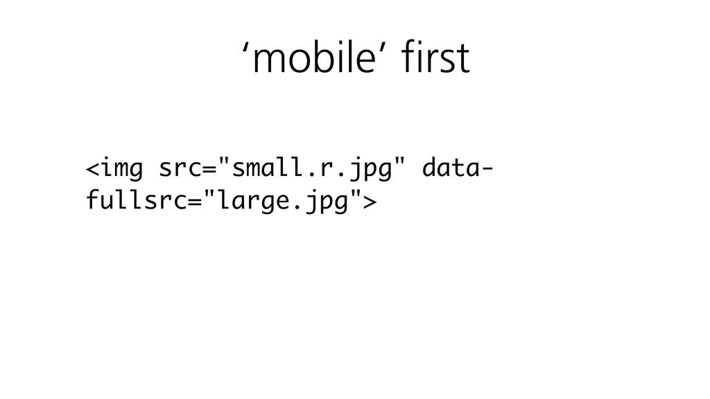
<img src="small.r.jpg" data- fullsrc="large.jpg"> ‘mobile’ first
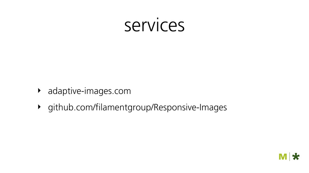
services ‣ adaptive-images.com ‣ github.com/filamentgroup/Responsive-Images
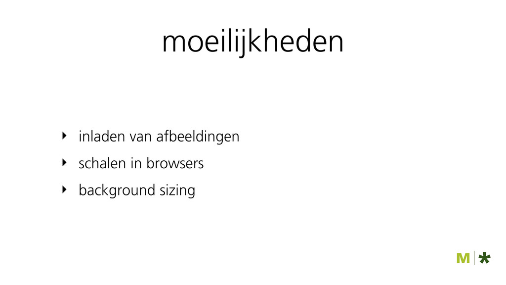
moeilijkheden ‣ inladen van afbeeldingen ‣ schalen in browsers ‣
background sizing
< film van hicksdesign.co.uk >
WERKWIJZE VOOR RESPONSIVE
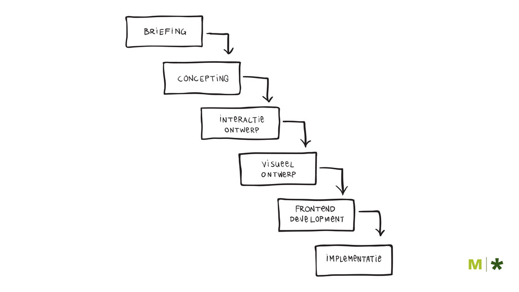
projectaanpak
None
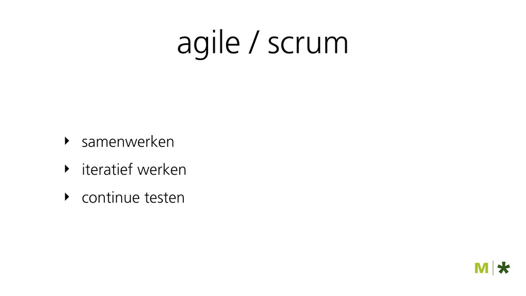
‣ samenwerken ‣ iteratief werken ‣ continue testen agile /
scrum
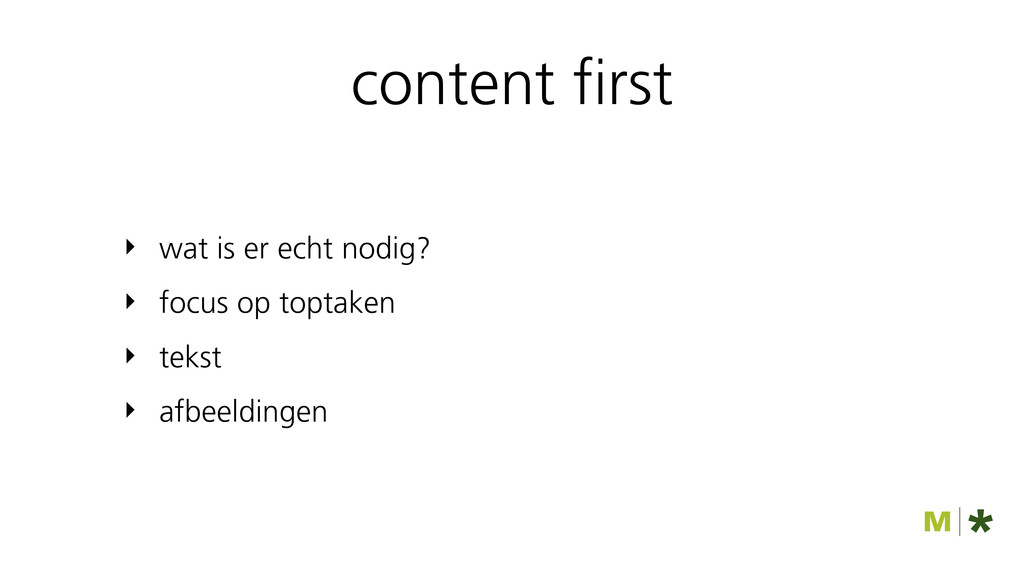
content first ‣ wat is er echt nodig? ‣ focus
op toptaken ‣ tekst ‣ afbeeldingen
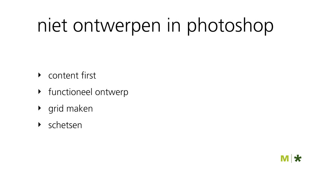
niet ontwerpen in photoshop ‣ content first ‣ functioneel ontwerp
‣ grid maken ‣ schetsen
testen
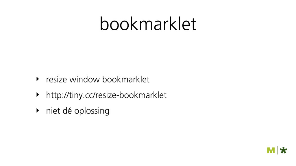
bookmarklet ‣ resize window bookmarklet ‣ http://tiny.cc/resize-bookmarklet ‣ niet dé
oplossing
zorg voor devices
must read
WEBDESIGN DONE RIGHT twitter: @NLife - http://tiny.cc/webdesign-done-right
 syb
syb
 peintangos
 phaya72
 muehara
 minorun365
 makikub
 safie_recruit
 belongadmin
 rfdnxbro
 subroh0508
 takatama
 shuta13
 oracle4engineer
 samlambert
 lcolladotor
 reverentgeek
 sabderemane
 skipperchong
 takai
takai
 smashingmag
 baasie
 garrettdimon
 nikkihalliwell
 palkan
 aleyda
![Modernizr.load([{ test : Modernizr.mq(‘(-webkit-min- device-pixel-ratio: 2)’), yep : [‘retina.css’], nope](https://files.speakerdeck.com/presentations/4f0ac31cafce7e001f00cbe6/slide_59.jpg)