Upgrade to Pro — share decks privately, control downloads, hide ads and more …

Stephenson Brand Guide

Avatar for Tom Bromwich Tom Bromwich
September 01, 2022

Stephenson Brand Guide

Avatar for Tom Bromwich

Tom Bromwich

September 01, 2022
Tweet

Other Decks in Design

Transcript

  1. Hello. Since you are holding this guide and reading these

    words, we’re trusting you with our very identity: our brand. We aren’t interested in all of the buzzwords and catchphrases and marketing jargon surrounding the word brand. But we do care about what people think about us. We care about our reputation. We care about building great relationships. We also care about growing our business. But, for us, it’s not all about revenue and sales. Our passion is in supporting our customers build their businesses. The following pages are full of guidelines, rules, and handy tips that we hope will help you communicate our values, realise our vision, and reinforce our brand. It is impossible to predict every situation, brand execution, or implementation, but this guide will help refine your approach. Whether you’re a employee, agency, or one of our amazing customers, thank you for helping us achieve our goals and pursue our mission. Sincerely, welcome to the Stephenson family. Introduction DIGITAL BRAND GUIDE STEPHENSON BRAND GUIDE 002
  2. What’s Inside Version 1.1 - Published: 29.06.2021 Originally Published: 01.04.2021

    Created By: Tom Bromwich, Creative Services Manager Questions: [email protected] Introduction 002. Hello 003. What’s Inside 004. Intent of this guide 005. Introduction About The Brand 007. About Us 008. History 010. Personality Voice & Style 012. Our Tone & Voice 013. Taglines 014. Master Style List Brand Logo 017. Primary Lock-up 018. Lock-up Assembly 019. Service Marks 020. Colour Variations 021. Scalable System 022. Alternative Lock-ups 026. Clear Space 027. Background Control 028. Logo Placement 034. Common Errors Brand Colours 036. Primary Colour Palette 037. Using White & Black 039. Colours 040. Approved Pairings 042. Common Errors Typography 044. Primary Typeface 045. Weights 046. Using Type 047. Digital Type 050. Common Errors Visual Style 052. Grids 055. Iconography 056. Elements Photography 058. Tone 059. People 060. Products Brand Collateral 063. Stationery 064. Packaging In Closing 066. Approvals 067. File Types 069. Contacts Introduction DIGITAL BRAND GUIDE STEPHENSON BRAND GUIDE 003
  3. This style guide is a reference for our internal design

    team, vendors, and others who are authorised to work with the Stephenson brand. The standards, guidelines, and references within this document are grounded in the years of research, experimentation, and brand executions that have preceded our new brand’s look and feel. Our intent with this guide is not to restrict creativity and innovation: far from it. We believe in the creative spirit, and innovation is one of our core values. What we strive for is a coordinated, consistent, and effective brand presence in everything we create. If we make something, we want to make sure that people know where it came from. While some of our brand executions and graphics have been standardized—like business cards, letterhead, and envelopes—these are not intended as the focus of this guide. Each one of our execution templates have internal documentation that is easier to update, follow and implement in today’s digital environment. Instead, the focus of this guide is to empower you, the creative, with the elements you need to create. By utilizing these tools, resources, and adhering to the guidelines within, you’ll make things that look like the Stephenson brand, every time. Please refer to this guide as we will make regular updates. We believe that our style guide is a living document. It should evolve over time, just as our brand inevitably will. If you have any questions concerning the content of this guide, please don’t hesitate to reach out to our Creative Team at marketing@ stephensonpersonalcare.co.uk Intent of this guide Introduction DIGITAL BRAND GUIDE STEPHENSON BRAND GUIDE 004
  4. Introduction Over the last 5 years we’ve noticed a significant

    rise in new solid format products launch in the market. As the pressure grows from consumers, realising it’s now or never for our environment, brands are beginning to catch up by either replacing original liquids in plastic bottles or offering more sustainable and environmentally friendly alternatives such as refillable packaging. In this guide we look to explore the trends and market insights of the solid format personal care market as it stands in 2021. We’ll offer some interesting innovations and share some solutions to the challenges we’re often presented by customers. For legal, copyright, or usage questions relating to our brand visuals, please reach out to Richard Musgrave, at richard.musgrave@ stephensongroup.co.uk. Introduction DIGITAL BRAND GUIDE STEPHENSON BRAND GUIDE 005
  5. About The Brand PAGE 11 PAGE 12 PAGE 13 About

    Us Our History Our Values 01 We’ve been working through generations to get the chemistry just right. Our heritage is important but it doesn’t define us. We’re a forward thinking, innovative brand, discreetly helping customers disrupt markets all over the world. Measure. Mix. React. Repeat. It’s more than just soap. DIGITAL BRAND GUIDE STEPHENSON BRAND GUIDE
  6. Curiosity, creativity and experimentation enable us to create some of

    the most exciting products in the world. Whether it’s a relaxing bath at home, teaching your children to wash their hands or understanding more about the ingredients that go in to your hair care products. We’re part of that journey and have been for a while now. That’s why customers work with us. We don’t compromise on the details because we’re here to help people overcome challenges and find solutions to drive new innovation. So, with this in mind, sit back and relax as we give you an insight into what we do. We’re a manufacturing business passionate about people and the relationships they build. About The Brand DIGITAL BRAND GUIDE STEPHENSON BRAND GUIDE 007
  7. 1856 2009 1995 2020 Stephenson Bros formed in Bradford, Yorkshire,

    England in 1856 originally manufacturing soap based agents for the processing of wool, along with furniture wax and polish products. Stephenson Personal Care launches a range of full certified organic soap bases including Liquid Soap and Bodycare bases, certifications include EcoCert, Soil Association and USDA Organic. Stephenson diversifies as other industries slow down - Introduction of soap based and opaque soap noodles. Following the sale of its textile division, the company rebrands itself to Stephenson, with the sole focus on the Personal Care and Cosmetic market. It all started with soap. Brookfoot House in the heart of Yorkshire. It might have changed over the years, but to us it’s home. About The Brand DIGITAL BRAND GUIDE STEPHENSON BRAND GUIDE 008
  8. We’re people helping people create amazing products. Our Values About

    The Brand DIGITAL BRAND GUIDE STEPHENSON BRAND GUIDE 009
  9. Our brand personality Our business isn’t what it used to

    be 100 years ago or even 1 year ago. We’re constantly evolving, innovating and experimenting, we adapt to the moving landscape of our industry. And we’re really exited by that evolution. It’s important too us that our people develop, evolve and grow within the business. This is how we work as a small team delivering a huge impact. We care about the people we work with. From employees to customers. HUMAN. SIMPLE. KNOWLEDGEABLE. About The Brand DIGITAL BRAND GUIDE STEPHENSON BRAND GUIDE 010
  10. Voice & Style PAGE 16 PAGE 17 PAGE 18 Tone

    & Voice Taglines Master Style List 02 Our customers and our Colleagues are the reason we’re here. They are our everything. Our purpose. The way we speak should reflect how important they are. We should strive to ensure that every brand execution communicates this tone of voice. In this section, you will find guidance on how to communicate in our brand voice and style. We’re human. We keep it simple. and we share our Knowledge. DIGITAL BRAND GUIDE STEPHENSON BRAND GUIDE
  11. We speak to our customers, our team, and others with

    kindness, calmness, and confidence. We’re genuine, honest, transparent, friendly, and relatable. And while we like to have a good time, we’re more playful then we are witty. And when we decide to have fun, it’s never at the expense of others, or in bad taste. Our marketing and advertising language shouldn’t feel like we’re selling. In fact, we think there’s something wrong if we feel the urge to sell. Our products do that for us. Skip the formalities, let’s keep it casual. It should feel human and always be simple. Our Writing Tone & Voice Brand Voice DIGITAL BRAND GUIDE STEPHENSON BRAND GUIDE 012
  12. Let our hospitality do the talking. You’ll feel part of

    the team in no time. The purpose of our brand tagline(s) are to capture and summarize our brand promise, brand values, and product experience. Tagline(s) may be used in any marketing materials, advertising, or brand execution where we seek to communicate our personality, mission, or brand values. Each tagline may be used in combination with the brand logo and brand images as a standalone brand marketing campaign. The brand taglines should not be combined with campaign-specific taglines or phrases. Avoid rewriting, rewording, or editing the tagline(s) in any way. Our taglines, which are not professionally written, are a representation of our brand value and overall mission. Brand Voice DIGITAL BRAND GUIDE STEPHENSON BRAND GUIDE 013
  13. Master Style List Headlines » Headlines should be short, clear,

    and “hook” the user into reading more » Use “&” instead of “and” » Use Title Case, not sentence case » Use periods when writing in sentences Punctuation » Use consistent punctuation » Use spaces around the em-dash » Do not end bulleted or numbered lists in periods, unless the list item contains multiple sentences. » Do not hyphenate paragraphs Correct Spelling » Use grey, not gray Formatting » Capitalise the first word in a sentence » Capitalise branded products like Syndopal Contact Information & Times » Phone numbers should be written with spaces. Do not use periods or parenthesis. For example: 123 456 7890 » Use military time formatting. For example: 1330, not 1:30PM or 1:30 p.m. » Military time should never use a colon » Use en-dash when referring to time ranges instead of words like “through, to, or thru” » Do not use AM or PM in any form. » List 0000 hours as midnight » List 1200 as noon » Use 24-hour instead of 24 hour » Use United Kingdom instead of UK » Address format should read as below: Stephenson Brookfoot House, Low Lane, Horsforth, Leeds, LS18 5PU United Kingdom This is a guide to the grey areas in grammar, spelling, and commonly confused styles. This list is not comprehensive. When in doubt, refer to a recent version of the AP Style Guide. Brand Voice DIGITAL BRAND GUIDE STEPHENSON BRAND GUIDE 014
  14. Brand Logo PAGE 16 PAGE 27 PAGE 21 PAGE 28

    PAGE 26 PAGE 34 Primary Logo Background Control Alternate Lock-ups Placement Spacing Common Errors 03 Our logo is how our customers tell us apart from a crowded industry. It’s a promise of quality, consistency, and reliability. As such, it is vital that our logo is presented correctly in every execution. This section covers these guidelines in detail. Any use of our brand logo outside of or conflicting with the contents of this section will be considered unauthorised. The heart, soul, and centre of our brand identity. DIGITAL BRAND GUIDE STEPHENSON BRAND GUIDE
  15. The brand logo identifies the Stephenson brand as a whole.

    Use this logo to represent individual locations, products, merchandise, and wholesale operations. This logo is a carefully created piece of locked artwork that should not be altered in any way. Primary Lock-up Brand Logo DIGITAL BRAND GUIDE STEPHENSON BRAND GUIDE 017
  16. When our icon and word-mark are assembled together, the height

    of our word-mark can be used to determine the ratio and relationship between the two elements. ICON HEIGHT The height of the icon is equal to the ‘S’ height - this aligns with the central element of the icon. SEPARATION The space between the icon and word mark is equal to the height of the word mark. Lock-up Assembly .75” or 50px MINIMUM SIZE This version is not intended for extremely small sizes. The minimum height is .75” for print applications and 50px for digital applications. Brand Logo DIGITAL BRAND GUIDE STEPHENSON BRAND GUIDE 018
  17. Our service marks provide notice of registered ownership within certain

    countries. Each Lock-up of the product logo has a registered service mark version for use: find these exports in the accompanying files. When in doubt, simply use the version without a service mark. The standard logo is acceptable for normal, day-to-day use, and as a secondary iteration in a longer document when the registered mark is used first. REGISTERED SERVICE MARKS The Stephenson logo, name and hero products are our existing trademarks and have been registered in the United Kingdom, USA, EU, Australia and China. Implementations within these countries may use the Registered Service Mark above. SERVICE MARK SIZING The logo and the registered mark scale independently. A general rule of thumb is to keep the registered mark at a maximum of half the x-height, but never be less than 2mm (printed) or 5px (digital) in width. PRODUCT TAGLINE When using the product Lock-ups it can also be paired with the product tagline. For example, Durosoft features the tagline is added in the our brand type below the Lock-up at a fixed ratio of 2:1. Service Marks Syndopal Brand Logo DIGITAL BRAND GUIDE STEPHENSON BRAND GUIDE 019
  18. Each brand logo Lock-up has several colour variations for use

    on different background types, tones, and colours. When in doubt, use the most legible version of the logo for the available background. For printed executions, special care should be given to ensure logo legibility on the final media or material used. Colour: Outer Space Colour: White Clouds Colour Variations SINGLE COLOUR, DARK SINGLE COLOUR, LIGHT Brand Logo DIGITAL BRAND GUIDE STEPHENSON BRAND GUIDE 020
  19. Trying to fit the same mark simultaneously on an 11.5kg

    box and on 1kg tray is a challenge. Our identity system is designed for flexibility, consistency, and brand recognition. Our logo has been carefully designed to grow with us into this next chapter. We have provided different logo Lock-ups that should cover every space imaginable. For product packaging, a vertical stack helps to give hierarchy to the information, where as a safety helmet doesn’t have the same real estate, so a an icon-only lock up is used. Instead of trying to fit a logo into a space that is too small or crowded, simply use a different version for maximum visual impact and clarity. A Scalable Identity System VERTICAL STACK LOCK-UP STACKED LOCK-UP ICON-ONLY PRIMARY LOCK-UP HORIZONTAL LOCK-UP Brand Logo DIGITAL BRAND GUIDE STEPHENSON BRAND GUIDE 021
  20. Designed specifically to be vertically efficient, the vertical Lock-up is

    a perfect fit for taller areas, and areas where a centred Lock-up would fit better. While we generally prefer the full horizontal logo, there are no specific restrictions that would prevent this version from use. 40px MINIMUM SIZE This version is not intended for extremely small sizes. The minimum height is 1.5” for print applications and 100px for digital applications. Horizontal Lock-up Brand Logo DIGITAL BRAND GUIDE STEPHENSON BRAND GUIDE 022
  21. Designed specifically to be vertically efficient, the vertical Lock-up is

    a perfect fit for taller areas, and areas where a centered Lock-up would fit better. While we generally prefer the full horizontal logo, there are no specific restrictions that would prevent this version from use. 1.5” or 100px MINIMUM SIZE This version is not intended for extremely small sizes. The minimum height is 1.5” for print applications and 100px for digital applications. Vertical Stacked Lock-up Brand Logo DIGITAL BRAND GUIDE STEPHENSON BRAND GUIDE 023
  22. Designed specifically to be vertically efficient, the vertical Lock-up is

    a perfect fit for taller areas, and areas where a centred Lock-up would fit better. While we generally prefer the full horizontal logo, there are no specific restrictions that would prevent this version from use. 1.5” or 100px MINIMUM SIZE This version is not intended for extremely small sizes. The minimum height is 1.5” for print applications and 100px for digital applications. Stacked Lock-up Brand Logo DIGITAL BRAND GUIDE STEPHENSON BRAND GUIDE 024
  23. When subtlety is desired, the Stephenson icon can be used

    in place of a full brand logo Lock-up. This should be used sparingly - when in doubt, use the other lock-up alternatives. The use of the icon across our Brookfoot House site has been carefully considered by our brand team. When this mark is used, ensure that our brand name is visible near or in relationship with the icon. For example, an helmet bearing the icon design is accompanied with a full logo on the torso of the uniform. This will help reinforce brand recognition. Icon-Only Lock-up .75” or 50px MINIMUM SIZE At small sizes, ensure the line weight is legible and that the negative spaces do not close. The minimum height is .75” for print and 50px for digital applications - except favicon use. SPECIAL COLOUR USAGE When the icon is used as a standalone element, it will accommodate any acceptable combination of our colours. Brand Logo DIGITAL BRAND GUIDE STEPHENSON BRAND GUIDE 025
  24. Clear space, or negative space, is the area that surrounds

    the logo that is completely clear of any other graphical element. Clear space helps the logo stand out from the rest of the elements on the page and ensures legibility, even at small sizes. As a general rule, the more clear, or negative, space around the logo, the better. At a minimum, there should be clear space equal to the height of the Stephenson icon on all four sides of the logo. Using an element from the logo as a unit of measurement ensures enough clear space at any size. Clear Space ICON HEIGHT All versions of the brand logo include an icon element. Each version of the logo uses its own icon size to determine clear space. Alternate Logo Versions Visualized Clear Space Brand Logo DIGITAL BRAND GUIDE STEPHENSON BRAND GUIDE 026
  25. Contrast is the name of the game when considering placing

    the logo on any background. Our logo should not only be legible; it should also make a clear, strong statement when used. If there is not enough contrast between the logo and the background, the presence of the logo is weakened. The logo may be placed on photographs, textures, and patterns as long as there is enough contrast for the logo to be visible. Background Control The standard logo in blue sky can be used on most solid-colour backgrounds, however there’s some colours that just don’t mix. Use the dark or light version to achieve maximum contrast. The standard blue sky version of the logo may be used on any light photographic background with negative space. Do not use the light version on clear and light photographs. The light version of the logo may used on any dark photographic background. Do not use the blue sky version on dark or busy photographs. The light version of the logo may used on low- contrast patterns. Use the light version to achieve maximum contrast. Brand Logo DIGITAL BRAND GUIDE STEPHENSON BRAND GUIDE 027
  26. Placement of the logo on canvas is vital to a

    consistent visual style. Where our logo is placed communicates a great deal about our brand’s visual style. In this chapter, you will find high-level guidance on how the logo should be positioned on a variety of touch points and media. As a general rule, our logo should not be centred in an area. We typically favour a left-aligned layout with the logo aligned to the primary grid line—the spine. Exceptions to this rule will inevitably surface. When in doubt, connect with a member of our team to review your situation. 029. On The Page 030. As Signage 031. On Clothing 032. On The Web 033. On Social Media Brand Logo DIGITAL BRAND GUIDE STEPHENSON BRAND GUIDE 028
  27. On The Page Place the logo left-aligned on the primary

    grid line. If this space is not available, the logo belongs in the top or bottom left page corners. Specific stationery layouts are provided in the Brand Collateral section of this document. Placement Sapidus non nus. Occuptas mil id mos experibus as dolorpo ssequistem quo tenimag nimusa quiberspel illaborae estibus apicae re paribus, nus is aut magnis ditis ditati incitat emporesti omnis quam rae quia quos culluptat ut vollibus pra sunt eium arciur soles ex ex est ut aut velloreped quis voles quam, cum et quibus que des simusciaecti dolesti blaborp oreius exero ea cum quuntur, ipsaecati corem simus rem. Itati consent lament est laut es ut ut as ma nos rem lacea verepud andebit fugiam, nitaecum nam quam voluptios et mod ut rectet am verferum exces re ipienem re dem. Harum quis ut aceste rem quiant audisin re volore officipit illigenis dit volorro restiatem non praecus andel ipsum dia quam que essed exceperiatem ipit lab in rem inctatur, omnis pa core sedipsus dunt. Ent. Ed es doluptatur aut veliquoditia quo dolendigenis elique ma qui as molenihil iniendis sum ea non ped ut qui sed ma sundus quae prat ilitaqu atibus, quidentorum doles el ipicitias et lam is everibus a se conserio omnime nisquiam quam et videlectione aut poresserum et ilignatquas earciat. Odi vit ex et quae. Taeruntectem eum reius, omnis solupti aeritiae simus quatisque comnis ped quostia volesti untur, cust hilibus am sedianis id enihilit rendestium entiani enduciditiur rectur, consed es sunt et evera velliquiae non es doluptaessit volor a prehento vollorem labo. At. Sequam volorer ibusdae natem iusam, quae. Ria quunt, ut ut fuga. Sunt. Sapidus non nus. Occuptas mil id mos experibus as dolorpo ssequistem quo PREFERRED Align the logo to the primary grid line (referred to as the spine). The primary Lock-up looks best when left-aligned. ALTERNATE OPTIONS Align the primary Lock-up to the left corners. If the layout dictates a centred or right- aligned mark, use the icon or vertical Lock-up. Sapidus non nus. Occuptas mil id mos experibus as dolorpo ssequistem quo Brand Logo DIGITAL BRAND GUIDE STEPHENSON BRAND GUIDE 029
  28. As Signage When used on the exterior of the building,

    signage should follow the same left-aligned placement of the logo on other touch points. As our locations are all renovated buildings, each situation is unique. In order to achieve consistency between locations, we recommend aligning the sign placement to a significant building feature, like a large window or doorway. If manufactured signs are required, place the logo on the sign asymmetrically (either horizontally or vertically). Detailed template files are available. Placement HORIZONTAL POSITION Align the logo in the lower left hand corner of a rectangular hanging sign to achieve asymmetry. VERTICAL POSITION Align the icon in the lower centre of a vertical rectangular hanging sign to achieve asymmetry. Brand Logo DIGITAL BRAND GUIDE STEPHENSON BRAND GUIDE 030
  29. On Uniform Branded merchandise like t-shirts, hats, and coffee mugs

    should all follow a left-aligned logo placement if possible. If possible, look for unique and uncommon imprint areas to utilize. Areas like t-shirt sleeves are rarely used and can make a striking visual statement. Each piece of merchandise will carry unique limitations. Use the images on the right as general guidance. Placement APPAREL Left align the logo when possible. Use the icon for centering, or if brand subtlety is desired. Brand Logo DIGITAL BRAND GUIDE STEPHENSON BRAND GUIDE 031
  30. On The Web On the Stephenson website, the logo will

    be placed in the upper left-hand corner of the navigation bar. Do not centre the logo on screen, even on small screens. Placement FAVICON Our favicon—a 32px x 32px icon that is displayed in the browser next to the url—is the only other approved usage of our icon in solid form. DEVICE ICON If our website is saved as a bookmark on the home screen of some mobile devices, this graphic will be displayed. Default size is 192px x 192px. Brand Logo DIGITAL BRAND GUIDE STEPHENSON BRAND GUIDE 032
  31. On Social Media When used as social media avatars, the

    icon-only logo should be used with the right amount of clear space on all sides. We have developed two approved avatar images found here on this page. They are each approved for both circular and square avatars shapes of all sizes. While the layout of these avatars should not be altered in any way, approved secondary brand colours may used to address special events, holidays, and seasonal changes. Placement ICON AVATAR Preferred avatar for use on all platforms. All approved colour combinations may be used. Brand Logo DIGITAL BRAND GUIDE STEPHENSON BRAND GUIDE 033
  32. Do not place the logo on a high- contrast pattern

    or busy photograph. Do not change the layout or relationship between logo elements. Do not encroach on the required clear space surrounding the logo. Do not stretch, squash, skew, or distort the logo in any way. Do not edit the logo colour, use an off- brand colour, or reduce the logo opacity. Do not add graphic effects to the logo, including drop shadows. Common Errors Note: This is not a comprehensive list of errors. These are simply the most common or egregious errors. Soap made by: Thank you! Brand Logo DIGITAL BRAND GUIDE STEPHENSON BRAND GUIDE 034
  33. Brand Colours PAGE 40 PAGE 36 PAGE 41 PAGE 37

    PAGE 42 PAGE 38 Approved Pairings Primary Palette Usage Scenario Secondary Palette Common Errors Black & White 04 The colours we’ve chosen for our brand are a key factor in differentiation and brand recognition. As such, it is vital that our colours are reproduced faithfully and combined in the right way. This section covers these guidelines in detail. Any colour outside of those outlined within this section will be considered unauthorized. Colour sets us apart & helps to invoke emotion. DIGITAL BRAND GUIDE STEPHENSON BRAND GUIDE
  34. The consistent use of colour is vital to effective brand

    recognition. Our brand should always be represented in one of the colours on this page, aside from specific recommendations within this guide. Do not use any other/unauthorised colours. Use of the Pantone Matching System is highly recommended to ensure colour consistency across any and all touch-points. If Pantone colour matching is not available or out of budget, please take great care to match the colours precisely. We prefer a natural matte/uncoated paper stock, so always match to the Uncoated Pantone book. Primary Colours Our main hue: A bright sky blue conveys peace and confidence. Use in compositions as a background or text colour. PMS 2995C CMYK: 100, 25, 0, 12 RGB: 0, 169, 224 HEX: #00a9e0 Blue Sky Deep Space White Clouds Green Grass PMS 4188C CMYK: 27, 0, 0, 62 RGB: 70, 96, 96 HEX: #466060 PMS White CMYK: 0, 0, 0, 1 RGB: 252, 252, 252 HEX: #fcfcfc PMS 2261C CMYK: 21, 0, 30, 25 RGB: 151, 192, 135 HEX: #477262 Brand Colours 036
  35. We get it: one colour is not enough for many

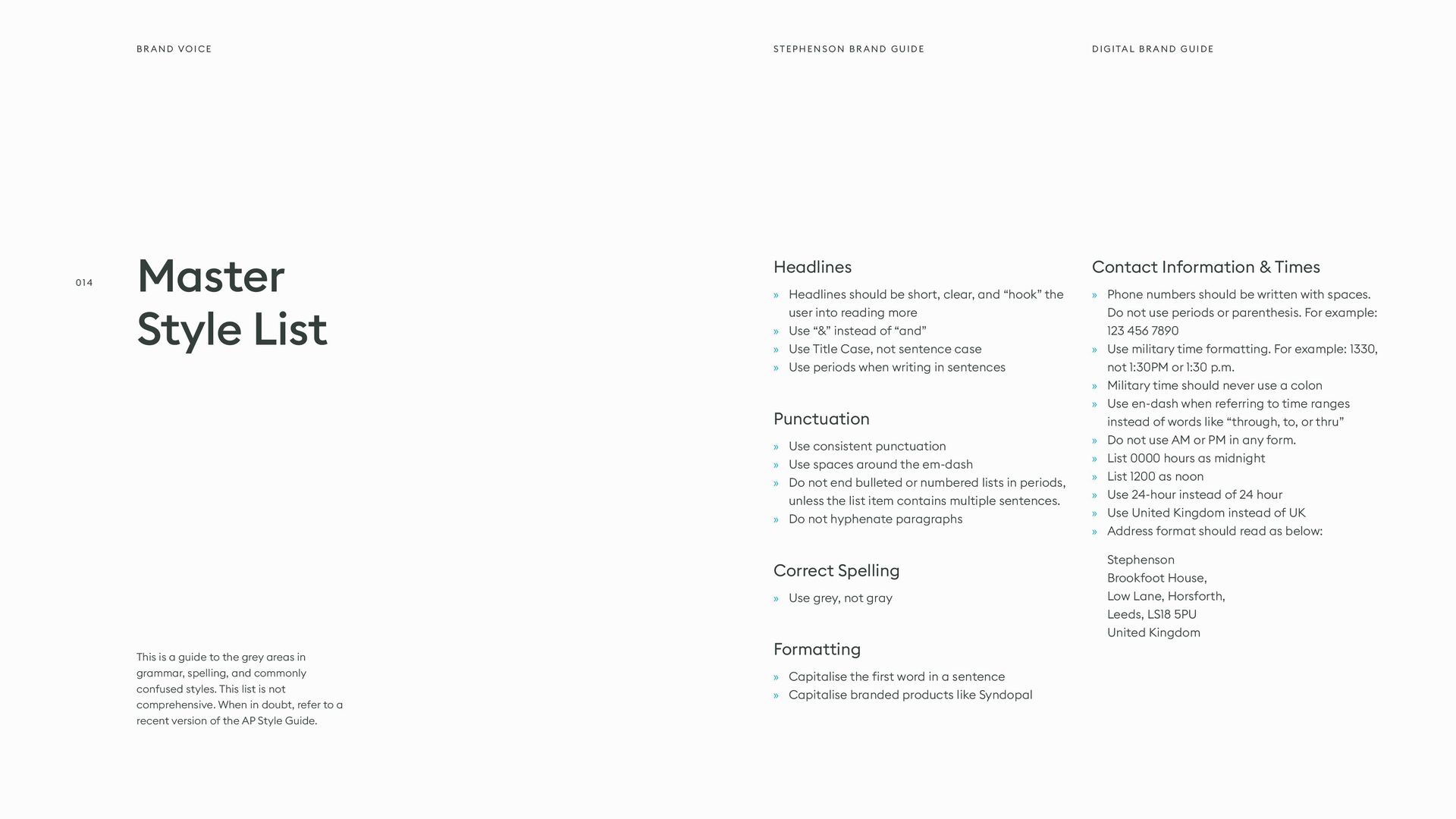
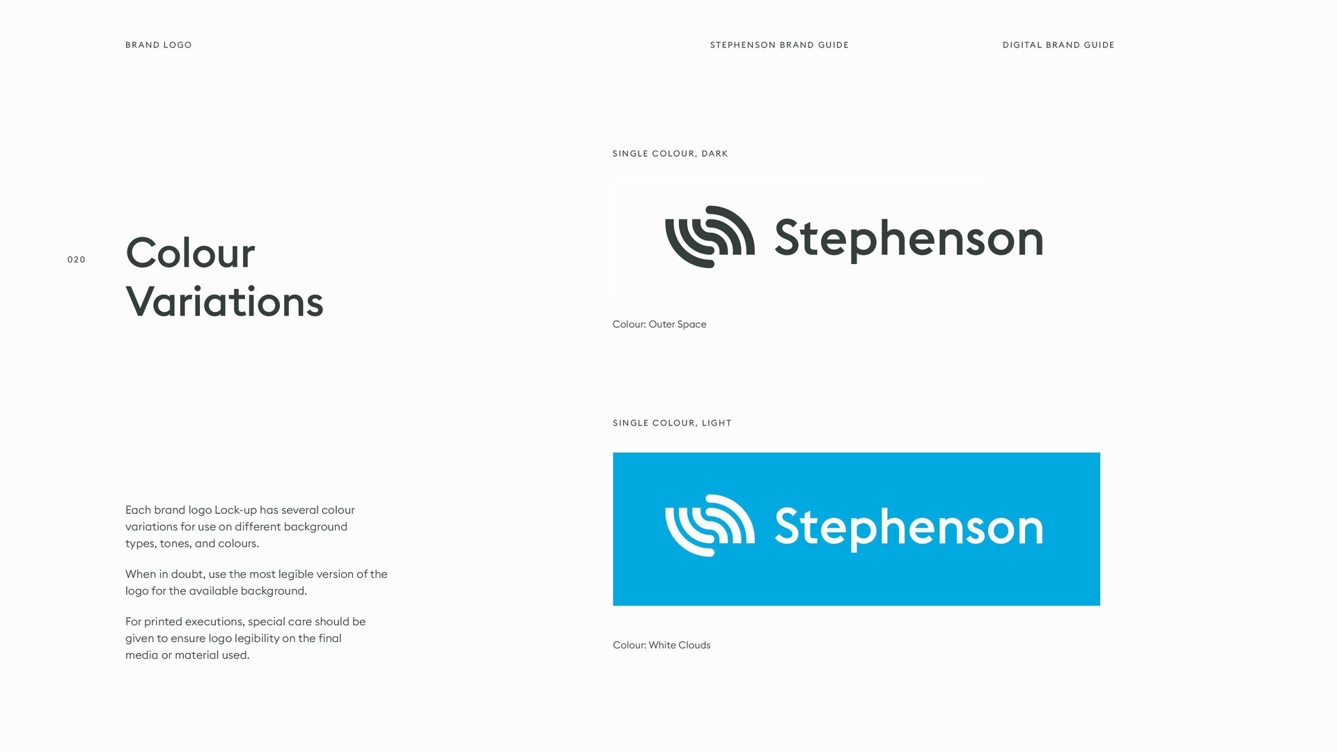
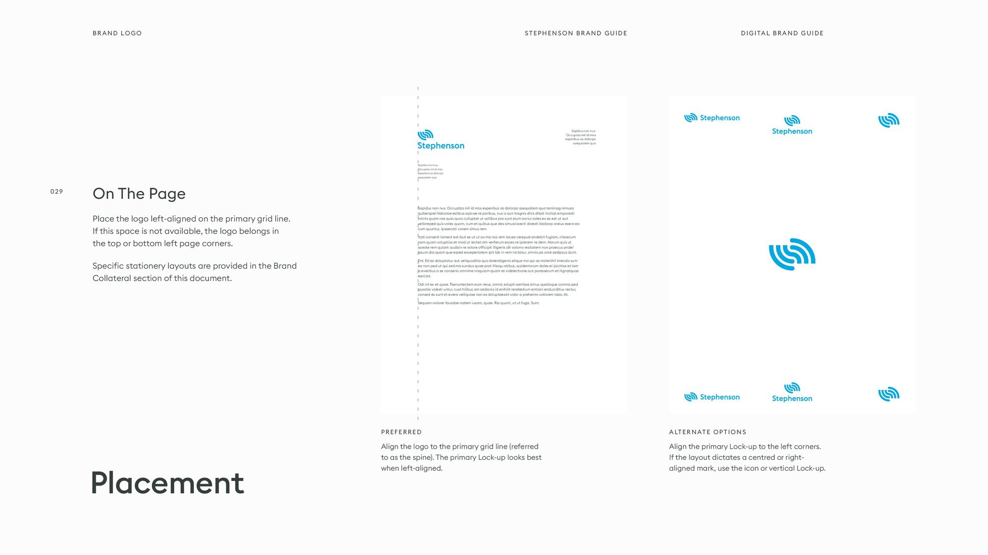
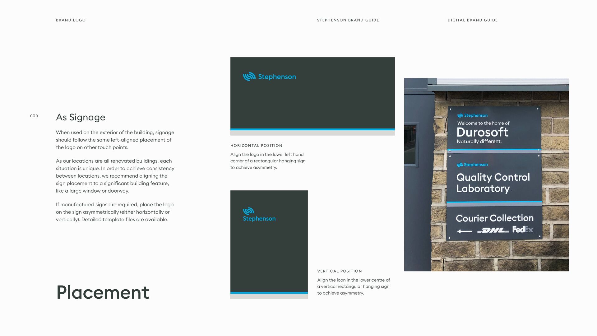
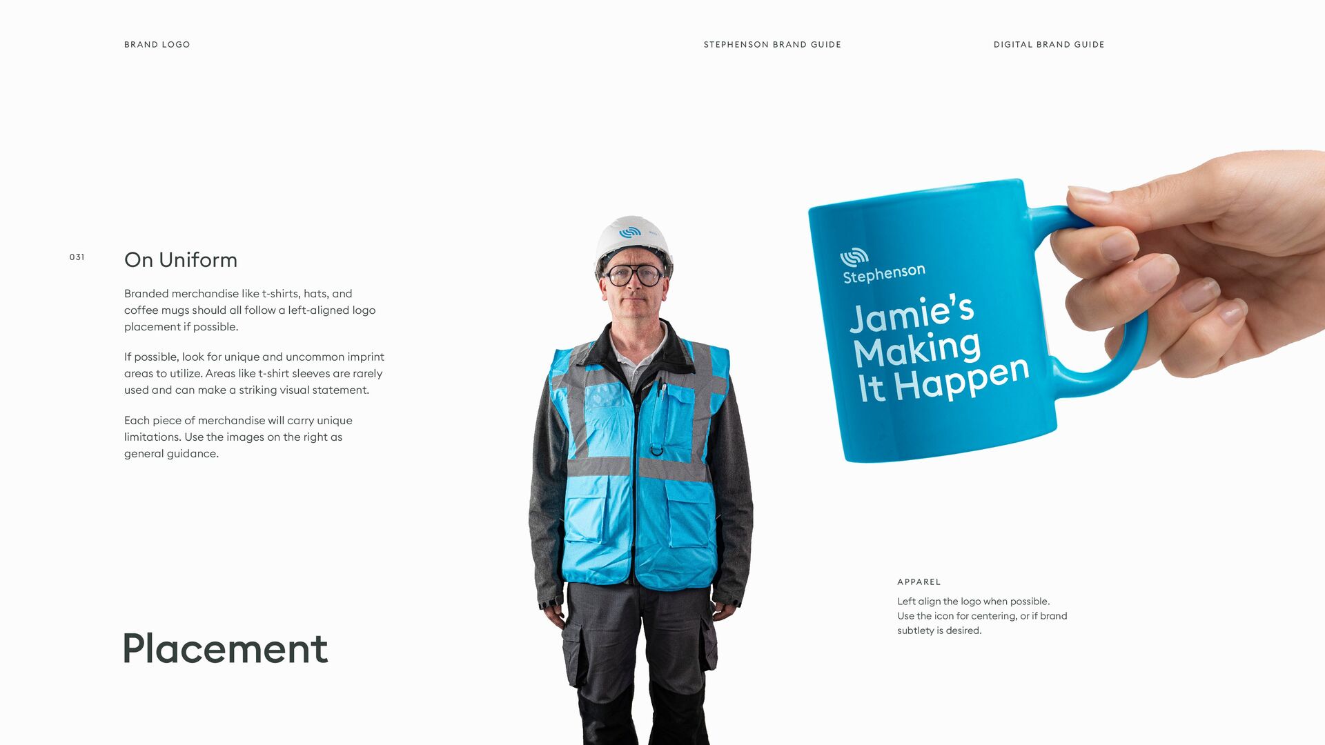
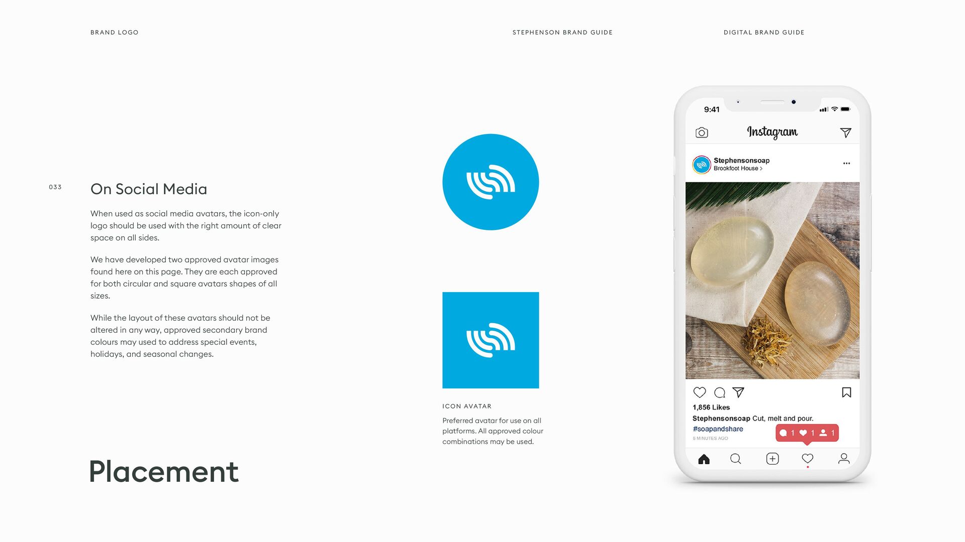
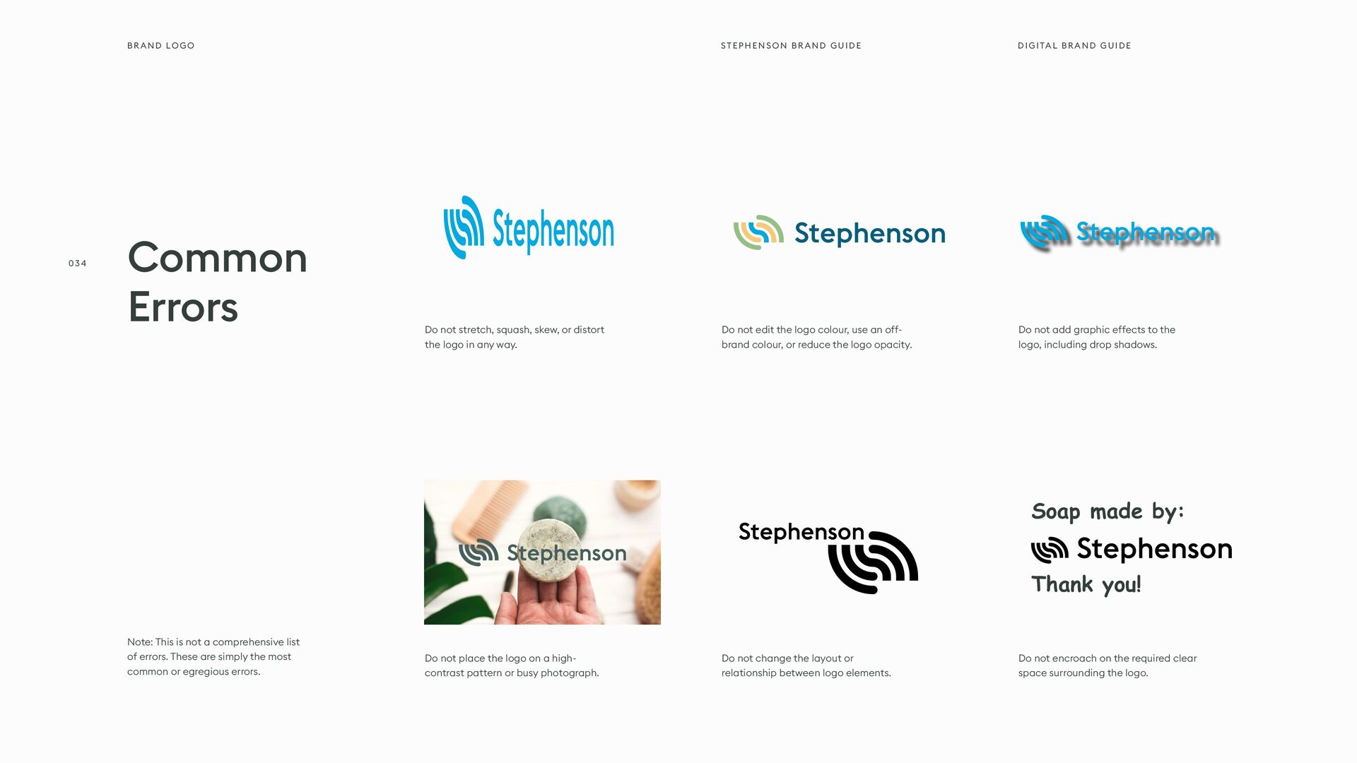
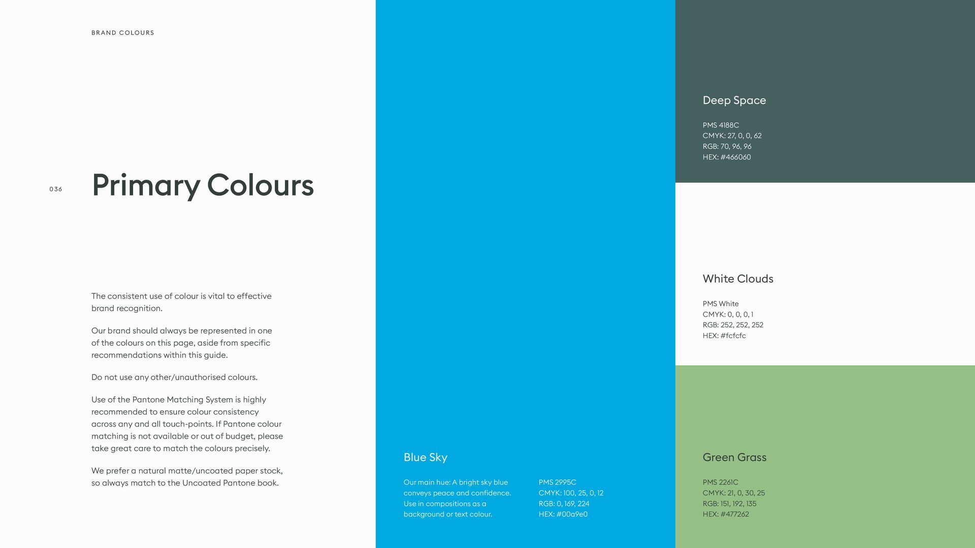
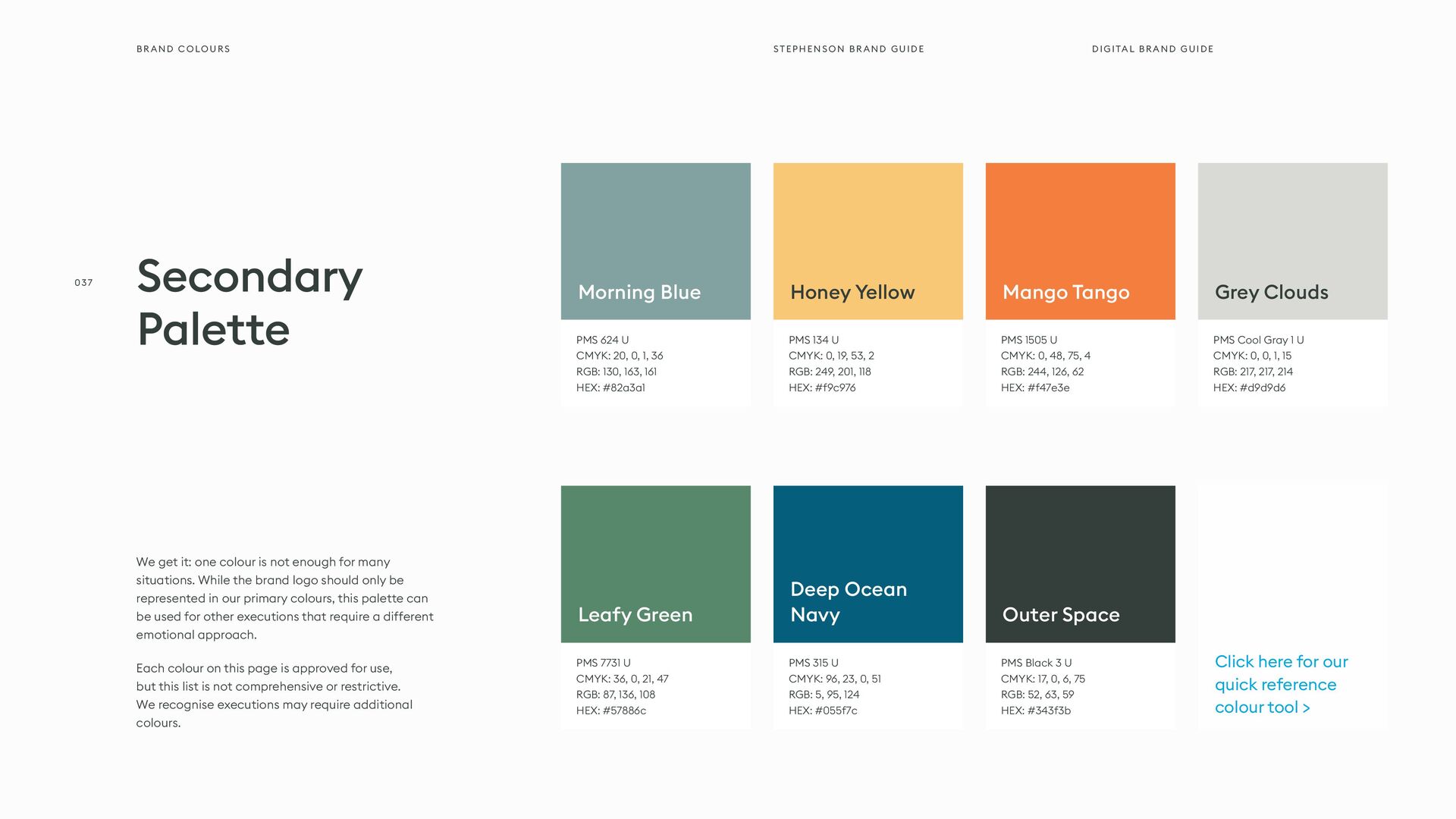
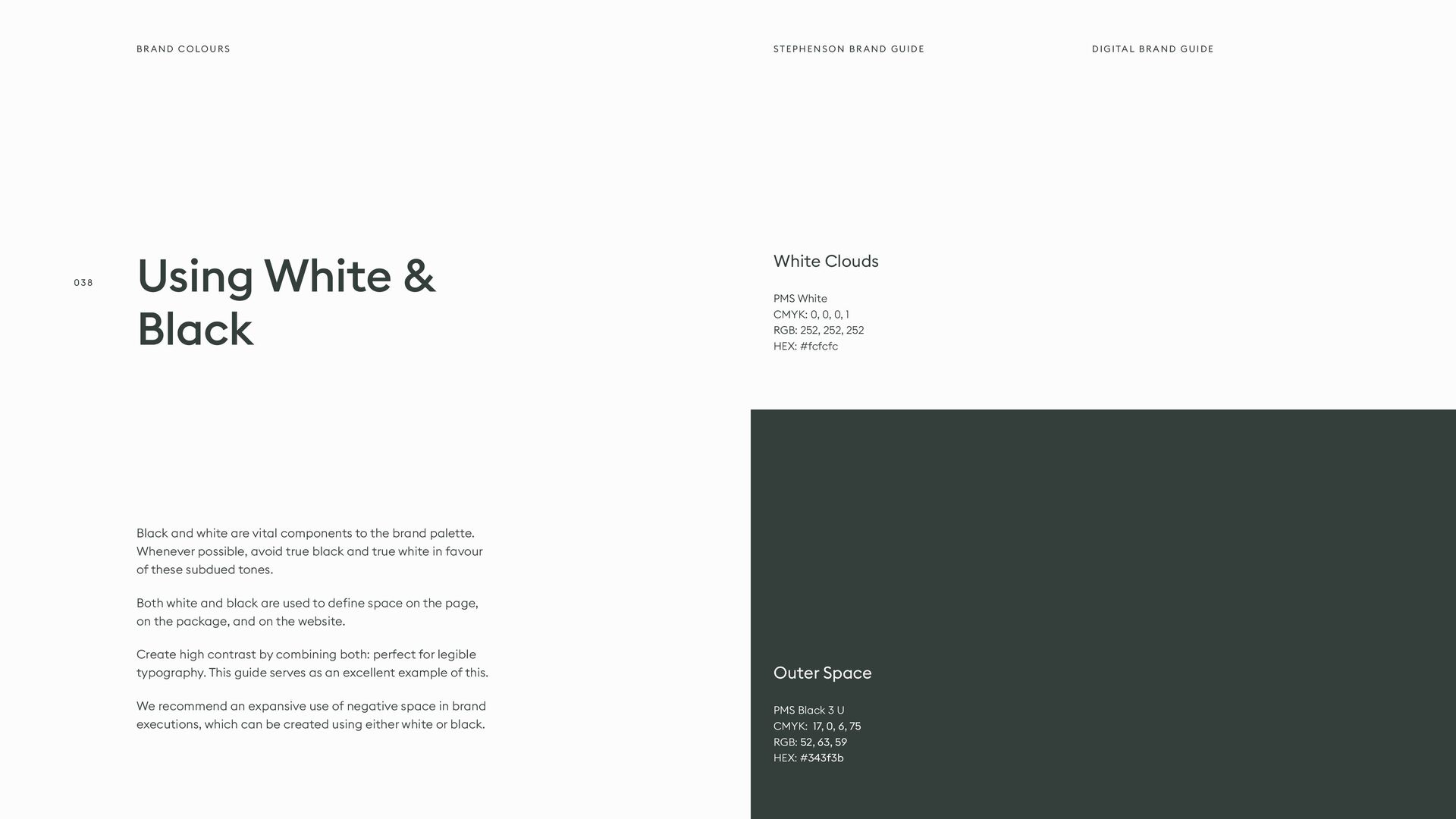
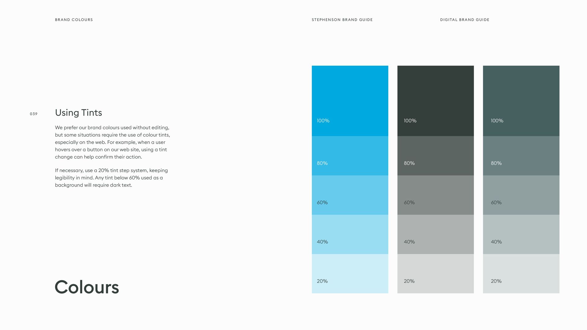
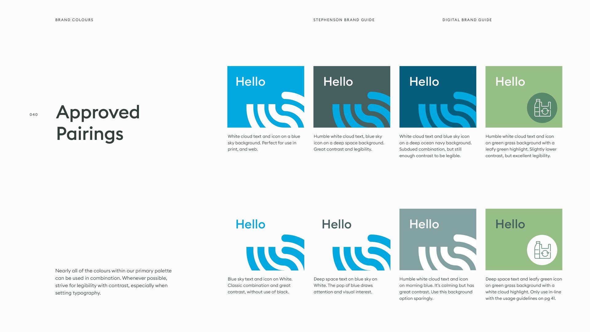
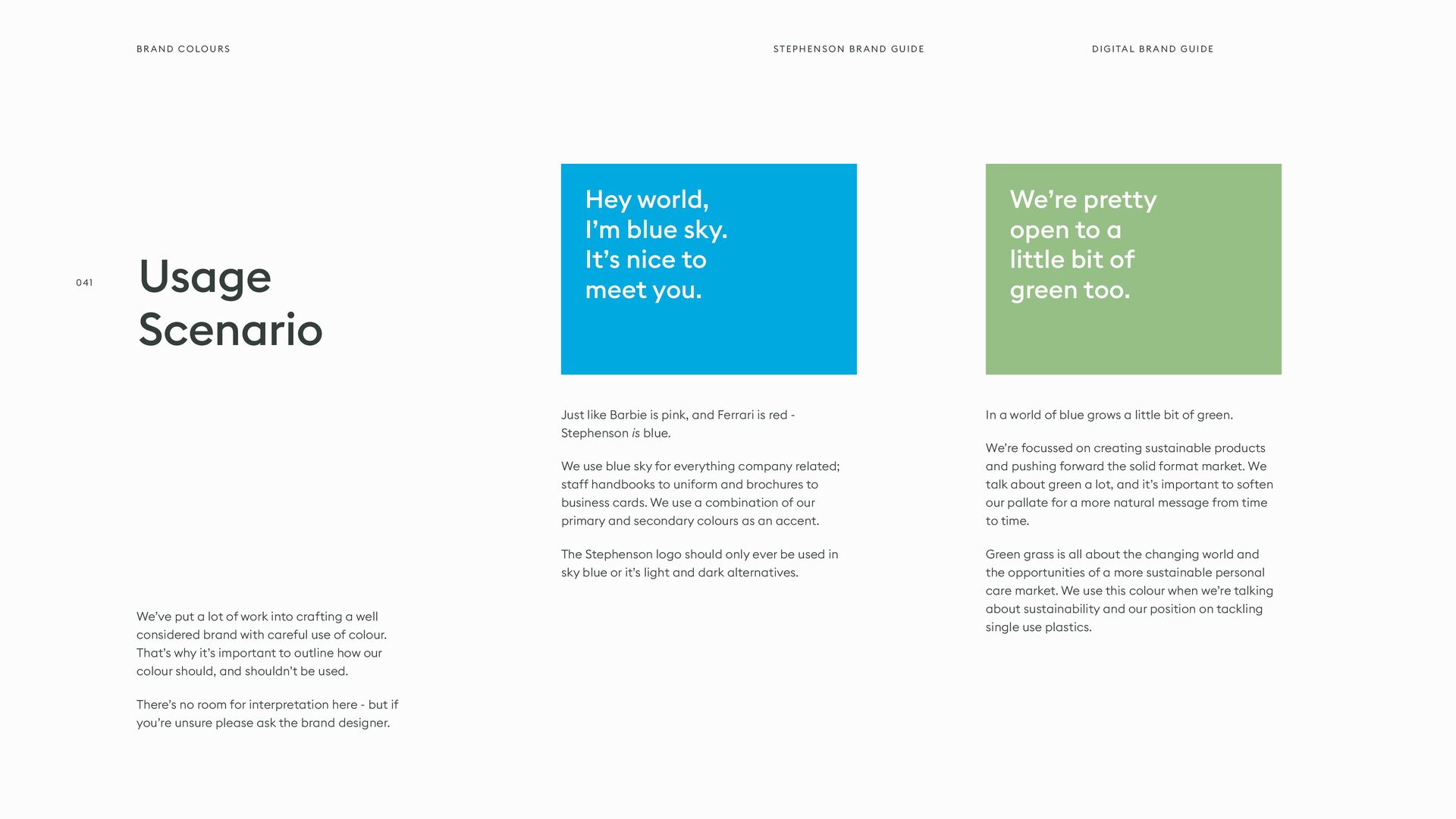
    situations. While the brand logo should only be represented in our primary colours, this palette can be used for other executions that require a different emotional approach. Each colour on this page is approved for use, but this list is not comprehensive or restrictive. We recognise executions may require additional colours. Secondary Palette Morning Blue Leafy Green Mango Tango Honey Yellow Deep Ocean Navy Outer Space Click here for our quick reference colour tool > Grey Clouds PMS 624 U CMYK: 20, 0, 1, 36 RGB: 130, 163, 161 HEX: #82a3a1 PMS 7731 U CMYK: 36, 0, 21, 47 RGB: 87, 136, 108 HEX: #57886c PMS 134 U CMYK: 0, 19, 53, 2 RGB: 249, 201, 118 HEX: #f9c976 PMS 315 U CMYK: 96, 23, 0, 51 RGB: 5, 95, 124 HEX: #055f7c PMS 1505 U CMYK: 0, 48, 75, 4 RGB: 244, 126, 62 HEX: #f47e3e PMS Black 3 U CMYK: 17, 0, 6, 75 RGB: 52, 63, 59 HEX: #343f3b PMS Cool Gray 1 U CMYK: 0, 0, 1, 15 RGB: 217, 217, 214 HEX: #d9d9d6 Brand Colours DIGITAL BRAND GUIDE STEPHENSON BRAND GUIDE 037
  36. Black and white are vital components to the brand palette.

    Whenever possible, avoid true black and true white in favour of these subdued tones. Both white and black are used to define space on the page, on the package, and on the website. Create high contrast by combining both: perfect for legible typography. This guide serves as an excellent example of this. We recommend an expansive use of negative space in brand executions, which can be created using either white or black. Using White & Black White Clouds PMS White CMYK: 0, 0, 0, 1 RGB: 252, 252, 252 HEX: #fcfcfc Outer Space PMS Black 3 U CMYK: 17, 0, 6, 75 RGB: 52, 63, 59 HEX: #343f3b Brand Colours DIGITAL BRAND GUIDE STEPHENSON BRAND GUIDE 038
  37. Colours 100% 100% 100% 80% 80% 80% 40% 40% 40%

    60% 60% 60% 20% 20% 20% Using Tints We prefer our brand colours used without editing, but some situations require the use of colour tints, especially on the web. For example, when a user hovers over a button on our web site, using a tint change can help confirm their action. If necessary, use a 20% tint step system, keeping legibility in mind. Any tint below 60% used as a background will require dark text. Brand Colours DIGITAL BRAND GUIDE STEPHENSON BRAND GUIDE 039
  38. Nearly all of the colours within our primary palette can

    be used in combination. Whenever possible, strive for legibility with contrast, especially when setting typography. Approved Pairings White cloud text and icon on a blue sky background. Perfect for use in print, and web. Blue sky text and icon on White. Classic combination and great contrast, without use of black. Humble white cloud text and icon on green grass background with a leafy green highlight. Slightly lower contrast, but excellent legibility. Humble white cloud text and icon on morning blue. It’s calming but has great contrast. Use this background option sparingly. Humble white cloud text, blue sky icon on a deep space background. Great contrast and legibility. Deep space text on blue sky on White. The pop of blue draws attention and visual interest. White cloud text and blue sky icon on a deep ocean navy background. Subdued combination, but still enough contrast to be legible. Deep space text and leafy green icon on green grass background with a white cloud highlight. Only use in-line with the usage guidelines on pg 41. Hello Hello Hello Hello Hello Hello Hello Hello Brand Colours DIGITAL BRAND GUIDE STEPHENSON BRAND GUIDE 040
  39. We’ve put a lot of work into crafting a well

    considered brand with careful use of colour. That’s why it’s important to outline how our colour should, and shouldn’t be used. There’s no room for interpretation here - but if you’re unsure please ask the brand designer. Just like Barbie is pink, and Ferrari is red - Stephenson is blue. We use blue sky for everything company related; staff handbooks to uniform and brochures to business cards. We use a combination of our primary and secondary colours as an accent. The Stephenson logo should only ever be used in sky blue or it’s light and dark alternatives. In a world of blue grows a little bit of green. We’re focussed on creating sustainable products and pushing forward the solid format market. We talk about green a lot, and it’s important to soften our pallate for a more natural message from time to time. Green grass is all about the changing world and the opportunities of a more sustainable personal care market. We use this colour when we’re talking about sustainability and our position on tackling single use plastics. Usage Scenario Hey world, I’m blue sky. It’s nice to meet you. We’re pretty open to a little bit of green too. Brand Colours DIGITAL BRAND GUIDE STEPHENSON BRAND GUIDE 041
  40. Common Errors Do not combine Blue Sky with Green Grass

    - blue and green should not be seen. Not enough contrast. Do not set important text in Gainsboro Grey on Blue Sky. The contrast ratio is too low. Do not use true black and true white in combination. This produces too much contrast for our brand. Do not combine Morning Blue and Blue Sky. The values are too close together to be legible. Do not change or adjust our colours in any way. Consistency in colour is vital to brand recognition. Do not use tints as primary colours. They should be reserved for effects and secondary tones in illustration. Do not use off-brand colours, especially in combination with approved brand colours. Hello Hello Hello Hello Hello Hello Ensure Accessibility Everyone should be able to read what we write and see what we make. Colour contrast is vital to ensure an accessible execution. We recommend maintaining a minimum contrast ratio of 4.5:1. When in doubt, check the contrast ratio using tools like contrast-ratio.com. Hello Brand Colours DIGITAL BRAND GUIDE STEPHENSON BRAND GUIDE 042
  41. Typography PAGE 44 PAGE 45 PAGE 47 Primary Typeface Approved

    Weights Digital Typography 05 Few things communicate the look and feel of a brand more clearly than the way letters, numbers, and symbols are put together. We believe typography should strike a balance between legibility and interest. This section will cover approved typefaces, the way we use typography to communicate clearly, and some helpful usage tips. Any typeface not referenced in this section will be considered unauthorized for use. We are obsessed with the beauty of typography. DIGITAL BRAND GUIDE STEPHENSON BRAND GUIDE
  42. Euclid is a geometric sans-serif typeface released by Swiss Typefaces

    in 2013. Designed in five weights for both screen and print publishing, this workhorse typeface is perfect for Stephenson. Euclid features a native kerning that increases legibility using all sizes, and includes a wide array of glyphs, weights, and special features. We love it. We hold a license for the use of this typeface - this includes all brand executions by third parties. Please get in touch for files. A workhorse sans-serif Euclid Square. The typeface we chose for all brand executions. Euclid should be used for every brand execution. In rare circumstances, however, we recognize it is not realistic to use custom fonts. In which case, Arial should be used - freely available on all Macs and PCs. Note: this should not occur frequently. ACCEPTABLE ALTERNATIVES Typography 044 DIGITAL BRAND GUIDE STEPHENSON BRAND GUIDE
  43. Weights Euclid Square Light Euclid Square Regular Euclid Square Medium

    Euclid Square Semi-Bold aåbcçd∂eéfghiîjklmnñoøpqœrstuüvwxyz AÅÂBCÇDEFGHIÍJKLMNOØÓÔÒPQRSTUVWXYZ 0123456789º(.,’”-;:)!?&©˙˚π®†≈◊™£¢∞§•ªº aåbcçd∂eéfghiîjklmnñoøpqœrstuüvwxyz AÅÂBCÇDEFGHIÍJKLMNOØÓÔÒPQRSTUVWXYZ 0123456789º(.,’”-;:)!?&©˙˚π®†≈◊™£¢∞§•ªº aåbcçd∂eéfghiîjklmnñoøpqœrstuüvwxyz AÅÂBCÇDEFGHIÍJKLMNOØÓÔÒPQRSTUVWXYZ 0123456789º(.,’”-;:)!?&©˙˚π®†≈◊™£¢∞§•ªº aåbcçd∂eéfghiîjklmnñoøpqœrstuüvwxyz AÅÂBCÇDEFGHIÍJKLMNOØÓÔÒPQRSTUVWXYZ 0123456789º(.,’”-;:)!?&©˙˚π®†≈◊™£¢∞§•ªº Hierarchy & Weight Euclid Square is a fixed-weight typeface, available in five weights. That being said, we typically stay within these four weights. Use contrast between heavy and lighter weights to communicate relevant importance, otherwise known as hierarchy, of information. Typography DIGITAL BRAND GUIDE STEPHENSON BRAND GUIDE 045
  44. Legibility and clarity are vitally important to great typographical layouts.

    Since most people read from left to right, we should align our type accordingly. And besides, we’re a little off-centre as a brand anyway. Whenever you place text next to each other, either align the baselines (the line that the bottom of a lowercase x sits on) or align the x-heights (the top of a lowercase x). This helps align each line visually. Negative space, or the space around elements is vitally important. That being said, if informational elements belong together, move them closer together. Use grouping wisely: just try not to cram too many things in one space! Contrast is the name of the game when it comes to great design. When in doubt, skip a weight when pairing two weights, and double the size between two text elements. When setting paragraphs, keep an eye on the right (ragged) edge. If the rag unintentionally creates a recognizable shape, consider tweaking the language or resizing the container. Also, try to prevent single-word lines (orphans). It is easy for the user to get lost in long lines of text, and short ones are easily ignored. It’s best to keep lines between 45 and 70 characters long, depending on the size of the font. This will ensure legibility as the font sizes increase or decrease. Using Type 01 03 05 02 04 06 Stay Left-Aligned, Rag Right Align X-Heights or Baselines Give Things Space, If Needed Skip Weights & Double Size Watch The Rag Keep Line Length Reasonable The Six Type Commandments When constructing layouts, these tips will help you build dynamic, interesting, and on-brand compositions with typography. While these rules are proven and sound, sometimes breaking them is the right call. Typography DIGITAL BRAND GUIDE STEPHENSON BRAND GUIDE 046
  45. Digital Type The Hero Type At times words can speak

    louder than actions. In this situation, the statement needs to be the hero on the page. When making statements, ensure the tone of the message is communicated correctly. Sometimes we like to make a statement. USAGE SPECIFICS • Meaningful Statements • Facts & Figures • Brand Messaging Font: Euclid Square Medium Size: 80pt, 106.6px (6.663rem) Bottom Margin: 0px Typography DIGITAL BRAND GUIDE STEPHENSON BRAND GUIDE 047
  46. USAGE USAGE USAGE USAGE SPECIFICS SPECIFICS SPECIFICS SPECIFICS • Page

    Headings • Major Section Headings • Emphasized Words • Sub Headings • Call To Action Headings • Blog Sub Headings • Section Headings • Blog Body Headings • Product Headings • Minor Headings • Table Labels • Sub-Sub Headings Font: Euclid Square Medium Size: 60pt, 80px (5rem) Bottom Margin: 50px Font: Euclid Square Semi-Bold Size: 30pt, 40px (2.5rem) Bottom Margin: 30px Font: Euclid Square Medium Size: 40pt, 53.36px (3.335rem) Bottom Margin: 30px Font: Euclid Square Regular, Title Case Size: 22pt, 29.32px (1.833rem) Bottom Margin: 20px Heading Four Heading One Heading Three Website Headings The heading structure on this page is in direct reference to our current website design. This is the basic breakdown of standard heading sizes, and their relationship to body copy. Obviously, exceptions exist, especially between different page templates. Also, the h-level of each heading should be set in accordance with search- engine and development best practices. Heading Two Digital Type Typography DIGITAL BRAND GUIDE STEPHENSON BRAND GUIDE 048
  47. Weight: Euclid Square Light Size: 18px Line Height: 26px Colour:

    Grey Bottom Margin: 16px Weight: Euclid Square Medium Size: 30px Line Height: 36px Margins: 20px, 0 Padding: 0, 0, 0, 40px Border (Left): 3px Weight: Euclid Square Medium Colour: Blue Sky Omnimus cuscilit que ea volesto et, sitatur minum rae. Et expel inctae rerum ea que omnima consedit maio conet, venimaximi, corepel iquunt volorpos quam, si quos intiusciate sitas millabo reicita tiissimus explantecab imet doluptati delit, sequiandit, aperfernam, officiisti dolorerate rerchil eaquassequid ut dolendit aciet officiatur am debis sum simporem nit, ut ut fuga. At fugit dent, suntur, consenim ad undae. Necta cus quodior iandund andionsed ut remque sinctotatur amus. Aximo quis veni dolupta spiet, sit harunto eum illor arumquas et aut pliquae necum liquam quam fugit quam enecus, sundiam, odit laboreptas qui aci cus, omnia qui doluptam in coreribus ellaccus. Dolut venis pre aboreri berions edicius doluptat rehendi omnihicitas quasperum ex esed magnatur magniet acerio con re doluptate sum iume vendi que repudae ctibus dero occae venim si ilique eum numet accae delestrume officia inti Met prepudi piderovid estio magnat adit offictet as aut dolori acerspedis Dolorro videnis poresequi doluptat liasita tincium debit, seque landae ligenda musdae verum haria doluptassi sendera velliquas dolla quatur, ut et postisquasin necuscipsam volesci mendae et inctem eos sundi reptaquia porepudio inctem quatio molectasped molorpos esci nimet odi doluptatur, nulpa porum. Quatia dolum alique es asped es aliquam, qui ducimus andunte volorendam ressitempos corrum ratur? Harita sequam inctotate volupisit veni doloriam dolut a por ad ut lam non pliquam eum ad quodit explique Max Width: 700px PARAGRAPH STRONG OR BOLD BLOCK QUOTE TEXT LINKS Body Text The root body text size, line width, line height, and tracking are set to enhance visibility and legibility on all screens. Certain typographic situations specific to digital type like block quotes and text links are also outlined on this page. Digital Type Typography DIGITAL BRAND GUIDE STEPHENSON BRAND GUIDE 049
  48. Weight: Euclid Square Light Size: 18px Line Height: 26px Colour:

    Outer Space Bottom Margin: 14px Indents: 20px Weight: Euclid Square Light Size: 18px Line Height: 30px Colour: Blue sky Bottom Margin: 16px Indents: 20px Right pointing double arrow 1. United Kingdom 1. London 2. Manchester 3. Leeds 2. Europe 1. London, UK 2. Rome, IT 3. Paris, FR » United Kingdom » London » Manchester » Leeds » Europe » London, UK » Rome, IT » Paris, FR SPECIFICS SPECIFICS Ordered List (ol) Unordered List (ul) Lists List styling is another important element of digital typography. Typically, lists are found in the body of blog articles, pages, and product descriptions. Styling for both ordered lists (ol) and unordered lists can be found on this page. Digital Type Typography DIGITAL BRAND GUIDE STEPHENSON BRAND GUIDE 050
  49. Help me Do not use unauthorised fonts or typefaces. The

    only exception is stylized merchandise or illustrations on a case-by-case basis. Do not stretch, squish, or otherwise mangle typography. Use the appropriate weight instead. Note: This is not a comprehensive list of errors. It is simply the most common or egregious. Keep tracking, kerning, and leading reasonable and legible. Do not stray far from the examples in this guide. Do not use a stroke or outline on typography. Also avoid using a drop shadow on typography at all costs. Do not use centred or completely justified alignment for multi-line text. There are no exceptions. Do not use typography on any angle other than 0° or 90°. Our typography should always read up if 90°. Omnimus cuscilit que ea volesto et, sitatur minum rae. Et expel inctae rerum ea que omnima consedit Not For Us Omnimus cuscilit que ea volesto et, sitatur minum rae. Et expel inctae rerum ea que omnima consedit maio conet, venimaximi, corepel iquunt volorpos quam, si quos intiusciate sitas millabo reicita tiissimus No t good, nope. Omnimus cuscilit que ea volesto et, sitatur minum rae. Et expel inctae rerum ea que omnima consedit maio Oh, Goodness, No... Omnimus cuscilit que ea volesto et, sitatur minum rae. Et expel inctae Too Much Stroke Too Much Stroke Omnimus cuscilit que ea volesto et, sitatur minum rae. Et expel inctae I’m Falling! Common Errors Typography DIGITAL BRAND GUIDE STEPHENSON BRAND GUIDE 051
  50. Visual Style PAGE 52 PAGE 55 PAGE 56 Grids Iconography

    Graphic Elements 06 While brand consistency relies heavily on logo usage, colour, and typography, we recognize that these are not the only elements within a brand identity design system. This section contains guidelines on grid usage and references to approved visual elements like icons, illustrations, patterns, frames and more. Ingredients for on-brand layouts and composition DIGITAL BRAND GUIDE STEPHENSON BRAND GUIDE
  51. Grids Letter Portrait orientation grids are typically four- columns, with

    generous margins that reflect the golden section. The type area is always off-centre, with the largest margin on the left side of the page. Gutters are typically one unit of measurement in comparison to the margins. MARGINS Generous margins set our stationery materials apart. We don’t waste space with unnecessary filler. UNITS OF MEASUREMENT Units of measurement can change depending on the desired layout. The ratio between them is the most important element. MOUSE TYPE If desired, mouse type or other small related elements can be set outside of the primary grid area. 5 UNITS 8 UNITS 5 UNITS 1 UNIT 3 UNITS Visual Style DIGITAL BRAND GUIDE STEPHENSON BRAND GUIDE 053
  52. Presentation Landscape orientation grids are typically 12-columns, with equally generous

    margins that reflect the golden section. The type and content area is off-centre, with the largest margin on the left side of the screen/page. Gutters are typically one unit of measurement when compared to margins. 6 UNITS 7 UNITS 4 UNITS 1 UNIT 4 UNITS EXAMPLE This guide is an excellent example of how we use the presentation grid. Take note of how elements are aligned within columns. Grids Visual Style DIGITAL BRAND GUIDE STEPHENSON BRAND GUIDE 054
  53. Grids Website In order to maximize compatibility across all devices

    and to ensure flexibility of layout, the website grid is symmetrical and centred in the browser. On the desktop version of the grid, there are 12 full columns. The number of columns decrease as the browser window gets smaller, until finally arriving at a single column layout on mobile devices. Gutter widths and side margins are calculated as a percentage of the user’s window size, and vary depending on column quantity. There are no top and bottom margins. 6% SIDE MARGIN 6% SIDE MARGIN Visual Style DIGITAL BRAND GUIDE STEPHENSON BRAND GUIDE 055
  54. Iconography is integral part of our packaging, website, and way

    finding. We have developed a large library of approved icons that can be used in brand executions. When it comes to iconography style, we like thick outlines and geometric shapes. If you need to construct new icons, keep the overall shape simple. Reduce the subject matter down to its essence. When placing icons in a layout, they should never be partially cut off. The icons shape, line weights, and construction should not be altered. Do not use the icons in place of or as an element within our logo. Ensure enough clear space is used so that the subject matter is legible. A full iconography library is available in our asset library, including seasonal varieties. Before constructing new icons, check there. Iconography BRAND VALUES ICONS PRODUCT & FORMULATION ICONS Visual Style DIGITAL BRAND GUIDE STEPHENSON BRAND GUIDE 056
  55. Product Patterns Each of our product categories has an abstract

    illustration that loosely fits the visual style of the product’s chemical make up or physical appearance. Each are approved for usage as backgrounds, in print materials, and in packaging. When using these patterns, the colour ways should not be altered. They have been designed to be used in Blue Sky and tints of similar hues. Elements EXTRUDED LIQUIDS MELT & POUR COSMETICS DUROSOFT Visual Style DIGITAL BRAND GUIDE STEPHENSON BRAND GUIDE 057
  56. Photography PAGE 59 PAGE 60 PAGE 61 Guidelines People Products

    07 A great photograph can change the entire trajectory of our business. In other words, photography is vital to the success of our brand and should be treated as an essential part of our brand executions. In this section, you will find guidelines on photographic composition, content, tone, and usage. Standardising these facets of photography will ensure a consistent look and feel across our entire image library. Photographs: worth more than 1,000 words. DIGITAL BRAND GUIDE STEPHENSON BRAND GUIDE
  57. Fresh, But Grounded Brand photographs should feel clean, fresh, and

    dynamic. We strive to use a fresh, natural, and grounded tone. The content of each photograph should convey our brand values, reflect our customers in the best light, express our unique qualities, and above all, showcase our people. Always seek excellent lighting that provides contrast between highlights and shadows, even if the light source is simply an open window. Darkening the black values and slightly desaturating red values will shift the photograph’s tone towards peaceful, natural colour and leave an overall feeling of grounded calm. Dynamic & Intriguing When composing a shot, use the foreground and background to ignite visual interest and curiosity. Consider partially obscuring the subject with an object in the foreground. Or obscuring an otherwise dull background with a very shallow depth of field. Using lighting effects like interesting concealing shadows and bright highlights can also create an interesting effect that draws the eye. - An interesting shooting angle is essential to great composition. In an effort to maintain consistency, most exterior, still life, and product shots should be shot “flat.” The camera should always be on the same level as the subject, and great care should be taken to ensure that all lines are straight and aligned to the frame. Of course, there will be exceptions to this rule, especially when shooting people in action. When using multiple photographs in a composition, mix the framing distance for interesting contrast. Tone Composition & Framing Photography DIGITAL BRAND GUIDE STEPHENSON BRAND GUIDE 059
  58. Photographing People People are the heart of our brand and

    should be treated with the highest respect during all shoots. In general, you should avoid capturing identifying features of customers, unless they have signed a release prior to the shoot. Whenever a person is the subject of a photograph, they should look relaxed, happy, and engaged. In order for the subject to appear natural, try to capture them “in the moment” instead of posing them. As a general rule, do not have them look directly into the camera lens. People Photography DIGITAL BRAND GUIDE STEPHENSON BRAND GUIDE 060
  59. Product Shots Product shots are used on the website, in

    advertising, and within other printed materials. Products should be shot flat (at eye level) or from top down and the package should fill the frame. Backgrounds should be simple, clean, and out of focus for primary shots. Detail shots should emphasize a specific feature and use shallow depth of field to achieve a clear focal point. Dynamic compositions are also welcome as secondary shots. Strive to achieve motion and capture action. Products Photography DIGITAL BRAND GUIDE STEPHENSON BRAND GUIDE 061
  60. Lifestyle Shots Whilst we don’t make consumer facing products, the

    base products we sell are 2 to 95% of the over all finished product. Through our photography, we aim to tell stories and showcase the real-world solutions that can be made with our products. We use a diverse range of models across our lifestyle photography and we always prefer natural over anything too polished. Smiles are encouraged, we want to keep expressions natural but never over the top. Natural elements like house plants are a key feature in our lifestyle shoots - mixed with natural lighting we aim to re-create real-life environments wherever possible. Products Photography DIGITAL BRAND GUIDE STEPHENSON BRAND GUIDE 062
  61. Brand Collateral PAGE 74 PAGE 75 PAGE 76 Business Cards

    Deliverable Deliverable 08 From business cards to packaging, we’ve created several template files for print and production. In this section, you will find guidelines on using the accompanying template files for standardised brand collateral. Most of the specific guidelines, instructions, and details are contained within the template files themselves. Pre-designed layouts, crafted with care DIGITAL BRAND GUIDE STEPHENSON BRAND GUIDE
  62. Stationery Business Cards Business cards are reserved for management and

    sales roles, and printed on an as-needed bases. If these are not needed for day to day use, do not produce them. We prefer to reduce our usage of paper products Content on all business cards should follow the included template: nothing should be added or removed. Size: Standard 85mm x 55mm Paper: Triple set with blue accent Faces - Multiloft Outer White Opaque 270GSM Insert - Multiloft Insert Blue 270GSM Finish: Spot UV (Back) - Matt Varnish FRONT Four-colour process print on doubled up uncoated stock with a matt varnish. Name typeset in Euclid Square Medium. Details typeset in Euclid Square Regular. BACK Four-colour process print on doubled up uncoated stock with a matt varnish White text printed in spot UV. Innovating soap bases and speciality ingredients since 1856 Richard Musgrave Marketing Manager +44(0) 113 205 0924 +44(0) 779 133 8896 [email protected] Stephenson, Brookfoot House, Low Lane, Horsforth, Leeds, LS18 5PU United Kingdom stephensonpersonalcare.com Collateral DIGITAL BRAND GUIDE STEPHENSON BRAND GUIDE 064
  63. Hero Product Lines Our products are in retail stores and

    warehouses in all four corners of the world - our packaging should tell our brand story where our people can’t. All packaging should be designed in-house by our brand team using our existing methodology. Work closely with the packaging buyers to ensure consistency. All of our product packaging follows the same typographic hierarchy system as below: Packaging United Kingdom Soap-free syndet base Melt & Pour Create a wide range of beautiful products by simply heating, combining colours, fragrances and a range of ingredients. Made in the United Kingdom stephensonpersonalcare.com Crystal soap base Product Name / Batch No. 1kg/2.2lbs CARROT CUCUMBER & ALOE. 149959 Remove lid before heating Caution when hot Cut Melt Pour Remove Product Name Sub heading Short, punchy description goes here. And here, but don’t make it too long otherwise it will get lost on the packaging. icon icon Collateral DIGITAL BRAND GUIDE STEPHENSON BRAND GUIDE 065
  64. In Closing PAGE 77 PAGE 78 PAGE 79 Approvals File

    Types Thank You 09 Though we’ve come to the end of this guide, this is only the beginning of our journey. In this section, you will find details on our approval process, several points of contact within the brand department, and a warm thank you note. Why? Because we care. Everything we forgot to mention before this. DIGITAL BRAND GUIDE STEPHENSON BRAND GUIDE
  65. Approvals As previously stated, this guide is not a comprehensive

    list of rules. We recognise the creative journey is full of twists and turns. New approaches, new trends, and changes in technology will inevitably have an effect on our brand and the way we execute it visually. That being said, we insist that any brand execution follow the guidelines listed within. Anything outside of these guidelines must be approved by an authorized representative from Stephenson. Approvals may be submitted electronically by emailing the concept to Tom Bromwich, Creative Services Manager, at tom.bromwich@ stephensongroup.co.uk or by calling our design department. If you are a vendor working on one of our brand executions, we require an electronic or physical proof before any item is printed, published, or otherwise executed. These proofs can be submitted to your point of contact within Stephenson. Questions prevent mishaps: If you have a question about the use of our brand materials, please do not hesitate to ask! Closing DIGITAL BRAND GUIDE STEPHENSON BRAND GUIDE 067
  66. File Types The files provided with this guide generally fall

    into two types: raster and vector files. While both can be used for most applications, typically one is more suited, depending on the usage intent. Raster Files Raster files are comprised of a grid of pixels. These types of files always have a set resolution and size. Once you increase the size past its predetermined size, the quality decreases. You’ve probably seen this before: images begin to appear pixel-lated if they’re pushed too far. Graphics, like the brand logo, can be exported in raster versions. Photographs are always raster files. Raster files are typically used for web graphics and digital executions. When used in print applications, you must ensure that the file exceeds the minimum DPI (dots per inch) of 150DPI, or risk a low-quality print. Typically, raster files end with .jpg, .png, .gif, and .psd. They are easy to open and apply. Vector files Vector files create their shapes by mathematical equations between anchor points. Since they are crafted by ratios, and not a grid of coloured squares, vector images can be infinitely scaled. Graphics, like the brand logo, are typically created as vector files. Illustrations, iconography, and many of our simple shapes and graphic elements are created as vector files. The limitations of vector files lie in their strengths: because each relationship is an equation, complex items, gradients, photographs often make vector file sizes too large. Raster images are more efficient in those situations. Vector files are typically used for printing or producing the logo or other graphics in most forms. If you’re ever asked for a high-resolution logo file, send a vector file. Typically, vector files end with .ai, .eps and .svg. Without special programs, these files will be difficult to open. Closing DIGITAL BRAND GUIDE STEPHENSON BRAND GUIDE 068
  67. Thank you. From everyone at Stephenson, thank you for your

    attention to detail, your unwavering support, and your commitment to making our brand vision a reality for so many people. Building a brand is like raising a child: it takes a village. Without you, we would not exist. To all of our vendors, creative teams, and outside consultants: we are here for you. If you need any help with our brand at all, especially when working on a brand execution, please do not hesitate to reach out to our team at [email protected]. Closing 069
  68. Contacts SALES & MARKETING DIRECTOR JUNIOR CREATIVE DESIGNER DIGITIAL COMMUNICATIONS

    MANAGER MARKETING MANAGER James Clews Joe Adams Agne Roke Richard Musgrave James.Clews @StephensonGroup.co.uk Joe.Adams @StephensonGroup.co.uk Agne.Roke @StephensonGroup.co.uk Richard.Musgrave @StephensonGroup.co.uk CREATIVE SERVICES MANAGER DATA & CUSTOMER INSIGHTS MANAGER Tom Bromwich Timothy Pulleyn Tom.Bromwich @StephensonGroup.co.uk Tim.Pulleyn @StephensonGroup.co.uk Closing DIGITAL BRAND GUIDE STEPHENSON BRAND GUIDE 070