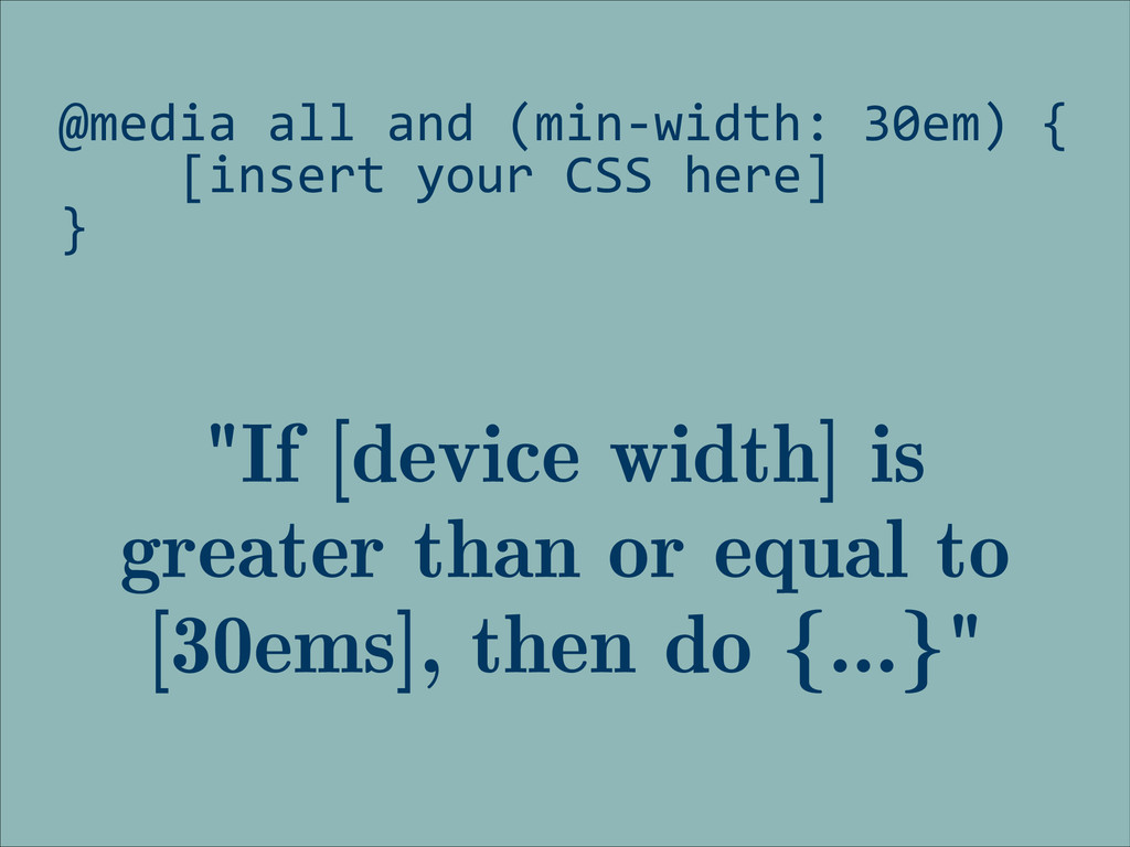
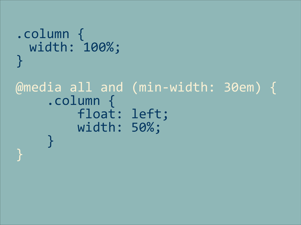
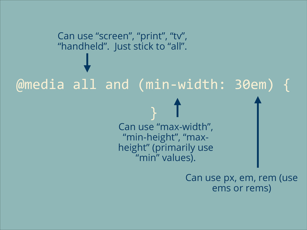
Responsive Design basics.
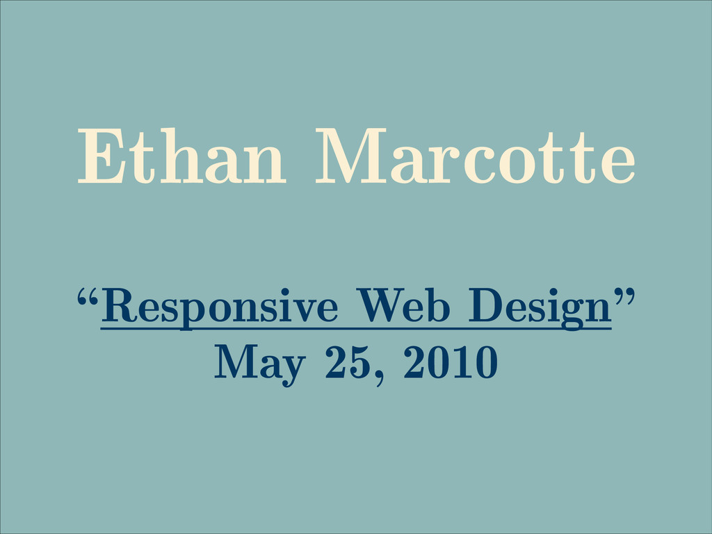
The article that started it all:
http://alistapart.com/article/responsive-web-design/
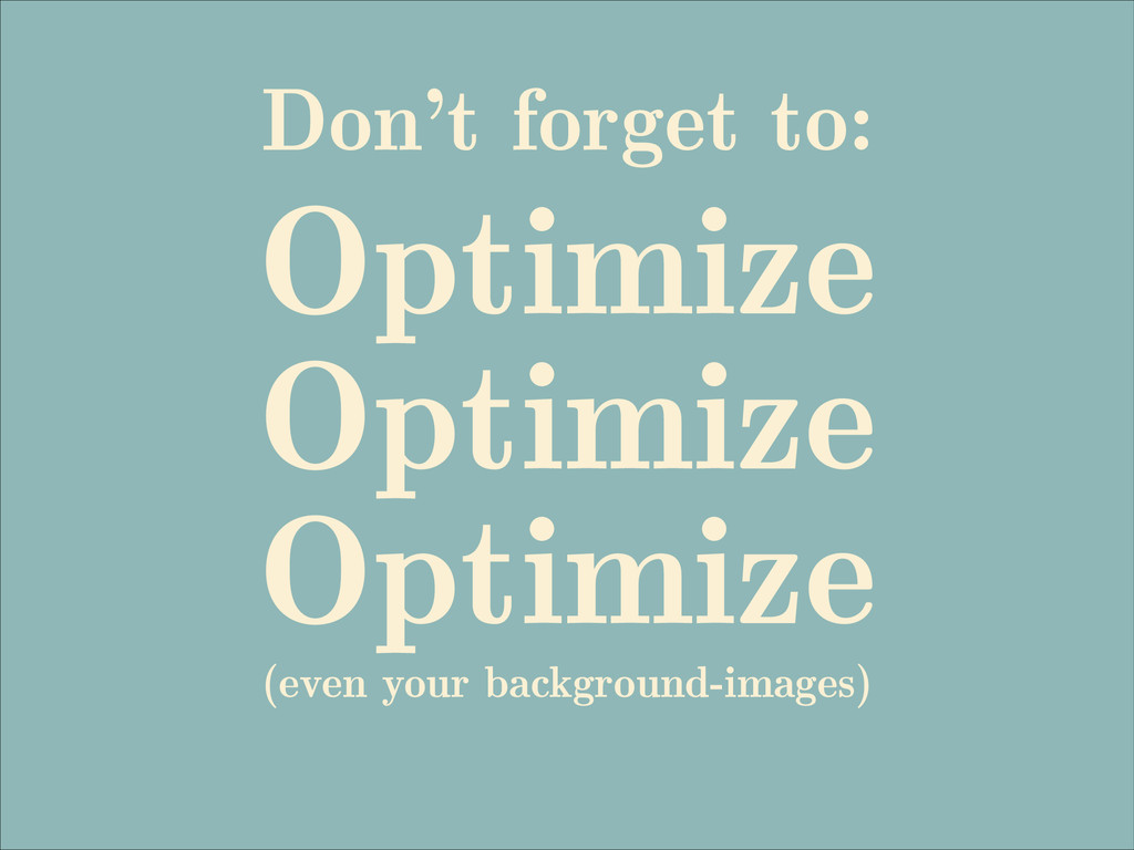
Image Optimizers:
http://www.imageoptimizer.net/
https://kraken.io/web-interface
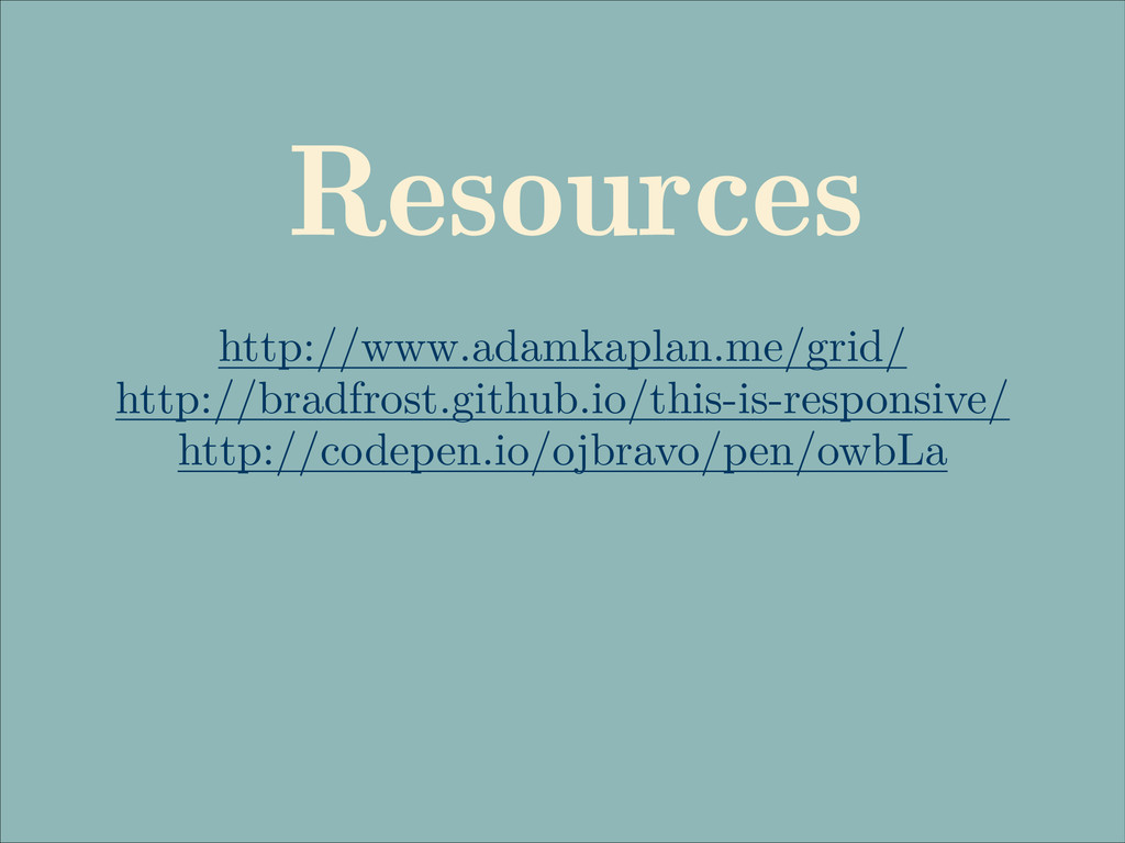
Responsive Resources / Tutorials:
http://www.adamkaplan.me/grid/
http://bradfrost.github.io/this-is-responsive/
http://codepen.io/ojbravo/pen/owbLa
 thebeckyhamm
 chiemitaki
 a2k
a2k
 ukaoli
 dmattsun
 lynteo
 yusukeiyoda
 ashapiro
 ncdc
ncdc
 csswizardry
 usagimaru
 kenichiota0711
 marcoroth
 mfonobong
 mza
mza
 marktimemedia
 aleyda
 marcduiker
 stephenakadiri
 skoyamalab
 inesmontani
 apolaine
 kastner