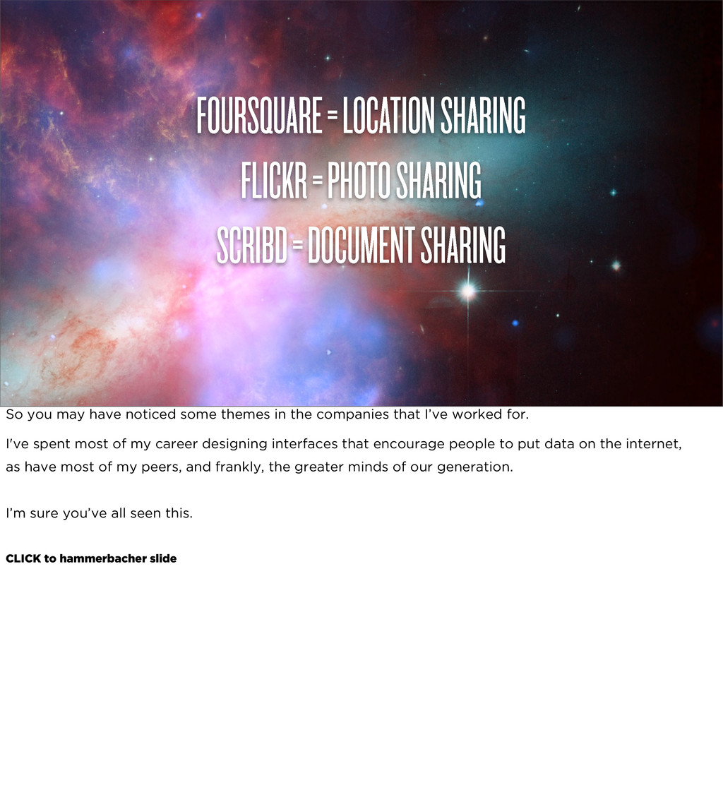
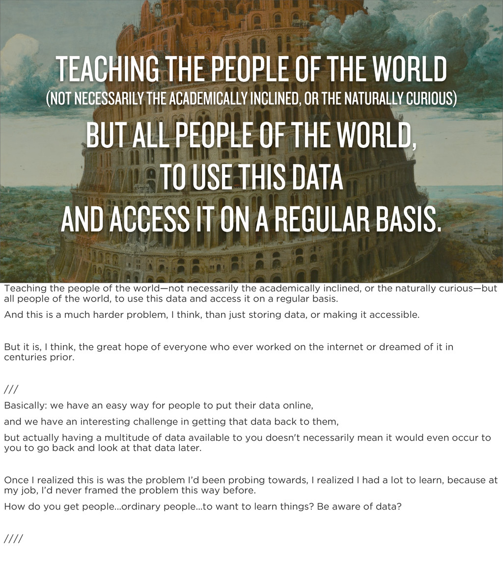
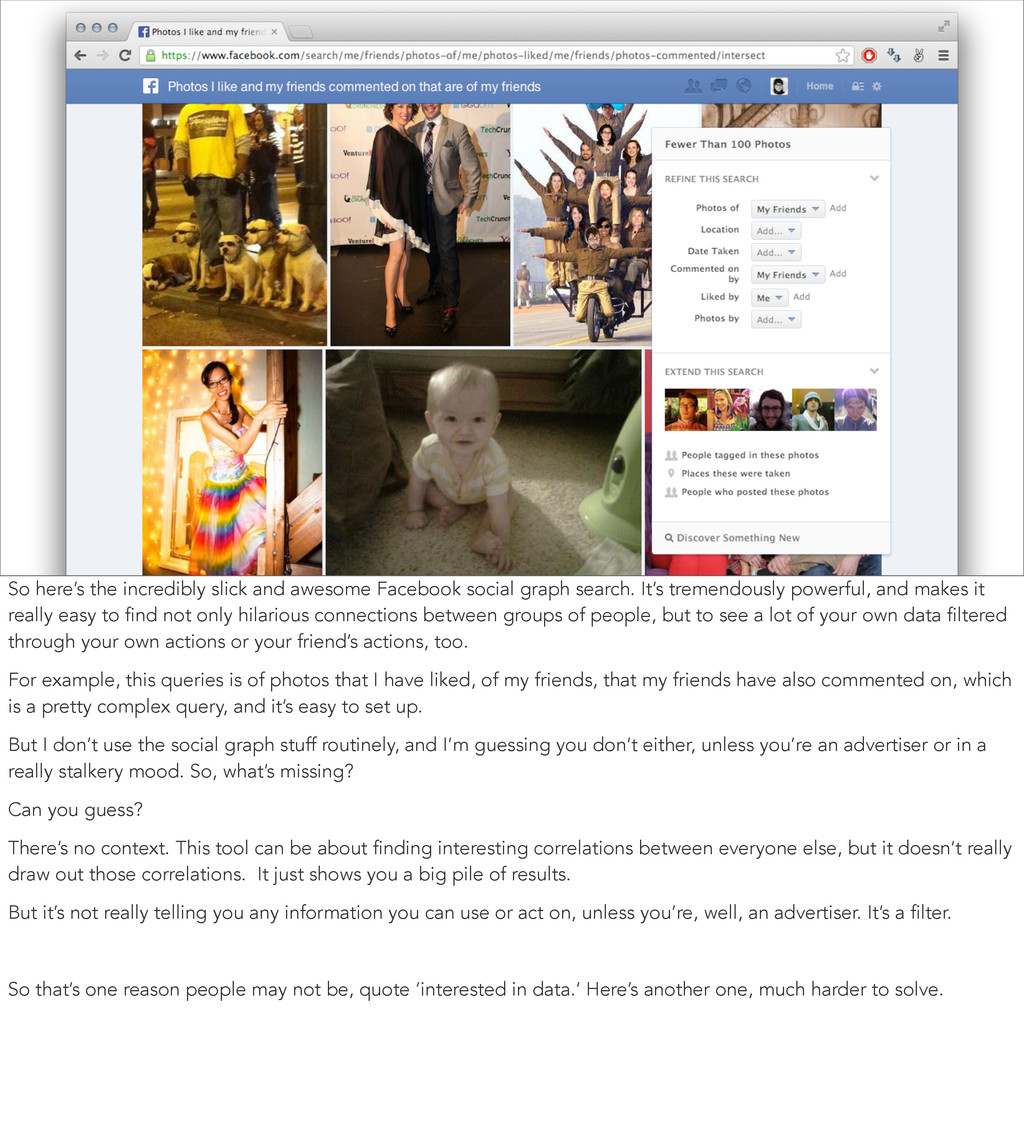
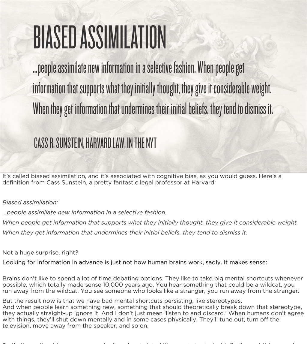
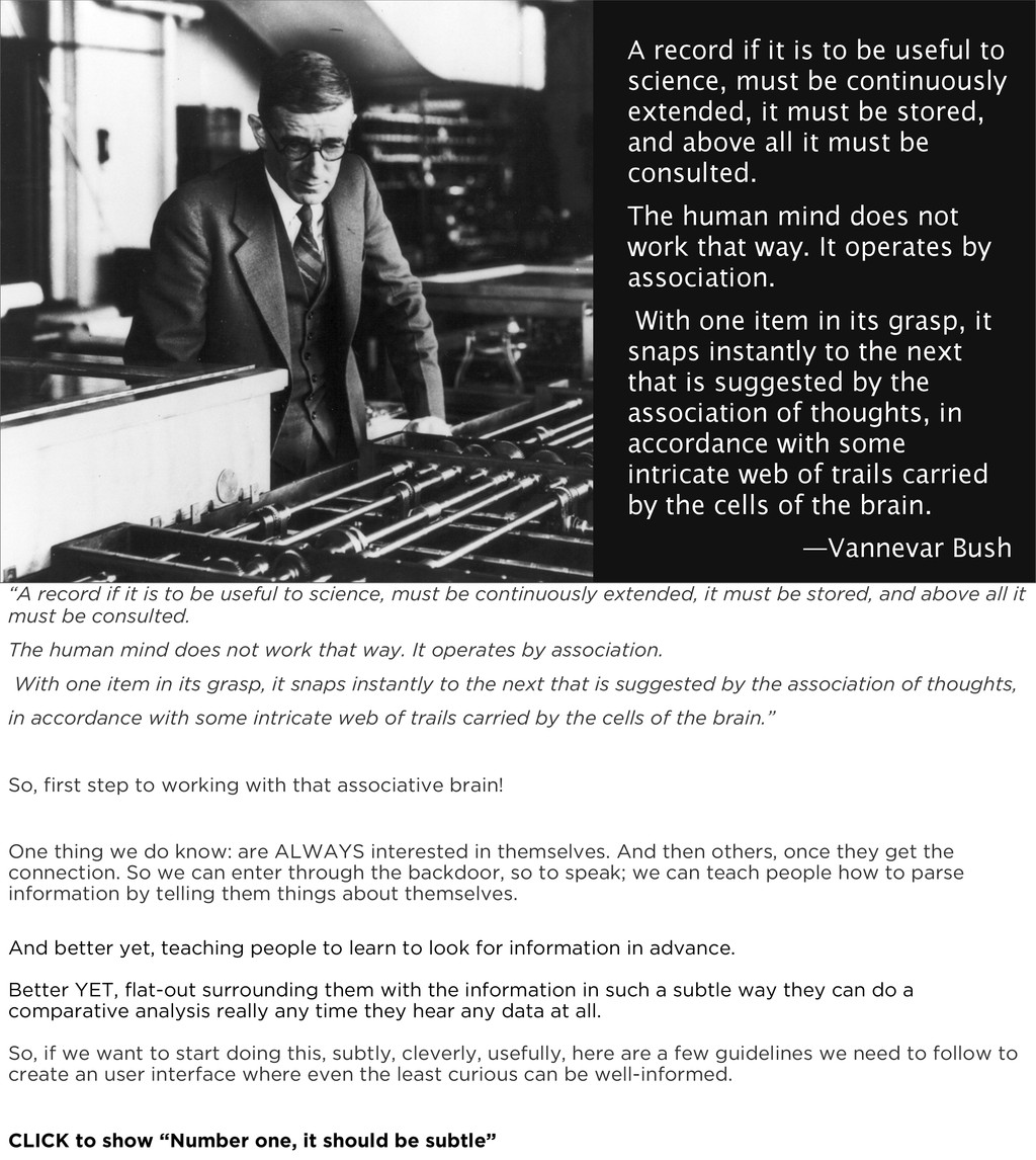
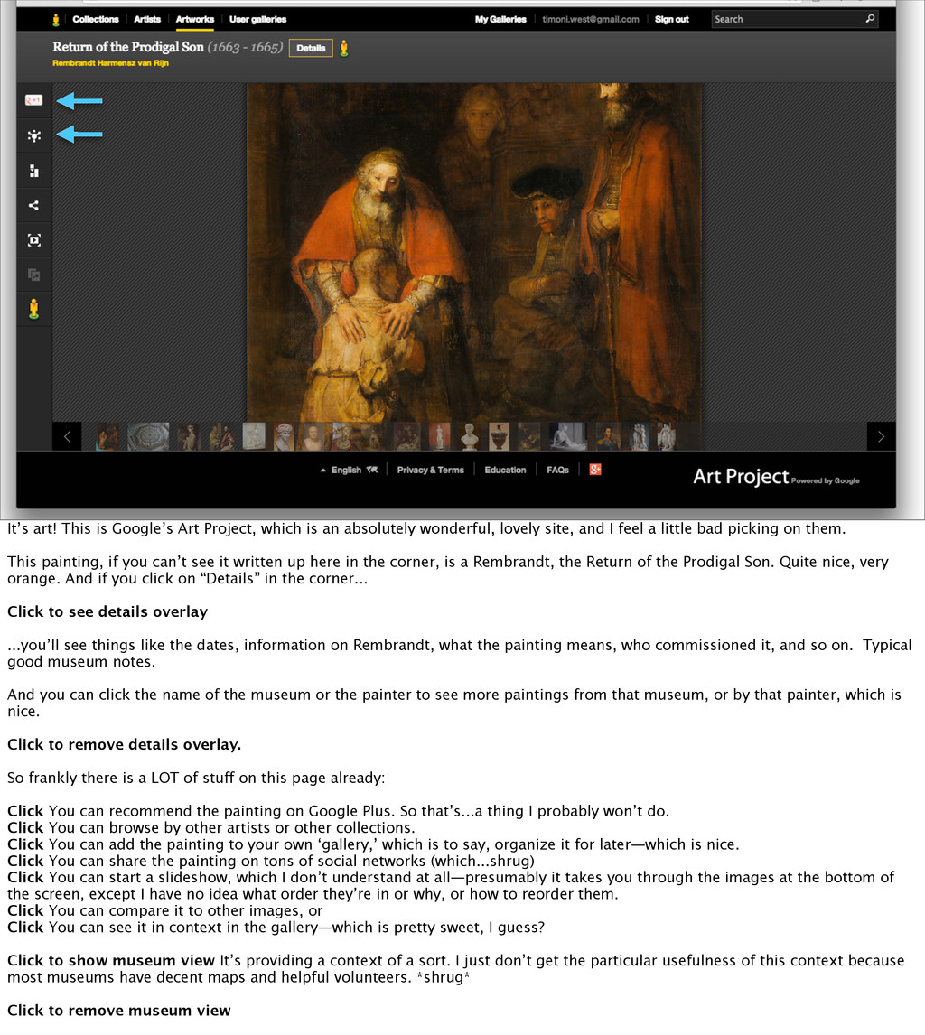
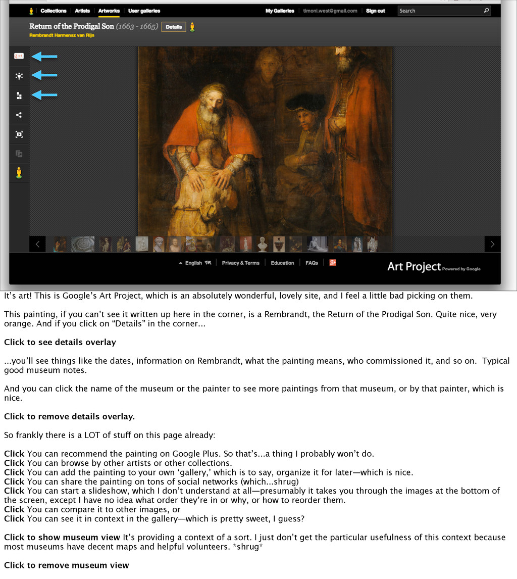
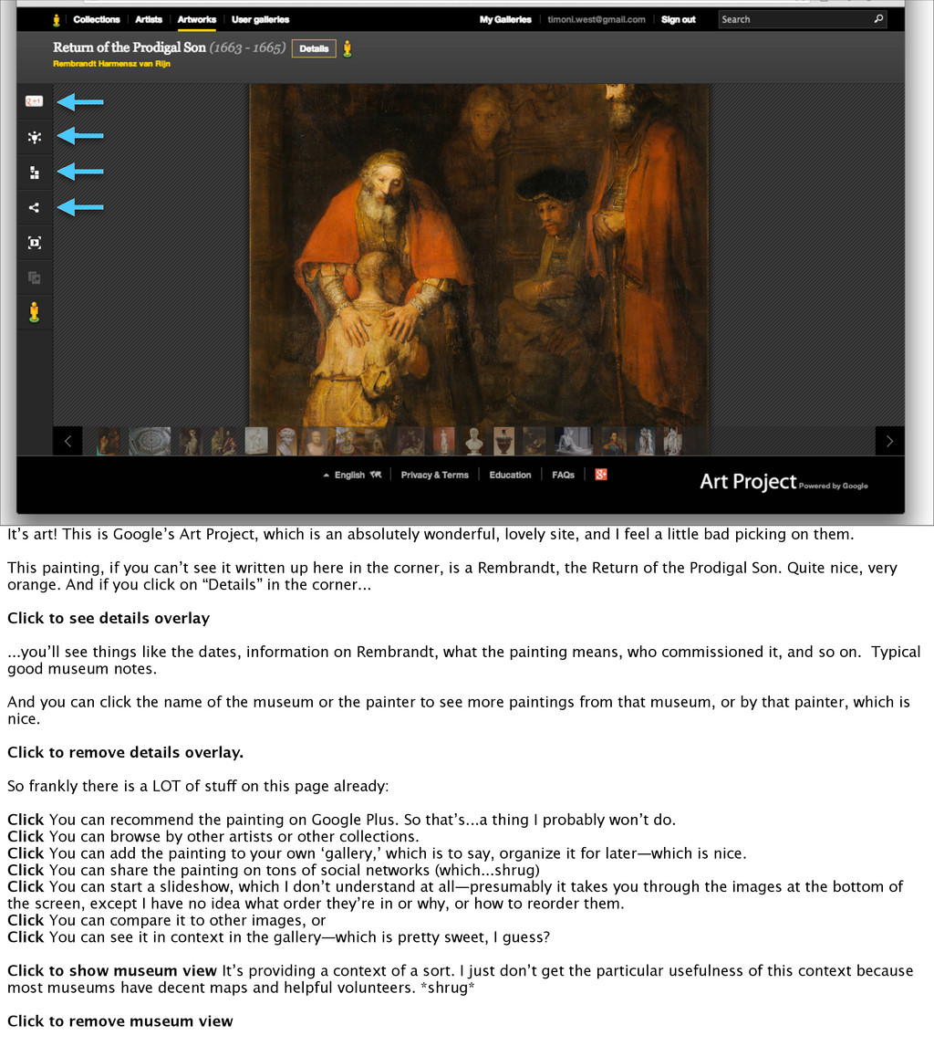
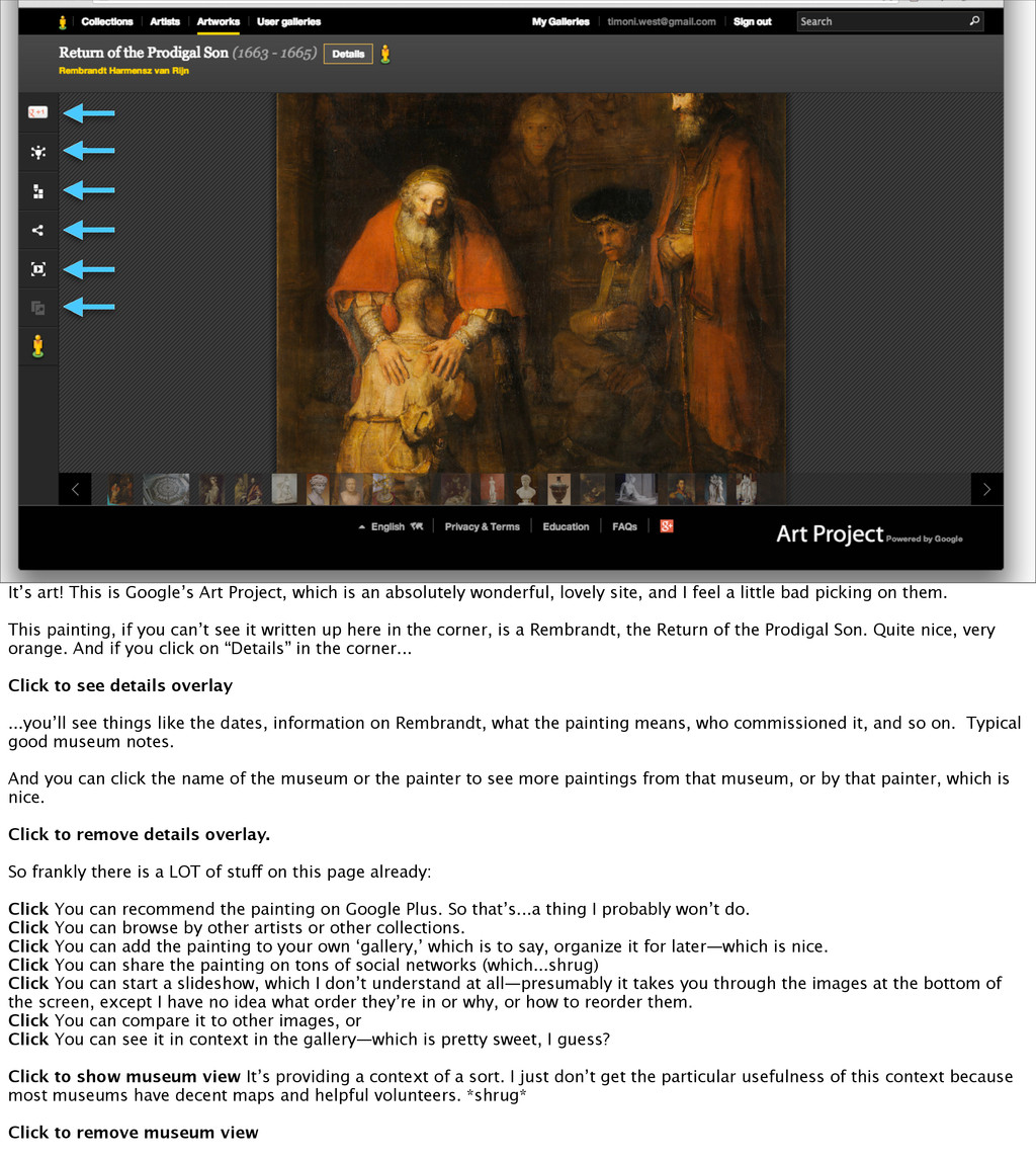
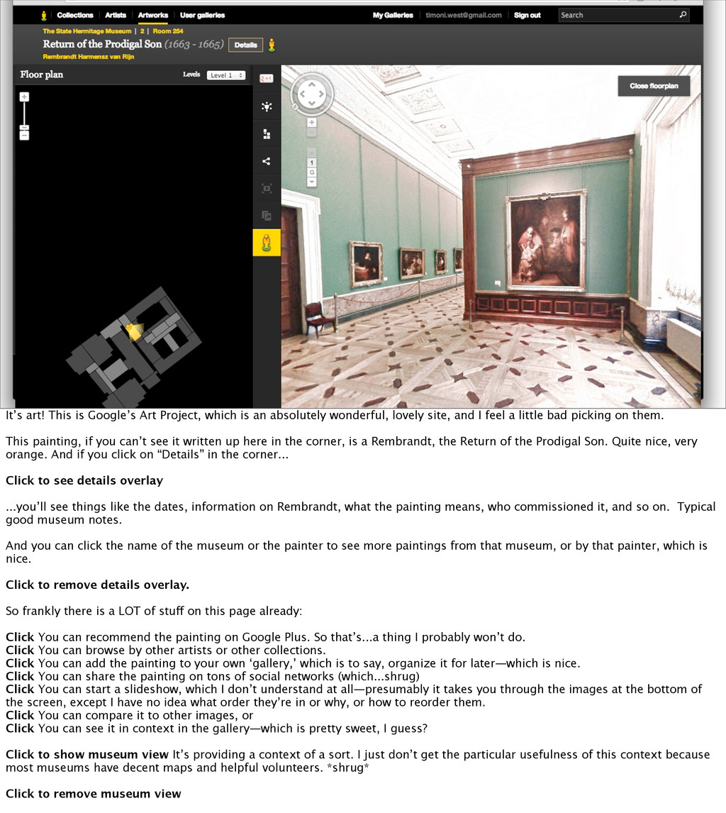
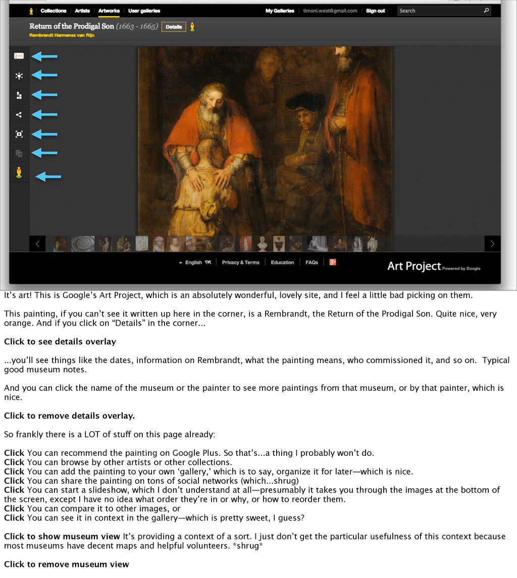
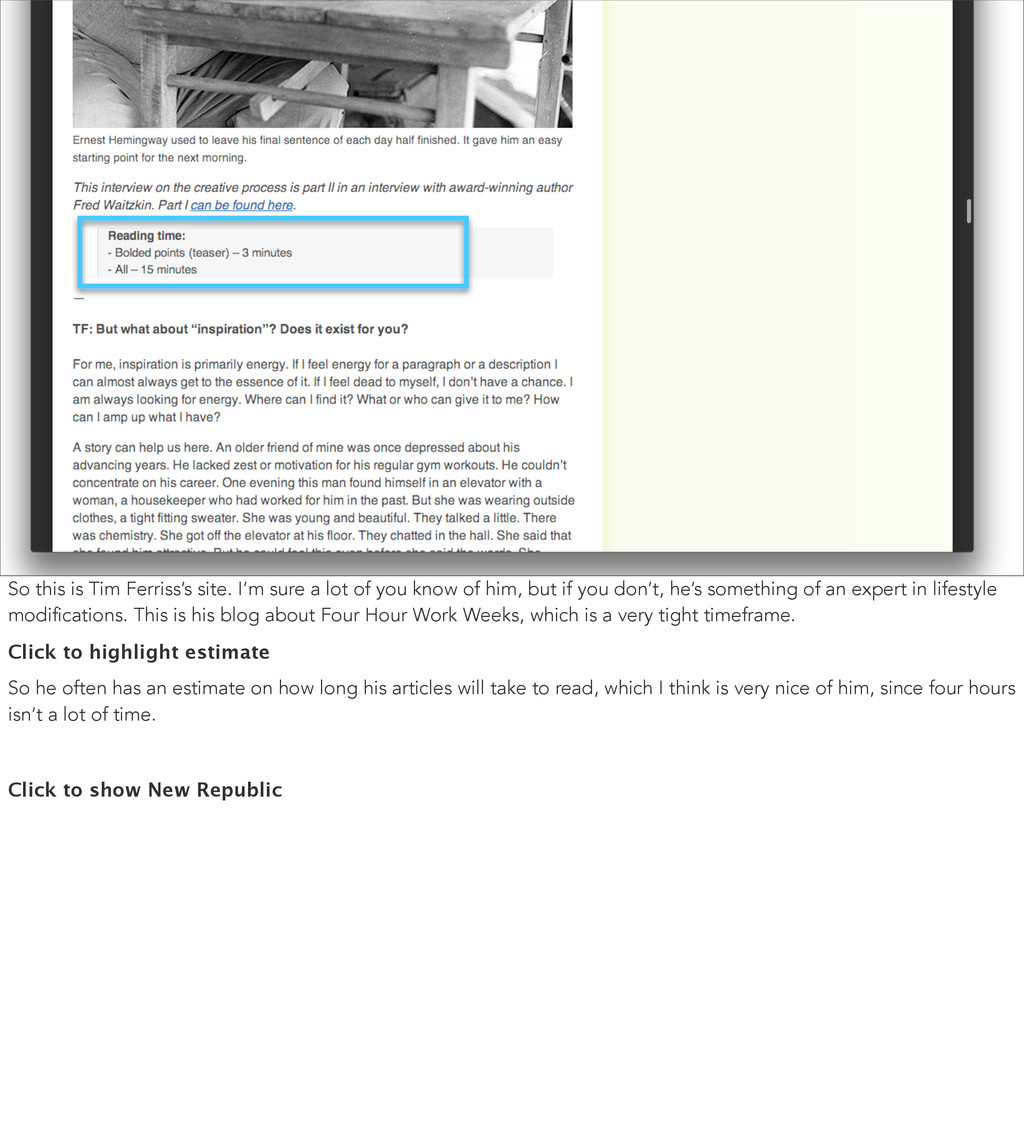
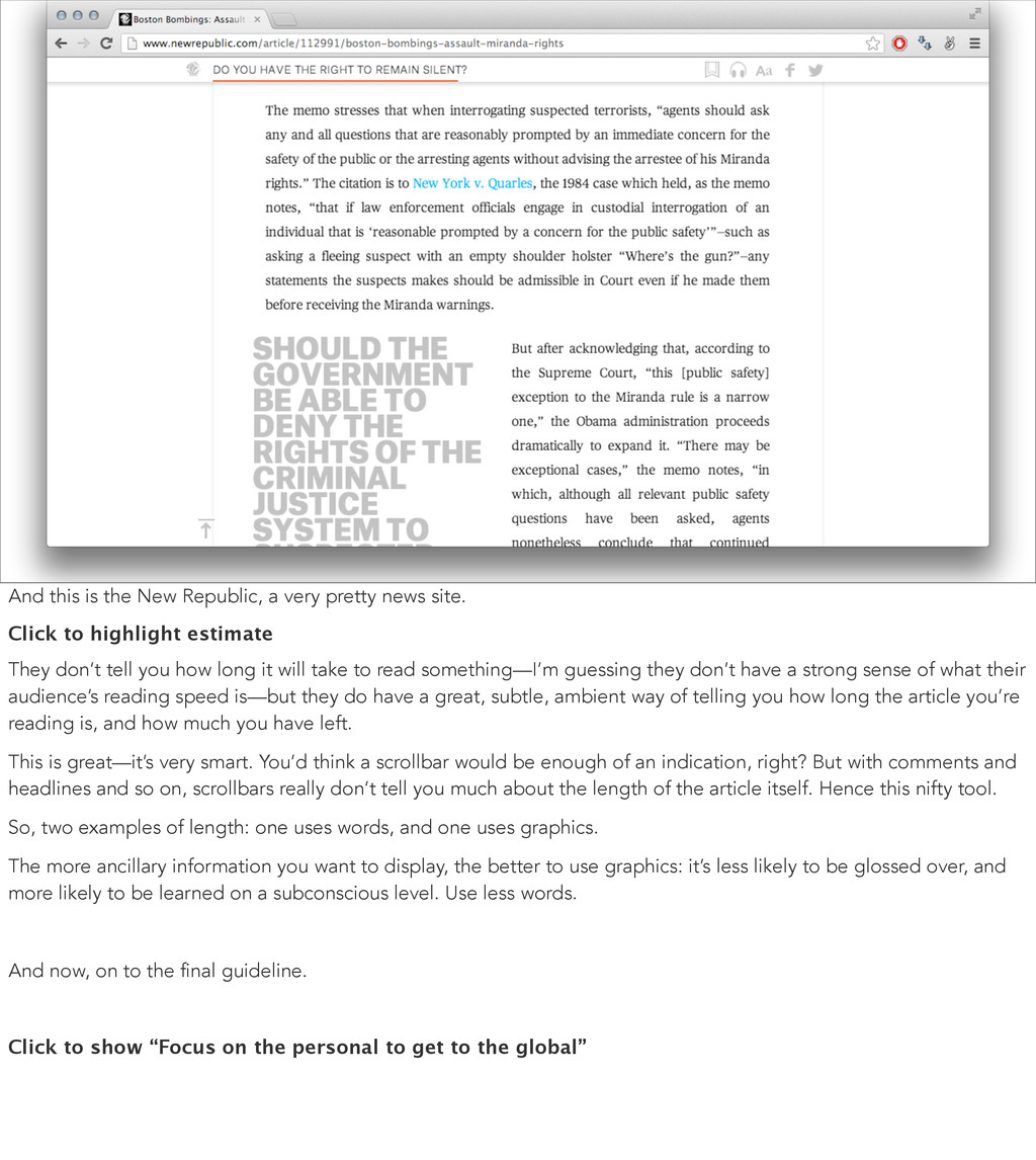
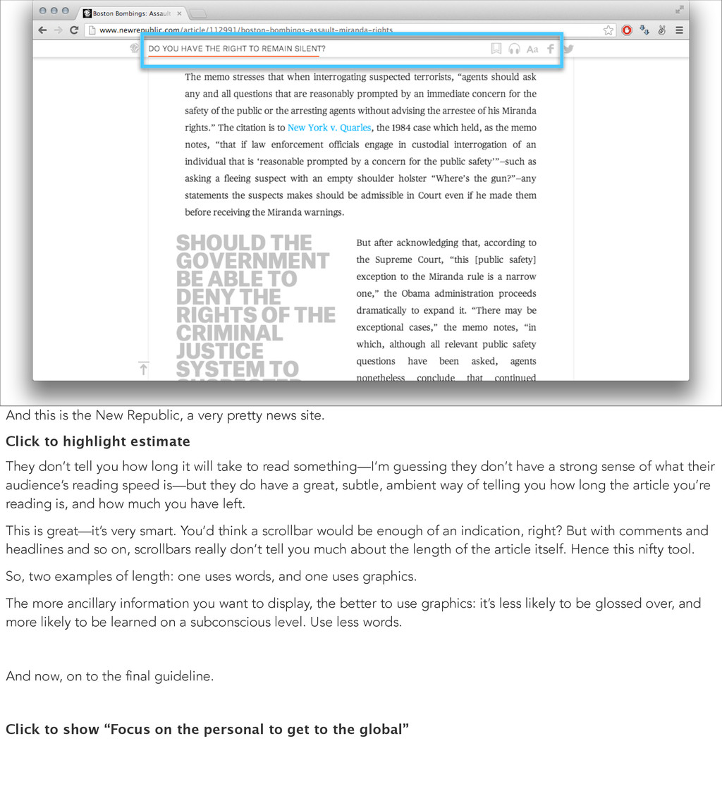
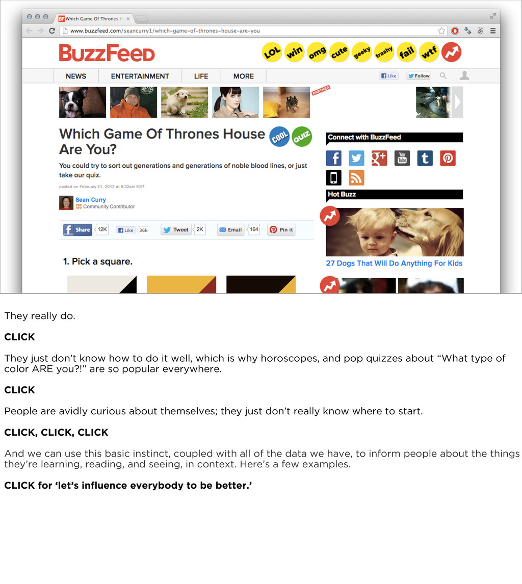
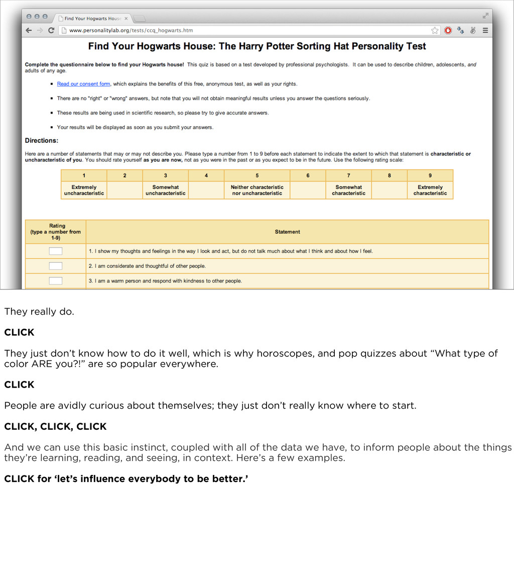
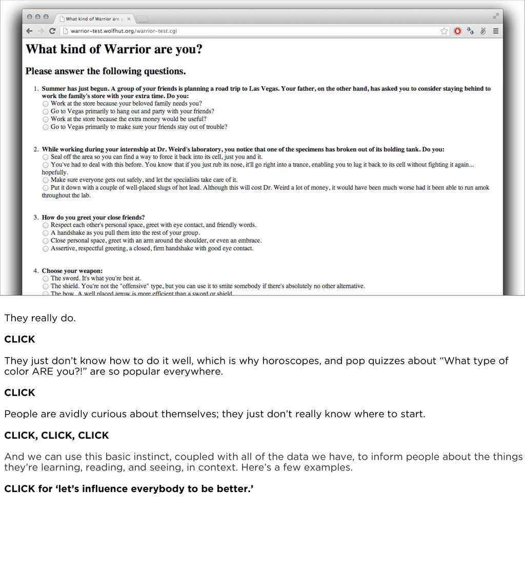
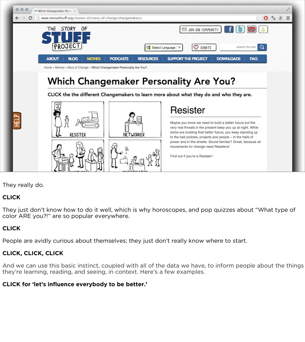
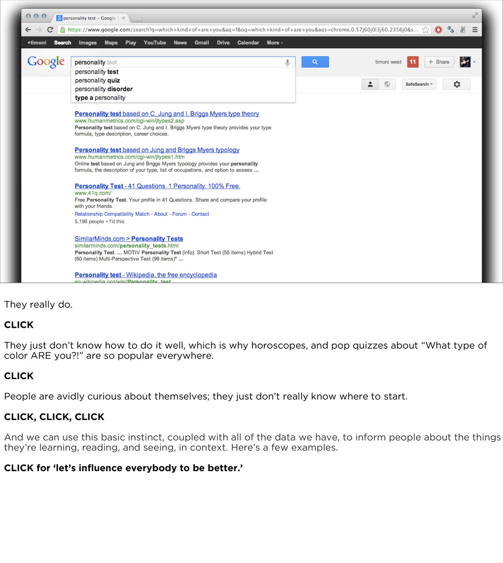
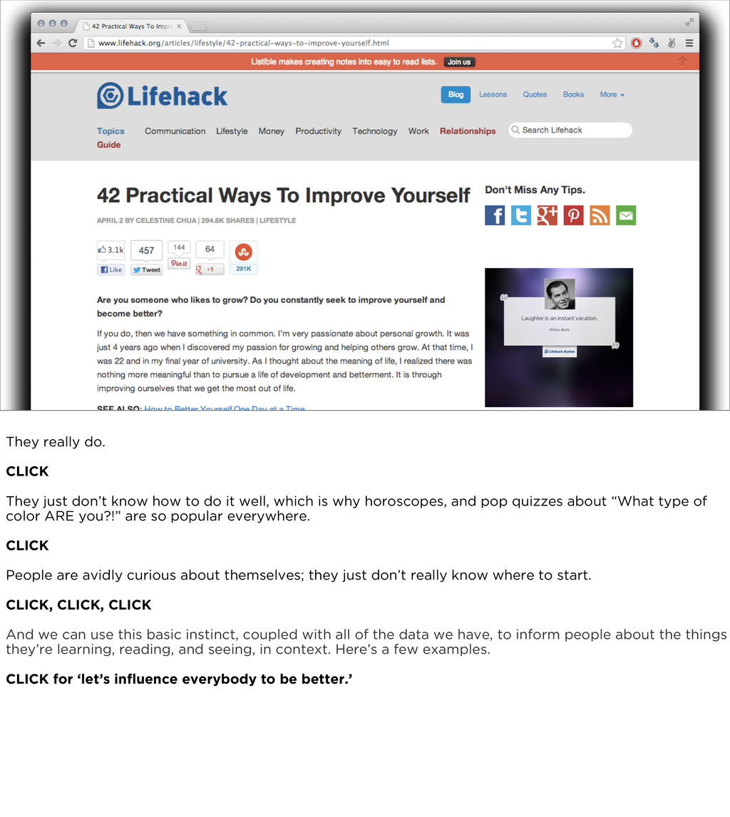
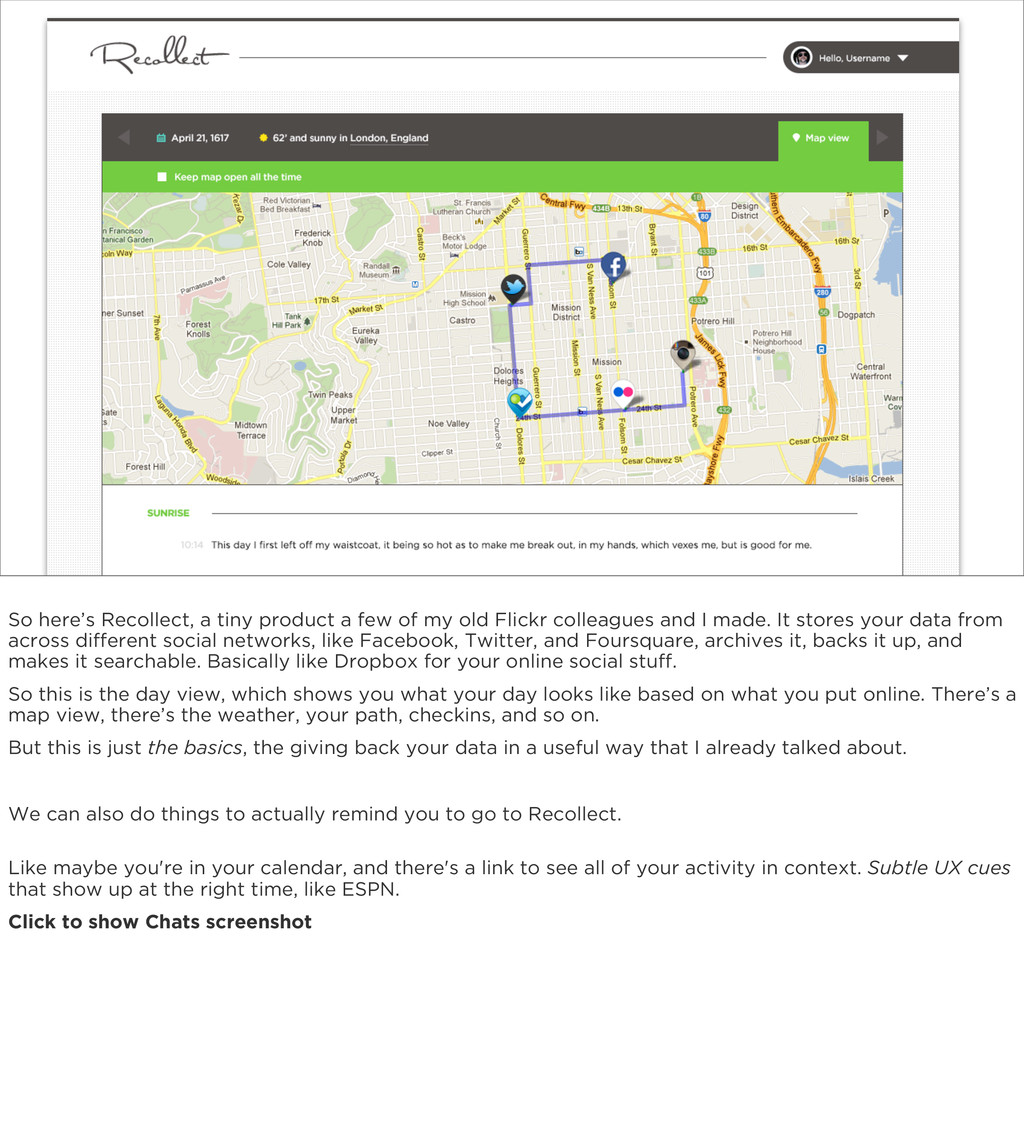
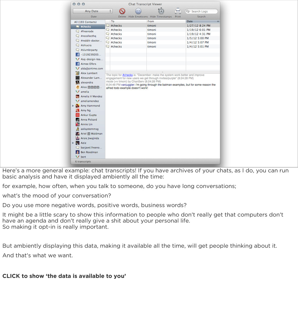
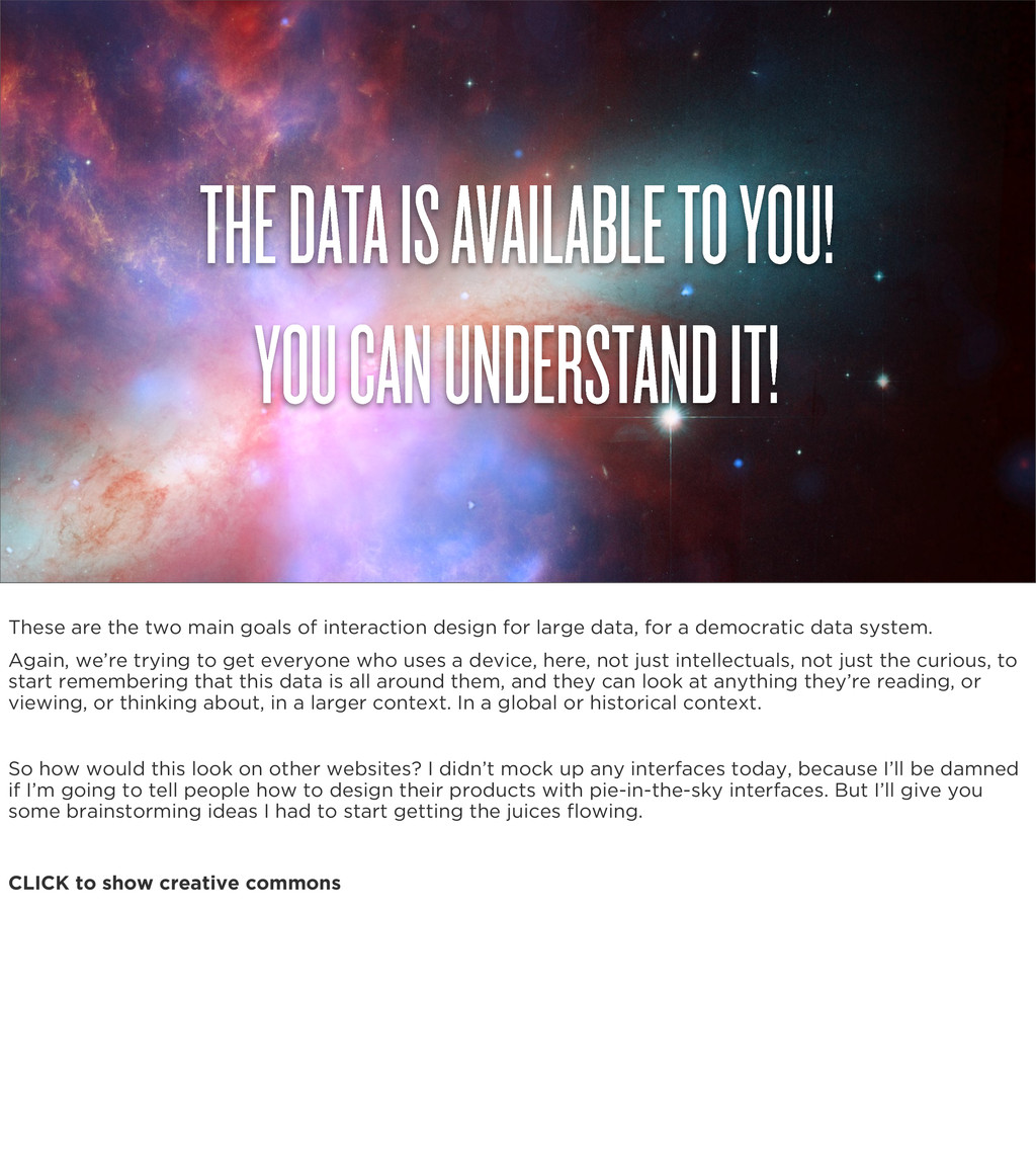
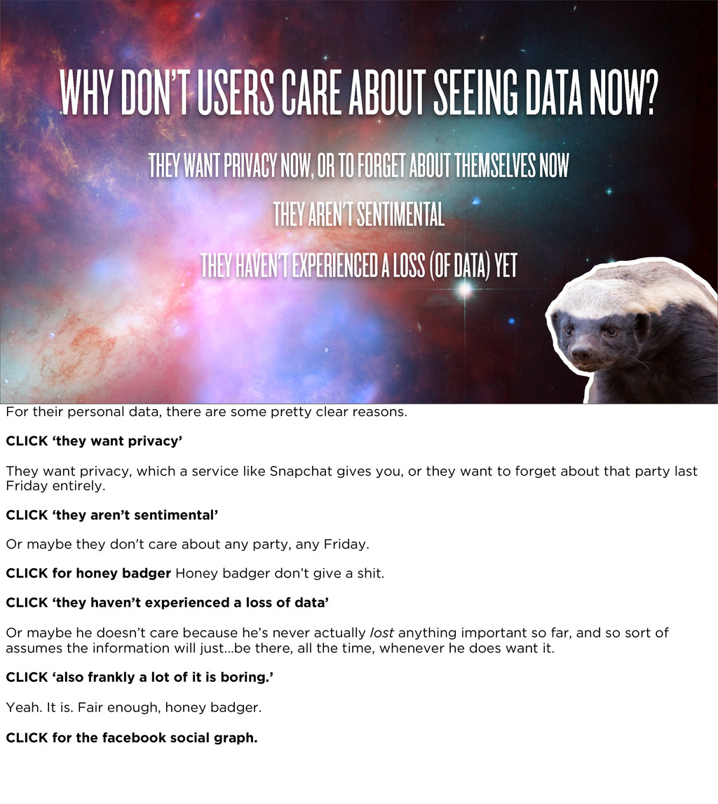
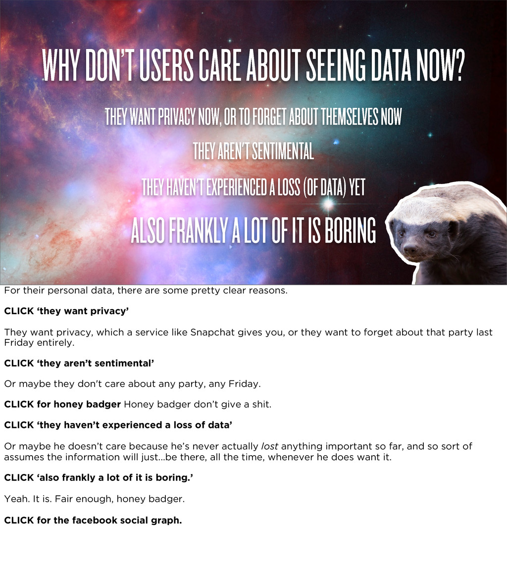
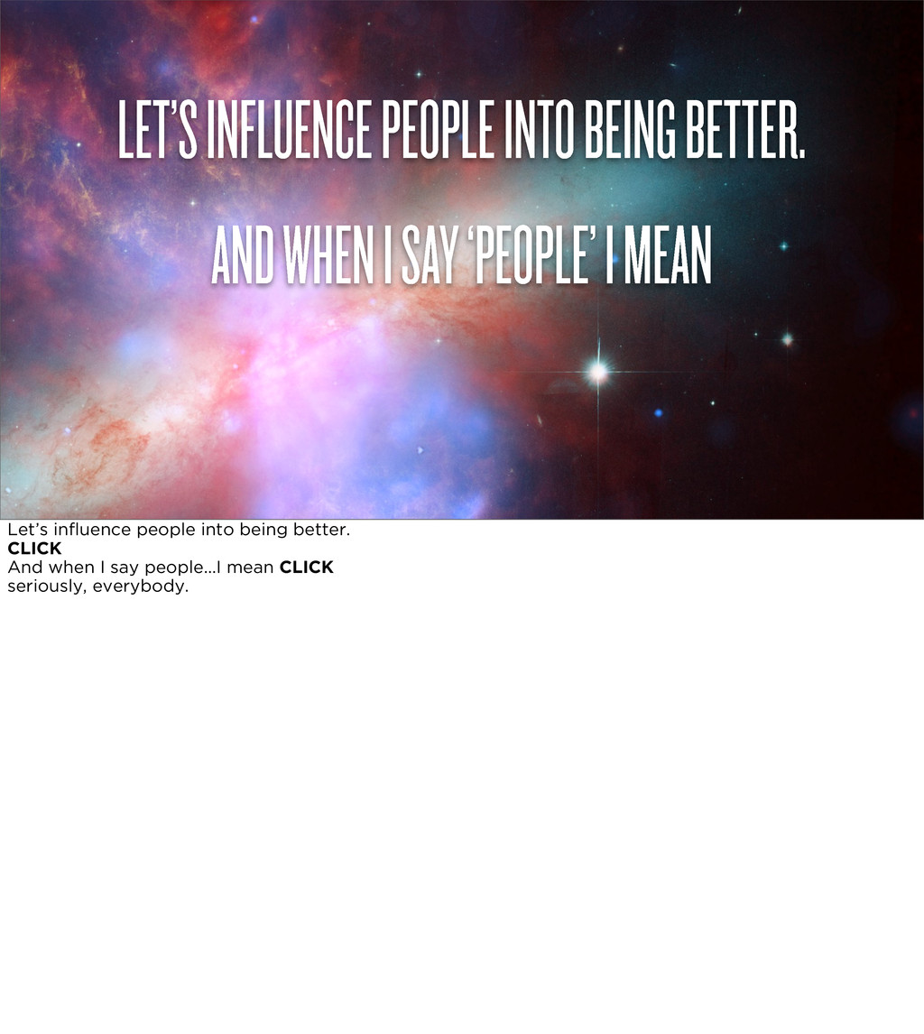
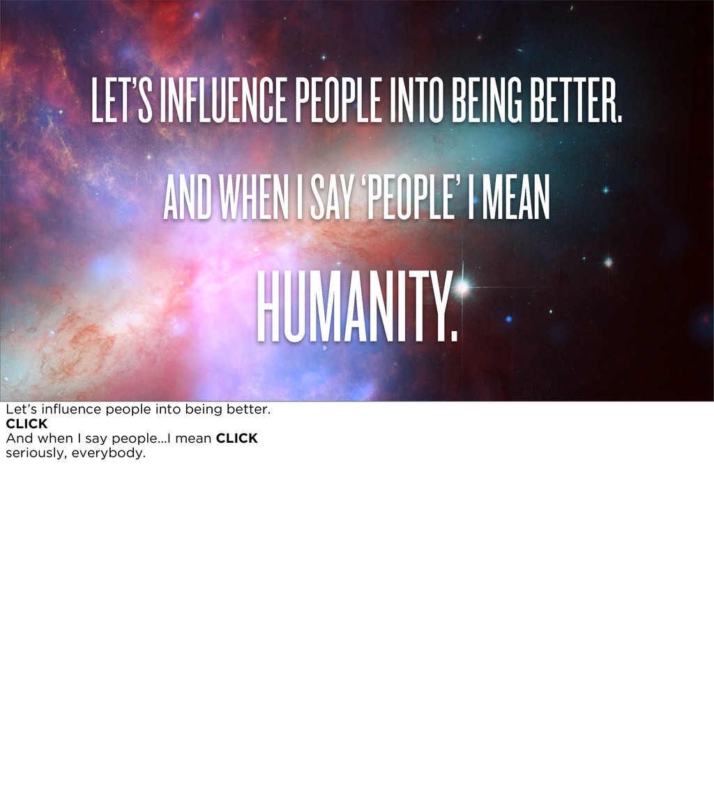
must be continuously extended, it must be stored, and above all it must be consulted. The human mind does not work that way. It operates by association. With one item in its grasp, it snaps instantly to the next that is suggested by the association of thoughts, in accordance with some intricate web of trails carried by the cells of the brain. —Vannevar Bush “A record if it is to be useful to science, must be continuously extended, it must be stored, and above all it must be consulted. The human mind does not work that way. It operates by association. With one item in its grasp, it snaps instantly to the next that is suggested by the association of thoughts, in accordance with some intricate web of trails carried by the cells of the brain.” So, first step to working with that associative brain! One thing we do know: are ALWAYS interested in themselves. And then others, once they get the connection. So we can enter through the backdoor, so to speak; we can teach people how to parse information by telling them things about themselves. And better yet, teaching people to learn to look for information in advance. Better YET, flat-out surrounding them with the information in such a subtle way they can do a comparative analysis really any time they hear any data at all. So, if we want to start doing this, subtly, cleverly, usefully, here are a few guidelines we need to follow to create an user interface where even the least curious can be well-informed. CLICK to show “Number one, it should be subtle”