Upgrade to Pro — share decks privately, control downloads, hide ads and more …

Intro to Responsive Web Design: RWD SF Meetup

tarajane
June 15, 2012

Intro to Responsive Web Design: RWD SF Meetup

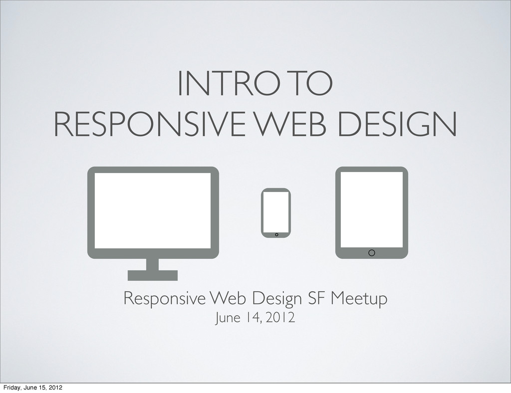
Extremely similar to my previous Intro to Responsive Web Design presentation, just some slight tweaks.

Presented this in the kickoff of the new San Francisco RWD Meetup group at Tagged headquarters.

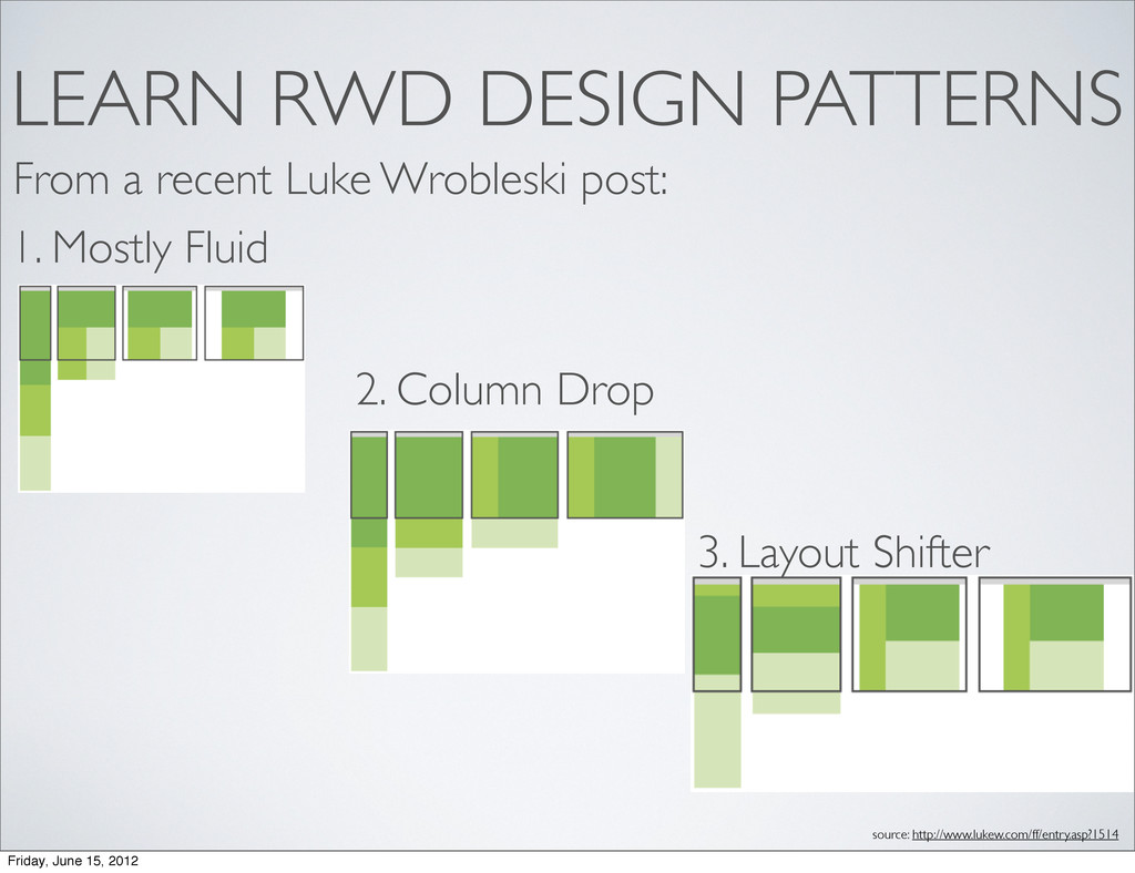
Responsive Web Design from 30, 000 feet. Breaking it down at a high level by the 5 W's.

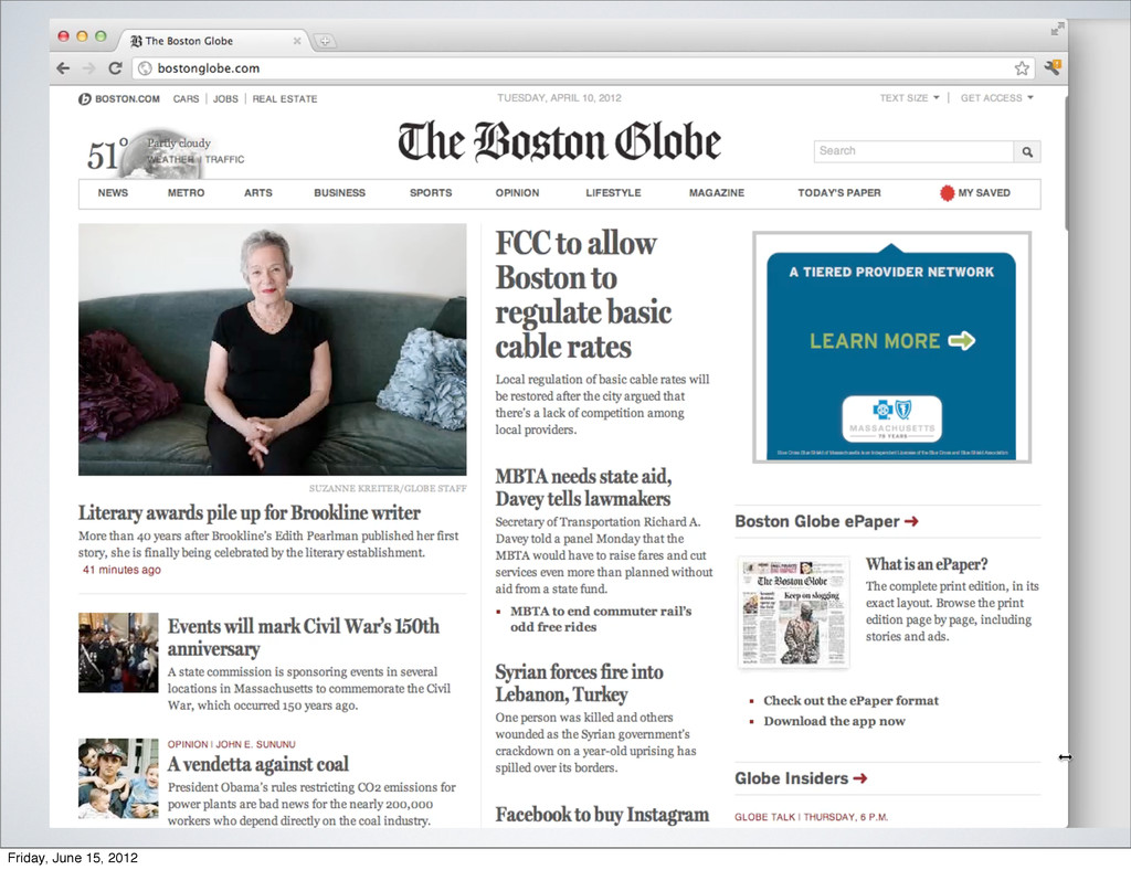
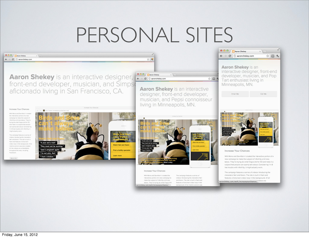
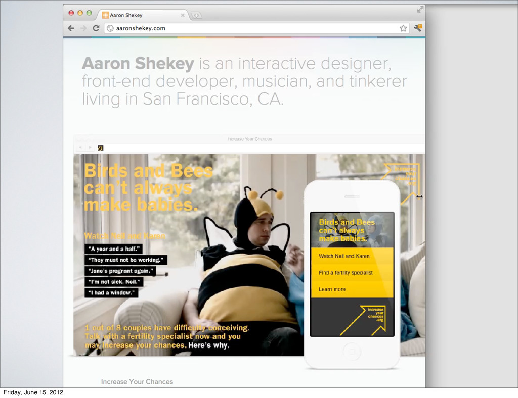
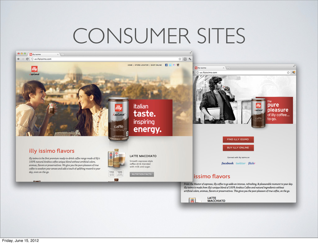
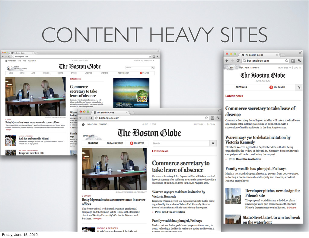
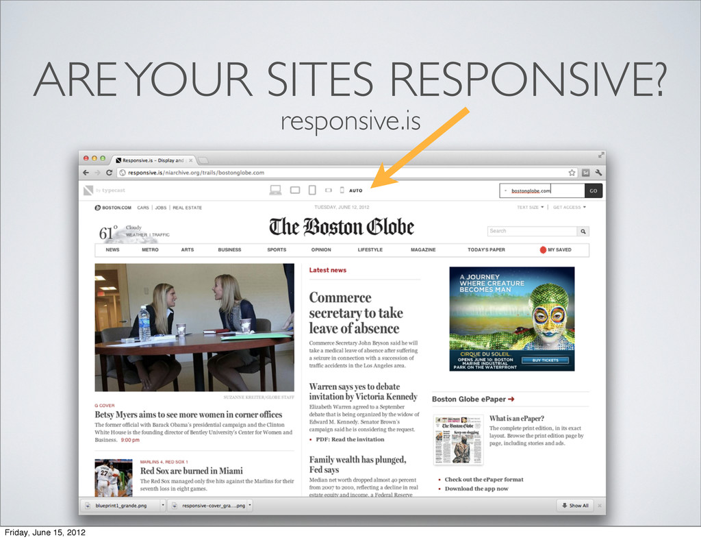
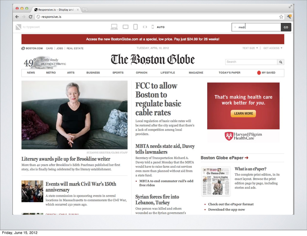
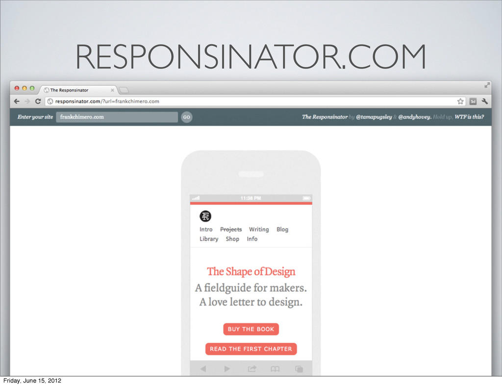
The videos don't play in this speaker deck preso... but grab the URLS and go check out the sites yourself! Have fun resizing the browser :)

tarajane

June 15, 2012
Tweet

More Decks by tarajane

Other Decks in Design

Transcript

  1. WHO AM I? • Software engineer at Adobe since 2006

    • Working in the XD group as a Senior Experience Developer • Experience Developer? You say? • Design savvy developer. Implementer of pixel perfect user interfaces and interactions. Friday, June 15, 2012
  2. MY FOCUS Working with XD and the Web Platform group

    at Adobe to prototype experiences in the browser. http://blogs.adobe.com/webplatform/ Friday, June 15, 2012
  3. How do we create a great experience which spans across

    multiple devices, different screen widths, different resolutions, etc? Friday, June 15, 2012
  4. M.MYSITE.COM On a tablet? TABLET.MYSITE.COM New Retina iPad? New iPad:

    Retina, 2048-by-1536-pixel resolution at 264 pixels per inch (ppi) On mobile? Landscape orientation on a tablet? TABLETLANDSCAPE.MYSITE.COM RETINATABLET.MYSITE.COM Friday, June 15, 2012
  5. DESIGNING FOR NATIVE How does my app look on Windows

    Metro? How does it look on an iDevice? How does it look on an android phone? Am I dealing with multiple dev teams? How do I as a designer, push a change to native apps across all of these different platforms? Friday, June 15, 2012
  6. “Day by day, the number of devices, platforms, and browsers

    that need to work with your site grows. Responsive web design represents a fundamental shift in how we’ll build websites for the decade to come.” - Jeffrey Veen Friday, June 15, 2012
  7. 1. FLEXIBLE GRID SYSTEM 2. MEDIA QUERIES 3. FLUID MEDIA

    (IMAGES & TEXT) Friday, June 15, 2012
  8. 1. FLEXIBLE GRID SYSTEM 2. MEDIA QUERIES 3. FLUID MEDIA

    (IMAGES & TEXT) Friday, June 15, 2012
  9. 1. FLEXIBLE GRID SYSTEM The static 960 grid 12 and

    16 column layouts just doesn’t cut it anymore. Friday, June 15, 2012
  10. 1. FLEXIBLE GRID SYSTEM - % width columns, gutters and

    margins - drops columns in and out as space is available target width/context width * 100 = % width Friday, June 15, 2012
  11. 1. FLEXIBLE GRID SYSTEM - % width columns, gutters and

    margins - drops columns in and out as space is available target width/context width * 100 = % width 55px Friday, June 15, 2012
  12. 1. FLEXIBLE GRID SYSTEM - % width columns, gutters and

    margins - drops columns in and out as space is available target width/context width * 100 = % width 848px Friday, June 15, 2012
  13. 1. FLEXIBLE GRID SYSTEM target width/context width * 100 =

    % width 55px/848px * 100 = 6.485849056604% Friday, June 15, 2012
  14. 1. FLEXIBLE GRID SYSTEM 2. MEDIA QUERIES 3. FLUID MEDIA

    (IMAGES & TEXT) Friday, June 15, 2012
  15. 2. MEDIA QUERIES Media queries allow us to describe a

    set of rules for how our web elements appear at certain max and min screen widths. Use them to fix your design when it breaks. . Friday, June 15, 2012
  16. 2. MEDIA QUERIES @media screen and (min-width: 320px) { header

    img .logo { align: middle; } } @media screen and (min-width: 767px) { header img .logo { align: left; } } Friday, June 15, 2012
  17. 3. FLUID MEDIA One trick to remember: img { max-width:

    100%; } *This trick is wasteful. There’s an ongoing debate and lots of activity happening in this area. So lets tackle Responsive Images next time, shall we? Friday, June 15, 2012
  18. 3. FLUID MEDIA Fonts - pixels vs ems - use

    pixels for absolute font sizes (when precision is needed) - use ems (scalable, ratio unit) otherwise - ems are proportional fonts, relative to the <body> and <html> defined font-size Friday, June 15, 2012
  19. 3. FLUID MEDIA The body tag has font-size=16px or 1em

    by default, so if you wanted your header to have a font size of 32px: 32/16 = 2em SO? As you zoom in/out in the browser (i.e. increase your font size), a font-size of 2em will scale to be twice the size of the body font size. Friday, June 15, 2012
  20. 1. FLEXIBLE GRID SYSTEM 2. MEDIA QUERIES 3. FLUID MEDIA

    (IMAGES & TEXT) Friday, June 15, 2012
  21. DESIGN CONTENT FIRST. What is the most important content your

    user will be looking for? - on a mobile sized screen - on a tablet sized screen - on a desktop sized screen ORDER MATTERS. Friday, June 15, 2012
  22. LEARN RWD DESIGN PATTERNS 1. Mostly Fluid 2. Column Drop

    3. Layout Shifter source: http://www.lukew.com/ff/entry.asp?1514 From a recent Luke Wrobleski post: Friday, June 15, 2012
  23. GET IN THE LOOP • Read the Responsive Web Design

    ‘A Book Apart’ book by Ethan Marcotte • Follow @RWD on twitter • Check out www.mediaqueri.es Friday, June 15, 2012
  24. We’re hiring Javascript Ninjas for some seriously cool projects happening

    in SF. Come talk to me if you’re interested. Friday, June 15, 2012
  25. We want your feedback to help influence the products you

    use every day! Participate in Adobe User Research. www.adobe.com/userresearch Friday, June 15, 2012