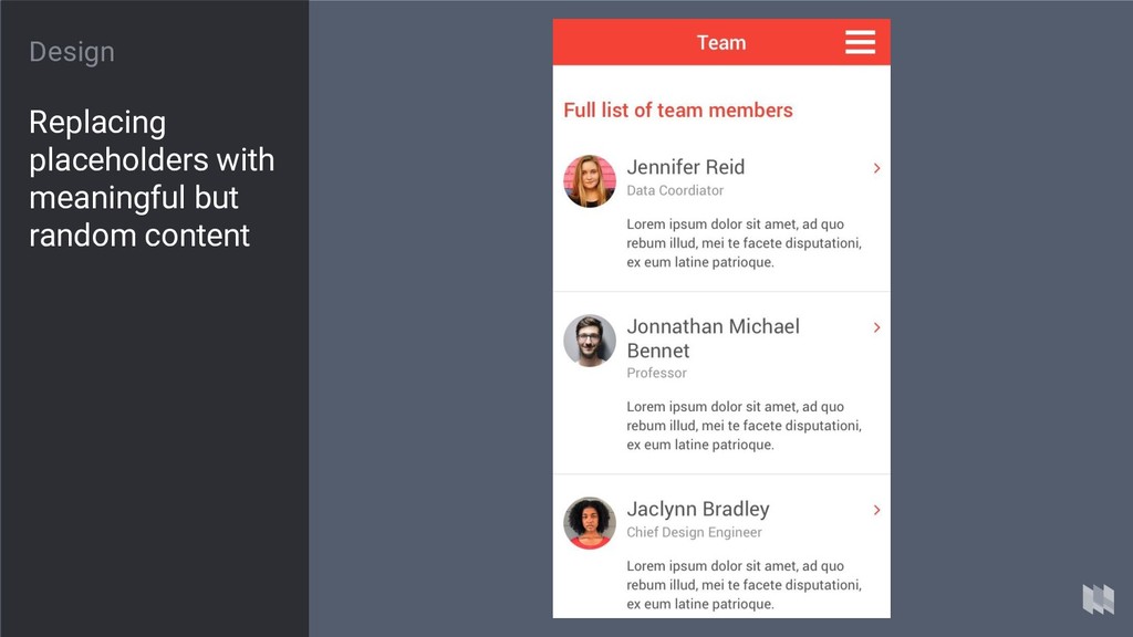
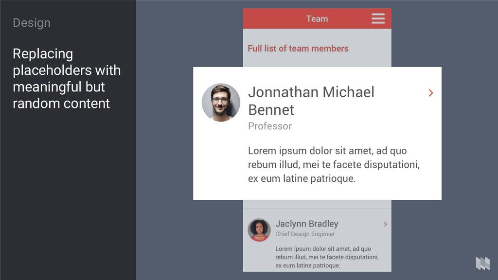
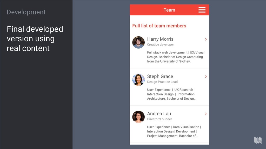
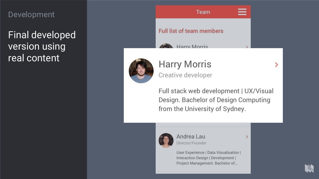
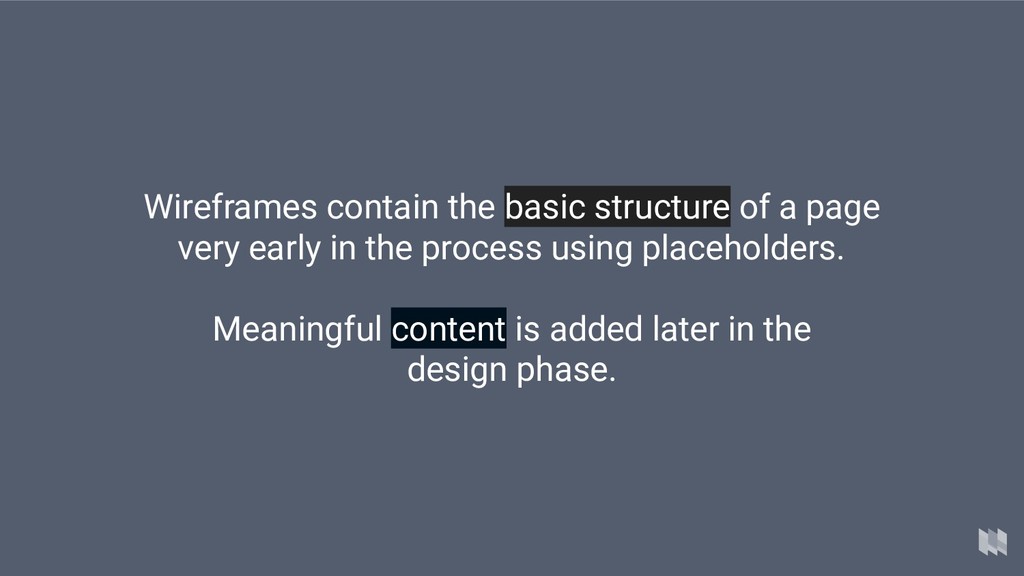
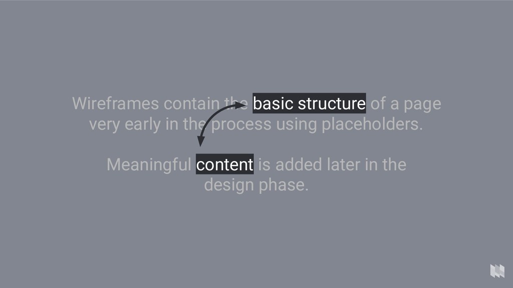
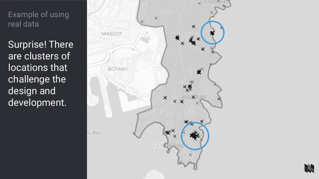
eu purus in pharetra. Maecenas pretium, nibh ut fermentum egestas, metus justo viverra elit, id porta felis velit id libero. Integer non dui ullamcorper, scelerisque libero ut, tempus purus. In faucibus leo quis nunc vehicula iaculis. Mauris commodo leo eget imperdiet elementum. Pellentesque dolor odio, euismod eget tristique sit amet, porta at sem. Nulla eget nibh ultricies, bibendum tortor ut, sodales felis. Cras diam nulla, suscipit eu pellentesque vitae, sodales non urna. Nam ut volutpat magna. Donec sodales consequat efficitur. Nullam aliquam lorem quam, et sagittis velit sagittis nec. Praesent ultricies, justo nec finibus pulvinar, enim mi auctor sem, sit amet congue purus diam sit amet neque. Morbi imperdiet ipsum turpis, quis tincidunt nisl ultricies eget. Curabitur fringilla purus turpis, vitae molestie libero finibus vel.
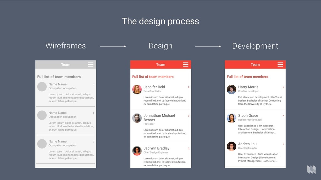
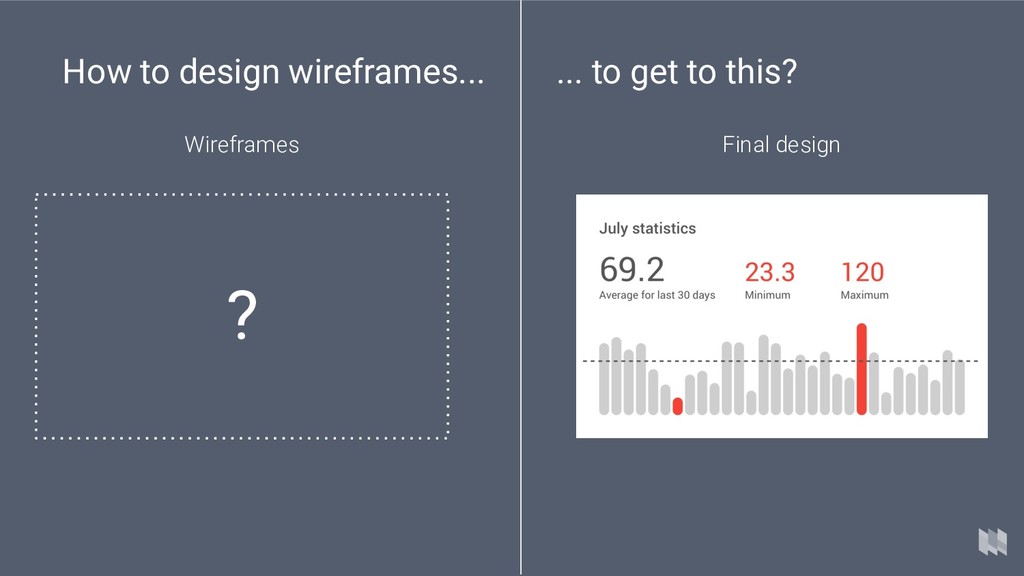
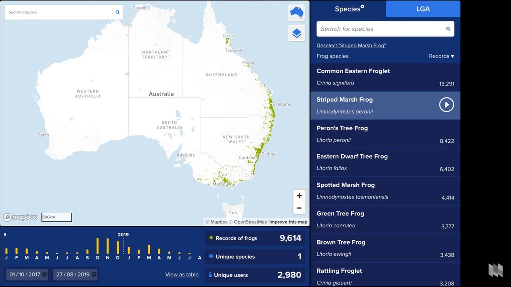
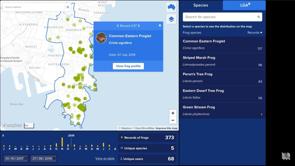
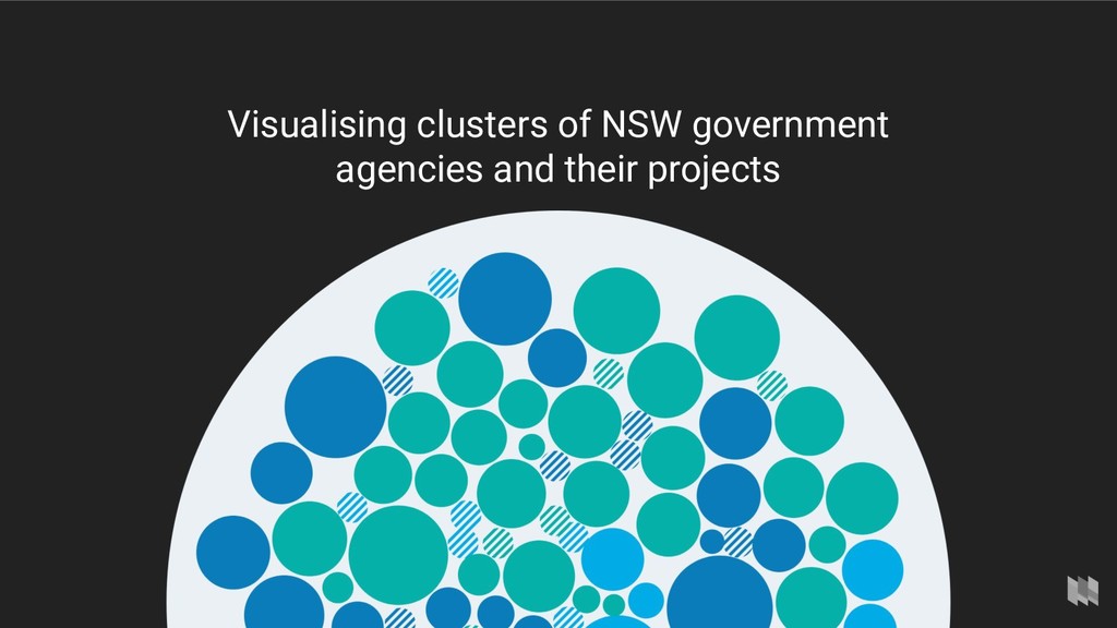
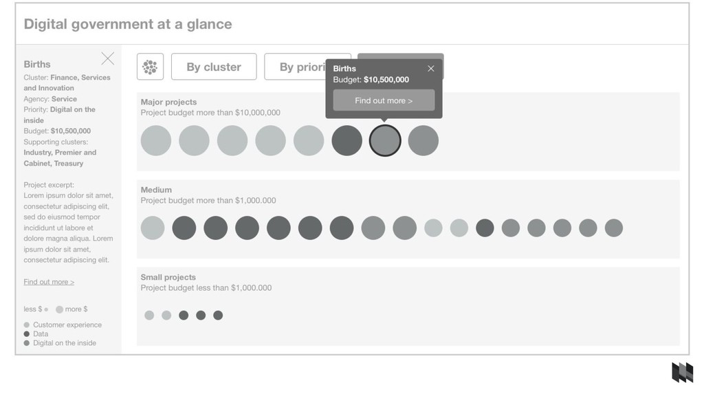
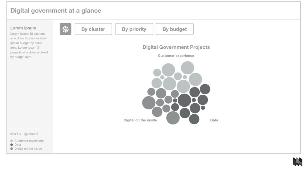
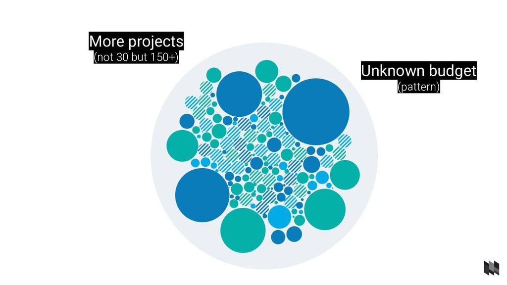
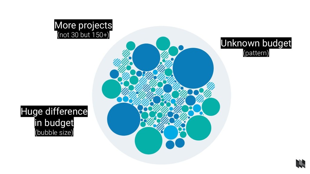
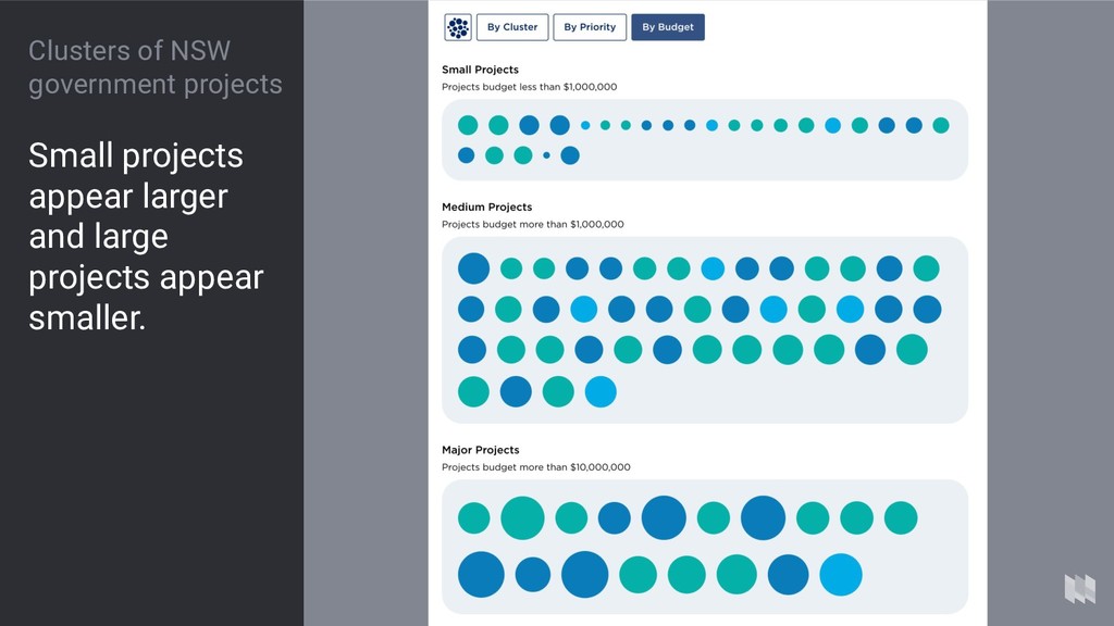
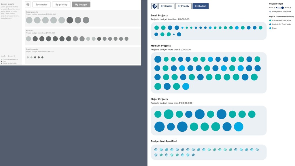
brief Interactive online visualisation of NSW government projects. Show alignment with the three priorities of the digital strategy. Arrange projects by ◦ Government cluster ◦ Priority ◦ Budget
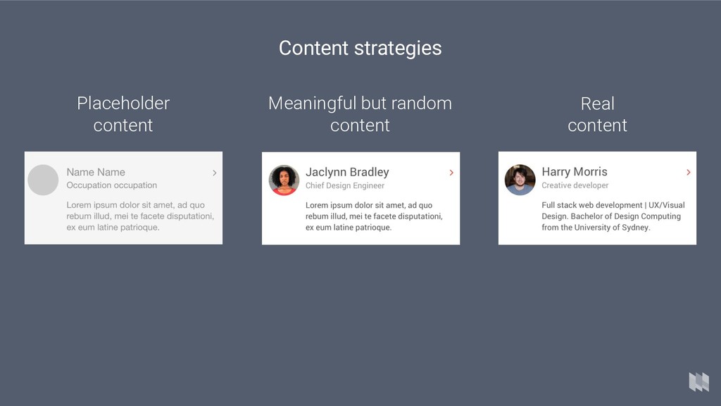
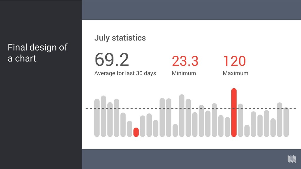
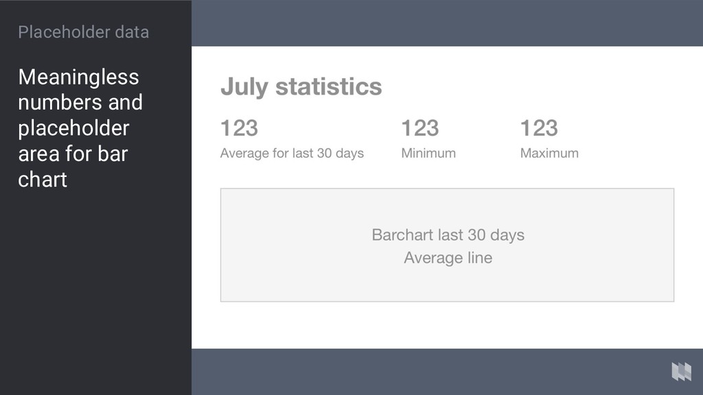
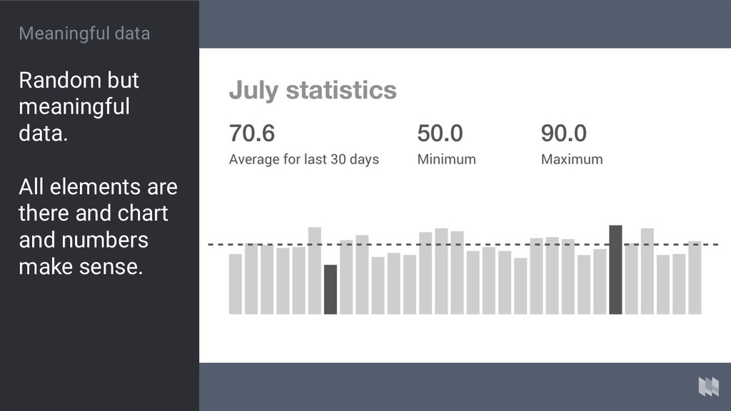
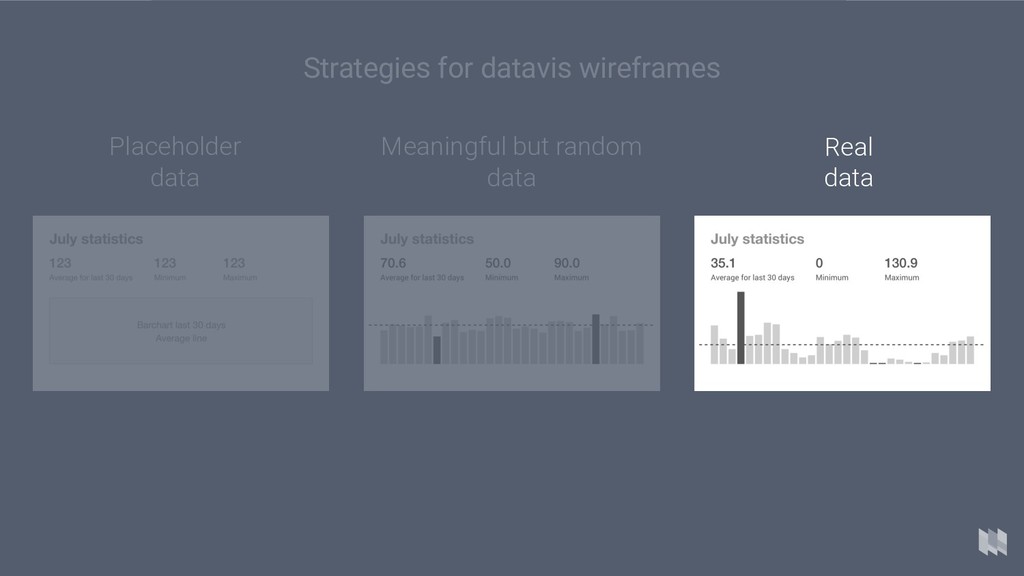
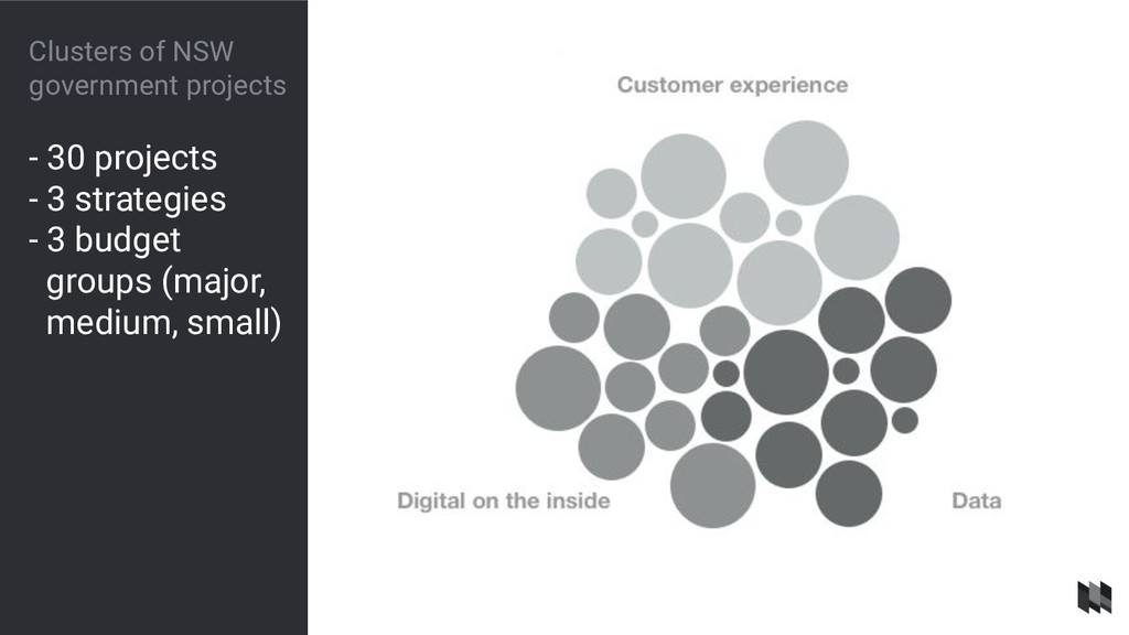
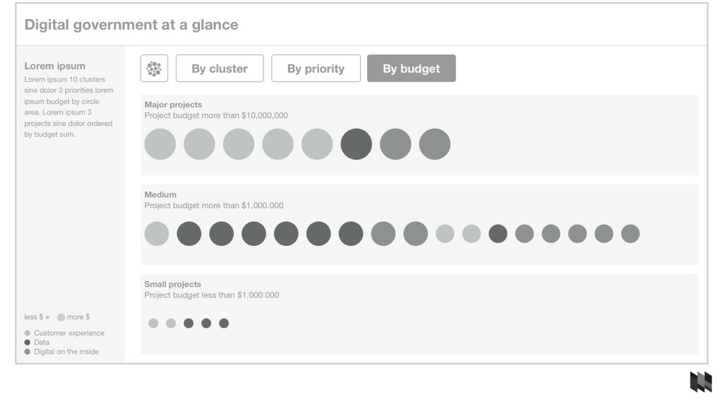
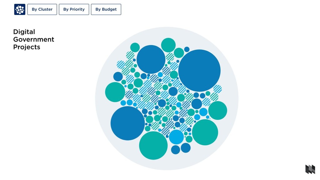
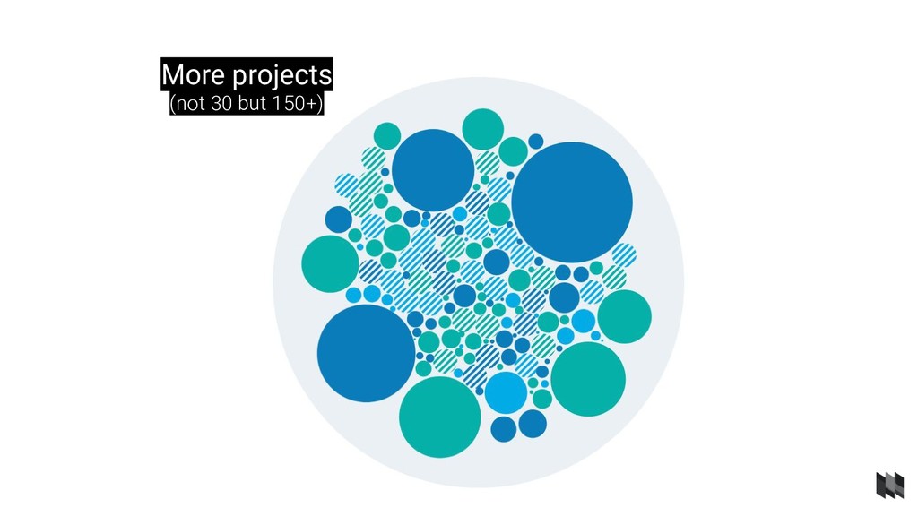
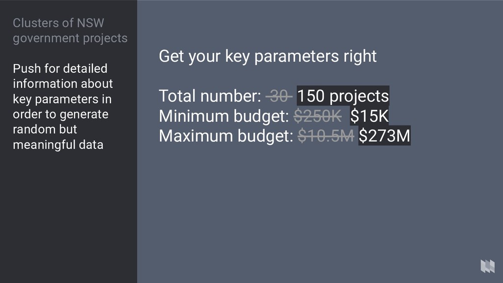
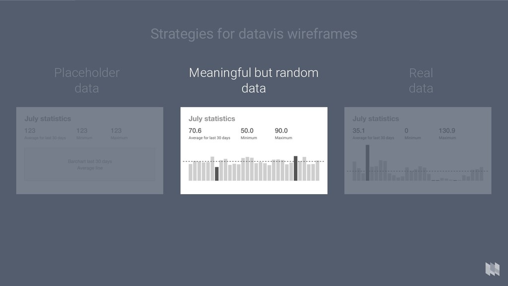
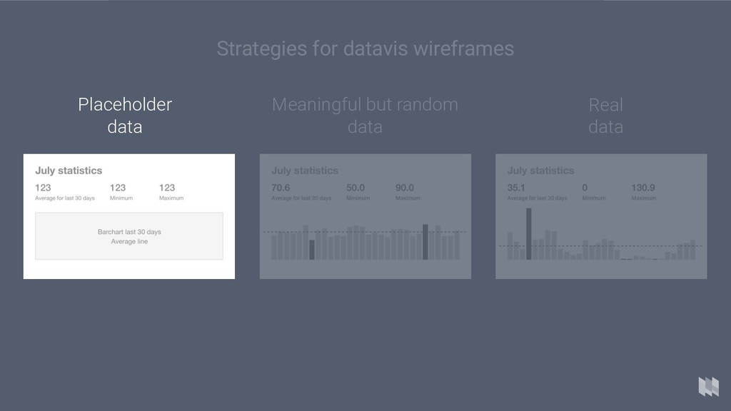
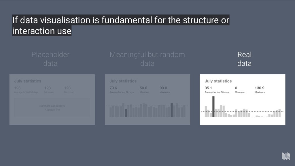
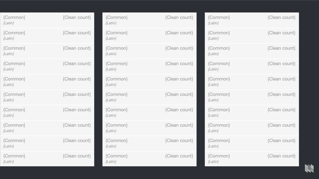
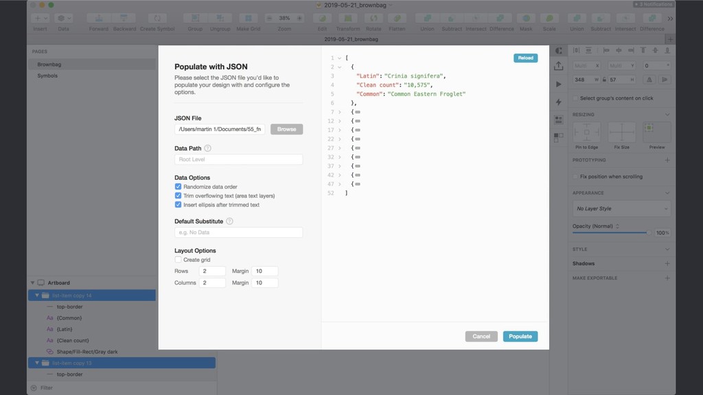
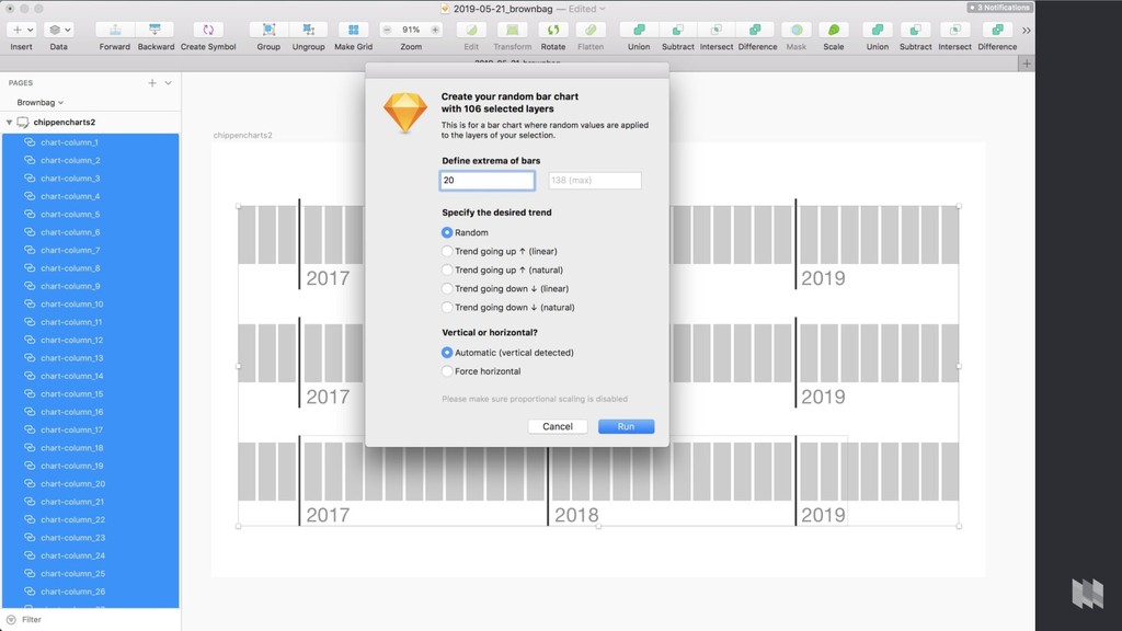
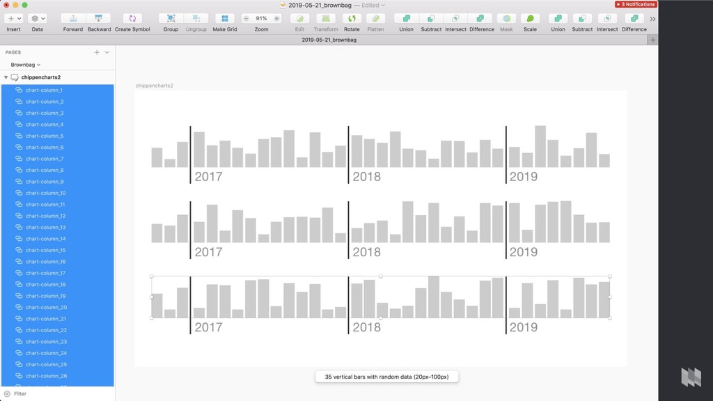
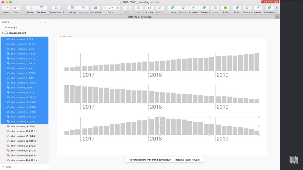
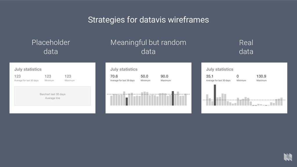
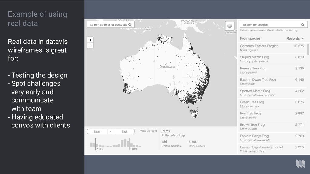
key parameters in order to generate random but meaningful data Get your key parameters right Total number: 30 150 projects Minimum budget: $250K $15K Maximum budget: $10.5M $273M
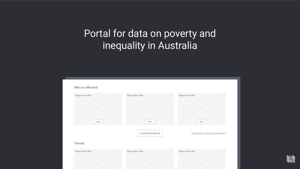
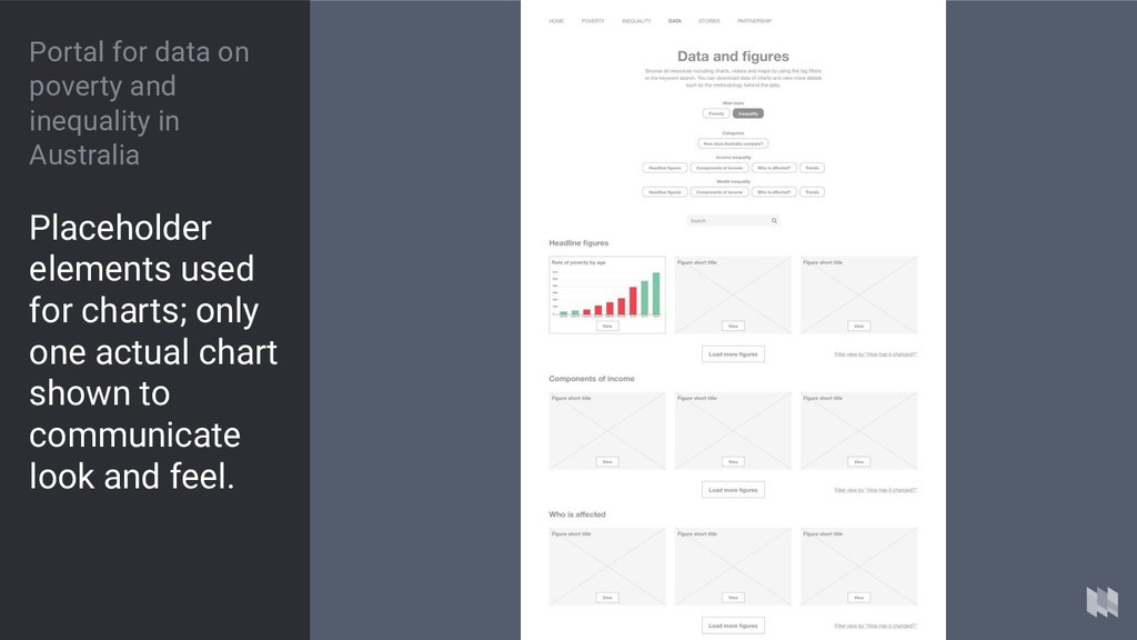
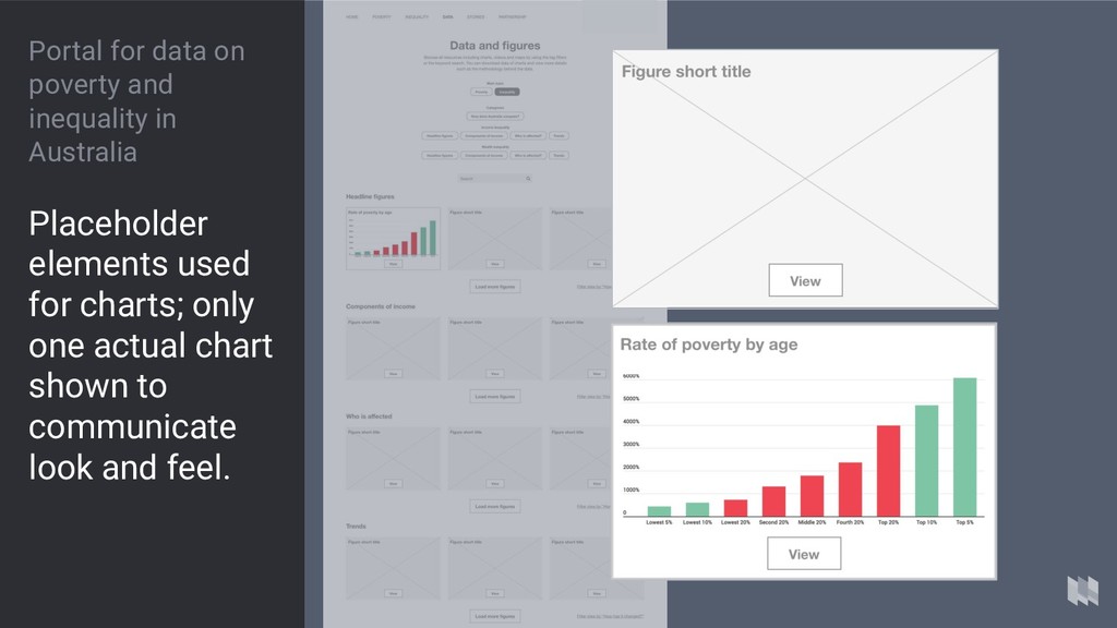
brief Create a website that showcases existing figures and charts about poverty and inequality in Australia. Include filters to let the user explore figures by theme.