Upgrade to Pro — share decks privately, control downloads, hide ads and more …

The Value of Logos - Andrew Bergeron - WordCamp OC 2015

The Value of Logos - Andrew Bergeron - WordCamp OC 2015

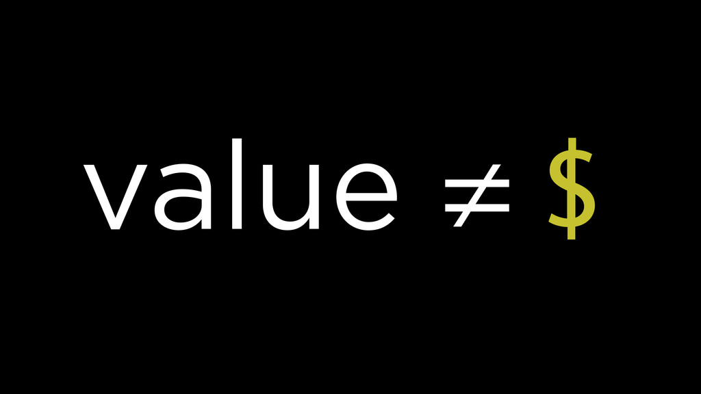
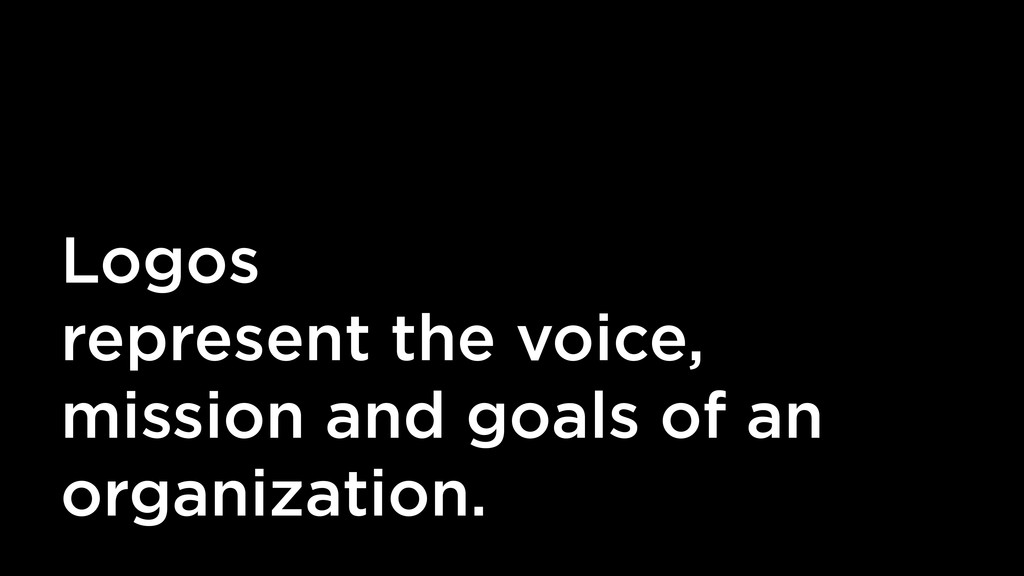
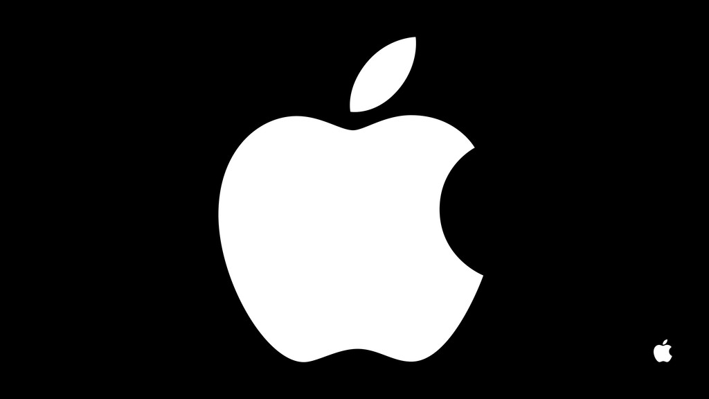
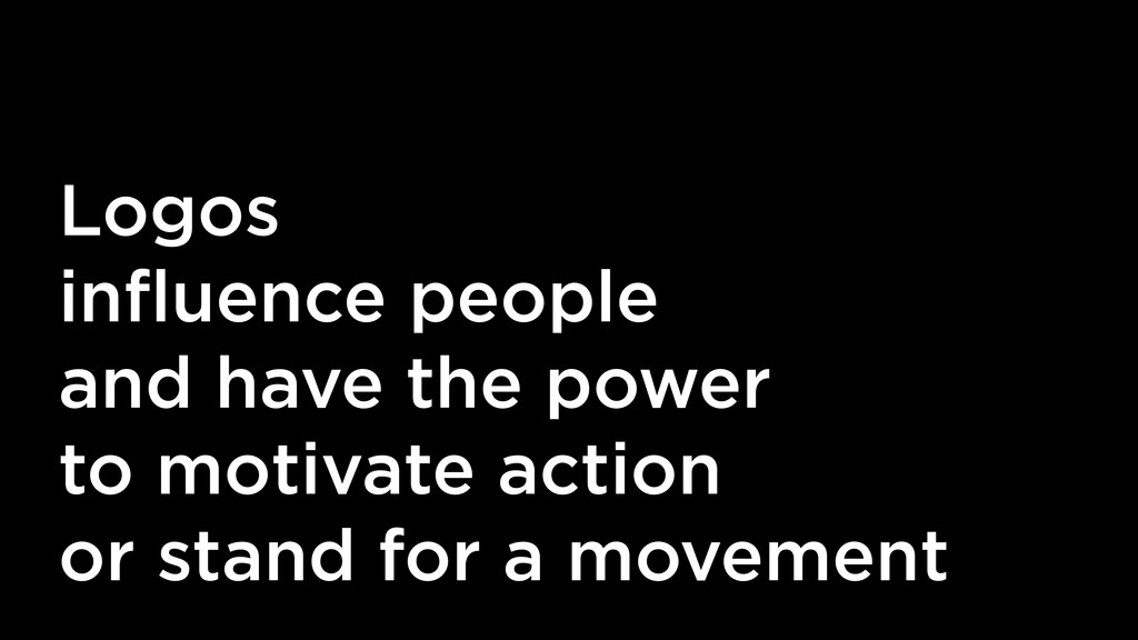
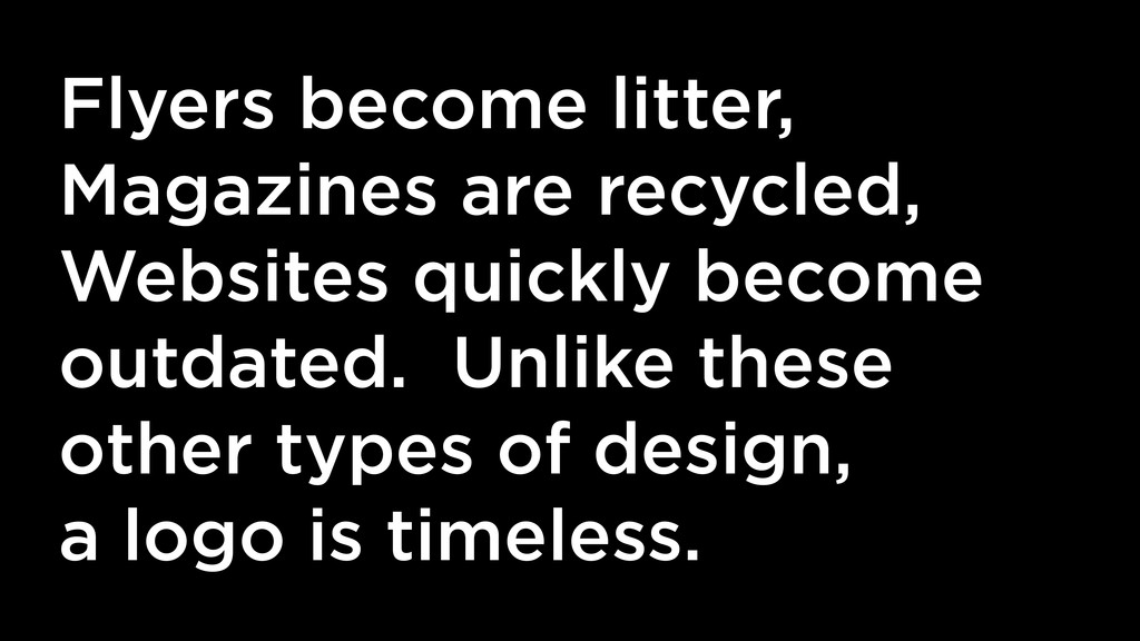
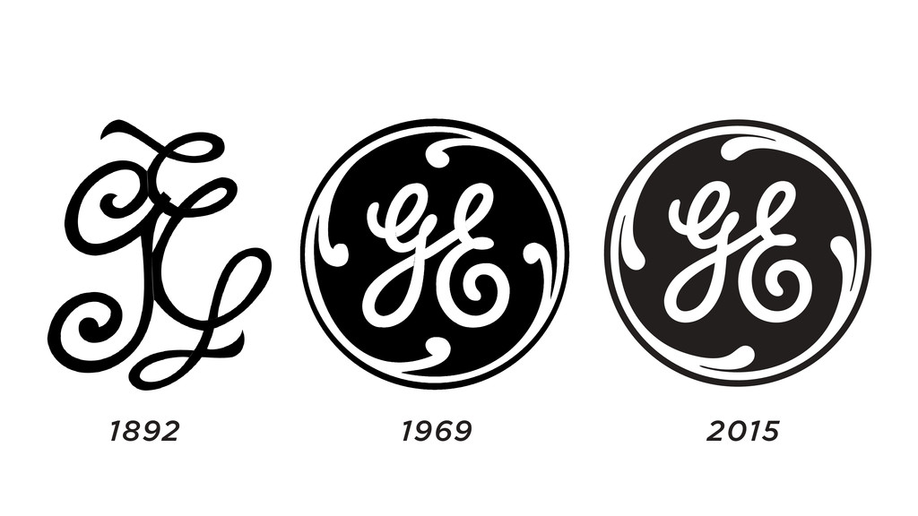
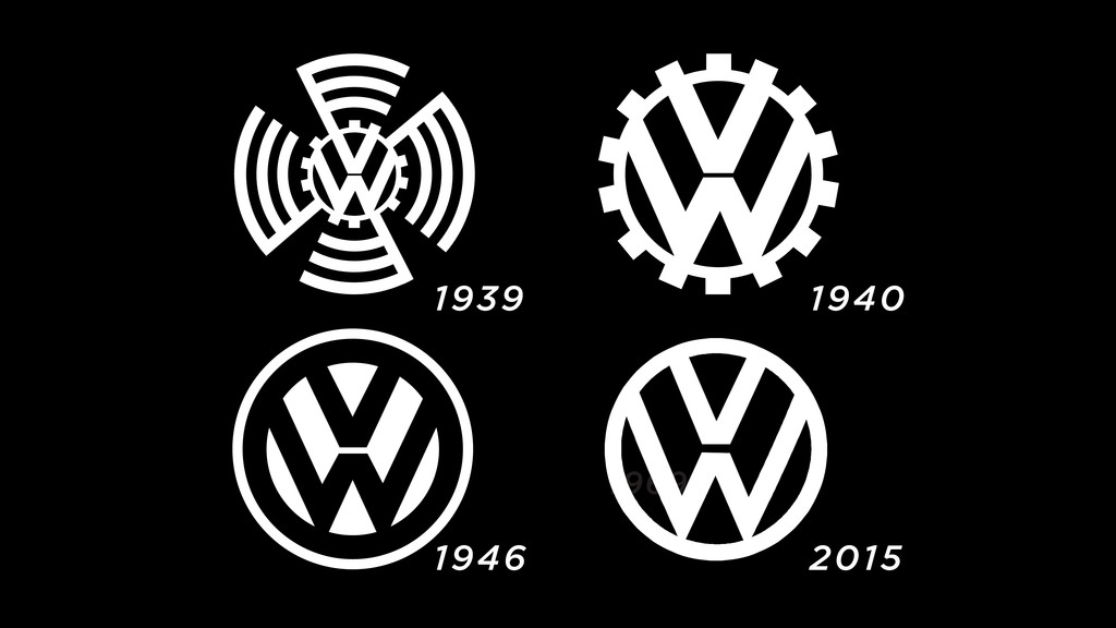
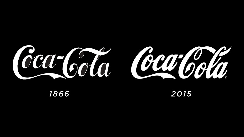
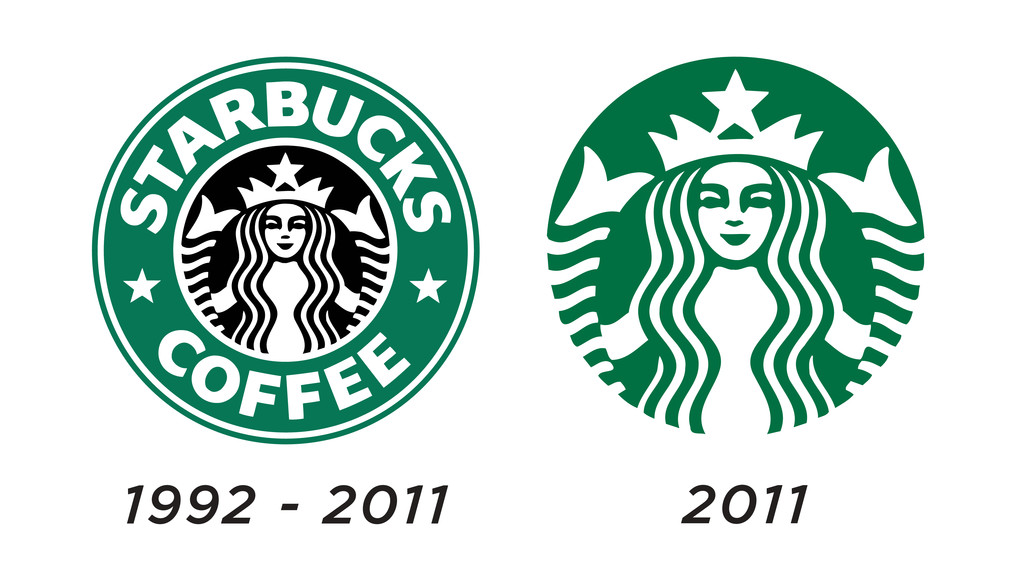
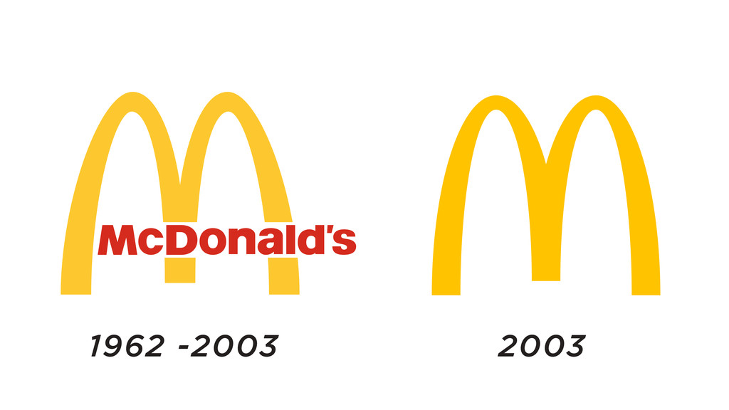
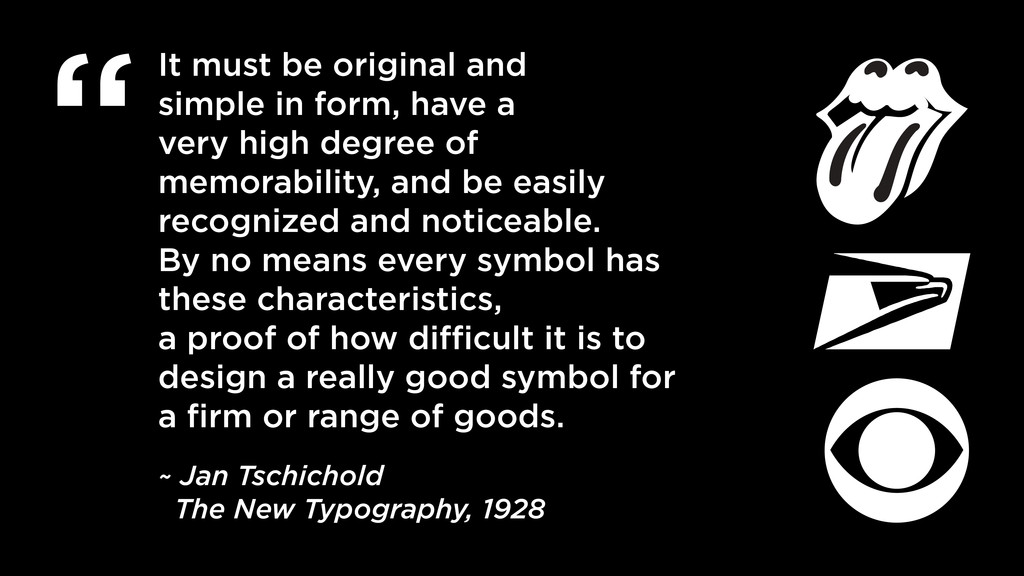
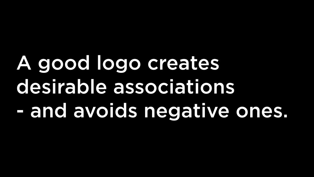
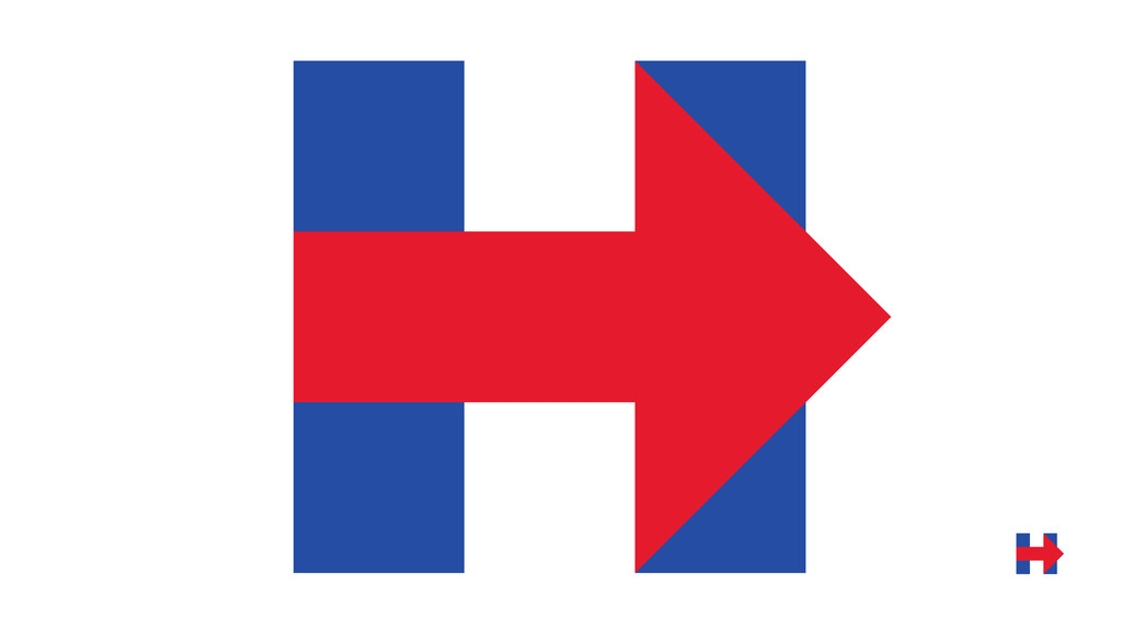
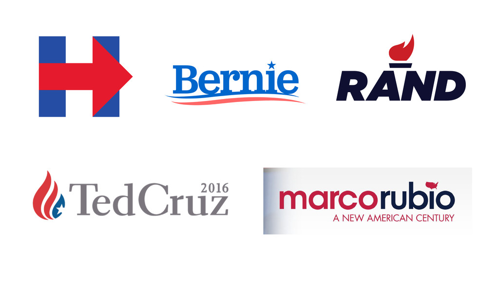
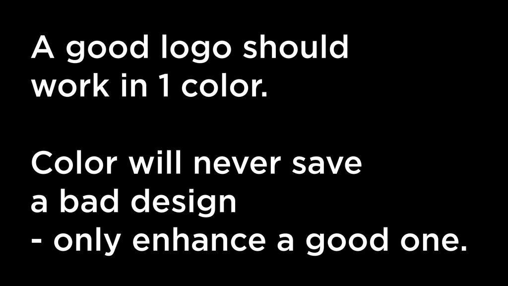
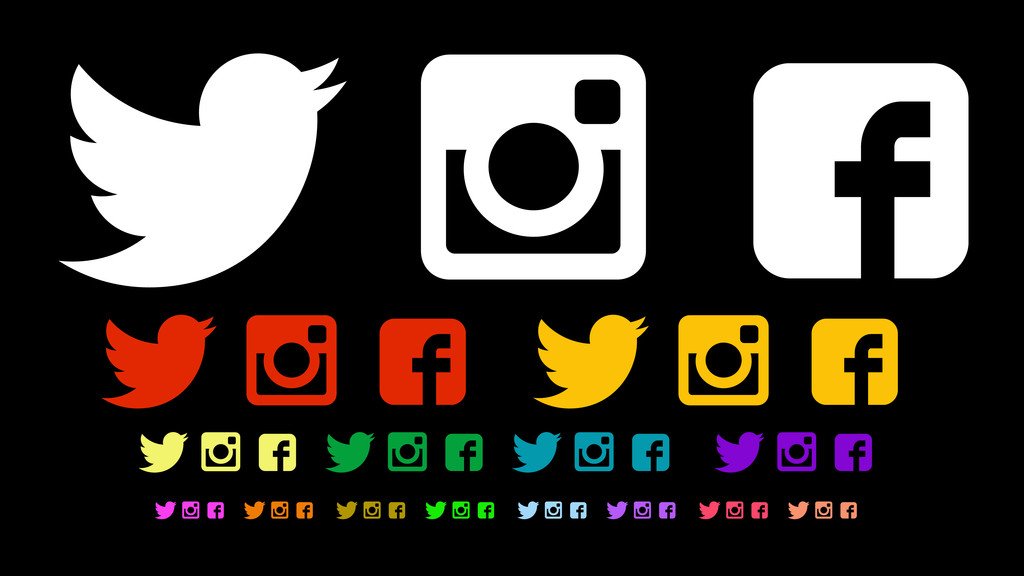
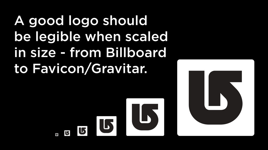
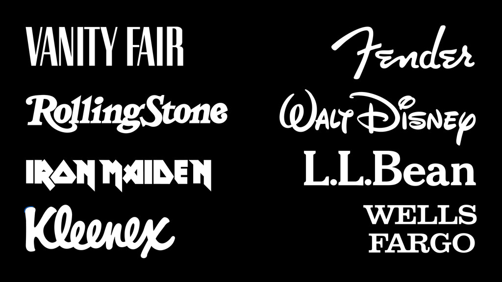
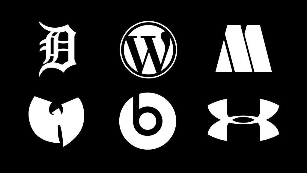
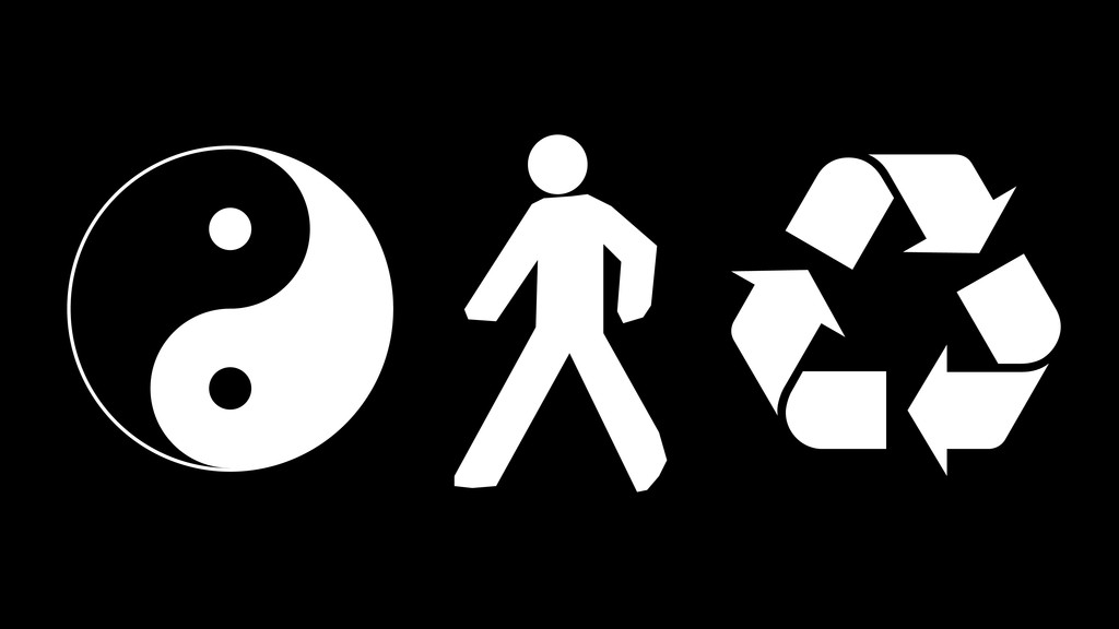
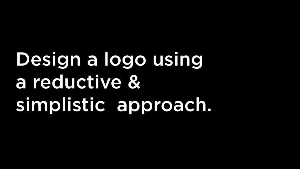
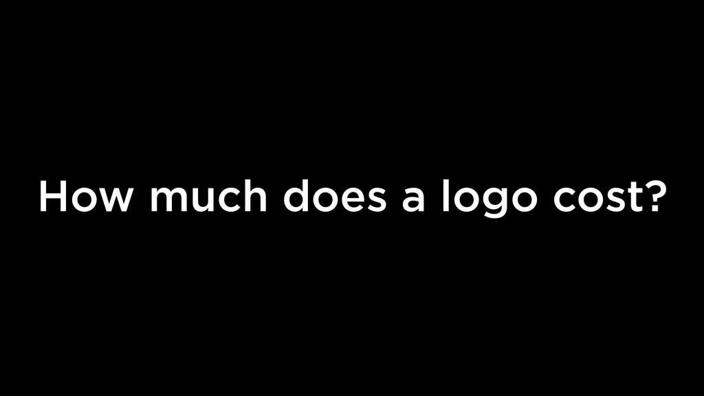
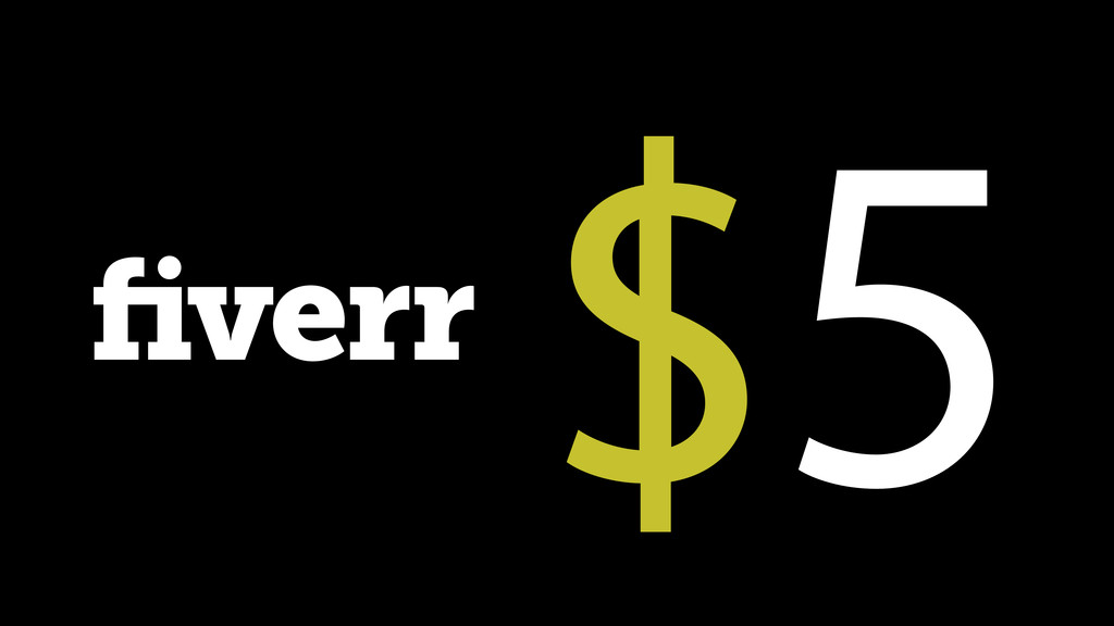
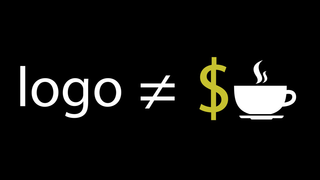
A logo should not cost the same as a cup of coffee (read: fiverr.com) – as WordPress designer/developer “unicorn” we often get stuck with a client who wants “just a simple logo”. The problem is logos are not simple, they are very important – and they are on every page of your website. This talk will offer guidelines on how to judge a good from a bad logo and offer some inspiration/steps for others to follow to build their own brilliant logos.

Visual Rhythm

June 06, 2015
Tweet

More Decks by Visual Rhythm

Other Decks in Design

Transcript

  1. elf

  2. He defines the Trinity as God, His Word (Logos) and

    His Wisdom (Sophia). Celtic Triquetra ~ Theophilus of Antioch, late 2ed Century
  3. …it was an attempt to make the logo very accessible

    to everyone, especially to young people so that Steve could get them into schools. ~ Rob Janoff 1977
  4. I selected a rabbit as the symbol for the magazine

    because of the humorous sexual connotation, and because he offered an image that was frisky and playful. I put him in a tuxedo to add the idea of sophistication. There was another editorial consideration, too. Since both 'The New Yorker' and 'Esquire' use men as their symbols, I felt the rabbit would be distinctive; and the notion of a rabbit dressed up in formal evening attire struck me as charming, amusing and right. ~ Hugh Hefner 1967
  5. I drew myself: the representative of an individual in despair,

    with hands palm outstretched outwards and downwards in the manner of Goya’s peasant before the firing squad. ~ Gerald Holtom 1958
  6. I drew myself: the representative of an individual in despair,

    with hands palm outstretched outwards and downwards in the manner of Goya’s peasant before the firing squad. ~ Gerald Holtom 1958
  7. I drew myself: the representative of an individual in despair,

    with hands palm outstretched outwards and downwards in the manner of Goya’s peasant before the firing squad. ~ Gerald Holtom 1958
  8. Because OBEY has no actual meaning, the various reactions and

    interpretations of those who view it reflect their personality and the nature of their sensibilities. ~ Shepard Fairey, 1990
  9. Flyers become litter, Magazines are recycled, Websites quickly become outdated.

    Unlike these other types of design, a logo is timeless.
  10. Global Appeal: After the connection between a company and a

    logo is understood, the name can be dropped and the symbol itself becomes it’s very own visual language.
  11. It must be original and simple in form, have a

    very high degree of memorability, and be easily recognized and noticeable. By no means every symbol has these characteristics, a proof of how difficult it is to design a really good symbol for a firm or range of goods. ~ Jan Tschichold The New Typography, 1928
  12. A good logo should work in 1 color. Color will

    never save a bad design - only enhance a good one.
  13. A good logo should be legible when scaled in size

    - from Billboard to Favicon/Gravitar.
  14. What if logo XYZ was only type? Who is XYZ’s

    mascot? What letters should be used if XYZ’s logo were a monogram?
  15. Write the story, take out all the good lines, and

    see if it still works. ~ Ernest Hemingway
  16. $5

  17. v NormanCar Family owned, built with love in the USA

    Named after my Black Lab, Norman (who loved to ride in cars) Less sporty version of a Tesla — more traditional than a Prius Target household income: $200K+ Insipired by Apple, GE and Audi logos Unique, inovative, modern, classic, memborable, “traditional with a twist” Color: Black and White (used on 100’s of car colors) - we like the colors orange, blue and brown Electric Cars for the People
  18. #2 (3 Days later) Hey Friend, I’m really sorry! I

    haven’t good ideas for this. I can refund you. ~ Fiver Designer #2
  19. I don’t love it, but I think it will grow

    on me. ~ Phil Knight, 1971
  20. Creating a mark for Tiffany was an interesting challenge: to

    design a monogram that could be small enough for the winder of a man’s watch, or large enough for a construction shed. ~ Louis Fili 2005
  21. v A logo should drive the entire look & feel

    of the website design (fonts, colors, icons, branding, photo selection etc…).
  22. v A good logo is perhaps one of the best

    design investments a company will ever make in terms of its retaining its value over time.