Upgrade to Pro — share decks privately, control downloads, hide ads and more …

Branding and Cartography

Vanessa KW
October 19, 2018

Branding and Cartography

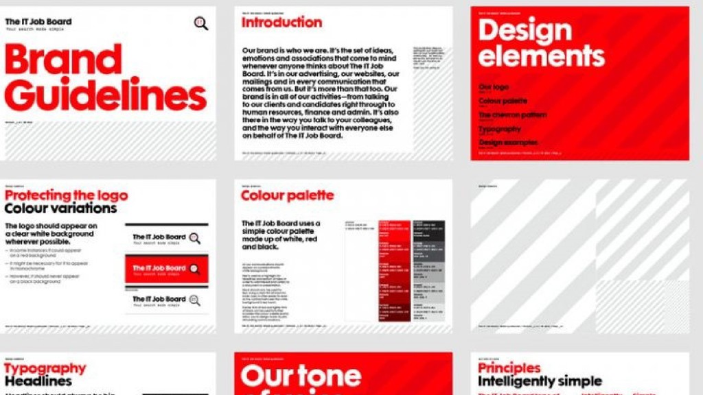
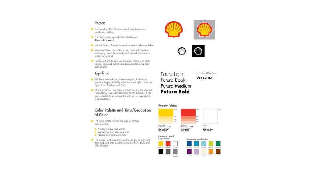
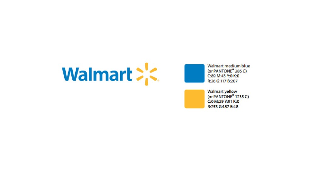
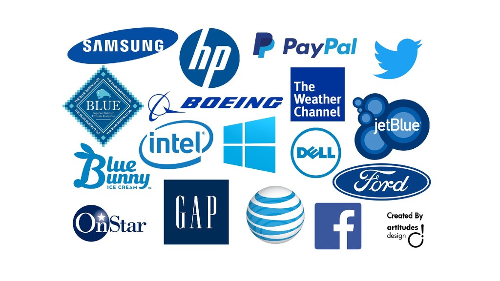
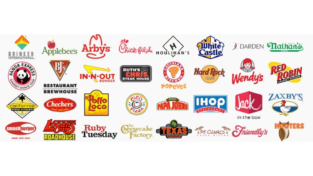
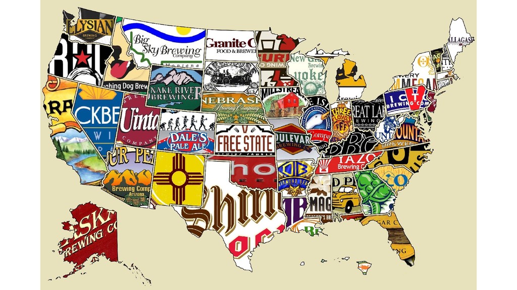
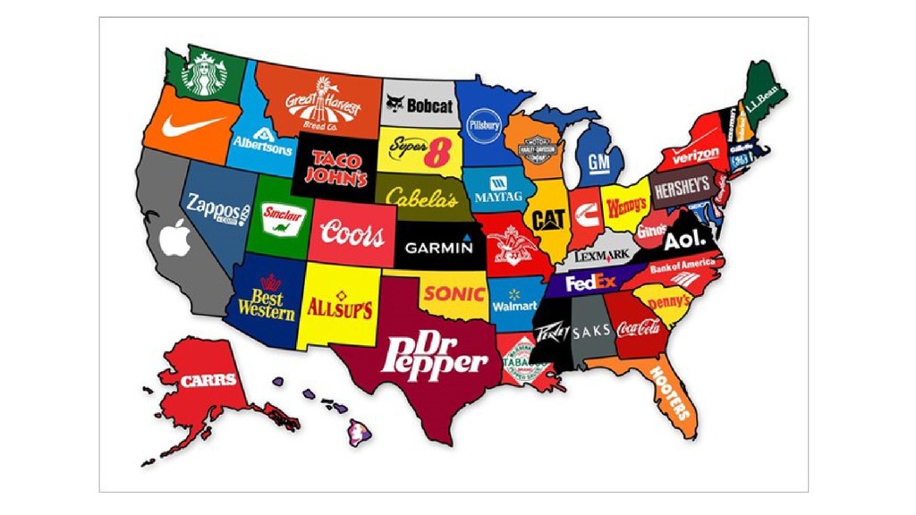
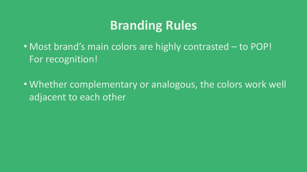
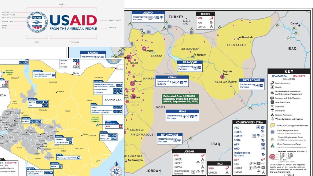
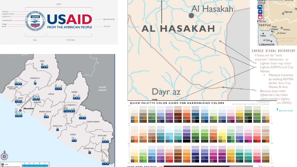
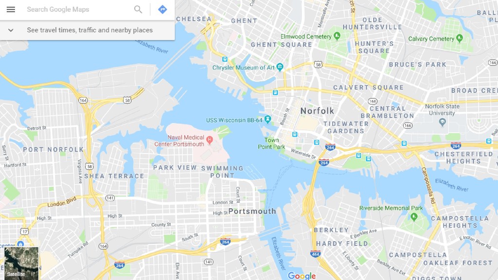
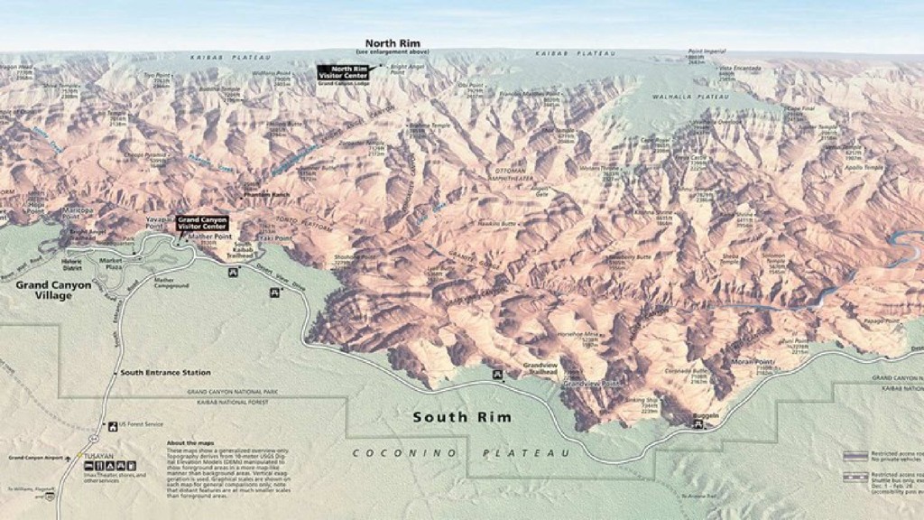
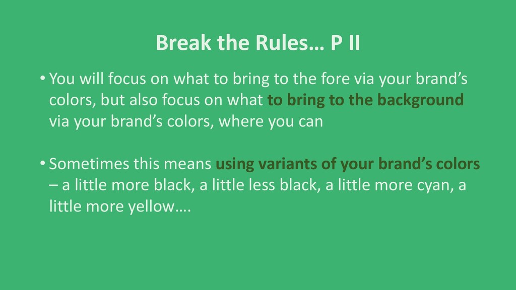
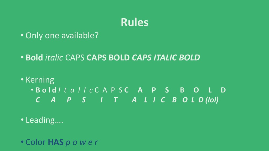
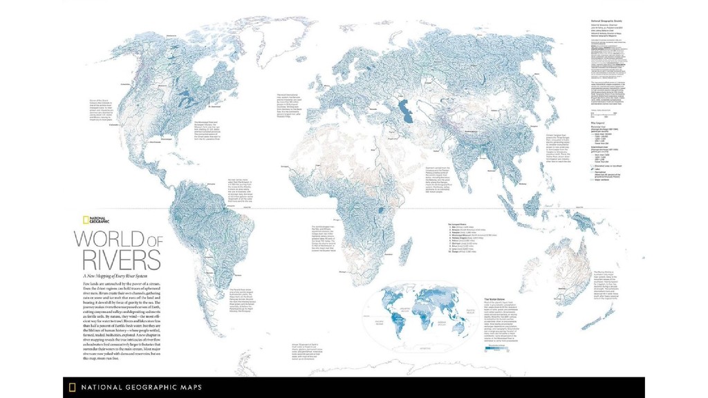
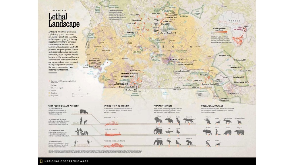
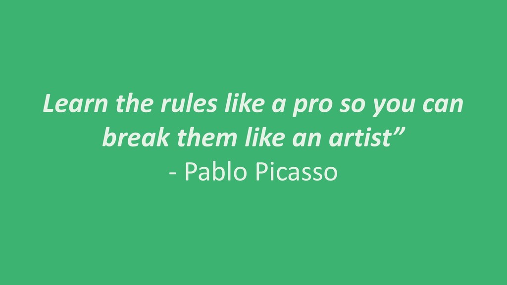
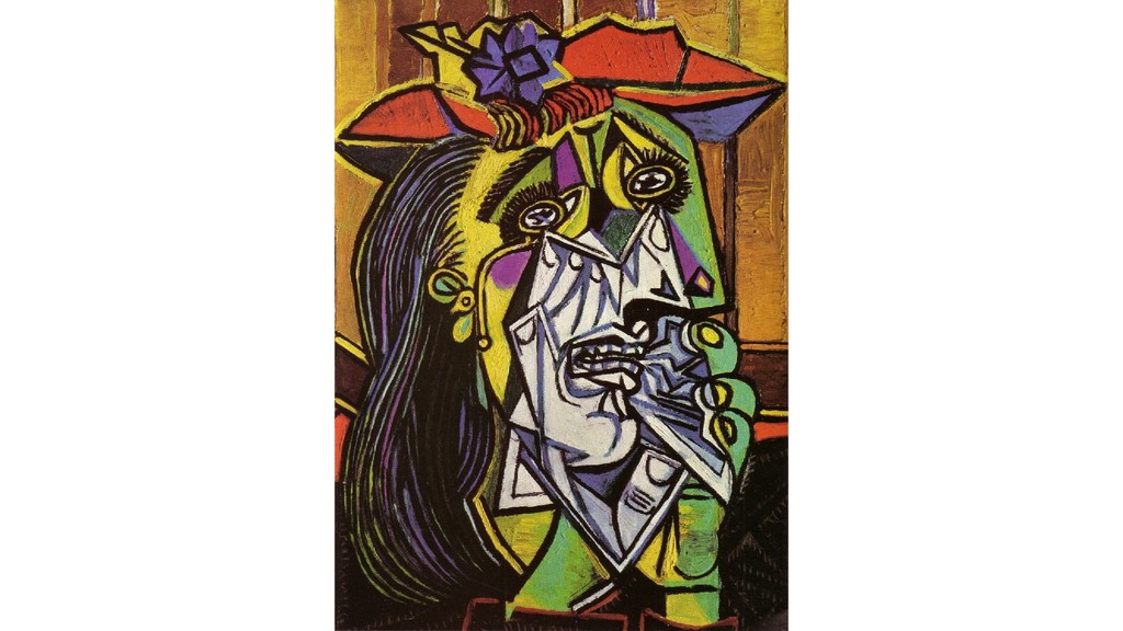
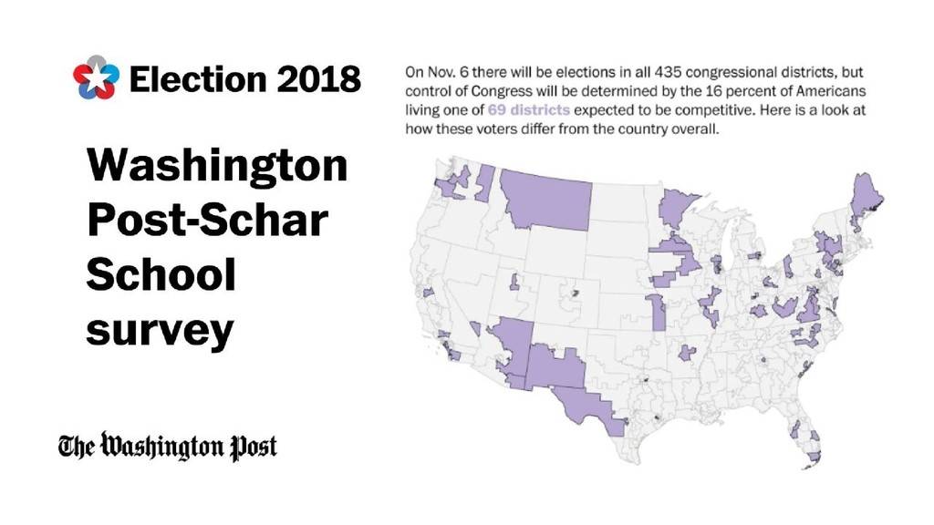
Branding is a strategic and valuable part of marketing for any organization - and visually branding graphics with a specific, set range of color choices and typefaces is an important part of any branding strategy. However, these defined colors are often not ideal for most map visualizations.The past three years, I’ve spent a lot of time defining and implementing what I think is ideal for the branding of map aesthetics for two organizations, and as such, I will share what I have learned and spread the word about BREAKING THE RULES when it comes to maps.

Vanessa KW

October 19, 2018
Tweet

More Decks by Vanessa KW

Other Decks in Design

Transcript

  1. OVERVIEW •Why? •Brand color schemes and graphics •vs branding for

    maps •Familiarization •“Base” map •Brand within your brand
  2. Branding Rules • Most brand’s main colors are highly contrasted

    – to POP! For recognition! • Whether complementary or analogous, the colors work well adjacent to each other
  3. Why? • Make underlying data LEGIBLE + • Allow for

    the possibility of more data layers + = a “well designed” map
  4. Your Brand’s Colors? • Use them to bring important features

    to can the fore: • In points, lines, and polygons • Via poly-transparencies • Via patterns • ……
  5. Your Brand’s Colors? • Use them where you can but

    also…. break the rules when you have to
  6. Break the Rules… P II • You will focus on

    what to bring to the fore via your brand’s colors, but also focus on what to bring to the background via your brand’s colors, where you can • Sometimes this means using variants of your brand’s colors – a little more black, a little less black, a little more cyan, a little more yellow….
  7. Break the Rules… P II • Also use colors that

    are complementary and analogous to your brand’s colors • (or… your brand’s variations in color, that you found testing/playing around with your perceptual cognition)
  8. Break the Rules… P II • Keep track of these

    “variant” colors! • Write them down, put them in an excel style sheet, use your eyedropper tool constantly… but remember them.
  9. Break the Rules… P III (?) • Congrats you’ve just

    broken all the rules but you’ve also added to your rules, so your broken rules are…. new rules??!?!
  10. Rules • Only one available? • Bold italic CAPS CAPS

    BOLD CAPS ITALIC BOLD • Kerning • B o l d I t a l I c C A P S C A P S B O L D C A P S I T A L I C B O L D (lol) • Leading…. • Color HAS p o w e r
  11. Break the Rules… P III (?) • Congrats you’ve just

    broken all the rules but you’ve also added to your rules, so your broken rules are…. new rules??!?!
  12. Stylistic Elements • Combining enough elements of your brand with

    color + typeface + a few other elements = a general consistency across the brand • (+ the way you use terrain? + the way you dash lines? + the linewidth color you choose? + the dropshadows you utilize?.... Possibilities are endless!)
  13. Learn the rules like a pro so you can break

    them like an artist” - Pablo Picasso