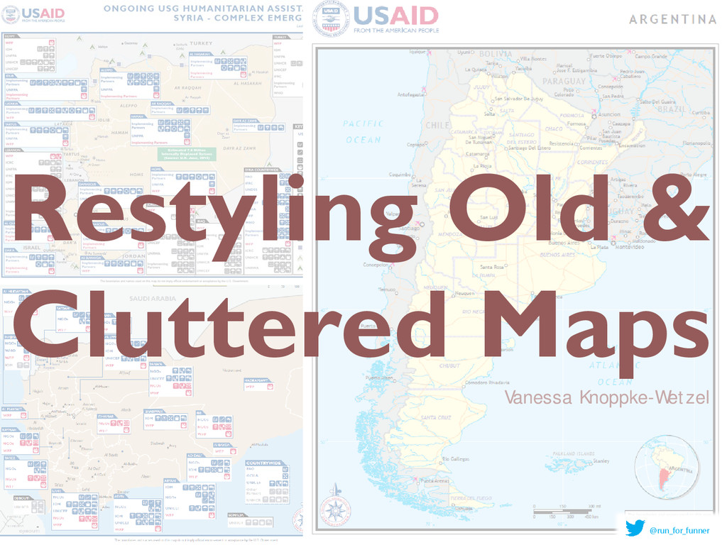
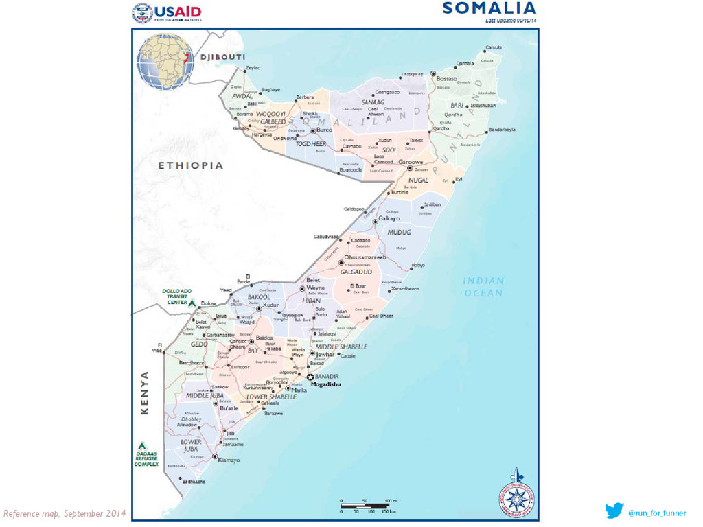
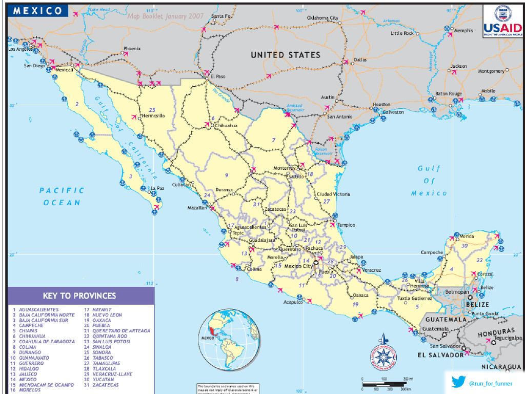
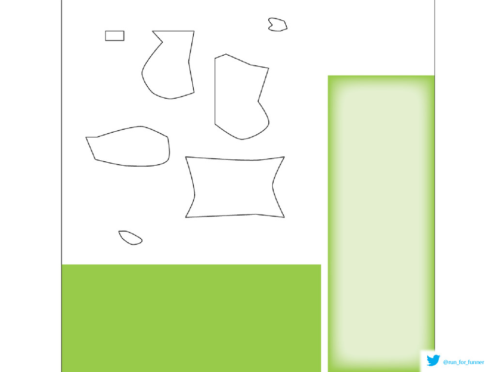
1. Changes explained 2. Map Booklet Restyling 1. Old vs New 2. Small change makes BIG change 3. How to do it 1. Plus tips and tricks Intro: Why bother changing map styles? Questions? @run_for_funner
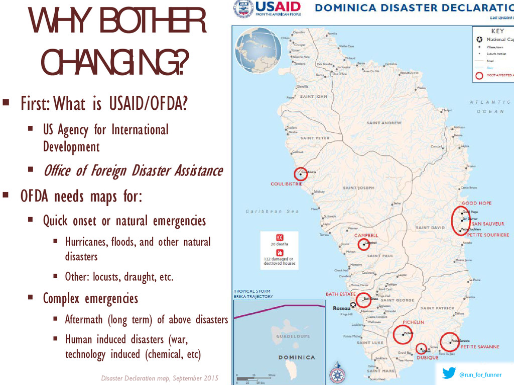
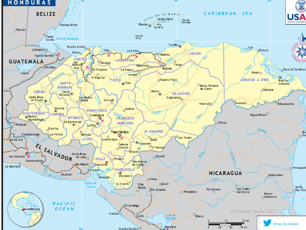
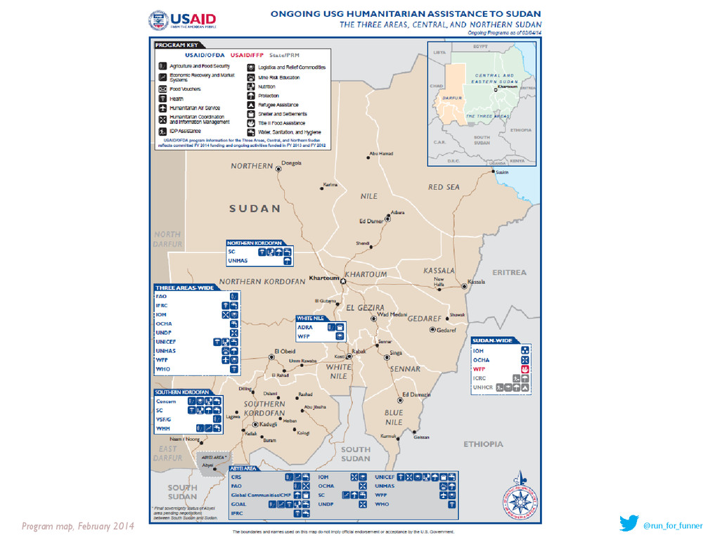
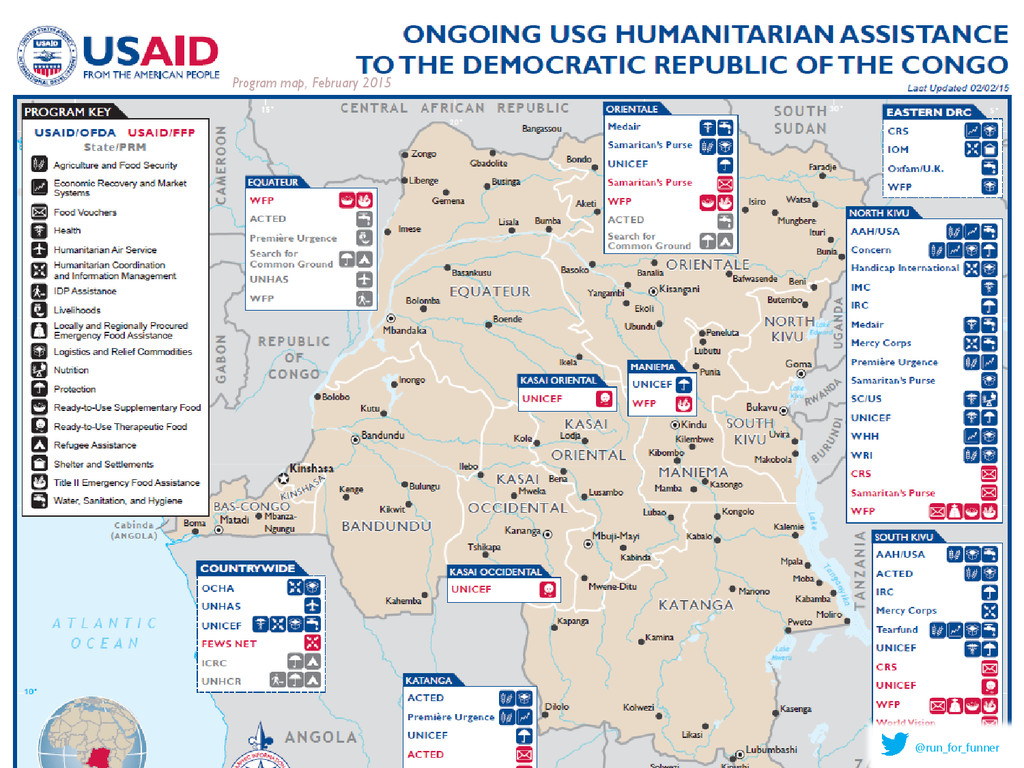
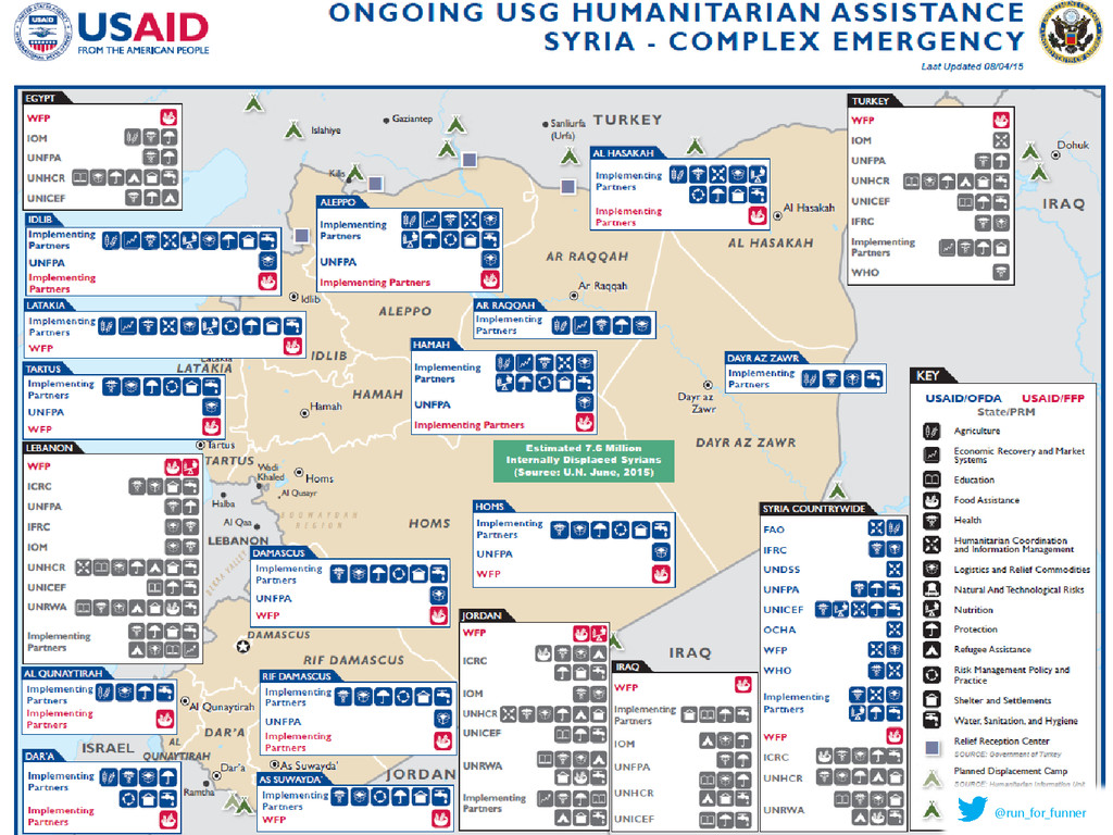
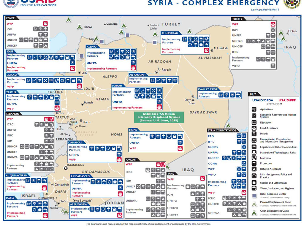
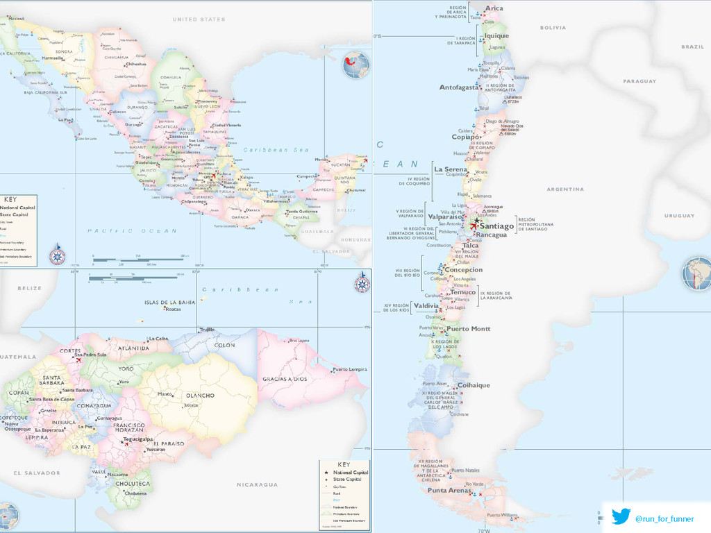
where USG humanitarian aid is going (to what programs and organizations in the affected area) 99% of the time: need FAST maps Reason why specs exist BUT: same reason why specs have not changed often – work focuses on pushing out as many maps as possible, as quickly as possible. (all GOOD REASONS of course, for why specs don’t change often) Program map, May 2013 @run_for_funner
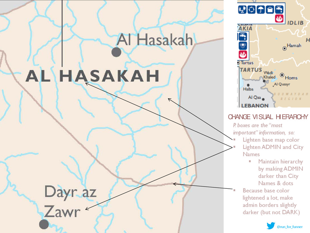
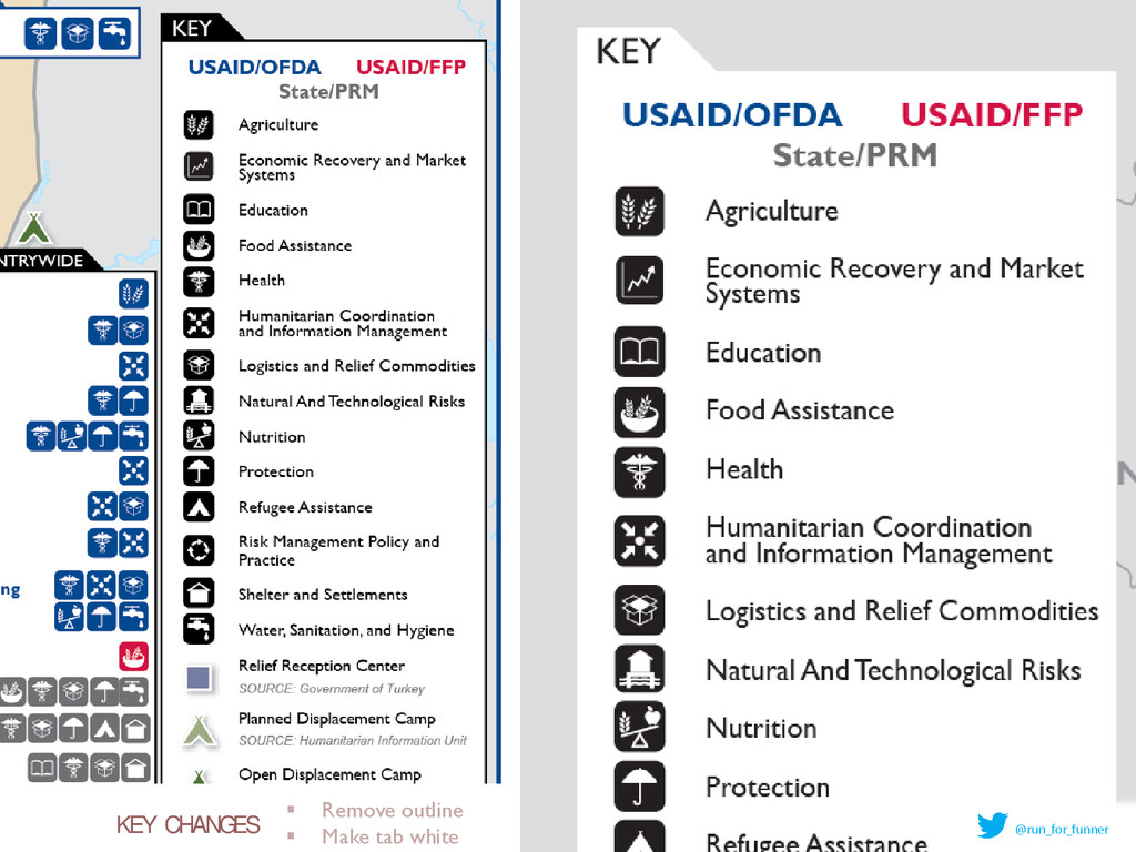
U A L H I E R A R C H Y P. boxes are the “most important” information, so: Lighten base map color Lighten ADMIN and City Names Maintain hierarchy by making ADMIN darker than City Names & dots Because base color lightened a lot, make admin borders slightly darker (but not DARK)
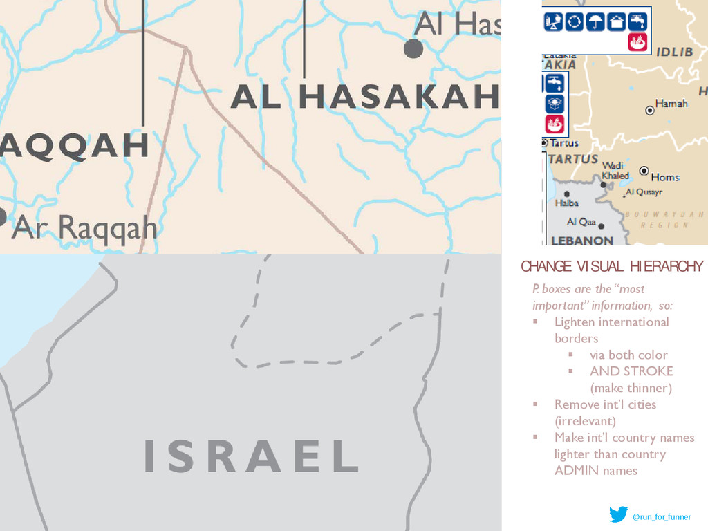
U A L H I E R A R C H Y P. boxes are the “most important” information, so: Lighten international borders via both color AND STROKE (make thinner) Remove int’l cities (irrelevant) Make int’l country names lighter than country ADMIN names
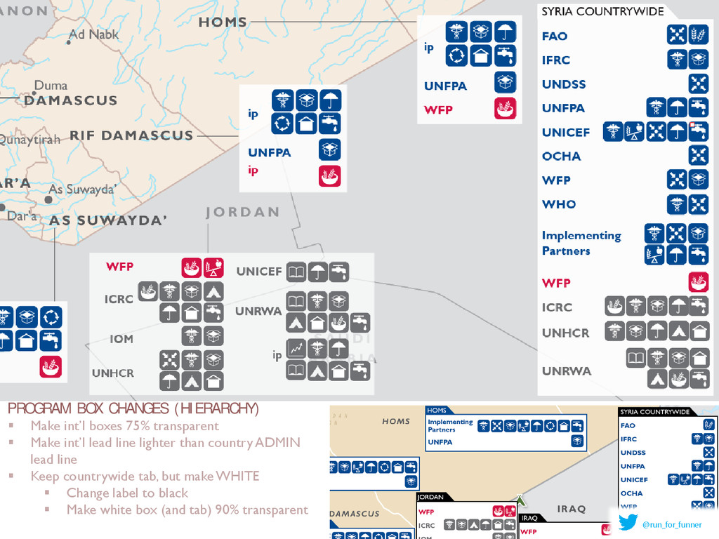
X C H A N G E S ( H I E R A R C H Y ) Make int’l boxes 75% transparent Make int’l lead line lighter than country ADMIN lead line Keep countrywide tab, but make WHITE Change label to black Make white box (and tab) 90% transparent
![WHY BOTHER CHANGING? [maps needed for…] Summaries of](https://files.speakerdeck.com/presentations/a7c234f515da4974b6e99d13953d38a9/slide_3.jpg)