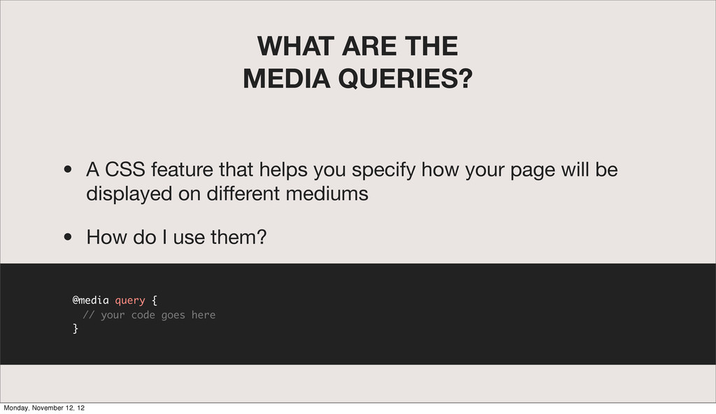
helps you specify how your page will be displayed on different mediums • How do I use them? @media query { // your code goes here } Monday, November 12, 12
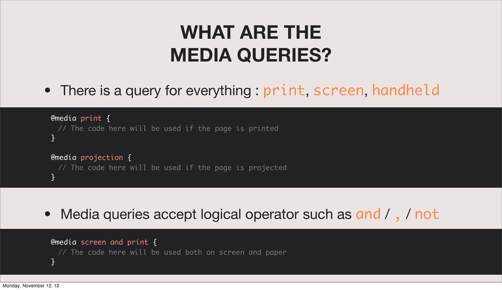
for everything : print, screen, handheld @media print { // The code here will be used if the page is printed } @media projection { // The code here will be used if the page is projected } • Media queries accept logical operator such as and / , / not @media screen and print { // The code here will be used both on screen and paper } Monday, November 12, 12
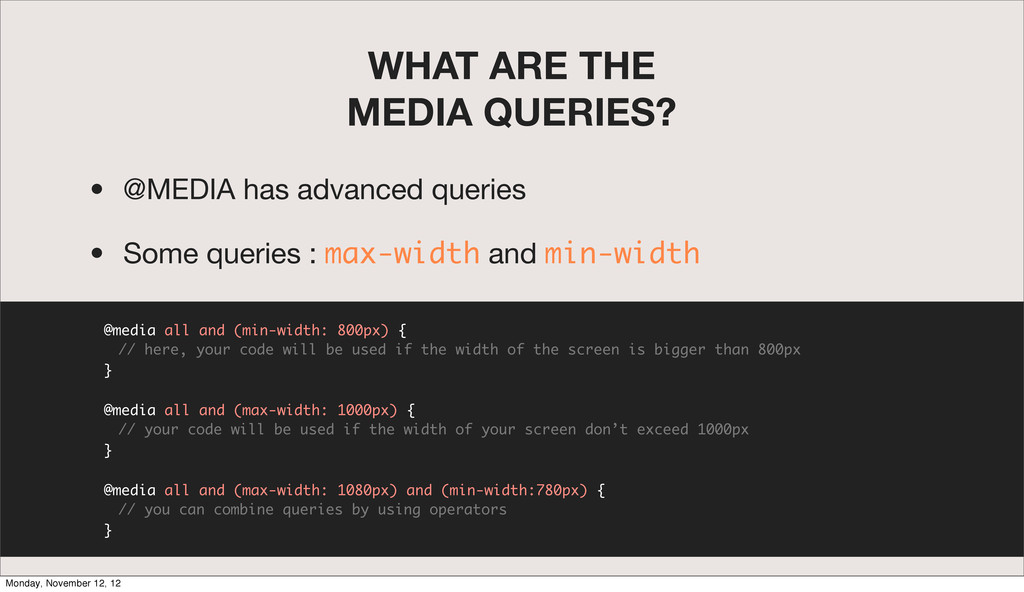
• Some queries : max-width and min-width @media all and (min-width: 800px) { // here, your code will be used if the width of the screen is bigger than 800px } @media all and (max-width: 1000px) { // your code will be used if the width of your screen don’t exceed 1000px } @media all and (max-width: 1080px) and (min-width:780px) { // you can combine queries by using operators } Monday, November 12, 12
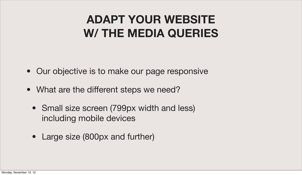
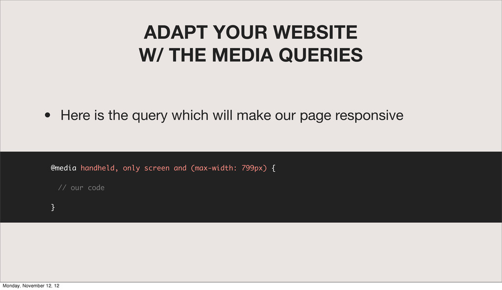
is to make our page responsive • What are the different steps we need? • Small size screen (799px width and less) including mobile devices • Large size (800px and further) Monday, November 12, 12
queries only adapt your page to the different devices • You have to use some techniques with those queries such as relative sizes to be fully responsive Monday, November 12, 12
 vmnrd
vmnrd
 simotin13
 masuda220
 naokihaba
 terryu16
 nrslib
 makicamel
 yukukotani
 hyshu
hyshu
 o0h
o0h
 yusukebe
 kajitack
 ioki
ioki
 jacobian
 rocio
rocio
 takai
takai
 stuffmc
 axbom
axbom
 orderedlist
 ks91
ks91
 sferik
 wayneb77
 kimpetersen
 aleyda
 shlominoach