Upgrade to Pro — share decks privately, control downloads, hide ads and more …

Preliminary Task

vren
November 18, 2015

Preliminary Task

...

vren

November 18, 2015
Tweet

More Decks by vren

Other Decks in Education

Transcript

  1. Puffs also increase sales of a magazine as these display

    exciting topics in school. Furthermore, this maintains the audience’s interest to read the magazine further. An example is the word ‘new’ something which the students might not have seen or heard thus they would buy the magazine in order to find out Anchorage uses jargon which applies to school as Head boy means someone, particularly a guy, who acts as a disciplinarian or a helper to his peers. This method will attract readers as the use of a community language will make the reader feel a sense of belonging. Central image portrays the subject of the magazine through the use of a picture. He is presented in appropriate school clothes that shows neatness and is a good example of how most students are expected to have an image of. It fits with the magazine’s genre – school Sometimes, freebie is necessary on a magazine because it has a big impact on people. It appeals to audiences as people generally love free stuff. This helps the magazine to sell out more. The masthead (title) is used to inform what the content of the magazine will be thus the masthead is the name of the school, Chosenhill. Colour scheme uses basic or primary colours which shows an academic vibe of the magazine. This is relevant as it displays formality which may suggest the school’s status. Conventions of a school magazine
  2. Colour scheme used is a combination of blue and red

    which is similar to flames’ hues. This connotes danger as abusing technology will likely result to distractedness, blurred vision or even fire. Central image – presenting cords of different technologies such as computers, smartphones and other gives information about the content of the magazine, school Layout – all the texts are set aside and gives the audience a clear view of the central image which is also an important aspect of a magazine as it depicts the subject of the magazine through an image Sell line uses vocabulary such as disruption to attract the audience because it makes them curious about this particular word, thus the target audience may have to take a magazine and read its content in order to find out Masthead’s font shows formality as its style is not comic nor has graffiti-like font. This is fitting to the magazine’s genre – school as it shows a studious image of the school.
  3. The issue number and date line should be included in

    a magazine as it tells the audience that the information given is up to date The use of few fonts makes the front cover easier to read as it gives the reader a sense of direction on where to start reading. The editor made a good choice of fonts such as semi- cursive to emphasize words that may catch the reader’s attention. Although the main image is not located at the centre of the magazine, it still looked professional by how the editor laid out texts. Blurring the background makes her to stand out which also helped in having a well-organized layout. Strap / Sell line aids people in their decision to buy the magazine or not. It acts as a summary in which the editors think is the most enticing aspect of the magazine. They used the mayor as an evidence because people believe he sees all the events in an area Puffs tackle aspects relevant to school such as GCSE results. Moreover, the use of hyperbole (‘best’) intrigues readers about how impressive the school is. This persuades the reader to purchase the magazine Colour scheme used is a bit colourful. This is not only eye-catching to the readers but also to not bore them while reading texts on the front cover. This increases the chances of people to take the magazine
  4. Including the date line is essential as it indicates the

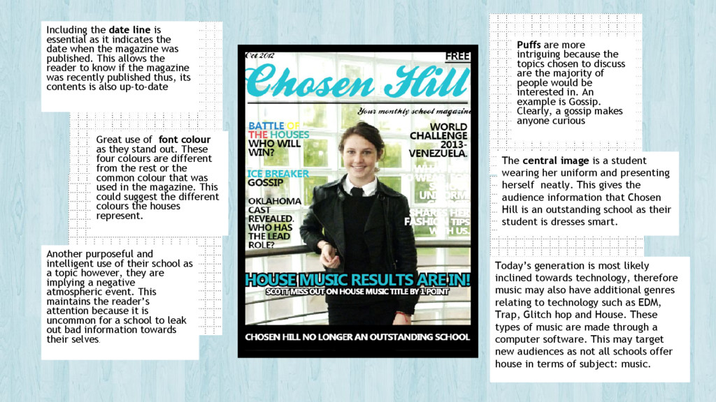
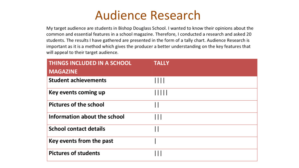
    date when the magazine was published. This allows the reader to know if the magazine was recently published thus, its contents is also up-to-date Puffs are more intriguing because the topics chosen to discuss are the majority of people would be interested in. An example is Gossip. Clearly, a gossip makes anyone curious Great use of font colour as they stand out. These four colours are different from the rest or the common colour that was used in the magazine. This could suggest the different colours the houses represent. Another purposeful and intelligent use of their school as a topic however, they are implying a negative atmospheric event. This maintains the reader’s attention because it is uncommon for a school to leak out bad information towards their selves. The central image is a student wearing her uniform and presenting herself neatly. This gives the audience information that Chosen Hill is an outstanding school as their student is dresses smart. Today’s generation is most likely inclined towards technology, therefore music may also have additional genres relating to technology such as EDM, Trap, Glitch hop and House. These types of music are made through a computer software. This may target new audiences as not all schools offer house in terms of subject: music.
  5. Audience Research THINGS INCLUDED IN A SCHOOL MAGAZINE TALLY Student

    achievements |||| Key events coming up ||||| Pictures of the school || Information about the school ||| School contact details || Key events from the past | Pictures of students ||| My target audience are students in Bishop Douglass School. I wanted to know their opinions about the common and essential features in a school magazine. Therefore, I conducted a research and asked 20 students. The results I have gathered are presented in the form of a tally chart. Audience Research is important as it is a method which gives the producer a better understanding on the key features that will appeal to their target audience.
  6. Preliminary exercise ❖ Produce a front page and contents page

    of a school magazine. Front covers must include a photograph of a student in a medium close-up with appropriately laid out text and use of an image manipulation programme (Photoshop). ❖ Below start to sketch what the front cover of your newsletter will look like.
  7. Preliminary exercise ❖ Produce a front page and contents page

    of a school magazine. Front covers must include a photograph of a student in a medium close-up with appropriately laid out text and use of an image manipulation programme (Photoshop). ❖ Below start to sketch what the contents page of your newsletter will look like.
  8. Here are some photos which I took. The first and

    third image were used for contents page. These two images were relevant as they correlate with the sub headings (see previous slide). An example is the subheading‘Pro or Con?’. This tackles a debate whether group studies really help students in learning better. Thus, image number 1 demonstrates a group of students working together. Furthermore, image number 2 was chosen as the front cover’s central image. It depicts a determined individual working on a computer and a background showing a school environment. The audience will easily identify that it is a school magazine; it will also make them believe that it represents how students should work at school. A good example may also define the school’s reputation. As you can see, the images have already been edited and I have lost the original copy. Initially, the background of these photos were not blurred. I used an app called Qtiie.JP from my smartphone to blur the photos’ background. The main focus will only be the models which makes it easier for the audience to identify what the images are portraying. 1 2 3 Notes on the Process
  9. How did I render the school logo? Firstly, I searched

    for Bishop Douglass’ logo from Google images and found this. I chose this picture as it is easier to render due to the fact that it only has a plain royal blue background and the logo itself. Thus, I dragged this image into Photoshop. After that, A psd file for the image pop up. I clicked on quick selection tool (+) and selected the logo by spreading the dotted lines into the logo’s outline. Then, seeing the whole outline of the logo has been selected, I clicked on refine edge. A box appeared (seen on the image above) which contains settings to improve the edges of the selected image. Lastly, I drop the rendered logo into my contents page and front cover psd file.
  10. A Brief ➢ In this preliminary task, I am required

    to create a front cover and contents page for a school magazine. I had to make this school magazine since it serves as a practice for my music magazine; it also helped me to distinguish the features which are relevant to a specific magazine. Moreover, this task also ensured that I now have a better understanding of what needs to be included in a magazine to effectively attract and satisfy its target audience.
  11. What have I learned? ➢ In creating my magazine, I

    have learned several aspects which are needed to create a successful and effective school magazine. The masthead should be large enough for the audience to see from afar. It will easily inform them that the magazine will be about Bishop Douglass School. In addition, the title block should not extend to more than two words. This allow the reader to remember the name of the magazine and instantly recognized it when the next issue is released. Furthermore, to achieve a professionally and well-organized magazine, the context should not overlap or cover the whole central image. Lastly, a preferred central image should literally have the model in the centre and have spaces for the context.