“As web designers we need to rethink this role, to abandon control, and seek a new relationship with the page. As designers we 9ind ourselves constraining pages as they were made out of paper. This conservatism is natural, “closely held beliefs are not easily released”, but it is time to move on, to embrace the web as its own medium. It’s time to throw out the rituals of the printed page, and to engage the medium of the web and its own nature. Tuesday, April 24, 12
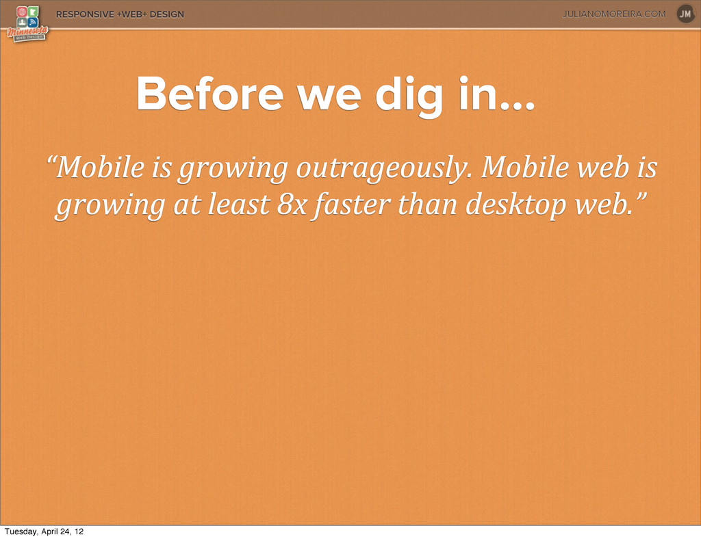
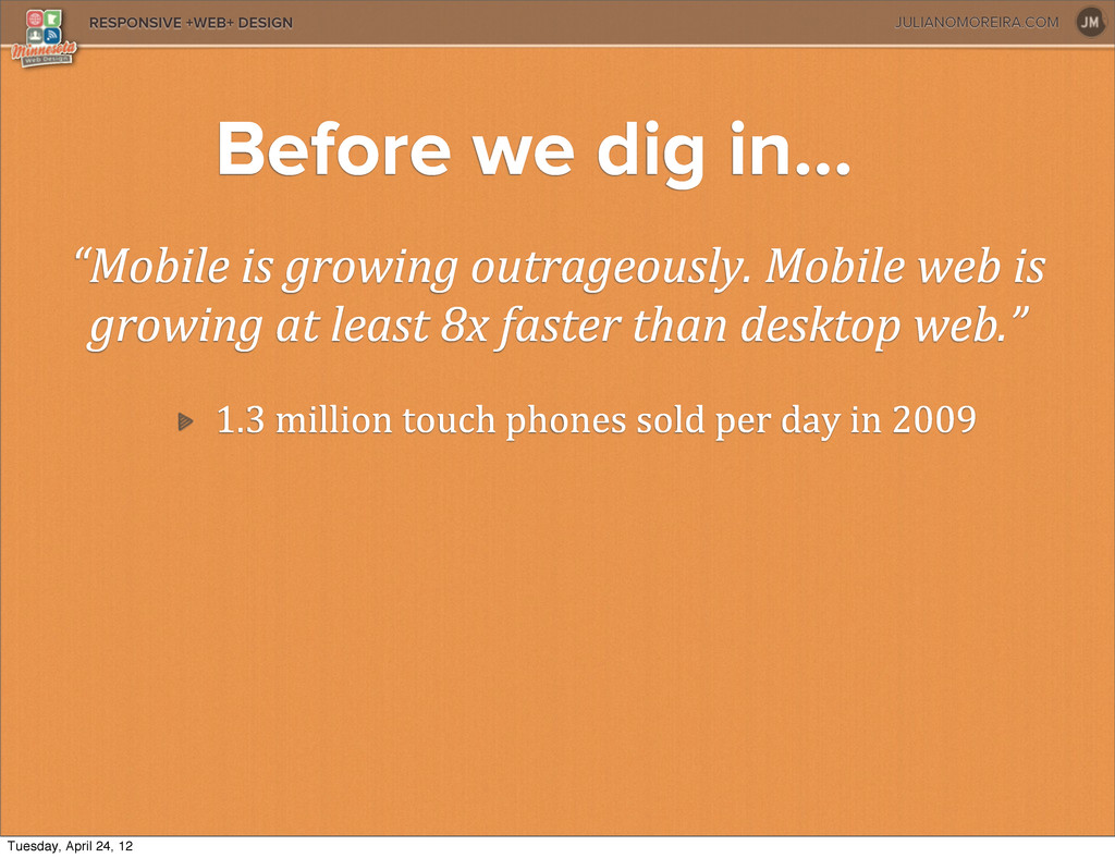
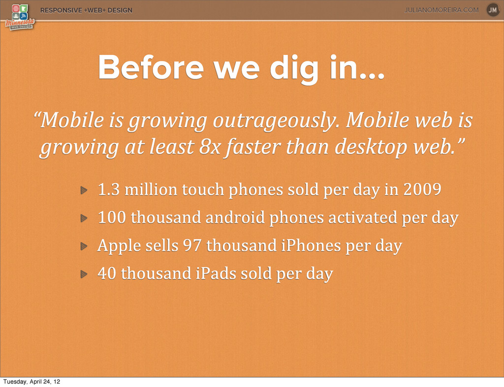
is growing at least 8x faster than desktop web.” 1.3 million touch phones sold per day in 2009 100 thousand android phones activated per day Before we dig in... Tuesday, April 24, 12
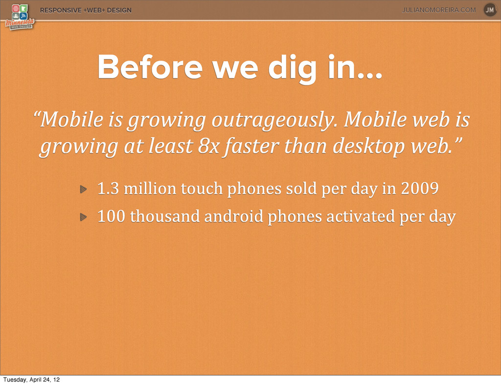
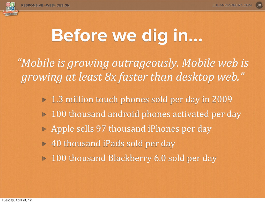
is growing at least 8x faster than desktop web.” 1.3 million touch phones sold per day in 2009 100 thousand android phones activated per day Apple sells 97 thousand iPhones per day Before we dig in... Tuesday, April 24, 12
is growing at least 8x faster than desktop web.” 1.3 million touch phones sold per day in 2009 100 thousand android phones activated per day Apple sells 97 thousand iPhones per day 40 thousand iPads sold per day Before we dig in... Tuesday, April 24, 12
is growing at least 8x faster than desktop web.” 1.3 million touch phones sold per day in 2009 100 thousand android phones activated per day Apple sells 97 thousand iPhones per day 40 thousand iPads sold per day 100 thousand Blackberry 6.0 sold per day Before we dig in... Tuesday, April 24, 12
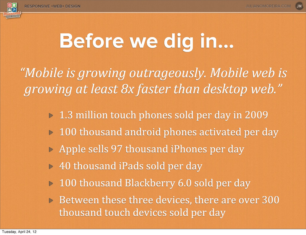
is growing at least 8x faster than desktop web.” 1.3 million touch phones sold per day in 2009 100 thousand android phones activated per day Apple sells 97 thousand iPhones per day 40 thousand iPads sold per day 100 thousand Blackberry 6.0 sold per day Between these three devices, there are over 300 thousand touch devices sold per day Before we dig in... Tuesday, April 24, 12
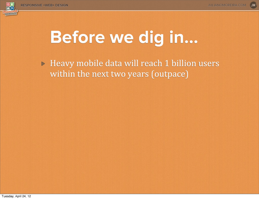
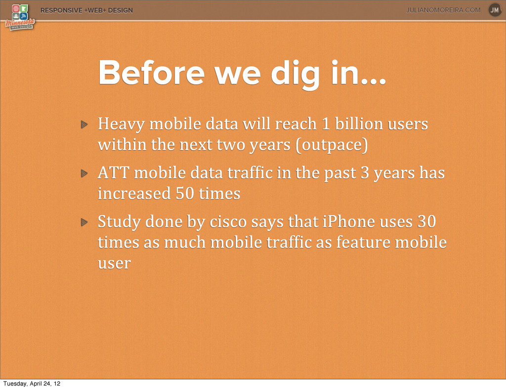
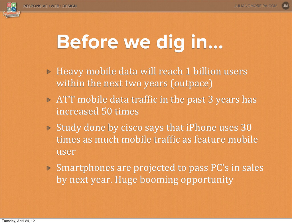
data will reach 1 billion users within the next two years (outpace) ATT mobile data trafXic in the past 3 years has increased 50 times Tuesday, April 24, 12
data will reach 1 billion users within the next two years (outpace) ATT mobile data trafXic in the past 3 years has increased 50 times Study done by cisco says that iPhone uses 30 times as much mobile trafXic as feature mobile user Tuesday, April 24, 12
data will reach 1 billion users within the next two years (outpace) ATT mobile data trafXic in the past 3 years has increased 50 times Study done by cisco says that iPhone uses 30 times as much mobile trafXic as feature mobile user Smartphones are projected to pass PC's in sales by next year. Huge booming opportunity Tuesday, April 24, 12
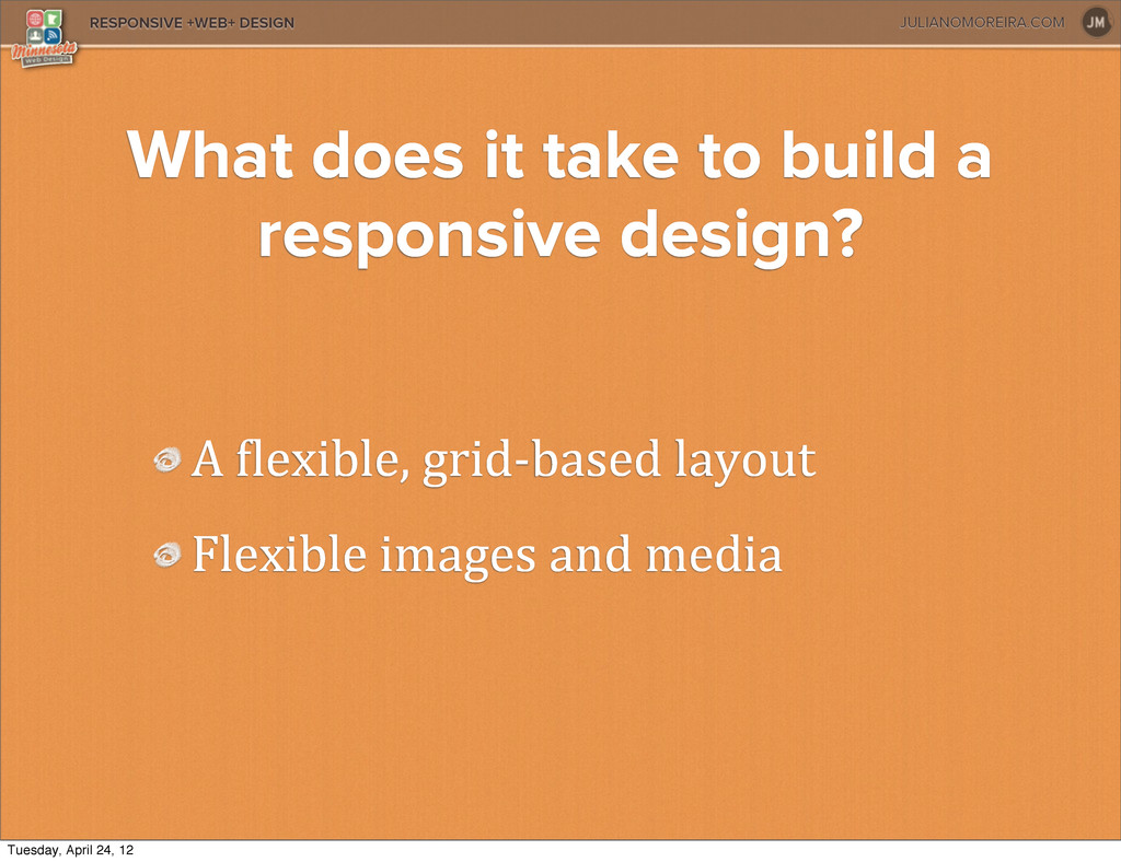
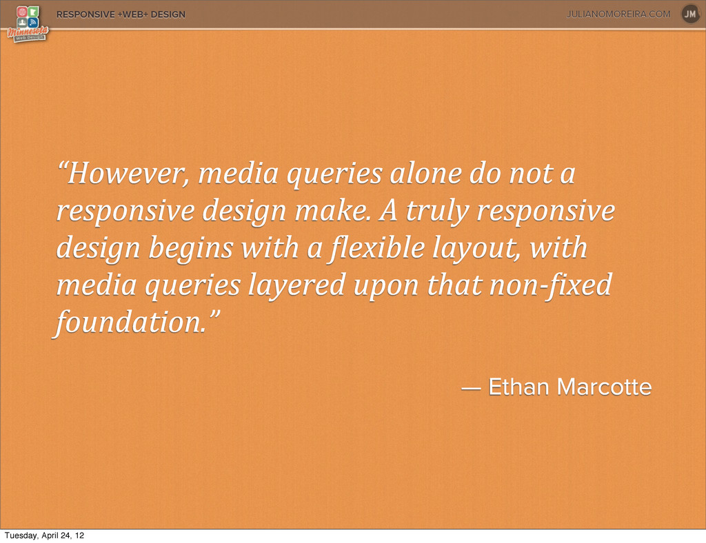
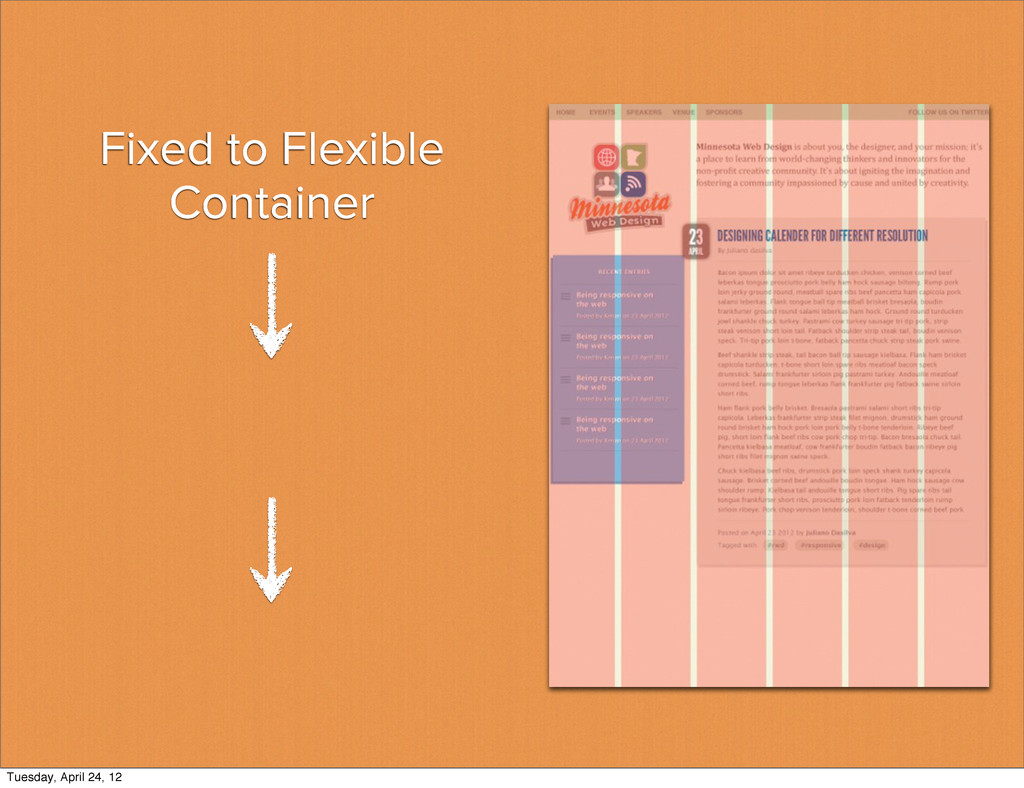
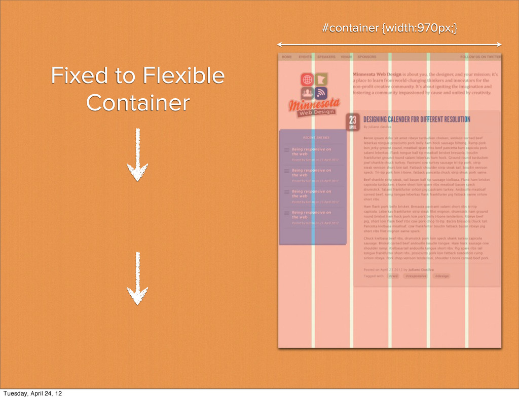
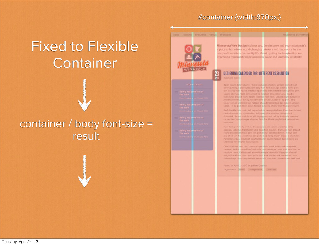
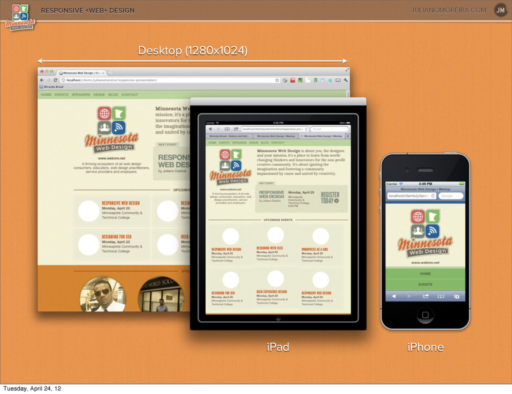
a responsive design make. A truly responsive design begins with a 9lexible layout, with media queries layered upon that non-‐9ixed foundation.” — Ethan Marcotte Tuesday, April 24, 12
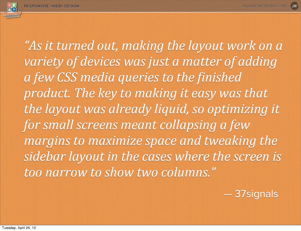
layout work on a variety of devices was just a matter of adding a few CSS media queries to the 9inished product. The key to making it easy was that the layout was already liquid, so optimizing it for small screens meant collapsing a few margins to maximize space and tweaking the sidebar layout in the cases where the screen is too narrow to show two columns.” — 37signals Tuesday, April 24, 12
 webmn
webmn
 rezaline
 sony
sony
 vivion
 aonomasahiro
 payatsusan213
 kspace
.jpg) rwang05
rwang05
 signull
 ncdc
ncdc
 nbkouhou
 moco1013
 hicard
 cassininazir
 aleyda
 marktimemedia
 techseoconnect
 hannesfritz
 sachag
 sabderemane
 bluesmoon
 baasie
 jonyablonski
 tammyeverts