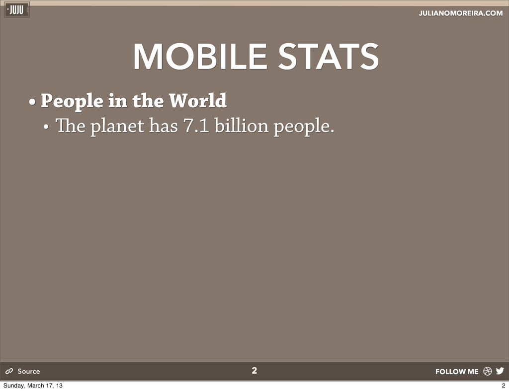
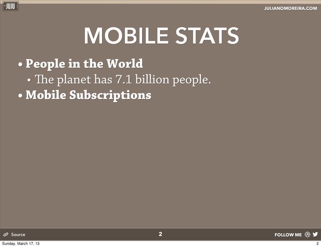
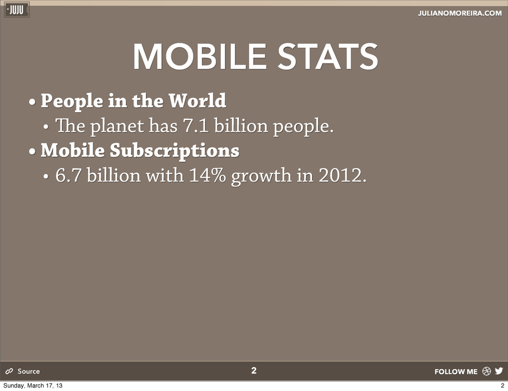
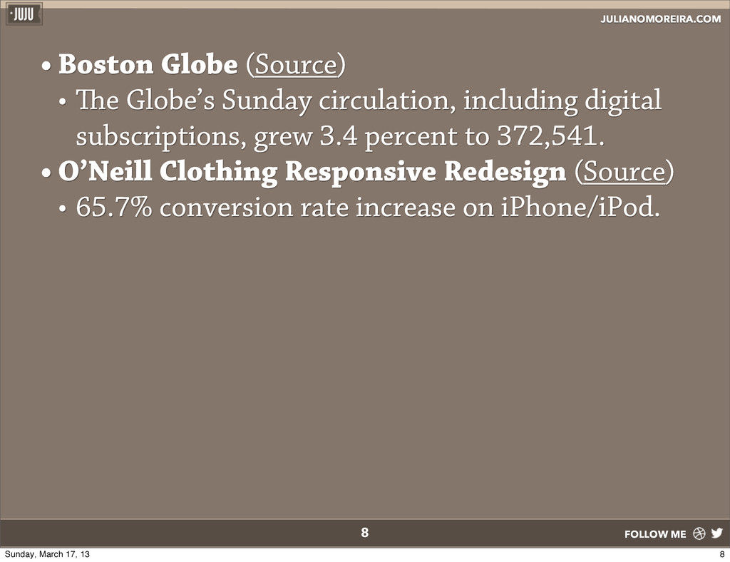
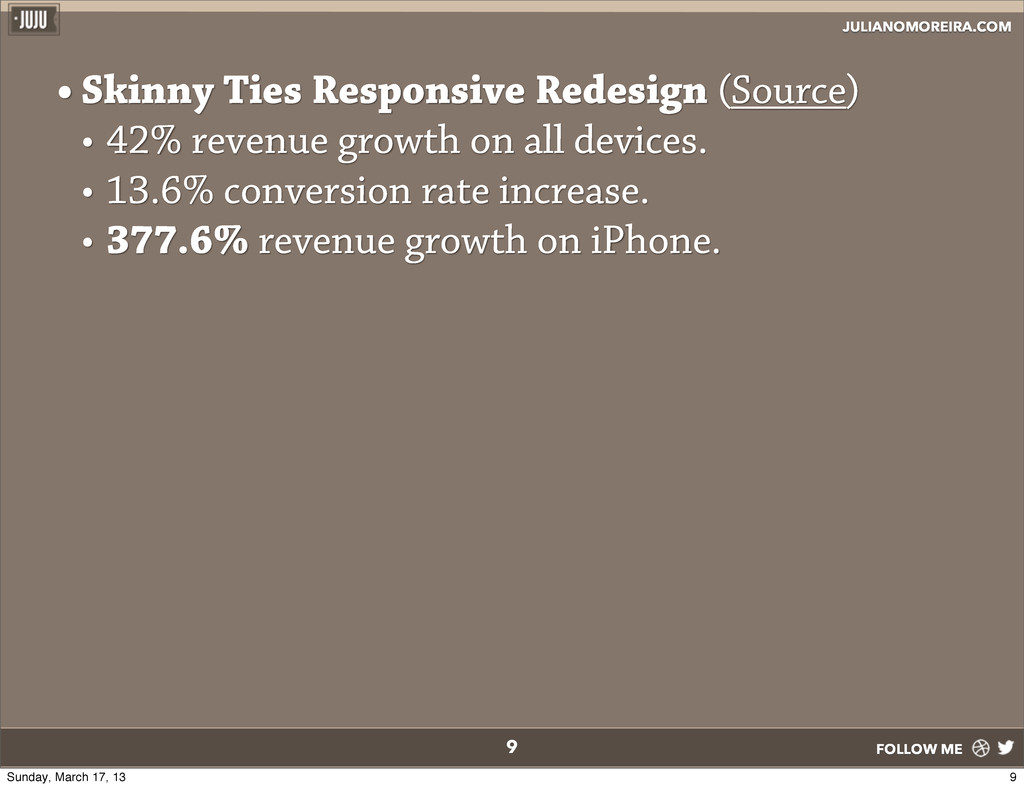
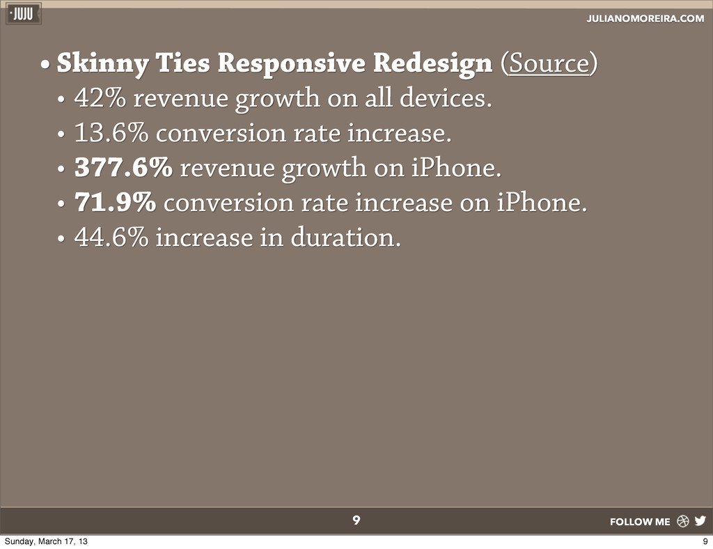
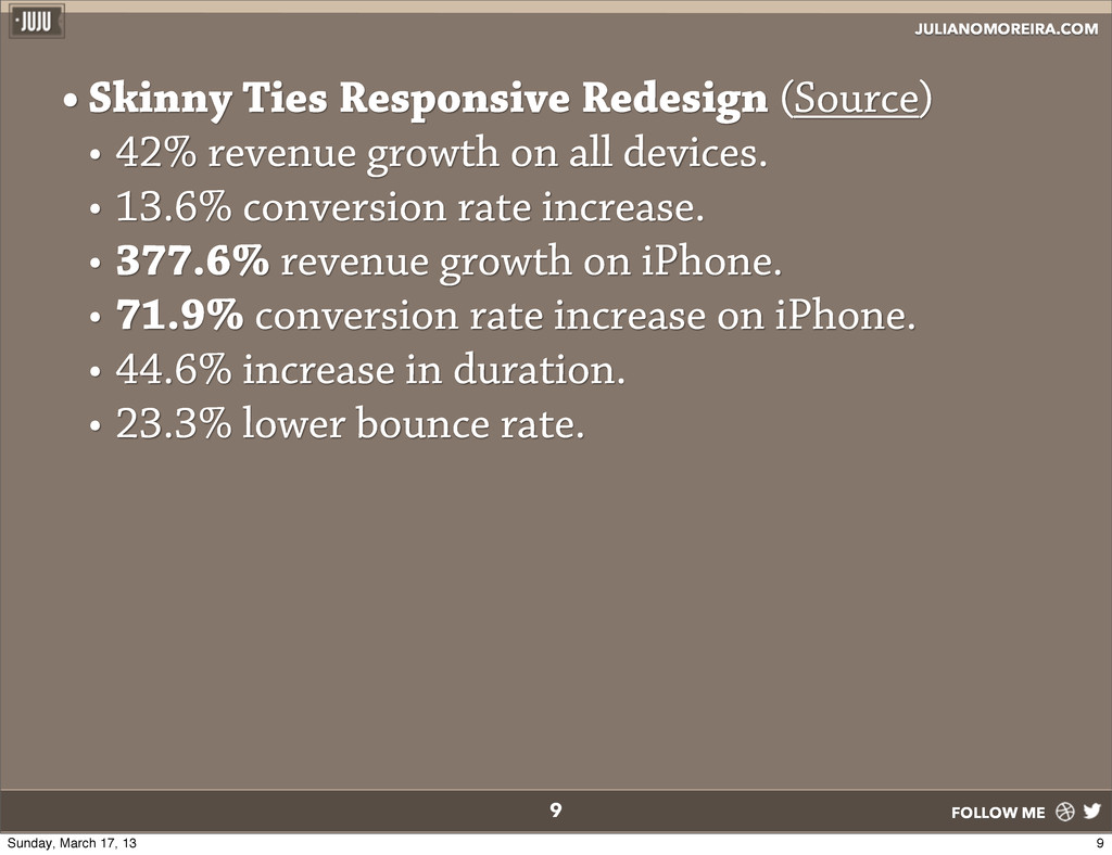
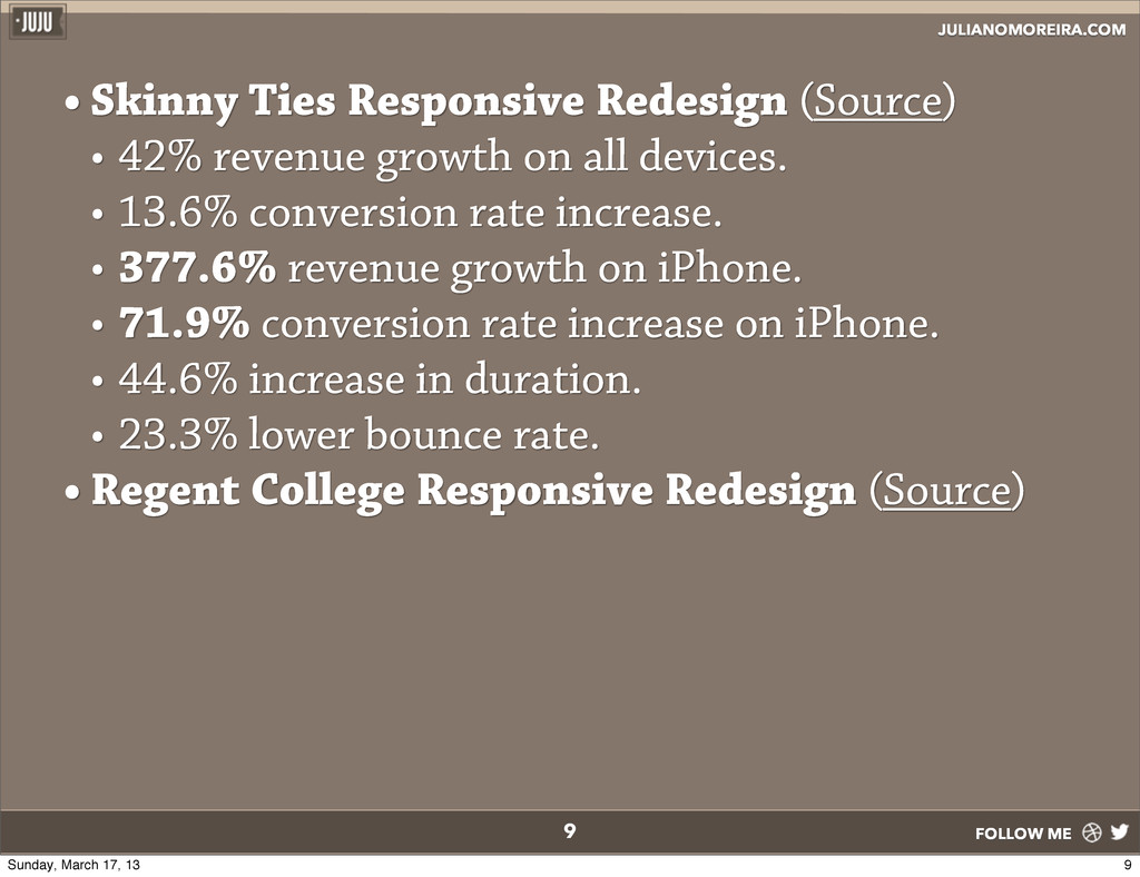
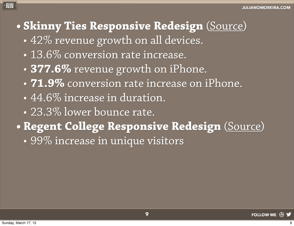
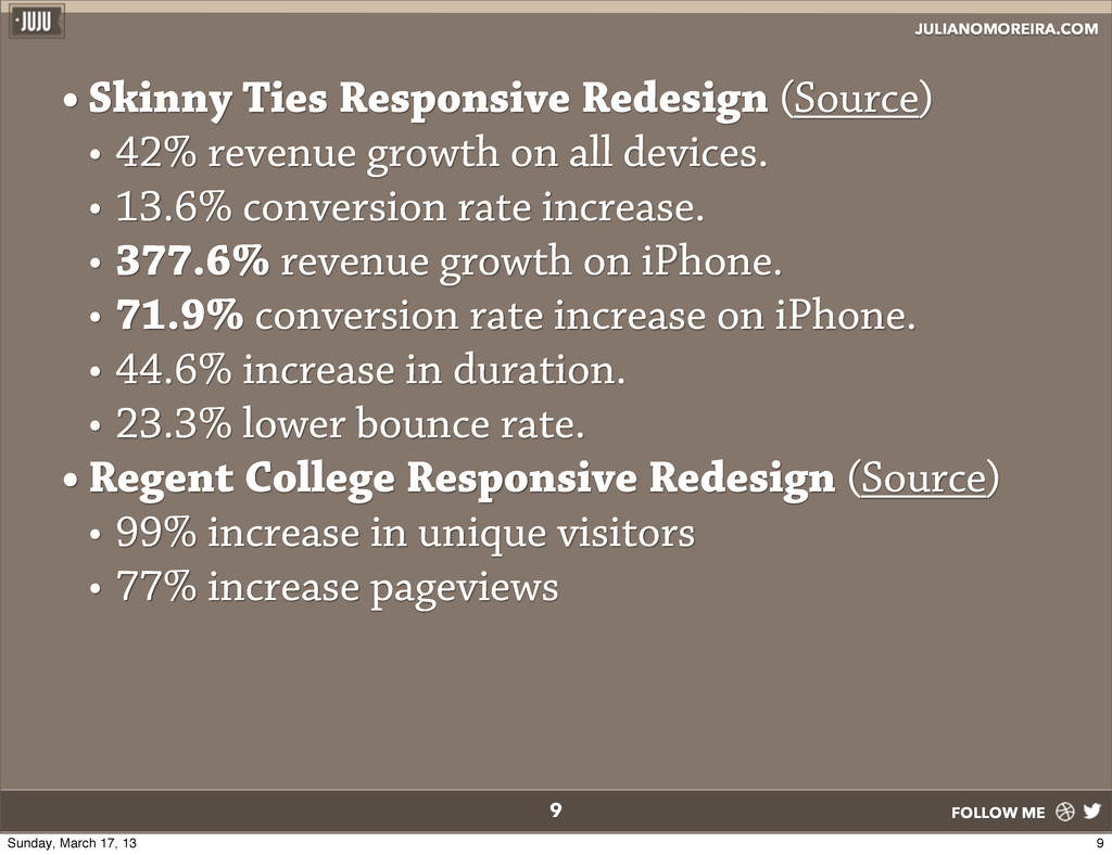
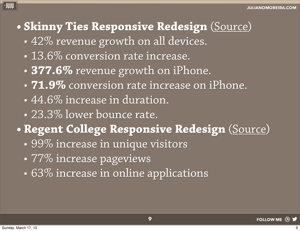
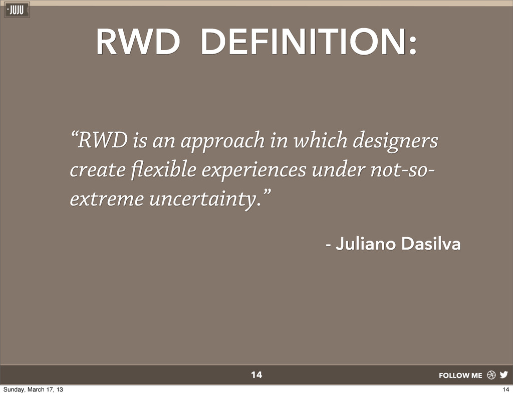
• e planet has 7.1 billion people. • Mobile Subscriptions • 6.7 billion with 14% growth in 2012. • By July 2013, subscriptions will hit 7.1 billion. 2 Source 2 Sunday, March 17, 13
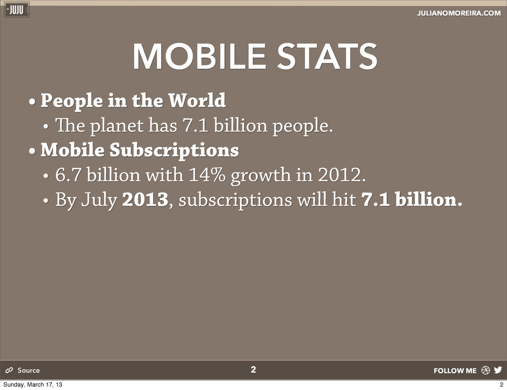
• e planet has 7.1 billion people. • Mobile Subscriptions • 6.7 billion with 14% growth in 2012. • By July 2013, subscriptions will hit 7.1 billion. • Actual Phones 2 Source 2 Sunday, March 17, 13
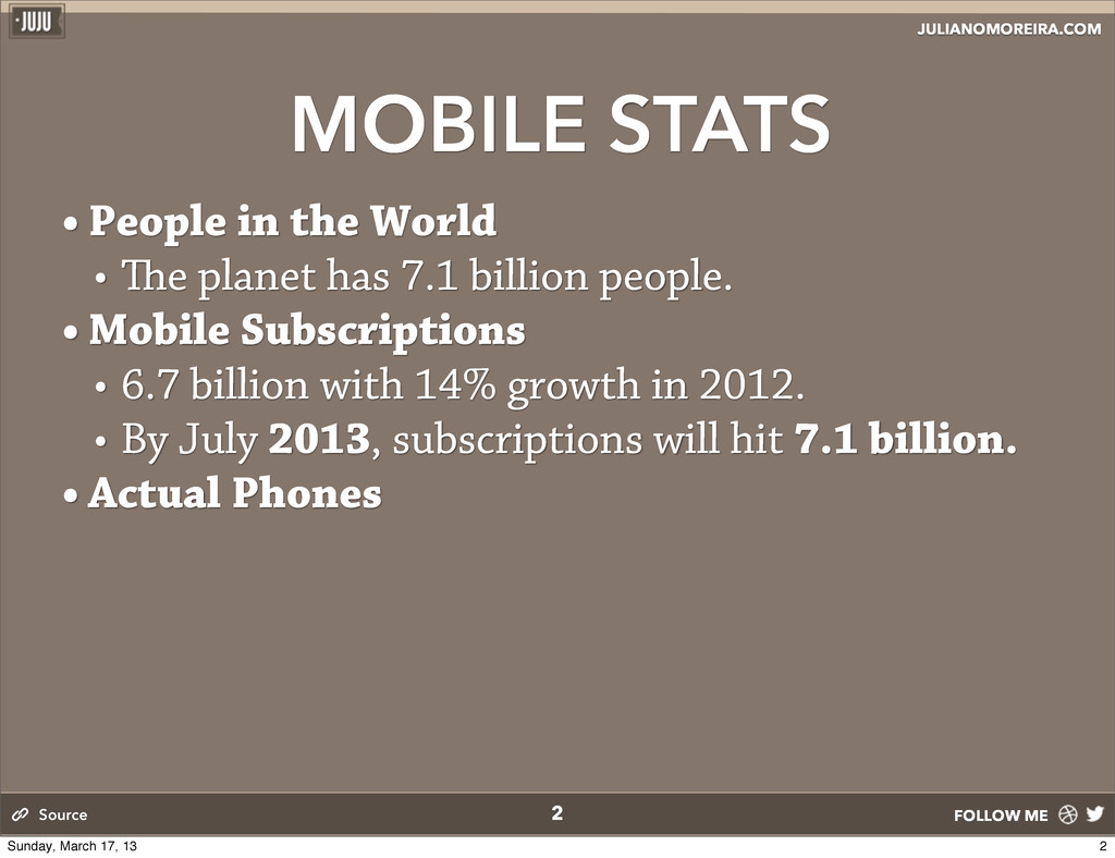
• e planet has 7.1 billion people. • Mobile Subscriptions • 6.7 billion with 14% growth in 2012. • By July 2013, subscriptions will hit 7.1 billion. • Actual Phones • 5.2 billion in use that can do voice calls, SMS and take pictures. 2 Source 2 Sunday, March 17, 13
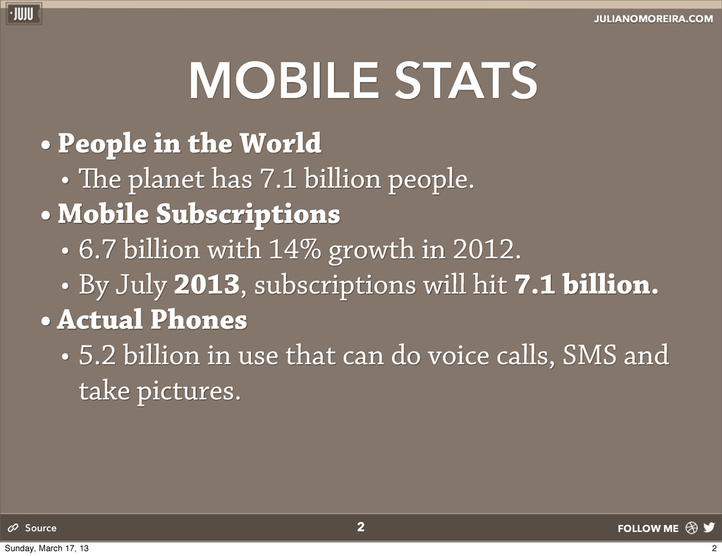
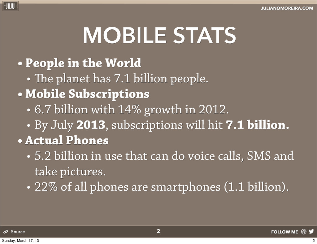
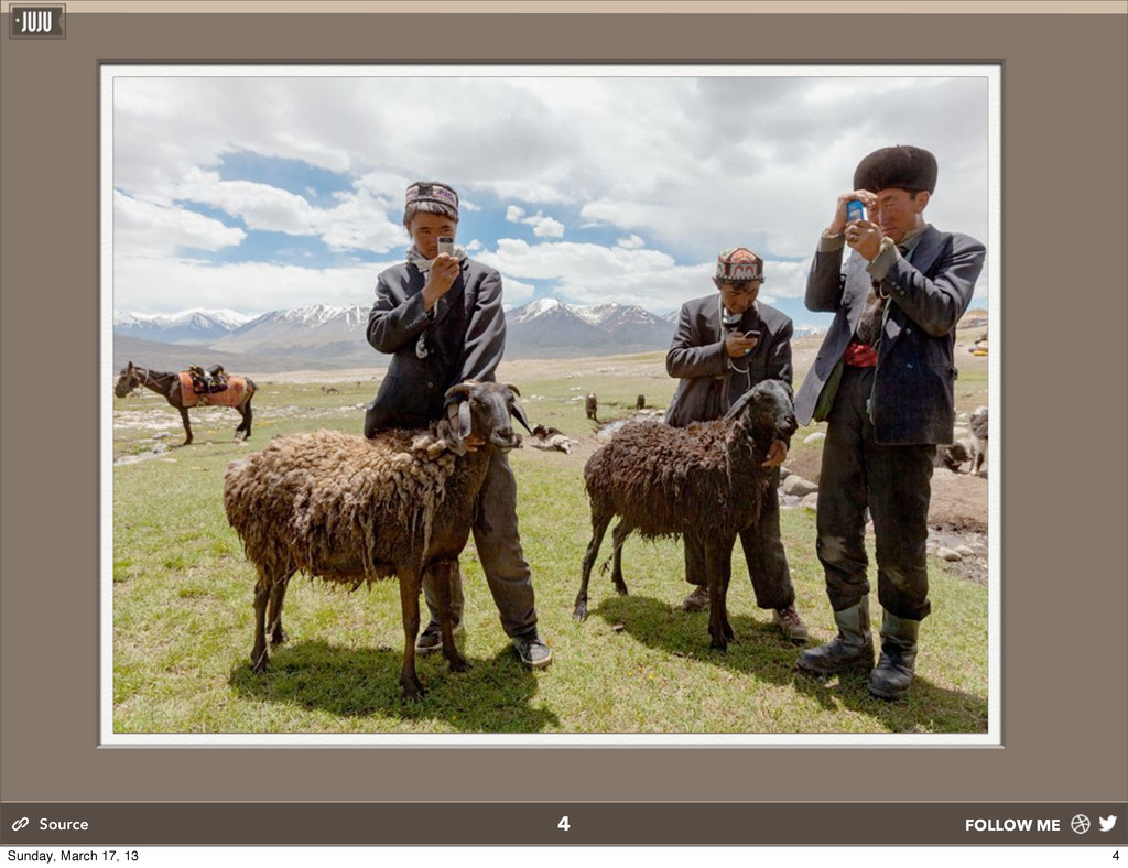
• e planet has 7.1 billion people. • Mobile Subscriptions • 6.7 billion with 14% growth in 2012. • By July 2013, subscriptions will hit 7.1 billion. • Actual Phones • 5.2 billion in use that can do voice calls, SMS and take pictures. • 22% of all phones are smartphones (1.1 billion). 2 Source 2 Sunday, March 17, 13
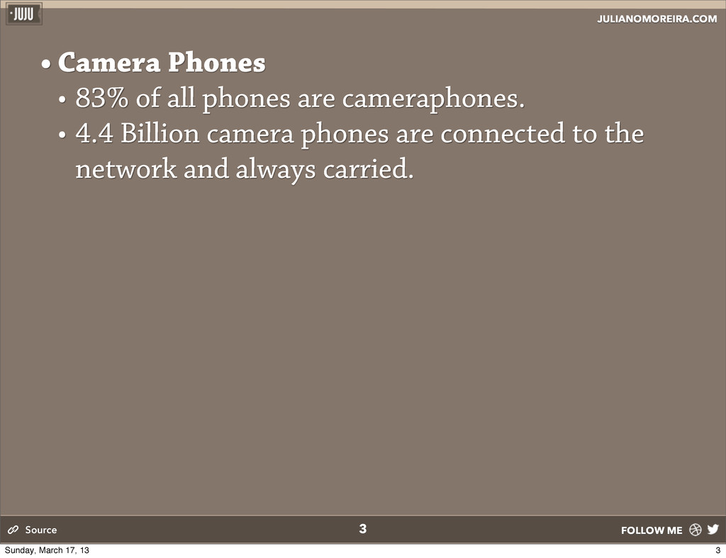
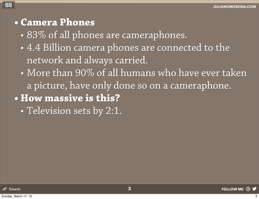
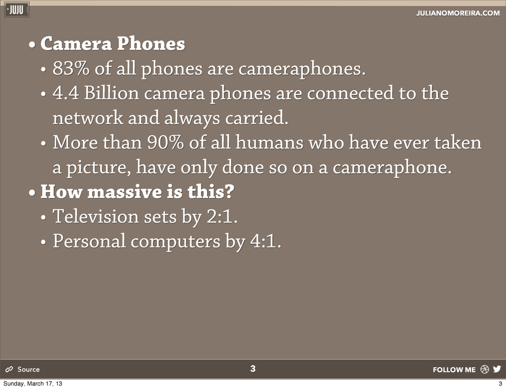
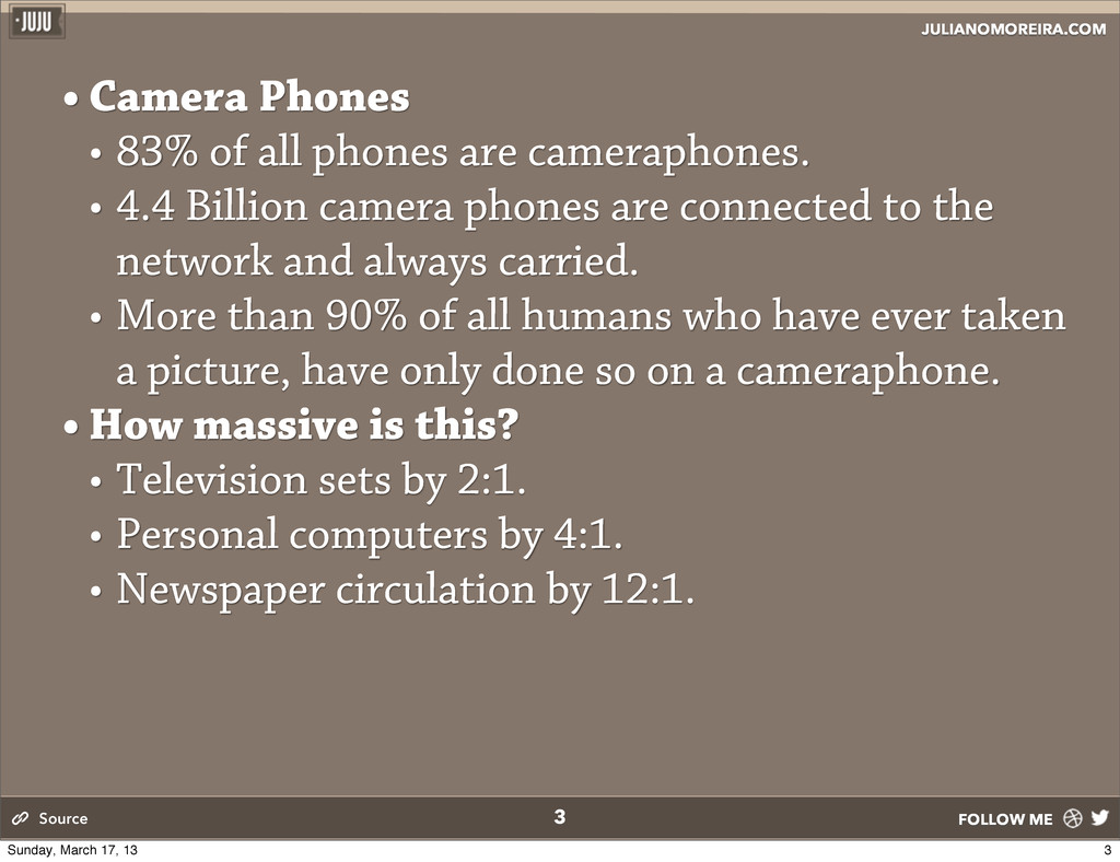
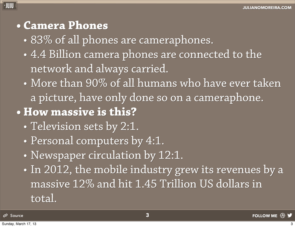
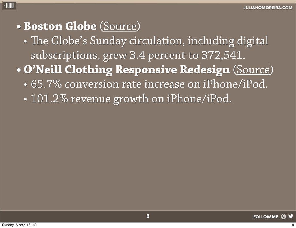
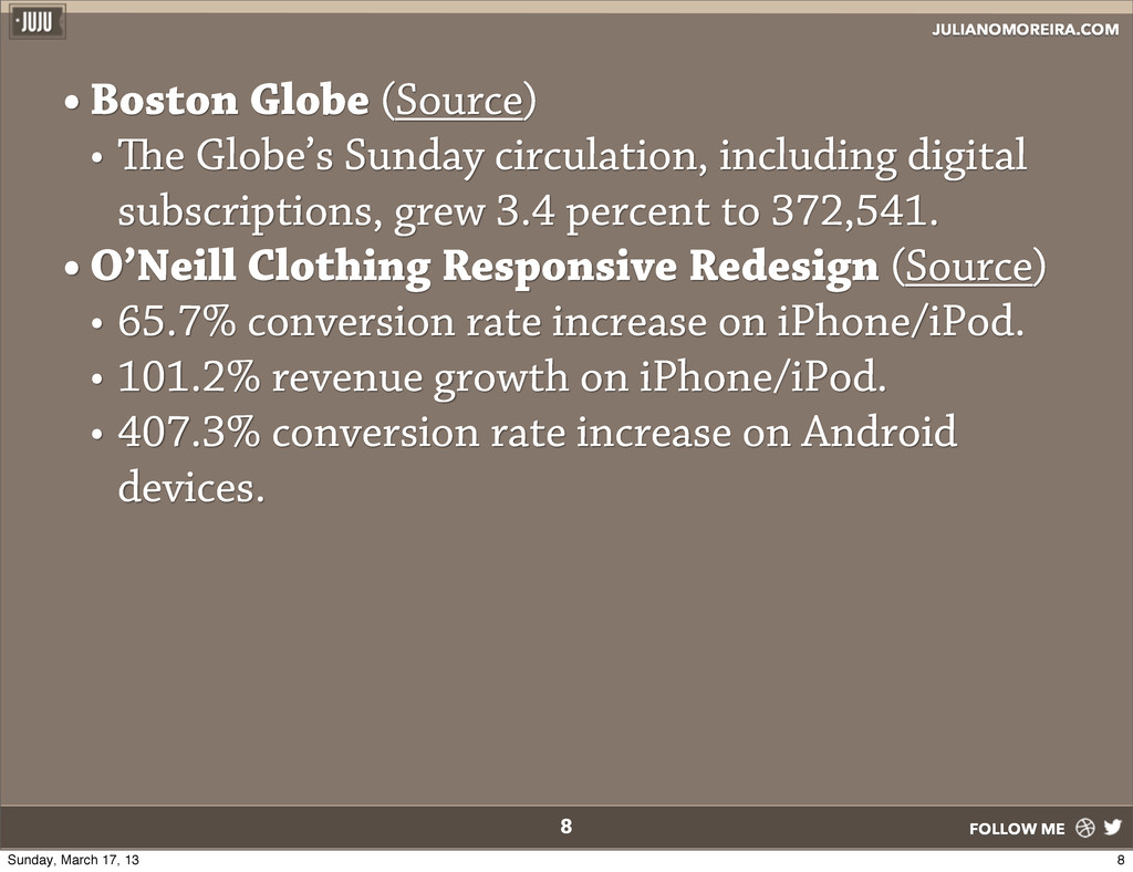
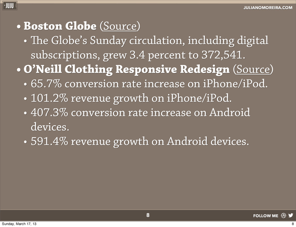
all phones are cameraphones. • 4.4 Billion camera phones are connected to the network and always carried. • More than 90% of all humans who have ever taken a picture, have only done so on a cameraphone. Source 3 Sunday, March 17, 13
all phones are cameraphones. • 4.4 Billion camera phones are connected to the network and always carried. • More than 90% of all humans who have ever taken a picture, have only done so on a cameraphone. • How massive is this? Source 3 Sunday, March 17, 13
all phones are cameraphones. • 4.4 Billion camera phones are connected to the network and always carried. • More than 90% of all humans who have ever taken a picture, have only done so on a cameraphone. • How massive is this? • Television sets by 2:1. Source 3 Sunday, March 17, 13
all phones are cameraphones. • 4.4 Billion camera phones are connected to the network and always carried. • More than 90% of all humans who have ever taken a picture, have only done so on a cameraphone. • How massive is this? • Television sets by 2:1. • Personal computers by 4:1. Source 3 Sunday, March 17, 13
all phones are cameraphones. • 4.4 Billion camera phones are connected to the network and always carried. • More than 90% of all humans who have ever taken a picture, have only done so on a cameraphone. • How massive is this? • Television sets by 2:1. • Personal computers by 4:1. • Newspaper circulation by 12:1. Source 3 Sunday, March 17, 13
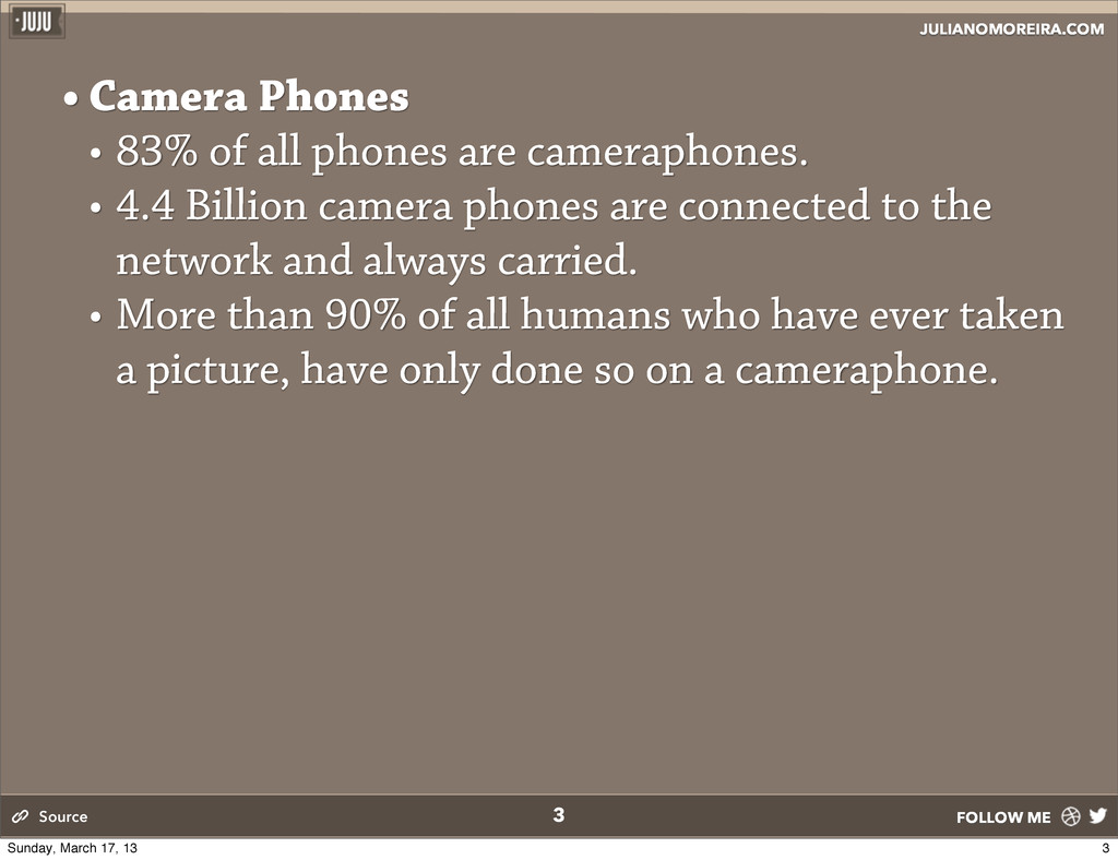
all phones are cameraphones. • 4.4 Billion camera phones are connected to the network and always carried. • More than 90% of all humans who have ever taken a picture, have only done so on a cameraphone. • How massive is this? • Television sets by 2:1. • Personal computers by 4:1. • Newspaper circulation by 12:1. • In 2012, the mobile industry grew its revenues by a massive 12% and hit 1.45 Trillion US dollars in total. Source 3 Sunday, March 17, 13
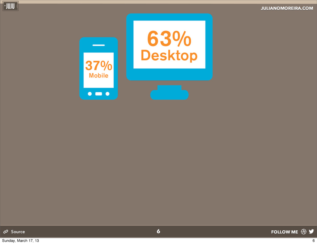
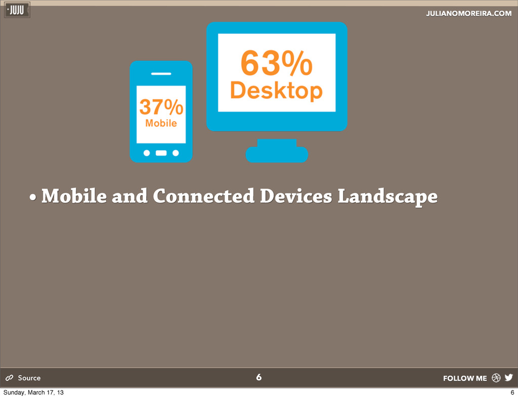
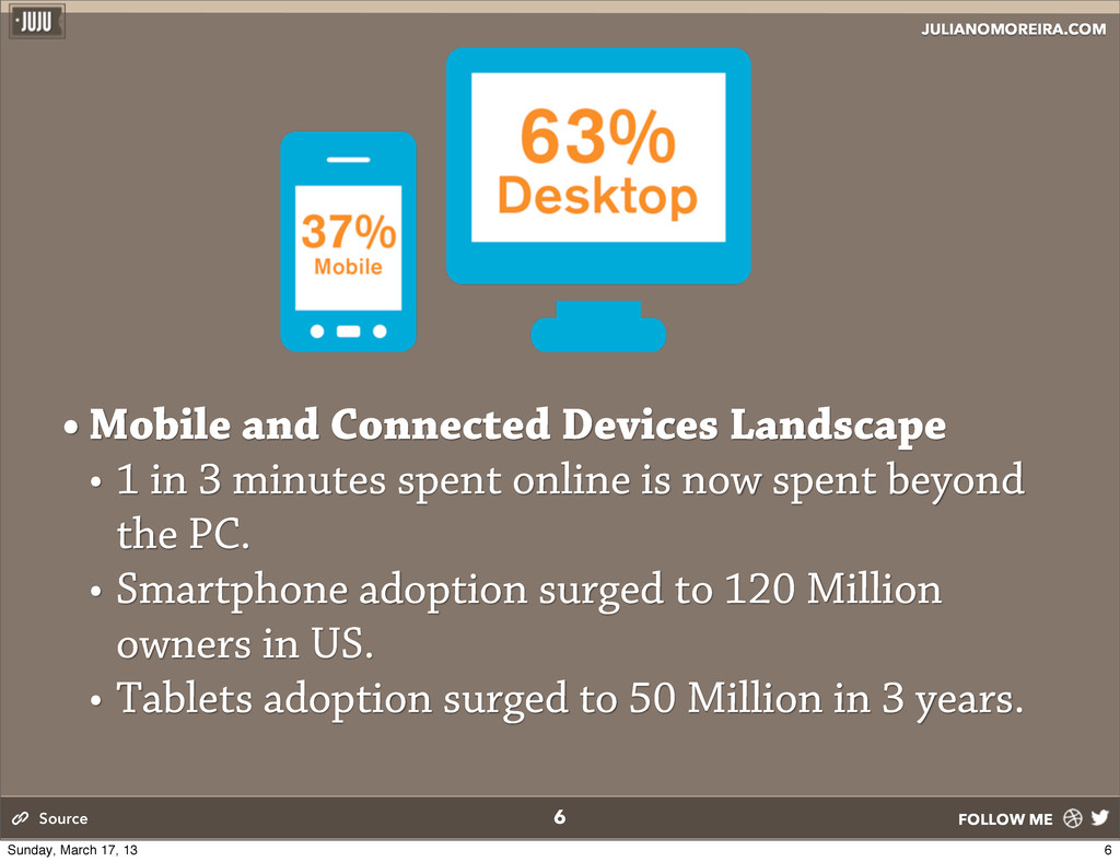
• 1 in 3 minutes spent online is now spent beyond the PC. • Smartphone adoption surged to 120 Million owners in US. • Tablets adoption surged to 50 Million in 3 years. Source 6 Sunday, March 17, 13
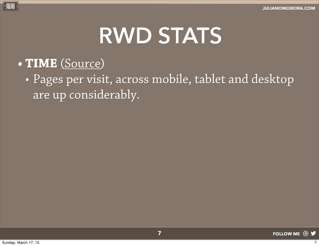
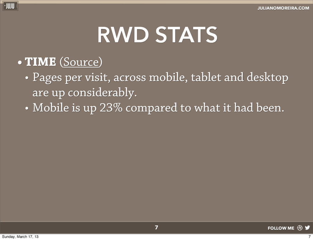
per visit, across mobile, tablet and desktop are up considerably. • Mobile is up 23% compared to what it had been. • e mobile bounce rate decreased by 26%. 7 7 Sunday, March 17, 13
per visit, across mobile, tablet and desktop are up considerably. • Mobile is up 23% compared to what it had been. • e mobile bounce rate decreased by 26%. • Homepage uniques are up 15%, and time spent is up 7.5%. 7 7 Sunday, March 17, 13
single URL for a piece of content makes it easier for your users to interact with, share, and link to your content, and a single URL for the content helps Google's algorithms assign the indexing properties for the content. 11 Source 11 Sunday, March 17, 13
single URL for a piece of content makes it easier for your users to interact with, share, and link to your content, and a single URL for the content helps Google's algorithms assign the indexing properties for the content. • No redirection is needed for users to get to the device- optimized view, which reduces loading time. Also, user agent- based redirection is error-prone and can degrade your site's user experience. 11 Source 11 Sunday, March 17, 13
single URL for a piece of content makes it easier for your users to interact with, share, and link to your content, and a single URL for the content helps Google's algorithms assign the indexing properties for the content. • No redirection is needed for users to get to the device- optimized view, which reduces loading time. Also, user agent- based redirection is error-prone and can degrade your site's user experience. • It saves resources for both your site and Google's crawlers. For responsive web design pages, any Googlebot user agents needs to crawl your pages once, as opposed to crawling multiple times with different user agents, to retrieve your content. 11 Source 11 Sunday, March 17, 13
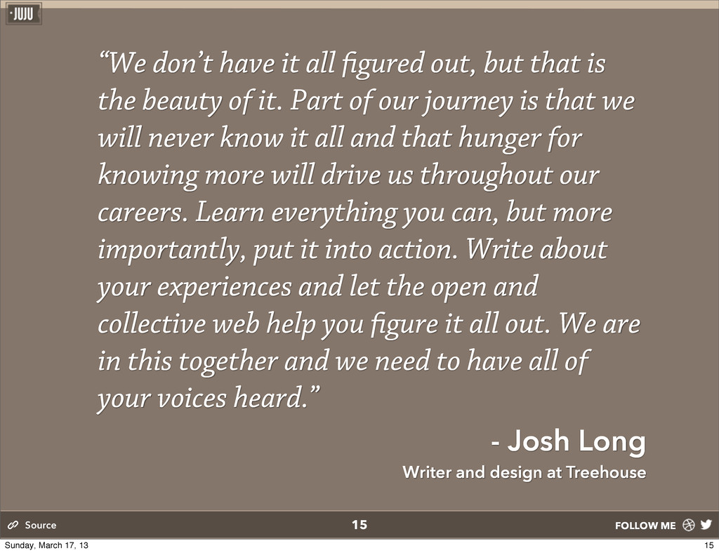
that is the beauty of it. Part of our journey is that we will never know it all and that hunger for knowing more will drive us throughout our careers. Learn everything you can, but more importantly, put it into action. Write about your experiences and let the open and collective web help you gure it all out. We are in this together and we need to have all of your voices heard.” - Josh Long Writer and design at Treehouse 15 Source 15 Sunday, March 17, 13
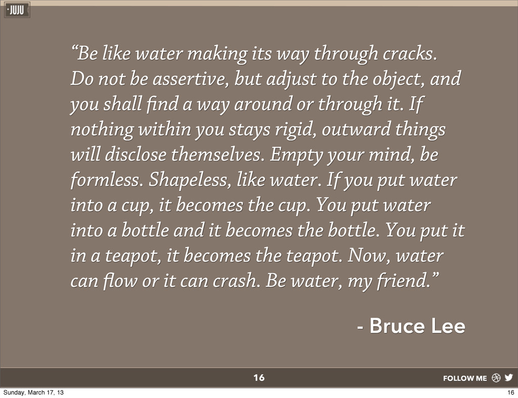
Do not be assertive, but adjust to the object, and you shall nd a way around or through it. If nothing within you stays rigid, outward things will disclose themselves. Empty your mind, be formless. Shapeless, like water. If you put water into a cup, it becomes the cup. You put water into a bottle and it becomes the bottle. You put it in a teapot, it becomes the teapot. Now, water can ow or it can crash. Be water, my friend.” - Bruce Lee 16 16 Sunday, March 17, 13
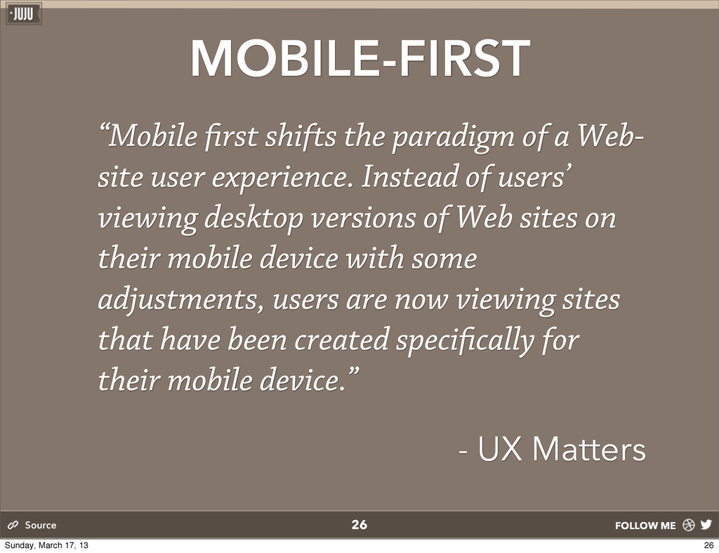
Web- site user experience. Instead of users’ viewing desktop versions of Web sites on their mobile device with some adjustments, users are now viewing sites that have been created speci cally for their mobile device.” - UX Matters 26 Source 26 Sunday, March 17, 13
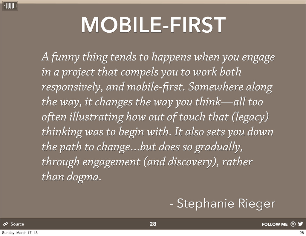
you engage in a project that compels you to work both responsively, and mobile- rst. Somewhere along the way, it changes the way you think—all too often illustrating how out of touch that (legacy) thinking was to begin with. It also sets you down the path to change…but does so gradually, through engagement (and discovery), rather than dogma. - Stephanie Rieger 28 Source 28 Sunday, March 17, 13
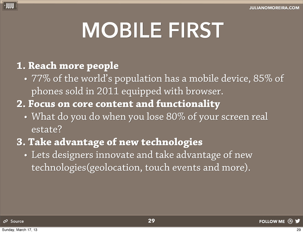
77% of the world’s population has a mobile device, 85% of phones sold in 2011 equipped with browser. 2. Focus on core content and functionality • What do you do when you lose 80% of your screen real estate? 3. Take advantage of new technologies • Lets designers innovate and take advantage of new technologies(geolocation, touch events and more). 29 Source 29 Sunday, March 17, 13
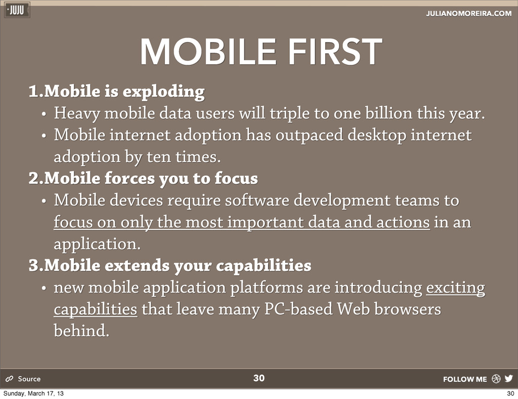
mobile data users will triple to one billion this year. • Mobile internet adoption has outpaced desktop internet adoption by ten times. 2.Mobile forces you to focus • Mobile devices require software development teams to focus on only the most important data and actions in an application. 3.Mobile extends your capabilities • new mobile application platforms are introducing exciting capabilities that leave many PC-based Web browsers behind. 30 Source 30 Sunday, March 17, 13
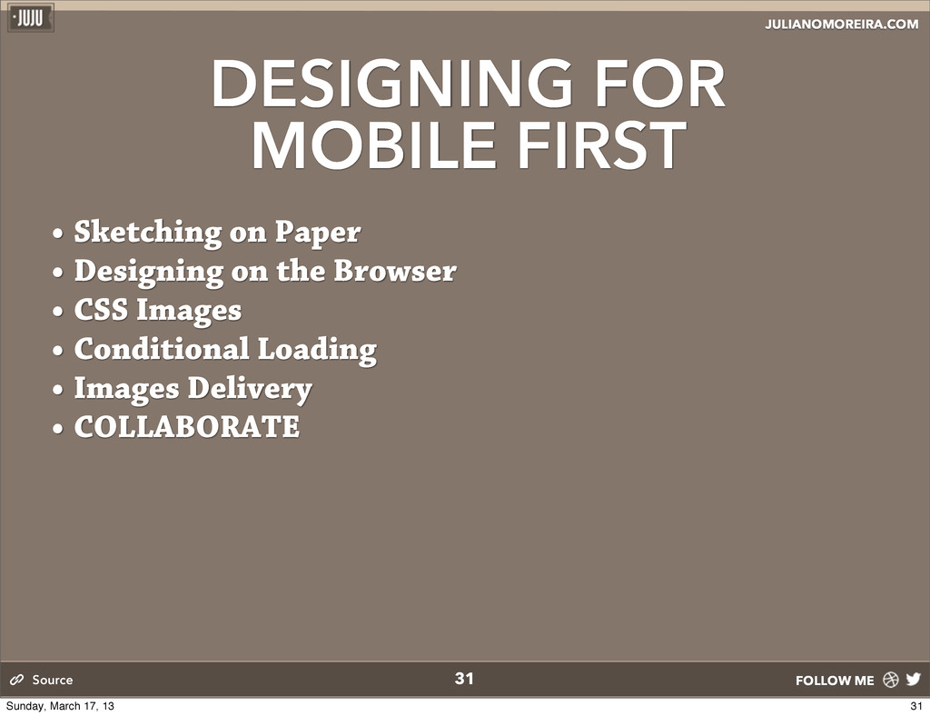
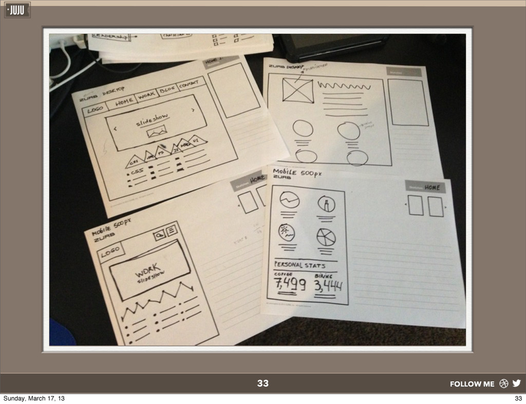
• It gives me sense of direction of how the design elements should function in different resolutions, and also helps me de ne hierarchy. • You start to engage and evaluate priorities for the site, and if you’re sharing it across your engineer team, engineer will start thinking about conditional loading, images delivery etc. • It takes very minimum effort xes, changes or implementing a new idea. 32 Source 32 Sunday, March 17, 13
is critical to accomplish beautiful sites • It doesn’t mean retire photoshop. It means we design elements (background, navigation, imagery, texture) in photoshop as opposed to pixel-perfect-full-blown experiences. • You can also start designing the desktop version rst in photoshop. (but start coding your mobile rst.) • Photoshop and browser just got married • Iterate on browser, x visual in photoshop as quickly as possible. • Iterating on the browsers for immediate “satisfaction”. 34 Source 34 Sunday, March 17, 13
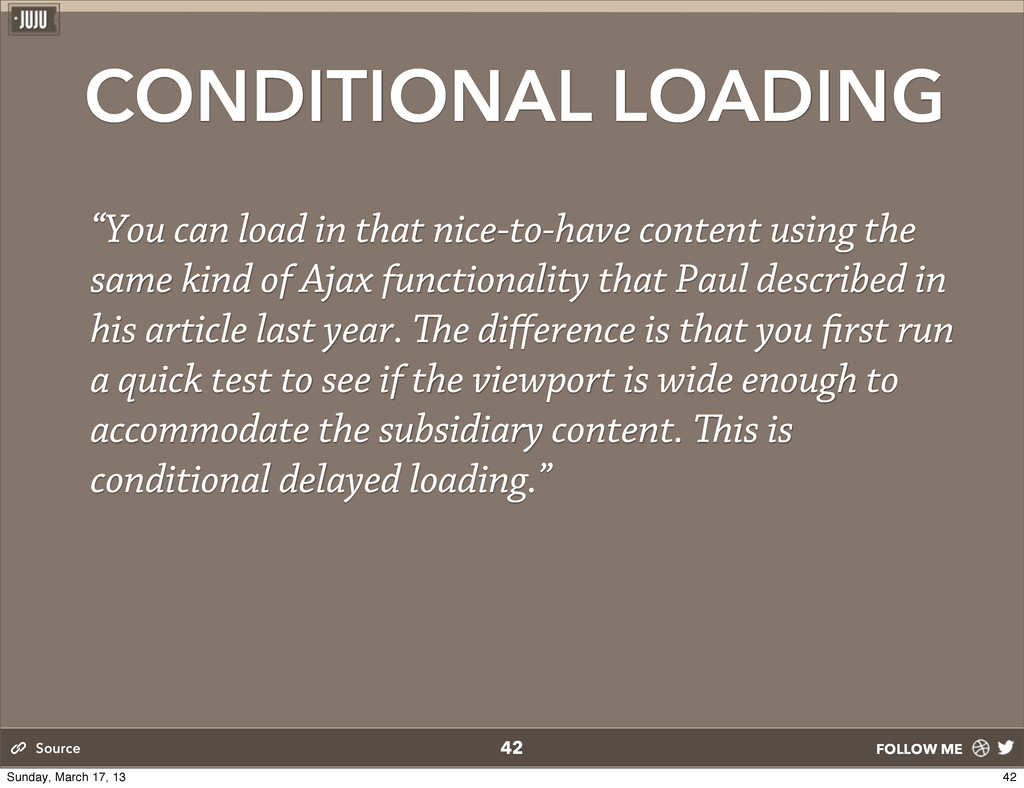
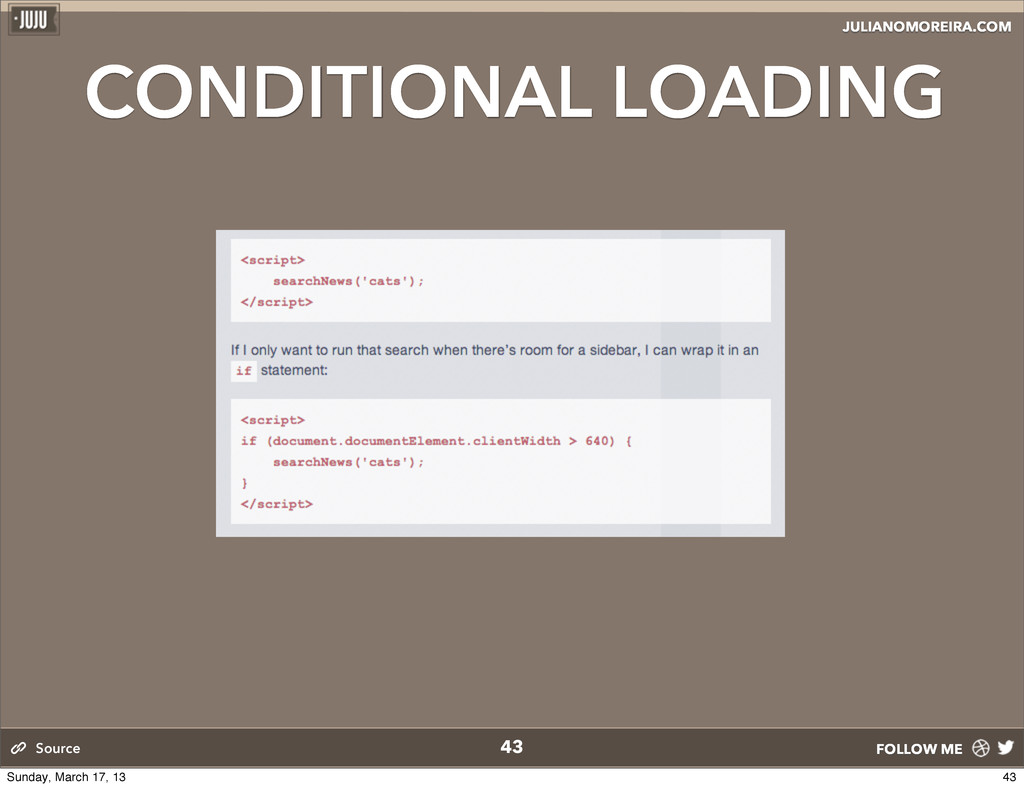
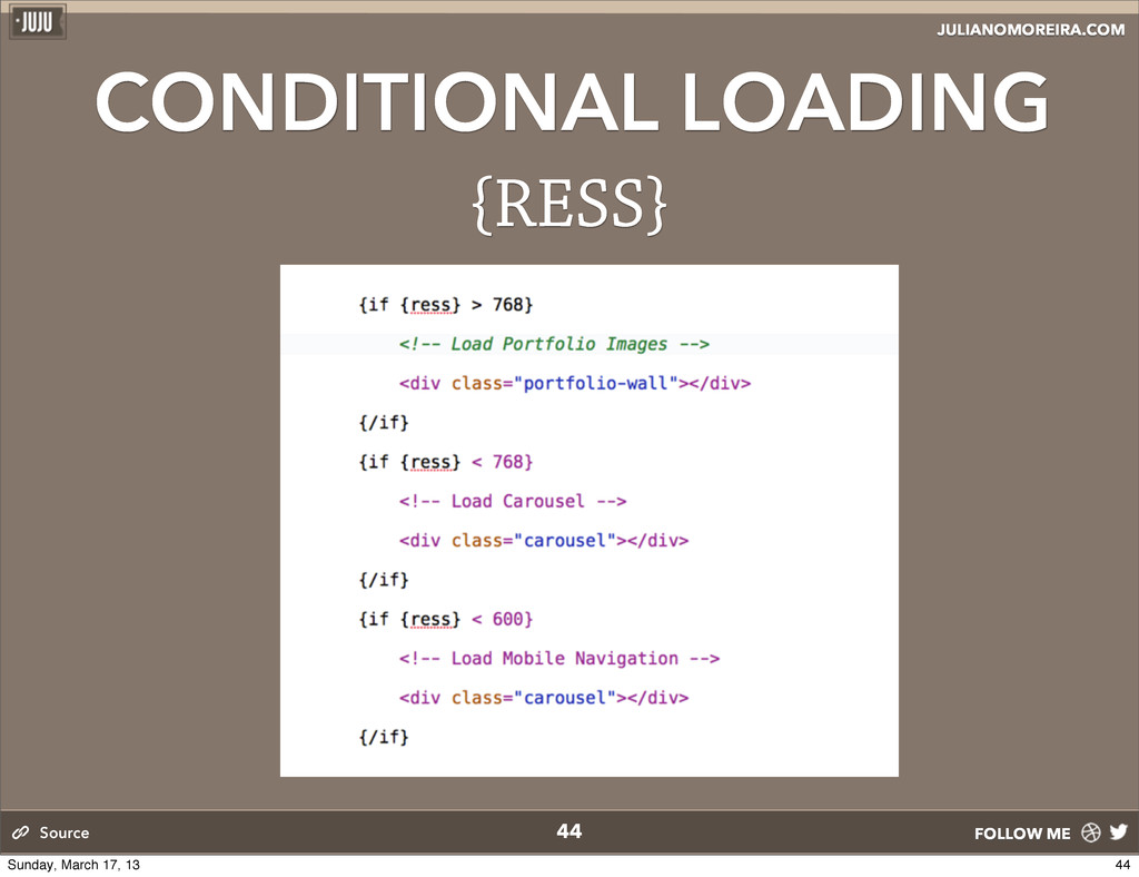
content using the same kind of Ajax functionality that Paul described in his article last year. e difference is that you rst run a quick test to see if the viewport is wide enough to accommodate the subsidiary content. is is conditional delayed loading.” 42 Source 42 Sunday, March 17, 13
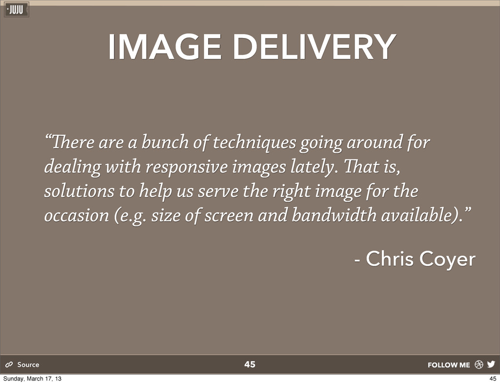
going around for dealing with responsive images lately. at is, solutions to help us serve the right image for the occasion (e.g. size of screen and bandwidth available).” - Chris Coyer 45 Source 45 Sunday, March 17, 13
owners, QA engineers, project managers, entrepreneurs change people lives. When a user visits your site, their life is changed for the moment they stay on your site; if a user purchased a product on your site, that’s a long- lasting experience for your customers. Regardless, you have that power; the power to change someone’s life for the better. At the heart of the details, of our work, is the person who will use it, emotional human beings. Don’t miss the opportunity. 49 Source 49 Sunday, March 17, 13
 webmn
webmn
 lynteo
 klemens
 root_recruit
 takaikanako
.jpg) rwang05
rwang05
 csswizardry
 a2k
a2k
 seto
seto
 mhand01
 abokadotyann
 teba_eleven
 axbom
axbom
 davetheseo
 inesmontani
 nmsamuel
 mfonobong
 bluesmoon
 pedronauck
 maltzj
 tammielis
 tenderlove
 aleyda
 cromwellryan