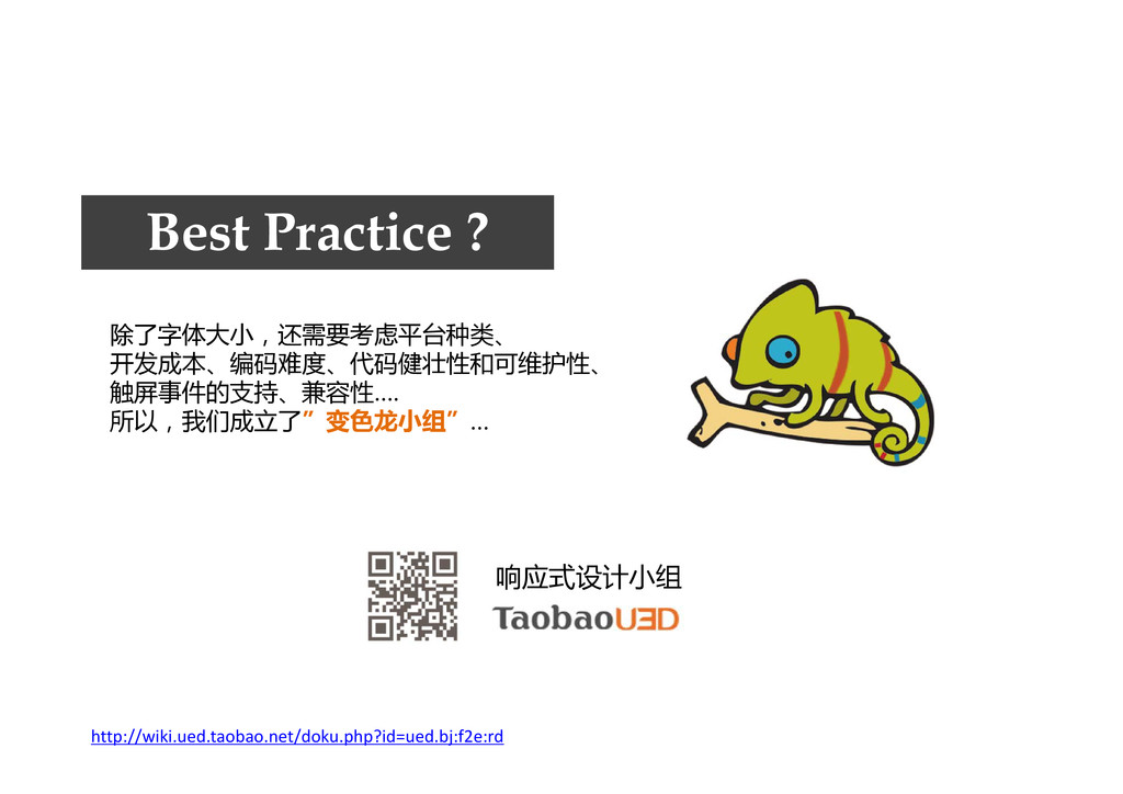
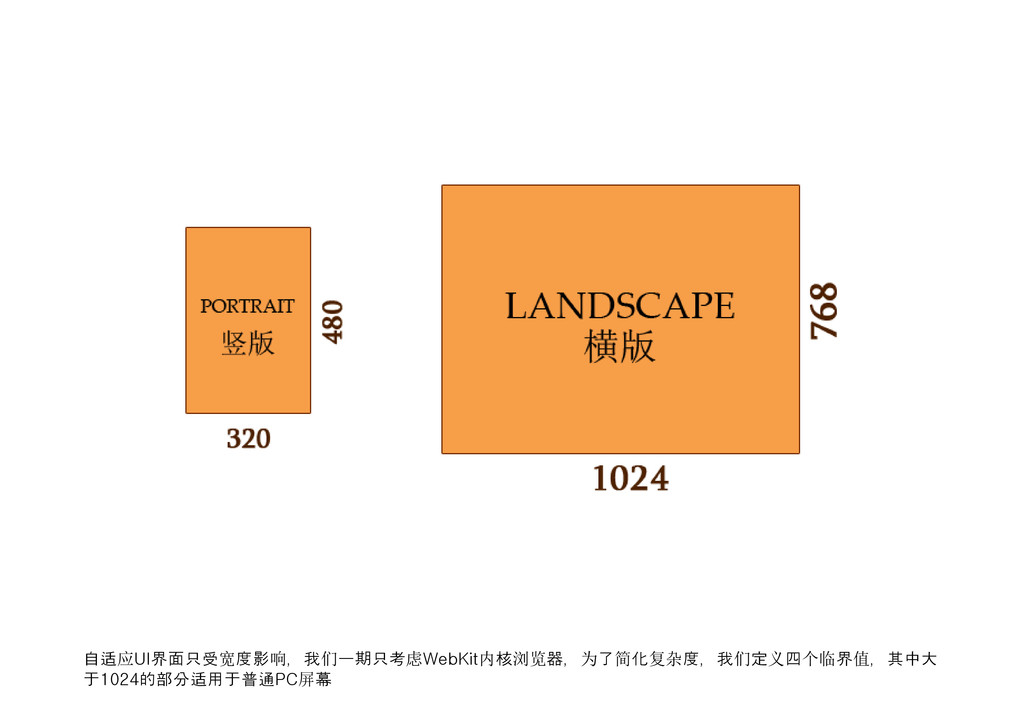
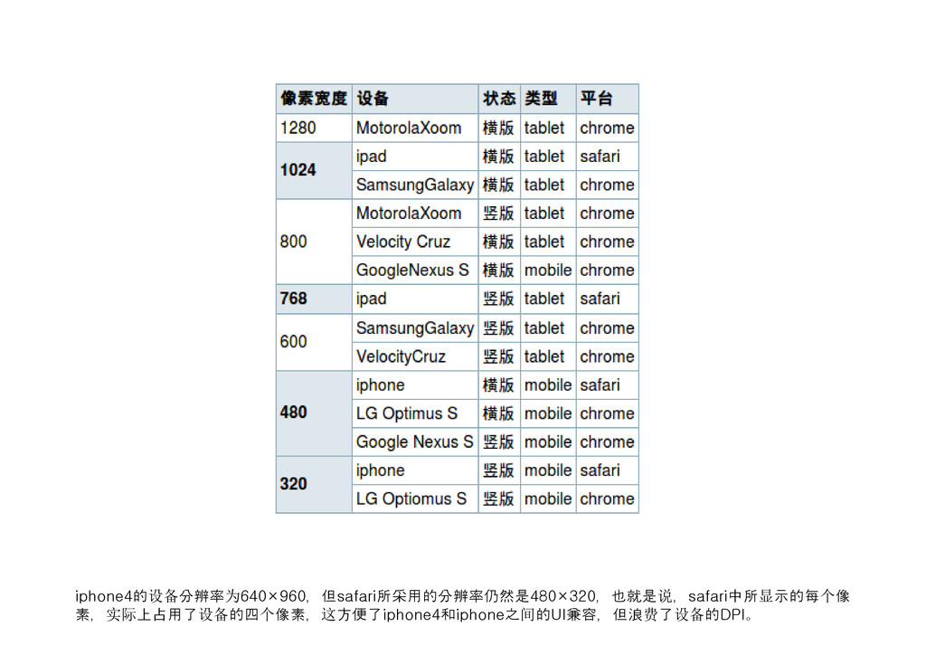
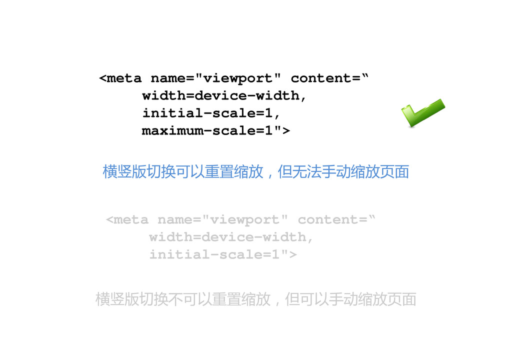
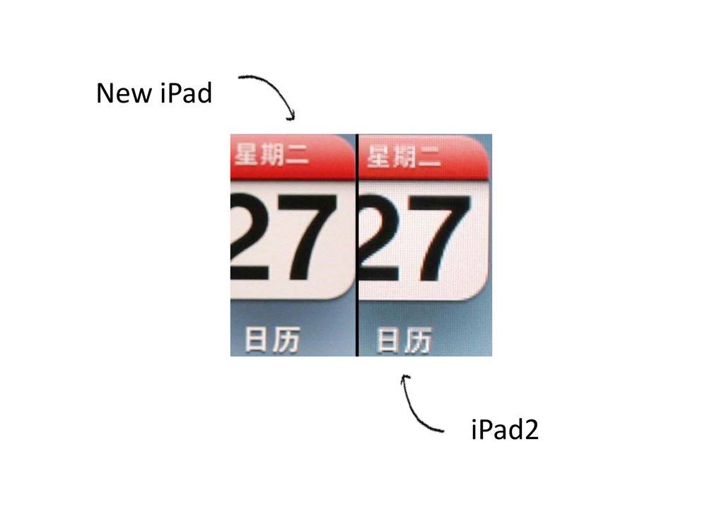
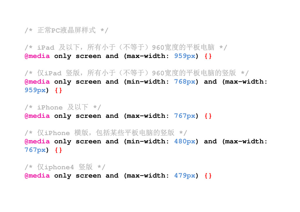
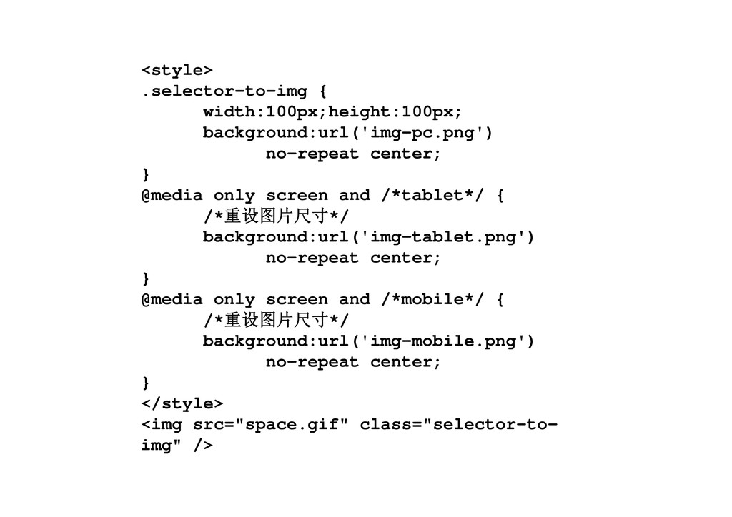
and (max-width: 959px) {} /* 仅iPad 竖版,所有小于(不等于)960宽度的平板电脑的竖版 */ @media only screen and (min-width: 768px) and (max-width: 959px) {} /* iPhone 及以下 */ @media only screen and (max-width: 767px) {} /* 仅iPhone 横版,包括某些平板电脑的竖版 */ @media only screen and (min-width: 480px) and (max-width: 767px) {} /* 仅iphone4 竖版 */ @media only screen and (max-width: 479px) {}
 karad
karad
 lynteo
 takaikanako
 shosira
 marzstarz
 stmn
stmn
 littlebusters
 tararira
 baasie
 xtone
xtone
 tajima_kaho
 hilokifigma
 eileencodes
 konakalab
 eitanlees
 apolaine
 katarinadahlin
 vanstee
 tammyeverts
 rmw
rmw
 inesmontani
 honzajavorek
 madoxten
 nikkihalliwell
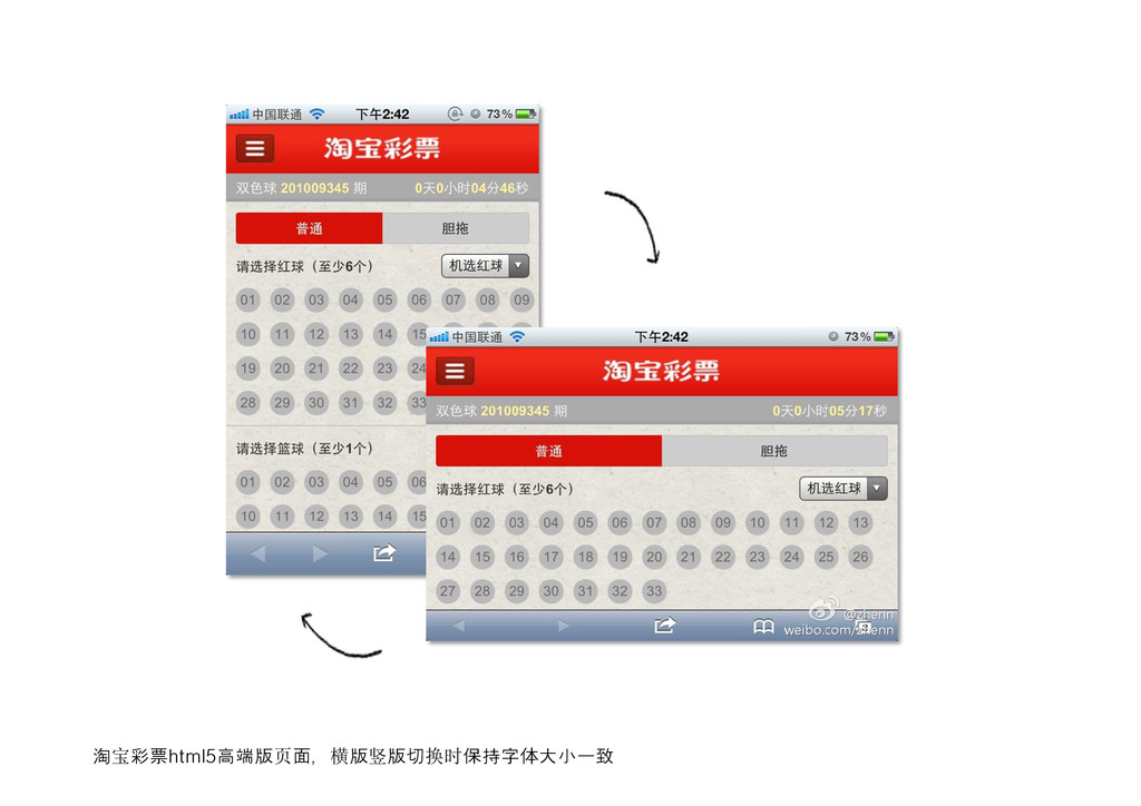
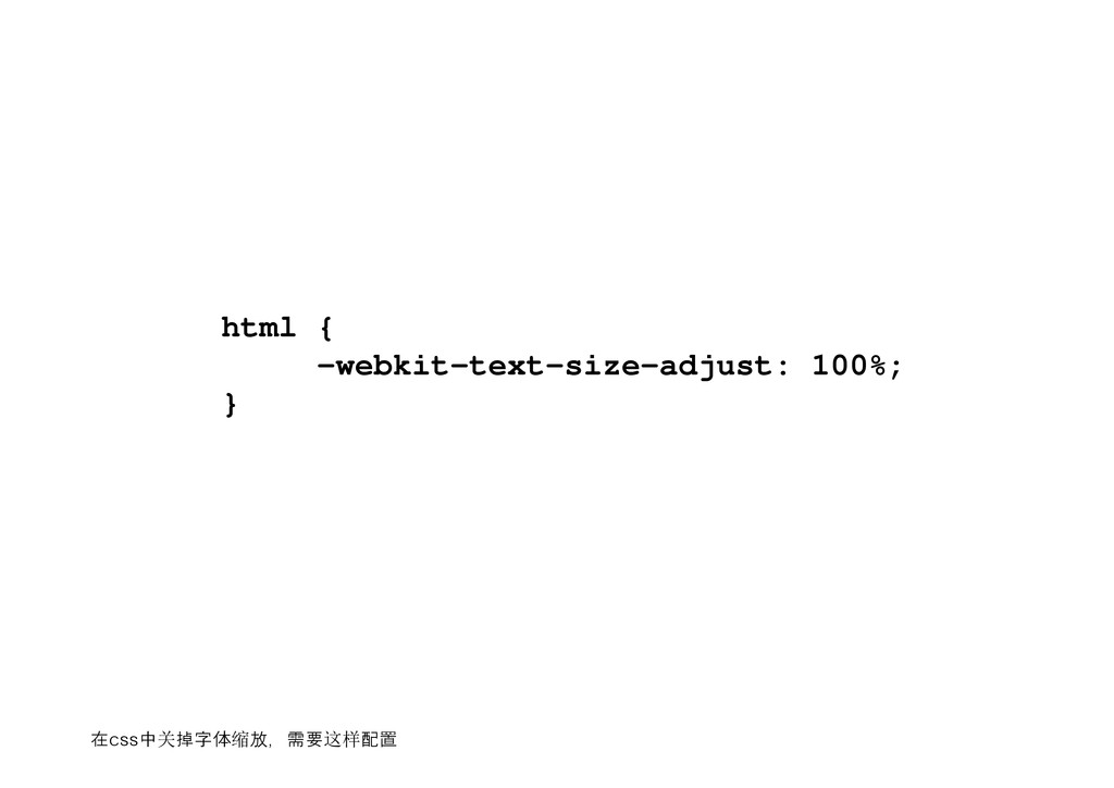
![Design & Develop @jayli F2E & Translator htt[p://jayli.github.com [email protected] 2012‐04‐13](https://files.speakerdeck.com/presentations/6392371011fa01307fca1231381d631d/slide_0.jpg)