Upgrade to Pro — share decks privately, control downloads, hide ads and more …

Accessibility-flavored React components make your design system delicious

A11YChi
October 28, 2020

Accessibility-flavored React components make your design system delicious

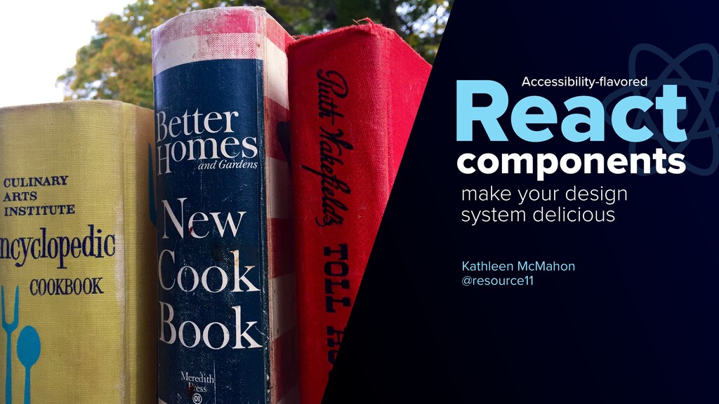
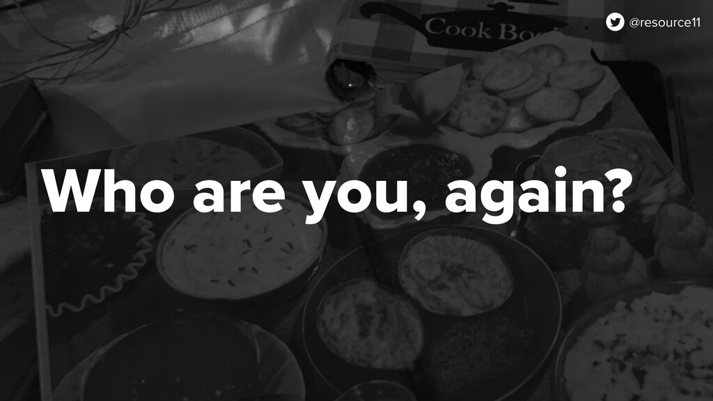
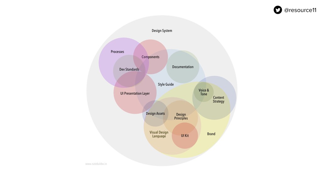
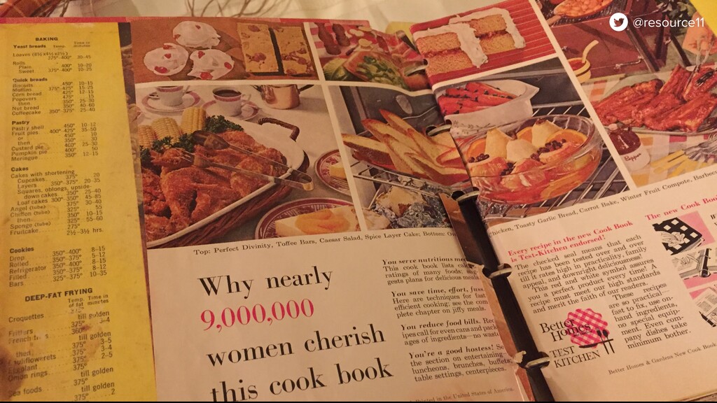
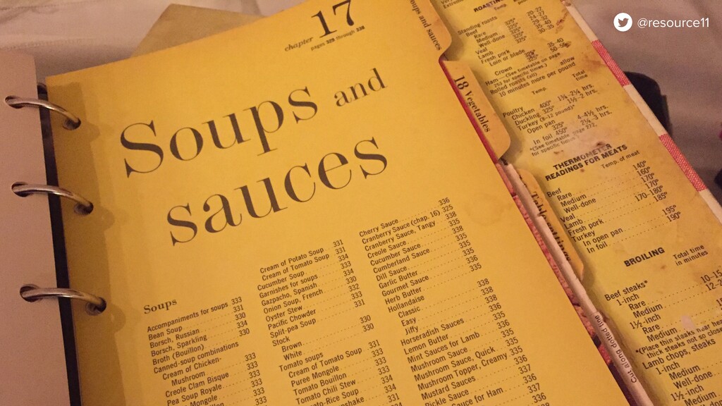
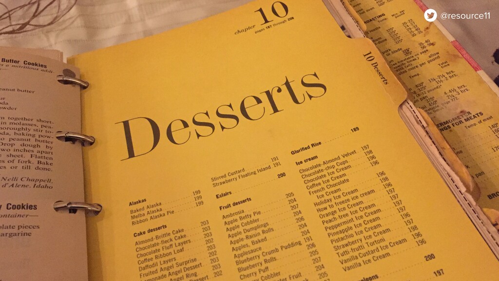
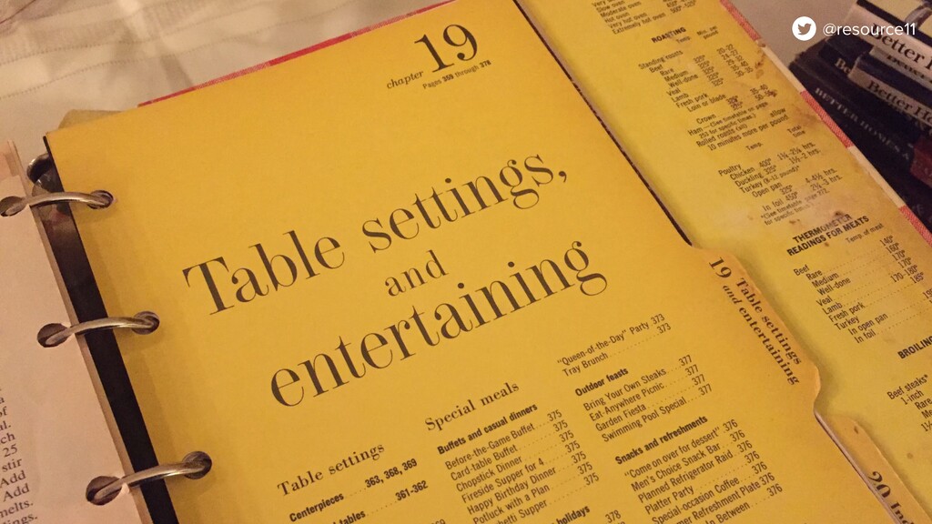
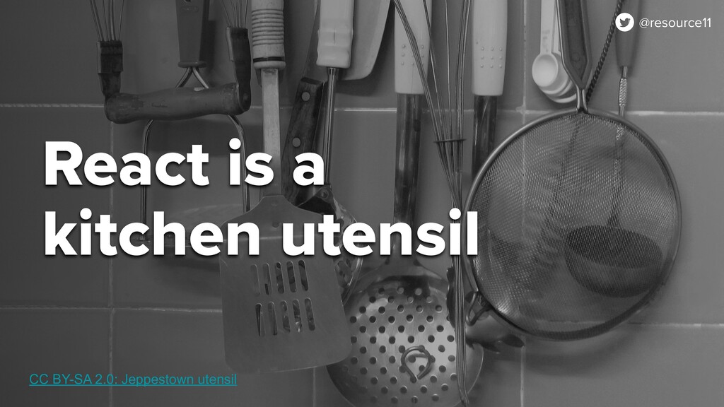
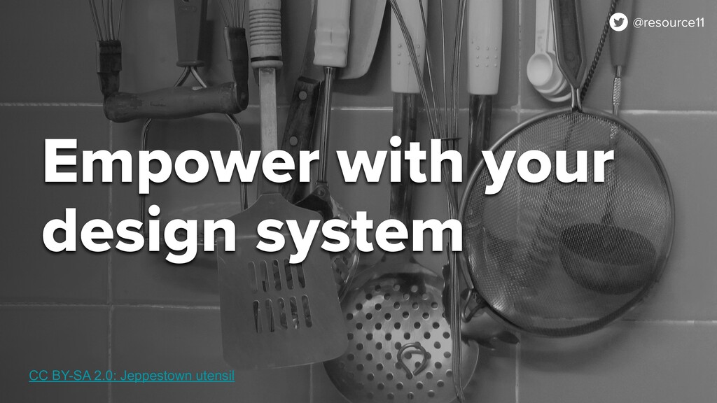
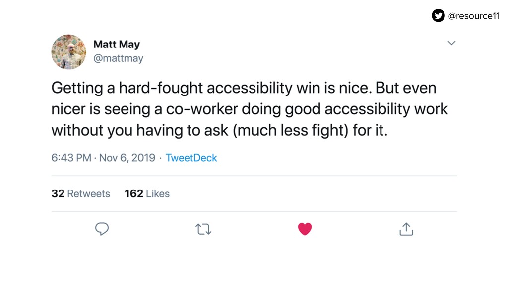
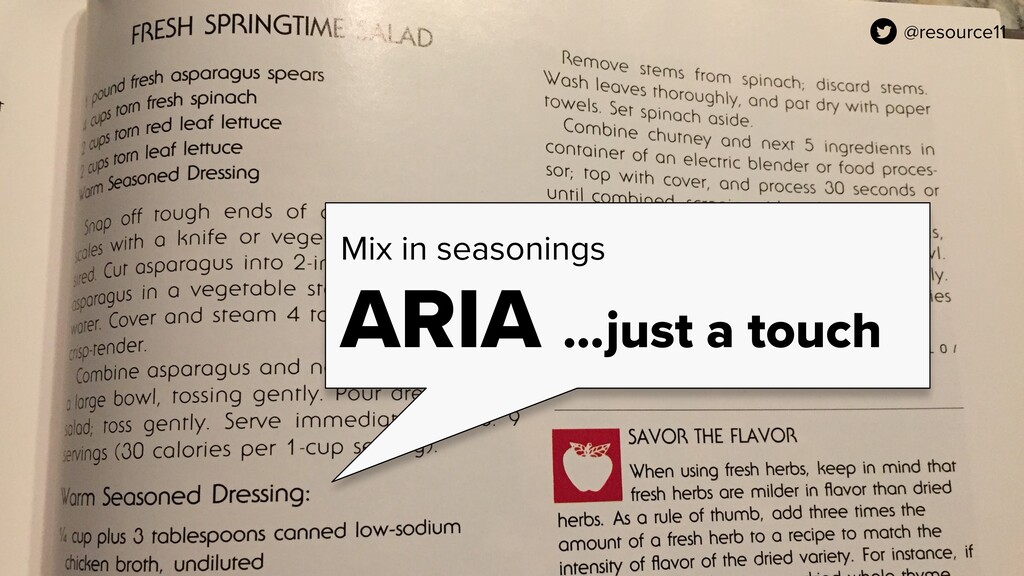
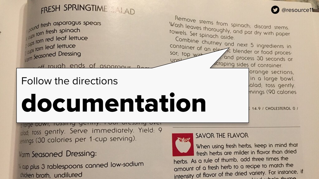
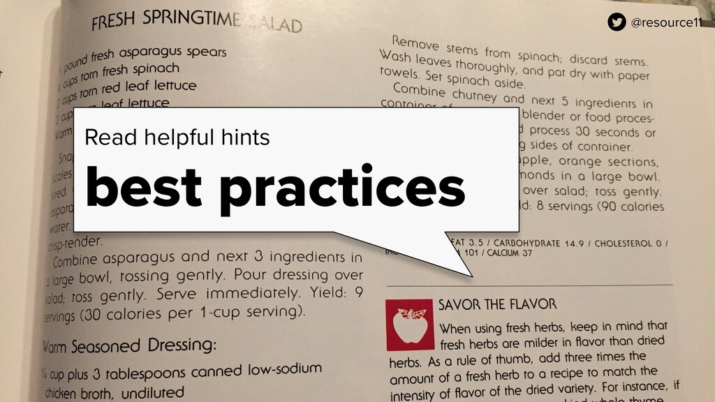
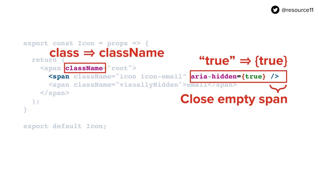
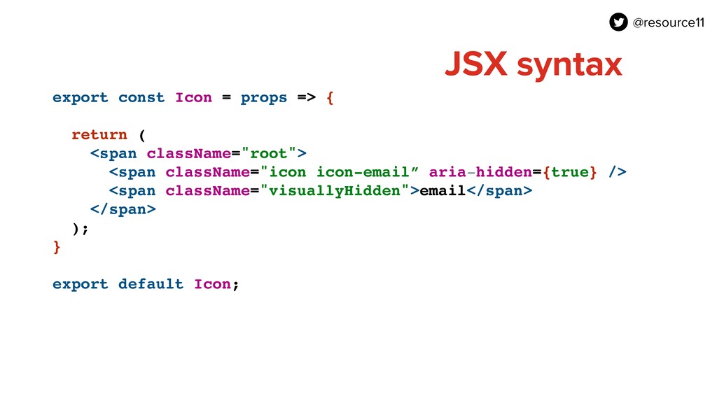
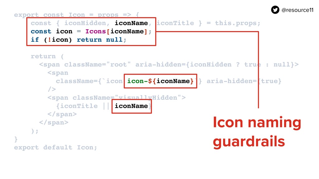
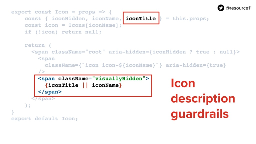
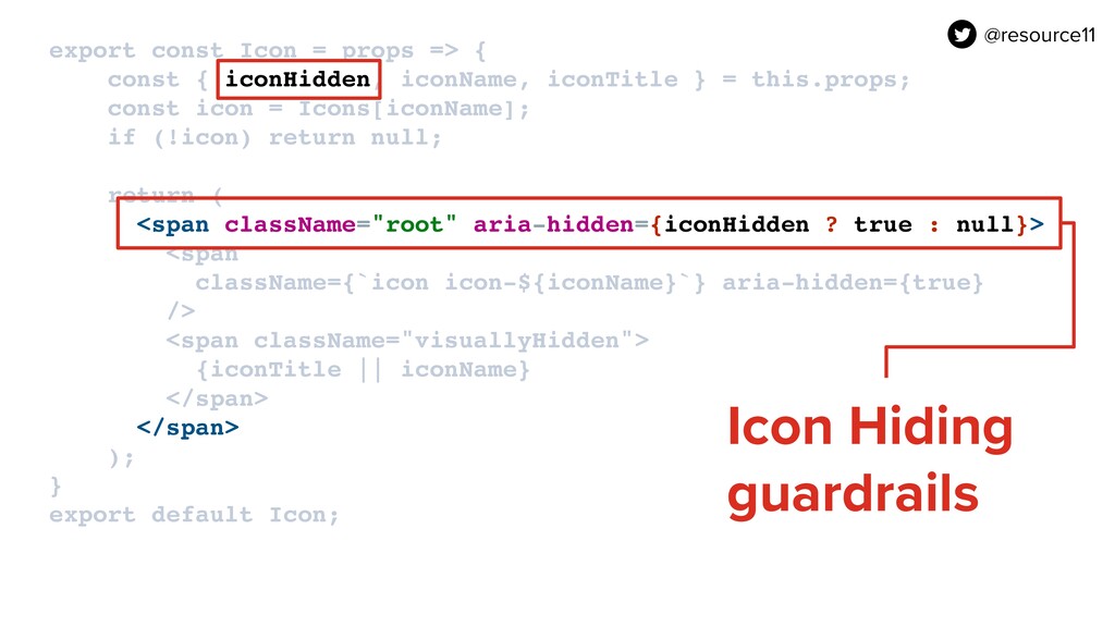
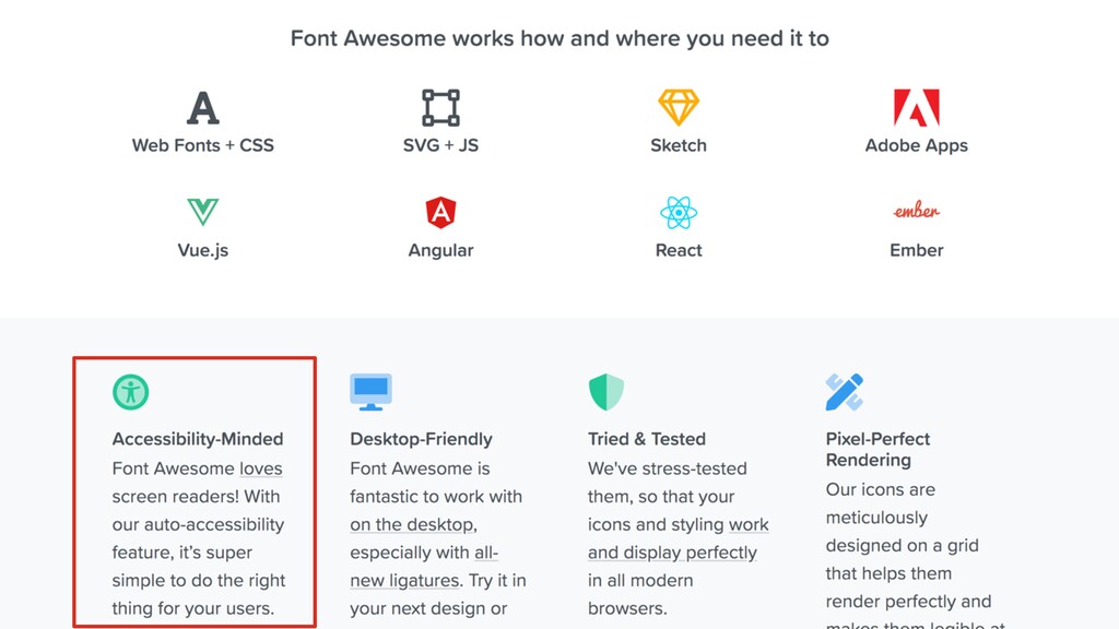
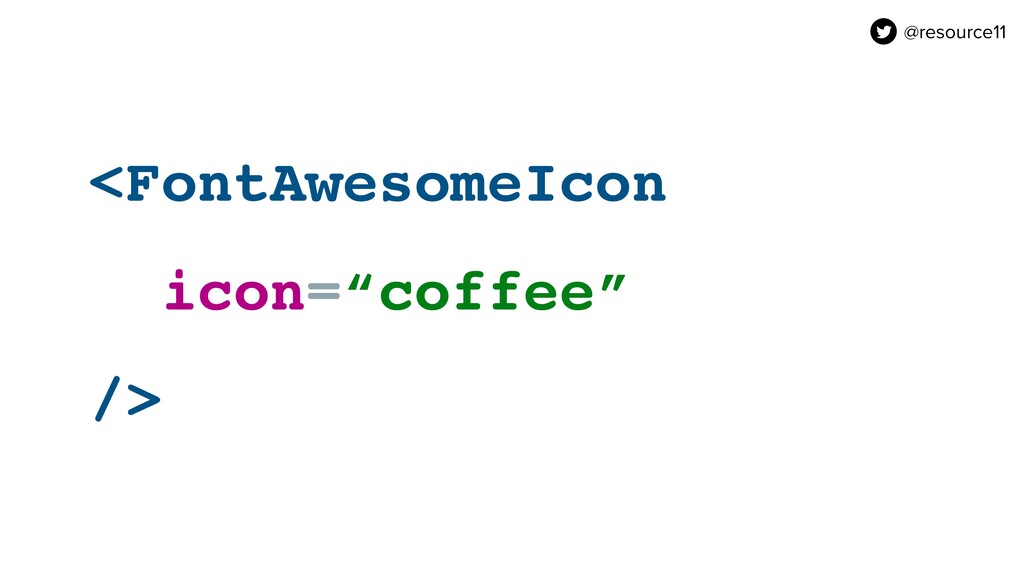
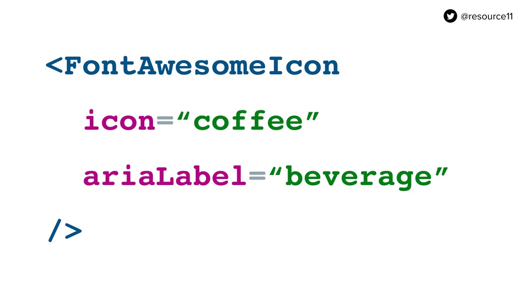
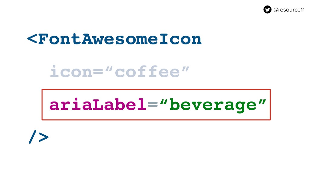
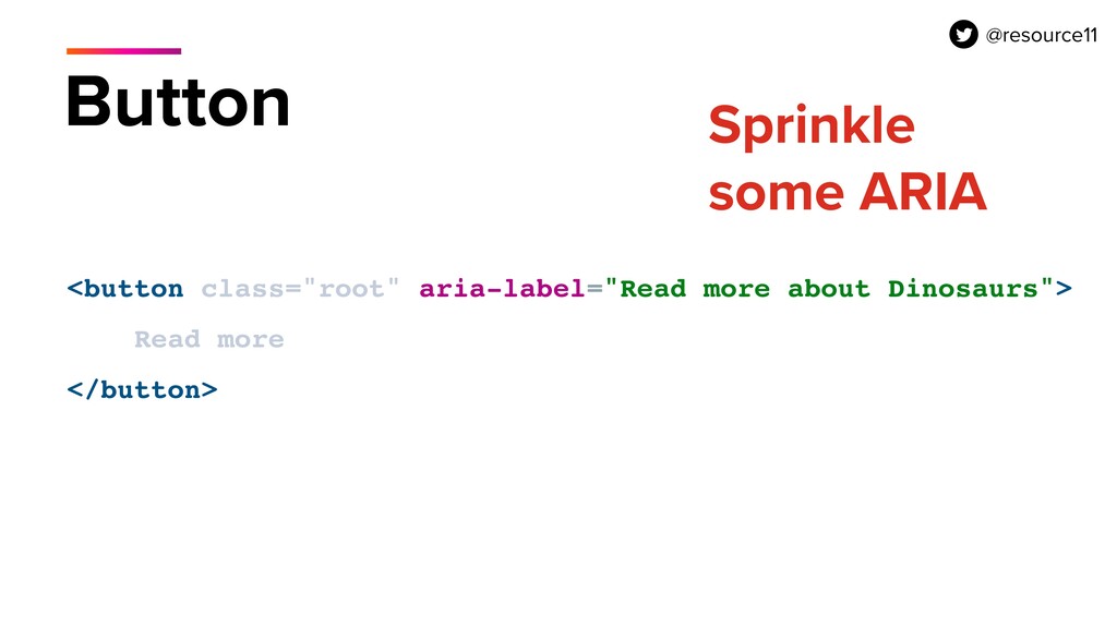
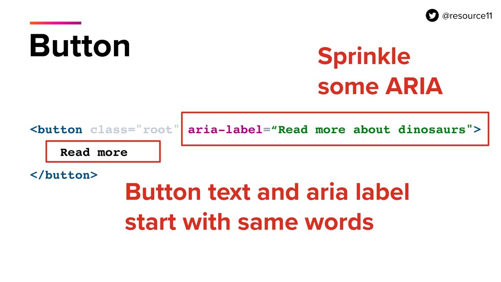
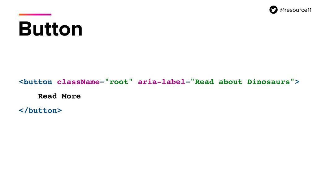
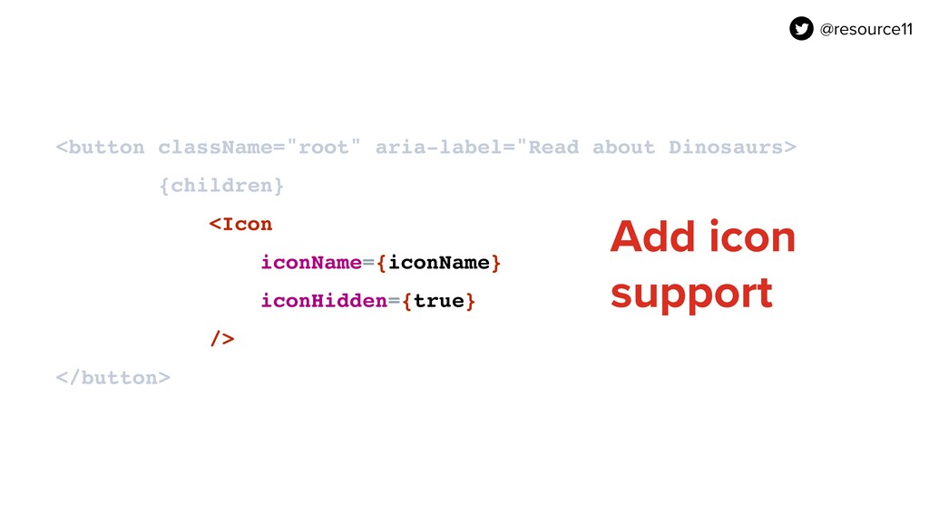
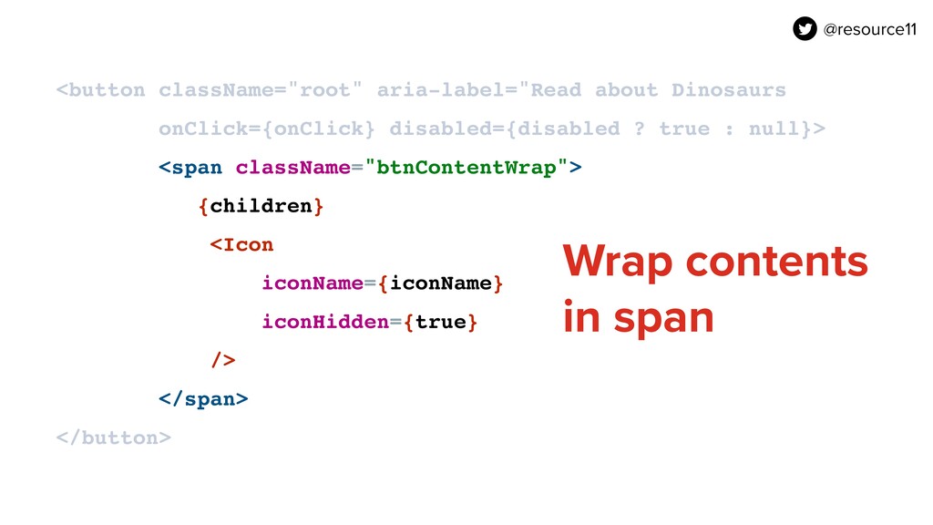
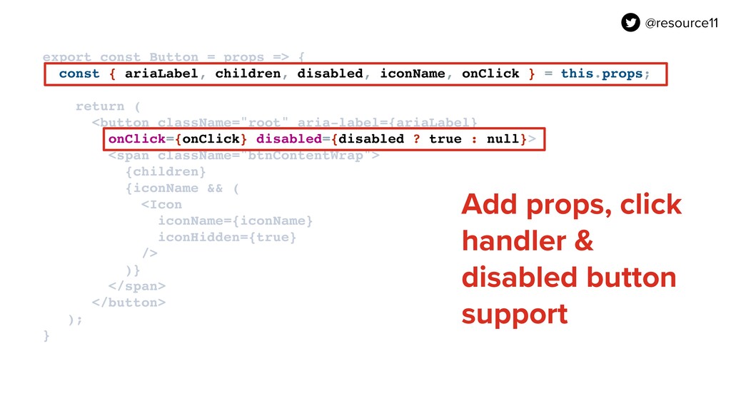
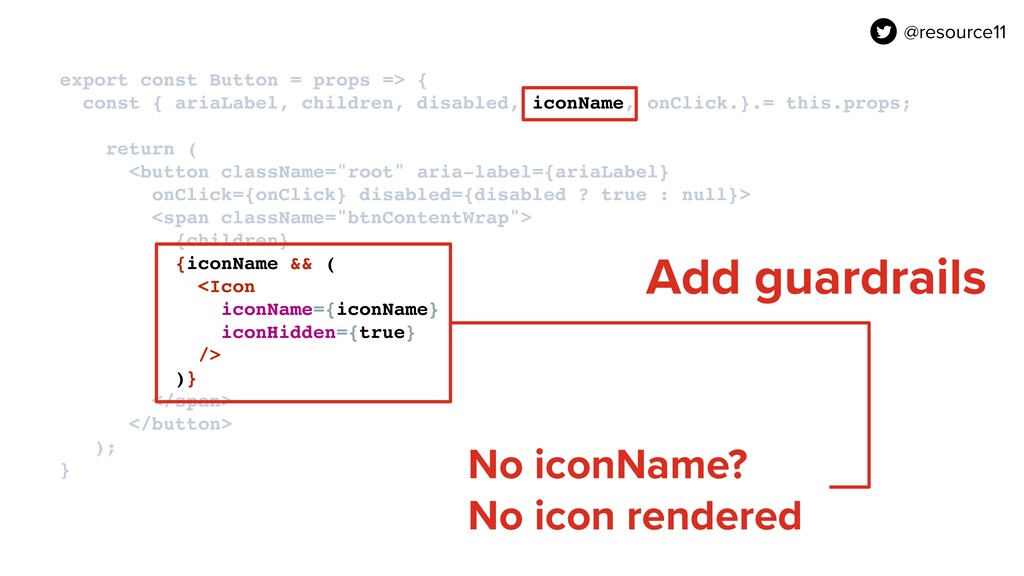
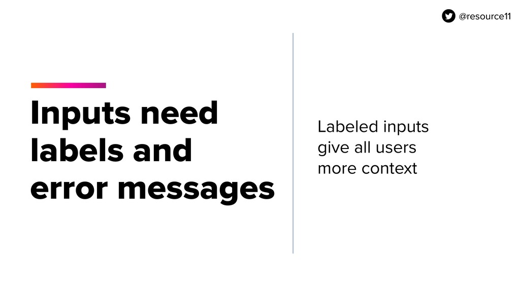
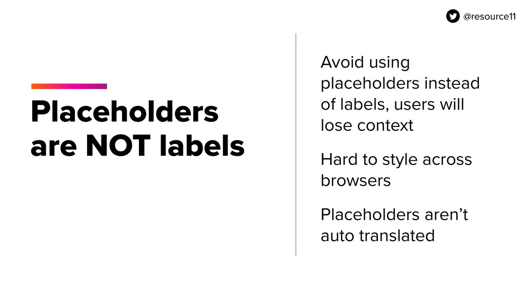
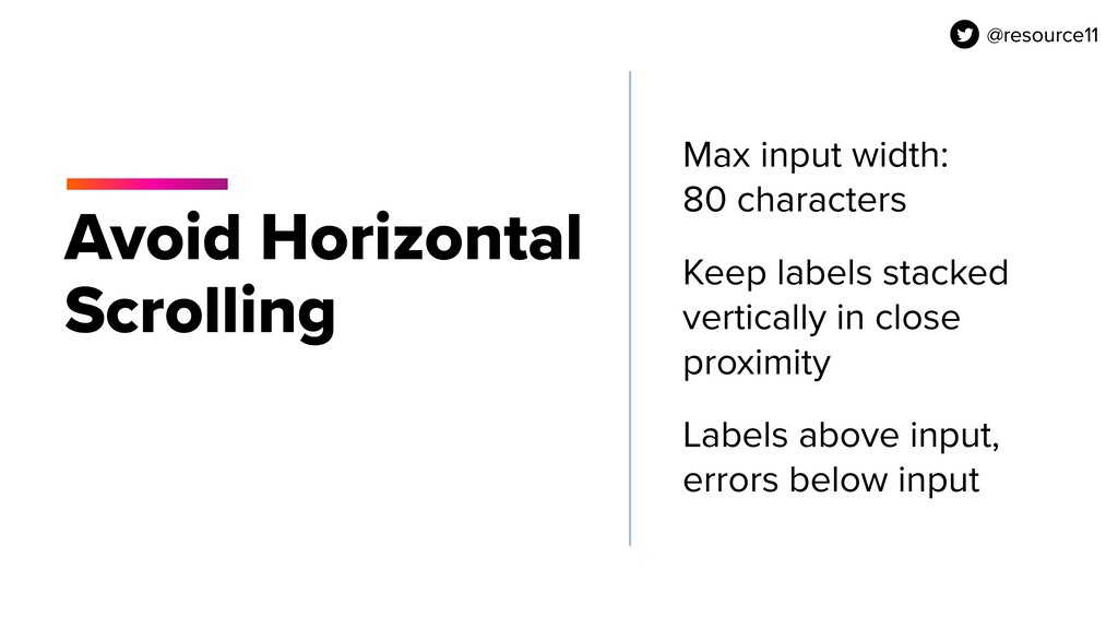
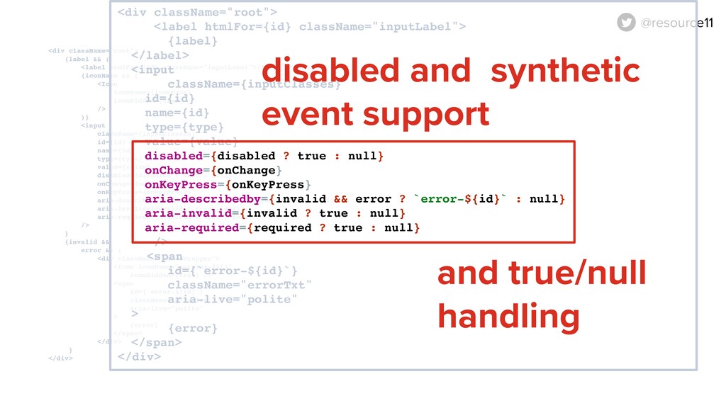
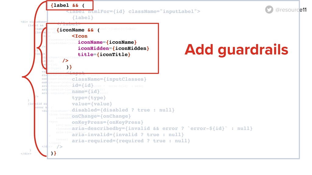
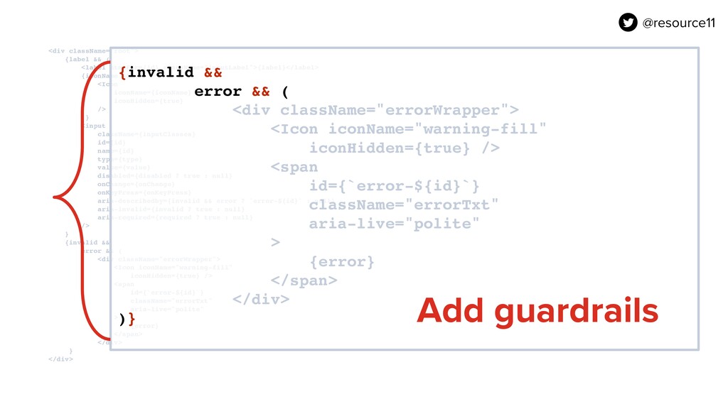
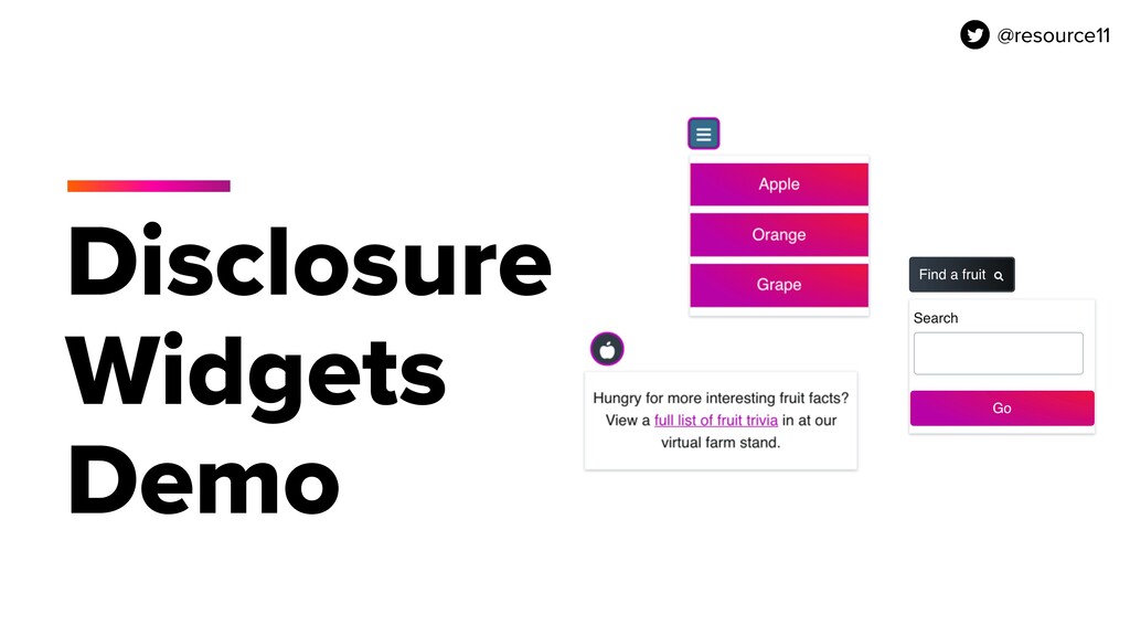
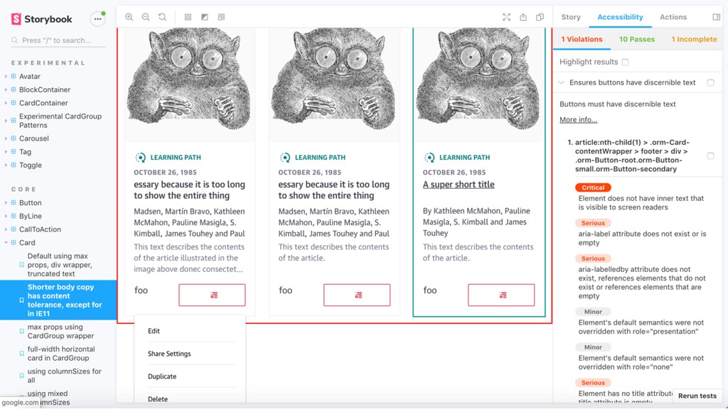
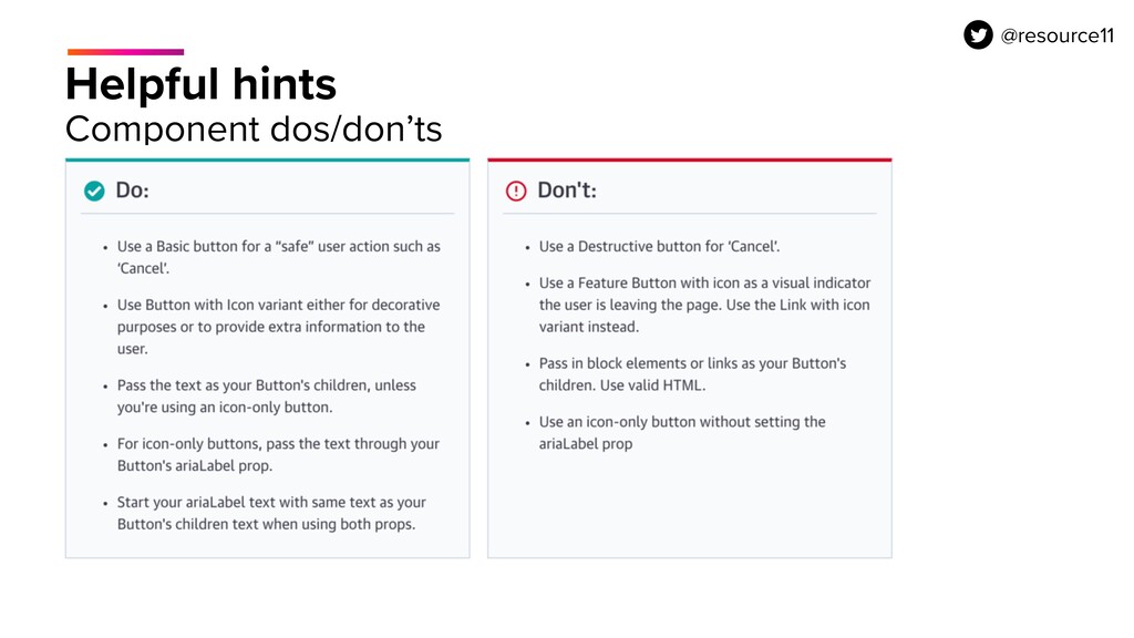
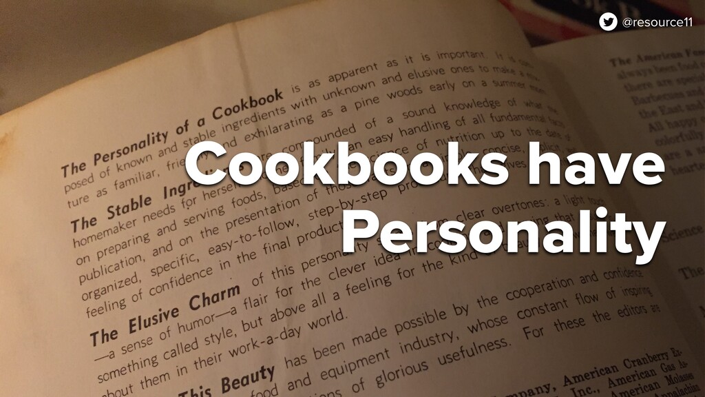
Design systems are a popular way for teams to flavor their design and development workflow. However, an often-missing ingredient in many design systems is a focus on accessibility best practices — especially when component libraries are involved. In this talk, we’ll take a look at how you can mix some commonly-used components with the ingredients of accessibility. Pair this with best practices guidance in your documentation, and you’ll have the recipe for a delectably inclusive design system.

---
About the speaker

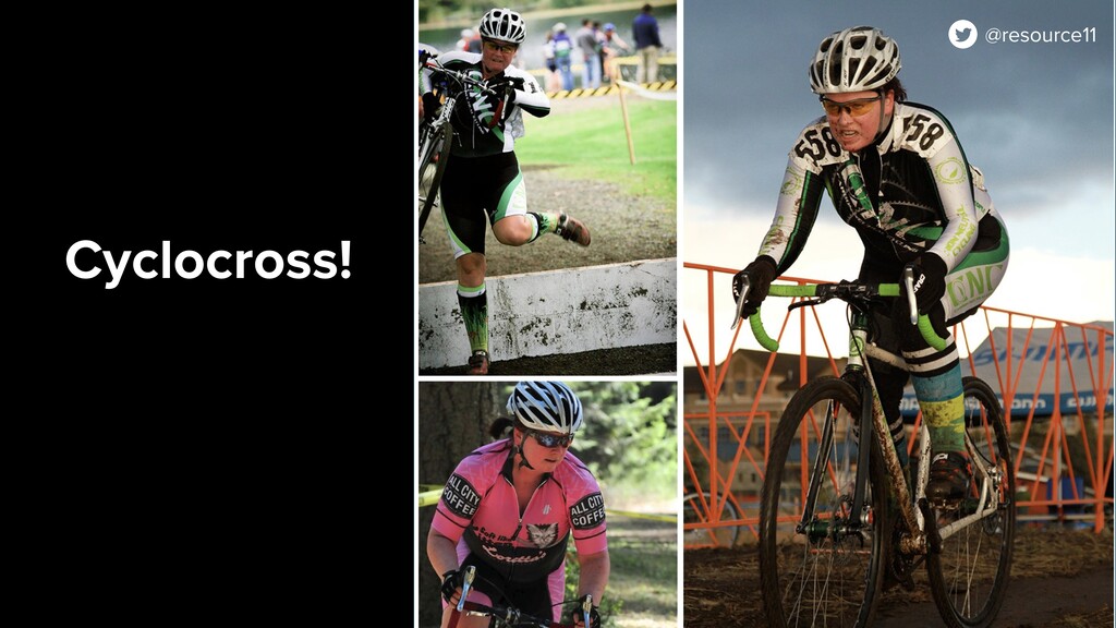
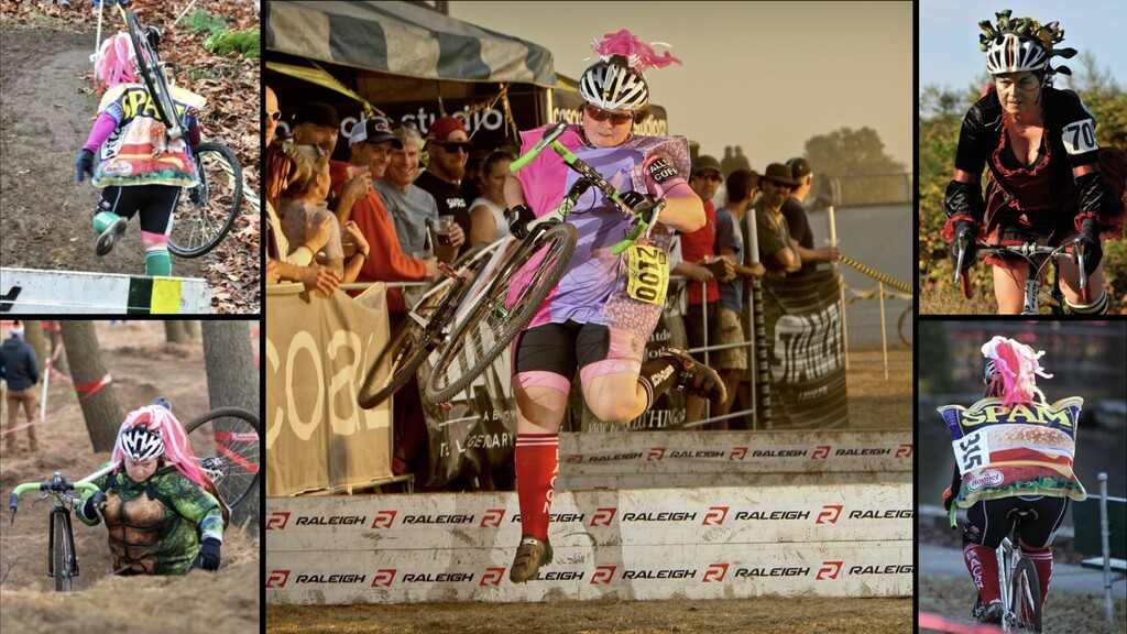
Kathleen McMahon (she/her) is a fullstack engineer with a design background. In other words, She really enjoys the front of the frontend, digging into new technologies, and talking about accessibility, React component libraries, design systems, and inclusive documentation. She is also a Color Module Specification Editor for the W3C Design Tokens Community Group. When not coding, designing, or speaking about things, Kathleen is the best Lanterne Rouge cyclocrosser you’ll ever meet.

Website: https://www.kathleenmcmahon.dev/
Twitter: https://twitter.com/resource11

A11YChi

October 28, 2020
Tweet

More Decks by A11YChi

Other Decks in Technology

Transcript

  1. @resource11 Good grief, there’s an agenda... Why accessibility first? Design

    systems are a cookbook Design systems and React Icons Buttons Inputs Documentation @resource11
  2. Inclusive Design Persona Spectrum (CC BY-NC-SA 2.0) Motor Hearing Vision

    Cognitive Low bandwidth Language Sensory Our users are diverse
  3. @resource11 Icons Informative or decorative Informative icons need descriptive text

    Decorative icons need to be hidden from assistive technology @resource11
  4. @resource11 <span class="root">
 <span class="icon icon-email" 
 aria-hidden="true"></span>
 <span class="visuallyHidden">email</span>


    </span> Icon font .icon { color: currentColor; font-family: "ORM Icons"; } .icon-email::before {
 content: "\f12f";
 }
  5. <span class="root">
 <span class="icon icon-email" 
 aria-hidden="true"></span>
 <span class="visuallyHidden">email</span>
 </span>

    Hide icon font from screen readers .icon-email::before {
 content: "\f12f";
 } @resource11
  6. @resource11 <span class="root">
 <span class="icon icon-email" 
 aria-hidden="true"></span>
 <span class="visuallyHidden">email</span>


    </span> Visually-hidden text .visuallyHidden {
 position: absolute;
 overflow: hidden;
 clip: rect(0 0 0 0);
 height: 1px;
 width: 1px;
 margin: -1px;
 padding: 0;
 border: 0;
 }
  7. Hide decorative icons from screen readers <span class=“root" aria-hidden="true">
 <span

    class="icon icon-email" 
 aria-hidden="true"></span>
 <span class="visuallyHidden">email</span>
 </span> @resource11
  8. export const Icon = props => { 
 return (


    <span class="root">
 <span class="icon icon-email” aria-hidden=”true” />
 <span class="visuallyHidden">email</span>
 </span>
 );
 } 
 export default Icon; HTML syntax React functional component @resource11
  9. export const Icon = props => { 
 return (


    <span className="root">
 <span className="icon icon-email” aria-hidden={true} />
 <span className="visuallyHidden">email</span>
 </span>
 );
 } 
 export default Icon; class 㱺 className Close empty span “true” 㱺 {true} @resource11
  10. JSX syntax export const Icon = props => { 


    return (
 <span className="root">
 <span className="icon icon-email” aria-hidden={true} />
 <span className="visuallyHidden">email</span>
 </span>
 );
 } 
 export default Icon; @resource11
  11. export const Icon = props => {
 const { iconHidden,

    iconName, iconTitle } = this.props;
 const icon = Icons[iconName];
 if (!icon) return null;
 
 return (
 <span className="root" aria-hidden={iconHidden ? true : null}>
 <span
 className={`icon icon-${iconName}`} aria-hidden={true}
 />
 <span className="visuallyHidden">
 {iconTitle || iconName}
 </span>
 </span>
 );
 }
 export default Icon; Support incoming props, add guardrails @resource11
  12. export const Icon = props => {
 const { iconHidden,

    iconName, iconTitle } = this.props;
 const icon = Icons[iconName];
 if (!icon) return null;
 
 return (
 <span className="root" aria-hidden={iconHidden ? true : null}>
 <span
 className={`icon icon-${iconName}`} aria-hidden={true}
 />
 <span className="visuallyHidden">
 {iconTitle || iconName}
 </span>
 </span>
 );
 }
 export default Icon; Icon naming guardrails @resource11
  13. export const Icon = props => {
 const { iconHidden,

    iconName, iconTitle } = this.props;
 const icon = Icons[iconName];
 if (!icon) return null;
 
 return (
 <span className="root" aria-hidden={iconHidden ? true : null}>
 <span
 className={`icon icon-${iconName}`} aria-hidden={true}
 />
 <span className="visuallyHidden">
 {iconTitle || iconName}
 </span>
 </span>
 );
 }
 export default Icon; Icon description guardrails @resource11
  14. export const Icon = props => {
 const { iconHidden,

    iconName, iconTitle } = this.props;
 const icon = Icons[iconName];
 if (!icon) return null;
 
 return (
 <span className="root" aria-hidden={iconHidden ? true : null}>
 <span
 className={`icon icon-${iconName}`} aria-hidden={true}
 />
 <span className="visuallyHidden">
 {iconTitle || iconName}
 </span>
 </span>
 );
 }
 export default Icon; Icon Hiding guardrails @resource11
  15. export const Icon = props => {
 const { iconHidden,

    iconName, iconTitle } = this.props;
 const icon = Icons[iconName];
 if (!icon) return null;
 
 return (
 <span className="root" aria-hidden={iconHidden ? true : null}>
 <span
 className={`icon icon-${iconName}`} aria-hidden={true}
 />
 <span className="visuallyHidden">
 {iconTitle || iconName}
 </span>
 </span>
 );
 }
 export default Icon; Icon Hiding guardrails @resource11
  16. export const Icon = props => {
 const { iconHidden,

    iconName, iconTitle } = this.props;
 
 return (
 <span className=“root” aria-hidden={iconHidden ? true : null}>
 <span
 className={`icon icon-${iconName}`} aria-hidden={true}
 />
 <span className="visuallyHidden">
 {iconTitle || iconName}
 </span>
 </span>
 );
 }
 export default Icon; @resource11 Swap out font-based className
  17. export const Icon = props => {
 const { iconHidden,

    iconName, iconTitle } = this.props;
 
 return (
 <span className="root" aria-hidden={iconHidden ? true : null}>
 <FontAwesomeIcon
 icon={iconName}
 />
 <span className="visuallyHidden">
 {iconTitle || iconName}
 </span>
 </span>
 );
 }
 export default Icon; @resource11 Swap in FontAwesomeIcon
  18. export const Icon = props => {
 const { iconHidden,

    iconName, iconTitle } = this.props;
 
 return (
 <span className="root" aria-hidden={iconHidden ? true : null}>
 <FontAwesomeIcon
 icon={iconName}
 />
 <span className="visuallyHidden">
 {iconTitle || iconName}
 </span>
 </span>
 );
 }
 export default Icon; Informative icon naming supported @resource11
  19. @resource11 Buttons Perform an action on the page Should look

    and act like a button Screen reader and keyboard functionality for free @resource11
  20. <button class="root" aria-label=“Read more about dinosaurs">
 Read more
 </button> Button

    Sprinkle some ARIA @resource11 Button text and aria label start with same words
  21. <button class="root" aria-label=“Read more about dinosaurs">
 Read more
 </button> Button

    Sprinkle some ARIA @resource11 Button text and aria label start with same words
  22. <button className="root" aria-label="Read about Dinosaurs 
 onClick={onClick} disabled={disabled ? true

    : null}>
 <span className="btnContentWrap">
 {children}
 <Icon
 iconName={iconName}
 iconHidden={true}
 />
 </span>
 </button> Wrap contents in span @resource11
  23. export const Button = props => {
 const { ariaLabel,

    children, disabled, iconName, onClick.}.= this.props;
 
 return (
 <button className="root" aria-label={ariaLabel} 
 onClick={onClick} disabled={disabled ? true : null}>
 <span className="btnContentWrap">
 {children}
 {iconName && (
 <Icon
 iconName={iconName}
 iconHidden={true}
 />
 )}
 </span>
 </button>
 );
 } Add props, click handler & disabled button support @resource11
  24. export const Button = props => {
 const { ariaLabel,

    children, disabled, iconName, onClick.}.= this.props;
 
 return (
 <button className="root" aria-label={ariaLabel} 
 onClick={onClick} disabled={disabled ? true : null}>
 <span className="btnContentWrap">
 {children}
 {iconName && (
 <Icon
 iconName={iconName}
 iconHidden={true}
 />
 )}
 </span>
 </button>
 );
 } No iconName? No icon rendered Add guardrails @resource11
  25. @resource11 Placeholders are NOT labels Avoid using placeholders instead of

    labels, users will lose context Hard to style across browsers Placeholders aren’t auto translated @resource11
  26. @resource11 Avoid Horizontal Scrolling Max input width: 80 characters Keep

    labels stacked vertically in close proximity Labels above input, errors below input @resource11
  27. <div className="root"> {label && ( <label htmlFor={id} className="inputLabel">{label}</label> {iconName &&

    ( <Icon iconName={iconName} iconHidden={true} /> )} <input className={inputClasses} id={id} name={id} type={type} value={value} disabled={disabled ? true : null} onChange={onChange} onKeyPress={onKeyPress} aria-describedby={invalid && error ? `error-${id}` : null} aria-invalid={invalid ? true : null} aria-required={required ? true : null} /> } {invalid && error && ( <div className="errorWrapper"> <Icon iconName="warning-fill" iconHidden={true} /> <span id={`error-${id}`} className="errorTxt" aria-live="polite" > {error} </span> </div> } </div> @resource11
  28. @resource11 <div className="root"> {label && ( <label htmlFor={id} className="inputLabel">{label}</label> {iconName

    && ( <Icon iconName={iconName} iconHidden={true} /> )} <input className={inputClasses} id={id} name={id} type={type} value={value} disabled={disabled ? true : null} onChange={onChange} onKeyPress={onKeyPress} aria-describedby={invalid && error ? `error-${id}` : null} aria-invalid={invalid ? true : null} aria-required={required ? true : null} /> } {invalid && error && ( <div className="errorWrapper"> <Icon iconName="warning-fill" iconHidden={true} /> <span id={`error-${id}`} className="errorTxt" aria-live="polite" > {error} </span> </div> } </div> <div class=“root”> <label for="inputFoo" class="inputLabel"> First name </label> <input class="inputClasses" id=“inputFoo"
 name="inputFoo"
 type="text" /> <span id=“errorFoo" class="errorTxt"> Whoops! Error. </span> </div> Semantic HTML
  29. <div className="root"> {label && ( <label htmlFor={id} className="inputLabel">{label}</label> {iconName &&

    ( <Icon iconName={iconName} iconHidden={true} /> )} <input className={inputClasses} id={id} name={id} type={type} value={value} disabled={disabled ? true : null} onChange={onChange} onKeyPress={onKeyPress} aria-describedby={invalid && error ? `error-${id}` : null} aria-invalid={invalid ? true : null} aria-required={required ? true : null} /> } {invalid && error && ( <div className="errorWrapper"> <Icon iconName="warning-fill" iconHidden={true} /> <span id={`error-${id}`} className="errorTxt" aria-live="polite" > {error} </span> </div> } </div> @resource11 Labels and error messages <div class=“root”> <label for="inputFoo" class="inputLabel"> First name </label> <input class="inputClasses" id=“inputFoo"
 name="inputFoo"
 type="text" /> <span id=“errorFoo" class="errorTxt"> Whoops! Error. </span> </div>
  30. <div className="root"> {label && ( <label htmlFor={id} className="inputLabel">{label}</label> {iconName &&

    ( <Icon iconName={iconName} iconHidden={true} /> )} <input className={inputClasses} id={id} name={id} type={type} value={value} disabled={disabled ? true : null} onChange={onChange} onKeyPress={onKeyPress} aria-describedby={invalid && error ? `error-${id}` : null} aria-invalid={invalid ? true : null} aria-required={required ? true : null} /> } {invalid && error && ( <div className="errorWrapper"> <Icon iconName="warning-fill" iconHidden={true} /> <span id={`error-${id}`} className="errorTxt" aria-live="polite" > {error} </span> </div> } </div> @resource11 <div className=“root”> <label htmlFor="inputFoo" className="inputLabel"> First name </label> <input className="inputClasses" id="inputFoo"
 name="inputFoo"
 type="text" /> <span id=“errorFoo" className="errorTxt"> Whoops! Error. </span> </div> Associate label with input
  31. @resource11 <div className="root"> {label && ( <label htmlFor={id} className="inputLabel">{label}</label> {iconName

    && ( <Icon iconName={iconName} iconHidden={true} /> )} <input className={inputClasses} id={id} name={id} type={type} value={value} disabled={disabled ? true : null} onChange={onChange} onKeyPress={onKeyPress} aria-describedby={invalid && error ? `error-${id}` : null} aria-invalid={invalid ? true : null} aria-required={required ? true : null} /> } {invalid && error && ( <div className="errorWrapper"> <Icon iconName="warning-fill" iconHidden={true} /> <span id={`error-${id}`} className="errorTxt" aria-live="polite" > {error} </span> </div> } </div> <div className="root"> <label htmlFor="inputFoo" className="inputLabel"> First name </label> <input className="inputClasses" id=“inputFoo" name=“inputFoo" type="text" aria-describedby=“errorFoo" aria-invalid="true" aria-required="true" /> <span id="errorFoo" className="errorTxt"> Whoops! Error. </span> </div> Sprinkle some ARIA
  32. <div className="root"> {label && ( <label htmlFor={id} className="inputLabel">{label}</label> {iconName &&

    ( <Icon iconName={iconName} iconHidden={true} /> )} <input className={inputClasses} id={id} name={id} type={type} value={value} disabled={disabled ? true : null} onChange={onChange} onKeyPress={onKeyPress} aria-describedby={invalid && error ? `error-${id}` : null} aria-invalid={invalid ? true : null} aria-required={required ? true : null} /> } {invalid && error && ( <div className="errorWrapper"> <Icon iconName="warning-fill" iconHidden={true} /> <span id={`error-${id}`} className="errorTxt" aria-live="polite" > {error} </span> </div> } </div> @resource11 <div className="root"> <label htmlFor="inputFoo" className="inputLabel"> First name </label> <input className="inputClasses" id="inputFoo"
 name="inputFoo"
 type="text" aria-describedby="errorFoo" aria-invalid="true" aria-required="true" /> <span id="errorFoo" className="errorTxt" aria-live="polite"> Whoops! Error. </span> </div>
  33. @resource11 <div className="root"> {label && ( <label htmlFor={id} className="inputLabel">{label}</label> {iconName

    && ( <Icon iconName={iconName} iconHidden={true} /> )} <input className={inputClasses} id={id} name={id} type={type} value={value} disabled={disabled ? true : null} onChange={onChange} onKeyPress={onKeyPress} aria-describedby={invalid && error ? `error-${id}` : null} aria-invalid={invalid ? true : null} aria-required={required ? true : null} /> } {invalid && error && ( <div className="errorWrapper"> <Icon iconName="warning-fill" iconHidden={true} /> <span id={`error-${id}`} className="errorTxt" aria-live="polite" > {error} </span> </div> } </div> <div className="root"> <label htmlFor={id} className="inputLabel"> {label} </label> <input className={inputClasses} id={id} name={id} type={type} value={value} disabled={disabled ? true : null} onChange={onChange} onKeyPress={onKeyPress} aria-describedby={invalid && error ? `error-${id}` : null} aria-invalid={invalid ? true : null} aria-required={required ? true : null} /> <span id={`error-${id}`} className="errorTxt" aria-live="polite" > {error} </span> </div> disabled and synthetic event support and true/null handling
  34. @resource11 <div className="root"> {label && ( <label htmlFor={id} className="inputLabel">{label}</label> {iconName

    && ( <Icon iconName={iconName} iconHidden={true} /> )} <input className={inputClasses} id={id} name={id} type={type} value={value} disabled={disabled ? true : null} onChange={onChange} onKeyPress={onKeyPress} aria-describedby={invalid && error ? `error-${id}` : null} aria-invalid={invalid ? true : null} aria-required={required ? true : null} /> } {invalid && error && ( <div className="errorWrapper"> <Icon iconName="warning-fill" iconHidden={true} /> <span id={`error-${id}`} className="errorTxt" aria-live="polite" > {error} </span> </div> } </div> {label && ( <label htmlFor={id} className="inputLabel"> {label} </label> {iconName && ( <Icon iconName={iconName} iconHidden={iconHidden} title={iconTitle} /> )} <input className={inputClasses} id={id} name={id} type={type} value={value} disabled={disabled ? true : null} onChange={onChange} onKeyPress={onKeyPress} aria-describedby={invalid && error ? `error-${id}` : null} aria-invalid={invalid ? true : null} aria-required={required ? true : null}
 /> )} Add guardrails
  35. @resource11 <div className="root"> {label && ( <label htmlFor={id} className="inputLabel">{label}</label> {iconName

    && ( <Icon iconName={iconName} iconHidden={true} /> )} <input className={inputClasses} id={id} name={id} type={type} value={value} disabled={disabled ? true : null} onChange={onChange} onKeyPress={onKeyPress} aria-describedby={invalid && error ? `error-${id}` : null} aria-invalid={invalid ? true : null} aria-required={required ? true : null} /> } {invalid && error && ( <div className="errorWrapper"> <Icon iconName="warning-fill" iconHidden={true} /> <span id={`error-${id}`} className="errorTxt" aria-live="polite" > {error} </span> </div> } </div> {invalid &&
 error && (
 <div className="errorWrapper">
 <Icon iconName="warning-fill"
 iconHidden={true} />
 <span
 id={`error-${id}`}
 className="errorTxt"
 aria-live="polite"
 >
 {error}
 </span>
 </div>
 )} Add guardrails
  36. Inclusive Design Persona Spectrum (CC BY-NC-SA 2.0) Motor Hearing Vision

    Cognitive Low bandwidth Language Sensory Our users are diverse