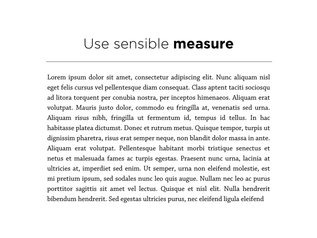
elit. Nunc aliquam nisl eget felis cursus vel pellentesque diam consequat. Class aptent taciti sociosqu ad litora torquent per conubia nostra, per inceptos himenaeos. Aliquam erat volutpat. Mauris justo dolor, commodo eu fringilla at, venenatis sed urna. Aliquam risus nibh, fringilla ut fermentum id, tempus id tellus. In hac habitasse platea dictumst. Donec et rutrum metus. Quisque tempor, turpis ut dignissim pharetra, risus erat semper neque, non blandit dolor massa in ante. Aliquam erat volutpat. Pellentesque habitant morbi tristique senectus et netus et malesuada fames ac turpis egestas. Praesent nunc urna, lacinia at ultricies at, imperdiet sed enim. Ut semper, urna non eleifend molestie, est mi pretium ipsum, sed sodales nunc leo quis augue. Nullam nec leo ac purus porttitor sagittis sit amet vel lectus. Quisque et nisl elit. Nulla hendrerit bibendum hendrerit. Sed egestas ultricies purus, nec eleifend ligula eleifend
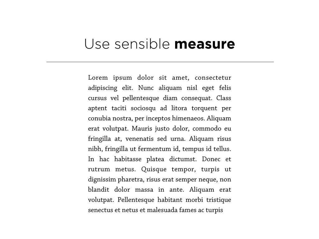
elit. Nunc aliquam nisl eget felis cursus vel pellentesque diam consequat. Class aptent taciti sociosqu ad litora torquent per conubia nostra, per inceptos himenaeos. Aliquam erat volutpat. Mauris justo dolor, commodo eu fringilla at, venenatis sed urna. Aliquam risus nibh, fringilla ut fermentum id, tempus id tellus. In hac habitasse platea dictumst. Donec et rutrum metus. Quisque tempor, turpis ut dignissim pharetra, risus erat semper neque, non blandit dolor massa in ante. Aliquam erat volutpat. Pellentesque habitant morbi tristique senectus et netus et malesuada fames ac turpis
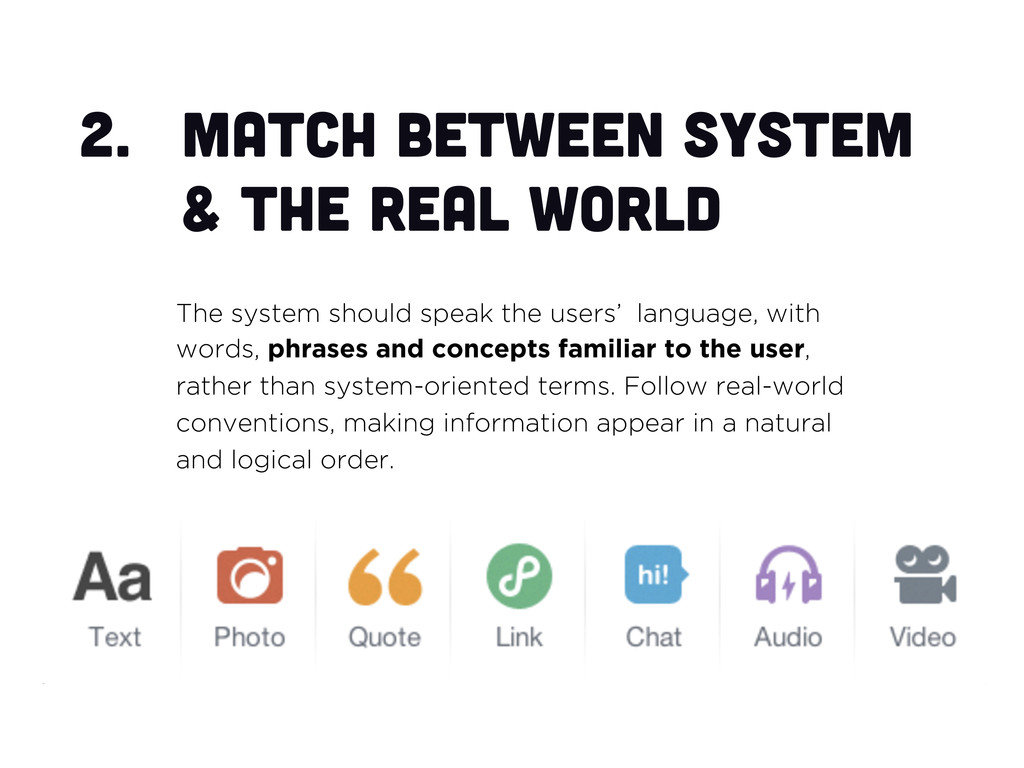
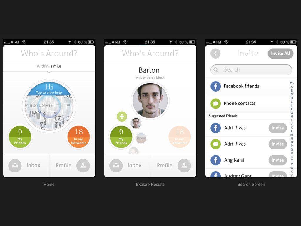
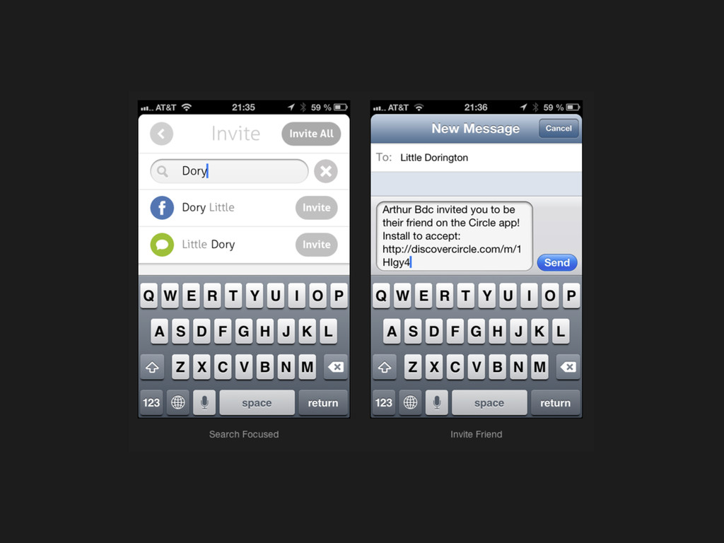
should speak the users’ language, with words, phrases and concepts familiar to the user, rather than system-oriented terms. Follow real-world conventions, making information appear in a natural and logical order.
by mistake and will need a clearly marked "emergency exit" to leave the unwanted state without having to go through an extended dialogue. Support undo and redo.
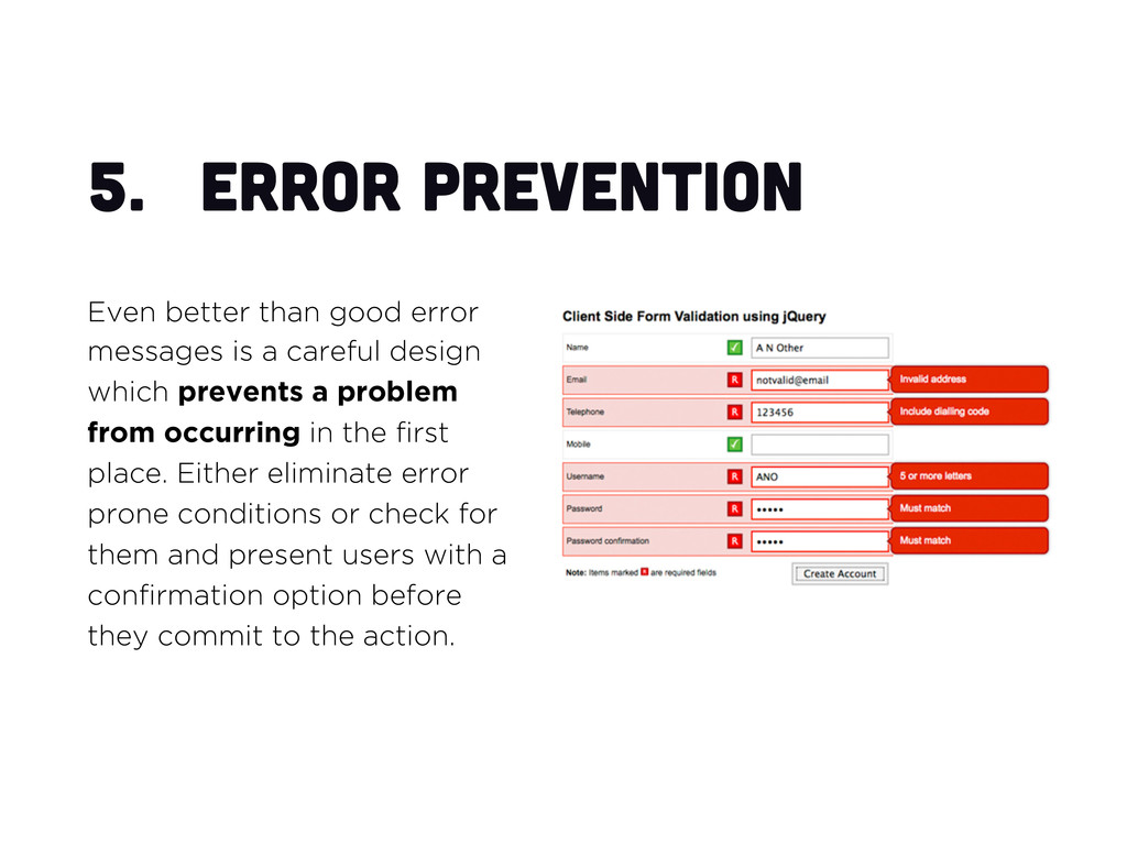
a careful design which prevents a problem from occurring in the first place. Either eliminate error prone conditions or check for them and present users with a confirmation option before they commit to the action.
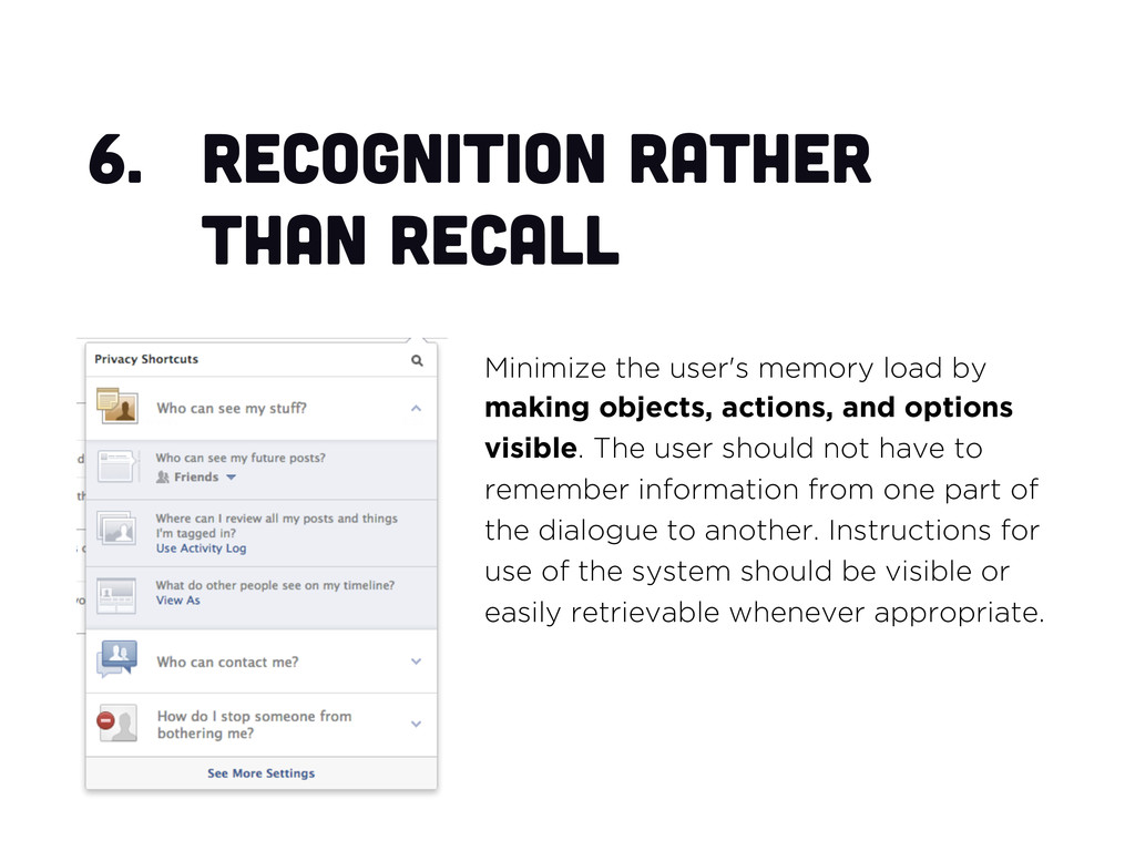
by making objects, actions, and options visible. The user should not have to remember information from one part of the dialogue to another. Instructions for use of the system should be visible or easily retrievable whenever appropriate.
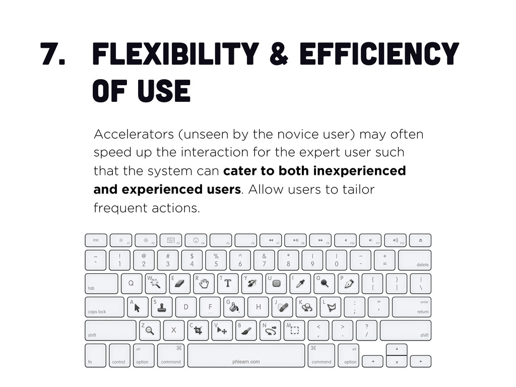
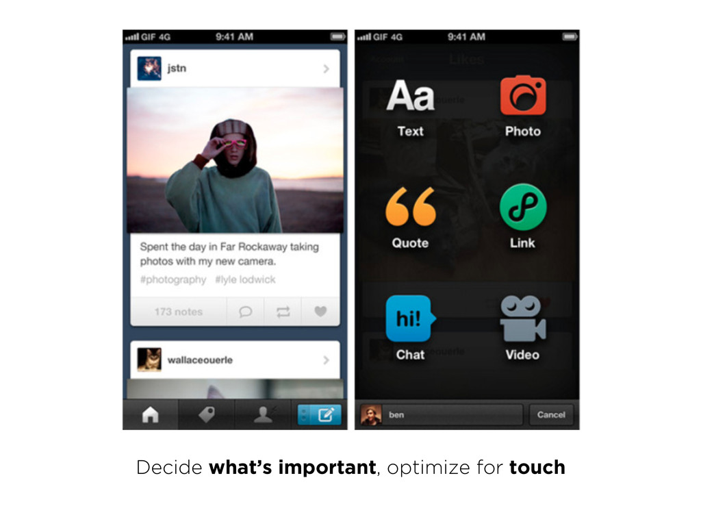
novice user) may often speed up the interaction for the expert user such that the system can cater to both inexperienced and experienced users. Allow users to tailor frequent actions.
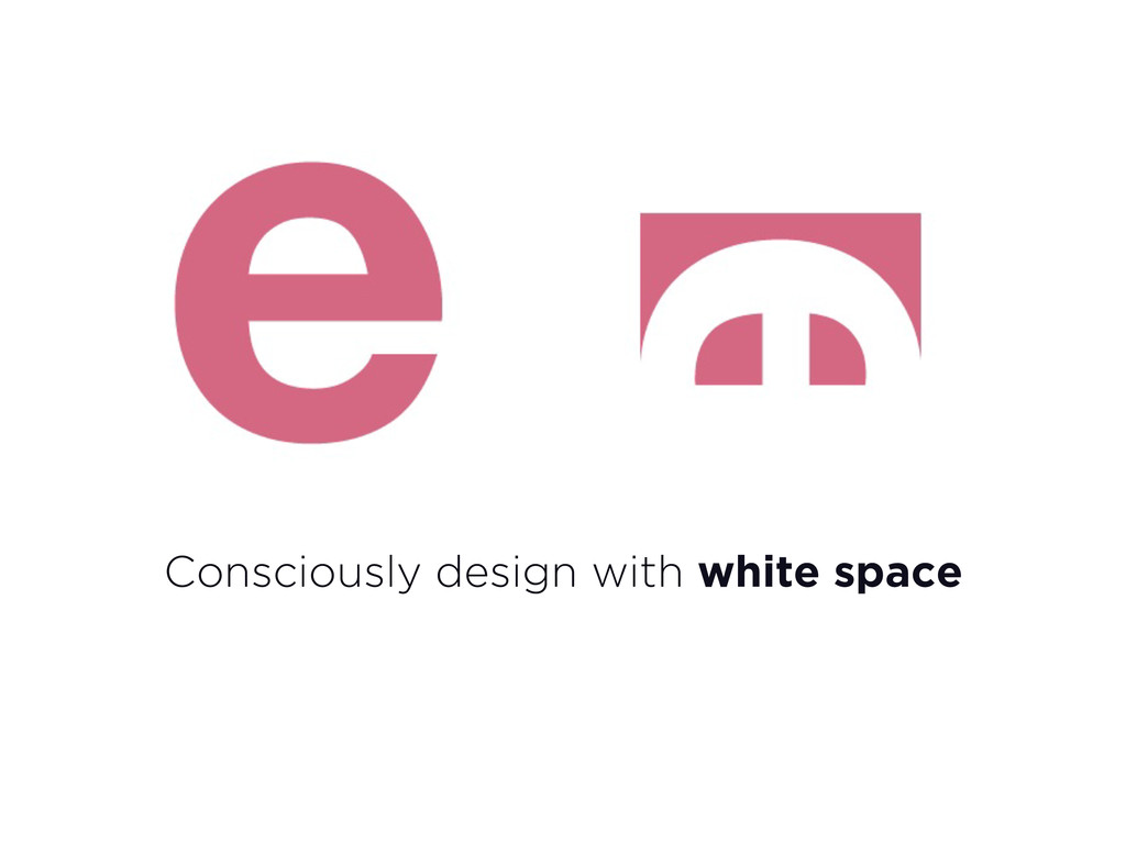
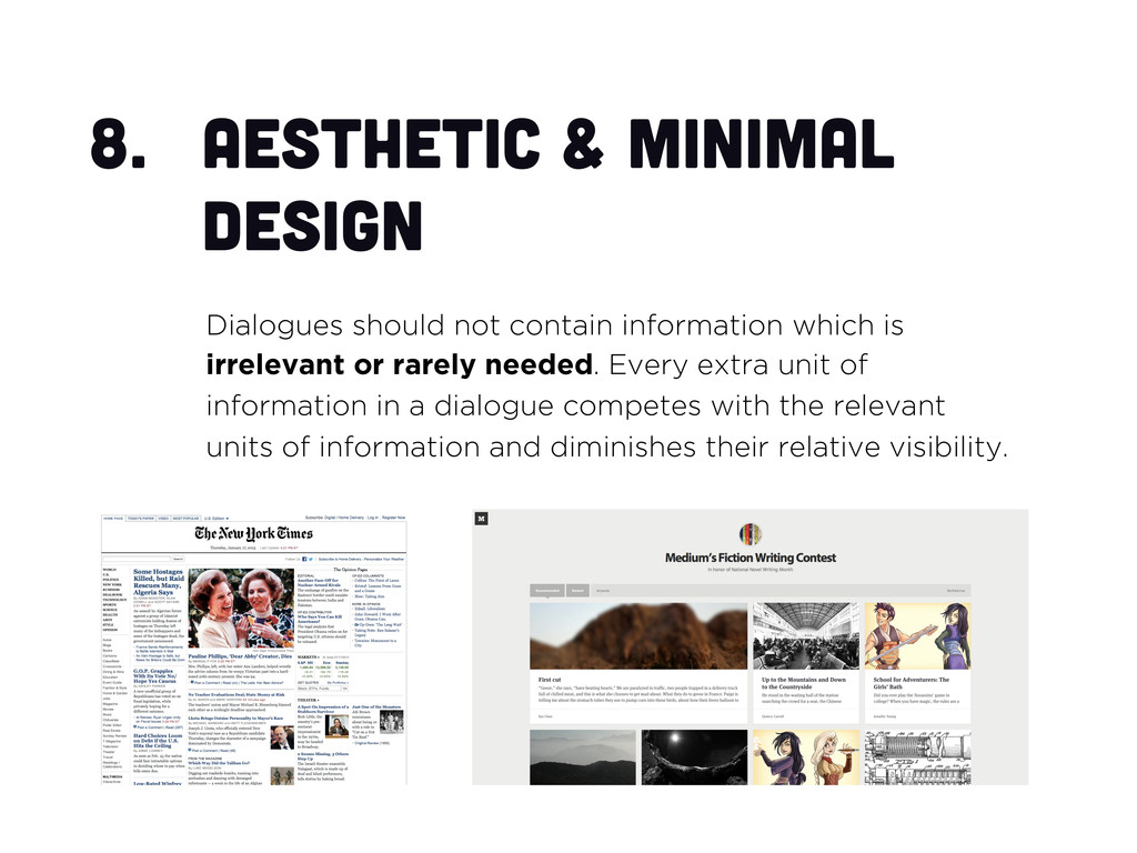
which is irrelevant or rarely needed. Every extra unit of information in a dialogue competes with the relevant units of information and diminishes their relative visibility.
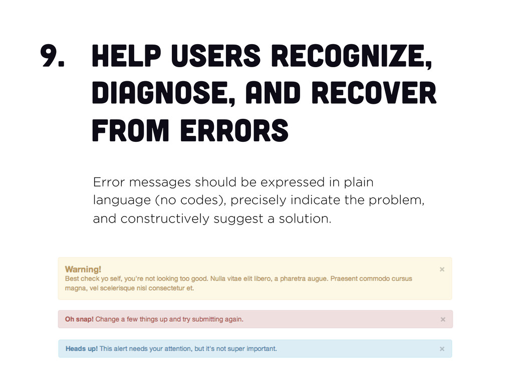
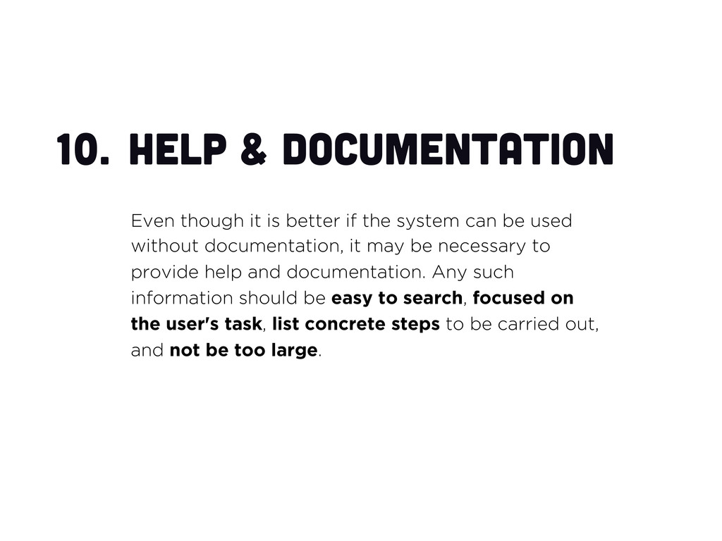
the system can be used without documentation, it may be necessary to provide help and documentation. Any such information should be easy to search, focused on the user's task, list concrete steps to be carried out, and not be too large.
 adidahiya
 mhand01
 terencebasart
 calpin
 nttcom
 dmattsun
 abokadotyann
 kumanoayumi
 hiranotomoki
 kspace
 bebe
bebe
 takanorip
 sachag
 ammeep
 trishagee
 jct
jct
 baasie
 codingconduct
 brettharned
 dougneiner
 letsgokoyo
 badams
 mfonobong
 rocio
rocio
![thanks! @adi_dahiya [email protected]](https://files.speakerdeck.com/presentations/61099ad046f301300d6b123139182e29/slide_59.jpg)