Upgrade to Pro — share decks privately, control downloads, hide ads and more …

Andromeda - Jetpack Compose open source Design system

Andromeda - Jetpack Compose open source Design system

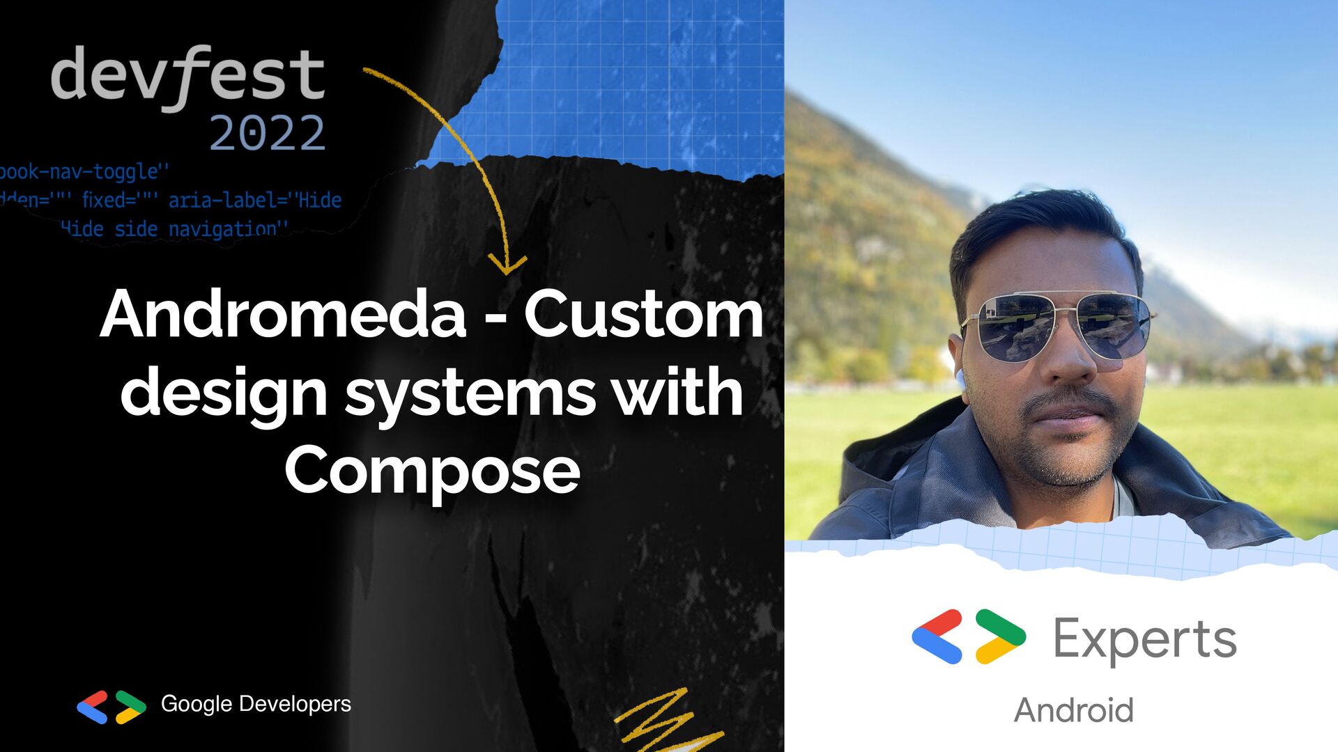
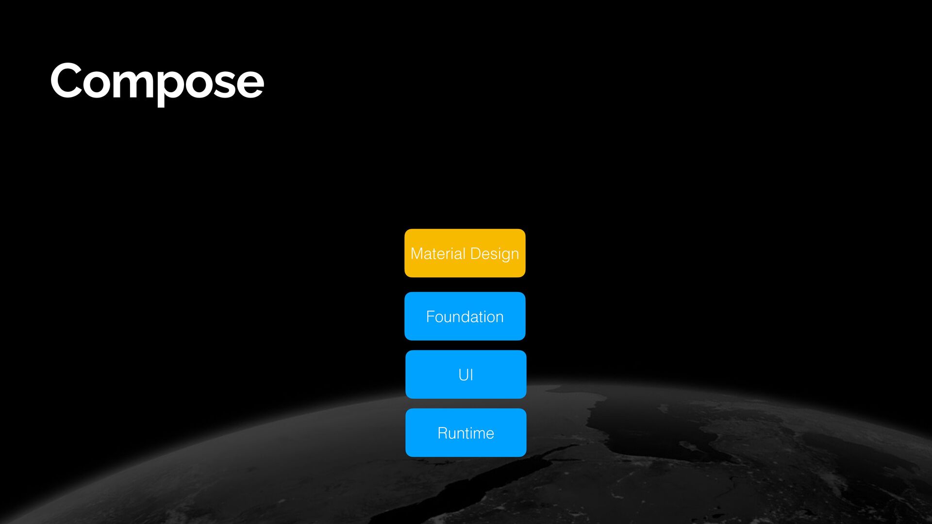
This talk emphasizes the thought process one can employ to build a design system, with Jetpack Compose - which gets even easier now.
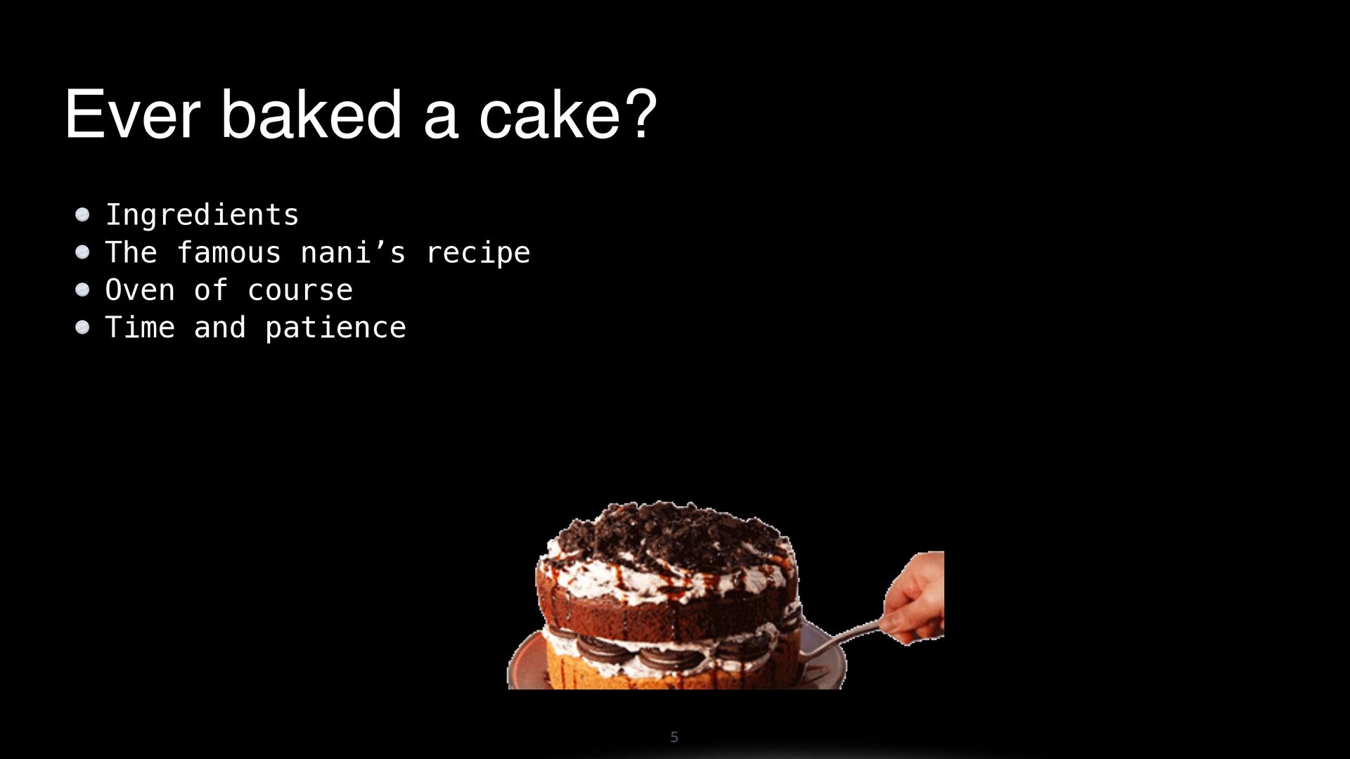
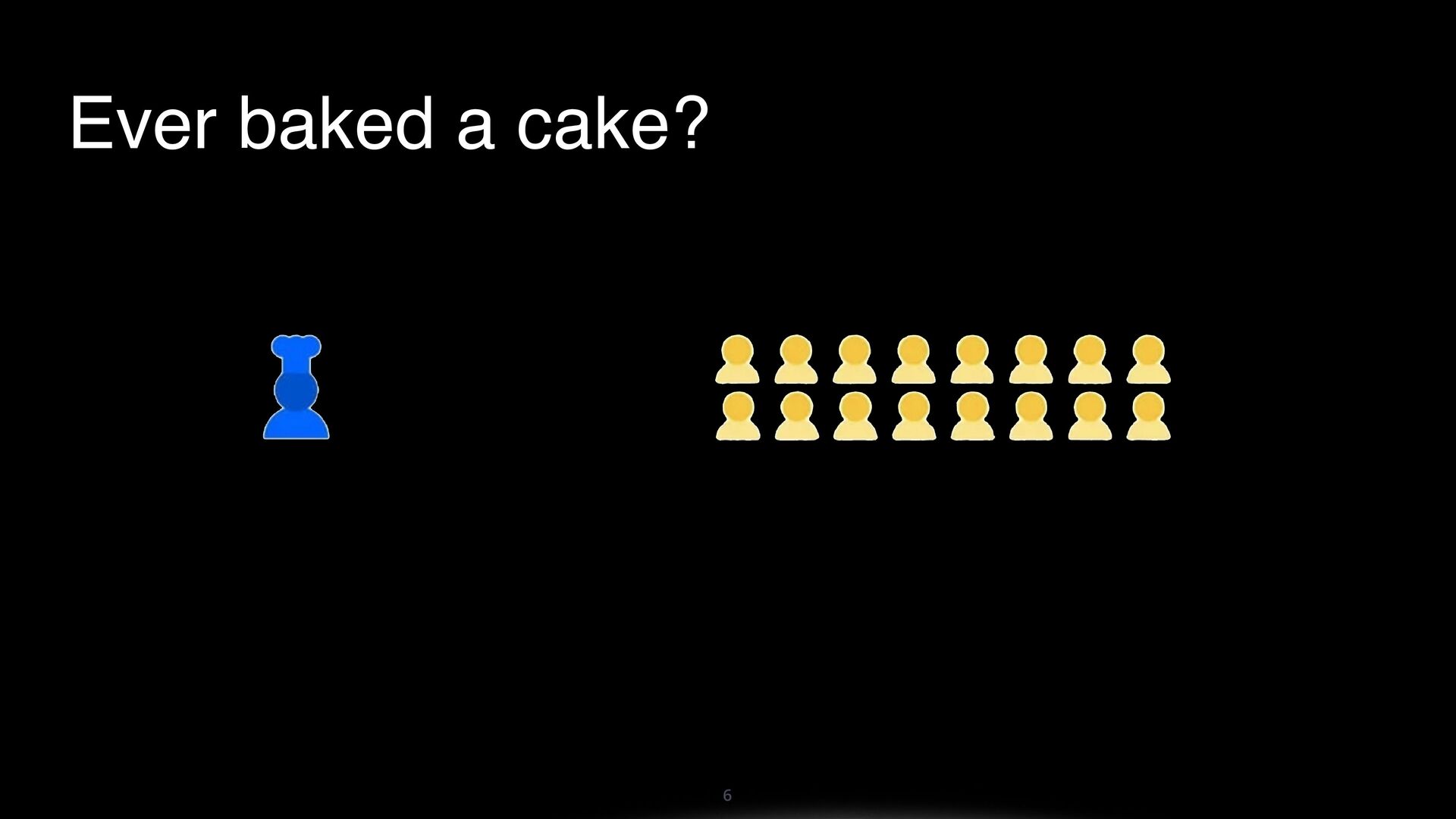
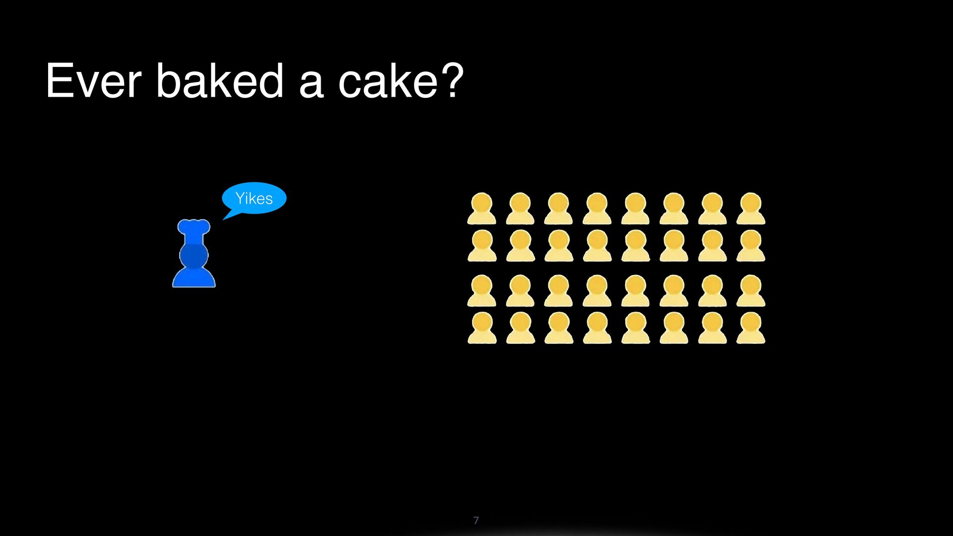
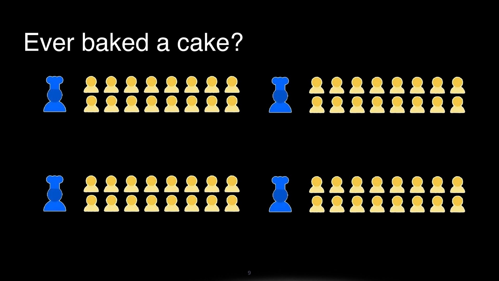
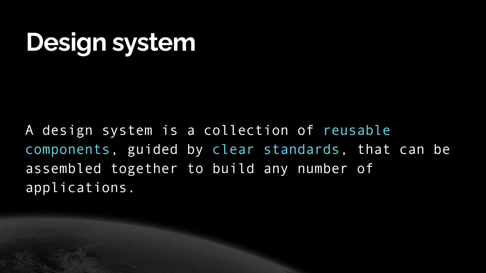
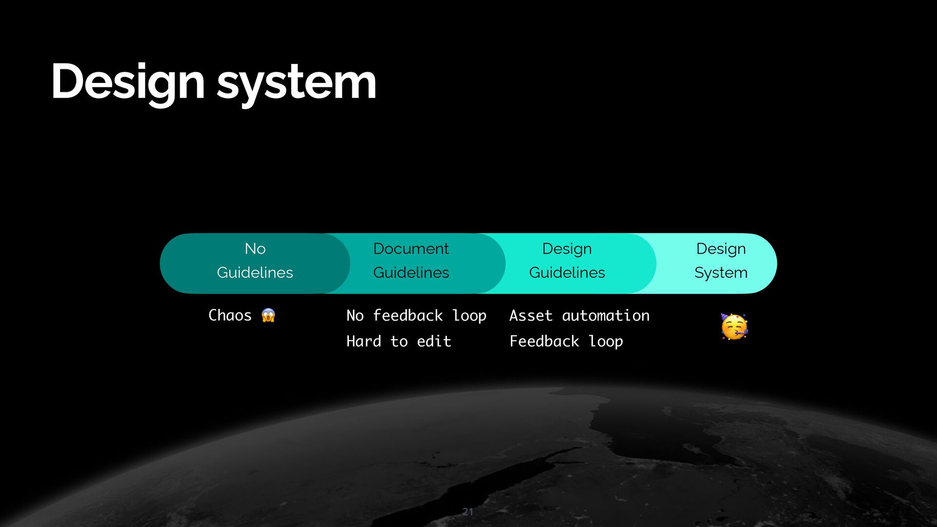
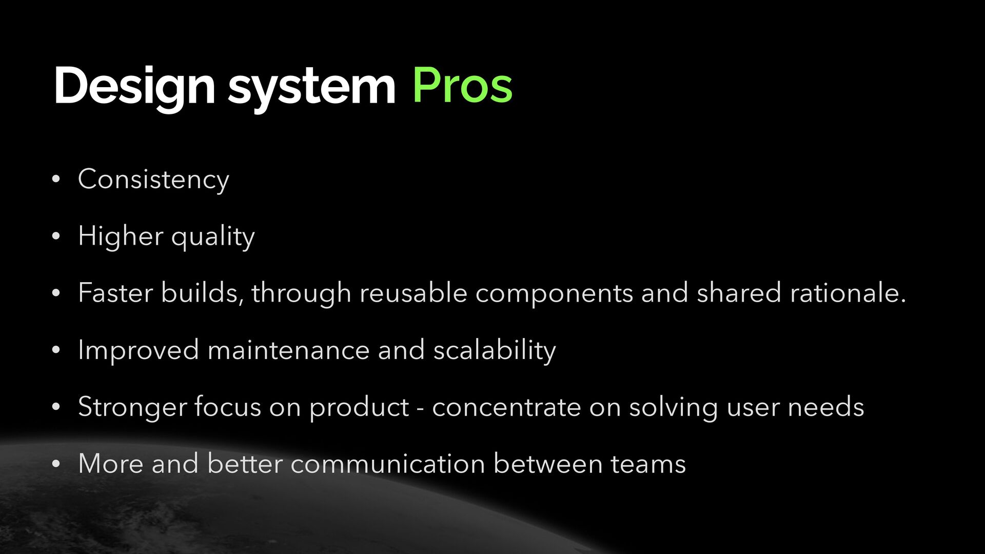
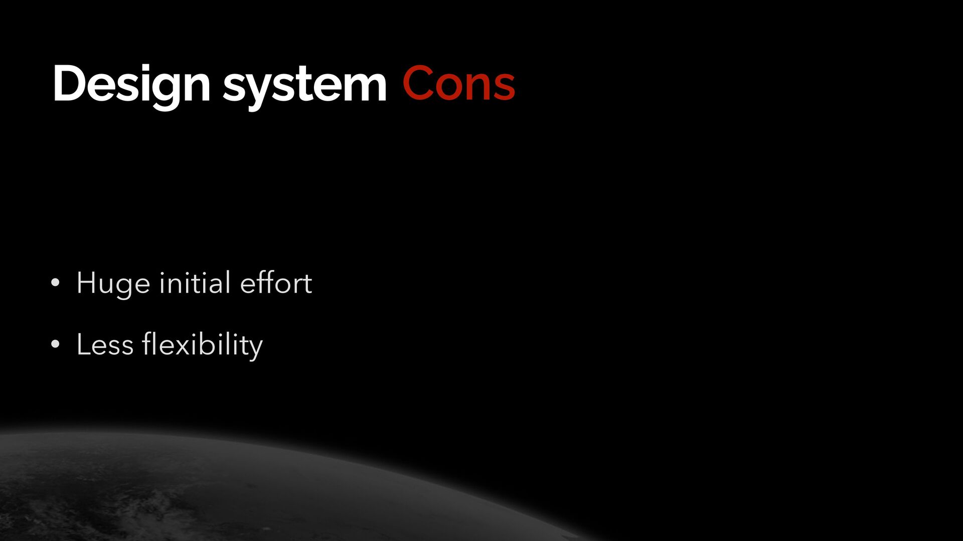
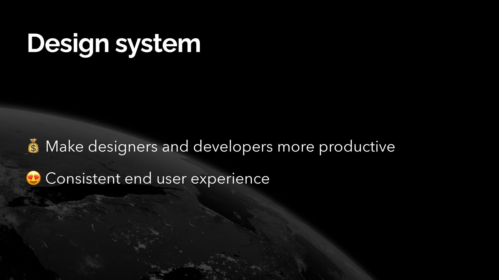
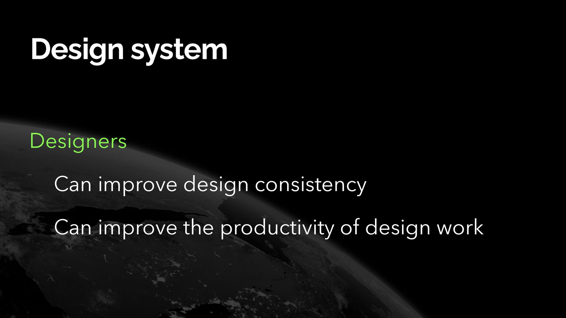
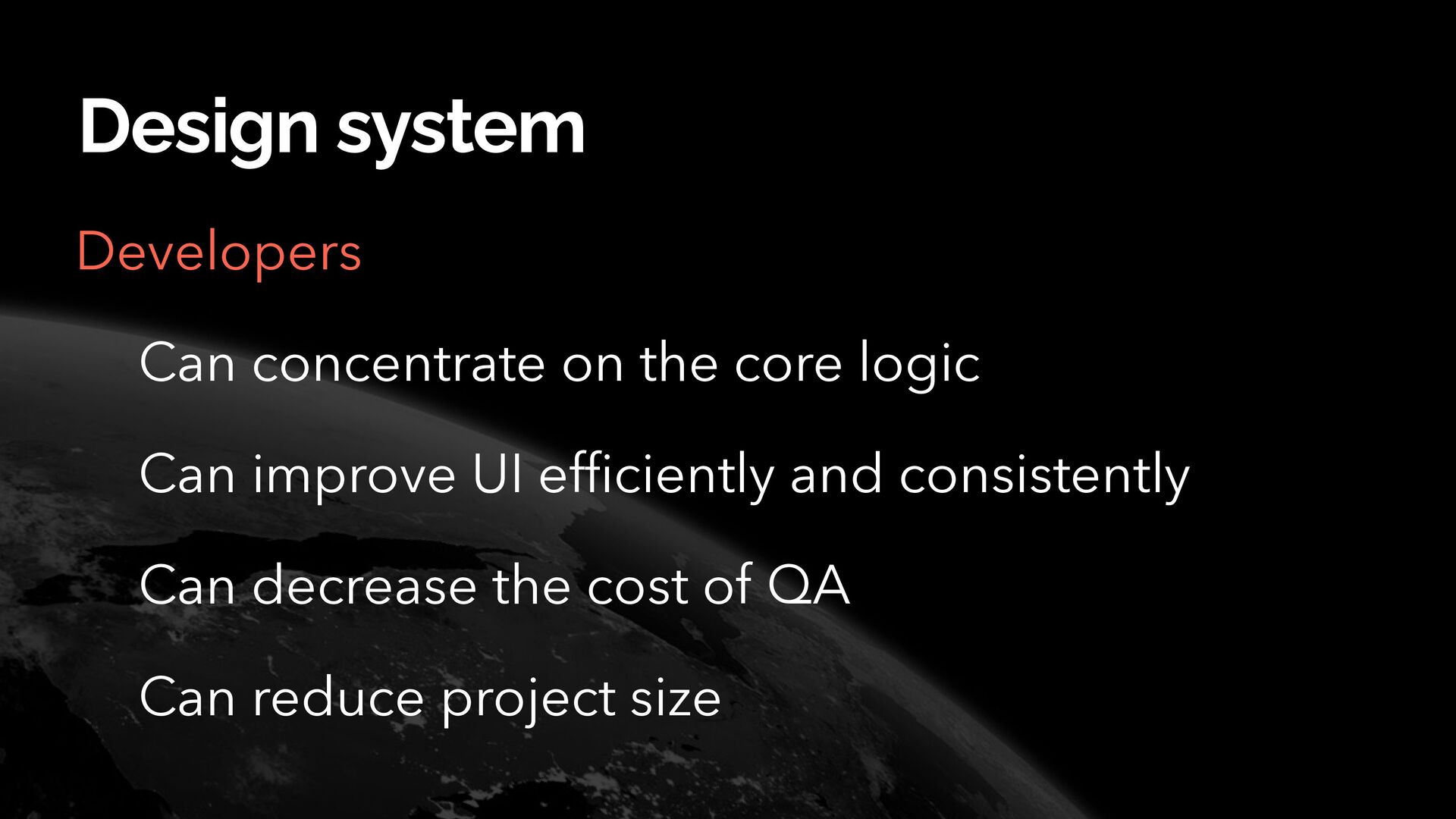
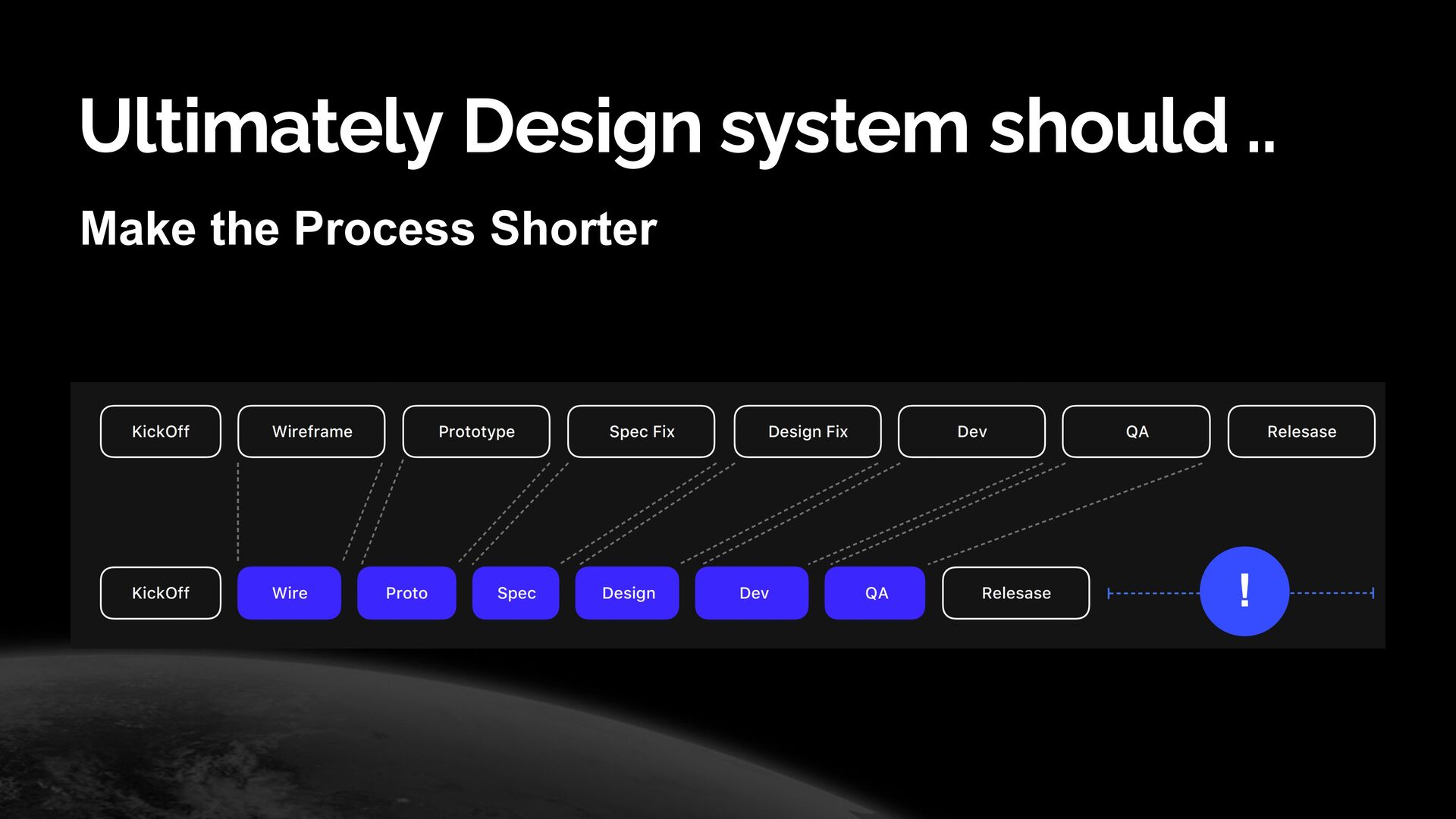
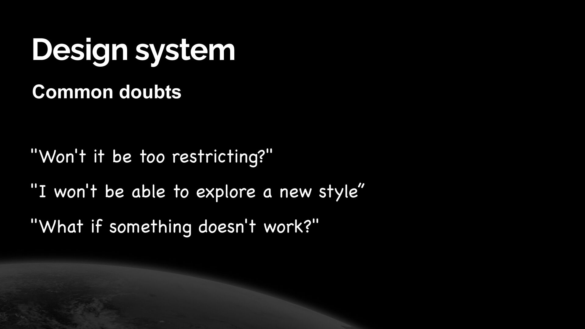
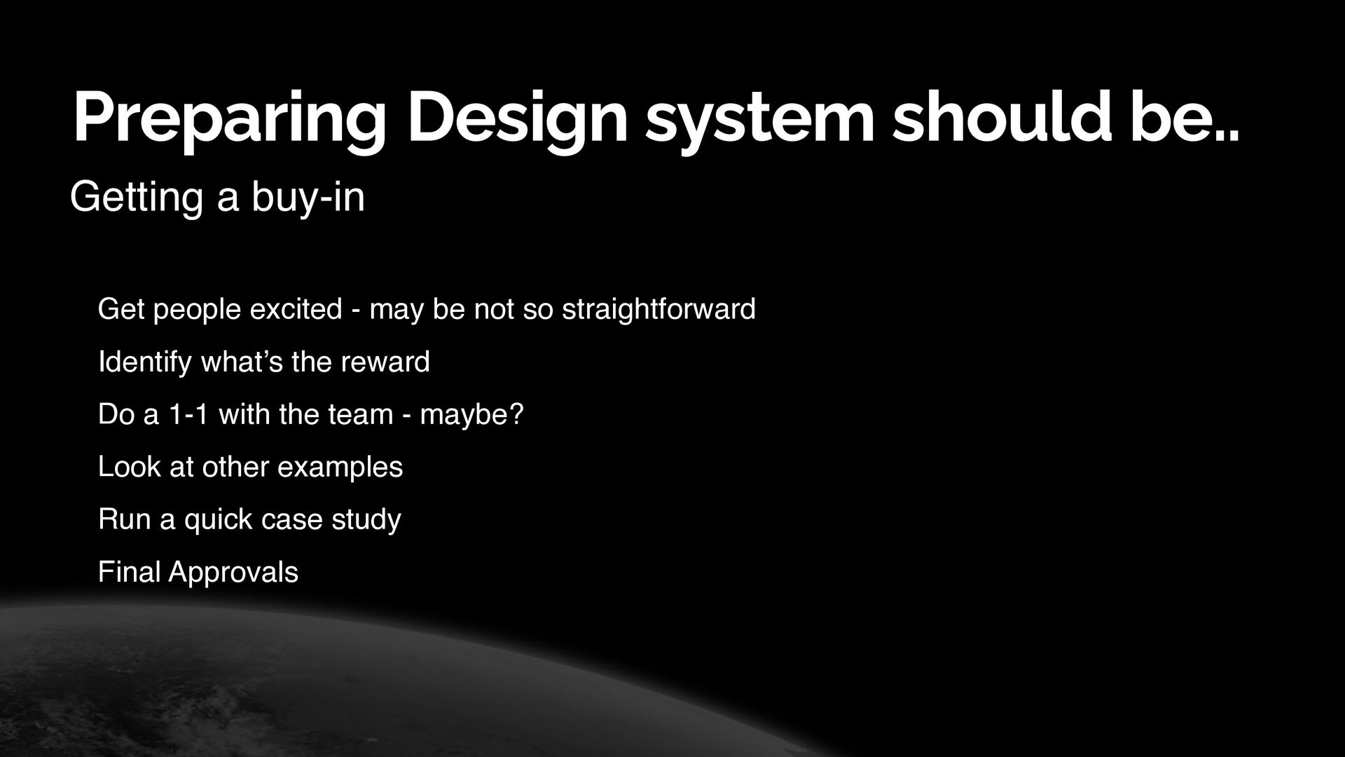
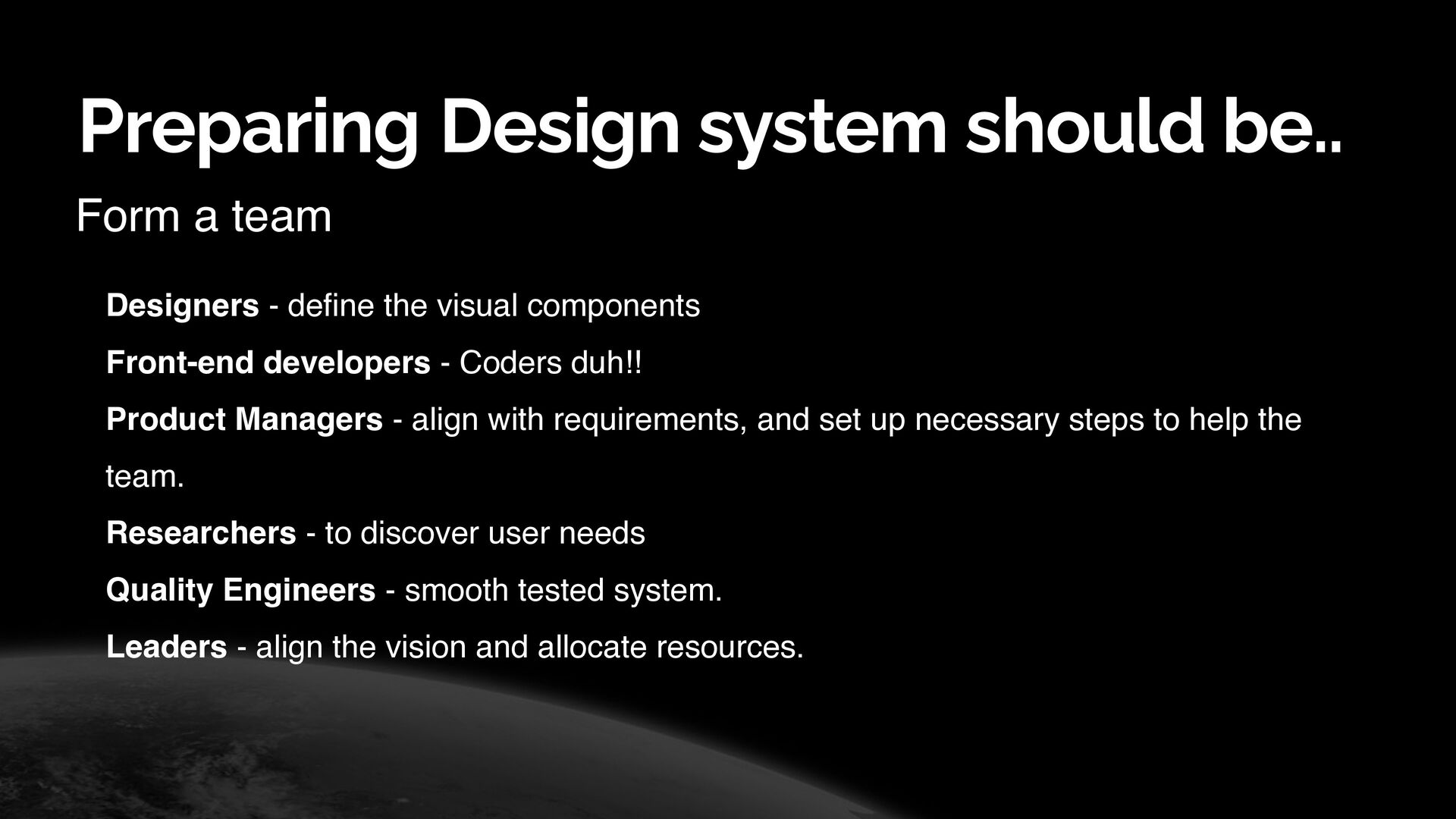
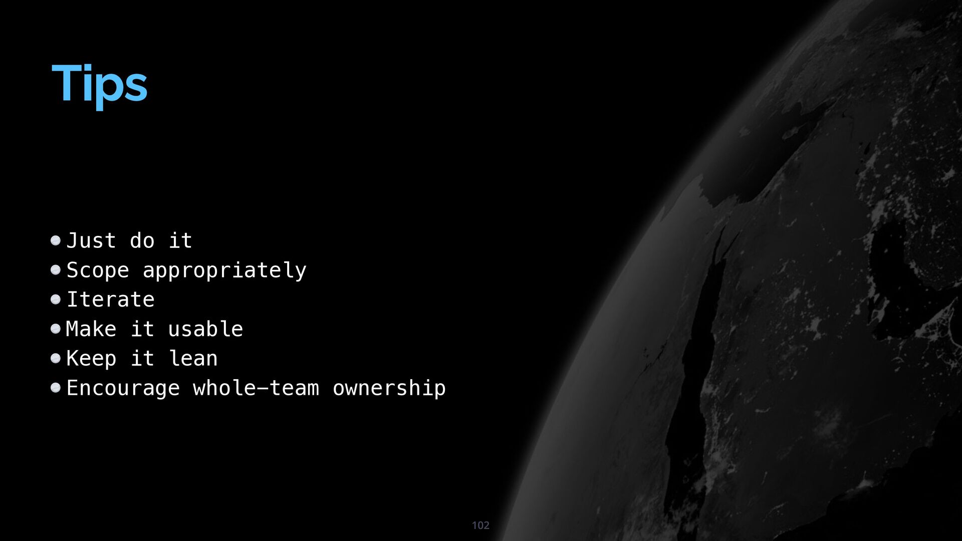
It takes a huge investment to build a design system in-house which can get very time-consuming, and a team would need dedicated member/s of the team to always keep things updated, documented, and answer any questions that may arise during the development lifecycle.

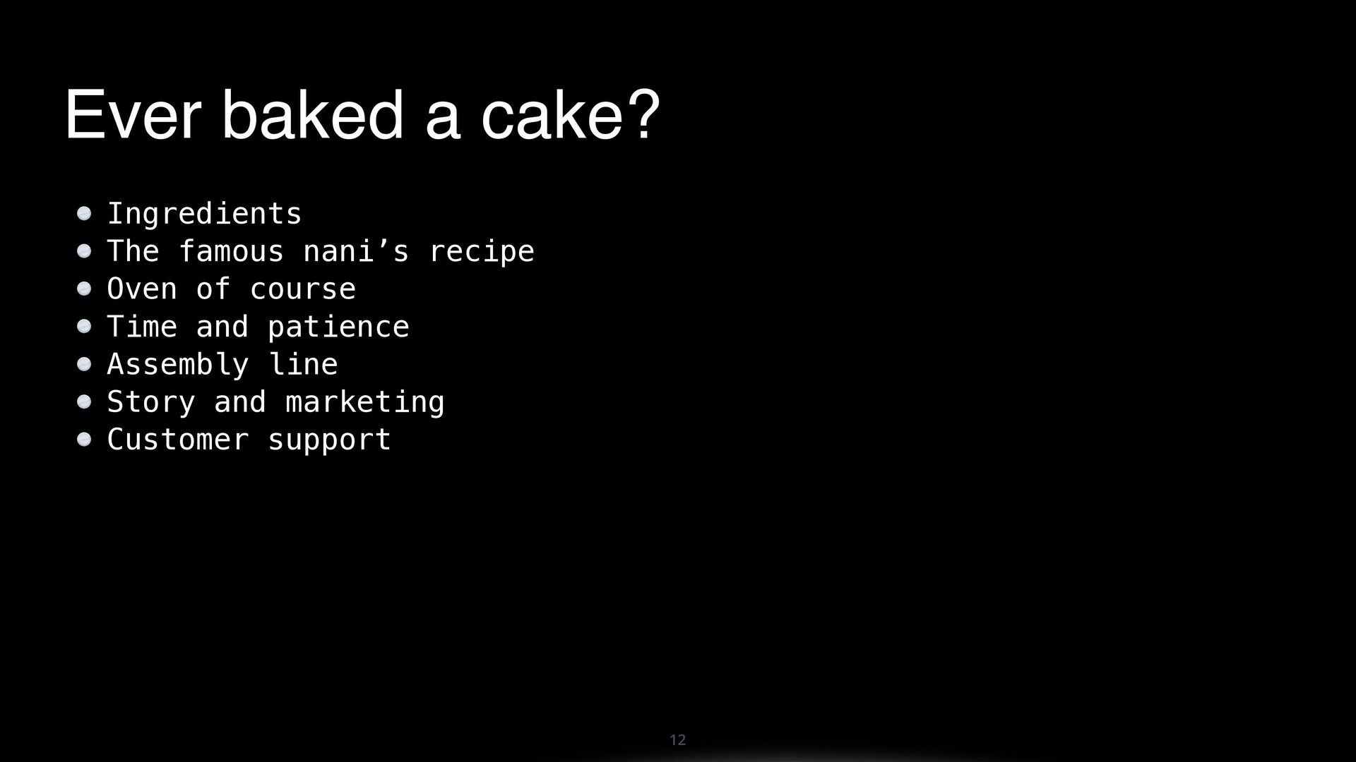
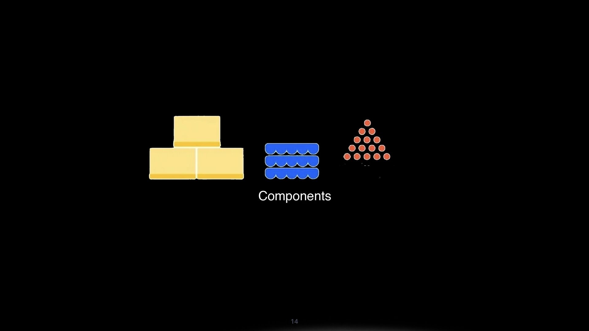
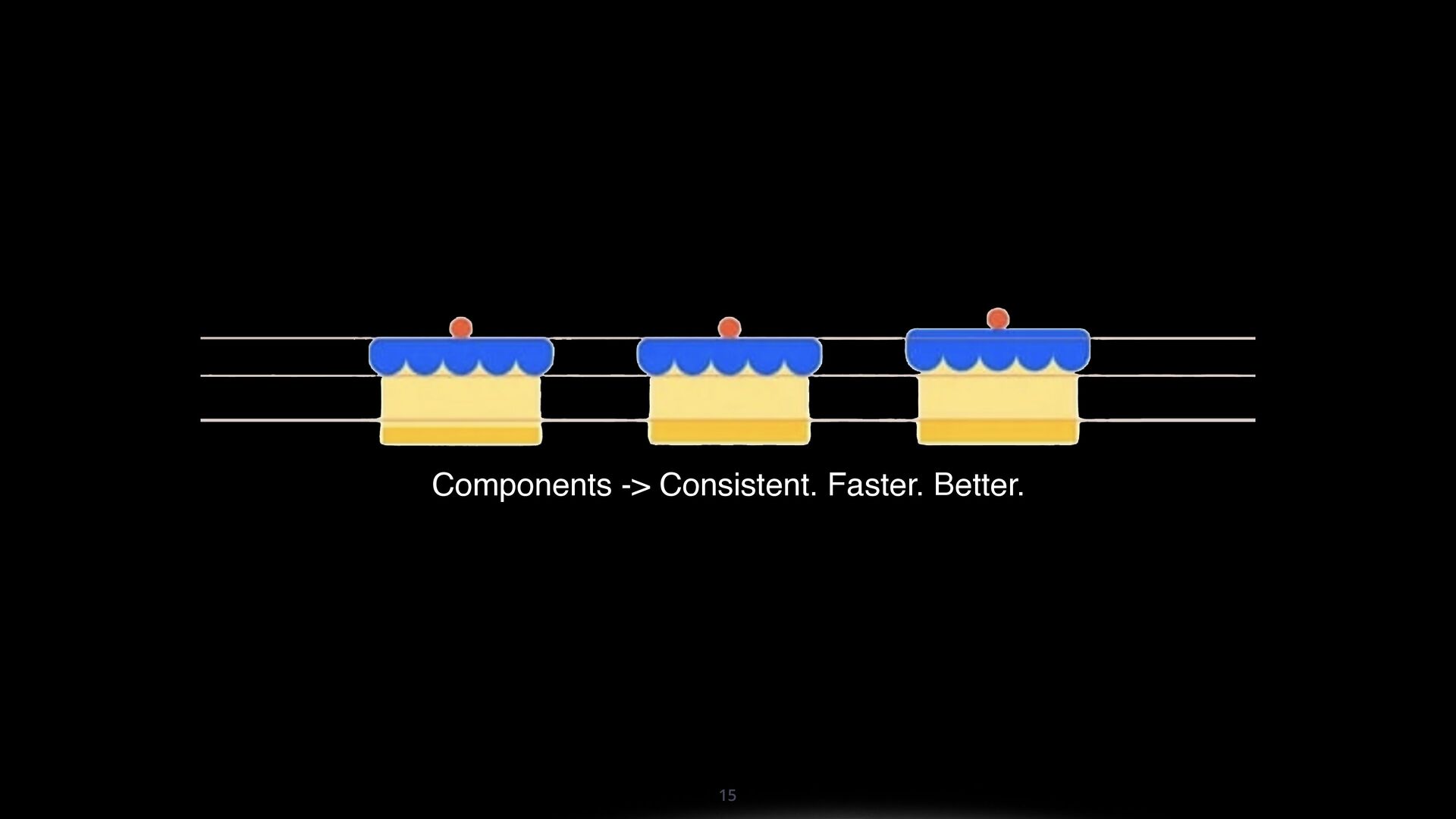
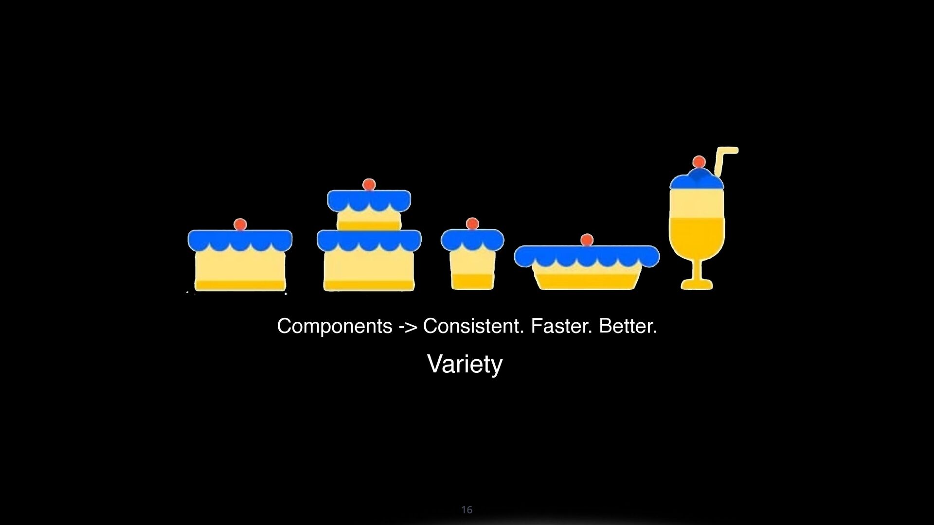
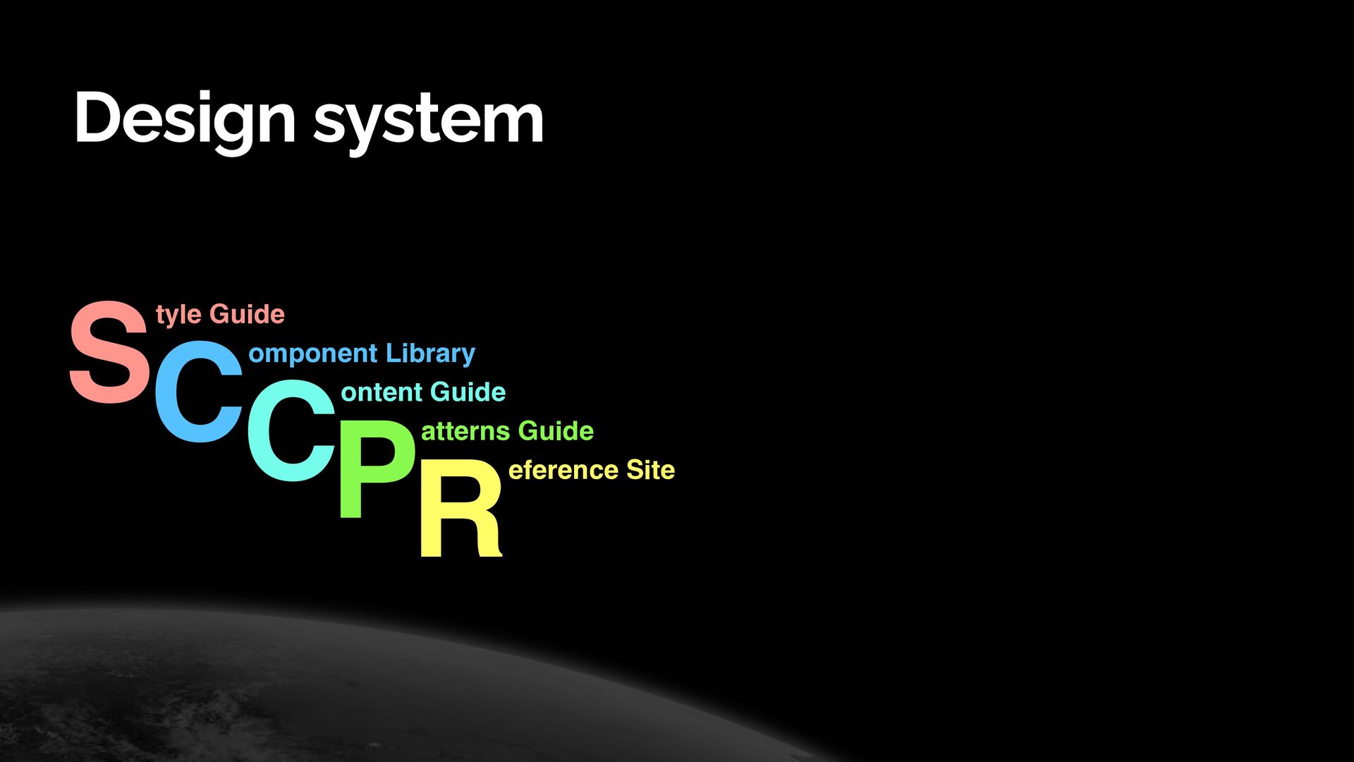
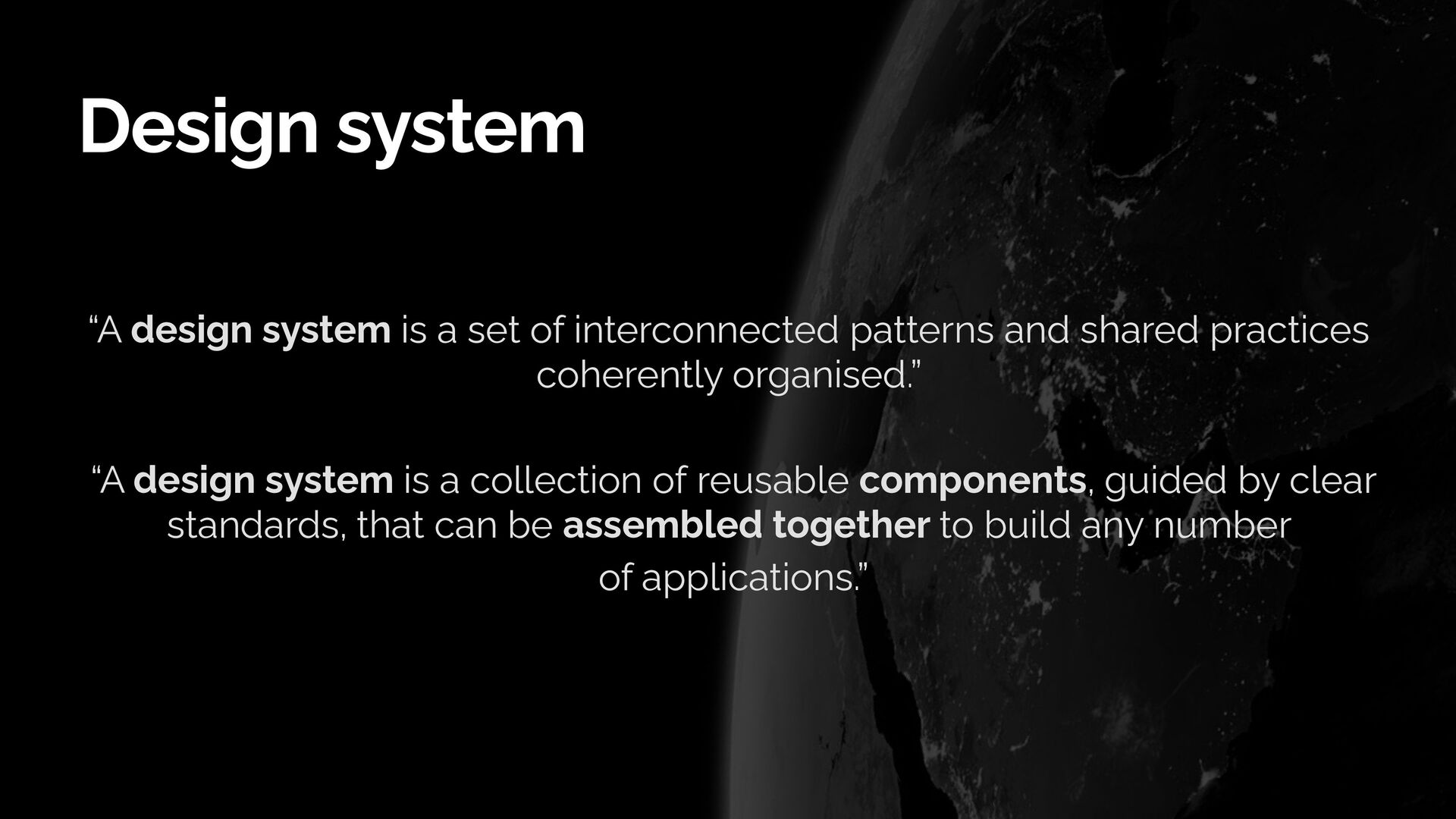
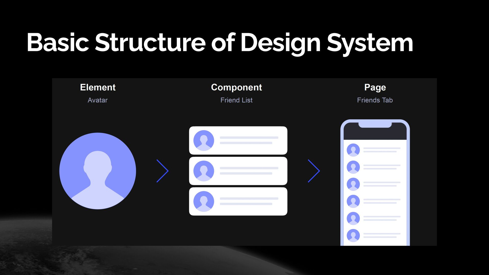
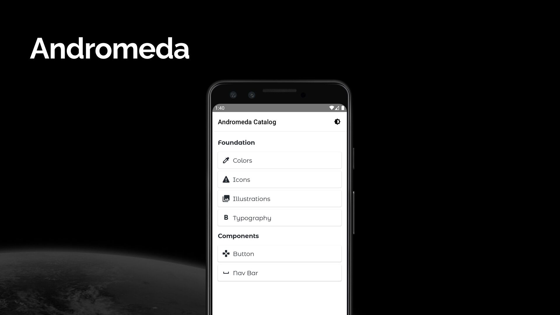
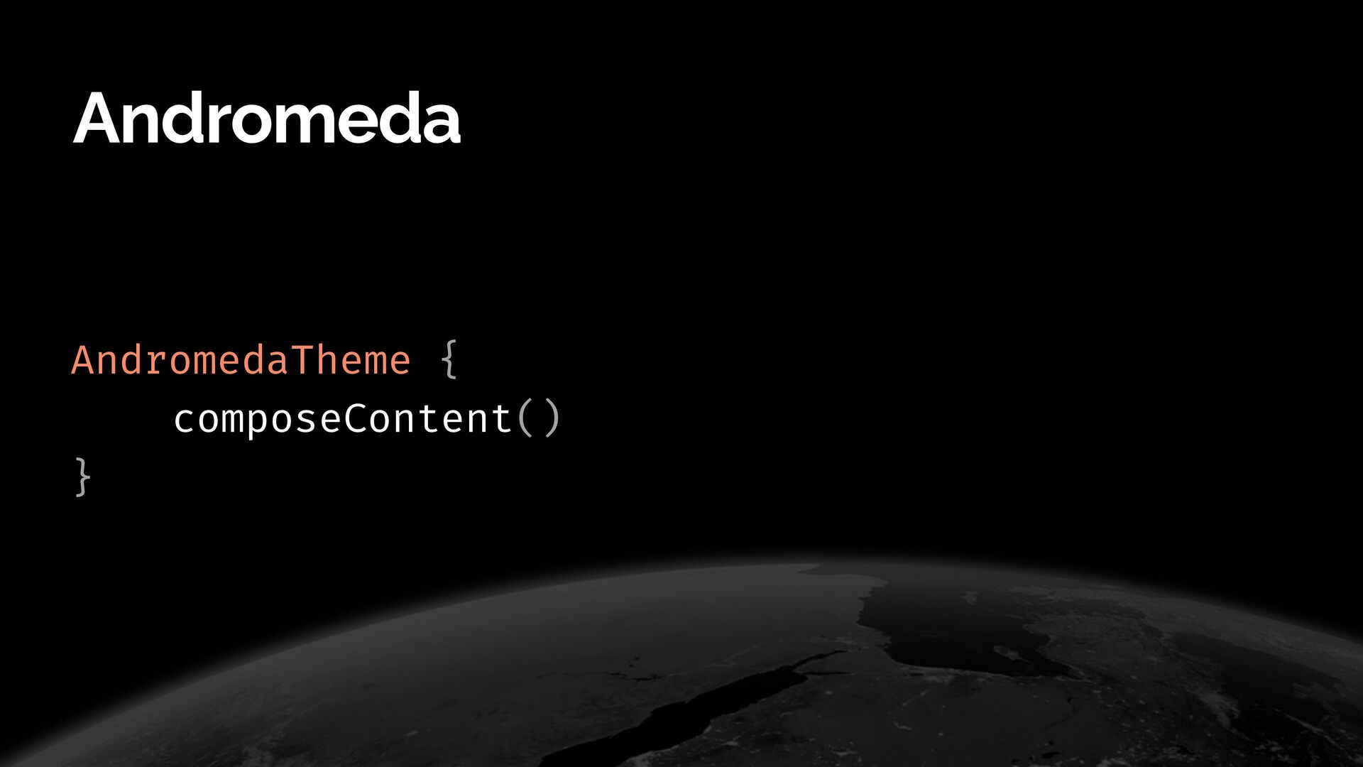
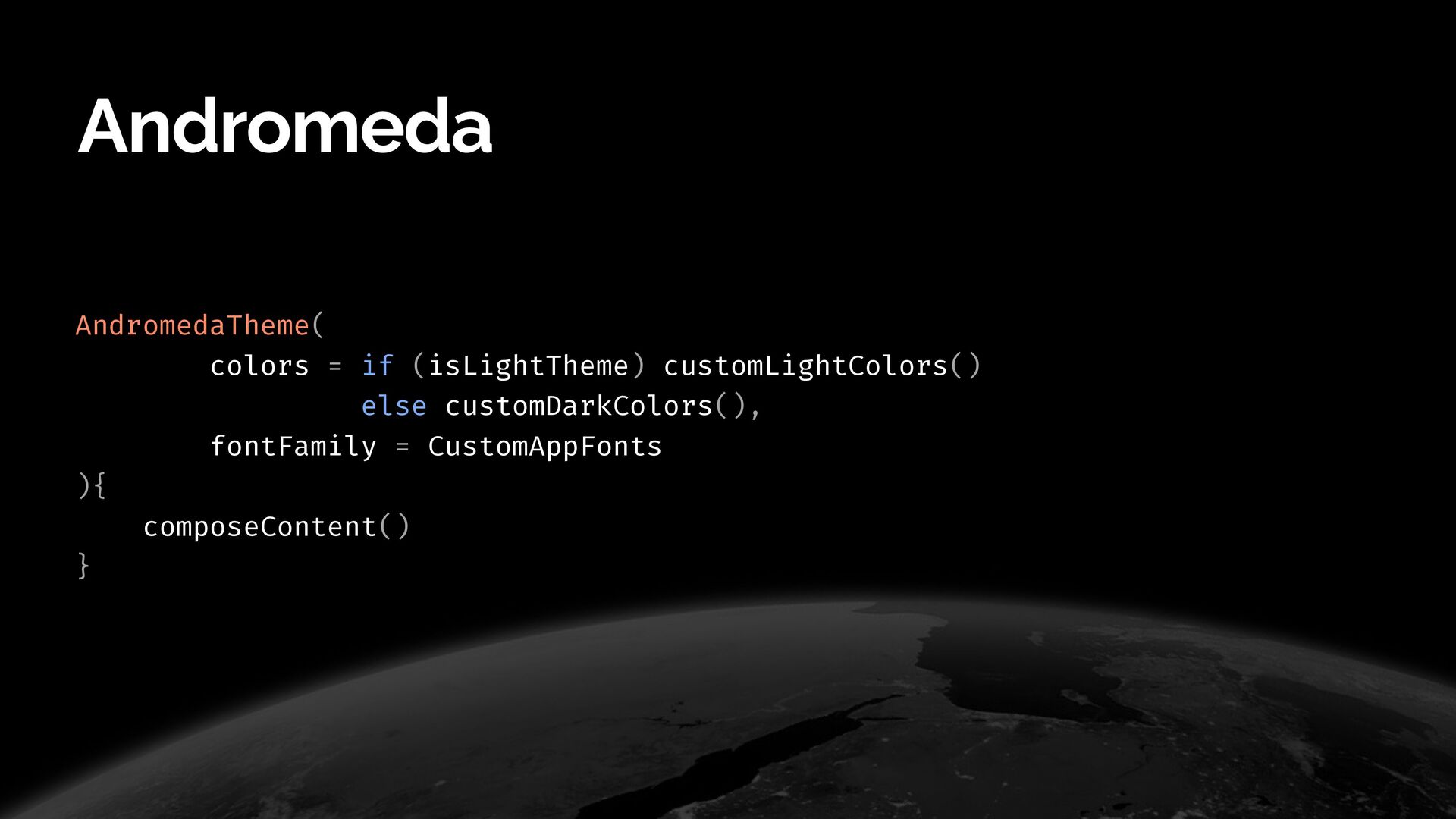
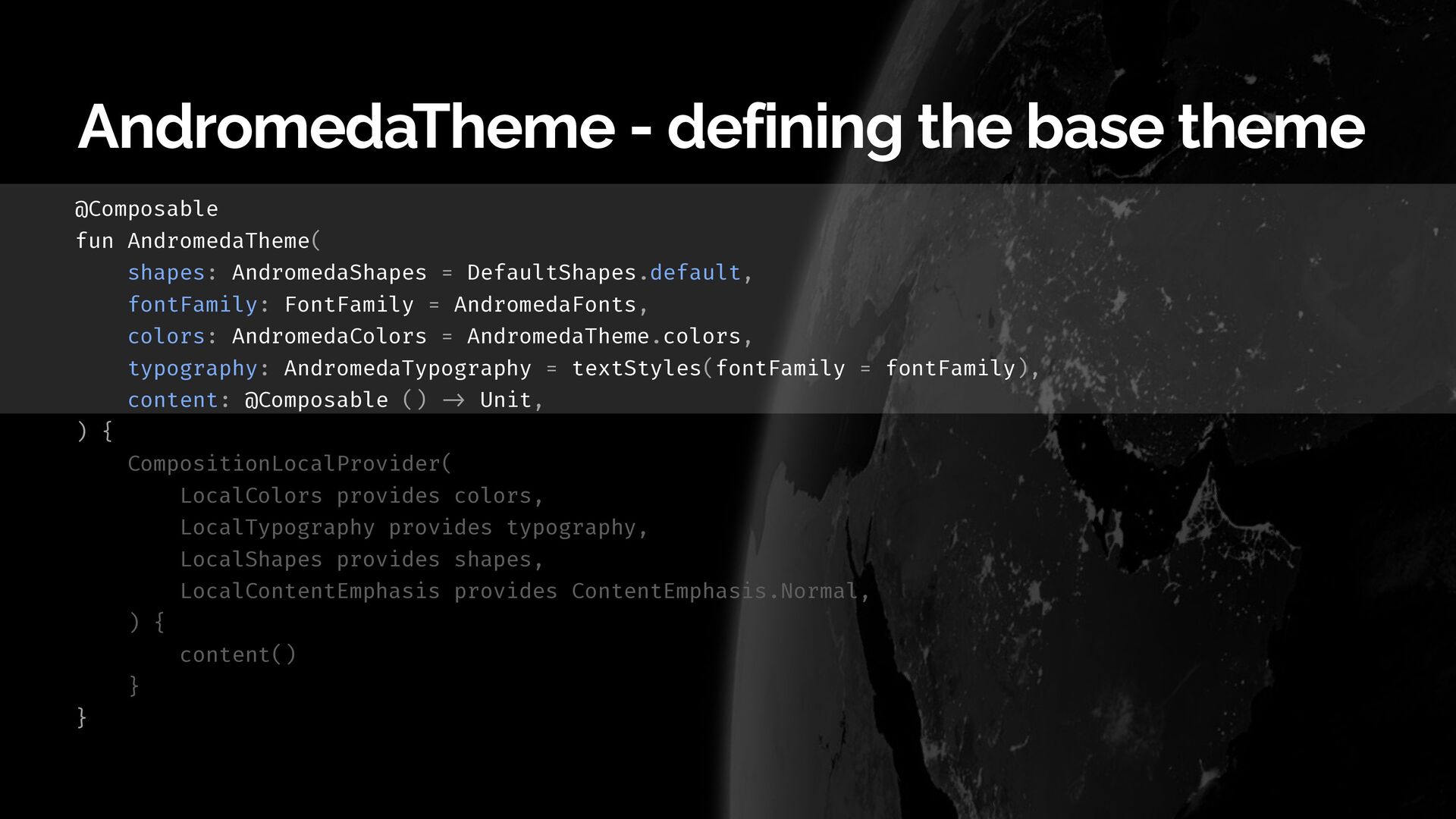
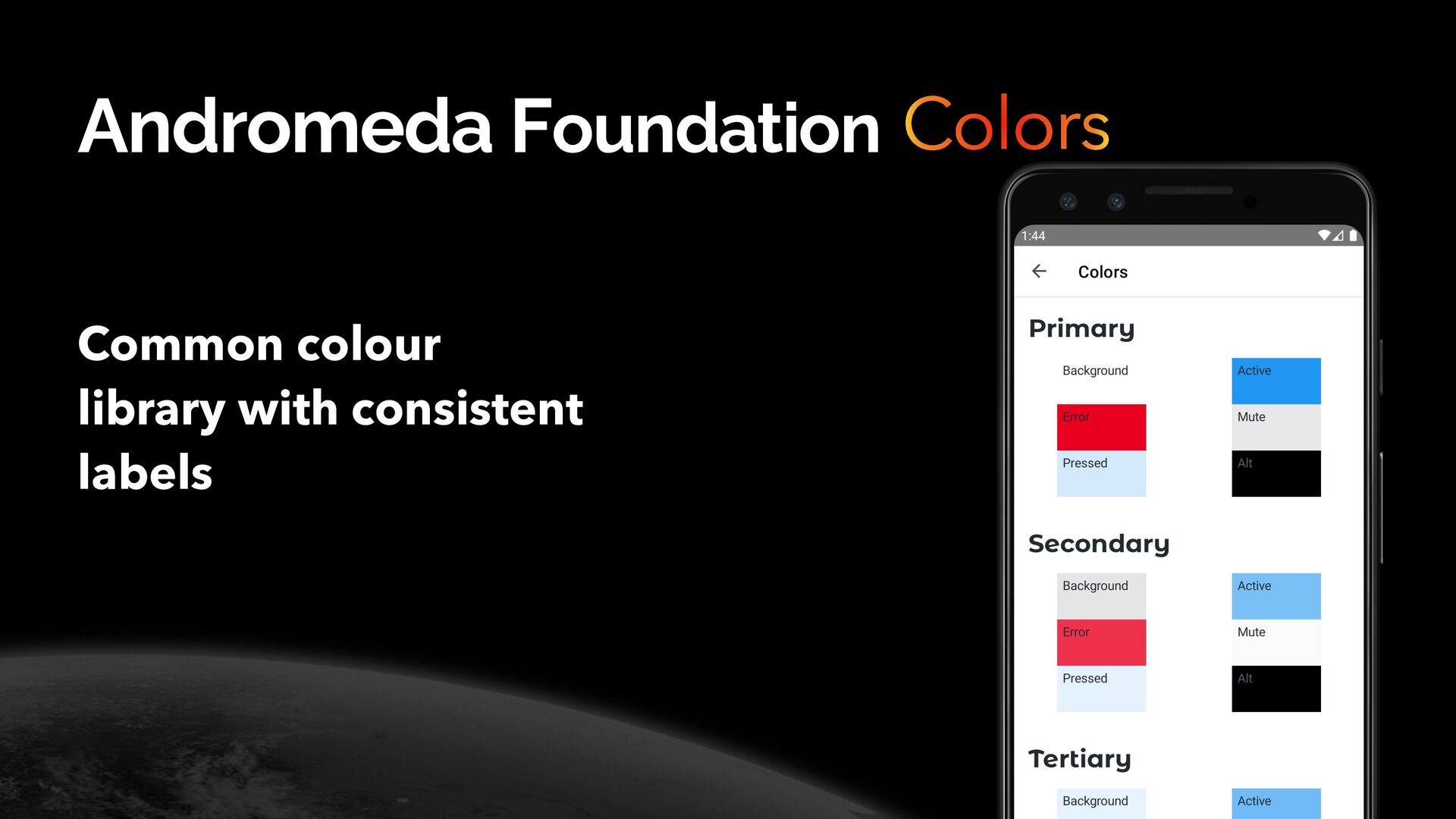
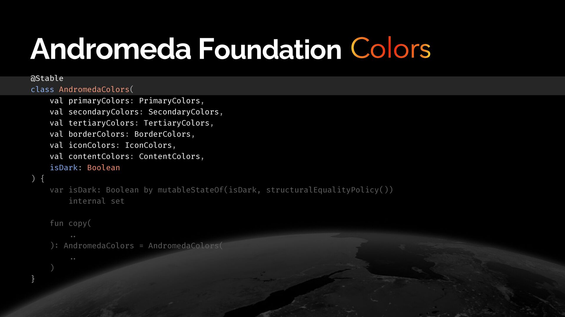
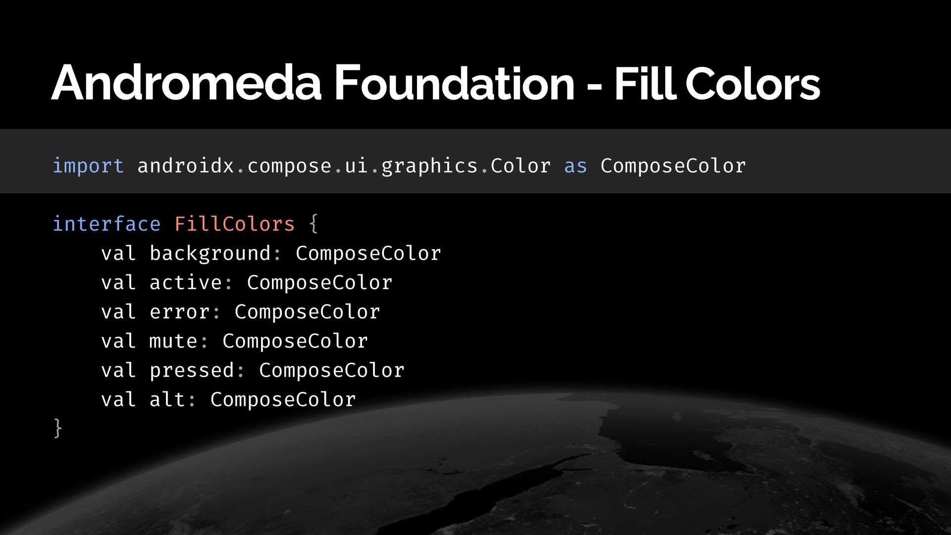
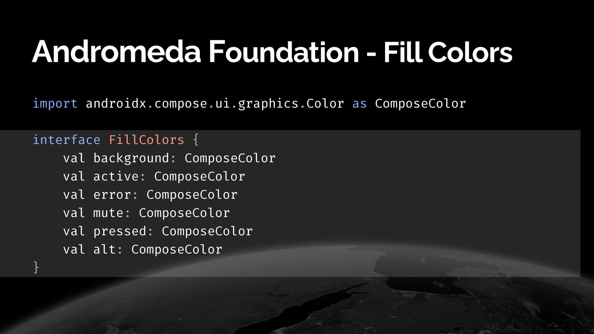
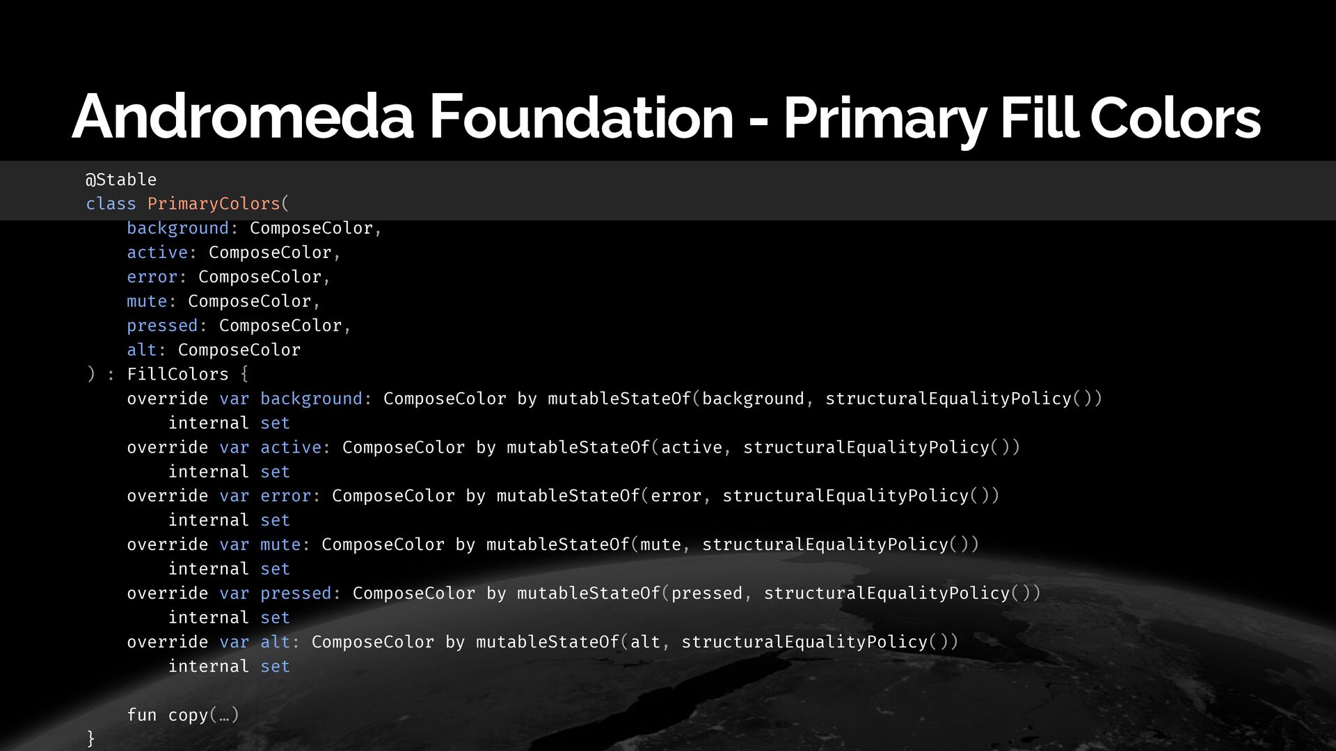
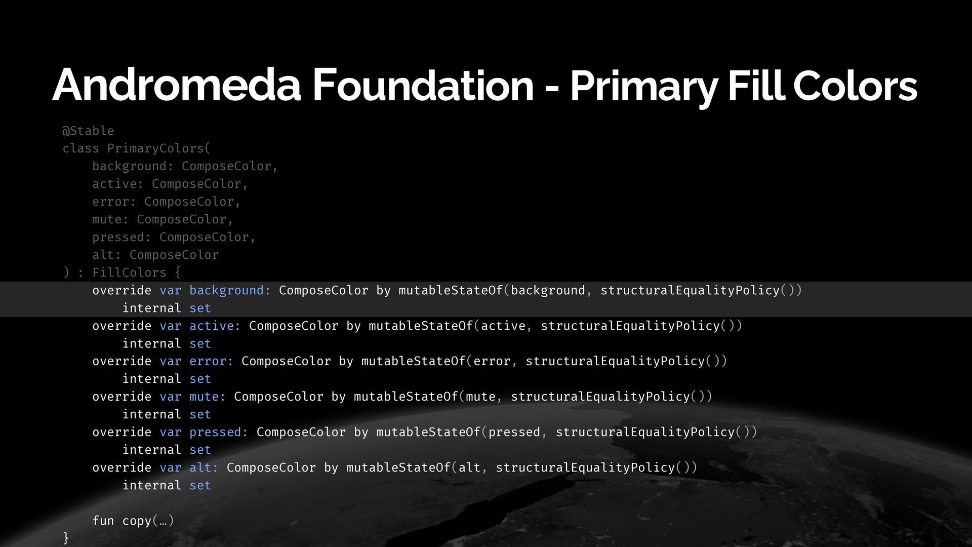
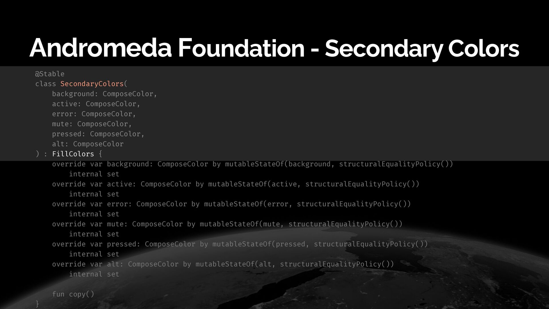
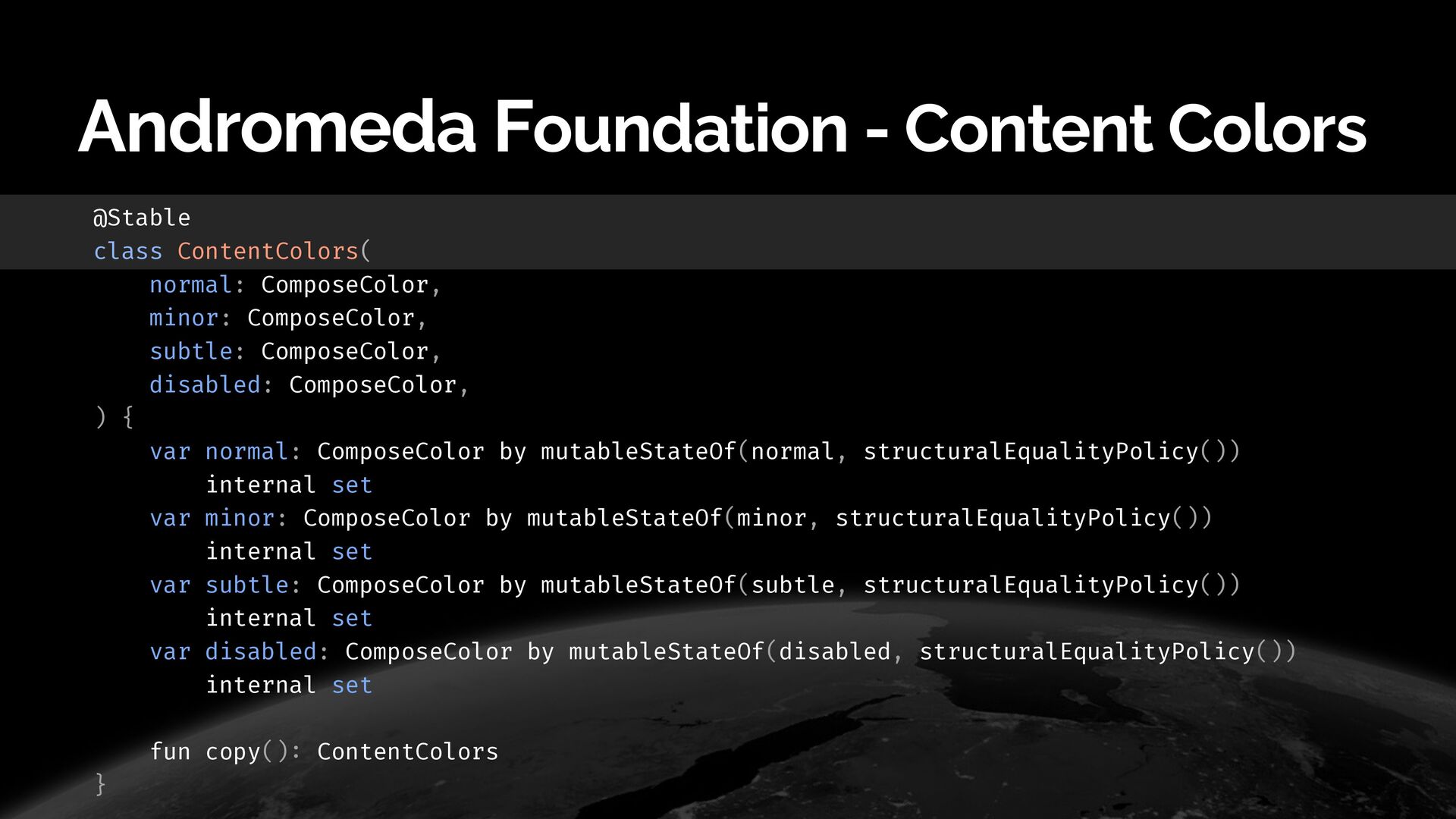
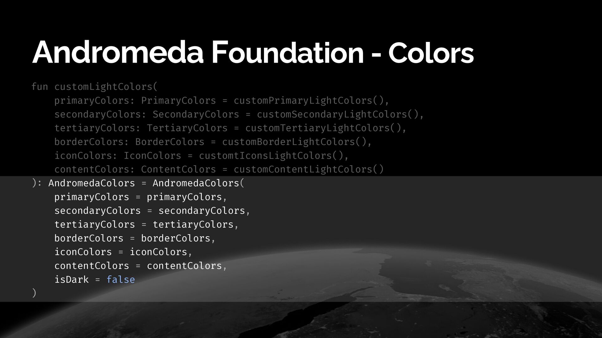
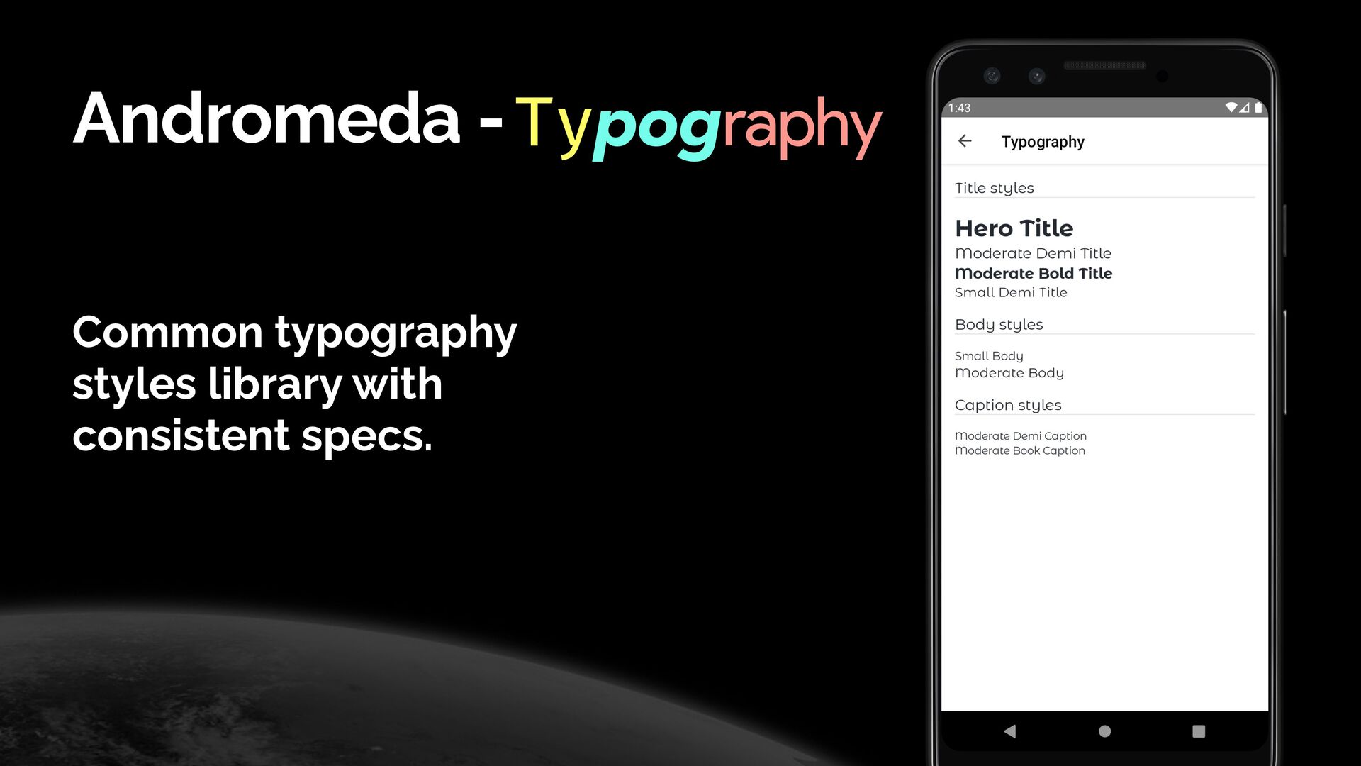
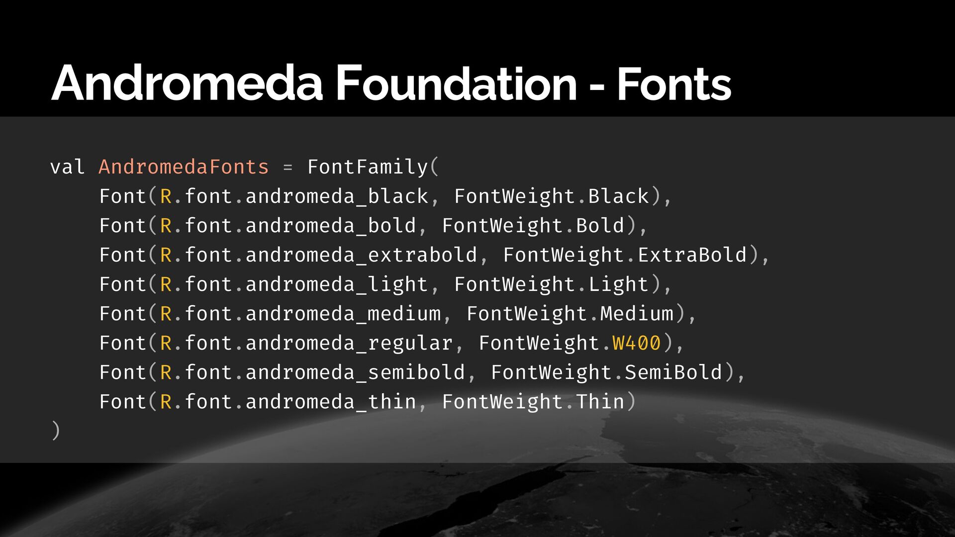
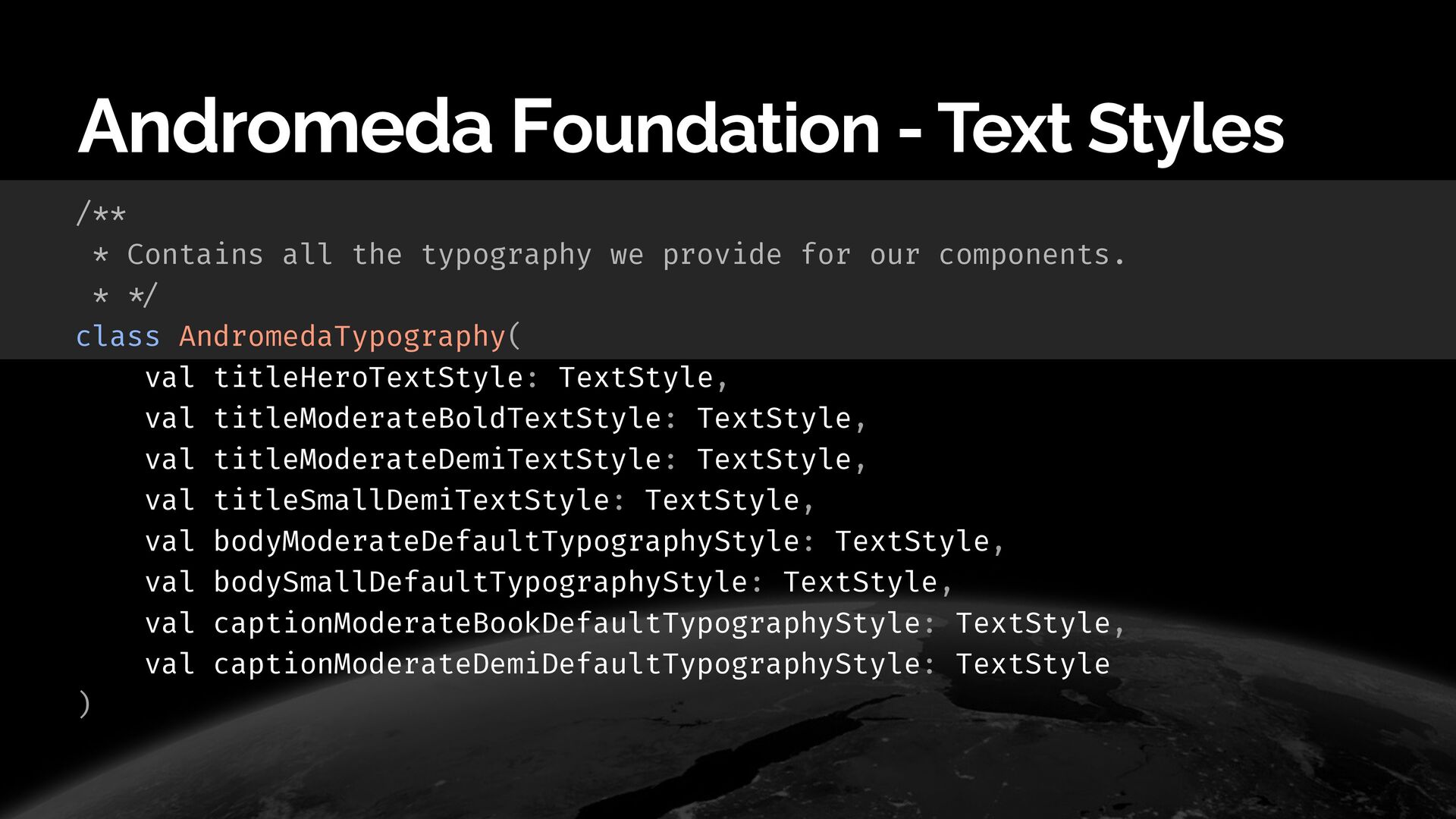
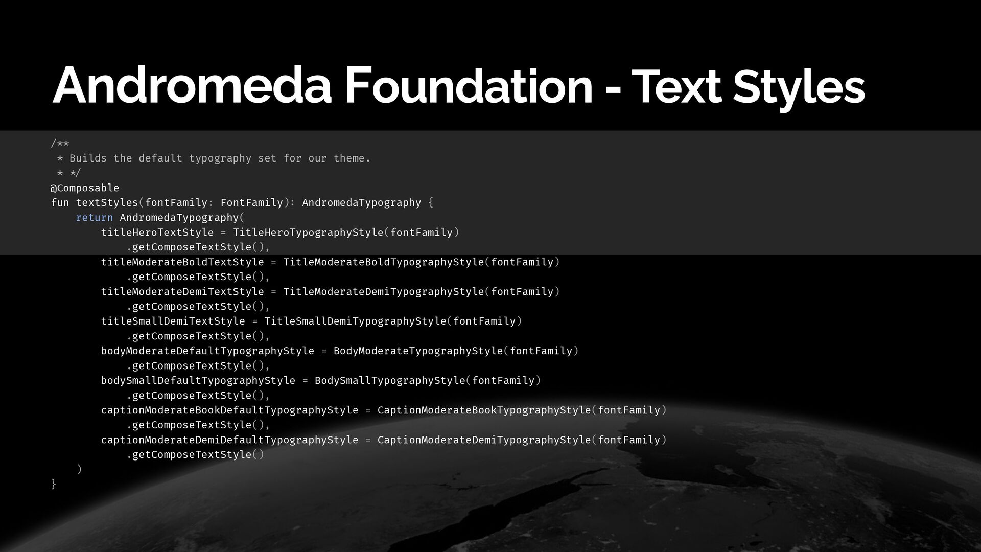
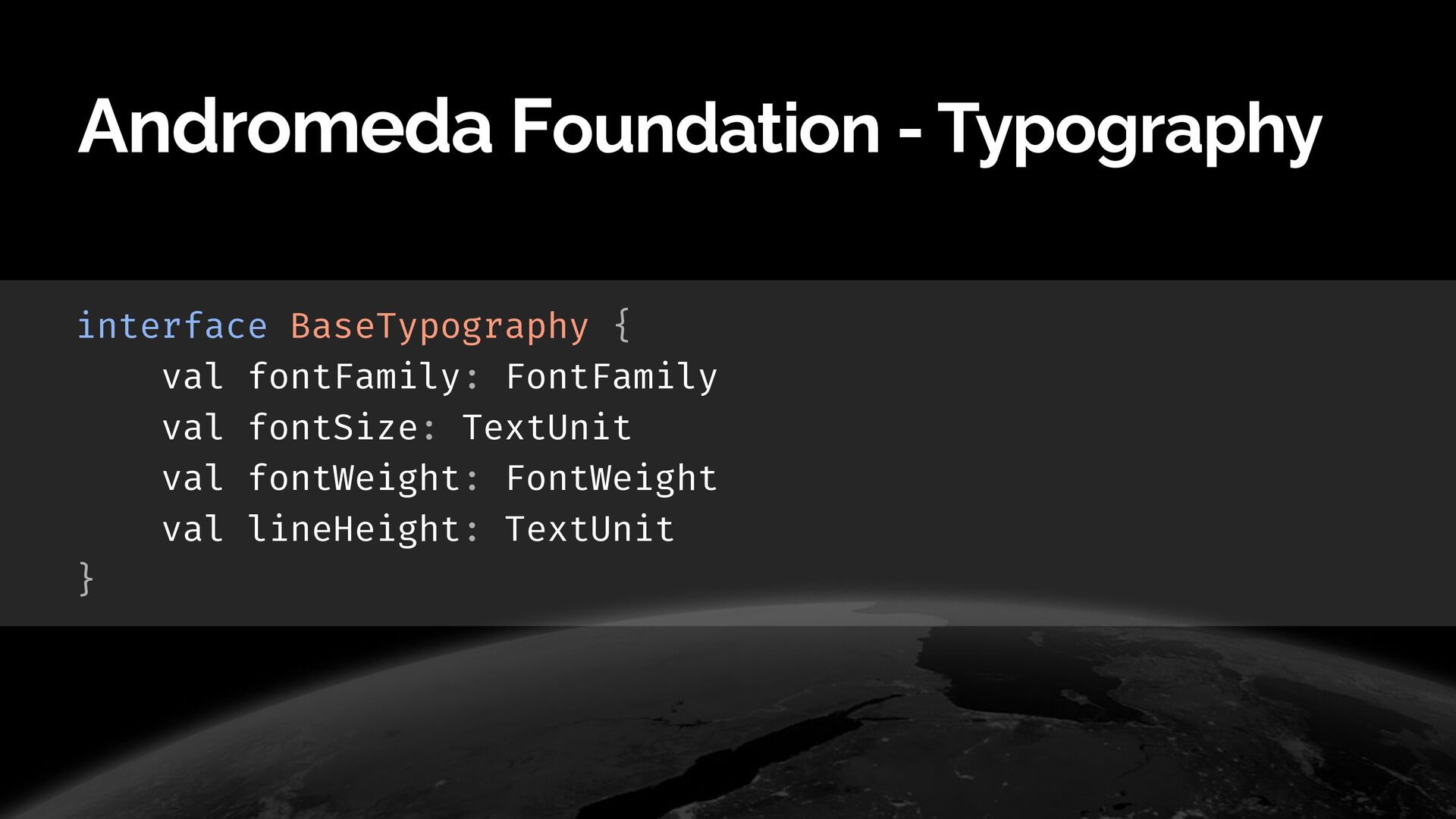
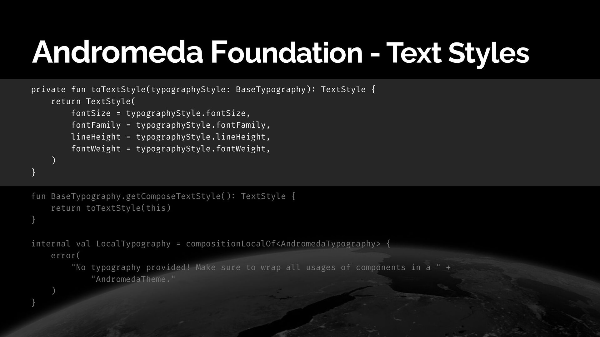
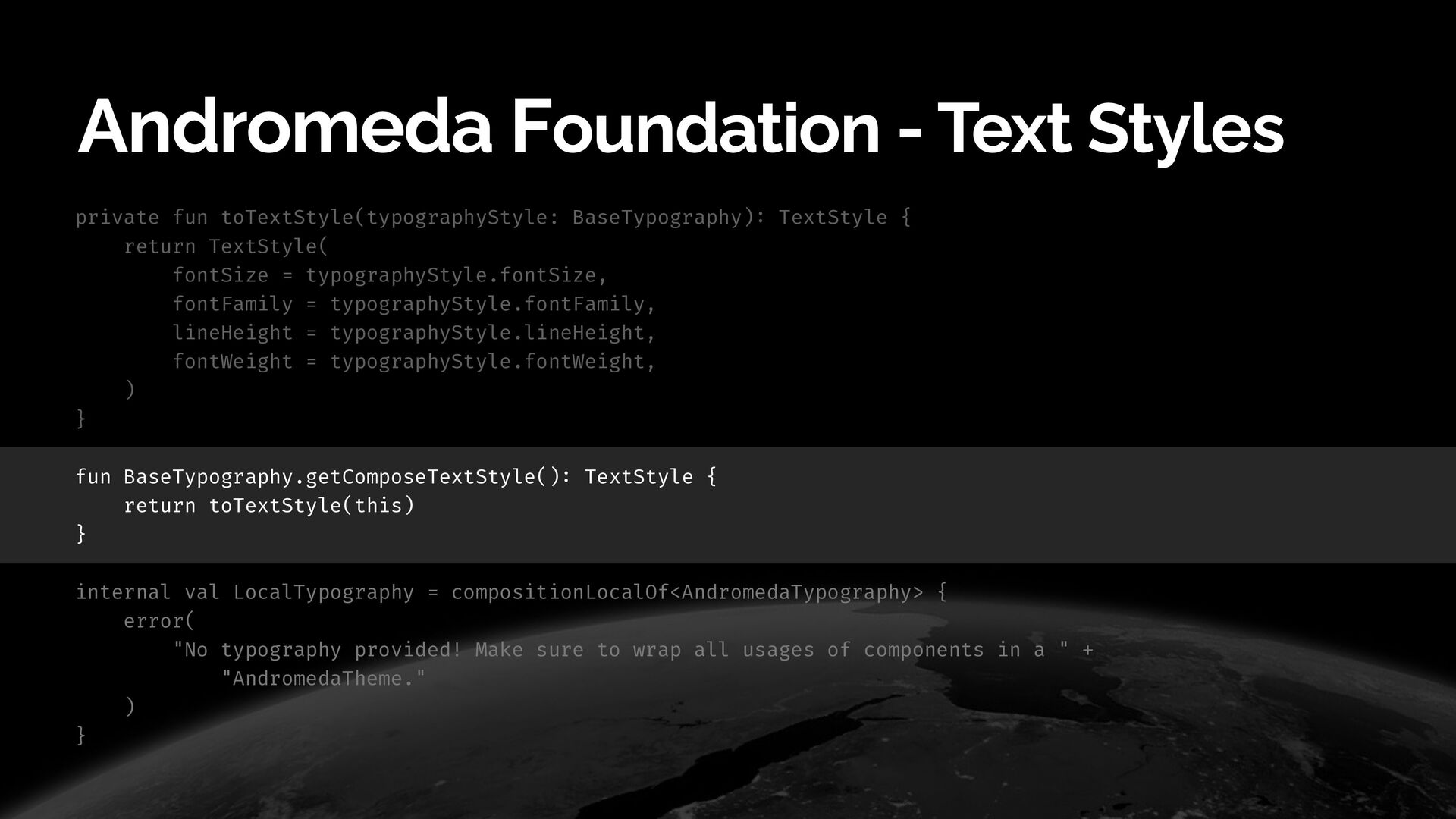
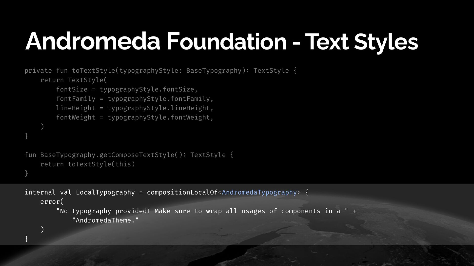
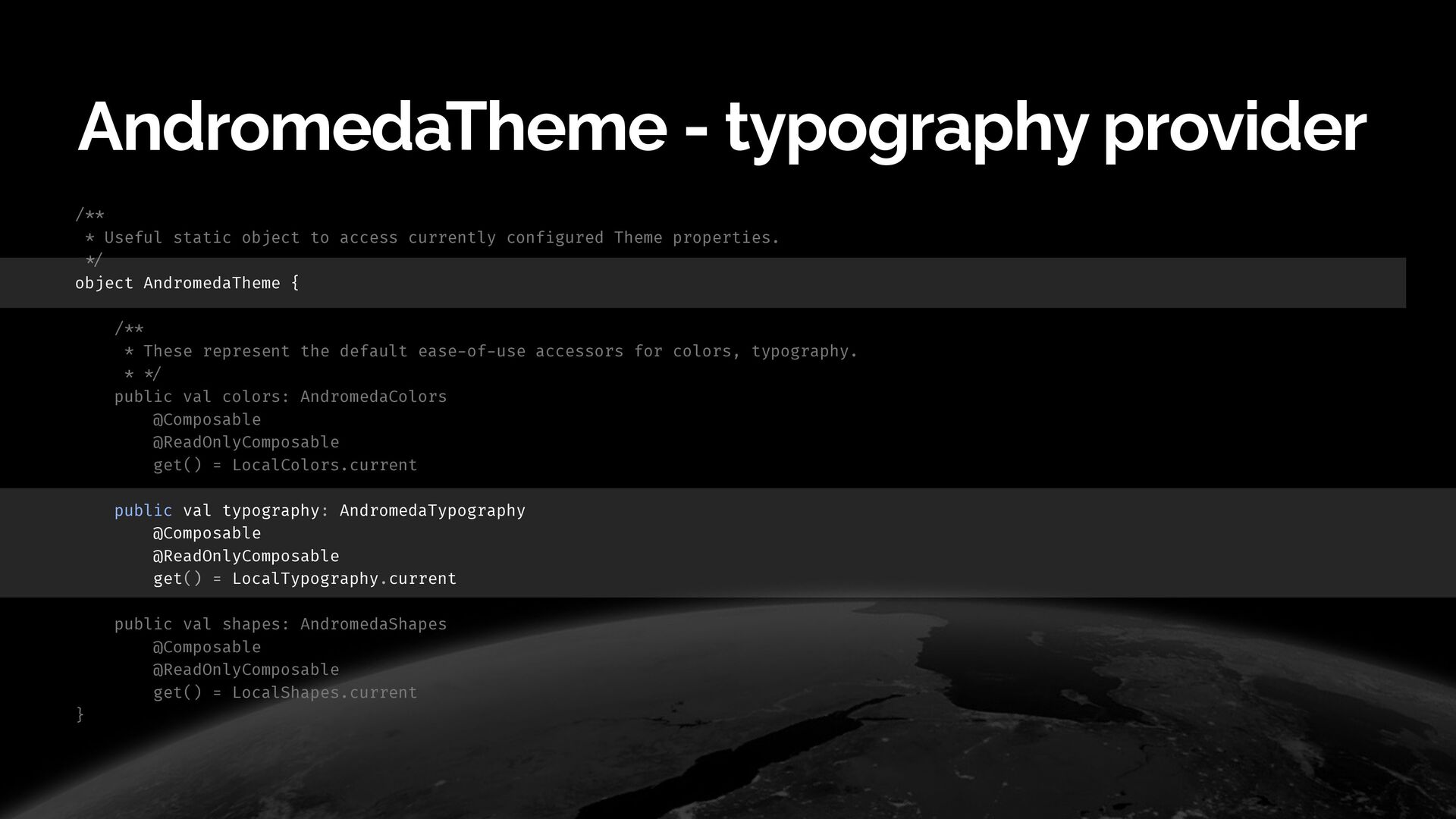
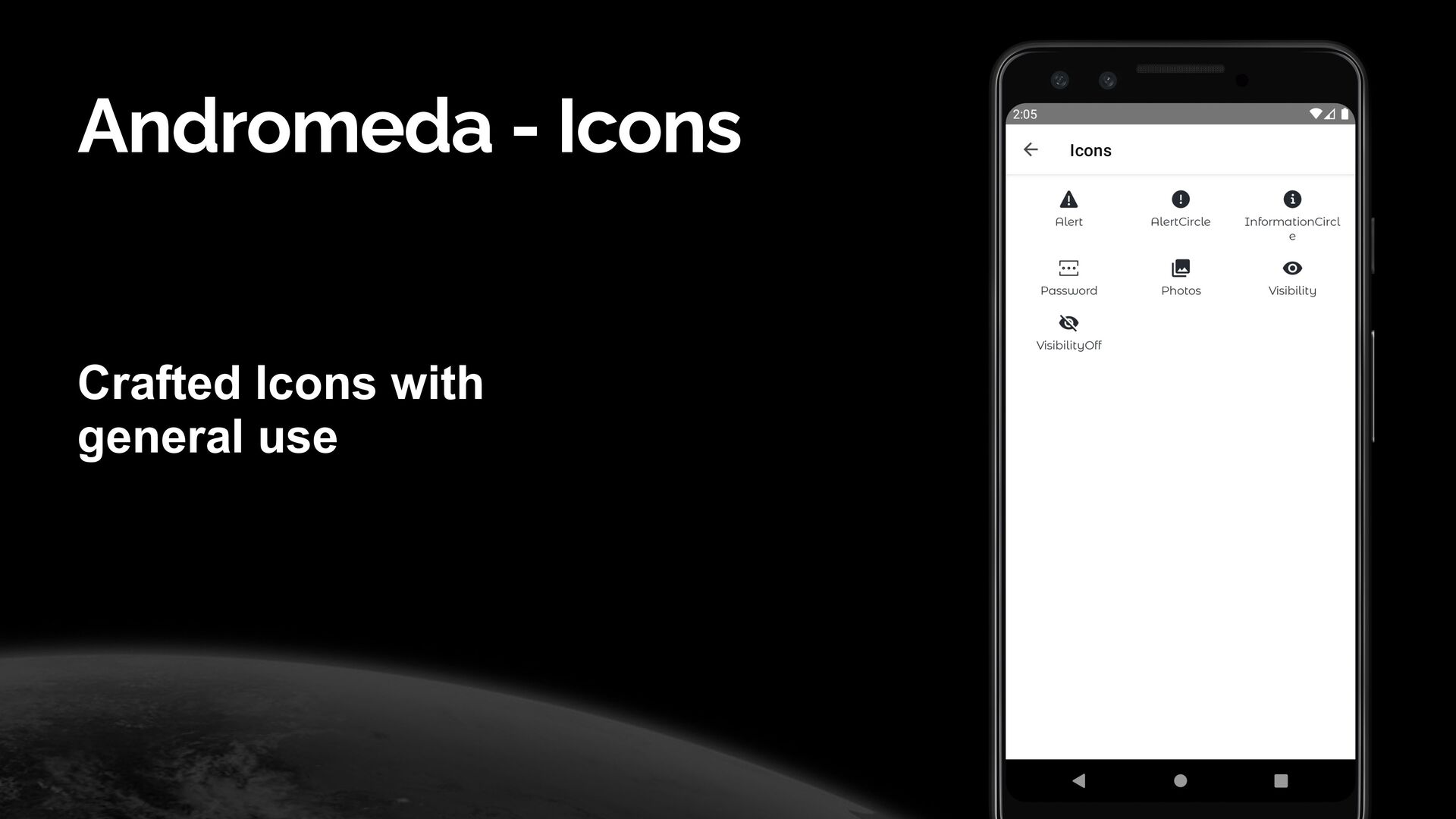
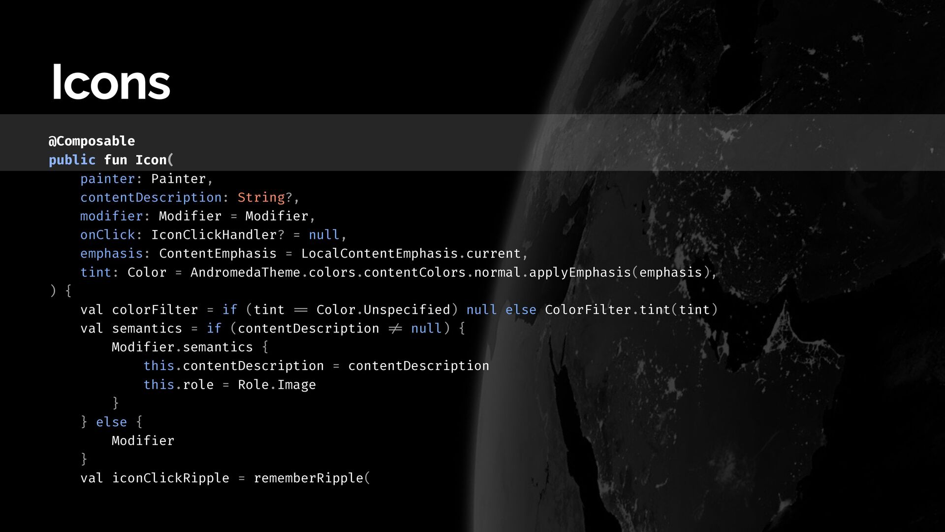
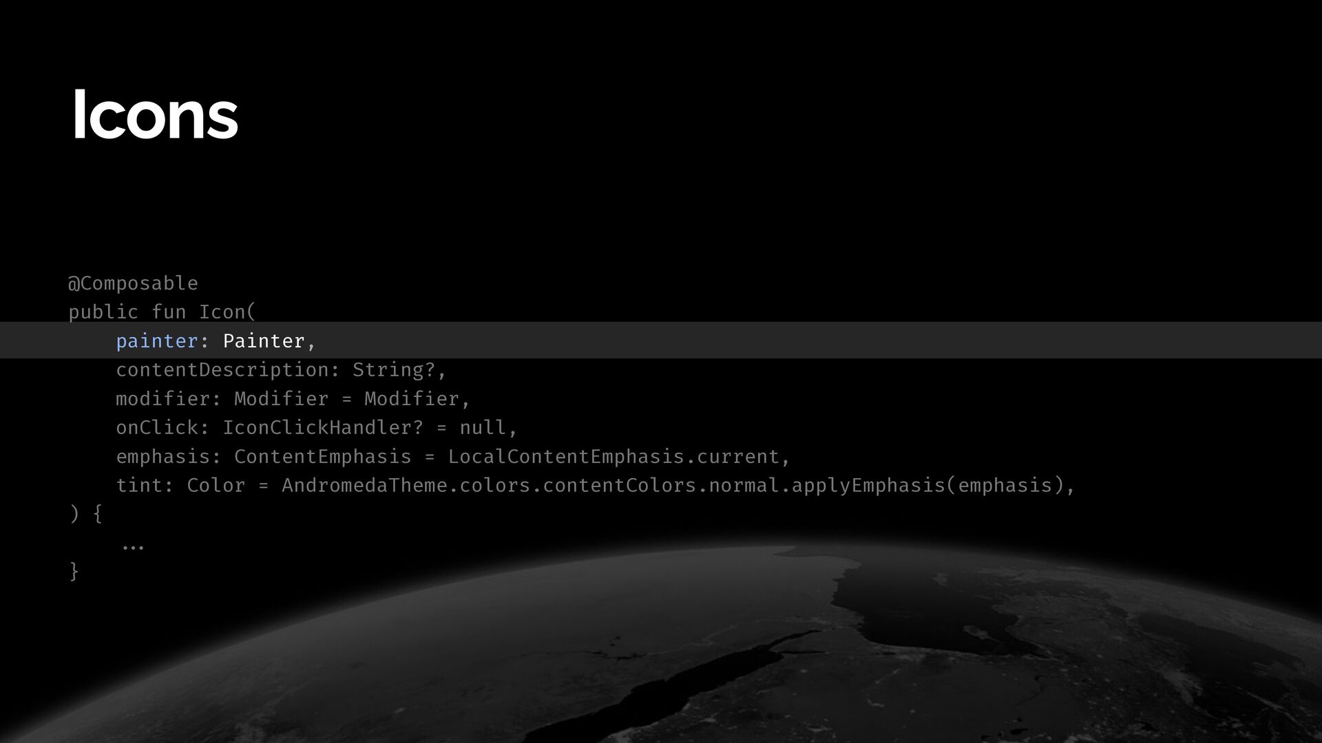
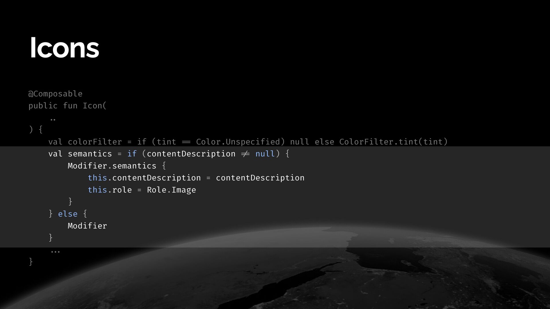
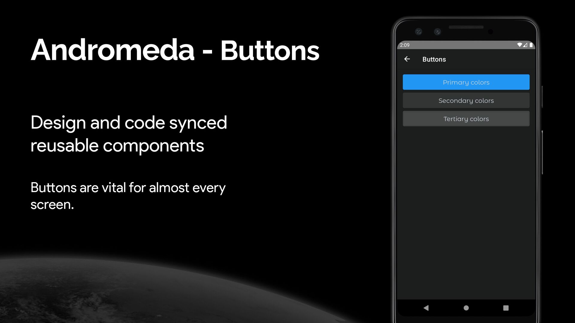
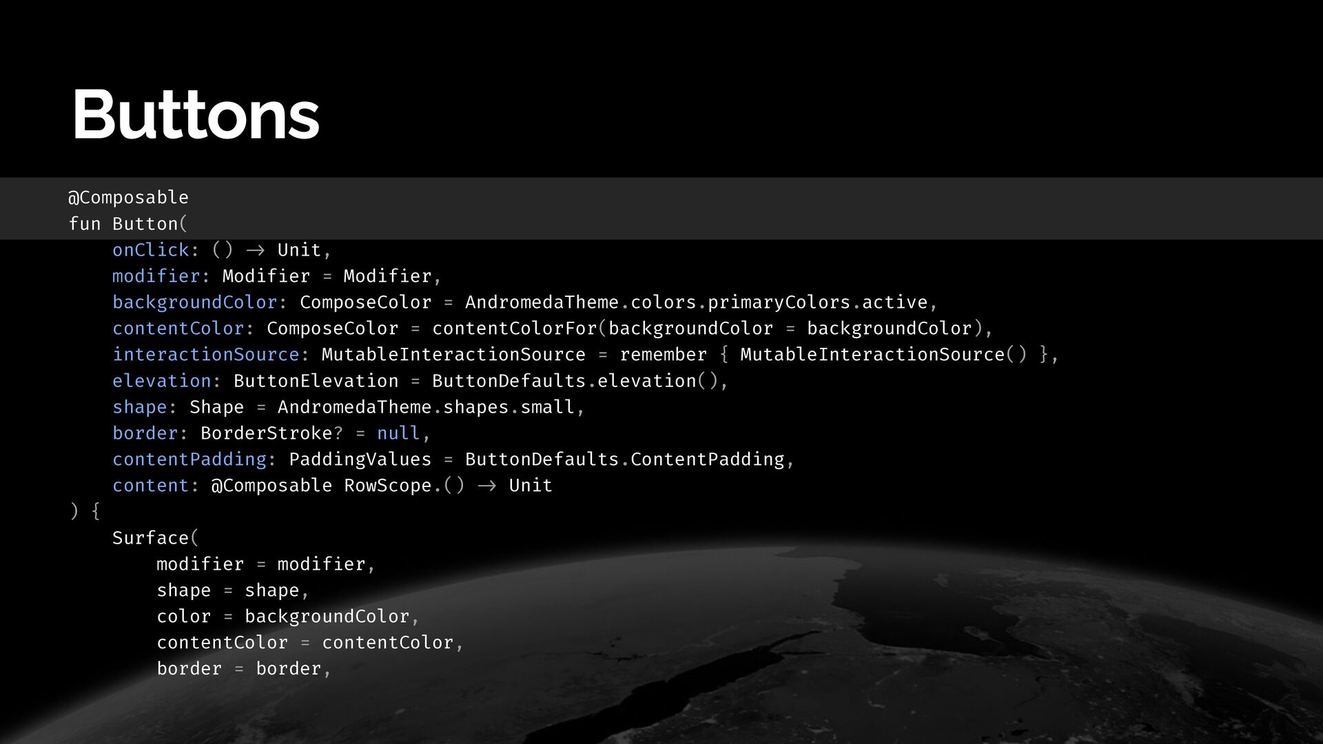
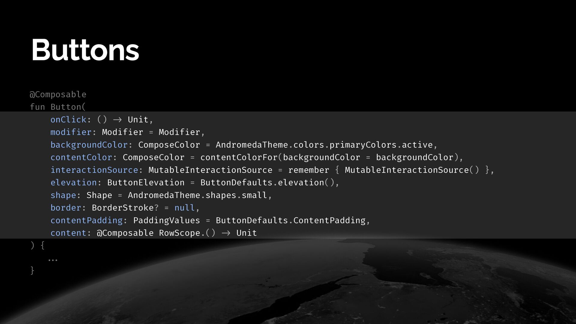
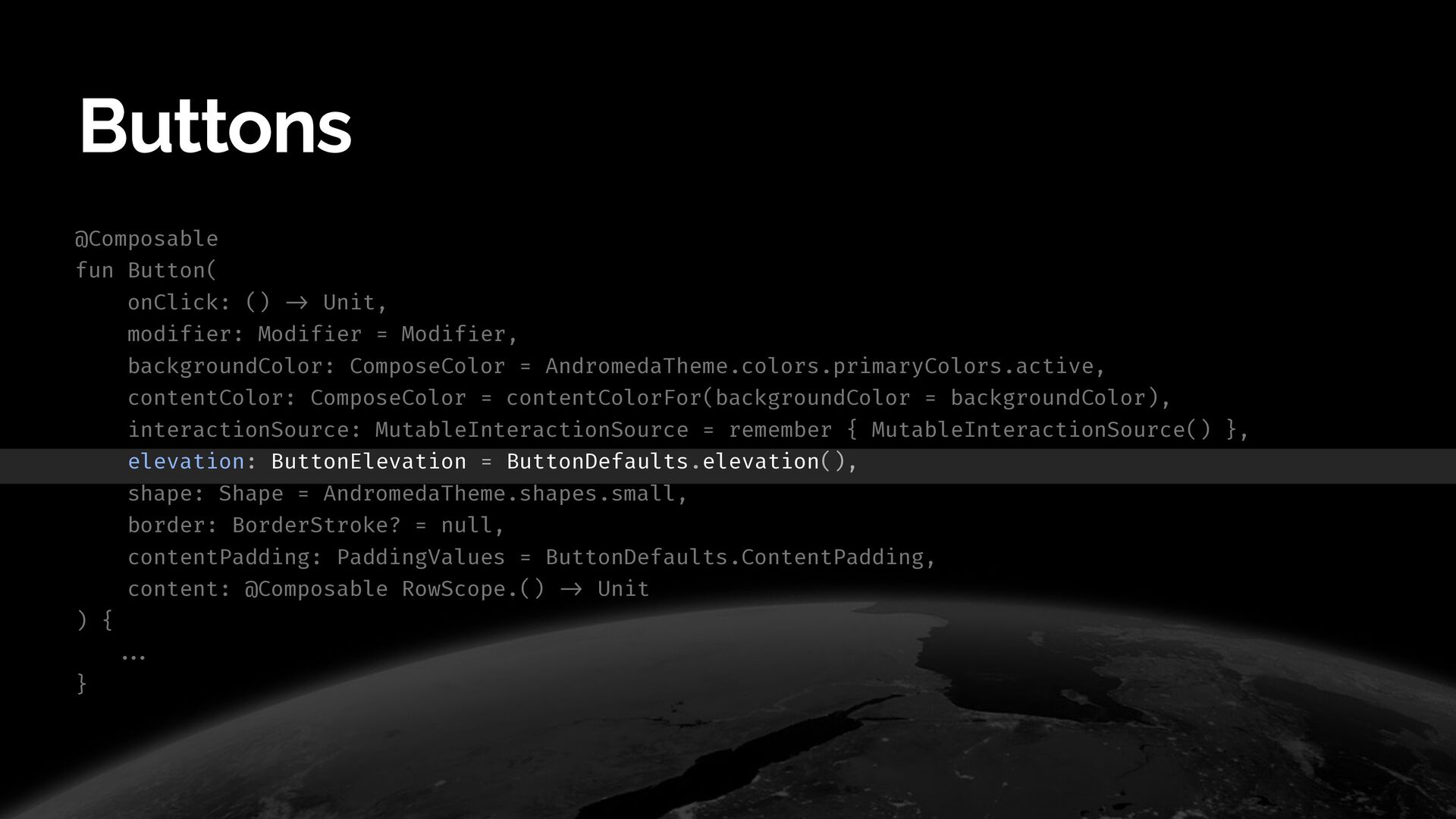
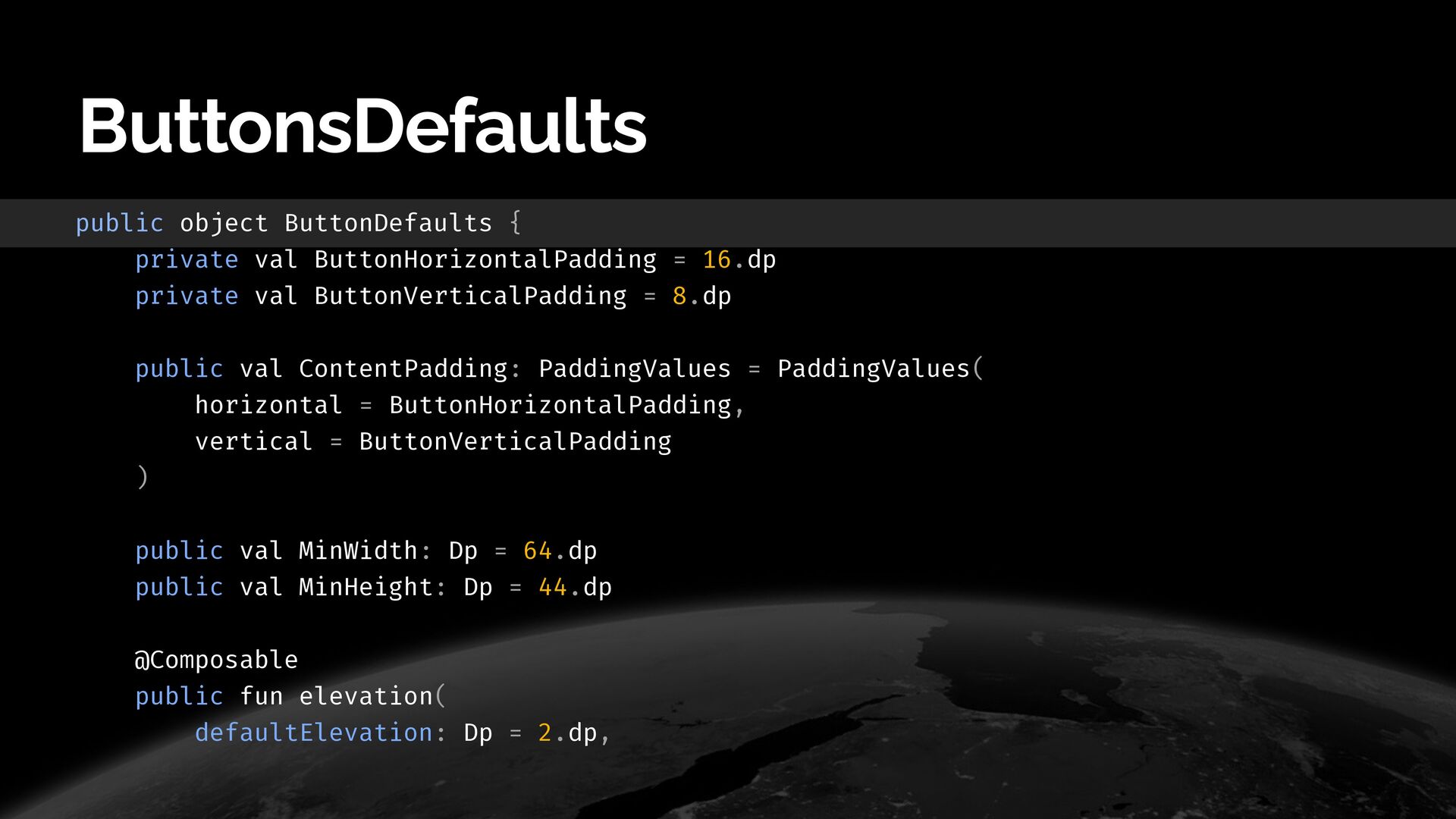
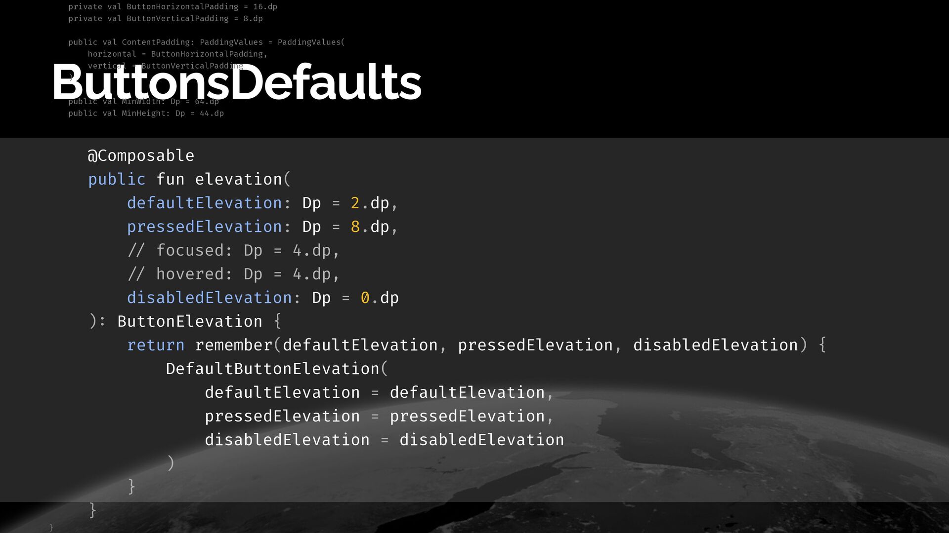
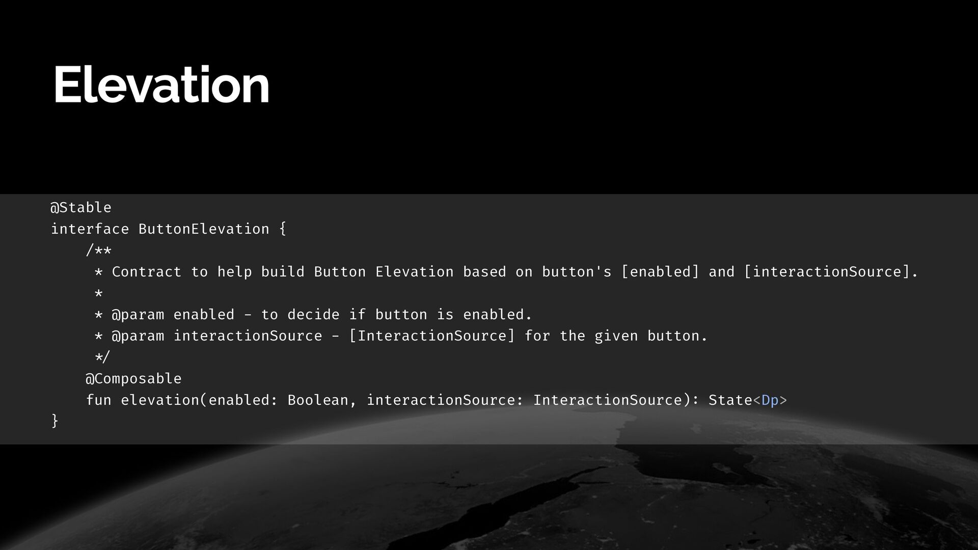
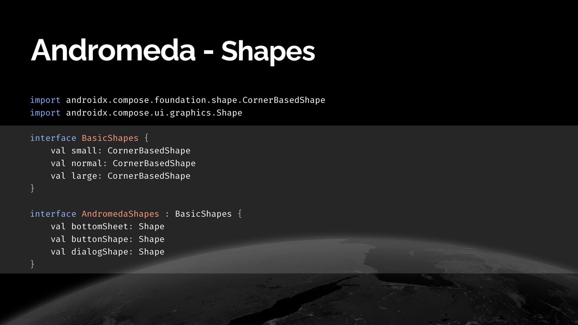
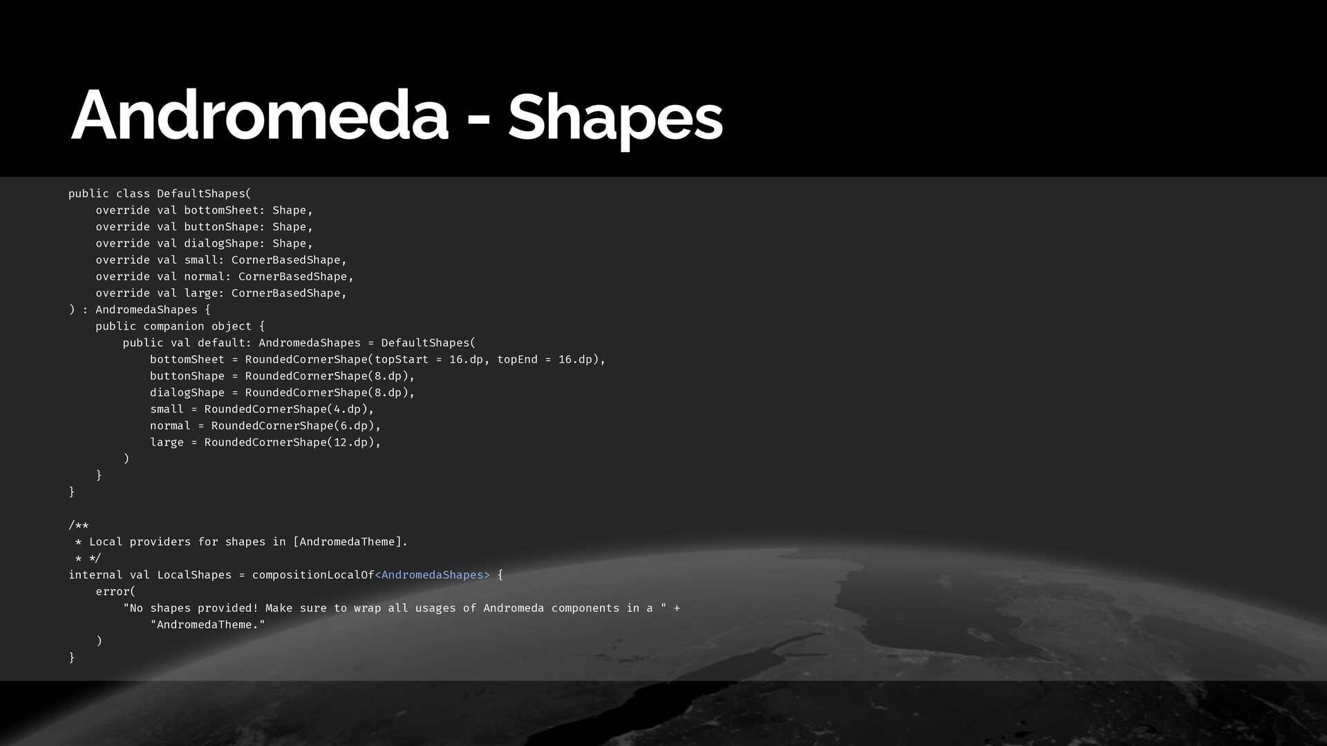
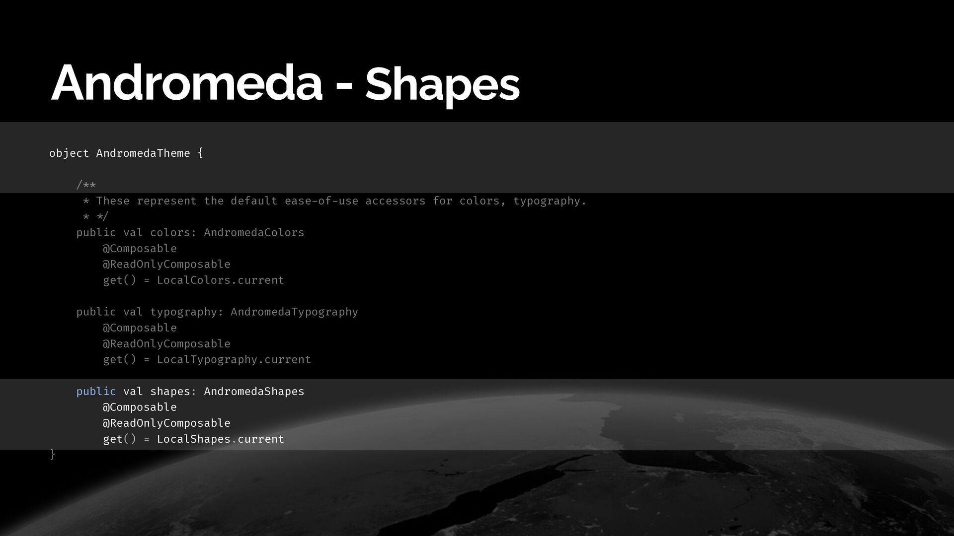
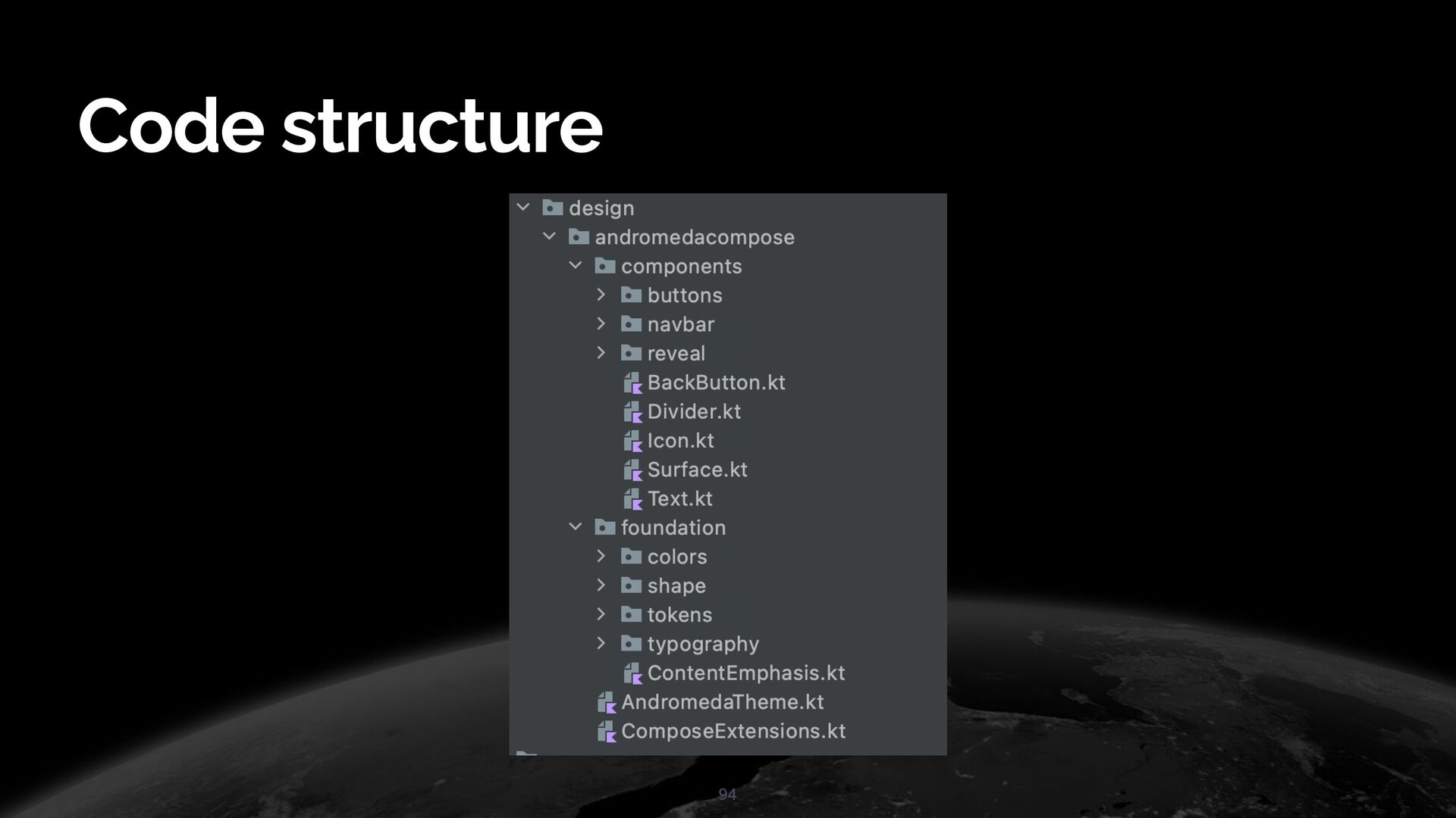
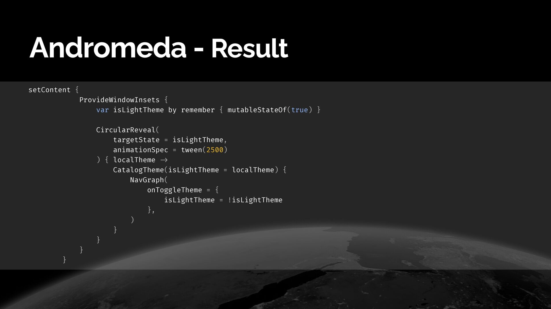
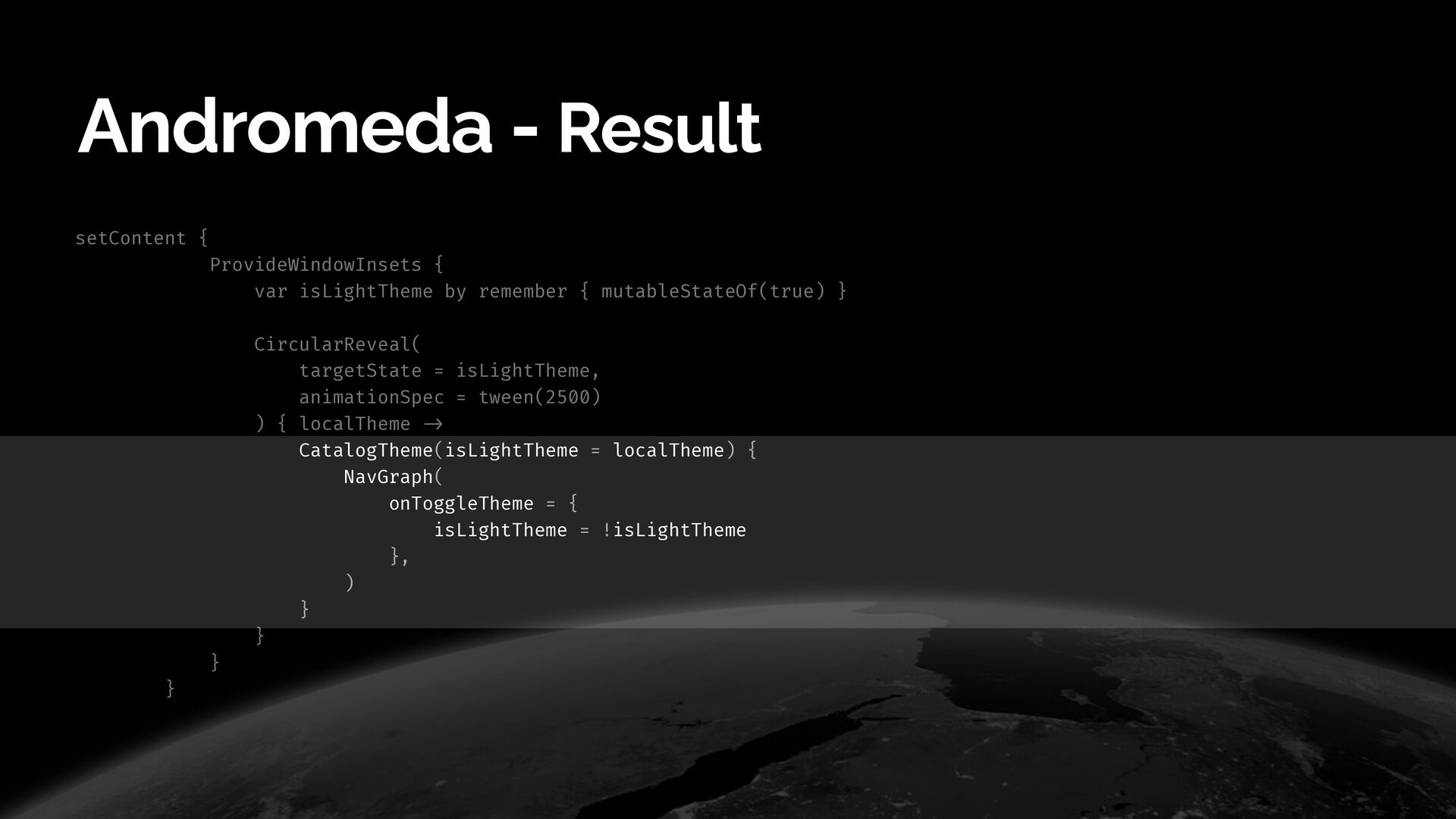
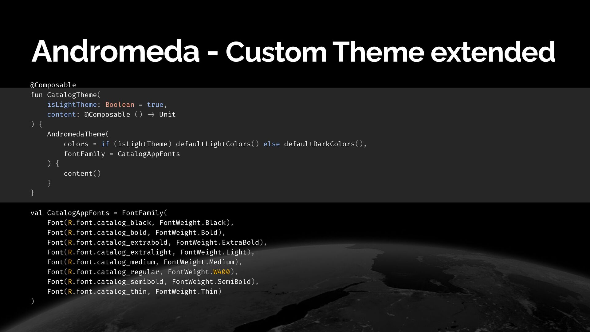
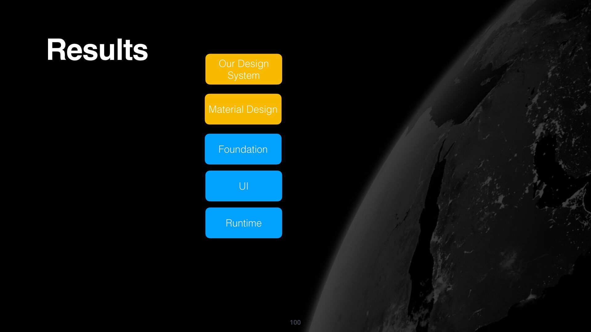
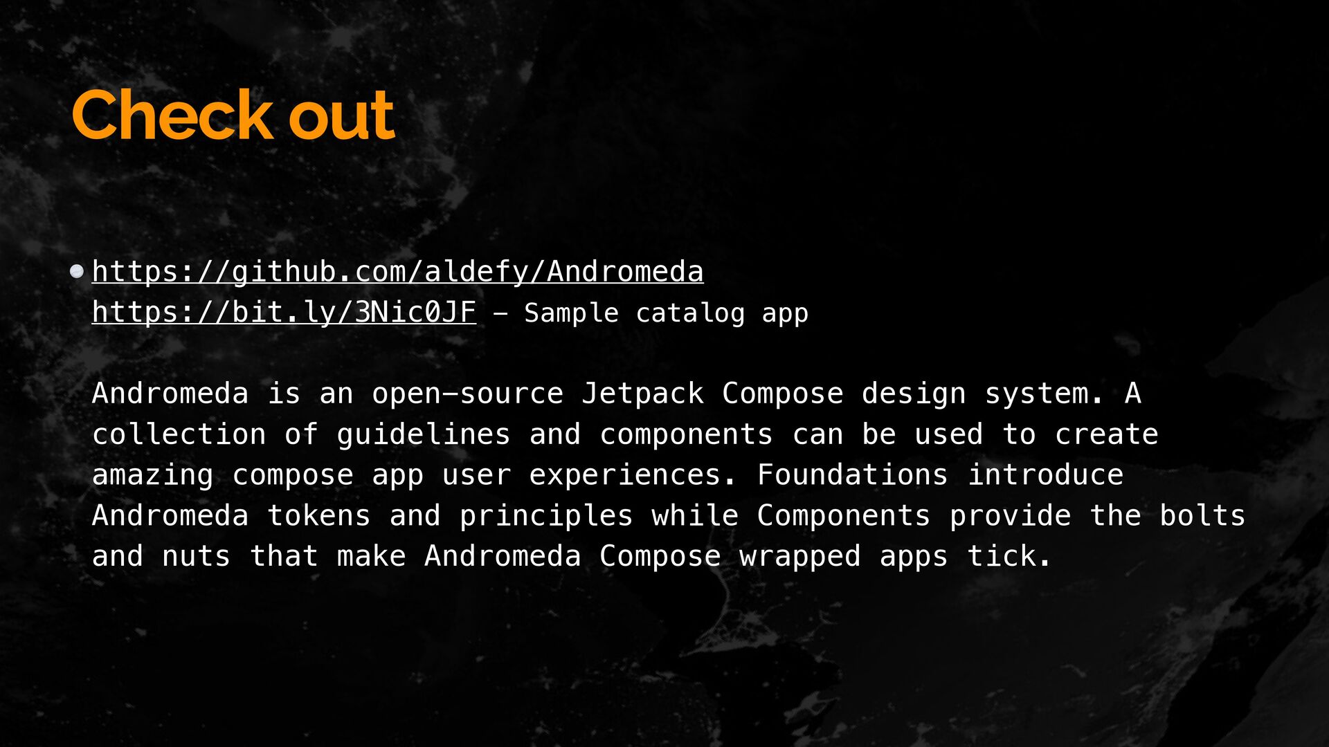
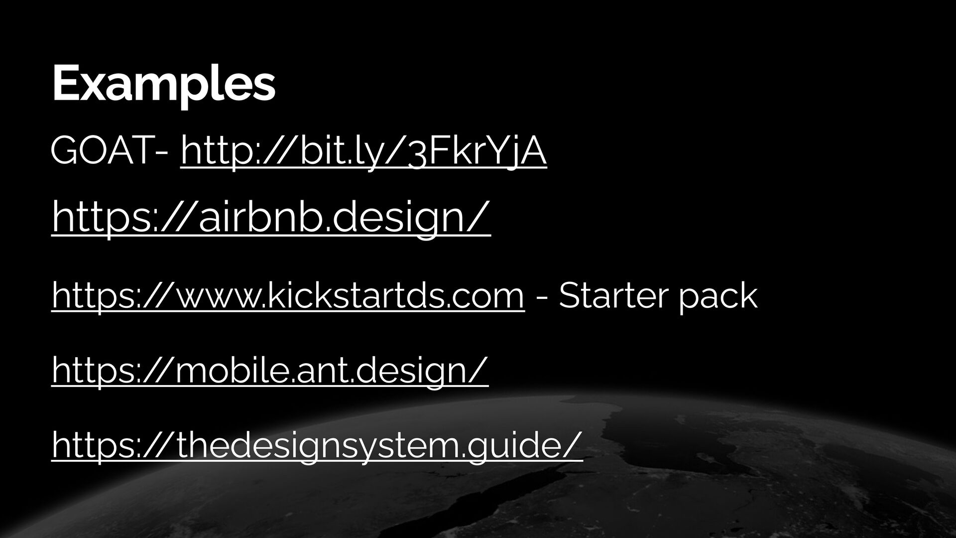
This talk would introduce and explain the reasons and learnings from building a brand new library - Andromeda - an open-source design system with custom components and a customizable theme. This talk would focus on how to set up a custom theme with custom colors typography and what all goes into making a design system framework

Adit Lal

April 19, 2022
Tweet

More Decks by Adit Lal

Other Decks in Programming

Transcript

  1. Google Developers
    Andromeda - Custom
    design systems with
    Compose

    View Slide

  2. Android GDE

    🛠 Individual Consultant

    🔊 Speaker

    🌎 Globe Trotter

    🍻 Beer enthusiast
    🎯https:/
    /androiddev.social/@aditlal
    🔗aditlal.dev

    View Slide

  3. Make design easier,
    better and faster.

    View Slide

  4. Ever baked a cake?

    View Slide

  5. 5
    Ingredients


    The famous nani’s recipe


    Oven of course


    Time and patience
    Ever baked a cake?

    View Slide

  6. 6
    Ever baked a cake?

    View Slide

  7. 7
    Ever baked a cake?
    Yikes

    View Slide

  8. 8
    Ever baked a cake?
    Phew

    View Slide

  9. 9
    Ever baked a cake?

    View Slide

  10. 10
    Ever baked a cake?

    View Slide

  11. 11
    Ever baked a cake?

    View Slide

  12. 12
    Ingredients


    The famous nani’s recipe


    Oven of course


    Time and patience


    Assembly line


    Story and marketing


    Customer support
    Ever baked a cake?

    View Slide

  13. 13
    Inconsistent. Slower. Not so Scaleable.

    View Slide

  14. 14
    Components

    View Slide

  15. 15
    Components -> Consistent. Faster. Better.

    View Slide

  16. 16
    Components -> Consistent. Faster. Better.
    Variety

    View Slide

  17. That’s what a
    Design System is for!

    View Slide

  18. A design system is a collection of reusable
    components, guided by clear standards, that can be
    assembled together to build any number of
    applications.
    Design system

    View Slide

  19. Style Guide: Colours, Typography, Icons, Illustrations, etc
    Component Library: Buttons, Forms, Menu, Navigation, etc
    Content Guide: Principles, Common De
    fi
    nitions, Voice and Tone, etc
    Patterns Guide: User and Business Flows, etc
    Reference Site: Documentation and Best Practices to use it all
    correctly
    Design system

    View Slide

  20. Style Guide: Colours, Typography, Icons, Illustrations, etc
    Component Library: Buttons, Forms, Menu, Navigation, etc
    Content Guide: Principles, Common De
    fi
    nitions, Voice and Tone, etc
    Patterns Guide: User and Business Flows, etc
    Reference Site: Documentation and Best Practices to use it all
    correctly
    Design system

    View Slide

  21. 21
    Design

    System
    Design


    Guidelines
    Document


    Guidelines
    Design system
    No


    Guidelines
    Chaos 😱 No feedback loop
    Hard to edit
    Asset automation

    Feedback loop
    🥳

    View Slide

  22. “A design system is a set of interconnected patterns and shared practices
    coherently organised.”


    “A design system is a collection of reusable components, guided by clear
    standards, that can be assembled together to build any number


    of applications.”


    Design system

    View Slide

  23. • Consistency


    • Higher quality


    • Faster builds, through reusable components and shared rationale.


    • Improved maintenance and scalability


    • Stronger focus on product - concentrate on solving user needs


    • More and better communication between teams
    Design system Pros

    View Slide

  24. • Huge initial effort


    • Less
    fl
    exibility
    Design system Cons

    View Slide

  25. 💰 Make designers and developers more productive


    😍 Consistent end user experience
    Design system

    View Slide

  26. Planners


    Can decide on UX
    fl
    ow decision faster


    Can focus on more business goals
    Design system

    View Slide

  27. Designers


    Can improve design consistency


    Can improve the productivity of design work
    Design system

    View Slide

  28. Developers


    Can concentrate on the core logic


    Can improve UI ef
    fi
    ciently and consistently


    Can decrease the cost of QA


    Can reduce project size
    Design system

    View Slide

  29. Ultimately
    Make the Process Shorter
    should ..
    Design system

    View Slide

  30. Design system
    Common doubts
    "Won't it be too restricting?"

    "I won't be able to explore a new style”

    "What if something doesn't work?"

    View Slide

  31. Design system
    Preparing should be..
    Making a List
    Getting a buy-in
    Form a team

    View Slide

  32. Making a List
    Getting a buy-in
    Form a team
    Re
    fl
    ect back on your recent projects
    Audit and focus on pain points
    Components, Principles - de
    fi
    ne work
    fl
    ows
    Design system
    Preparing should be..

    View Slide

  33. Making a List
    Getting a buy-in
    Form a team
    Get people excited - may be not so straightforward
    Identify what’s the reward
    Do a 1-1 with the team - maybe?
    Look at other examples
    Run a quick case study
    Final Approvals
    Design system
    Preparing should be..

    View Slide

  34. Making a List
    Getting a buy-in
    Form a team
    Designers - de
    fi
    ne the visual components
    Front-end developers - Coders duh!!
    Product Managers - align with requirements, and set up necessary steps to help the
    team.
    Researchers - to discover user needs
    Quality Engineers - smooth tested system.
    Leaders - align the vision and allocate resources.
    Design system
    Preparing should be..

    View Slide

  35. Compose goodness
    Less code


    Intuitive


    Accelerate development


    Powerful framework

    View Slide

  36. 36
    Where to start?

    View Slide

  37. Runtime
    UI
    Foundation
    Material Design
    Compose

    View Slide

  38. Basic Structure of Design System

    View Slide

  39. Andromeda

    View Slide

  40. • Always keep users’ expectations in mind and focus on
    patterns to build a clean design.


    • Clear primary task - Users want to USE an app if the
    design is simple yet effective, so make it clear.


    • Find the best middle ground!


    • Give enough controls
    Andromeda - Design Principles

    View Slide

  41. Andromeda

    View Slide

  42. Andromeda
    AndromedaTheme {


    }


    composeContent()

    View Slide

  43. Andromeda
    AndromedaTheme(


    colors = if (isLightTheme) customLightColors()


    else customDarkColors(),


    fontFamily = CustomAppFonts


    ){


    composeContent()


    }


    View Slide

  44. Breakdown

    View Slide

  45. AndromedaTheme - defining the base theme
    @Composable


    fun AndromedaTheme(


    shapes: AndromedaShapes = DefaultShapes.default,


    fontFamily: FontFamily = AndromedaFonts,


    colors: AndromedaColors = AndromedaTheme.colors,


    typography: AndromedaTypography = textStyles(fontFamily = fontFamily),


    content: @Composable ()
    - >
    Unit,


    ) {


    CompositionLocalProvider(


    LocalColors provides colors,


    LocalTypography provides typography,


    LocalShapes provides shapes,


    LocalContentEmphasis provides ContentEmphasis.Normal,


    ) {


    content()


    }


    }


    View Slide

  46. AndromedaTheme - defining the base theme
    @Composable


    fun AndromedaTheme(


    shapes: AndromedaShapes = DefaultShapes.default,


    fontFamily: FontFamily = AndromedaFonts,


    colors: AndromedaColors = AndromedaTheme.colors,


    typography: AndromedaTypography = textStyles(fontFamily = fontFamily),


    content: @Composable ()
    - >
    Unit,


    ) {


    CompositionLocalProvider(


    LocalColors provides colors,


    LocalTypography provides typography,


    LocalShapes provides shapes,


    LocalContentEmphasis provides ContentEmphasis.Normal,


    ) {


    content()


    }


    }


    View Slide

  47. AndromedaTheme - defining the base theme
    @Composable


    fun AndromedaTheme(


    shapes: AndromedaShapes = DefaultShapes.default,


    fontFamily: FontFamily = AndromedaFonts,


    colors: AndromedaColors = AndromedaTheme.colors,


    typography: AndromedaTypography = textStyles(fontFamily = fontFamily),


    content: @Composable ()
    - >
    Unit,


    ) {


    CompositionLocalProvider(


    LocalColors provides colors,


    LocalTypography provides typography,


    LocalShapes provides shapes,


    LocalContentEmphasis provides ContentEmphasis.Normal,


    ) {


    content()


    }


    }


    View Slide

  48. AndromedaTheme - important bits
    @Composable


    fun AndromedaTheme(


    shapes: AndromedaShapes = DefaultShapes.default,


    fontFamily: FontFamily = AndromedaFonts,


    colors: AndromedaColors = AndromedaTheme.colors,


    typography: AndromedaTypography = textStyles(fontFamily = fontFamily),


    content: @Composable ()
    - >
    Unit,


    ) {


    CompositionLocalProvider(


    LocalColors provides colors,


    LocalTypography provides typography,


    LocalShapes provides shapes,


    LocalContentEmphasis provides ContentEmphasis.Normal,


    ) {


    content()


    }


    }


    View Slide

  49. AndromedaTheme
    object AndromedaTheme {


    public val colors: AndromedaColors


    @Composable


    @ReadOnlyComposable


    get() = LocalColors.current


    public val typography: AndromedaTypography


    @Composable


    @ReadOnlyComposable


    get() = LocalTypography.current


    public val shapes: AndromedaShapes


    @Composable


    @ReadOnlyComposable


    get() = LocalShapes.current


    }


    View Slide

  50. AndromedaTheme
    object AndromedaTheme {


    public val colors: AndromedaColors


    @Composable


    @ReadOnlyComposable


    get() = LocalColors.current


    public val typography: AndromedaTypography


    @Composable


    @ReadOnlyComposable


    get() = LocalTypography.current


    public val shapes: AndromedaShapes


    @Composable


    @ReadOnlyComposable


    get() = LocalShapes.current


    }


    View Slide

  51. 51
    Colors
    `

    View Slide

  52. Andromeda Foundation
    Common colour
    library with consistent
    labels
    Colors
    `

    View Slide

  53. Andromeda Foundation
    @Stable


    class AndromedaColors(


    val primaryColors: PrimaryColors,


    val secondaryColors: SecondaryColors,


    val tertiaryColors: TertiaryColors,


    val borderColors: BorderColors,


    val iconColors: IconColors,


    val contentColors: ContentColors,


    isDark: Boolean


    ) {


    var isDark: Boolean by mutableStateOf(isDark, structuralEqualityPolicy())


    internal set


    fun copy(


    . .

    )
    :
    AndromedaColors = AndromedaColors(


    . .

    )


    }


    Colors

    View Slide

  54. Andromeda Foundation Colors
    @Stable


    class AndromedaColors(


    val primaryColors: PrimaryColors,


    val secondaryColors: SecondaryColors,


    val tertiaryColors: TertiaryColors,


    val borderColors: BorderColors,


    val iconColors: IconColors,


    val contentColors: ContentColors,


    isDark: Boolean


    ) {


    var isDark: Boolean by mutableStateOf(isDark, structuralEqualityPolicy())


    internal set


    fun copy(


    . .

    )
    :
    AndromedaColors = AndromedaColors(


    . .

    )


    }


    View Slide

  55. Andromeda Foundation - Fill Colors
    import androidx.compose.ui.graphics.Color as ComposeColor


    interface FillColors {


    val background: ComposeColor


    val active: ComposeColor


    val error: ComposeColor


    val mute: ComposeColor


    val pressed: ComposeColor


    val alt: ComposeColor


    }


    View Slide

  56. Andromeda Foundation - Fill Colors
    import androidx.compose.ui.graphics.Color as ComposeColor


    interface FillColors {


    val background: ComposeColor


    val active: ComposeColor


    val error: ComposeColor


    val mute: ComposeColor


    val pressed: ComposeColor


    val alt: ComposeColor


    }


    View Slide

  57. Andromeda Foundation - Primary Fill Colors
    @Stable


    class PrimaryColors(


    background: ComposeColor,


    active: ComposeColor,


    error: ComposeColor,


    mute: ComposeColor,


    pressed: ComposeColor,


    alt: ComposeColor


    ) : FillColors {


    override var background: ComposeColor by mutableStateOf(background, structuralEqualityPolicy())


    internal set


    override var active: ComposeColor by mutableStateOf(active, structuralEqualityPolicy())


    internal set


    override var error: ComposeColor by mutableStateOf(error, structuralEqualityPolicy())


    internal set


    override var mute: ComposeColor by mutableStateOf(mute, structuralEqualityPolicy())


    internal set


    override var pressed: ComposeColor by mutableStateOf(pressed, structuralEqualityPolicy())


    internal set


    override var alt: ComposeColor by mutableStateOf(alt, structuralEqualityPolicy())


    internal set


    fun copy(…)


    }


    View Slide

  58. Andromeda Foundation - Primary Fill Colors
    @Stable


    class PrimaryColors(


    background: ComposeColor,


    active: ComposeColor,


    error: ComposeColor,


    mute: ComposeColor,


    pressed: ComposeColor,


    alt: ComposeColor


    ) : FillColors {


    override var background: ComposeColor by mutableStateOf(background, structuralEqualityPolicy())


    internal set


    override var active: ComposeColor by mutableStateOf(active, structuralEqualityPolicy())


    internal set


    override var error: ComposeColor by mutableStateOf(error, structuralEqualityPolicy())


    internal set


    override var mute: ComposeColor by mutableStateOf(mute, structuralEqualityPolicy())


    internal set


    override var pressed: ComposeColor by mutableStateOf(pressed, structuralEqualityPolicy())


    internal set


    override var alt: ComposeColor by mutableStateOf(alt, structuralEqualityPolicy())


    internal set


    fun copy(…)


    }


    View Slide

  59. Andromeda Foundation - Primary Fill Colors
    @Stable


    class PrimaryColors(


    background: ComposeColor,


    active: ComposeColor,


    error: ComposeColor,


    mute: ComposeColor,


    pressed: ComposeColor,


    alt: ComposeColor


    ) : FillColors {


    override var background: ComposeColor by mutableStateOf(background, structuralEqualityPolicy())


    internal set


    override var active: ComposeColor by mutableStateOf(active, structuralEqualityPolicy())


    internal set


    override var error: ComposeColor by mutableStateOf(error, structuralEqualityPolicy())


    internal set


    override var mute: ComposeColor by mutableStateOf(mute, structuralEqualityPolicy())


    internal set


    override var pressed: ComposeColor by mutableStateOf(pressed, structuralEqualityPolicy())


    internal set


    override var alt: ComposeColor by mutableStateOf(alt, structuralEqualityPolicy())


    internal set


    fun copy(…)


    }


    View Slide

  60. Andromeda Foundation - Secondary Colors
    @Stable


    class SecondaryColors(


    background: ComposeColor,


    active: ComposeColor,


    error: ComposeColor,


    mute: ComposeColor,


    pressed: ComposeColor,


    alt: ComposeColor


    ) : FillColors {


    override var background: ComposeColor by mutableStateOf(background, structuralEqualityPolicy())


    internal set


    override var active: ComposeColor by mutableStateOf(active, structuralEqualityPolicy())


    internal set


    override var error: ComposeColor by mutableStateOf(error, structuralEqualityPolicy())


    internal set


    override var mute: ComposeColor by mutableStateOf(mute, structuralEqualityPolicy())


    internal set


    override var pressed: ComposeColor by mutableStateOf(pressed, structuralEqualityPolicy())


    internal set


    override var alt: ComposeColor by mutableStateOf(alt, structuralEqualityPolicy())


    internal set


    fun copy()


    }


    View Slide

  61. Andromeda Foundation - Content Colors
    @Stable


    class ContentColors(


    normal: ComposeColor,


    minor: ComposeColor,


    subtle: ComposeColor,


    disabled: ComposeColor,


    ) {


    var normal: ComposeColor by mutableStateOf(normal, structuralEqualityPolicy())


    internal set


    var minor: ComposeColor by mutableStateOf(minor, structuralEqualityPolicy())


    internal set


    var subtle: ComposeColor by mutableStateOf(subtle, structuralEqualityPolicy())


    internal set


    var disabled: ComposeColor by mutableStateOf(disabled, structuralEqualityPolicy())


    internal set


    fun copy()
    :
    ContentColors


    }


    View Slide

  62. fun customLightColors(


    primaryColors: PrimaryColors = customPrimaryLightColors(),


    secondaryColors: SecondaryColors = customSecondaryLightColors(),


    tertiaryColors: TertiaryColors = customTertiaryLightColors(),


    borderColors: BorderColors = customBorderLightColors(),


    iconColors: IconColors = customtIconsLightColors(),


    contentColors: ContentColors = customContentLightColors()


    )
    :
    AndromedaColors = AndromedaColors(


    primaryColors = primaryColors,


    secondaryColors = secondaryColors,


    tertiaryColors = tertiaryColors,


    borderColors = borderColors,


    iconColors = iconColors,


    contentColors = contentColors,


    isDark = false


    )


    Andromeda Foundation - Colors

    View Slide

  63. fun customLightColors(


    primaryColors: PrimaryColors = customPrimaryLightColors(),


    secondaryColors: SecondaryColors = customSecondaryLightColors(),


    tertiaryColors: TertiaryColors = customTertiaryLightColors(),


    borderColors: BorderColors = customBorderLightColors(),


    iconColors: IconColors = customtIconsLightColors(),


    contentColors: ContentColors = customContentLightColors()


    )
    :
    AndromedaColors = AndromedaColors(


    primaryColors = primaryColors,


    secondaryColors = secondaryColors,


    tertiaryColors = tertiaryColors,


    borderColors = borderColors,


    iconColors = iconColors,


    contentColors = contentColors,


    isDark = false


    )


    Andromeda Foundation - Colors

    View Slide

  64. 64
    Typography

    View Slide

  65. Andromeda -
    Common typography
    styles library with
    consistent specs.
    Typography

    View Slide

  66. val AndromedaFonts = FontFamily(


    Font(R.font.andromeda_black, FontWeight.Black),


    Font(R.font.andromeda_bold, FontWeight.Bold),


    Font(R.font.andromeda_extrabold, FontWeight.ExtraBold),


    Font(R.font.andromeda_light, FontWeight.Light),


    Font(R.font.andromeda_medium, FontWeight.Medium),


    Font(R.font.andromeda_regular, FontWeight.W400),


    Font(R.font.andromeda_semibold, FontWeight.SemiBold),


    Font(R.font.andromeda_thin, FontWeight.Thin)


    )


    Andromeda Foundation - Fonts

    View Slide

  67. /**


    * Contains all the typography we provide for our components.


    *
    * /

    class AndromedaTypography(


    val titleHeroTextStyle: TextStyle,


    val titleModerateBoldTextStyle: TextStyle,


    val titleModerateDemiTextStyle: TextStyle,


    val titleSmallDemiTextStyle: TextStyle,


    val bodyModerateDefaultTypographyStyle: TextStyle,


    val bodySmallDefaultTypographyStyle: TextStyle,


    val captionModerateBookDefaultTypographyStyle: TextStyle,


    val captionModerateDemiDefaultTypographyStyle: TextStyle


    )


    Andromeda Foundation - Text Styles

    View Slide

  68. /**


    * Builds the default typography set for our theme.


    *
    * /

    @Composable


    fun textStyles(fontFamily: FontFamily)
    :
    AndromedaTypography {


    return AndromedaTypography(


    titleHeroTextStyle = TitleHeroTypographyStyle(fontFamily)


    .getComposeTextStyle(),


    titleModerateBoldTextStyle = TitleModerateBoldTypographyStyle(fontFamily)


    .getComposeTextStyle(),


    titleModerateDemiTextStyle = TitleModerateDemiTypographyStyle(fontFamily)


    .getComposeTextStyle(),


    titleSmallDemiTextStyle = TitleSmallDemiTypographyStyle(fontFamily)


    .getComposeTextStyle(),


    bodyModerateDefaultTypographyStyle = BodyModerateTypographyStyle(fontFamily)


    .getComposeTextStyle(),


    bodySmallDefaultTypographyStyle = BodySmallTypographyStyle(fontFamily)


    .getComposeTextStyle(),


    captionModerateBookDefaultTypographyStyle = CaptionModerateBookTypographyStyle(fontFamily)


    .getComposeTextStyle(),


    captionModerateDemiDefaultTypographyStyle = CaptionModerateDemiTypographyStyle(fontFamily)


    .getComposeTextStyle()


    )


    }


    Andromeda Foundation - Text Styles

    View Slide

  69. /**


    * Builds the default typography set for our theme.


    *
    * /

    @Composable


    fun textStyles(fontFamily: FontFamily)
    :
    AndromedaTypography {


    return AndromedaTypography(


    titleHeroTextStyle = TitleHeroTypographyStyle(fontFamily)


    .getComposeTextStyle(),


    titleModerateBoldTextStyle = TitleModerateBoldTypographyStyle(fontFamily)


    .getComposeTextStyle(),


    titleModerateDemiTextStyle = TitleModerateDemiTypographyStyle(fontFamily)


    .getComposeTextStyle(),


    titleSmallDemiTextStyle = TitleSmallDemiTypographyStyle(fontFamily)


    .getComposeTextStyle(),


    bodyModerateDefaultTypographyStyle = BodyModerateTypographyStyle(fontFamily)


    .getComposeTextStyle(),


    bodySmallDefaultTypographyStyle = BodySmallTypographyStyle(fontFamily)


    .getComposeTextStyle(),


    captionModerateBookDefaultTypographyStyle = CaptionModerateBookTypographyStyle(fontFamily)


    .getComposeTextStyle(),


    captionModerateDemiDefaultTypographyStyle = CaptionModerateDemiTypographyStyle(fontFamily)


    .getComposeTextStyle()


    )


    }


    Andromeda Foundation - Text Styles

    View Slide

  70. interface BaseTypography {


    val fontFamily: FontFamily


    val fontSize: TextUnit


    val fontWeight: FontWeight


    val lineHeight: TextUnit


    }


    Andromeda Foundation - Typography

    View Slide

  71. private fun toTextStyle(typographyStyle: BaseTypography)
    :
    TextStyle {


    return TextStyle(


    fontSize = typographyStyle.fontSize,


    fontFamily = typographyStyle.fontFamily,


    lineHeight = typographyStyle.lineHeight,


    fontWeight = typographyStyle.fontWeight,


    )


    }


    fun BaseTypography.getComposeTextStyle()
    :
    TextStyle {


    return toTextStyle(this)


    }


    internal val LocalTypography = compositionLocalOf {


    error(


    "No typography provided! Make sure to wrap all usages of components in a " +


    "AndromedaTheme."


    )


    }


    Andromeda Foundation - Text Styles

    View Slide

  72. private fun toTextStyle(typographyStyle: BaseTypography)
    :
    TextStyle {


    return TextStyle(


    fontSize = typographyStyle.fontSize,


    fontFamily = typographyStyle.fontFamily,


    lineHeight = typographyStyle.lineHeight,


    fontWeight = typographyStyle.fontWeight,


    )


    }


    fun BaseTypography.getComposeTextStyle()
    :
    TextStyle {


    return toTextStyle(this)


    }


    internal val LocalTypography = compositionLocalOf {


    error(


    "No typography provided! Make sure to wrap all usages of components in a " +


    "AndromedaTheme."


    )


    }


    Andromeda Foundation - Text Styles

    View Slide

  73. private fun toTextStyle(typographyStyle: BaseTypography)
    :
    TextStyle {


    return TextStyle(


    fontSize = typographyStyle.fontSize,


    fontFamily = typographyStyle.fontFamily,


    lineHeight = typographyStyle.lineHeight,


    fontWeight = typographyStyle.fontWeight,


    )


    }


    fun BaseTypography.getComposeTextStyle()
    :
    TextStyle {


    return toTextStyle(this)


    }


    internal val LocalTypography = compositionLocalOf {


    error(


    "No typography provided! Make sure to wrap all usages of components in a " +


    "AndromedaTheme."


    )


    }


    Andromeda Foundation - Text Styles

    View Slide

  74. private fun toTextStyle(typographyStyle: BaseTypography)
    :
    TextStyle {


    return TextStyle(


    fontSize = typographyStyle.fontSize,


    fontFamily = typographyStyle.fontFamily,


    lineHeight = typographyStyle.lineHeight,


    fontWeight = typographyStyle.fontWeight,


    )


    }


    fun BaseTypography.getComposeTextStyle()
    :
    TextStyle {


    return toTextStyle(this)


    }


    internal val LocalTypography = compositionLocalOf {


    error(


    "No typography provided! Make sure to wrap all usages of components in a " +


    "AndromedaTheme."


    )


    }


    Andromeda Foundation - Text Styles

    View Slide

  75. AndromedaTheme - typography provider
    /**


    * Useful static object to access currently conf
    i
    gured Theme properties.


    * /

    object AndromedaTheme {


    /**


    * These represent the default ease
    -
    of
    -
    use accessors for colors, typography.


    *
    * /

    public val colors: AndromedaColors


    @Composable


    @ReadOnlyComposable


    get() = LocalColors.current


    public val typography: AndromedaTypography


    @Composable


    @ReadOnlyComposable


    get() = LocalTypography.current


    public val shapes: AndromedaShapes


    @Composable


    @ReadOnlyComposable


    get() = LocalShapes.current


    }


    View Slide

  76. 76
    Building blocks 

    &
    Components

    View Slide

  77. Andromeda - Icons
    Crafted Icons with
    general use

    View Slide

  78. Icons
    @Composable


    public fun Icon(


    painter: Painter,


    contentDescription: String?,


    modif
    i
    er: Modif
    i
    er = Modif
    i
    er,


    onClick: IconClickHandler? = null,


    emphasis: ContentEmphasis = LocalContentEmphasis.current,


    tint: Color = AndromedaTheme.colors.contentColors.normal.applyEmphasis(emphasis),


    ) {


    val colorFilter = if (tint
    = =
    Color.Unspecif
    i
    ed) null else ColorFilter.tint(tint)


    val semantics = if (contentDescription
    ! =
    null) {


    Modif
    i
    er.semantics {


    this.contentDescription = contentDescription


    this.role = Role.Image


    }


    } else {


    Modif
    i
    er


    }


    val iconClickRipple = rememberRipple(


    View Slide

  79. Icons
    @Composable


    public fun Icon(


    painter: Painter,


    contentDescription: String?,


    modif
    i
    er: Modif
    i
    er = Modif
    i
    er,


    onClick: IconClickHandler? = null,


    emphasis: ContentEmphasis = LocalContentEmphasis.current,


    tint: Color = AndromedaTheme.colors.contentColors.normal.applyEmphasis(emphasis),


    ) {

    . . .

    }


    @Composable


    public fun Icon(


    painter: Painter,


    contentDescription: String?,


    modif


    onClick: IconClickHandler? = null,


    emphasis: ContentEmphasis = LocalContentEmphasis.current,


    tint: Color = AndromedaTheme.colors.contentColors.normal.applyEmphasis(emphasis),


    ) {


    val colorFilter = if (tint


    val semantics = if (contentDescription


    Modif


    this.contentDescription = contentDescription


    this.role = Role.Image


    }


    } else {


    Modif


    }


    View Slide

  80. Icons
    @Composable


    public fun Icon(


    painter: Painter,


    contentDescription: String?,


    modif
    i
    er: Modif
    i
    er = Modif
    i
    er,


    onClick: IconClickHandler? = null,


    emphasis: ContentEmphasis = LocalContentEmphasis.current,


    tint: Color = AndromedaTheme.colors.contentColors.normal.applyEmphasis(emphasis),


    ) {

    . . .

    }


    View Slide

  81. Icons
    @Composable


    public fun Icon(


    painter: Painter,


    contentDescription: String?,


    modif
    i
    er: Modif
    i
    er = Modif
    i
    er,


    onClick: IconClickHandler? = null,


    emphasis: ContentEmphasis = LocalContentEmphasis.current,


    tint: Color = AndromedaTheme.colors.contentColors.normal.applyEmphasis(emphasis),


    ) {

    . . .

    }


    View Slide

  82. Icons
    @Composable


    public fun Icon(


    . .

    ) {


    val colorFilter = if (tint
    = =
    Color.Unspecif
    i
    ed) null else ColorFilter.tint(tint)


    val semantics = if (contentDescription
    ! =
    null) {


    Modif
    i
    er.semantics {


    this.contentDescription = contentDescription


    this.role = Role.Image


    }


    } else {


    Modif
    i
    er


    }


    . . .

    }


    View Slide

  83. Icons
    @Composable


    public fun Icon(


    . .

    ) {


    val colorFilter = if (tint
    = =
    Color.Unspecif
    i
    ed) null else ColorFilter.tint(tint)


    val semantics = if (contentDescription
    ! =
    null) {


    Modif
    i
    er.semantics {


    this.contentDescription = contentDescription


    this.role = Role.Image


    }


    } else {


    Modif
    i
    er


    }


    . . .

    }


    View Slide

  84. Andromeda - Buttons
    Design and code synced
    reusable components


    Bu
    tt
    ons are vital for almost every
    screen.

    View Slide

  85. Buttons
    @Composable


    fun Button(


    onClick: ()
    - >
    Unit,


    modif
    i
    er: Modif
    i
    er = Modif
    i
    er,


    backgroundColor: ComposeColor = AndromedaTheme.colors.primaryColors.active,


    contentColor: ComposeColor = contentColorFor(backgroundColor = backgroundColor),


    interactionSource: MutableInteractionSource = remember { MutableInteractionSource() },


    elevation: ButtonElevation = ButtonDefaults.elevation(),


    shape: Shape = AndromedaTheme.shapes.small,


    border: BorderStroke? = null,


    contentPadding: PaddingValues = ButtonDefaults.ContentPadding,


    content: @Composable RowScope.()
    - >
    Unit


    ) {


    Surface(


    modif
    i
    er = modif
    i
    er,


    shape = shape,


    color = backgroundColor,


    contentColor = contentColor,


    border = border,


    View Slide

  86. Buttons
    @Composable


    fun Button(


    onClick: ()
    - >
    Unit,


    modif
    i
    er: Modif
    i
    er = Modif
    i
    er,


    backgroundColor: ComposeColor = AndromedaTheme.colors.primaryColors.active,


    contentColor: ComposeColor = contentColorFor(backgroundColor = backgroundColor),


    interactionSource: MutableInteractionSource = remember { MutableInteractionSource() },


    elevation: ButtonElevation = ButtonDefaults.elevation(),


    shape: Shape = AndromedaTheme.shapes.small,


    border: BorderStroke? = null,


    contentPadding: PaddingValues = ButtonDefaults.ContentPadding,


    content: @Composable RowScope.()
    - >
    Unit


    ) {


    . . .

    }


    @Composable


    fun Button(


    onClick: ()


    modif


    backgroundColor: ComposeColor = AndromedaTheme.colors.primaryColors.active,


    contentColor: ComposeColor = contentColorFor(backgroundColor = backgroundColor),


    interactionSource: MutableInteractionSource = remember { MutableInteractionSource() },


    elevation: ButtonElevation = ButtonDefaults.elevation(),


    shape: Shape = AndromedaTheme.shapes.small,


    border: BorderStroke? = null,


    contentPadding: PaddingValues = ButtonDefaults.ContentPadding,


    content: @Composable RowScope.()


    ) {


    Surface(


    modif


    shape = shape,


    color = backgroundColor,


    contentColor = contentColor,


    border = border,


    View Slide

  87. Buttons
    @Composable


    fun Button(


    onClick: ()
    - >
    Unit,


    modif
    i
    er: Modif
    i
    er = Modif
    i
    er,


    backgroundColor: ComposeColor = AndromedaTheme.colors.primaryColors.active,


    contentColor: ComposeColor = contentColorFor(backgroundColor = backgroundColor),


    interactionSource: MutableInteractionSource = remember { MutableInteractionSource() },


    elevation: ButtonElevation = ButtonDefaults.elevation(),


    shape: Shape = AndromedaTheme.shapes.small,


    border: BorderStroke? = null,


    contentPadding: PaddingValues = ButtonDefaults.ContentPadding,


    content: @Composable RowScope.()
    - >
    Unit


    ) {


    . . .

    }


    View Slide

  88. ButtonsDefaults
    public object ButtonDefaults {


    private val ButtonHorizontalPadding = 16.dp


    private val ButtonVerticalPadding = 8.dp


    public val ContentPadding: PaddingValues = PaddingValues(


    horizontal = ButtonHorizontalPadding,


    vertical = ButtonVerticalPadding


    )


    public val MinWidth: Dp = 64.dp


    public val MinHeight: Dp = 44.dp


    @Composable


    public fun elevation(


    defaultElevation: Dp = 2.dp,


    View Slide

  89. ButtonsDefaults


    private val ButtonHorizontalPadding = 16.dp


    private val ButtonVerticalPadding = 8.dp


    public val ContentPadding: PaddingValues = PaddingValues(


    horizontal = ButtonHorizontalPadding,


    vertical = ButtonVerticalPadding


    )


    public val MinWidth: Dp = 64.dp


    public val MinHeight: Dp = 44.dp


    @Composable


    public fun elevation(


    defaultElevation: Dp = 2.dp,


    pressedElevation: Dp = 8.dp,


    / /
    focused: Dp = 4.dp,


    / /
    hovered: Dp = 4.dp,


    disabledElevation: Dp = 0.dp


    )
    :
    ButtonElevation {


    return remember(defaultElevation, pressedElevation, disabledElevation) {


    DefaultButtonElevation(


    defaultElevation = defaultElevation,


    pressedElevation = pressedElevation,


    disabledElevation = disabledElevation


    )


    }


    }


    }


    View Slide

  90. Elevation
    @Stable


    interface ButtonElevation {


    /**


    * Contract to help build Button Elevation based on button's [enabled] and [interactionSource].


    *


    * @param enabled - to decide if button is enabled.


    * @param interactionSource - [InteractionSource] for the given button.


    * /

    @Composable


    fun elevation(enabled: Boolean, interactionSource: InteractionSource)
    :
    State


    }


    View Slide

  91. import androidx.compose.foundation.shape.CornerBasedShape


    import androidx.compose.ui.graphics.Shape


    interface BasicShapes {


    val small: CornerBasedShape


    val normal: CornerBasedShape


    val large: CornerBasedShape


    }


    interface AndromedaShapes : BasicShapes {


    val bottomSheet: Shape


    val buttonShape: Shape


    val dialogShape: Shape


    }


    Andromeda - Shapes

    View Slide

  92. public class DefaultShapes(


    override val bottomSheet: Shape,


    override val buttonShape: Shape,


    override val dialogShape: Shape,


    override val small: CornerBasedShape,


    override val normal: CornerBasedShape,


    override val large: CornerBasedShape,


    ) : AndromedaShapes {


    public companion object {


    public val default: AndromedaShapes = DefaultShapes(


    bottomSheet = RoundedCornerShape(topStart = 16.dp, topEnd = 16.dp),


    buttonShape = RoundedCornerShape(8.dp),


    dialogShape = RoundedCornerShape(8.dp),


    small = RoundedCornerShape(4.dp),


    normal = RoundedCornerShape(6.dp),


    large = RoundedCornerShape(12.dp),


    )


    }


    }


    /**


    * Local providers for shapes in [AndromedaTheme].


    *
    * /

    internal val LocalShapes = compositionLocalOf {


    error(


    "No shapes provided! Make sure to wrap all usages of Andromeda components in a " +


    "AndromedaTheme."


    )


    }


    Andromeda - Shapes

    View Slide

  93. object AndromedaTheme {


    /**


    * These represent the default ease
    -
    of
    -
    use accessors for colors, typography.


    *
    * /

    public val colors: AndromedaColors


    @Composable


    @ReadOnlyComposable


    get() = LocalColors.current


    public val typography: AndromedaTypography


    @Composable


    @ReadOnlyComposable


    get() = LocalTypography.current


    public val shapes: AndromedaShapes


    @Composable


    @ReadOnlyComposable


    get() = LocalShapes.current


    }


    Andromeda - Shapes

    View Slide

  94. 94
    Code structure

    View Slide

  95. setContent {


    ProvideWindowInsets {


    var isLightTheme by remember { mutableStateOf(true) }


    CircularReveal(


    targetState = isLightTheme,


    animationSpec = tween(2500)


    ) { localTheme
    - >

    CatalogTheme(isLightTheme = localTheme) {


    NavGraph(


    onToggleTheme = {


    isLightTheme = !isLightTheme


    },


    )


    }


    }


    }


    }


    Andromeda - Result

    View Slide

  96. setContent {


    ProvideWindowInsets {


    var isLightTheme by remember { mutableStateOf(true) }


    CircularReveal(


    targetState = isLightTheme,


    animationSpec = tween(2500)


    ) { localTheme
    - >

    CatalogTheme(isLightTheme = localTheme) {


    NavGraph(


    onToggleTheme = {


    isLightTheme = !isLightTheme


    },


    )


    }


    }


    }


    }


    Andromeda - Result

    View Slide

  97. @Composable


    fun CatalogTheme(


    isLightTheme: Boolean = true,


    content: @Composable ()
    - >
    Unit


    ) {


    AndromedaTheme(


    colors = if (isLightTheme) defaultLightColors() else defaultDarkColors(),


    fontFamily = CatalogAppFonts


    ) {


    content()


    }


    }


    val CatalogAppFonts = FontFamily(


    Font(R.font.catalog_black, FontWeight.Black),


    Font(R.font.catalog_bold, FontWeight.Bold),


    Font(R.font.catalog_extrabold, FontWeight.ExtraBold),


    Font(R.font.catalog_extralight, FontWeight.Light),


    Font(R.font.catalog_medium, FontWeight.Medium),


    Font(R.font.catalog_regular, FontWeight.W400),


    Font(R.font.catalog_semibold, FontWeight.SemiBold),


    Font(R.font.catalog_thin, FontWeight.Thin)


    )


    Andromeda - Custom Theme extended

    View Slide

  98. 98
    Results

    View Slide

  99. 99
    Runtime
    UI
    Foundation
    Material Design
    Results

    View Slide

  100. 100
    Runtime
    UI
    Foundation
    Material Design
    Results
    Our Design
    System

    View Slide

  101. Check out
    https://github.com/aldefy/Andromeda

    https://bit.ly/3Nic0JF - Sample catalog app


    Andromeda is an open-source Jetpack Compose design system. A
    collection of guidelines and components can be used to create
    amazing compose app user experiences. Foundations introduce
    Andromeda tokens and principles while Components provide the bolts
    and nuts that make Andromeda Compose wrapped apps tick.


    View Slide

  102. 102
    Tips
    Just do it


    Scope appropriately


    Iterate


    Make it usable


    Keep it lean


    Encourage whole-team ownership

    View Slide

  103. 103

    View Slide

  104. https:/
    /plasterdesignsystem.com
    https:/
    /github.com/Skyscanner/backpack-android
    https:/
    /github.com/alexpate/awesome-
    design-systems
    Examples

    View Slide

  105. GOAT- http:/
    /bit.ly/3FkrYjA
    https:/
    /airbnb.design/
    https:/
    /www.kickstartds.com - Starter pack
    https:/
    /mobile.ant.design/
    https:/
    /thedesignsystem.guide/
    Examples

    View Slide

  106. Thats all folks!
    https://linktr.ee/aldefy

    View Slide