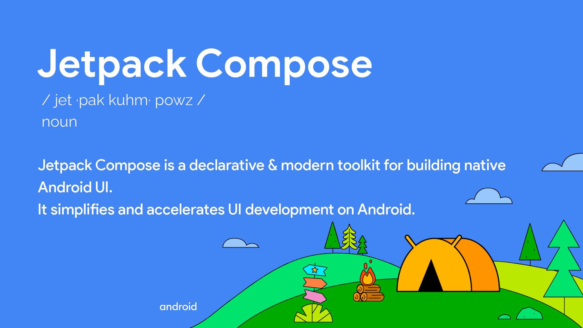
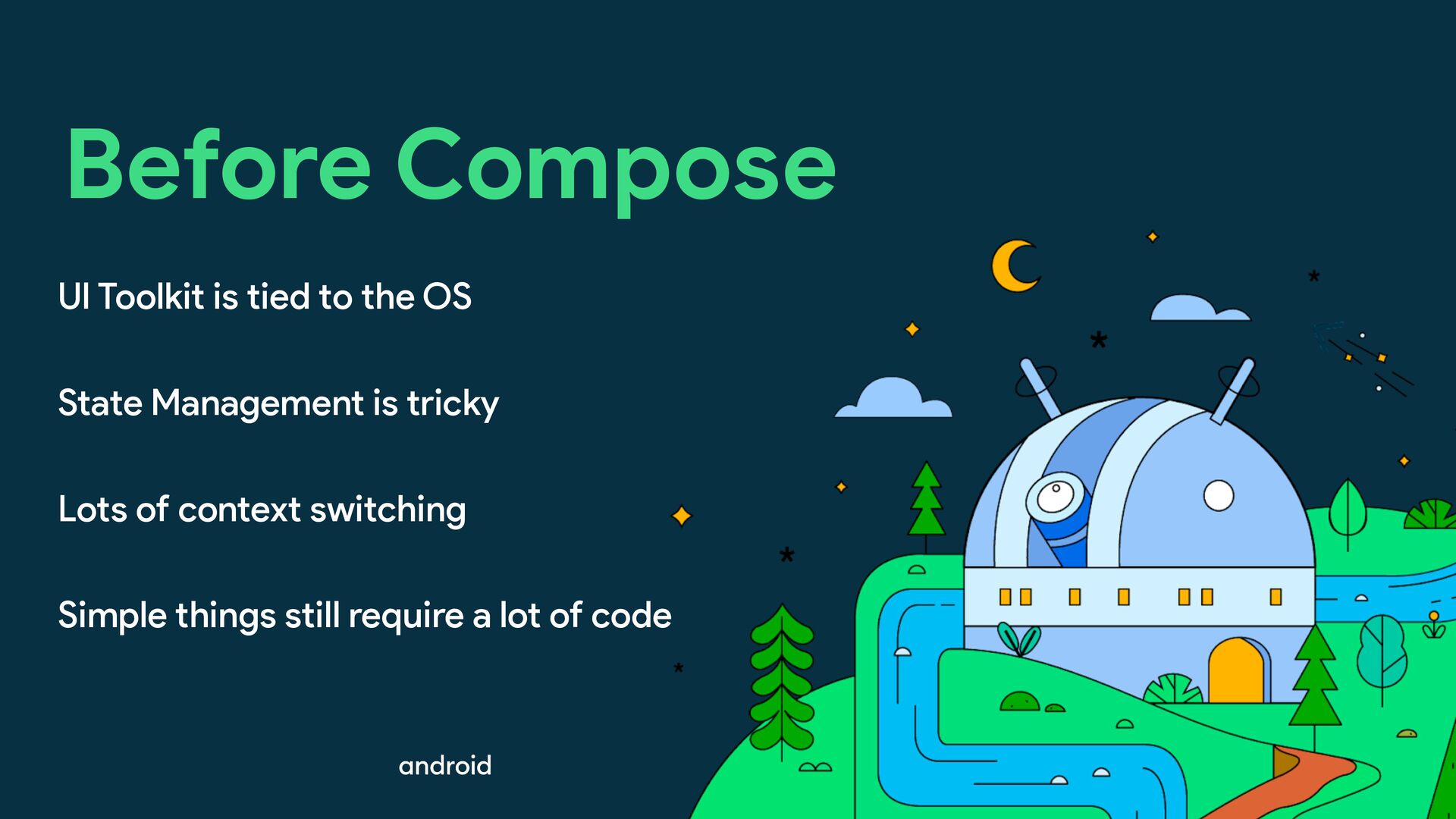
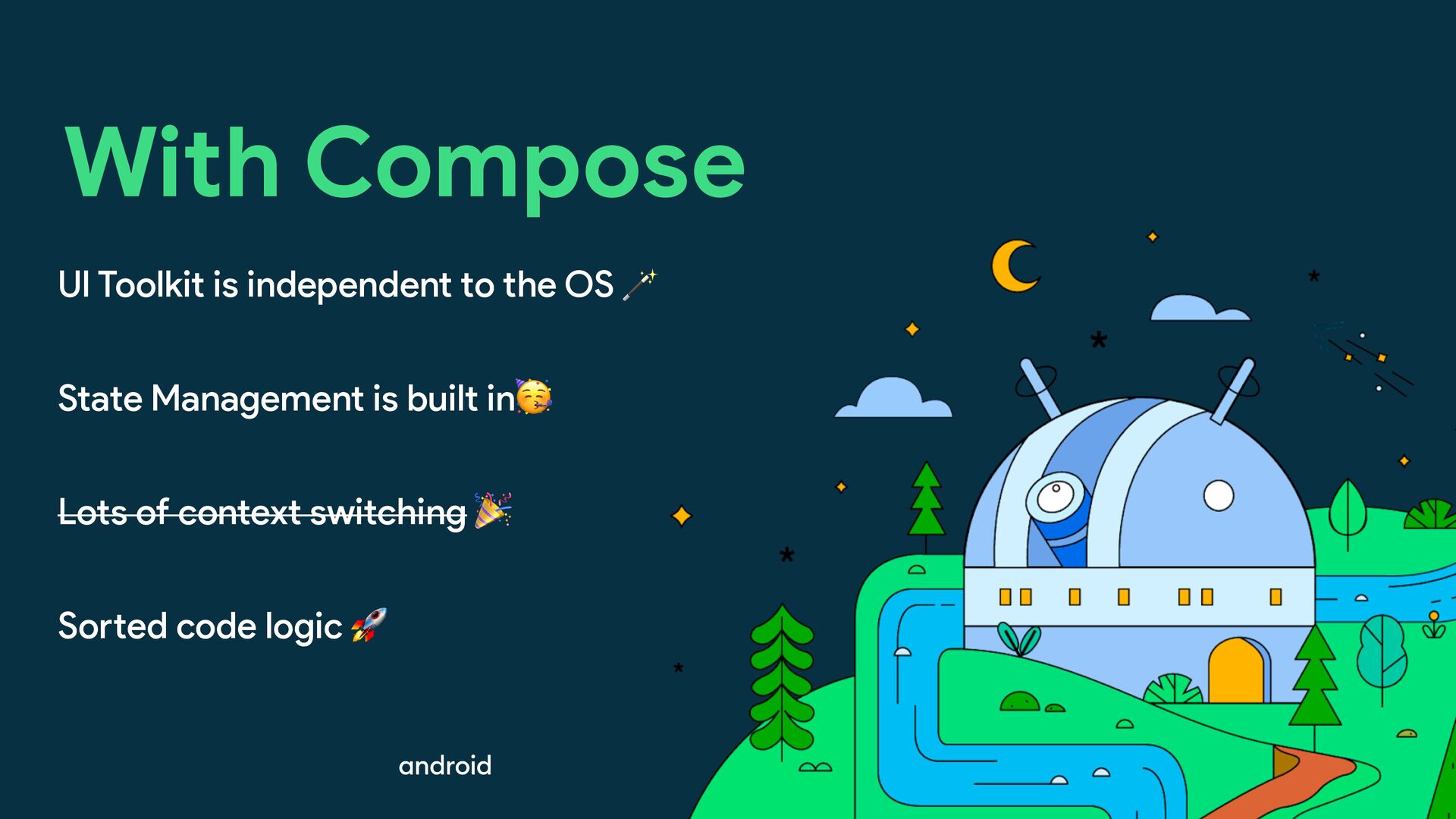
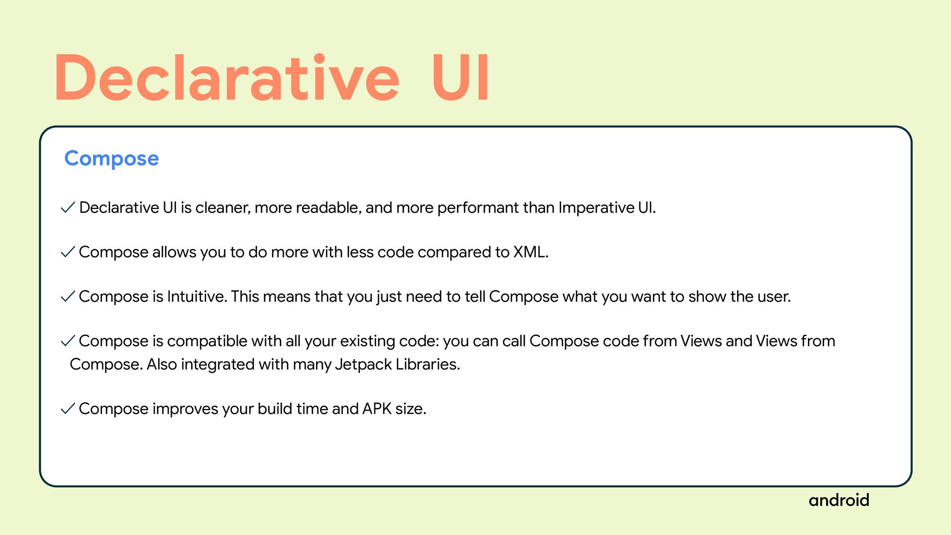
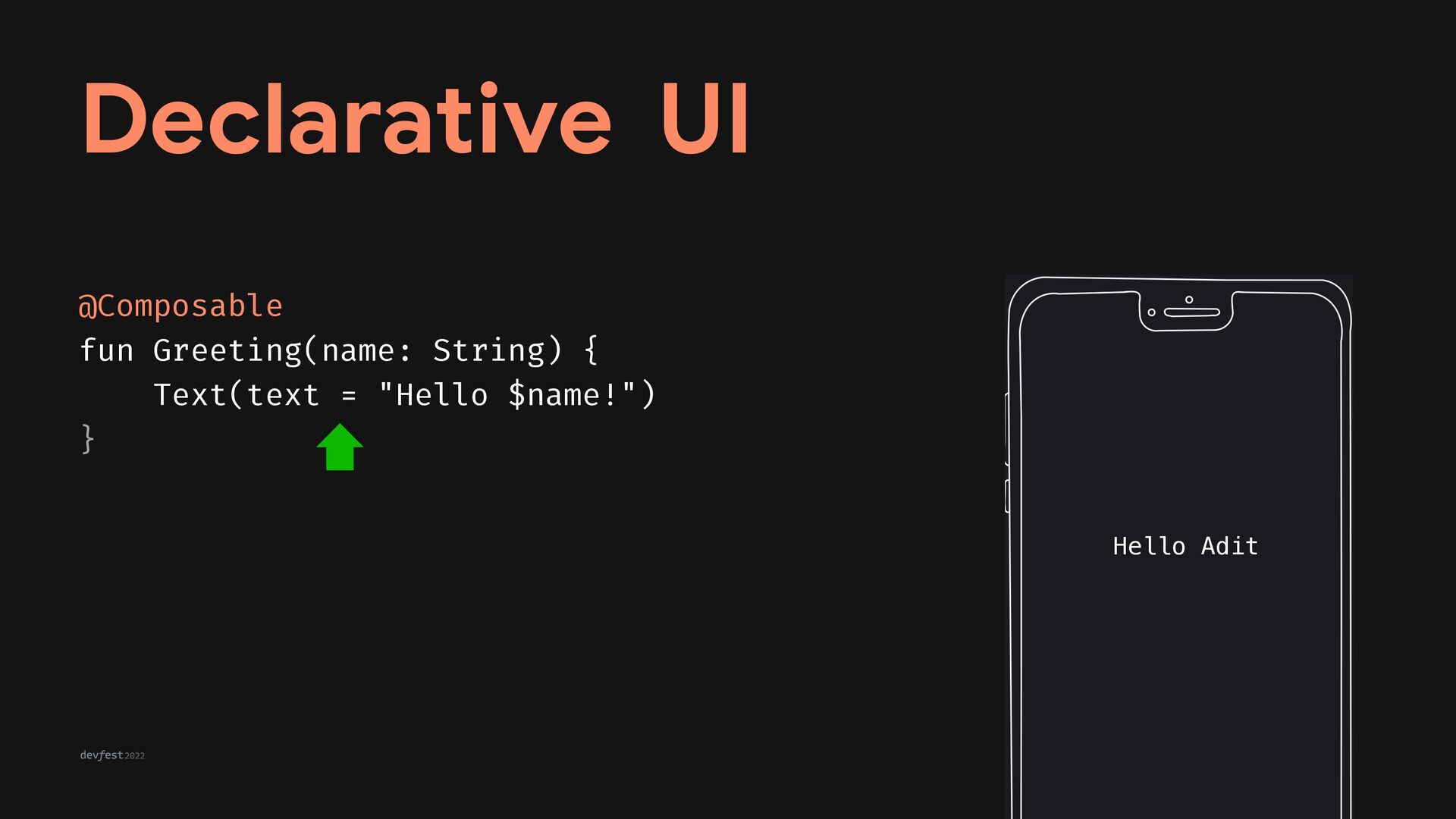
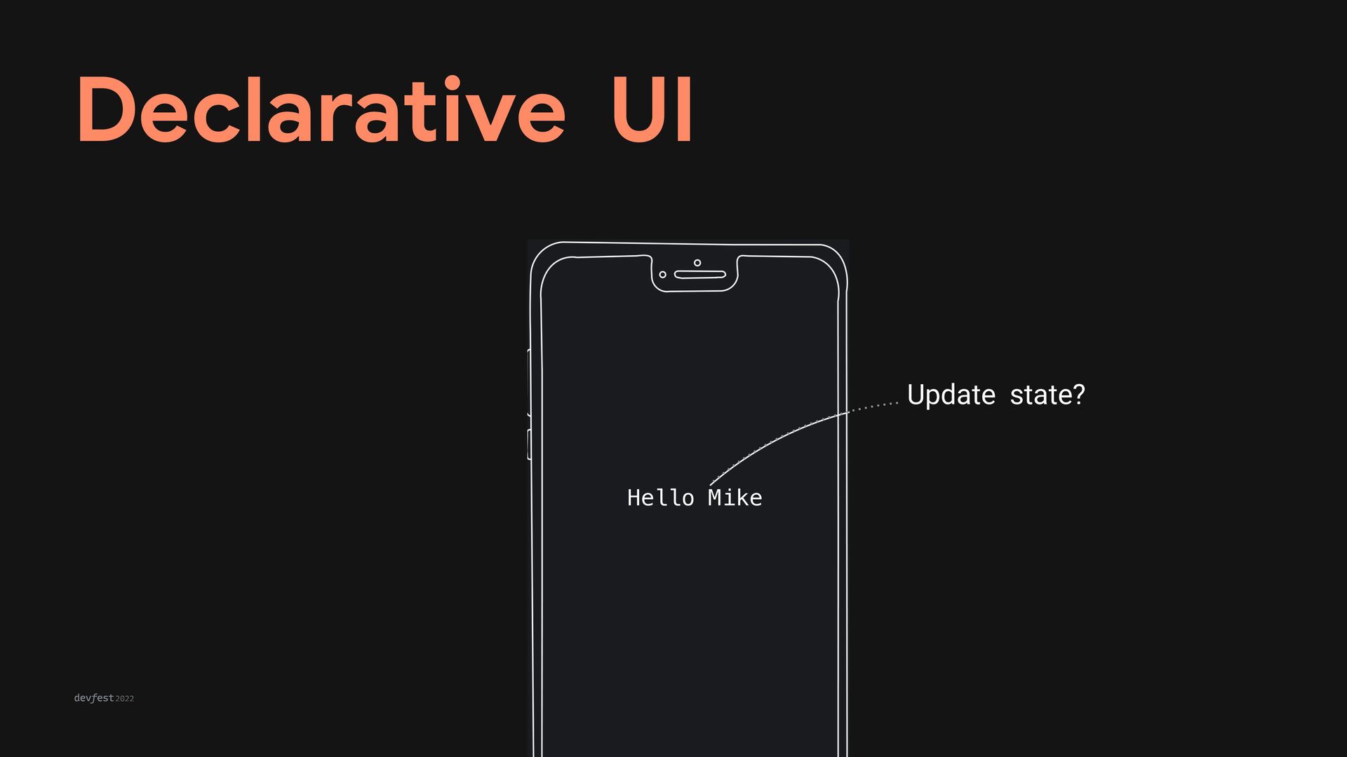
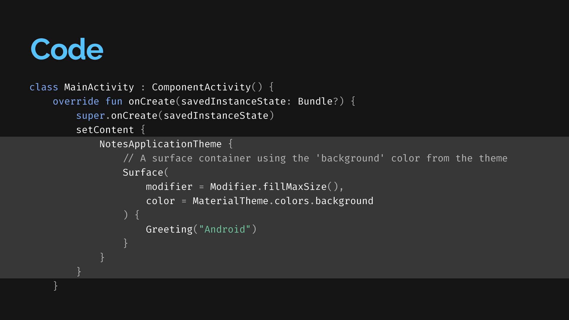
than Imperative UI. ✓ Compose allows you to do more with less code compared to XML. ✓ Compose is Intuitive. This means that you just need to tell Compose what you want to show the user. ✓ Compose is compatible with all your existing code: you can call Compose code from Views and Views from Compose. Also integrated with many Jetpack Libraries. ✓ Compose improves your build time and APK size. Declarative UI Compose
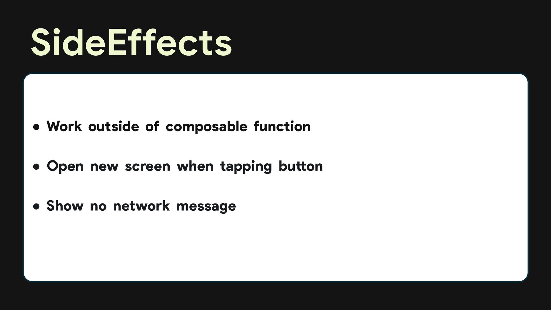
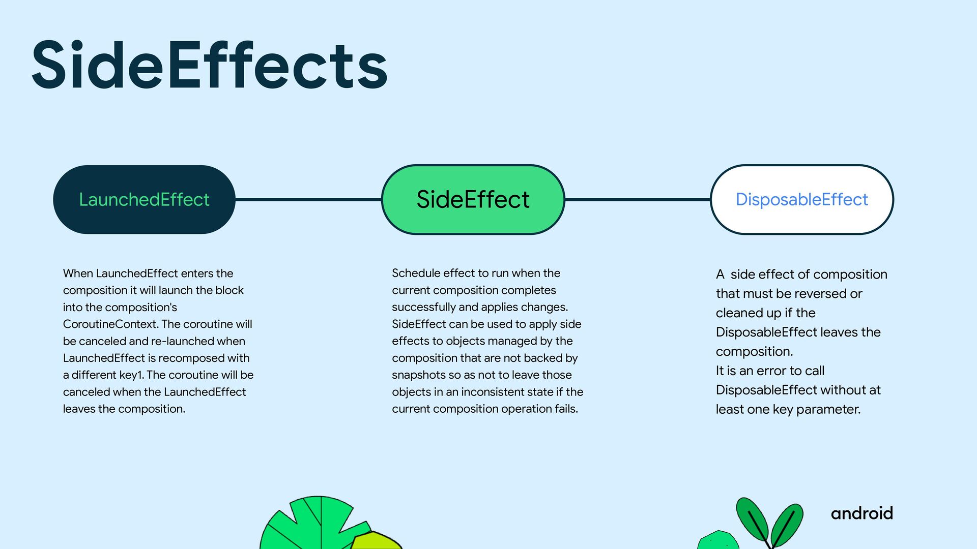
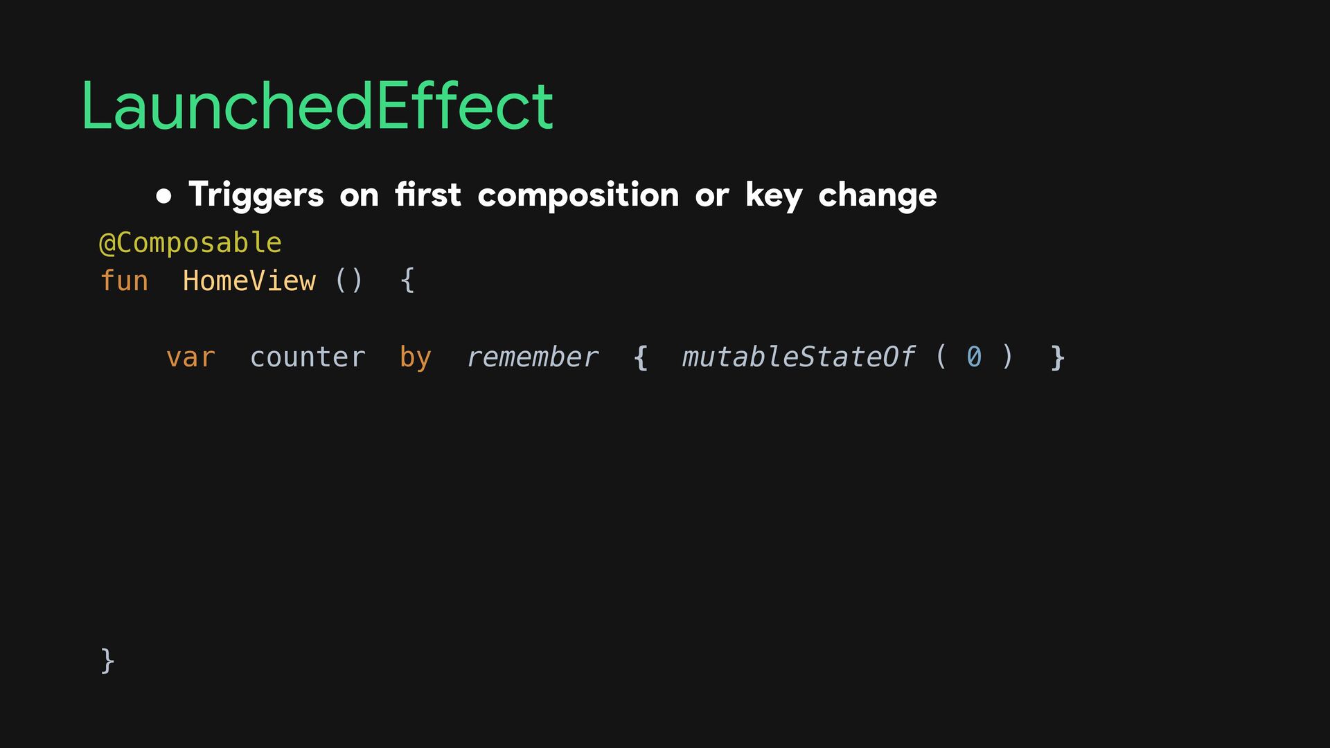
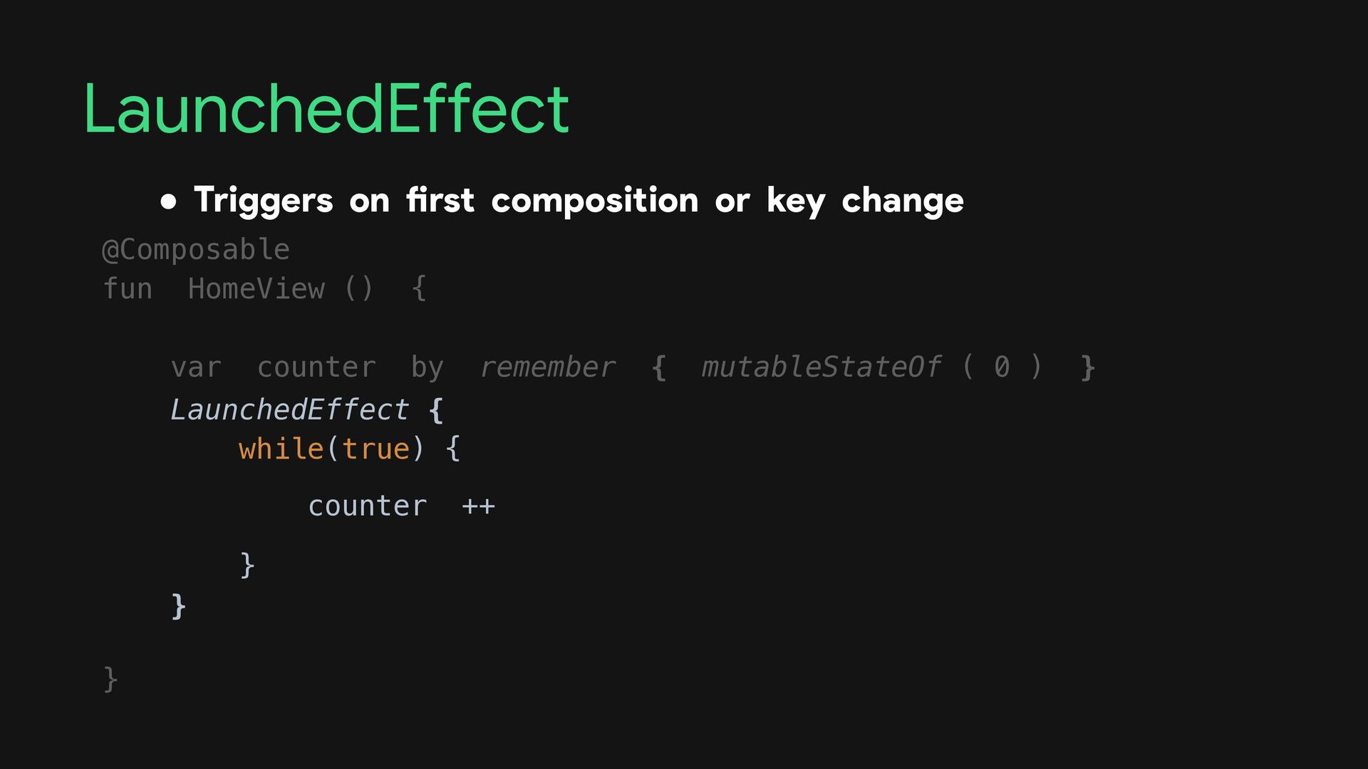
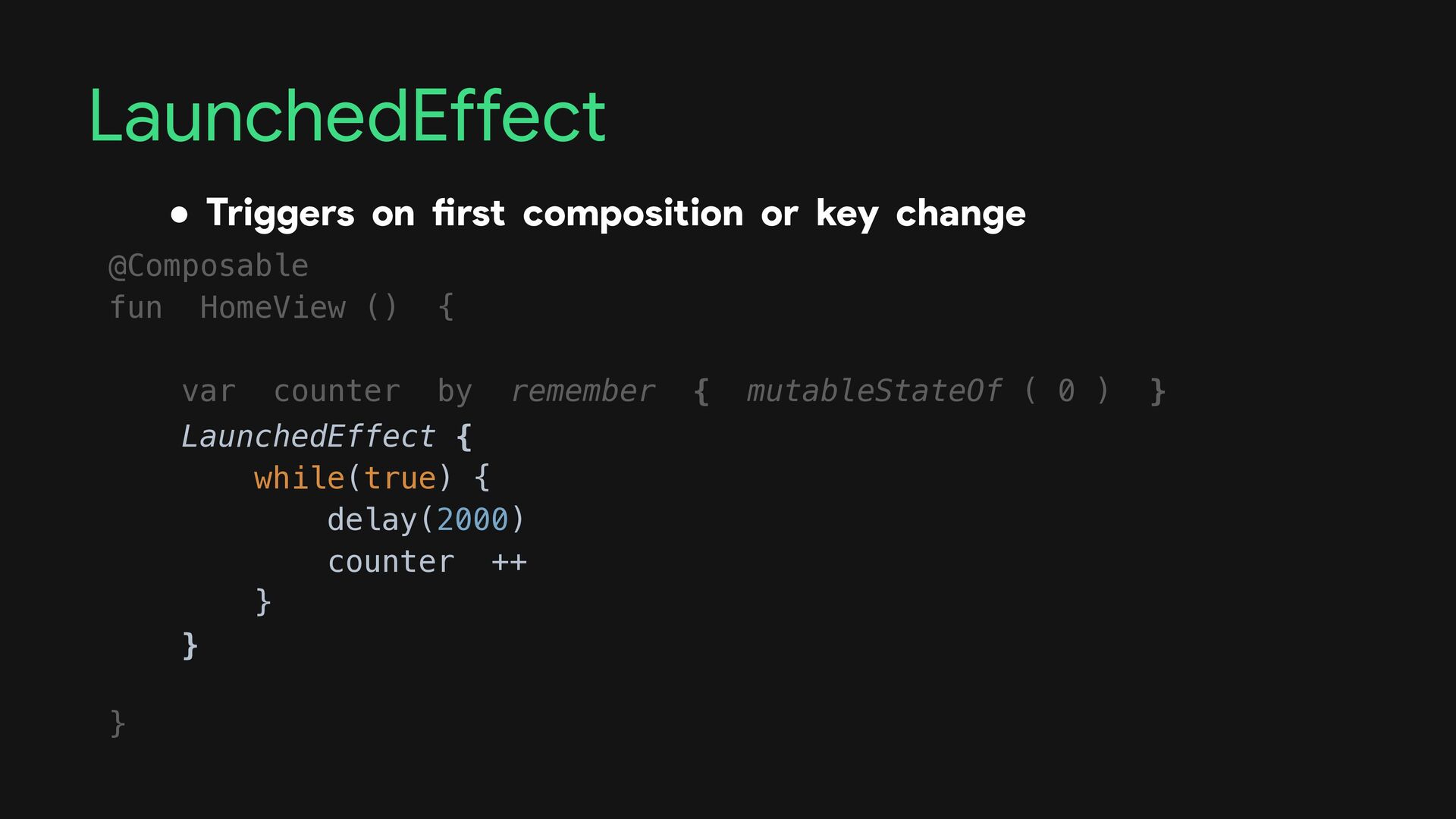
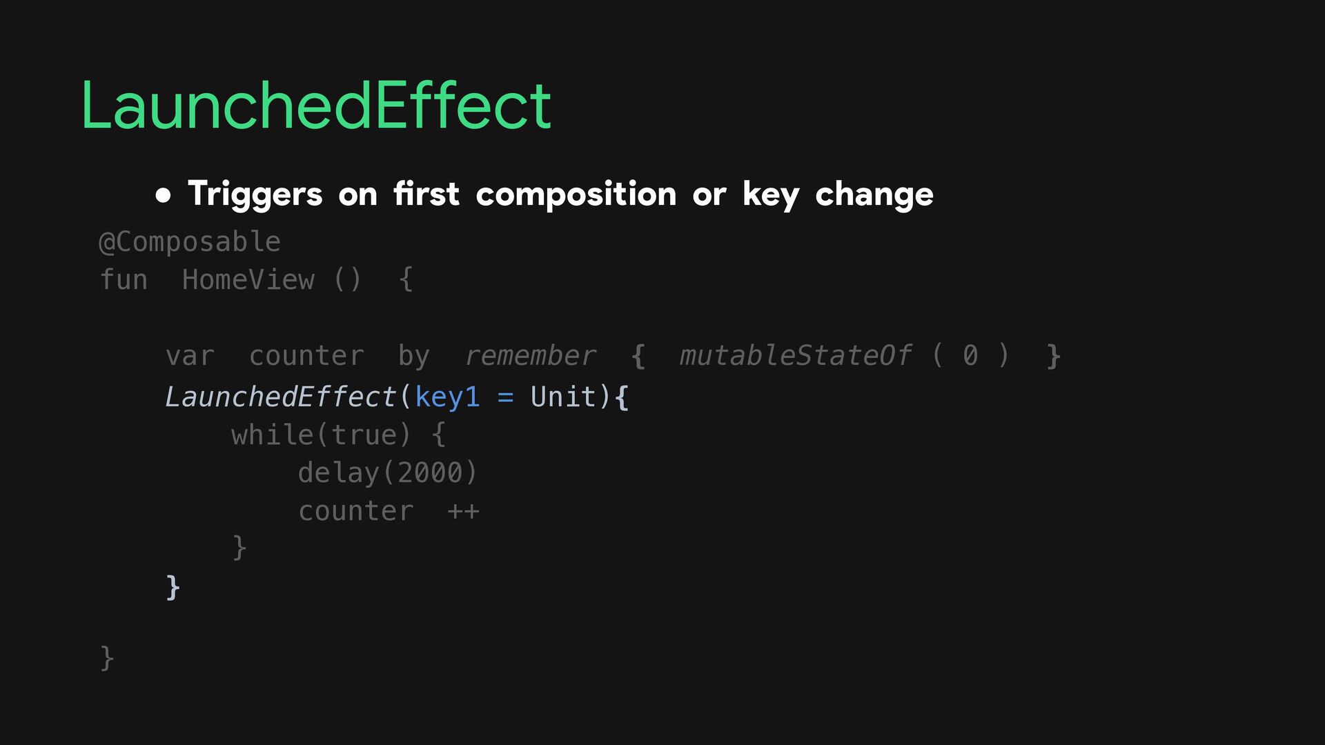
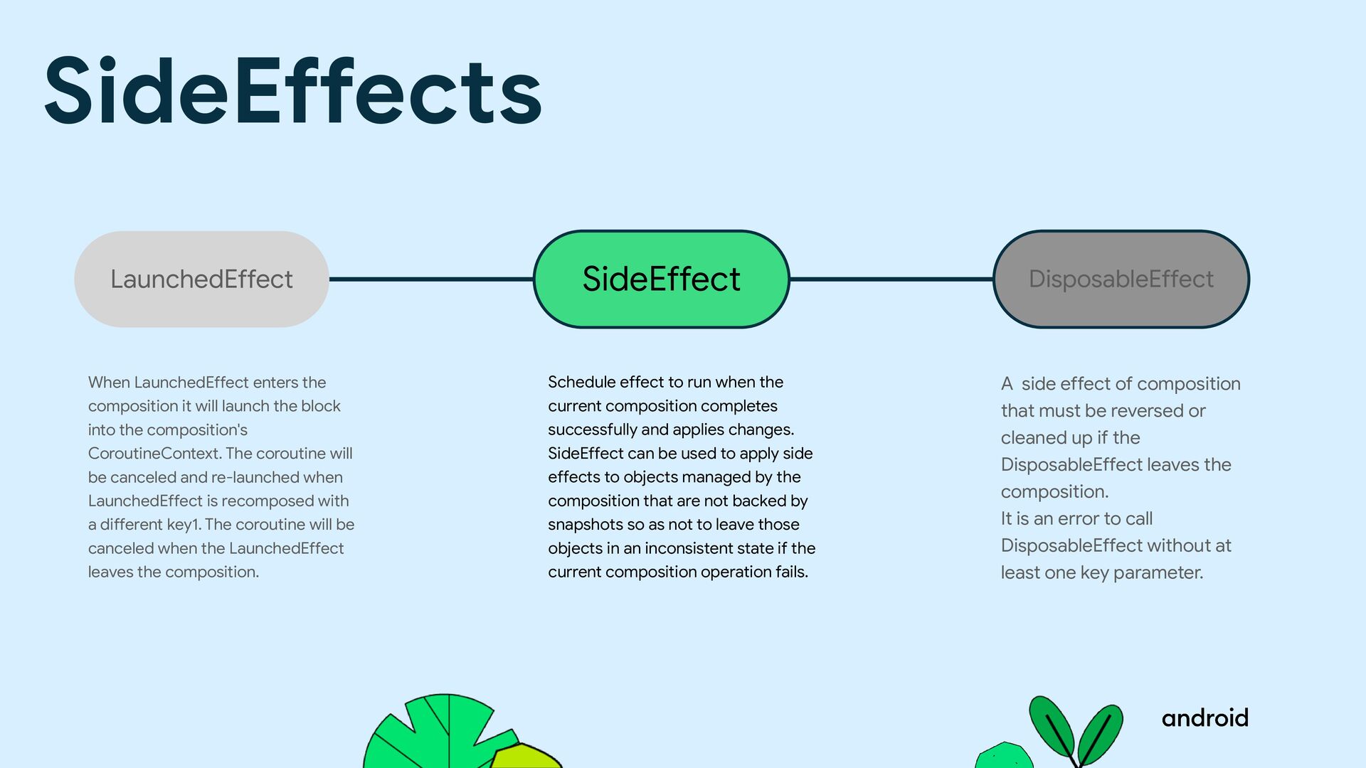
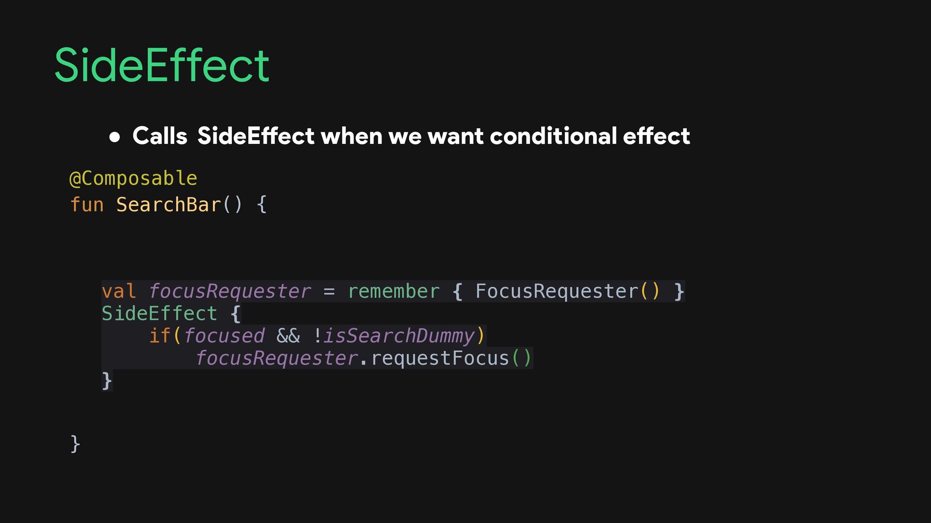
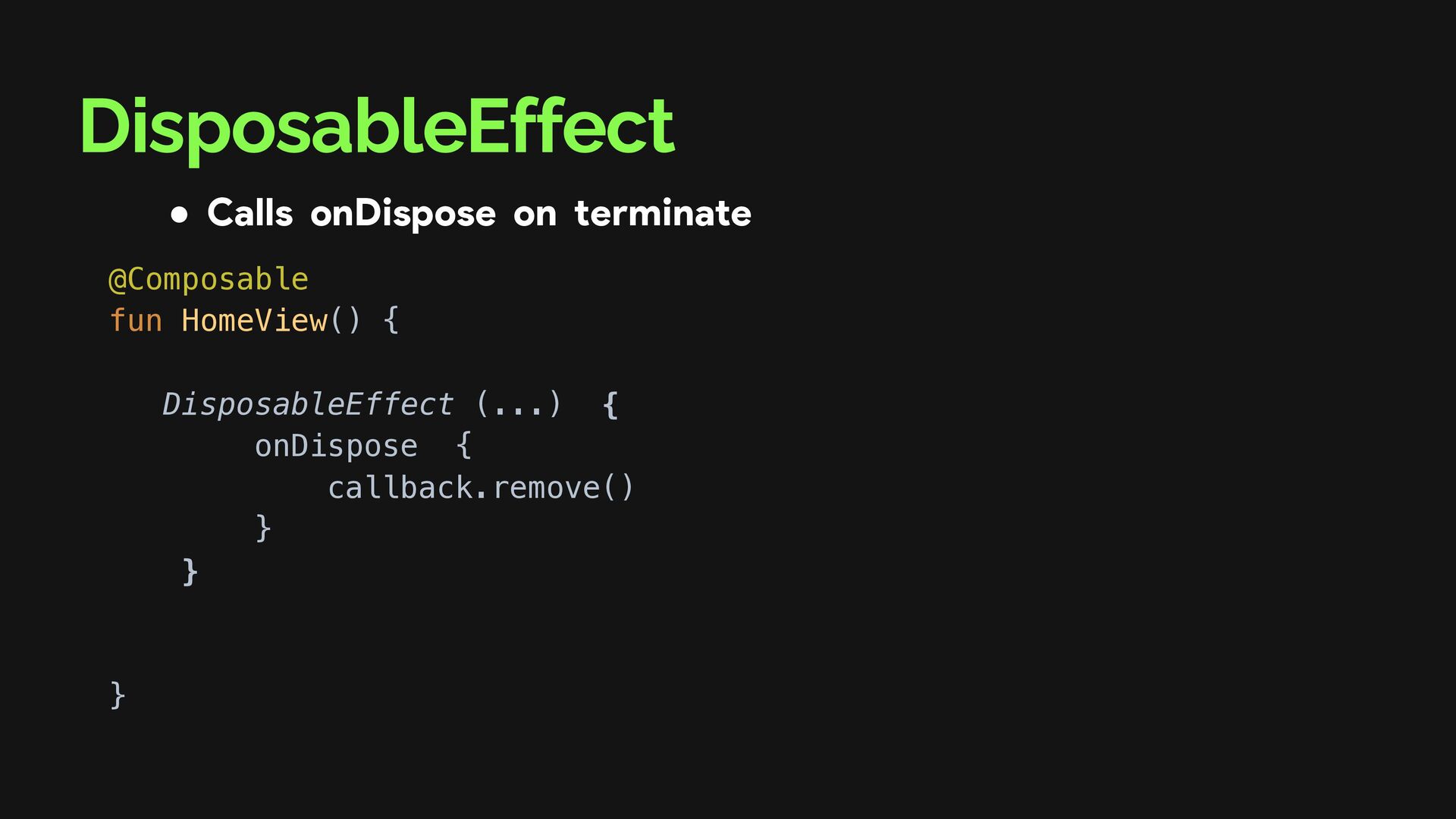
cleaned up if the DisposableEffect leaves the composition. It is an error to call DisposableEffect without at least one key parameter. Schedule effect to run when the current composition completes successfully and applies changes. SideEffect can be used to apply side effects to objects managed by the composition that are not backed by snapshots so as not to leave those objects in an inconsistent state if the current composition operation fails. When LaunchedEffect enters the composition it will launch the block into the composition's CoroutineContext. The coroutine will be canceled and re-launched when LaunchedEffect is recomposed with a different key1. The coroutine will be canceled when the LaunchedEffect leaves the composition. LaunchedEffect SideEffect DisposableEffect SideEffects
cleaned up if the DisposableEffect leaves the composition. It is an error to call DisposableEffect without at least one key parameter. Schedule effect to run when the current composition completes successfully and applies changes. SideEffect can be used to apply side effects to objects managed by the composition that are not backed by snapshots so as not to leave those objects in an inconsistent state if the current composition operation fails. When LaunchedEffect enters the composition it will launch the block into the composition's CoroutineContext. The coroutine will be canceled and re-launched when LaunchedEffect is recomposed with a different key1. The coroutine will be canceled when the LaunchedEffect leaves the composition. LaunchedEffect SideEffect DisposableEffect SideEffects
and applies changes. SideEffect can be used to apply side effects to objects managed by the composition that are not backed by snapshots so as not to leave those objects in an inconsistent state if the current composition operation fails. When LaunchedEffect enters the composition it will launch the block into the composition's CoroutineContext. The coroutine will be canceled and re-launched when LaunchedEffect is recomposed with a different key1. The coroutine will be canceled when the LaunchedEffect leaves the composition. LaunchedEffect SideEffect SideEffects A side effect of composition that must be reversed or cleaned up if the DisposableEffect leaves the composition. It is an error to call DisposableEffect without at least one key parameter. DisposableEffect
cleaned up if the DisposableEffect leaves the composition. It is an error to call DisposableEffect without at least one key parameter. Schedule effect to run when the current composition completes successfully and applies changes. SideEffect can be used to apply side effects to objects managed by the composition that are not backed by snapshots so as not to leave those objects in an inconsistent state if the current composition operation fails. When LaunchedEffect enters the composition it will launch the block into the composition's CoroutineContext. The coroutine will be canceled and re-launched when LaunchedEffect is recomposed with a different key1. The coroutine will be canceled when the LaunchedEffect leaves the composition. LaunchedEffect SideEffect DisposableEffect SideEffects
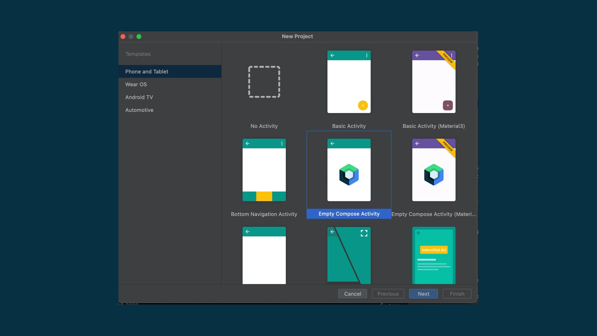
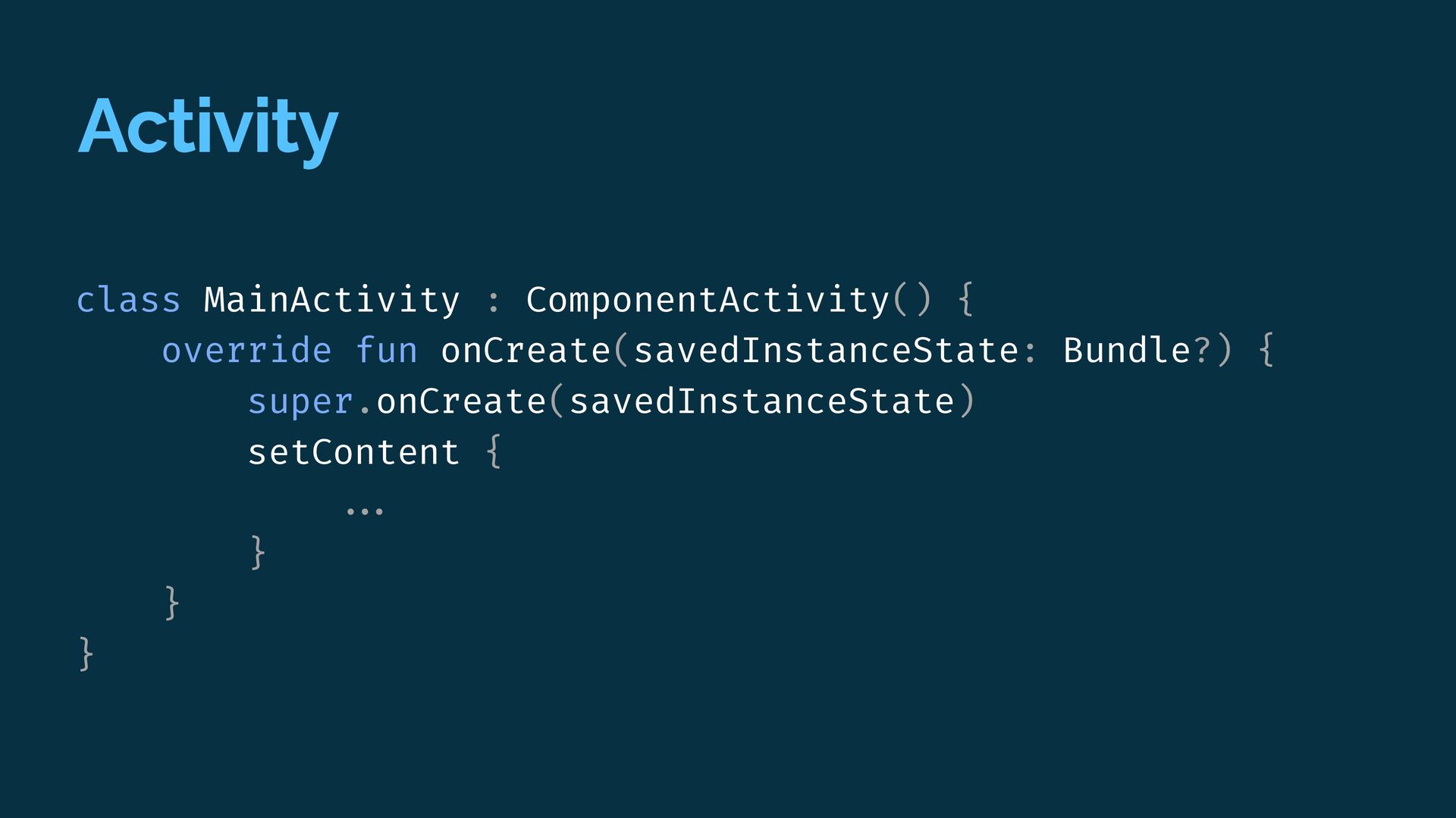
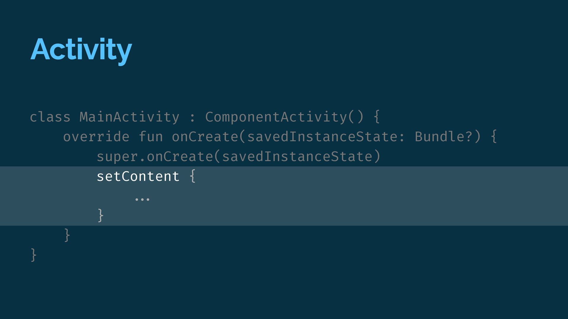
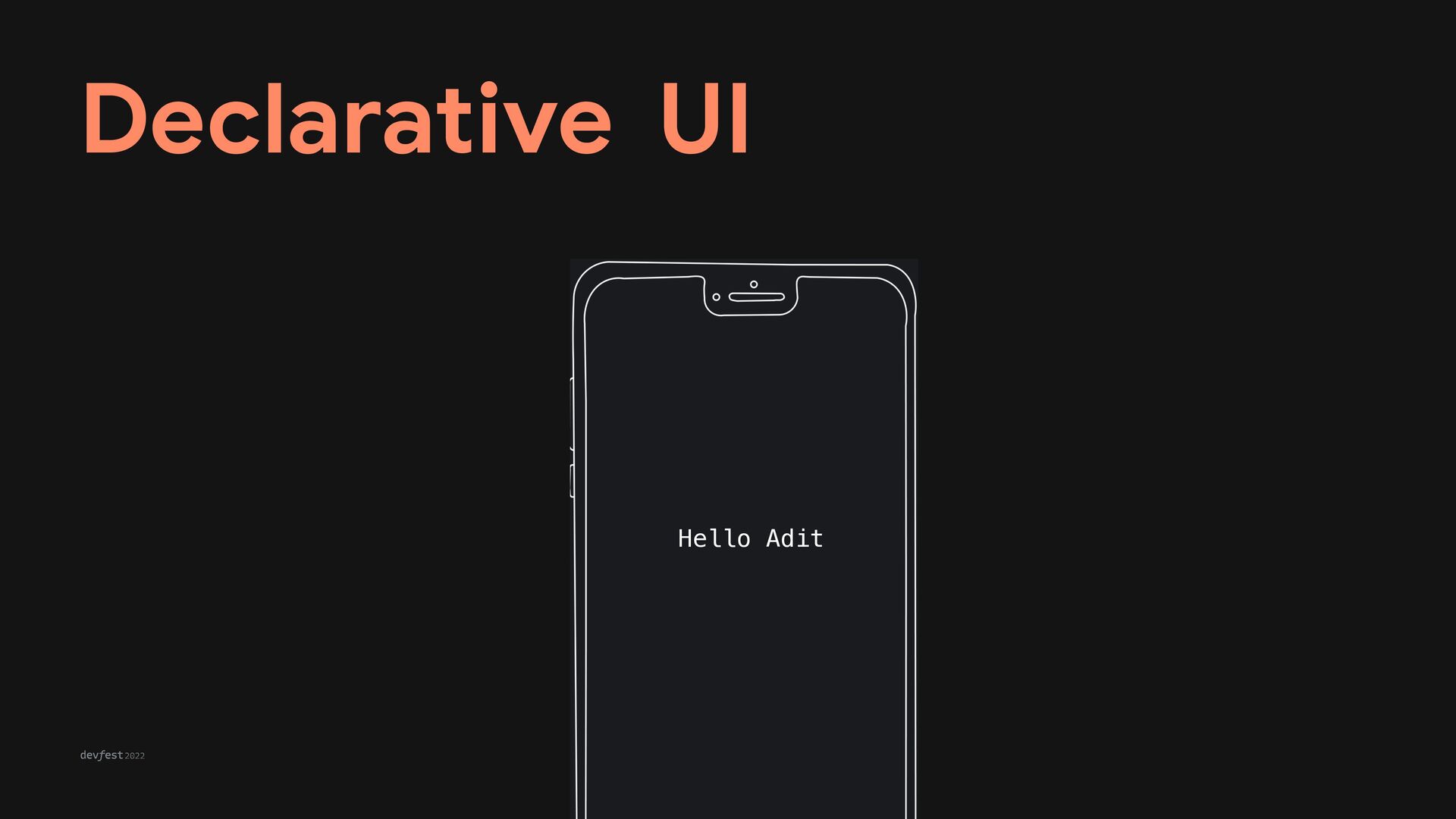
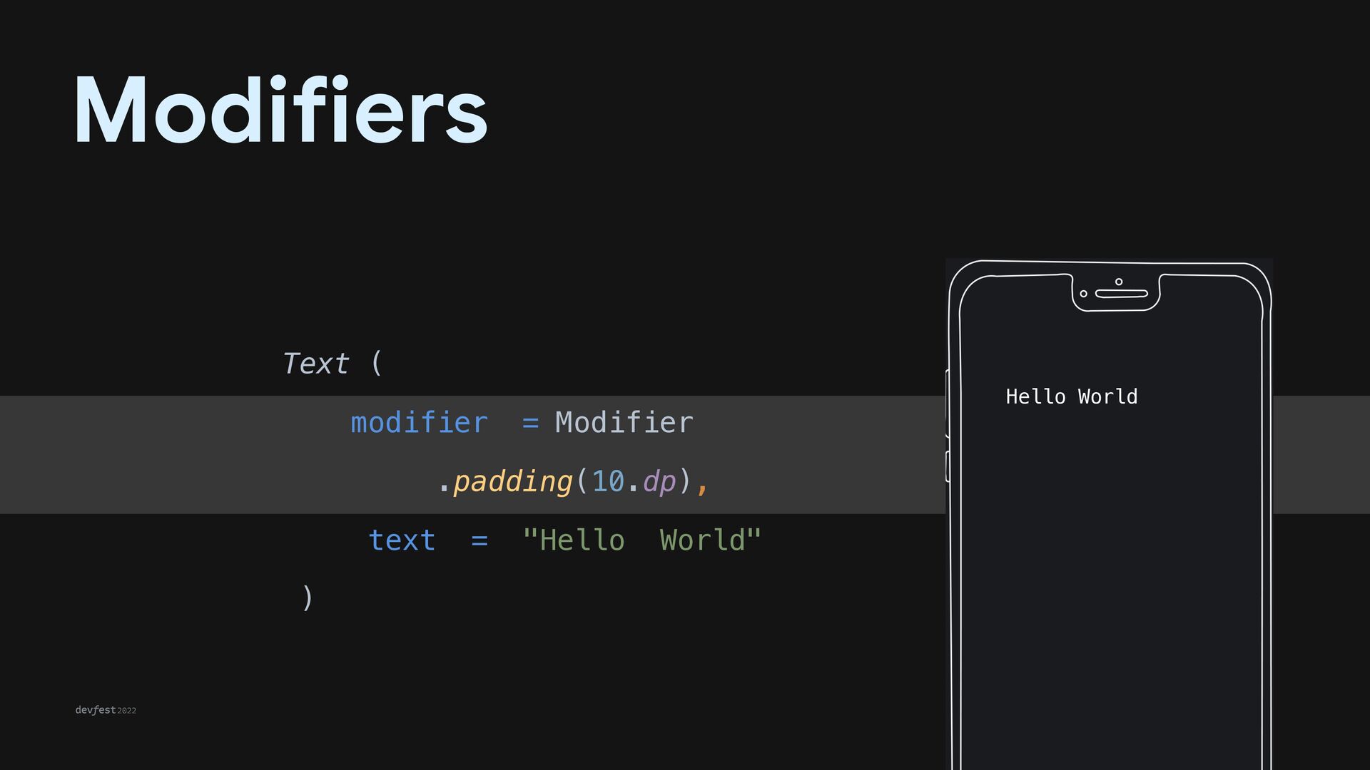
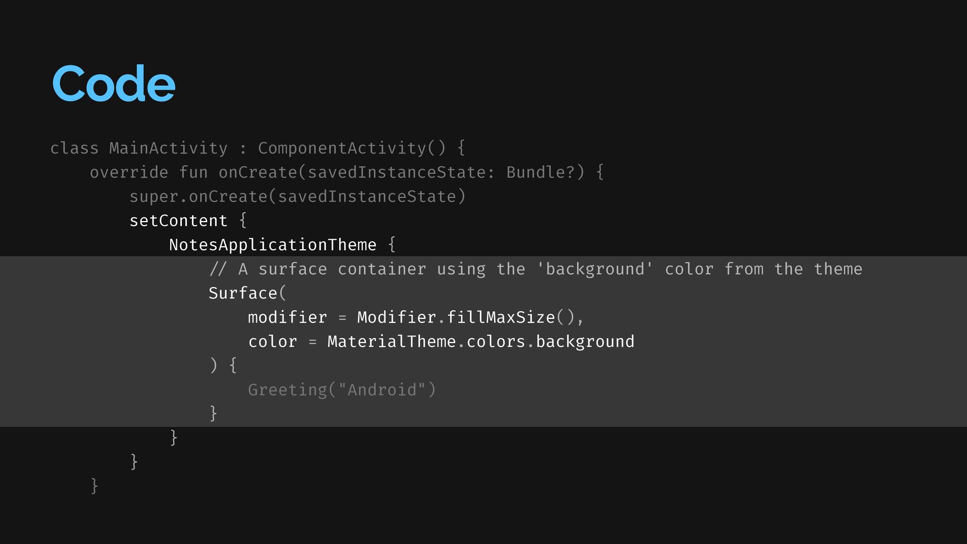
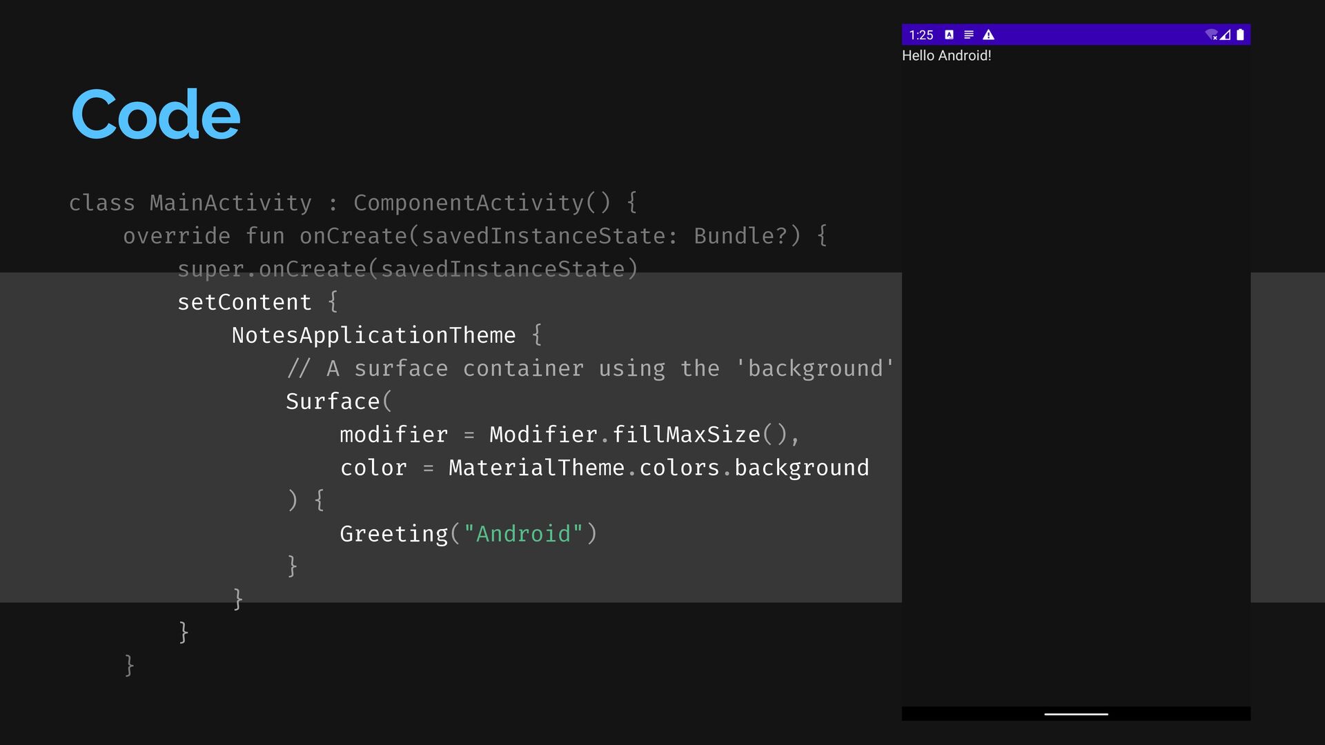
{ super.onCreate(savedInstanceState) setContent { NotesApplicationTheme { / / A surface container using the 'background' color from the theme Surface( modif i er = Modif i er.f i llMaxSize(), color = MaterialTheme.colors.background ) { Greeting("Android") } } } }
{ super.onCreate(savedInstanceState) setContent { NotesApplicationTheme { / / A surface container using the 'background' color from the theme Surface( modif i er = Modif i er.f i llMaxSize(), color = MaterialTheme.colors.background ) { Greeting("Android") } } } }
{ super.onCreate(savedInstanceState) setContent { NotesApplicationTheme { / / A surface container using the 'background' color from the theme Surface( modif i er = Modif i er.f i llMaxSize(), color = MaterialTheme.colors.background ) { Greeting("Android") } } } }
{ super.onCreate(savedInstanceState) setContent { NotesApplicationTheme { / / A surface container using the 'background' color from the theme Surface( modif i er = Modif i er.f i llMaxSize(), color = MaterialTheme.colors.background ) { Greeting("Android") } } } }
{ super.onCreate(savedInstanceState) setContent { NotesApplicationTheme { / / A surface container using the 'background' color from the theme Surface( modif i er = Modif i er.f i llMaxSize(), color = MaterialTheme.colors.background ) { Greeting("Android") } } } }
is an open-source Jetpack Compose design system. A collection of guidelines and components can be used to create amazing compose app user experiences. Foundations introduce Andromeda tokens and principles while Components provide the bolts and nuts that make Andromeda Compose wrapped apps tick. Check out
 aldefy
 jame2408
 raiga0310
 o0h
o0h
 yuppeeng
 mizchi
 philipschwarz
 okumin
 _fhhmm
 ryugen04
 supurazako
 andpad
 utilforever
 bluesmoon
 jnunemaker
 axbom
axbom
 skoyamalab
 elsirapls
 konakalab
 baasie
 sabderemane
 irinanazarova
 tessaabrams
 greggifford