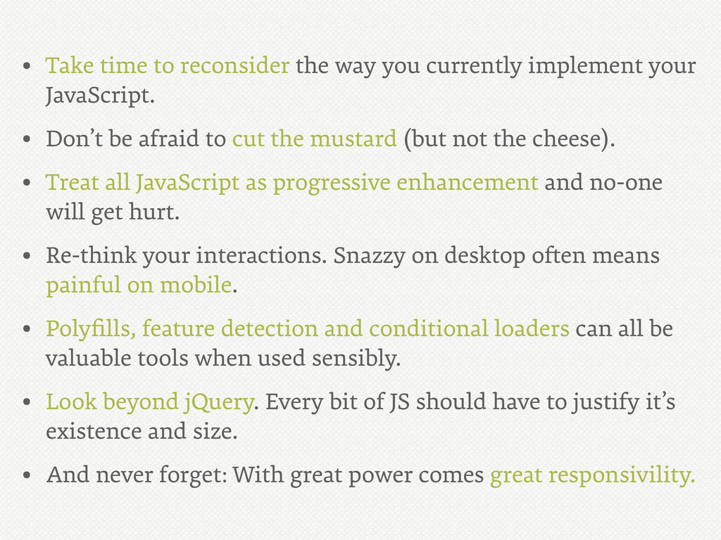
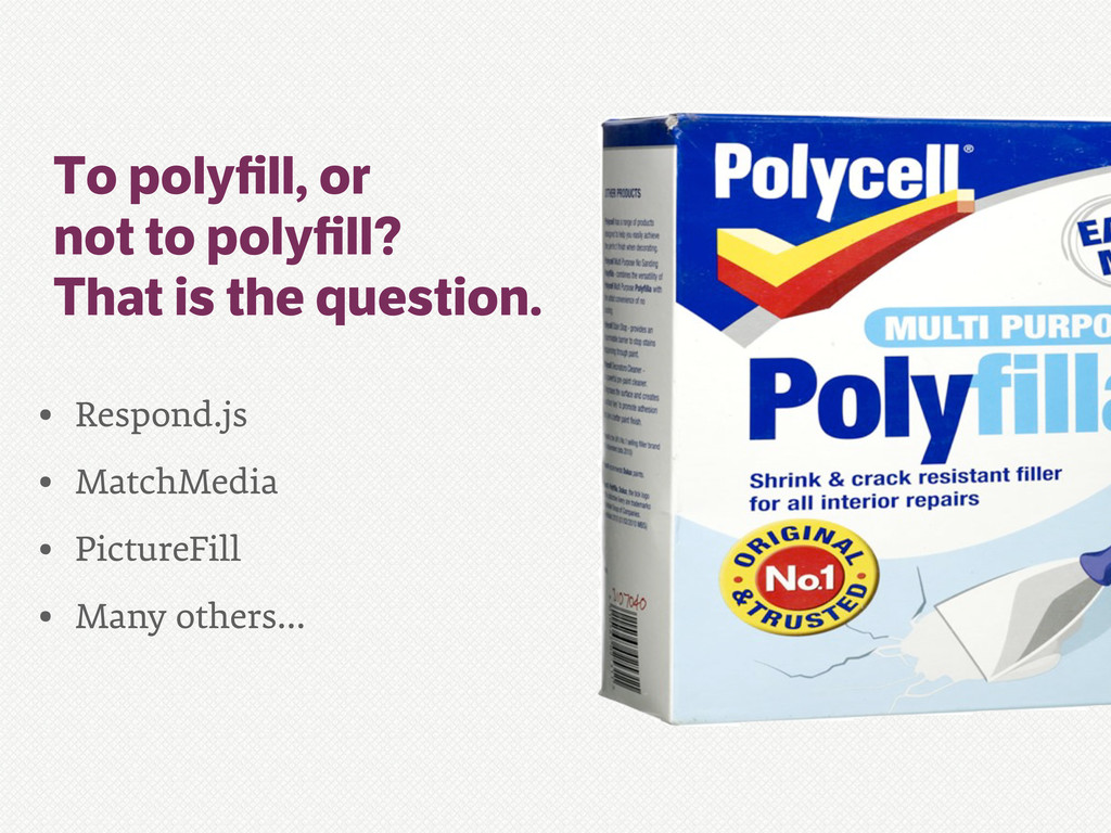
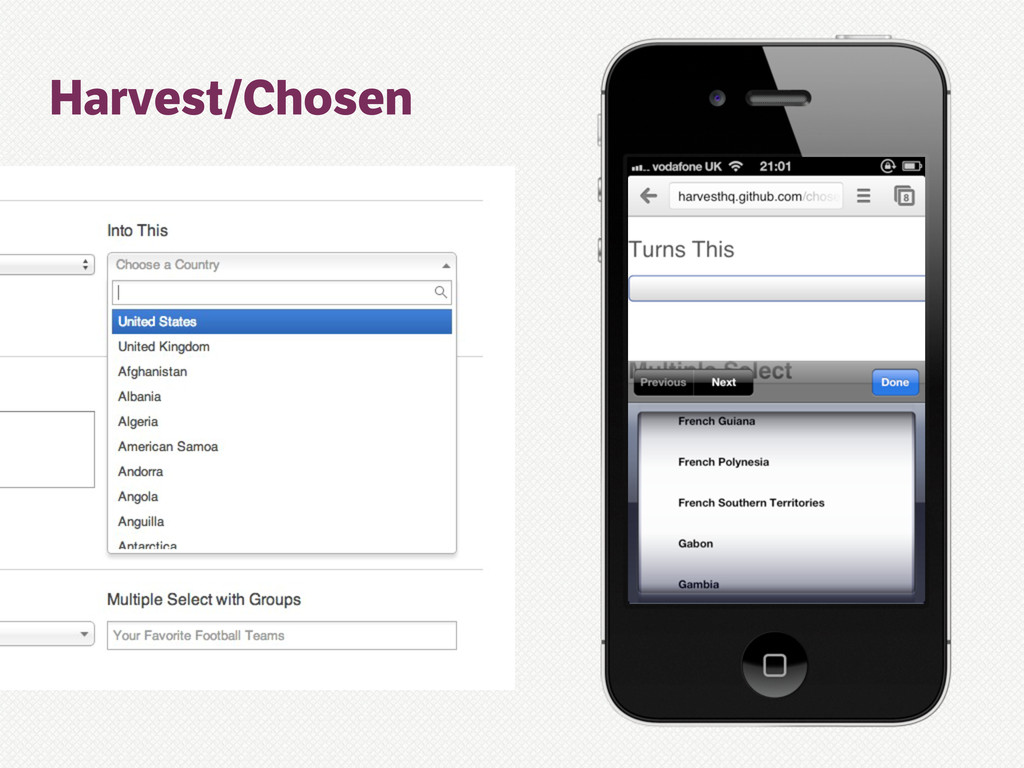
your JavaScript. • Don’t be afraid to cut the mustard (but not the cheese). • Treat all JavaScript as progressive enhancement and no-one will get hurt. • Re-think your interactions. Snazzy on desktop o!en means painful on mobile. • Polyfills, feature detection and conditional loaders can all be valuable tools when used sensibly. • Look beyond jQuery. Every bit of JS should have to justify it’s existence and size. • And never forget: With great power comes great responsivility.
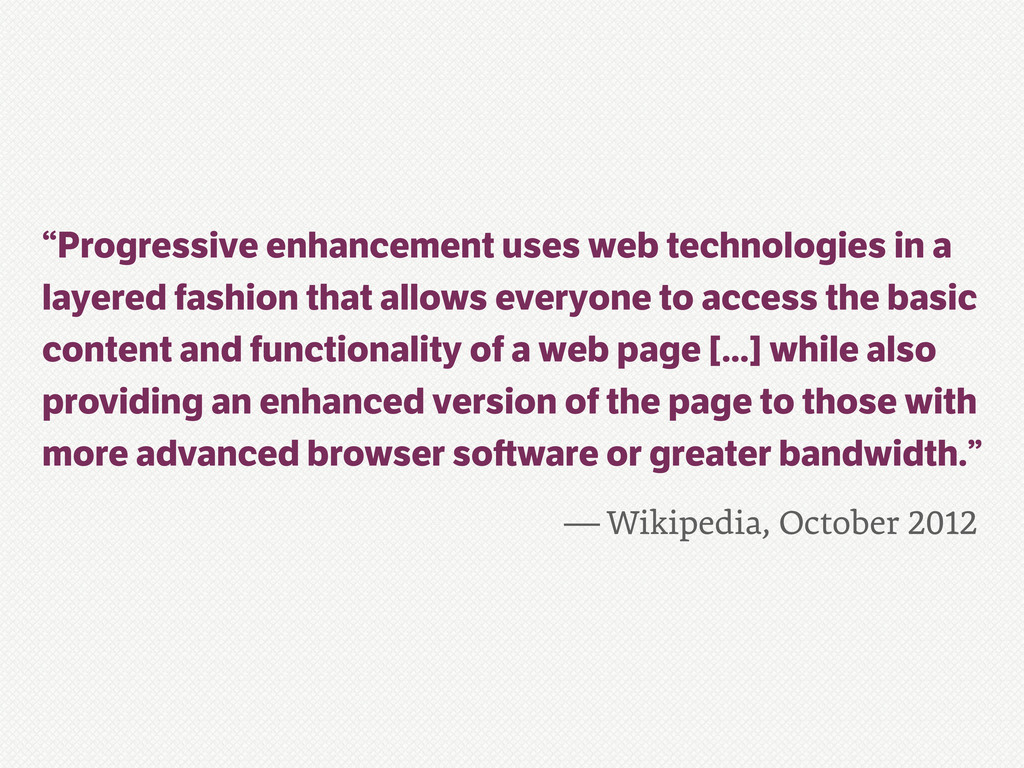
a layered fashion that allows everyone to access the basic content and functionality of a web page [...] while also providing an enhanced version of the page to those with more advanced browser so ware or greater bandwidth.”
your JavaScript. • Don’t be afraid to cut the mustard (but not the cheese). • Treat all JavaScript as progressive enhancement and no-one will get hurt. • Re-think your interactions. Snazzy on desktop o!en means painful on mobile. • Polyfills, feature detection and conditional loaders can all be valuable tools when used sensibly. • Look beyond jQuery. Every bit of JS should have to justify it’s existence and size. • And never forget: With great power comes great responsivility.
 allmarkedup
 kazzpapa3
 oracle4engineer
 nutslove
 tsukuboshi
 yamatai1212
 fullkaiten
 m_seki
 daitak
 riku_423
 shoheimitani
 hiroyaonoe
 sansan33
 mza
mza
 michielstock
 axbom
axbom
 jlugia
 lcolladotor
 baasie
 afnizarnur
 stephaniewalter
 ammeep
 jacobian
 danielanewman
 tonyrice
![Proxy (poxy) browsers if(Object.prototype.toString.call( window.operamini)/!==/'[object/OperaMini]')/{ ///*not*/feature/detection/:C( }](https://files.speakerdeck.com/presentations/507806c11d371f000203b9f8/slide_18.jpg)