$30 off During Our Annual Pro Sale. View Details »

Human Compatibility Error: How novice tech users in West Africa respond to your fancy CSS

Ally Long
November 30, 2016

Human Compatibility Error: How novice tech users in West Africa respond to your fancy CSS

The opening talk from CSSConf AU. Video here: http://2016.cssconf.com.au/

We can do so much cool stuff with CSS now! Animations are totally boss. Focus effects are so much fun. We barely even have to worry about browser compatibility any more!

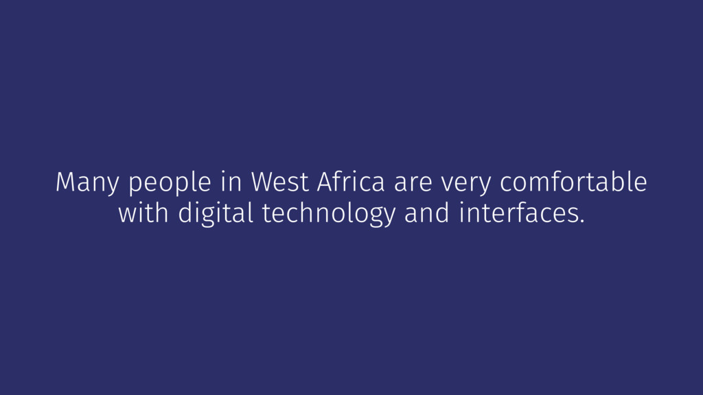
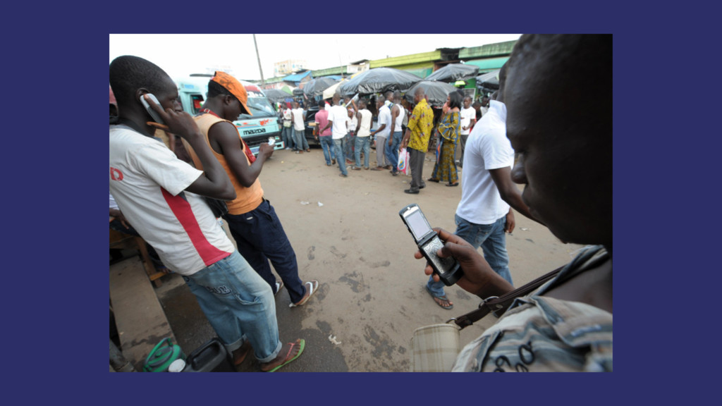
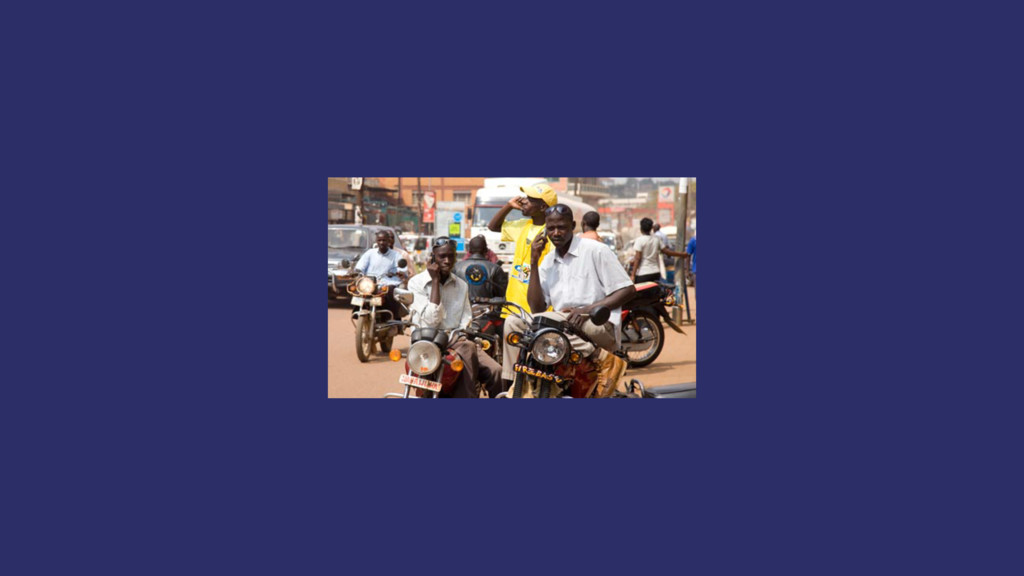
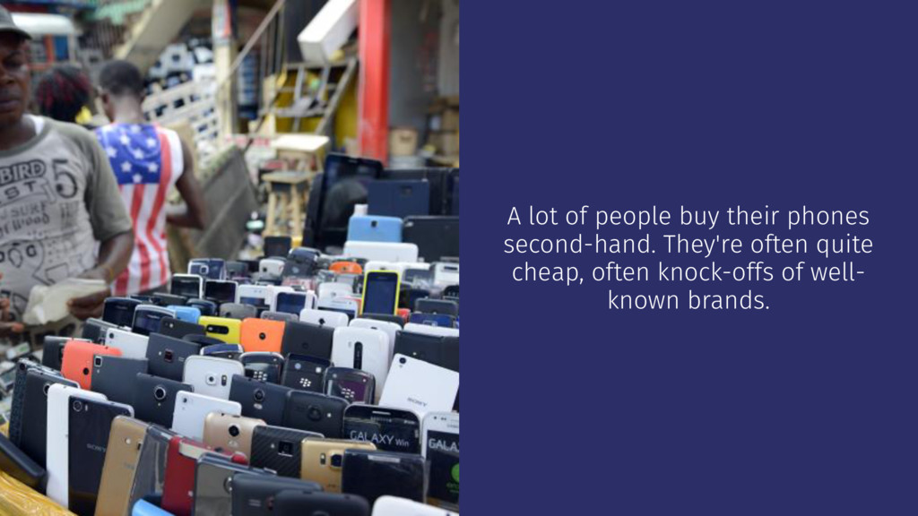
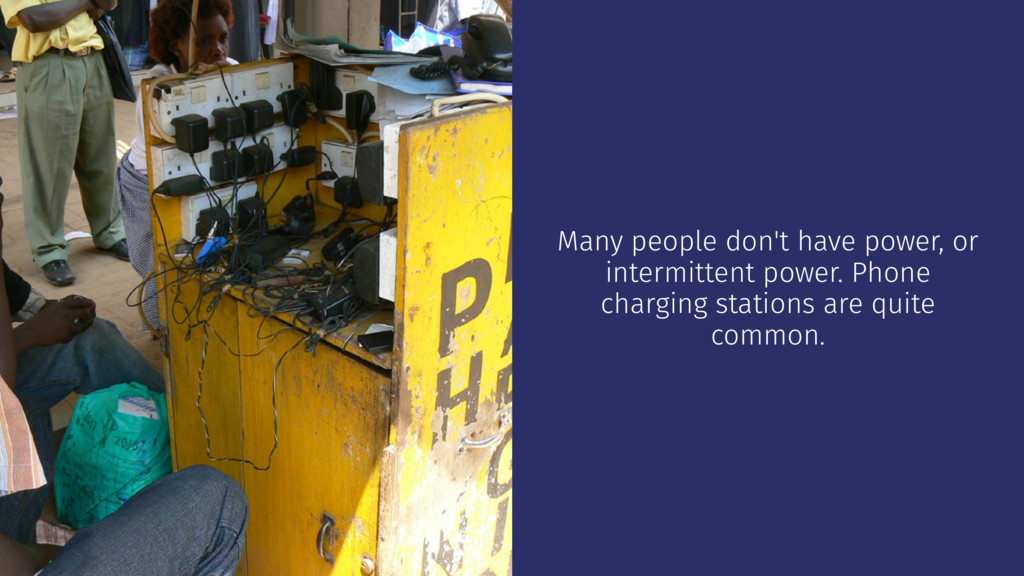
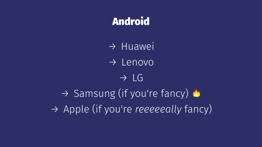
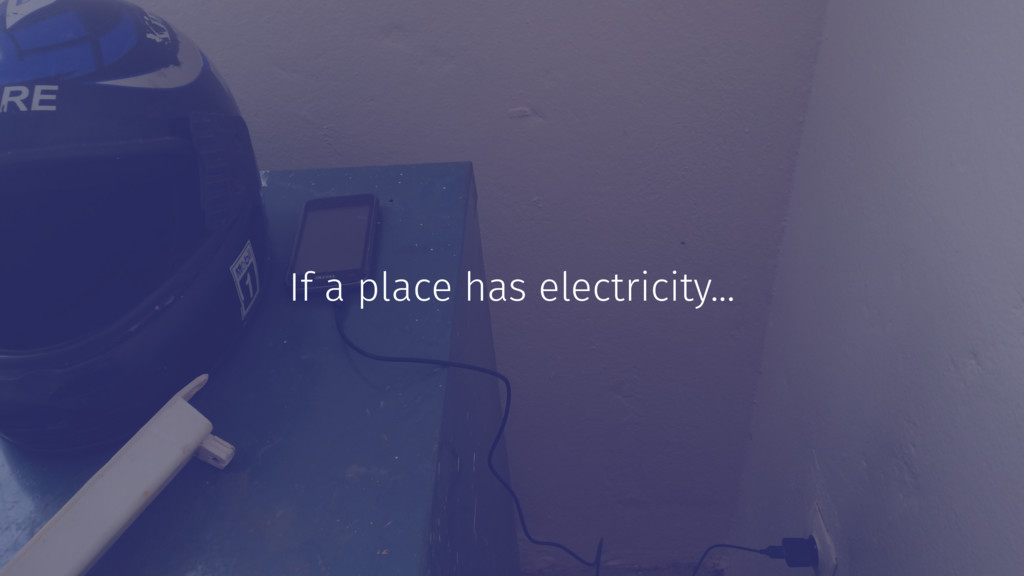
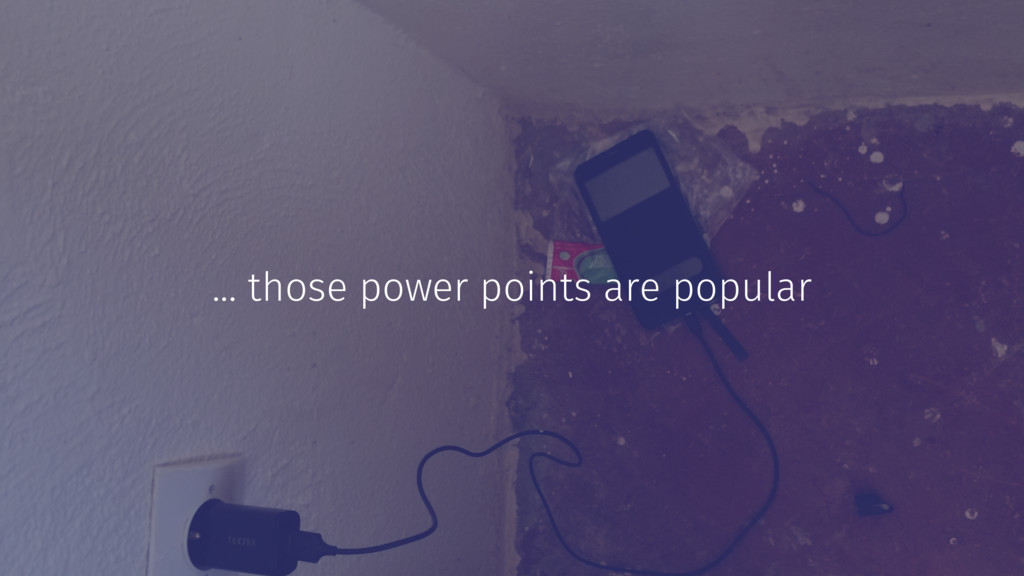
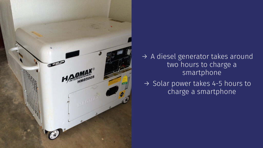
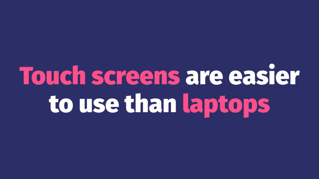
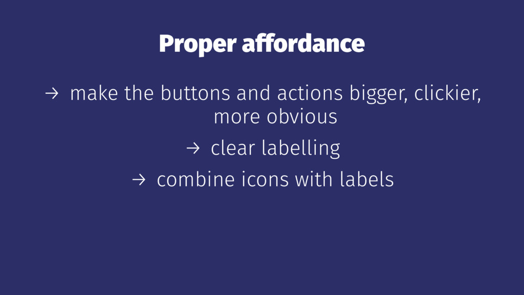
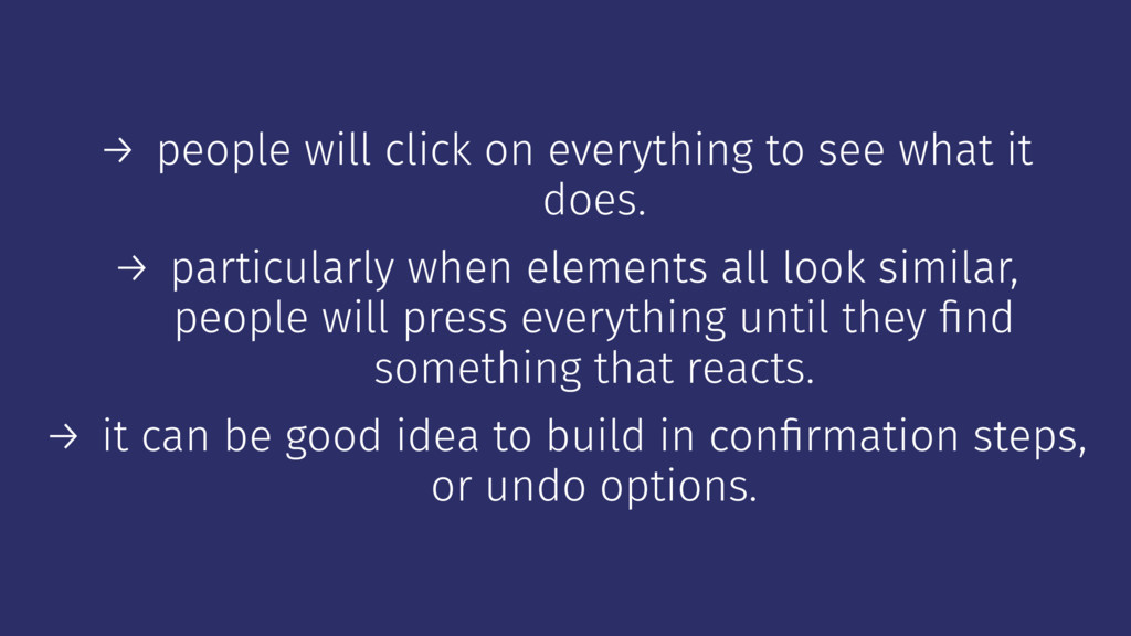
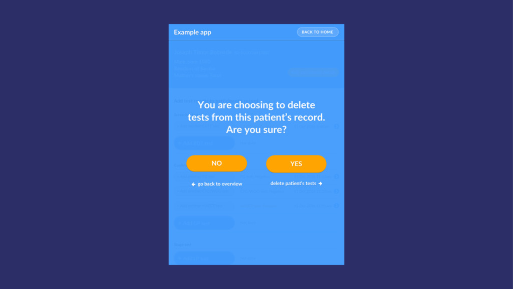
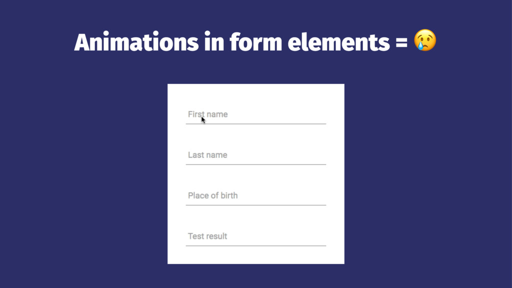
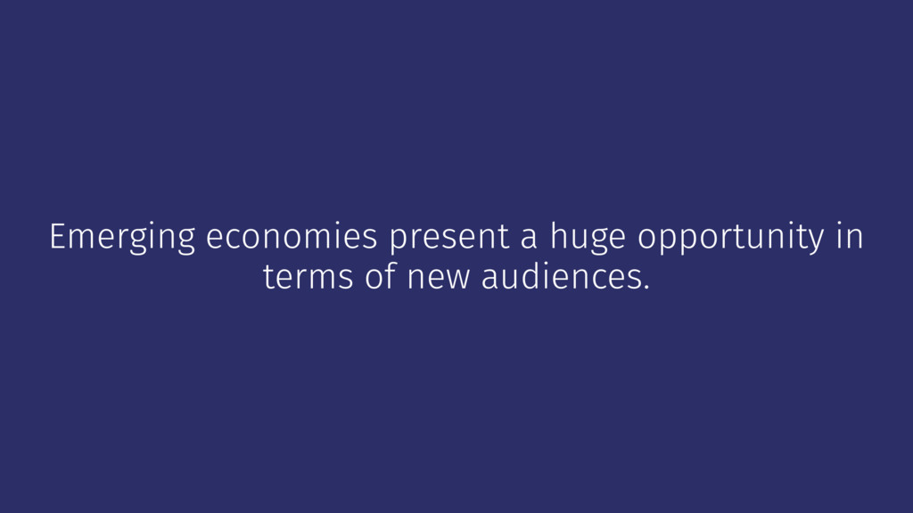
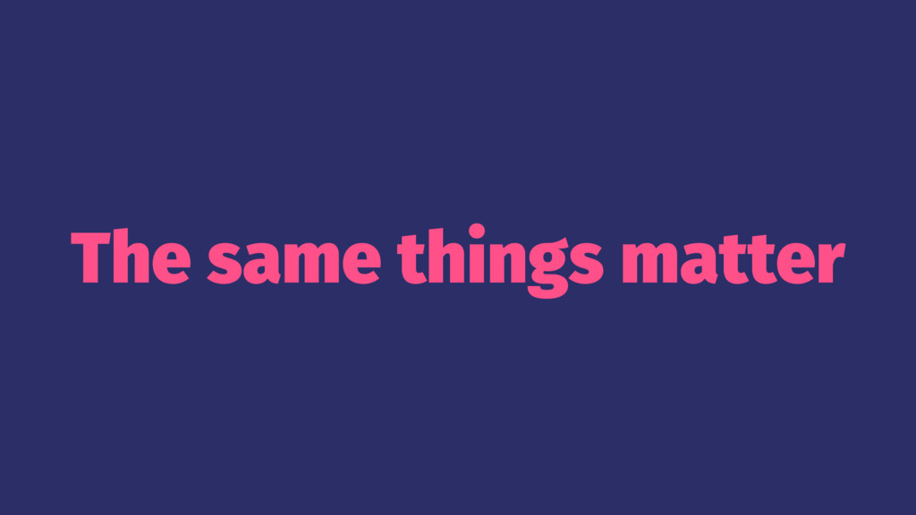
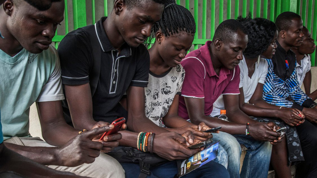
Ok, hold up. What about human compatibility? How does a newbie react to something like an animated input focus effect when trying to fill out an online form? We can probably all fairly easily venture outside our meme bubble and ask a Luddite relative to test our app. But let’s move even further outside the comfort zone. What about people in places with unreliable power and intermittent internet? How does someone who's been introduced to technology through a second-hand cheap Blackberry knock-off powered by a car battery respond to these new and shiny ways of interacting with machines? (Hint: 😱) Do animations hinder or help? Does a flat UI give people enough clues about how to use an interface? How can we make sure that keeping up with the cutting edge won’t alienate people in these fast-growing emerging economies who are just starting to get into the web?

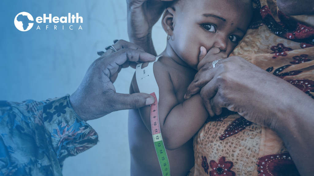
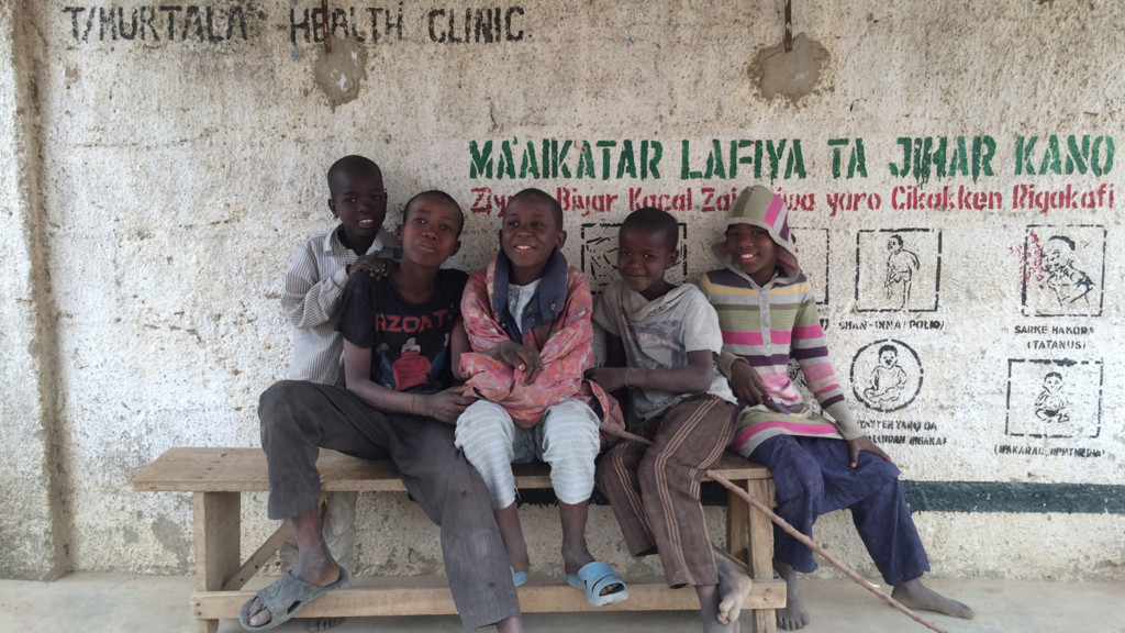
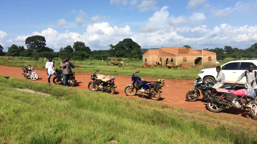
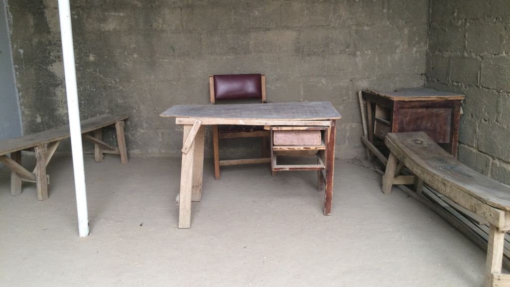
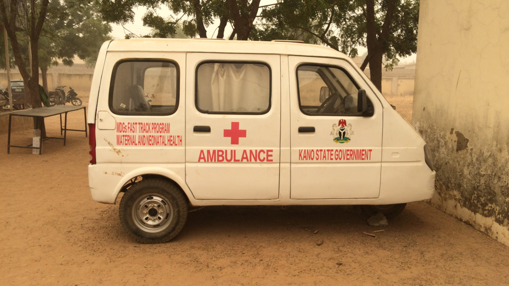
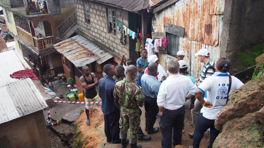
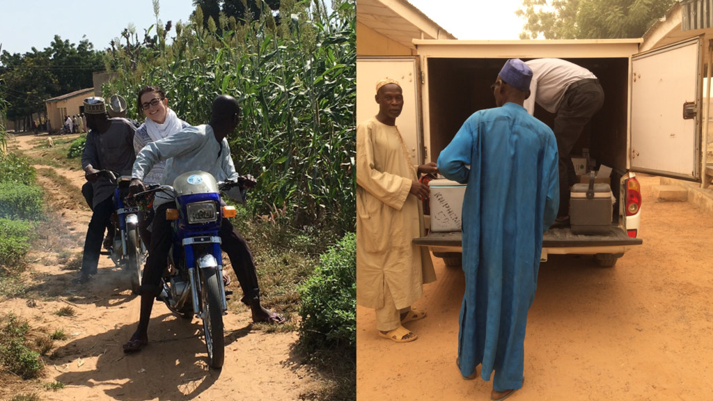
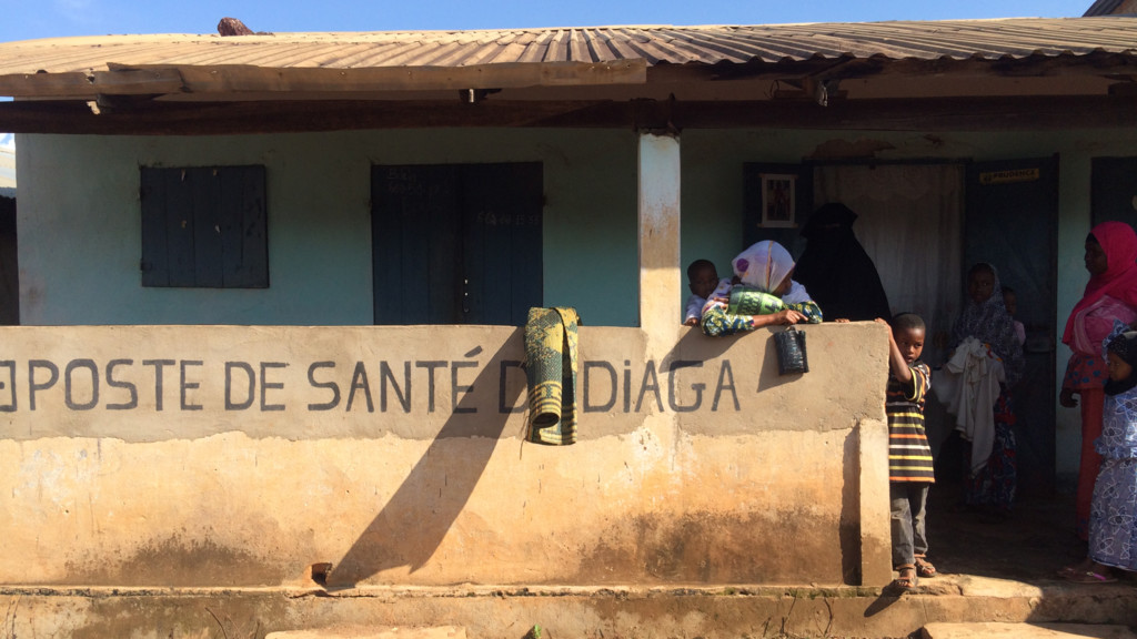
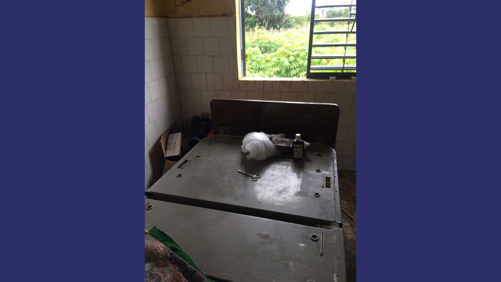
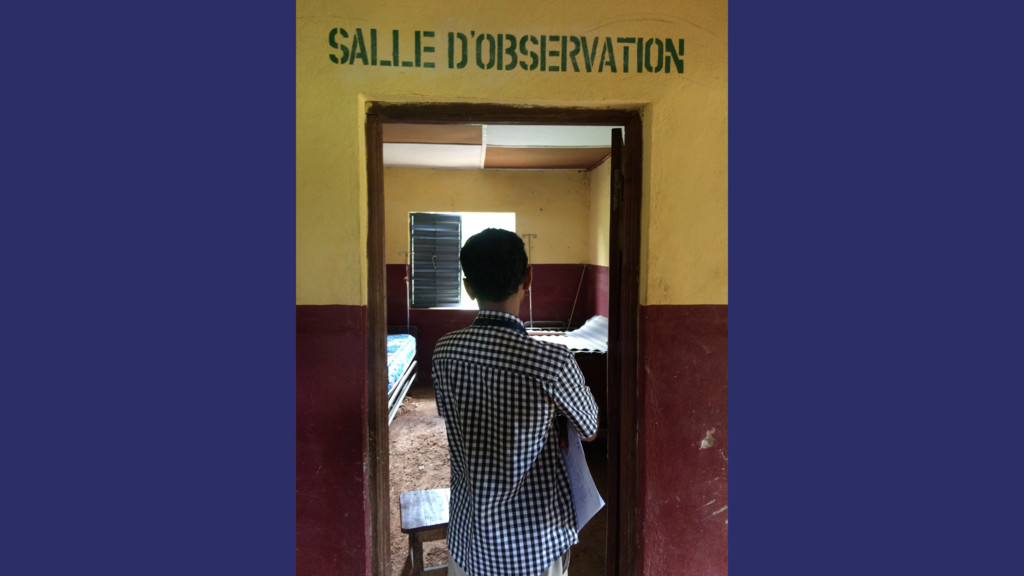
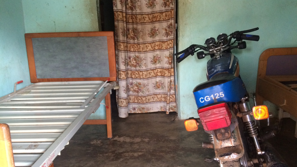
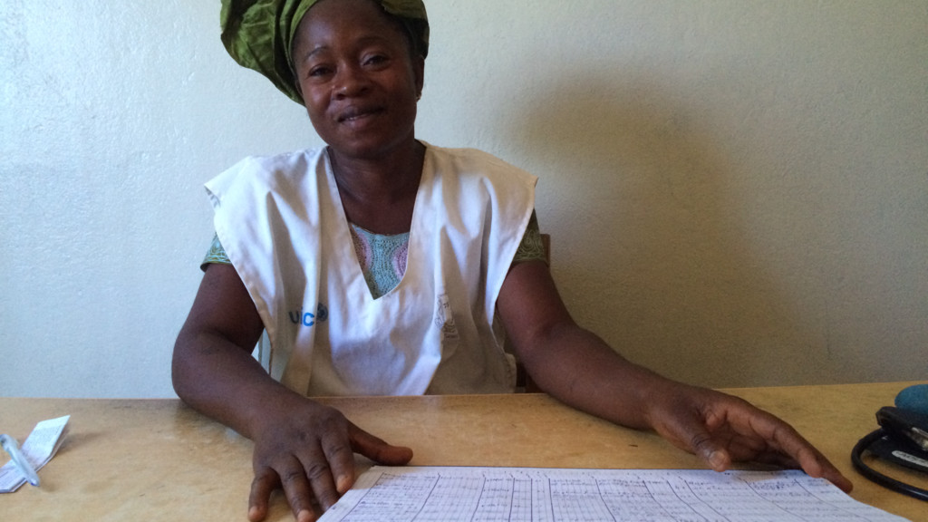
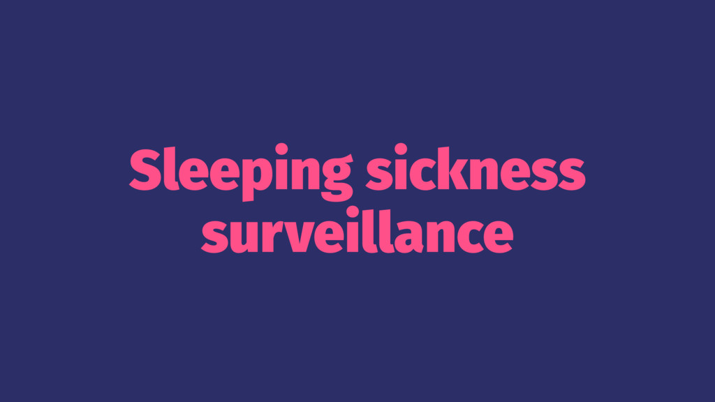
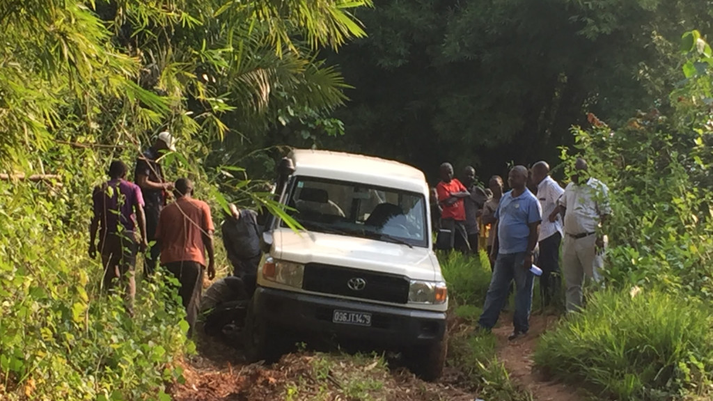
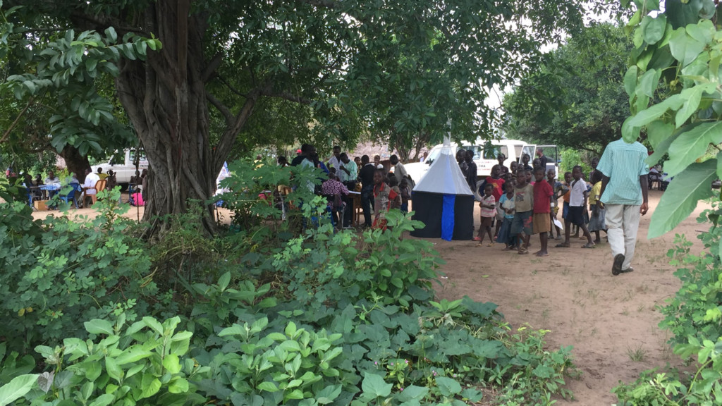
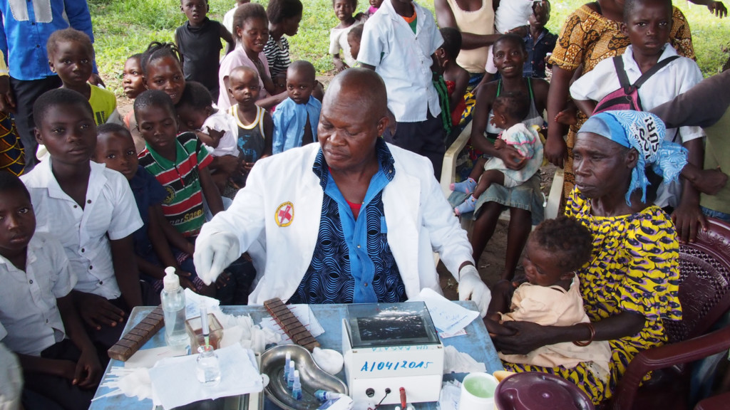
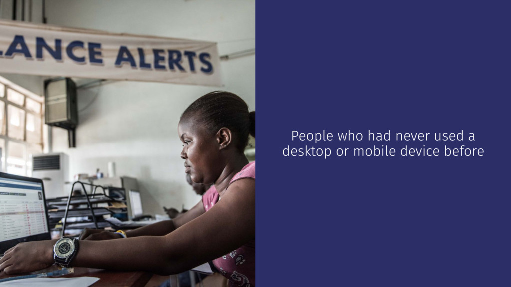
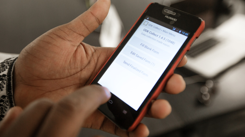
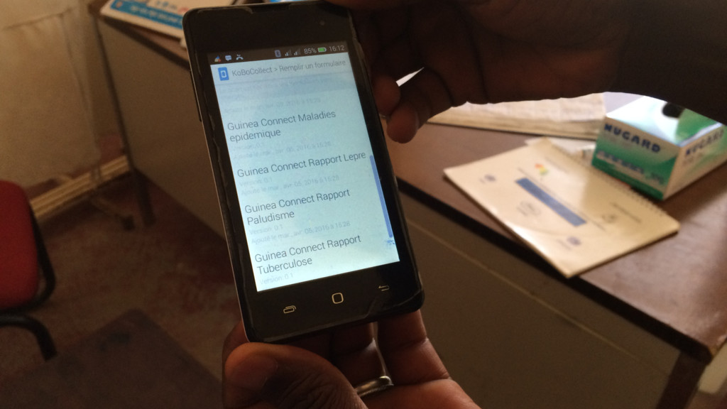
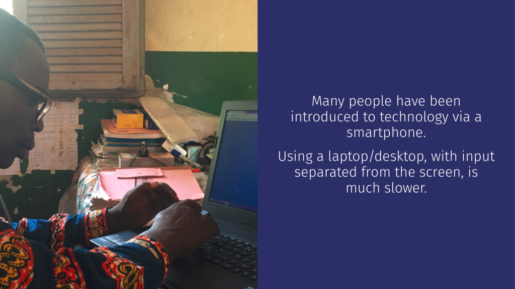
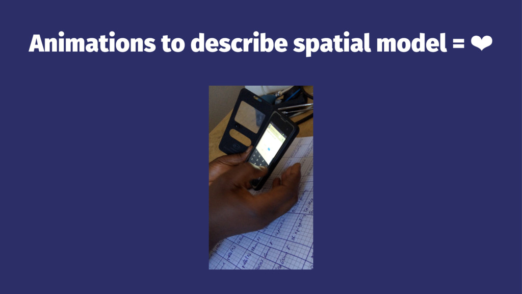
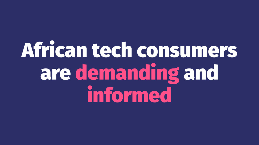
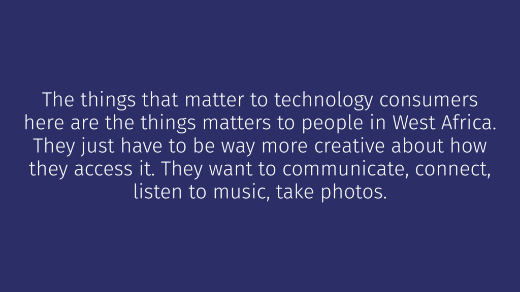
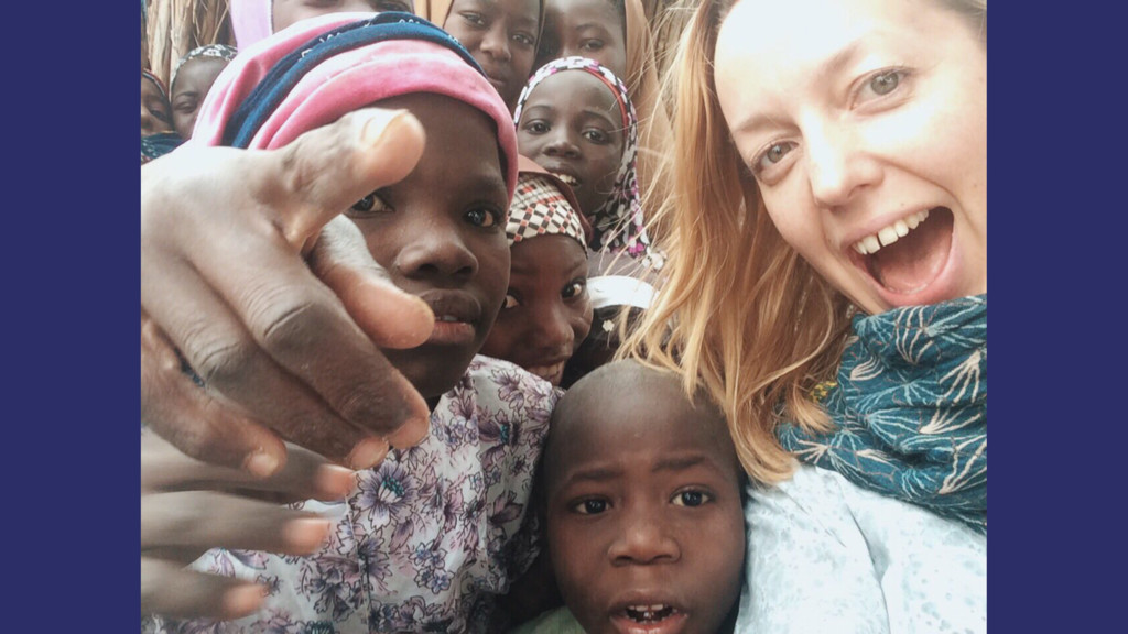
I work for an NGO, designing and building apps for public health projects in West Africa – oftentimes for people that have never used any kind of digital interface before. I’ve done a lot of user research and direct observation of novice tech users and how they navigate apps, input data, and understand screen flows. In this talk, I share what I’ve learnt through this work. I go through specific and practical examples about how newcomers are using all this fancy stuff we’re building, and what that means for the way we design and build interfaces. You’ll leave with a better understanding of how you can optimise for human compatibility while still having fun with css.

Ally Long

November 30, 2016
Tweet

More Decks by Ally Long

Other Decks in Technology

Transcript

  1. Human compatibility error
    How novice tech users in West Africa
    respond to your fancy CSS

    View Slide

  2. Hi!

    View Slide

  3. I'm Ally
    @allyelle

    View Slide

  4. I’m a product designer and front-end developer from
    Melbourne

    View Slide

  5. I live in Berlin now

    View Slide

  6. I've worked for some pretty awesome
    people

    View Slide

  7. In some pretty awesome places

    View Slide

  8. On some pretty awesome projects

    View Slide

  9. Now I work with an NGO called eHealth Africa

    View Slide

  10. View Slide

  11. eHealth Africa works on public health programs and
    emergency outbreak response in West Africa.

    View Slide

  12. Field work used to be this...

    View Slide

  13. View Slide

  14. Now field work is more like this...

    View Slide

  15. View Slide

  16. View Slide

  17. View Slide

  18. View Slide

  19. Human-
    centered

    View Slide

  20. Some of the projects we
    work on

    View Slide

  21. Ebola response

    View Slide

  22. Liberia

    View Slide

  23. Sierra Leone

    View Slide

  24. View Slide

  25. View Slide

  26. View Slide

  27. Polio vaccination

    View Slide

  28. Nigeria

    View Slide

  29. View Slide

  30. View Slide

  31. View Slide

  32. Health facility upgrades

    View Slide

  33. Guinea

    View Slide

  34. View Slide

  35. View Slide

  36. View Slide

  37. View Slide

  38. View Slide

  39. Sleeping sickness
    surveillance

    View Slide

  40. Democratic Republic of Congo

    View Slide

  41. View Slide

  42. View Slide

  43. View Slide

  44. View Slide

  45. The typical user...

    View Slide

  46. There isn't one ¯\(ϑ)/¯

    View Slide

  47. Many people in West Africa are very comfortable
    with digital technology and interfaces.

    View Slide

  48. View Slide

  49. View Slide

  50. But many are just starting to come online...

    View Slide

  51. Novice tech users

    View Slide

  52. People who had never used a
    desktop or mobile device before

    View Slide

  53. People who had to go from using
    pen and paper, to using an app for
    their work

    View Slide

  54. A lot of people buy their phones
    second-hand. They're often quite
    cheap, often knock-offs of well-
    known brands.

    View Slide

  55. Many people don't have power, or
    intermittent power. Phone
    charging stations are quite
    common.

    View Slide

  56. Devices

    View Slide

  57. View Slide

  58. View Slide

  59. Android
    → Huawei
    → Lenovo
    → LG
    → Samsung (if you're fancy) !
    → Apple (if you're reeeeeally fancy)

    View Slide

  60. Condition
    → scratched up screens
    → glare protection films
    → big rugged cases

    View Slide

  61. View Slide

  62. Lack of
    connectivity
    → remote and rural areas have
    very little cellular coverage
    → broadband internet very
    uncommon
    → data is expensive

    View Slide

  63. Difficult to charge
    Finding a working power source is not always easy

    View Slide

  64. If a place has electricity...

    View Slide

  65. ... those power points are popular

    View Slide

  66. → A diesel generator takes around
    two hours to charge a
    smartphone
    → Solar power takes 4-5 hours to
    charge a smartphone

    View Slide

  67. Touch screens are easier
    to use than laptops

    View Slide

  68. Many people have been
    introduced to technology via a
    smartphone.
    Using a laptop/desktop, with input
    separated from the screen, is
    much slower.

    View Slide

  69. Where's it at?
    If elements are offscreen, they're not
    discoverable.

    View Slide

  70. This is a standard way to display
    form fields.
    But it's deceptive. How do you
    know there's more below the edge
    of the device window? Where's the
    button to continue, or go back?
    And validation errors can get
    complicated.
    It's only obvious to us because
    we've already learnt it.

    View Slide

  71. A good alternative is to break down long forms into a
    "wizard" style interface, with one question per
    screen.

    View Slide

  72. View Slide

  73. Avoid concealed
    elements

    View Slide

  74. The select tag is a prime example.

    View Slide

  75. For example, a hierarchical
    location select. Using select tags is
    an obvious solution, but confusing
    to novice users.

    View Slide

  76. This is a clearer alternative

    View Slide

  77. View Slide

  78. Proper affordance
    → make the buttons and actions bigger, clickier,
    more obvious
    → clear labelling
    → combine icons with labels

    View Slide

  79. View Slide

  80. What does this do?

    View Slide

  81. → people will click on everything to see what it
    does.
    → particularly when elements all look similar,
    people will press everything until they find
    something that reacts.
    → it can be good idea to build in confirmation steps,
    or undo options.

    View Slide

  82. View Slide

  83. Animations
    Animations are interesting, because they can do so much to
    help, and yet so much to hinder.

    View Slide

  84. Animations in form elements = !

    View Slide

  85. → Animations tend to hinder when it comes to data
    input, or task completion.
    → Material UI has some great guidelines on how to
    best use motion and animation.
    → However, Material UI has some form field
    animations that confuse users.

    View Slide

  86. Animations to describe spatial model = ❤

    View Slide

  87. Animations really shine when they are used to
    illuminate the spatial model of an app.

    View Slide

  88. Use left/right, up/down animations to remind the
    user where they are, and where they are going.

    View Slide

  89. Consistency is key

    View Slide

  90. Consistency in UI and navigation elements help non-
    literate and low-literate people learn how to use
    apps by rote memorisation.

    View Slide

  91. If you use a forwards / backwards
    pattern here...

    View Slide

  92. ... don't disturb that pattern here.

    View Slide

  93. Make it interesting

    View Slide

  94. Introduce elements that give users
    a sense of progress, or fun, or
    achievement.

    View Slide

  95. Steal!

    View Slide

  96. Ok fine. Borrow.
    → Facebook
    → WhatsApp
    → Gmail
    These apps are all ubiquitous. If in doubt, emulate
    the navigation patterns and UI patterns common to
    these apps.

    View Slide

  97. The next billion

    View Slide

  98. Emerging economies present a huge opportunity in
    terms of new audiences.

    View Slide

  99. African tech consumers
    are demanding and
    informed

    View Slide

  100. They want clear and
    reliable mobile solutions

    View Slide

  101. The same things matter

    View Slide

  102. The things that matter to technology consumers
    here are the things matters to people in West Africa.
    They just have to be way more creative about how
    they access it. They want to communicate, connect,
    listen to music, take photos.

    View Slide

  103. View Slide

  104. View Slide

  105. View Slide

  106. View Slide

  107. View Slide

  108. Resource-constrained environments teach us a lot
    as designers and makers.

    View Slide

  109. Strip everything back to
    the essentials

    View Slide

  110. Know your users

    View Slide

  111. Empathy and curiosity
    are at the heart of design

    View Slide

  112. !! Thank you !!

    View Slide