Upgrade to Pro — share decks privately, control downloads, hide ads and more …

Field-tested interfaces for the next billion – Generate Conf

Ally Long
September 21, 2017

Field-tested interfaces for the next billion – Generate Conf

This talk was given at Generate London, 21 September 2017.

In the tech industry, we’re constantly chasing innovation – the new and the shiny, the slickest UI, the latest framework, an immersive user experience. We’re understandably excited about the possibilities inherent in a world of powerful hand-held devices, super-fast connections, and a user base with the means and the know-how to buy into whatever next big thing we put out there.

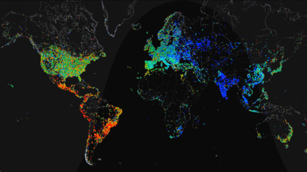
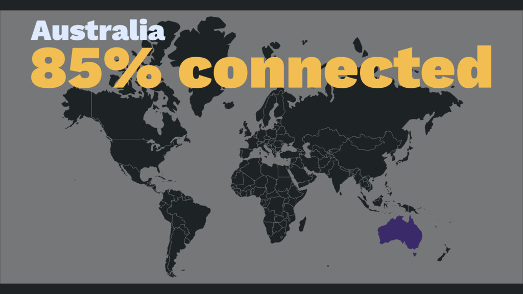
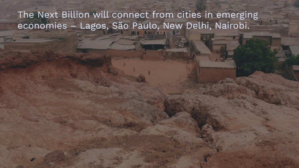
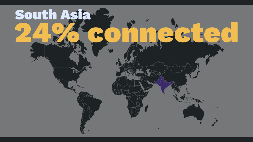
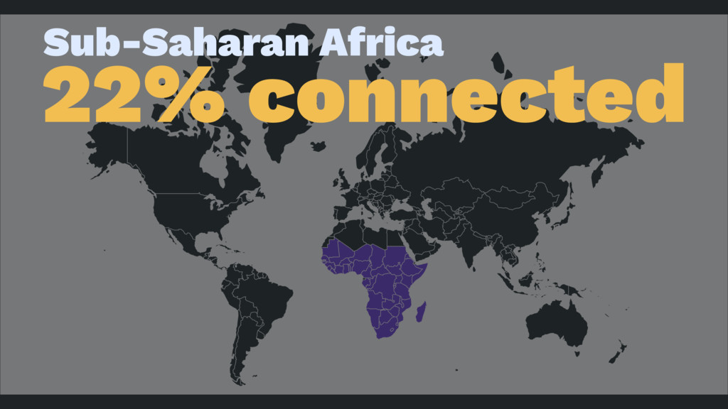
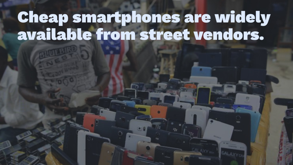
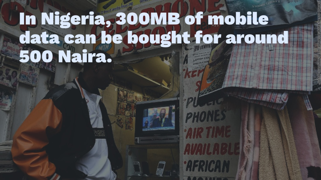
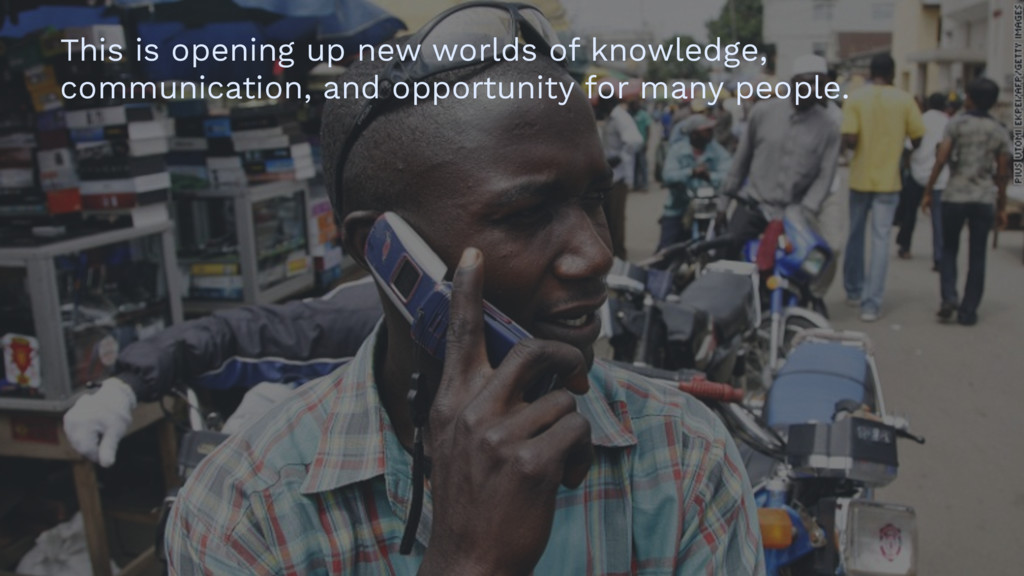
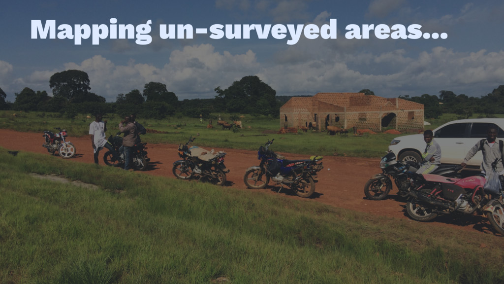
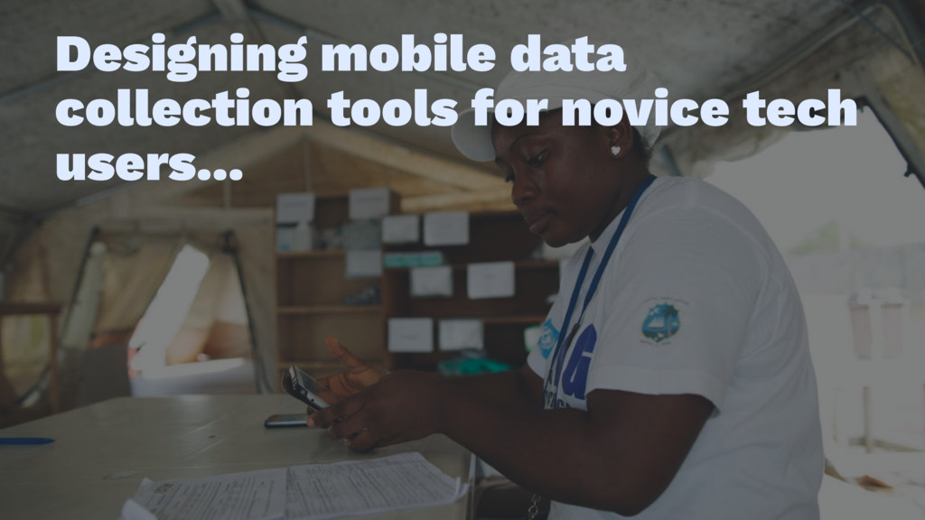
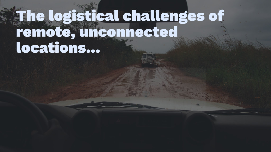
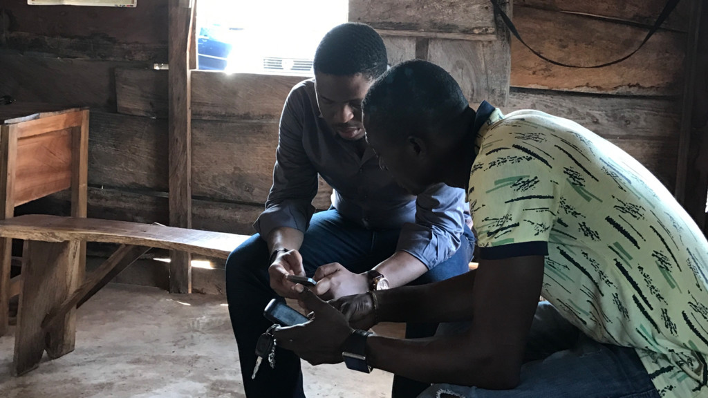
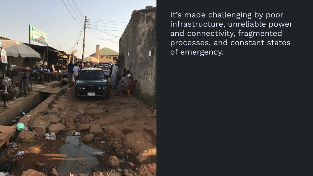
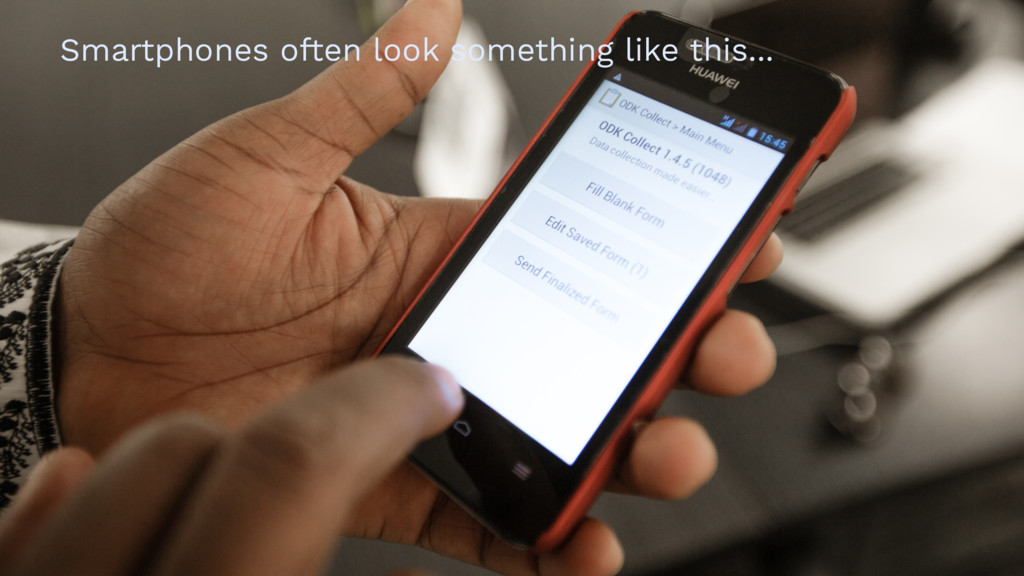
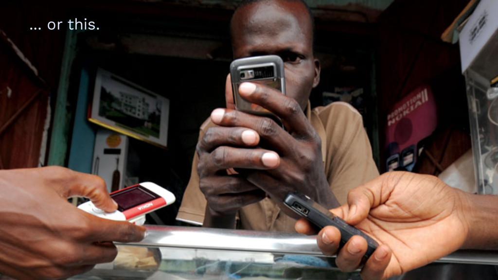
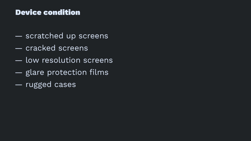
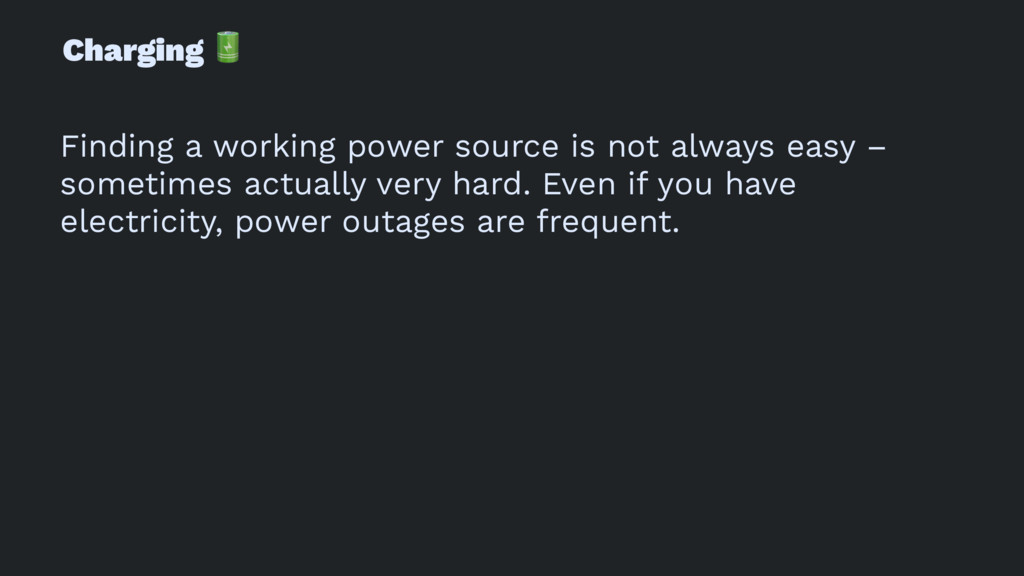
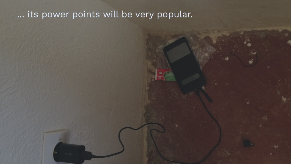
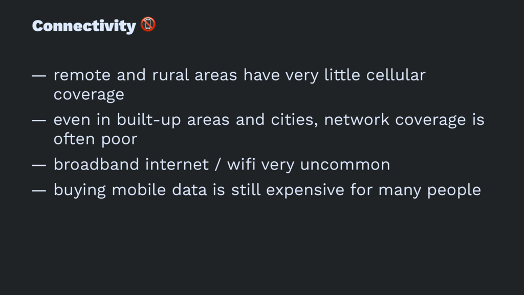
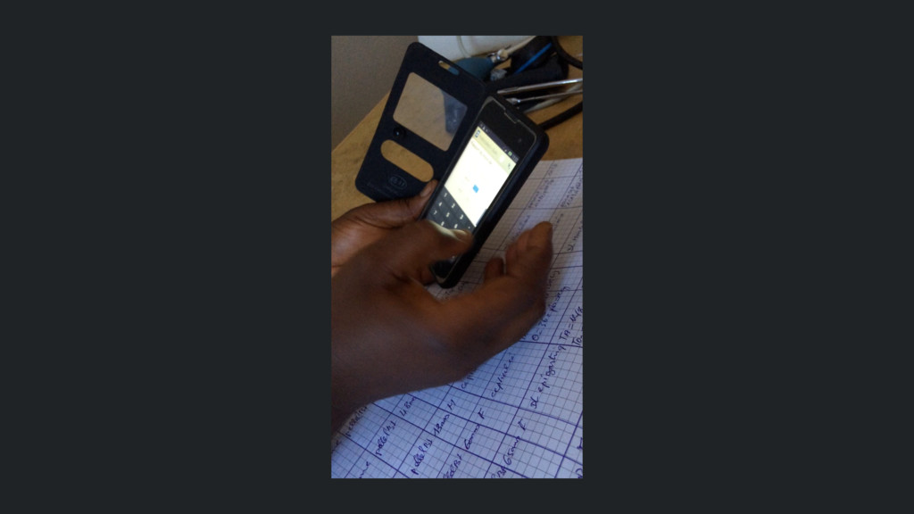
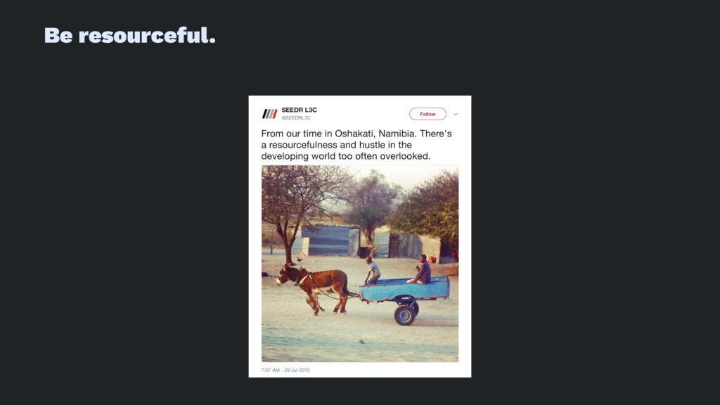
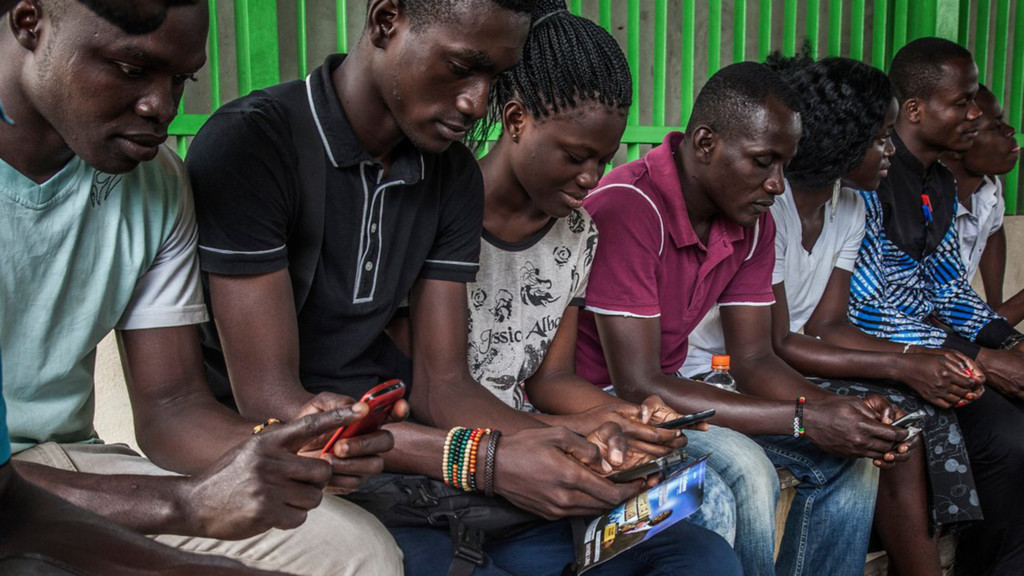
But there exists another kind of digital landscape – places where conditions are imperfect, where networks are flawed, where technical literacy is low, where kilobytes are precious; a world where our carefully-crafted digital experiences stutter and crawl and obfuscate and perplex, and ultimately fail. There are billions of people around the world that now have access to connected smart phones, but many can afford only a few megabytes of data here and there, have low-cost, low-specced smartphones, unreliable electricity sources to charge them, and are learning to use digital interfaces for the first time in their lives.

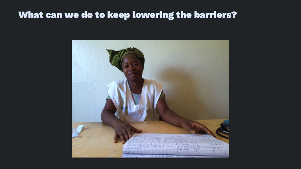
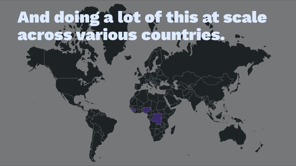
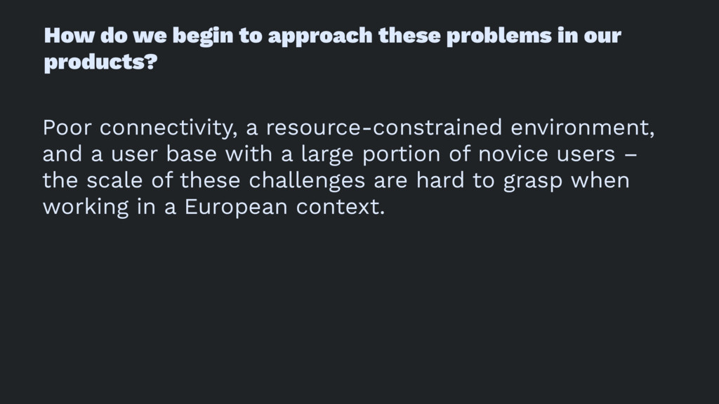
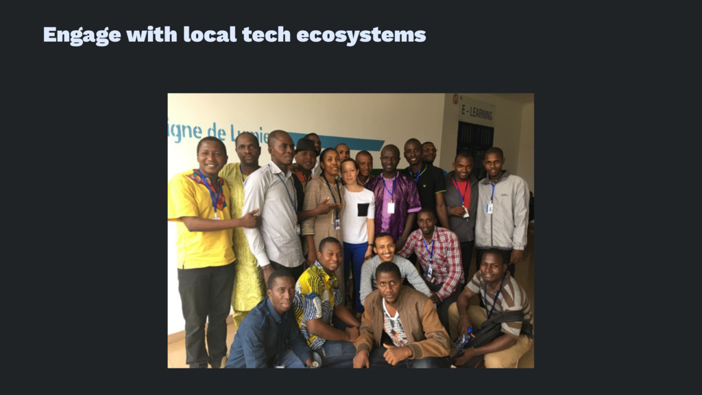
So how can we make sure that keeping up with the cutting edge won’t exclude people in these fast-growing emerging economies? In this talk we’ll go through examples from working with novice tech users in West Africa and discover how they navigate and comprehend interfaces, input data, and understand screen flows. You’ll gain some insight into the context and the constraints, learn how certain UI patterns and conventions hinder or help, and leave with an understanding of how to include these millions of new users in your product thinking.

Ally Long

September 21, 2017
Tweet

More Decks by Ally Long

Other Decks in Technology

Transcript

  1. The Next Billion will connect from cities in emerging economies

    – Lagos, São Paulo, New Delhi, Nairobi.
  2. The connectivity rate in these resource-poor countries has lagged, but

    is changing rapidly. The cost of mobile data is decreasing, and the availability of cheap handsets is increasing.
  3. But the barrier to entry still exists. Many people can

    afford only a few megabytes of data here and there, have low-cost, low-specced smartphones, unreliable electricity sources to charge them, and some are learning to use digital interfaces for the first time in their lives.
  4. But I've also worked with NGOs and non-profits on software

    for public health and markets in West Africa, with partners like UNICEF, WHO, the Gates Foundation, the Institute of Tropical Medicine, and various West African governments.
  5. The issues are grave and often urgent, and the technical

    challenges were significant, but fascinating.
  6. We try to take on big public health problems in

    Nigeria, Central African Republic and beyond, and to prove that they can be solved with the right technology, the right design, and the right market-shaping approaches.
  7. Our approach is on solving problems on the ground, collecting

    insights in the field, being in touch with real users and real problems in hard places.
  8. It’s made challenging by poor infrastructure, unreliable power and connectivity,

    fragmented processes, and constant states of emergency.
  9. How do we begin to approach these problems in our

    products? Poor connectivity, a resource-constrained environment, and a user base with a large portion of novice users – the scale of these challenges are hard to grasp when working in a European context.
  10. Tech users in Africa fall across a broad spectrum of

    experience, resources, education, and tech savviness. Many people in West Africa are skillful users of technology. There are thriving tech scenes in many cities. But design for a baseline experience.
  11. Common smartphone brands ! Mostly Android, mostly cheap hardware. —

    Huawei — Lenovo — Tecno — Motorola — LG — Samsung (if you're fancy) ! — Apple (if you're reeeeeally fancy)
  12. Device condition — scratched up screens — cracked screens —

    low resolution screens — glare protection films — rugged cases
  13. Charging ! Finding a working power source is not always

    easy – sometimes actually very hard. Even if you have electricity, power outages are frequent.
  14. Charging can be slow — A diesel generator takes around

    two hours to charge a smartphone — Solar power takes 4-5 hours to charge a smartphone
  15. Connectivity ! — remote and rural areas have very little

    cellular coverage — even in built-up areas and cities, network coverage is often poor — broadband internet / wifi very uncommon — buying mobile data is still expensive for many people
  16. Offline-first Your app should be reliable and work as much

    as possible independently from an internet connection. Build in graceful degradations for users without a stable network connection.
  17. Optimise for responsive UIs — Don't tie UI elements to

    long-running operations such as network requests — Don’t block navigation — Loading indicators (spinners, progress bars) should be inline
  18. Slimmed-down browsing – Opera Mini is popular It is the

    lightest in terms of data usage and system requirements. Make sure it's part of your testing process.
  19. Phones are o!en turned off To save battery and data,

    people often turn off their phones. This means background processes are tricky. You need to be smart about the way you use service workers.
  20. When trialling a project on laptop and tablet devices, we

    found that people found the tablet version easier to use because: — a lot of people had never used laptops before — inputs were separate from the screen — it was harder to carry around and charge
  21. Gesture-based navigation... ! Gestures like swiping, pull down, pull up

    are very unintuitive to a novice tech user. Buttons are easier to understand. People learnt these fairly quickly, once introduced to the concept – but it's safer to use gestures as shortcuts to actions that are also accessible by other means.
  22. Where's it at? ! If elements are offscreen, they're not

    discoverable. Where possible, it can be good to use only the visible area of the screen as your canvas, especially if the user needs to take action on the screen.
  23. Avoid concealed elements in general A good example here is

    the select tag. People everywhere find those hard to use.
  24. Good affordance is vital — make the buttons and actions

    bigger, clickier, more obvious — clearly label things — combine icons with labels
  25. People often tap on everything, just to see what it

    does. It's usually a good idea to build in confirmation dialogues for destructive actions.
  26. Animations Animations can be very illuminating, or they can confuse

    the hell out of users. Be mindful about where and how you use them.
  27. Consistency is key A consistent UI helps people learn and

    memorise, and has particular advantages for low-literate or non-literate people learning via rote memorisation.
  28. Make it fun There's no need to be boring. Inserting

    personality into your app makes it fun to use and encouraging to learn. Introducing elements of gamification incentivises people to return to your app.
  29. Ok fine. Borrow. There are certain apps that almost everyone

    in Africa uses. If in doubt, look at the navigation patterns and UI patterns common to those apps and emulate them. — Facebook — Whatsapp — Gmail