Developer at Staple Web Design, also the Co-Founder of the Buffalo WordPress Users Meetup and WordCamp Buffalo. Web: staplewebdesign.com Twitter: @AndyStaple Saturday, September 14, 13
into words and sentences and printed or displayed electronically. Originated after the invention of printing from movable type in the mid 15th century. Saturday, September 14, 13
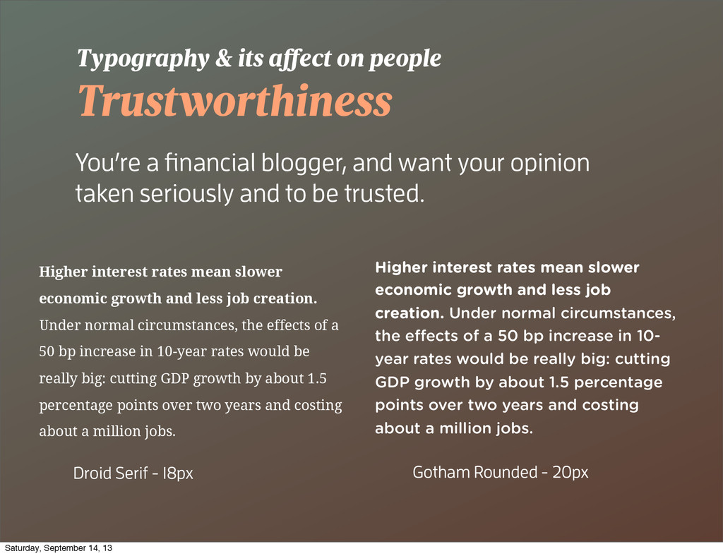
care what your website is portraying itself as. Some characteristics a website might aspire towards: - Trustworthiness - Engagement - Playfulness - Somberness Your Typography helps! You may be thinking Saturday, September 14, 13
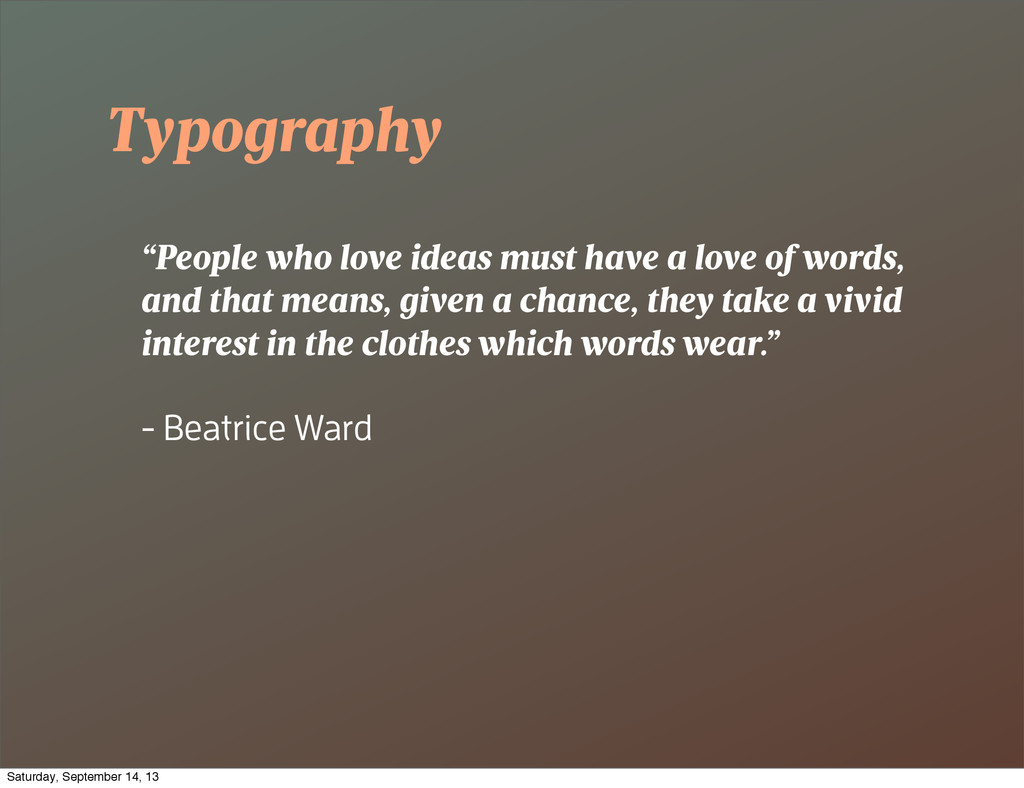
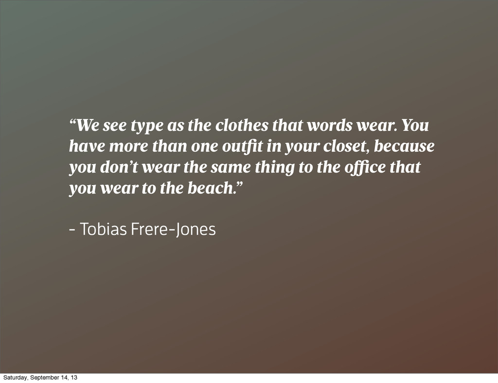
have more than one outfit in your closet, because you don’t wear the same thing to the o ce that you wear to the beach.” - Tobias Frere-Jones Saturday, September 14, 13
seriously and to be trusted. Typography & its a ect on people Higher interest rates mean slower economic growth and less job creation. Under normal circumstances, the effects of a 50 bp increase in 10-year rates would be really big: cutting GDP growth by about 1.5 percentage points over two years and costing about a million jobs. Higher interest rates mean slower economic growth and less job creation. Under normal circumstances, the e ects of a 50 bp increase in 10- year rates would be really big: cutting GDP growth by about 1.5 percentage points over two years and costing about a million jobs. Droid Serif - 18px Gotham Rounded - 20px Saturday, September 14, 13
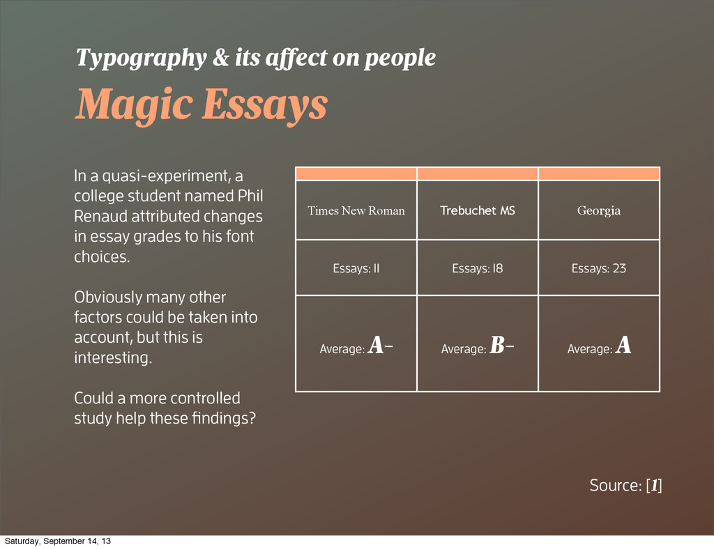
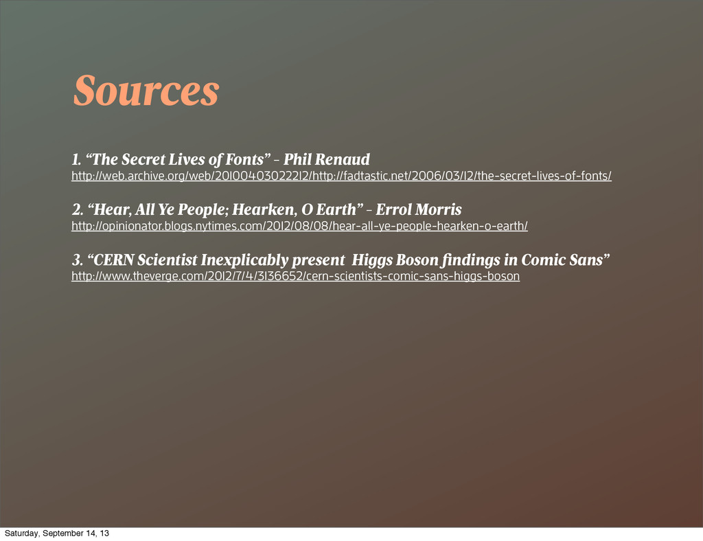
Renaud attributed changes in essay grades to his font choices. Obviously many other factors could be taken into account, but this is interesting. Could a more controlled study help these findings? Typography & its a ect on people Source: [1] Times New Roman Trebuchet MS Georgia Essays: 11 Essays: 18 Essays: 23 Average: A- Average: B- Average: A Saturday, September 14, 13
York Times conducted an interesting experiment. It was thought to be a simple quiz to find out if the reader was an optimist or pessimist. In reality it was a test seeing if typefaces had an effect on a readers perception of credulity and their confidence. Typography & its a ect on people Source: [2] Saturday, September 14, 13
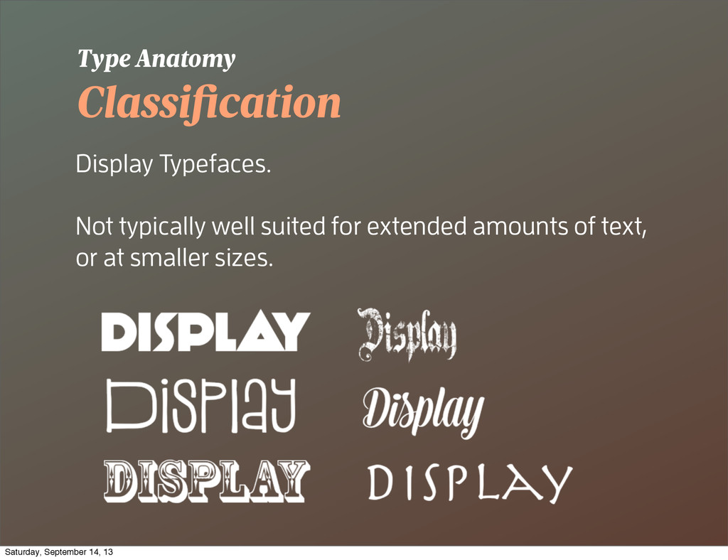
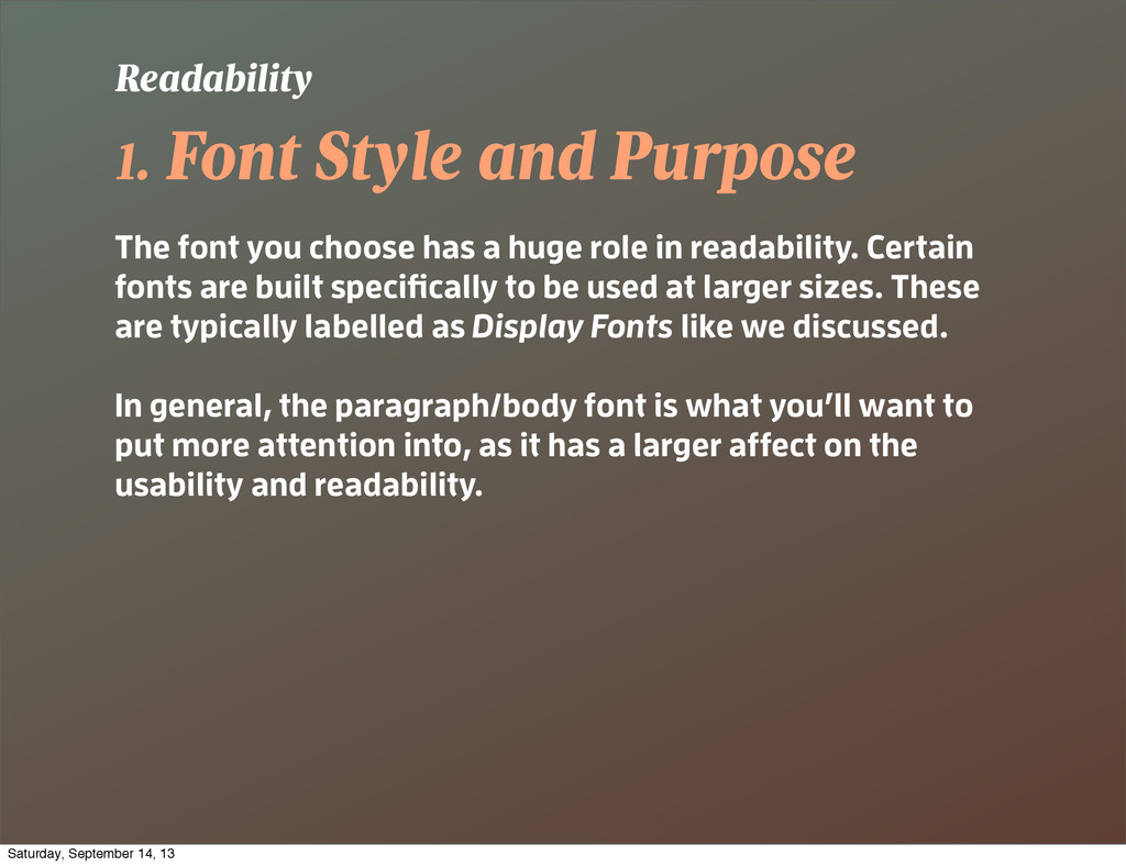
a huge role in readability. Certain fonts are built specifically to be used at larger sizes. These are typically labelled as Display Fonts like we discussed. In general, the paragraph/body font is what you’ll want to put more attention into, as it has a larger affect on the usability and readability. Readability Saturday, September 14, 13
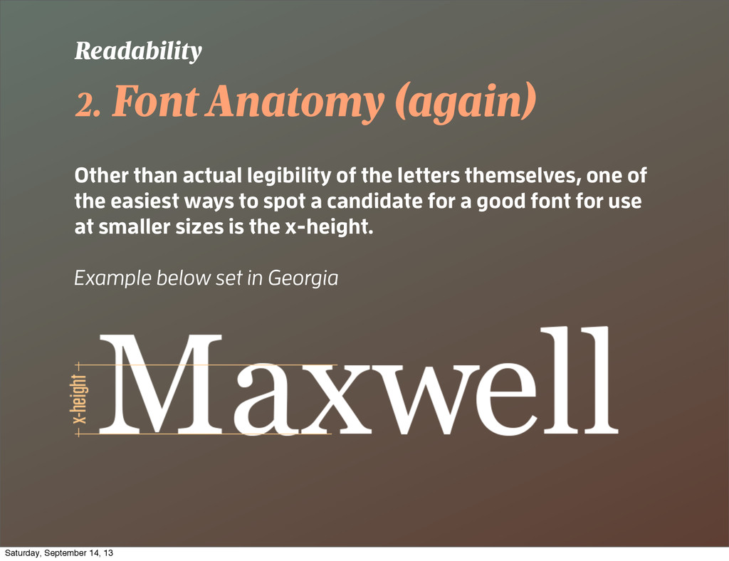
letters themselves, one of the easiest ways to spot a candidate for a good font for use at smaller sizes is the x-height. Example below set in Georgia Readability Saturday, September 14, 13
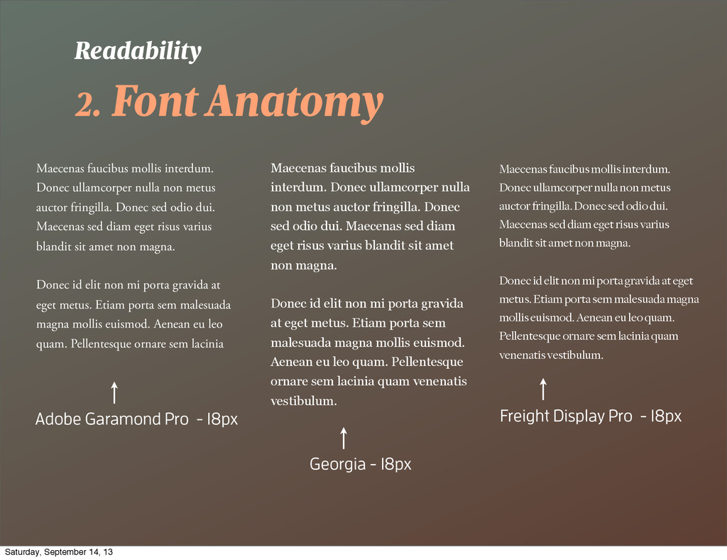
non metus auctor fringilla. Donec sed odio dui. Maecenas sed diam eget risus varius blandit sit amet non magna. Donec id elit non mi porta gravida at eget metus. Etiam porta sem malesuada magna mollis euismod. Aenean eu leo quam. Pellentesque ornare sem lacinia Readability Maecenas faucibus mollis interdum. Donec ullamcorper nulla non metus auctor fringilla. Donec sed odio dui. Maecenas sed diam eget risus varius blandit sit amet non magna. Donec id elit non mi porta gravida at eget metus. Etiam porta sem malesuada magna mollis euismod. Aenean eu leo quam. Pellentesque ornare sem lacinia quam venenatis vestibulum. Adobe Garamond Pro - 18px Georgia - 18px Maecenas faucibus mollis interdum. Donec ullamcorper nulla non metus auctor fringilla. Donec sed odio dui. Maecenas sed diam eget risus varius blandit sit amet non magna. Donec id elit non mi porta gravida at eget metus. Etiam porta sem malesuada magna mollis euismod. Aenean eu leo quam. Pellentesque ornare sem lacinia quam venenatis vestibulum. Freight Display Pro - 18px Saturday, September 14, 13
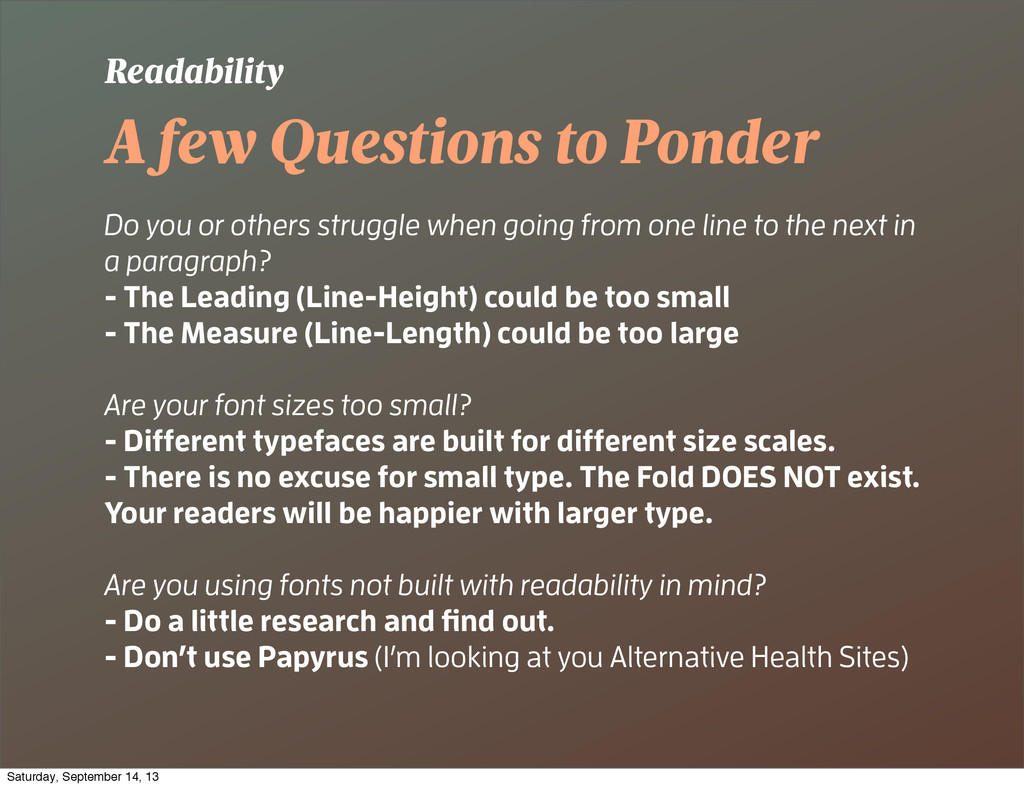
when going from one line to the next in a paragraph? - The Leading (Line-Height) could be too small - The Measure (Line-Length) could be too large Are your font sizes too small? - Different typefaces are built for different size scales. - There is no excuse for small type. The Fold DOES NOT exist. Your readers will be happier with larger type. Are you using fonts not built with readability in mind? - Do a little research and find out. - Don’t use Papyrus (I’m looking at you Alternative Health Sites) Readability Saturday, September 14, 13
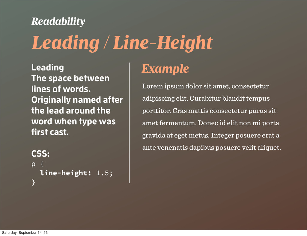
Originally named after the lead around the word when type was first cast. CSS: p { line-height: 1.5; } Readability Lorem ipsum dolor sit amet, consectetur adipiscing elit. Curabitur blandit tempus porttitor. Cras mattis consectetur purus sit amet fermentum. Donec id elit non mi porta gravida at eget metus. Integer posuere erat a ante venenatis dapibus posuere velit aliquet. Example Saturday, September 14, 13
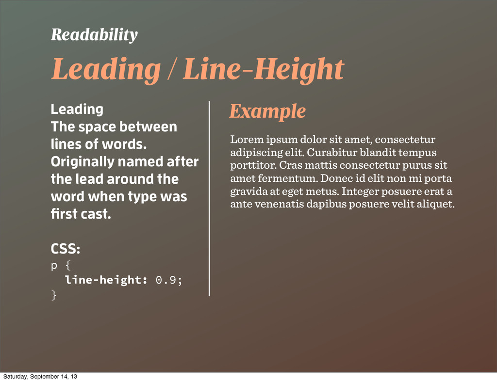
Originally named after the lead around the word when type was first cast. CSS: p { line-height: 0.9; } Readability Lorem ipsum dolor sit amet, consectetur adipiscing elit. Curabitur blandit tempus porttitor. Cras mattis consectetur purus sit amet fermentum. Donec id elit non mi porta gravida at eget metus. Integer posuere erat a ante venenatis dapibus posuere velit aliquet. Example Saturday, September 14, 13
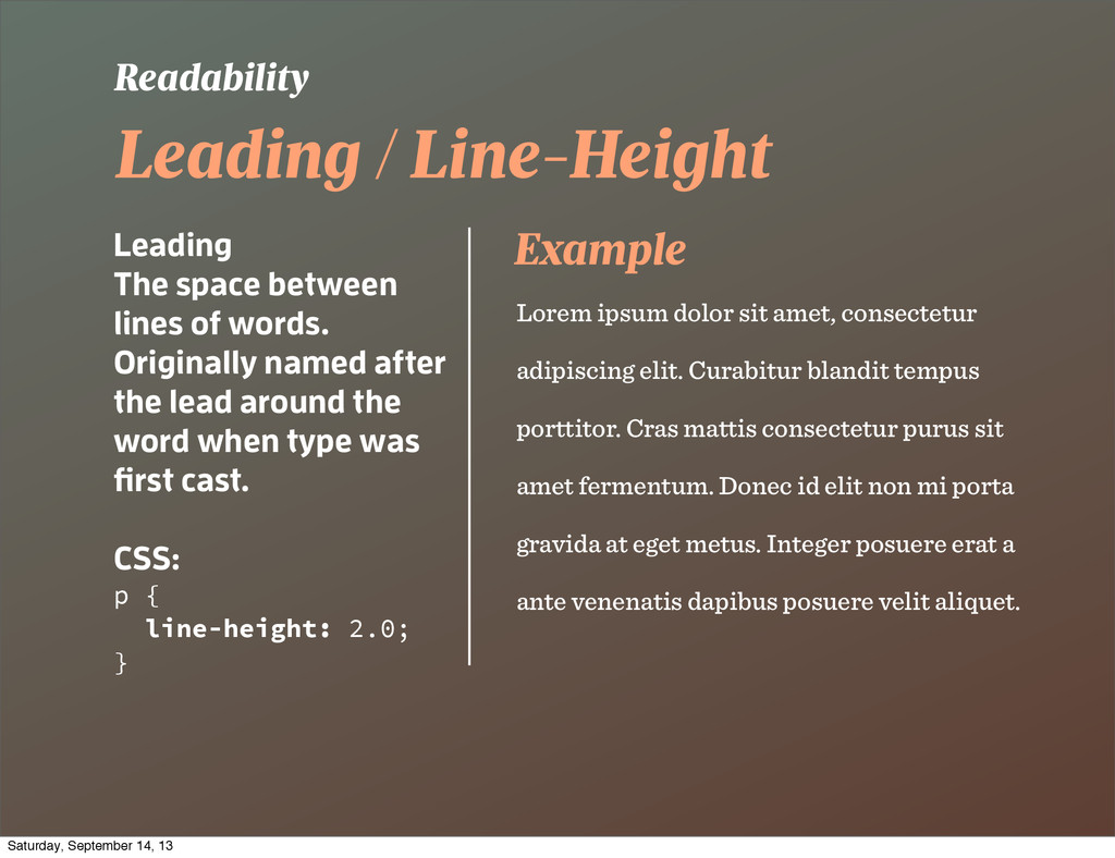
Originally named after the lead around the word when type was first cast. CSS: p { line-height: 2.0; } Readability Lorem ipsum dolor sit amet, consectetur adipiscing elit. Curabitur blandit tempus porttitor. Cras mattis consectetur purus sit amet fermentum. Donec id elit non mi porta gravida at eget metus. Integer posuere erat a ante venenatis dapibus posuere velit aliquet. Example Saturday, September 14, 13
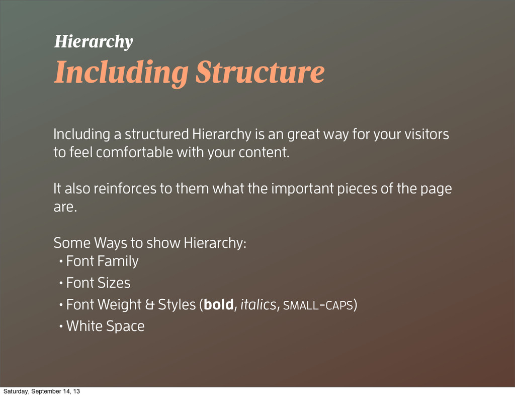
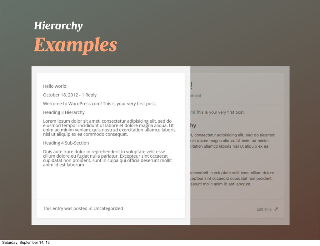
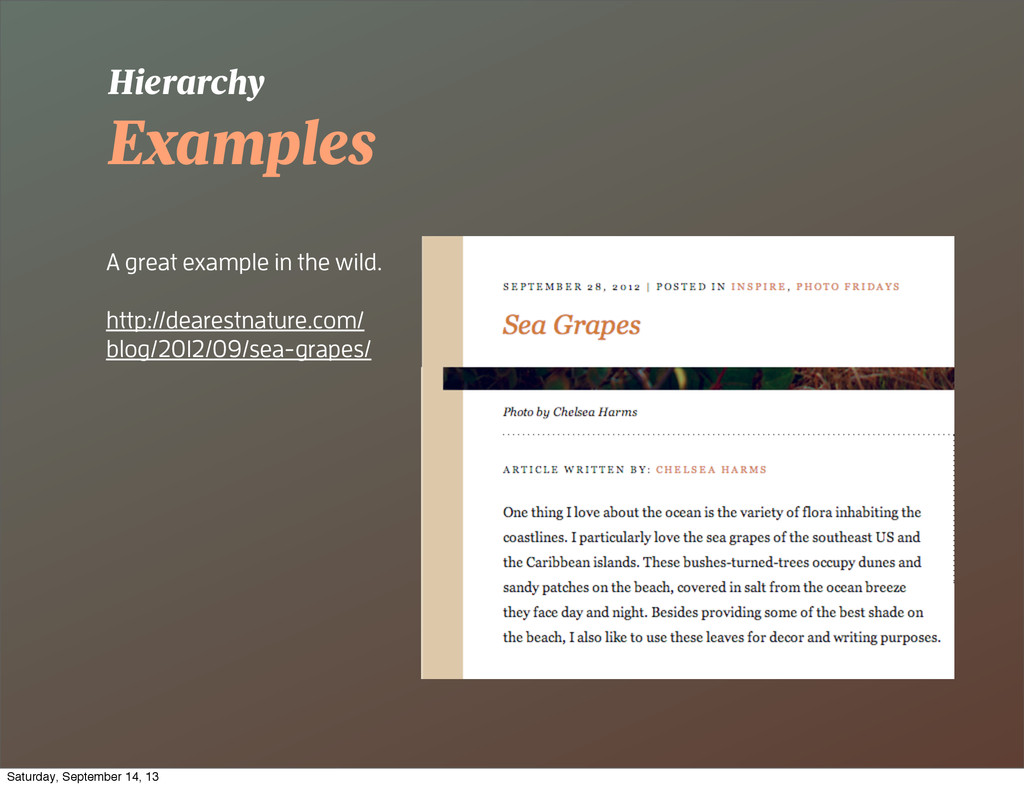
for your visitors to feel comfortable with your content. It also reinforces to them what the important pieces of the page are. Some Ways to show Hierarchy: • Font Family • Font Sizes • Font Weight & Styles (bold, italics, SMALL-CAPS) • White Space Hierarchy Saturday, September 14, 13
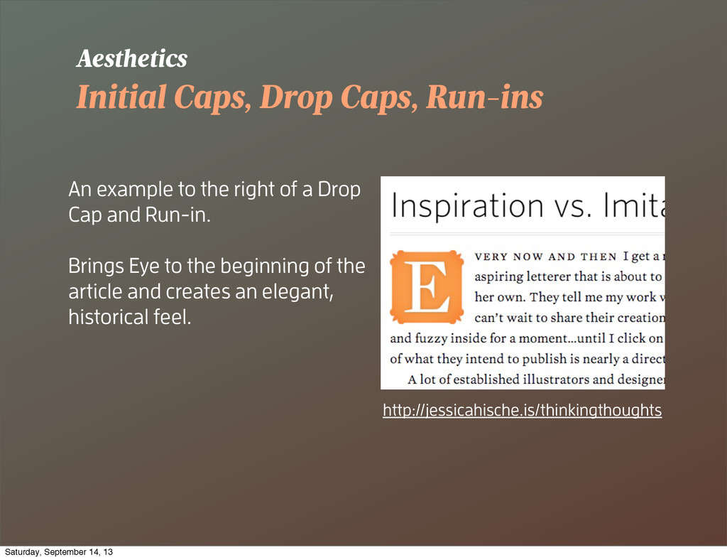
of a Drop Cap and Run-in. Brings Eye to the beginning of the article and creates an elegant, historical feel. Aesthetics http://jessicahische.is/thinkingthoughts Saturday, September 14, 13
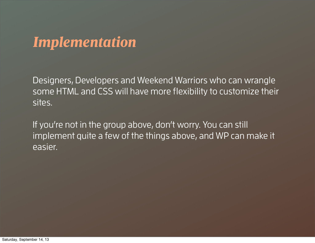
HTML and CSS will have more flexibility to customize their sites. If you’re not in the group above, don’t worry. You can still implement quite a few of the things above, and WP can make it easier. Saturday, September 14, 13
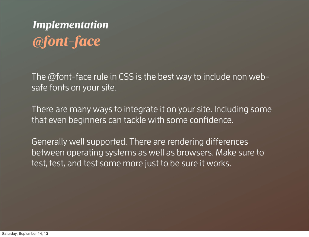
to include non web- safe fonts on your site. There are many ways to integrate it on your site. Including some that even beginners can tackle with some confidence. Generally well supported. There are rendering differences between operating systems as well as browsers. Make sure to test, test, and test some more just to be sure it works. Implementation Saturday, September 14, 13
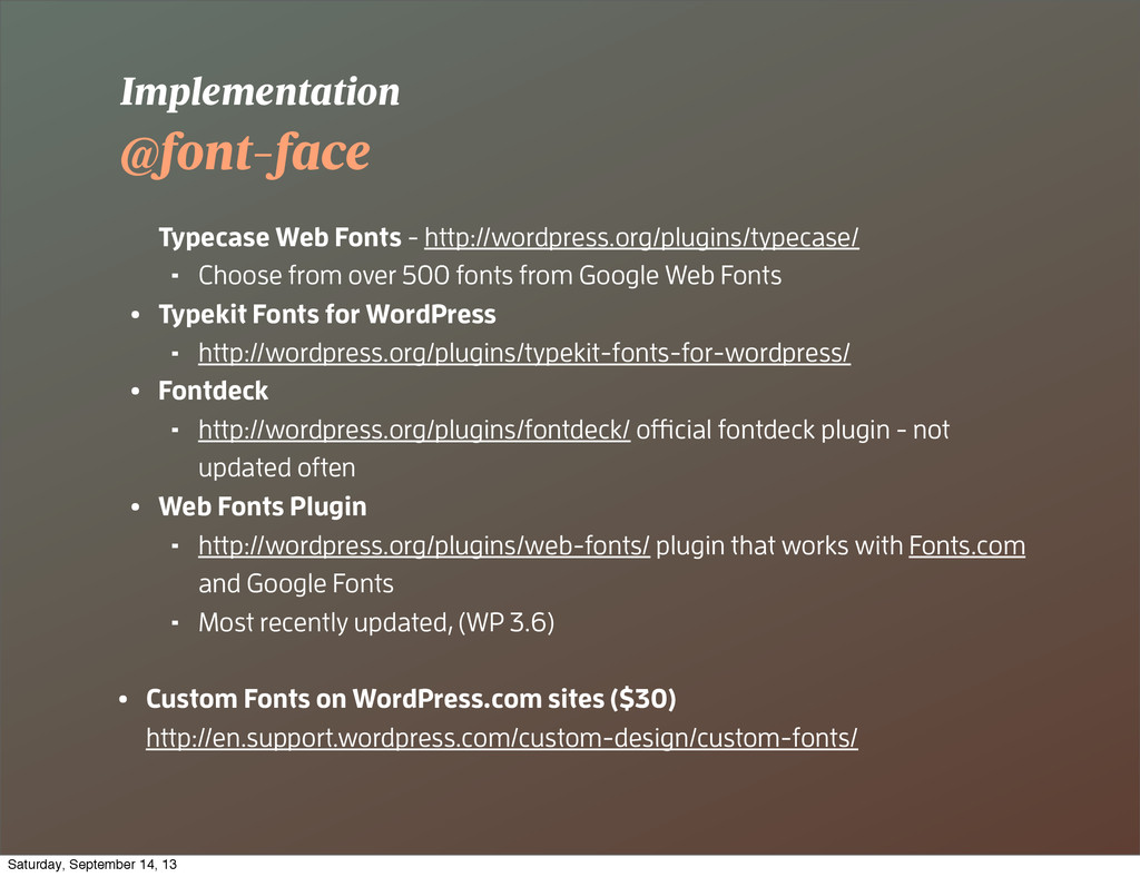
500 fonts from Google Web Fonts • Typekit Fonts for WordPress ⁃ http://wordpress.org/plugins/typekit-fonts-for-wordpress/ • Fontdeck ⁃ http://wordpress.org/plugins/fontdeck/ official fontdeck plugin - not updated often • Web Fonts Plugin ⁃ http://wordpress.org/plugins/web-fonts/ plugin that works with Fonts.com and Google Fonts ⁃ Most recently updated, (WP 3.6) • Custom Fonts on WordPress.com sites ($30) http://en.support.wordpress.com/custom-design/custom-fonts/ Implementation Saturday, September 14, 13
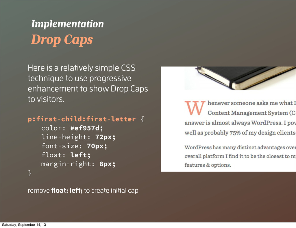
use progressive enhancement to show Drop Caps to visitors. p:first-child:first-letter { color: #ef957d; line-height: 72px; font-size: 70px; float: left; margin-right: 8px; } remove float: left; to create initial cap Implementation Saturday, September 14, 13
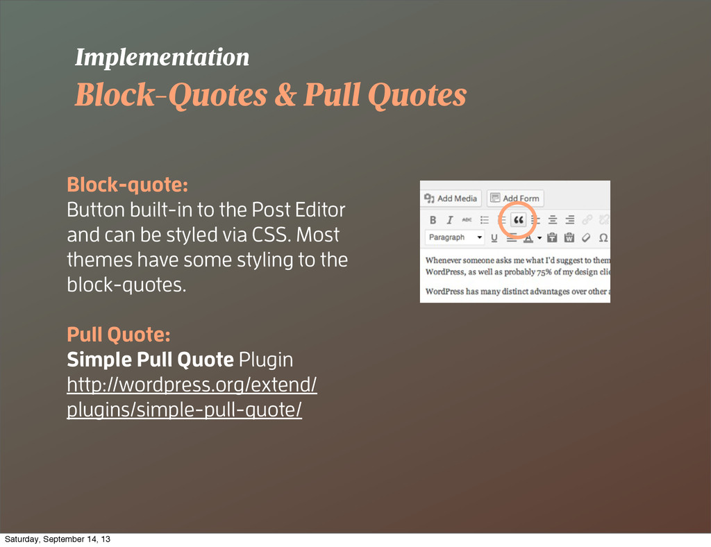
Editor and can be styled via CSS. Most themes have some styling to the block-quotes. Pull Quote: Simple Pull Quote Plugin http://wordpress.org/extend/ plugins/simple-pull-quote/ Implementation Saturday, September 14, 13
you get. Fix that. You can style the editor text, colors, and other elements via CSS so that when you’re typing your post, it looks more like the real thing when published. http://codex.wordpress.org/ Function_Reference/add_editor_style Implementation Saturday, September 14, 13
![Trustworthiness Typography & its a ect on people Source: [2]](https://files.speakerdeck.com/presentations/f4d1a6a0943801318f2b6e547a61a23d/slide_14.jpg)